Posts: 432
Threads: 70
Joined: Mar 2020
Reputation:
69
This week's theme and brief by previous winner, JosephCow
Crimson Character of the Week #42
Elemental Whisperer
"A priest or priestess with an innate and divine ability to communicate with an elemental being conjured from an ancient ethereal plane to aid in a righteous quest"
The best of the CHOWs will be picked by an anonymous poll in the Finals thread and the winner is given the opportunity to pick the theme of the next CHOW's design, as well as becoming the title banner for that week! So go hard, design something interesting and unique!
Guidelines: - No photograph paint overs, must be 100% original work. (See next rule for exception)
- 3D is permitted and renders MAY be used as whole or in part of a painting, as long as YOU created the work. Pre-made and/or purchased, online, assets are forbidden.
- There is no restriction on the character's gender, time period or culture.
- Studies are recommended, but not required.
- There is no restriction on image formats (horizontal, vertical, square).
- Environment backgrounds are optional.
- Keep in mind you are not required to stick to what is in the passage. It is more of a guide in terms of mood.
Rules: - You must post at least one WIP in the WIP thread to be accepted into the final poll.
- Finals must be posted in the finals thread before the deadline.
- At least 3/4 of the character must be visible (minimum from the knees up).
- Only ONE submission per person in the finals thread.
- No fanart. We want to see your original, unique interpretations!
- Voting will be held for 5 days after the deadline.
- In an event of a tiebreaker, a winner will be chosen through a randomized name picker.
Deadline is Monday, March 6th @ UTC: 23:59
-+|| WIP THREAD ||+-
Posts: 261
Threads: 9
Joined: Dec 2021
Reputation:
43
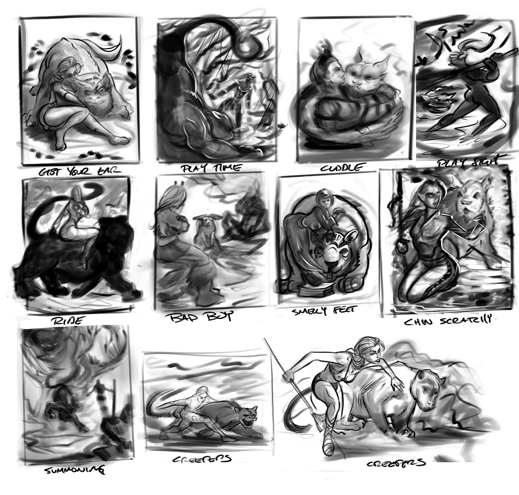
Should be a fun one, thumbed up some quick ideas during a morning meeting. Think I might take the ‘chin scratchy” approach to this one but will see how things turn out.
Let’s see some good ones this time round ya’ll
Posts: 369
Threads: 6
Joined: Sep 2019
Reputation:
23
The "smelly feet" one is a stunning composition, almost iconic. My favorite one.
I'm not sure I guess the element the creature represents though.
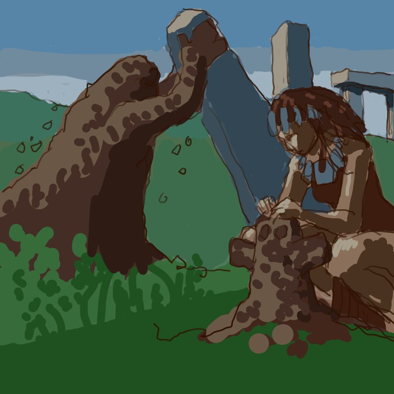
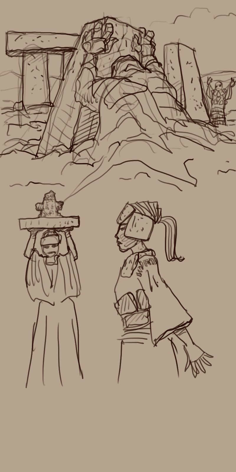
Here is some attempt at capturing some tellurichthonic forces. Righteous quest not decided upon yet, but may be about building Stonehenge.

Posts: 261
Threads: 9
Joined: Dec 2021
Reputation:
43
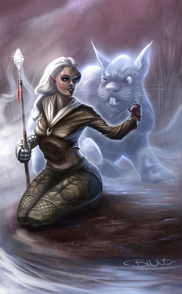
Good to see you joining in Leo! Great start so far! Yeah I’m a fan of the smelly feet comp also and Might have a go at this one also at some point. But my creative juices pushed me towards chin scratchy. Managed a good few hours today to flesh things out.
Posts: 369
Threads: 6
Joined: Sep 2019
Reputation:
23
@CBI - That's a funny elemental from the rabbitoid plane! Interesting costume on the priestess, she evokes a bit of a mermaid. Also a contorsionist's arm unless I'm misjudging the distances. You're almost done while I'm watching the deadline with anxiety, lol.
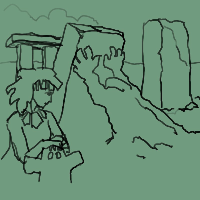
A bit more exploring:
Posts: 397
Threads: 24
Joined: Dec 2022
Reputation:
25
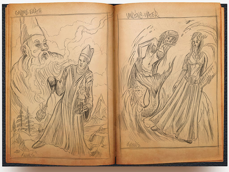
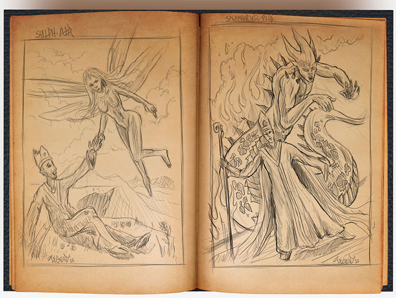
Greetings all! I just finished my group of thumbnails and would like to know which one you might like to see rendered out.
@CBinnsIllustration Your thumbnails are great and the main illustration is coming along wonderfully.
@LeoKi very good start and keep it going!
LEGEND'S SKETCHBOOK_001
To all artists struggling to create and are intimidated by A.I. (anti-imagination)
 "Everything has been done, but not by you" 
Posts: 432
Threads: 70
Joined: Mar 2020
Reputation:
69
CBinns, that picture is coming along nicely. I like how the lady seems to have the same kind of buck teeth as the creature.
LeoKi, nice Druidic feel to those sketches.
Lege1, I'm partial to Salamander and Undine, but the gnome one might be the best composition. I don't like gnomes so much though, LOL.
Posts: 397
Threads: 24
Joined: Dec 2022
Reputation:
25
 02-11-2023, 02:29 PM
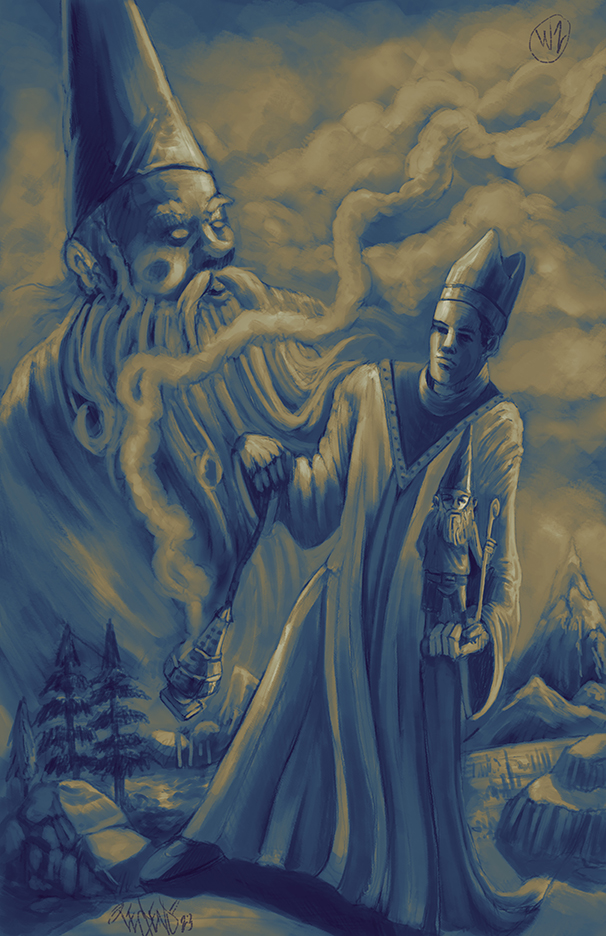
@Pubic Enemy thank you so much and if I have the time to I will do all of them =) Right now I'm working on the Gnome and this is where I'm currently at. So what's the deal with you and Gnomes man, any interesting stories?lol

LEGEND'S SKETCHBOOK_001
To all artists struggling to create and are intimidated by A.I. (anti-imagination)
 "Everything has been done, but not by you" 
Posts: 432
Threads: 70
Joined: Mar 2020
Reputation:
69
No stories. Gnomes just don't sit right with me, man.
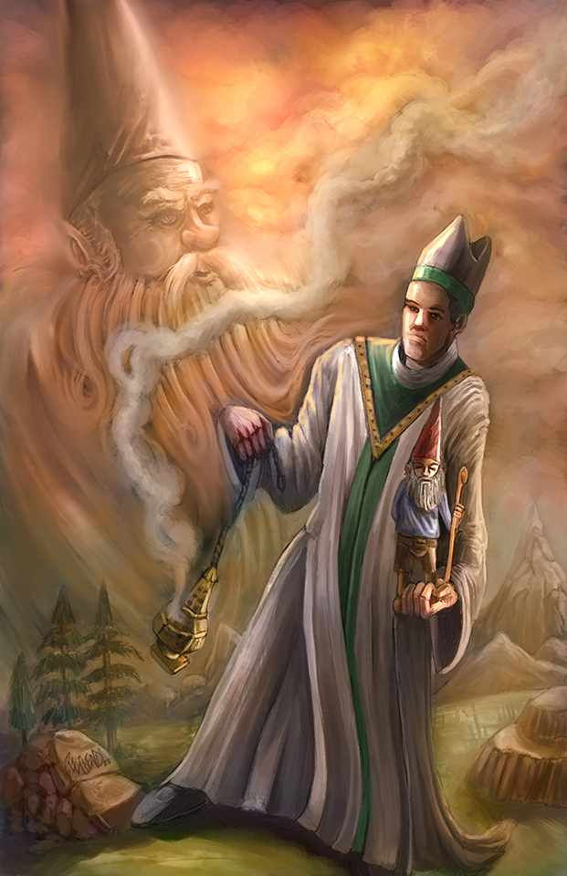
Picture is coming along nicely though. I'd just put some more atmospheric perspective on the mountains and trees in the back. I'm assuming the elementalist is supposed to be human-sized and the gnome is supposed to be a giant, looming enormously in the background, but right now the values make them look like they're kinda in the same plane.
Posts: 397
Threads: 24
Joined: Dec 2022
Reputation:
25
@Pubic Enemy Ahh, lol, I was looking forward to an interesting story, but I understand if gnomes don't sit right with you; is it anything like Coulrophobia? Either way, I hate to cause you any trauma here on the forum.
I appreciate the compliment greatly that my image is coming along nicely. You're absolutely right about the atmospheric perspective on the mountains and trees in the back, and I will absolutely be adding this once I render things furthermore. The priest is indeed human size and holding a gnome, and then the gnome in the background is a graphical representation of the gnome in the background; I think by applying atmospheric to the gnome in the background also will help push that back and make it more understandable that is like the spirit of the gnome in background sky area. What is your input on this?
LEGEND'S SKETCHBOOK_001
To all artists struggling to create and are intimidated by A.I. (anti-imagination)
 "Everything has been done, but not by you" 
Posts: 432
Threads: 70
Joined: Mar 2020
Reputation:
69
Don't worry about it dude, I just think gnomes are a little weird, LOL. Especially garden gnomes.
I agree about adding more atmospheric perspective to the gnome in the back; I meant to write that in my last post also but that somehow slipped outta my fingers. Anyway, I think it's a good idea.
Posts: 397
Threads: 24
Joined: Dec 2022
Reputation:
25
@Pubic Enemy Thank you very much and you've been a great help in your mentions and advice.
This is my conclusion for this topic...

LEGEND'S SKETCHBOOK_001
To all artists struggling to create and are intimidated by A.I. (anti-imagination)
 "Everything has been done, but not by you" 
Posts: 397
Threads: 24
Joined: Dec 2022
Reputation:
25
 02-13-2023, 09:18 AM
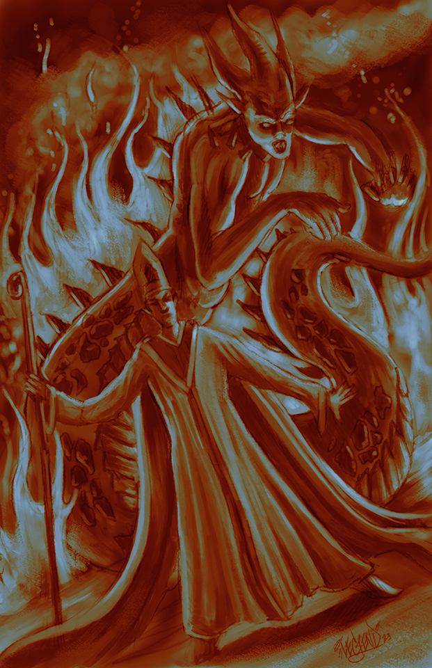
Alright, so here we go with the fire element, introducing the Salamander.....

LEGEND'S SKETCHBOOK_001
To all artists struggling to create and are intimidated by A.I. (anti-imagination)
 "Everything has been done, but not by you" 
Posts: 369
Threads: 6
Joined: Sep 2019
Reputation:
23
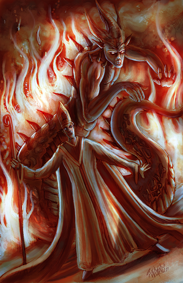
@Lege1 - I like the color palette of the gnome piece and how the gnome's beard fades into the environment. The whisperer's stiff tilt makes him look a bit uncomfortable, maybe he is under the influence of a conjuring trance? The salamander piece is very dynamic and dramatic. Are you planning on adding some contrasting colors to separate the realms? I think it works well as is though.
(02-11-2023, 08:50 AM)Pubic Enemy Wrote: LeoKi, nice Druidic feel to those sketches.
Thanks! I'm aiming for the the pre-celtic megalithic neolithic civilisations but we know zilch about them and I'm unsure how to characterize them... Also, I'm starting to realize that communicating with the ethereal realm might not allow invoking actual creatures to help physically with the righteous quest. @JosephCow, have I misunderstood the brief?
(02-13-2023, 06:44 AM)Pubic Enemy Wrote: Especially garden gnomes.
A truly invasive species. During the last great proliferation, I had to bring my flamethrower out :P
Posts: 397
Threads: 24
Joined: Dec 2022
Reputation:
25
@Leo Ki Thanks so much for the input and yes, with the priest, I wanted to try something entirely different in my composition and definitely have him in a weird stance as if he was conjuring the power of the Gnome; thanks on the good words of the color palette and gnome merging into the background, I had to put a bit of thought into it. Initially the gnome was fully colored in the background with red hat, blue shirt, and fleshy skin, but it conveyed the wrong mood and feeling in the piece for me and @Pubic Enemy's advice on adding atmospheric perspective really helped work out the background from the foreground elements of the image.
Thanks on the good words with the Salamander piece as well. I definitely am pushing for very dynamic and different compositions in my work and enjoying working on an entire image again instead of just focusing on the character like I did in the Cimmerian Chef entrees. I'm going crazy with the color on this one, just pushing and pulling what I feel works best based on my understanding of color theory and most importantly experimenting.
I'm liking your ideas and am looking forward to seeing them fleshed out more. Keep up the great work and motivation and thanks for being a part of the forum!
LEGEND'S SKETCHBOOK_001
To all artists struggling to create and are intimidated by A.I. (anti-imagination)
 "Everything has been done, but not by you" 
Posts: 397
Threads: 24
Joined: Dec 2022
Reputation:
25
 02-13-2023, 06:09 PM
Alright, this is going to conclude the Fire Salamander version...

LEGEND'S SKETCHBOOK_001
To all artists struggling to create and are intimidated by A.I. (anti-imagination)
 "Everything has been done, but not by you" 
Posts: 397
Threads: 24
Joined: Dec 2022
Reputation:
25
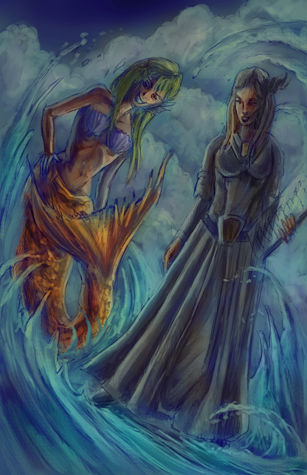
Alright, and here we go with the Undine development...

LEGEND'S SKETCHBOOK_001
To all artists struggling to create and are intimidated by A.I. (anti-imagination)
 "Everything has been done, but not by you" 
Posts: 261
Threads: 9
Joined: Dec 2021
Reputation:
43
Dang @Lege1 i thought i worked fast, you are really cranking them out! I like how they are all conceptually strong. the colors in the Gnome piece are really nice, but there is something about the Salamander piece that i really like! it has the strongest composition and you update really gave some nice contrast and the value separation really helps make your focal points pop a lot more. plus im a sucker for a good cameral tilt :)
@Leo Ki you ideas are looking good, looking forward to seeing you updates. Thanks for the feedback I will work on the proximity of the creature and cozy up that space a bit more to look like she is less of a contortionist :) good feedback.
@Pubic Enemy thanks dude, its nice when someone notices the subtle detail you stick in as a little Easter egg!
Im working on a minor update to mine that I will post this week.
Posts: 369
Threads: 6
Joined: Sep 2019
Reputation:
23
@Lege1 -
Quite the carnivorous smile on the water spirit, what good deed is she up to? In this one, the whisperer kind of fades into the environment while the spirit stands out, that's a twist from your first piece.
Wow, the way you pumped up the contrasts in the salamander piece works very well for the mood.
Thank you both for the encouragements. I explored one comp, didn't like it and am exploring another one. Don't like it either, so more to come for sure.


Posts: 397
Threads: 24
Joined: Dec 2022
Reputation:
25
@CBinnsIllustration Thanks so much man, and I'm not trying to work too fast here, but truth be told when I'm focused, I do work faster than usual, lol; I should probably slow it down some in all honesty. I have been in a unique situation in life where I left my home state to move to another with my sister and have been starting life over from scratch, so I have had some unusual time on my hands while figuring everything out and going through various waiting periods getting things in order, and what better way to spend my time then the gym, listening to audio books, and practicing my art craft? So, I make best of the time indeed.
I'm glad you recognize the conceptually strong aspect of my recent works, as that is something I always struggled with; being more focused on just making a great looking illustration and skimping on, or not fully elaborating on the concept. I'm very glad also that you liked the palette in the Gnome piece, I had to put a lot of thought into that one believe it, or not, it had me stumped for a good while. I'm glad you like the Salamander piece; the Gnome piece served as a great warm up into things, and I felt on fire once I got into the Salamander piece and I feel it shows pretty well.
I had a lot of fun with the Salamander piece as it posed its challenges with the lighting situation and the more analogous color scheme. I'm finding myself experimenting with color in my work to convey things like mood etc. The cameral tilt you mention I know as something from traditional painting called a Dutch Tilt, and I find it really adds a lot of impact when constructing unique and original compositions, add in perspective and you have a recipe for something really cool. Right now I'm free hand painting everything in regard to my edge work, so all the hard edges are being made strictly with brush and not taking advantage of masking techniques, which I may or may not employ in my final works or new works going forward. I'm torn between the hand done painterly look and using masking techniques at least on the perimeters of the main subjects to create the hardest edges to push things more forward, I know taking advantage of things like hard edges to push things forward in the images and blurring the background just a tad bit can really push the imagery into new depths. Time will tell my decisions in progression no doubt.
@Leo Ki lol, yes, quite the carnivorous smile indeed on the water spirit and she may not be at all about good deeds; just entertaining her summoner, lol, it will be interesting to see how this image evolves more for sure. Yes, I like how this challenge allows us to put emphasis on a two-character challenge, it's a brilliant two and one deal by @JosephCow . I personally find the priest characters to be a bit boring next to the more humanoid elemental characters.
I'm also the guy who usually finds the villains in the comic books to be a lot more interesting than the heroes, lol; the villains always have the better origin stories in my strong opinion, and they look more interesting in most cases. Yes, thank you for noticing the contrast adjustments in the Salamander piece, I really wanted that piece to have a lot of visual impact. In most of my images, I usually start off very dull and bland and then bump everything up gradually. Starting off darker and duller leaves lot of room for improvement. When I render my forms I tend to usually just put down my shadows and midtones and work back and forth between those two to build the form before adding highlights, once the highlights are added the piece really comes to life quite suddenly. I also notoriously work from black and gray into color in both my traditional work, and digital, I find it easier to deal with the values when in black and gray opposed to going right in with color. If the values are correct it doesn't matter what color you throw over them.
Your most recent compositions are interesting for sure. Try to not over think the idea because you will create unnecessary artist blocks. Instead, consider creating small thumbnails of your ideas which gives you a great way to explore your compositions and ideas freely and worry free. When thumbnailing be as messy and loose as you'd like to be able to get your idea out and explore the images layout. The great thing about thumbnailing is that it is fast, and you can produce as many as you want to get where you want to be with your image. I personally don't thumbnail much if at all a lot of times and will just dive into whatever I have in my mind putting all my effort and energy into the thing, but it's still a great idea to thumbnail those mental ideas first to get the information out, and down. Having a bunch of ideas is like a kitchen sink faucet recklessly running, but then as soon as you put a cup under the water flow you capture your ideas, and this is the idea of thumbnailing, thumbnailing is the cup. You can also use thumbnails to explore lighting scenarios and color. @CBinnsIllustration shows a great example in his first post on this forum of thumbnailing and a great artist to check out if you haven't already is Jesper Ejsing on the wonderful Muddy Colors site...Enjoy!:
https://www.muddycolors.com/author/jesperejsing/
LEGEND'S SKETCHBOOK_001
To all artists struggling to create and are intimidated by A.I. (anti-imagination)
 "Everything has been done, but not by you" 
|


 "Everything has been done, but not by you"