TrashPanda: You were off to such a great start. Hopefully with the added deadline time you will be able to make a successful finish. I'm looking forward to your update.
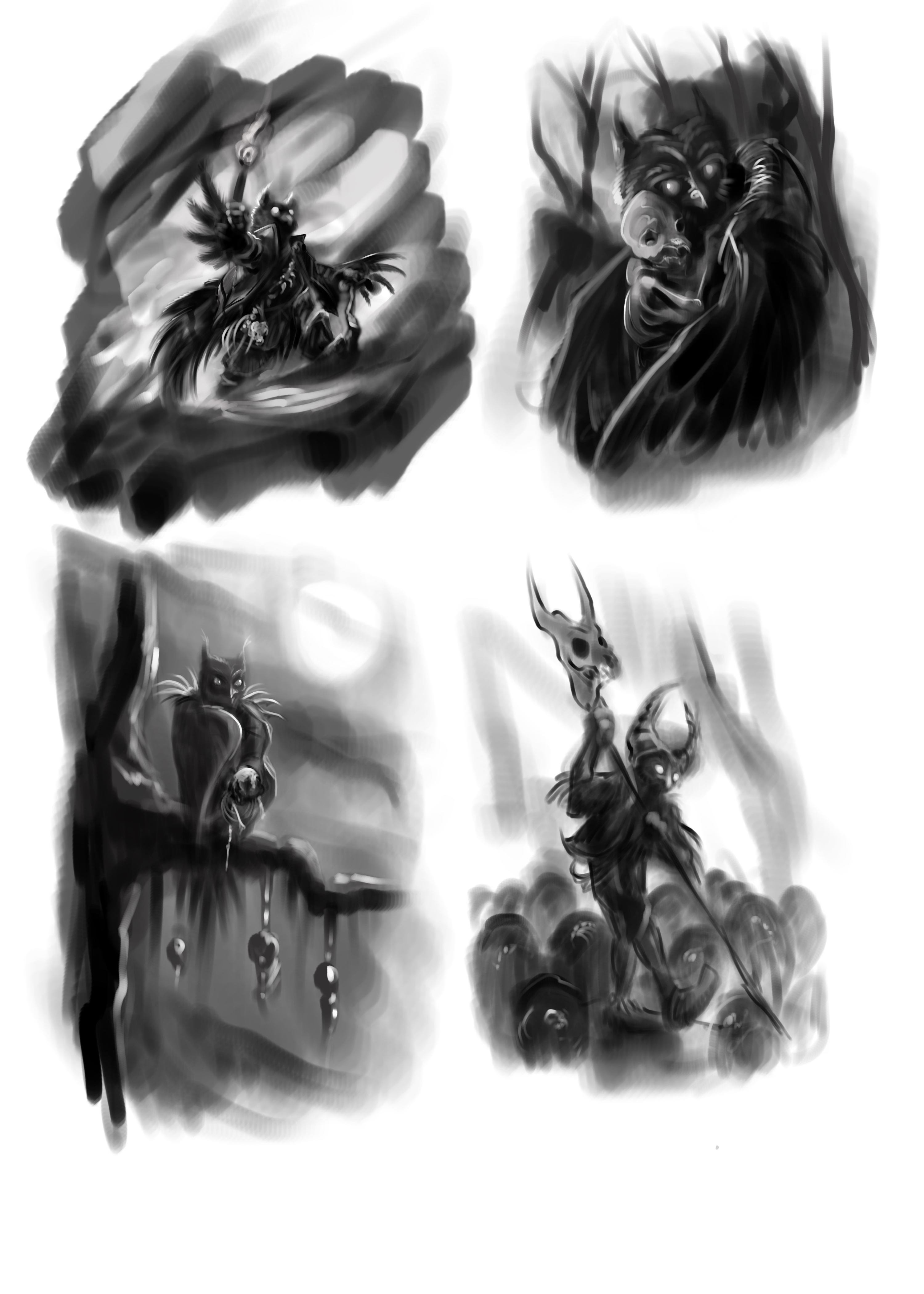
CBinssIllustration: I really enjoyed all four of your black and gray concepts and liked the one you decided to go with the most. It's great to see you back on track with being visually creative again, and I know very well how things can go in life that either slow or hinder the process. Your over all concept is really nice and awesome that you were able to incorporate that quality time with your daughter into your art; family and relationships are important, these are true things to cherish in life.
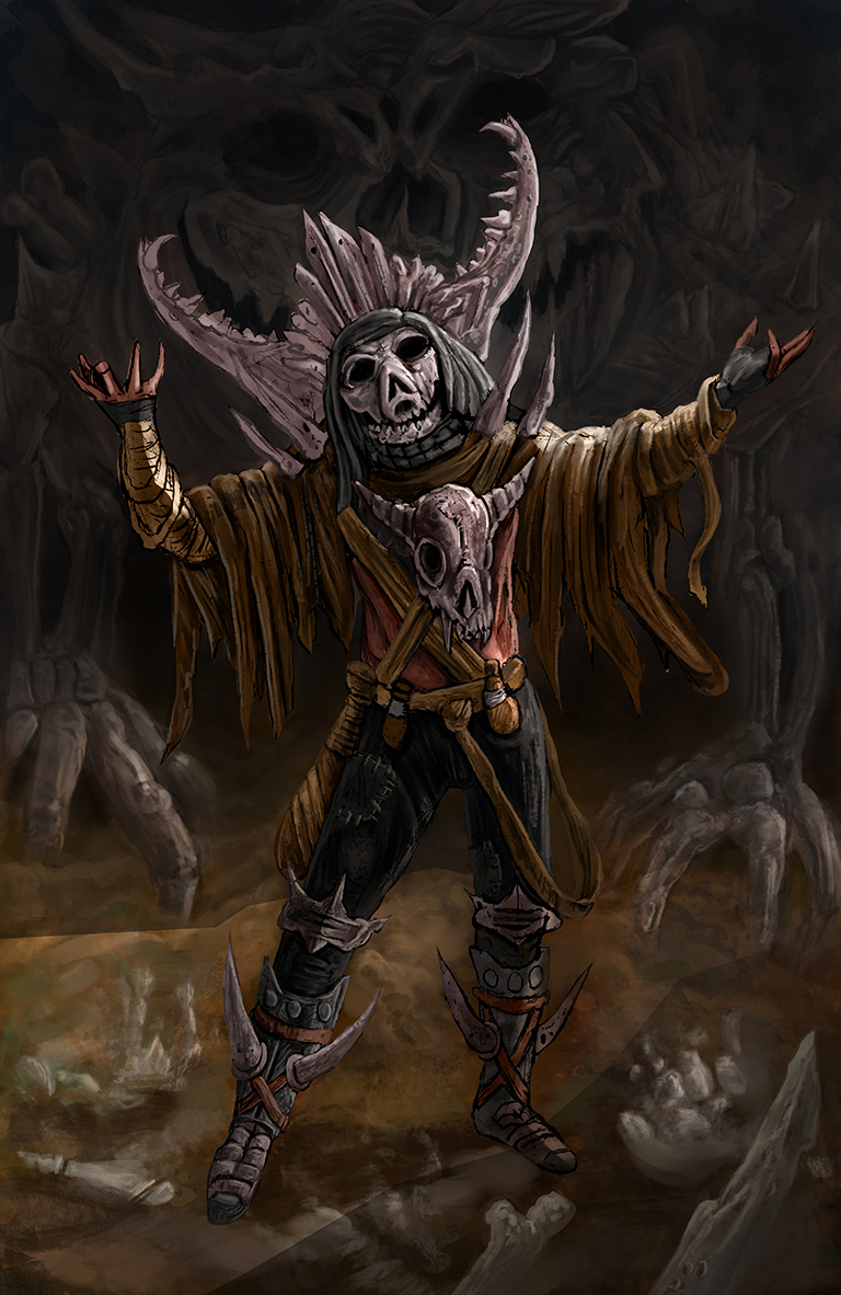
The color / rendered version looks awesome and I'm really enjoying the lighting on this one along with your very spooky night time color palette. I like the book cover format although the main character looks small in the overall image. I'm interested to see if you crop the image to make the character appear larger in the final, or if you add more to the over all image and keep it as a whole. Great work always from you! I'm curious to know more about what you mean when you mention 50% black to do your concepts, is the 50% referring to your brush flow?
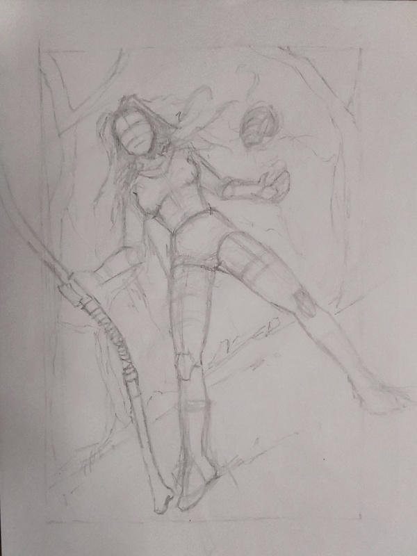
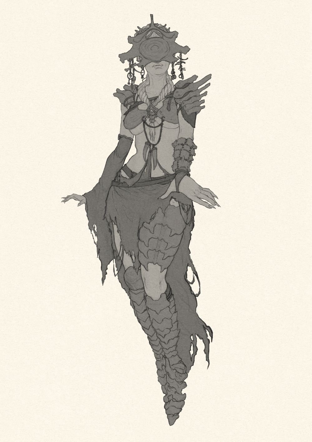
RottenPocket: My first initial reaction to your sketch was being super impressed with the concept alone, and the anatomy and what appears to be either really good traditional drawing on paper, or well done super imposed digital sketch work on paper texture. I really love the over all costume design of your character especially with how you treated the head of the character, the shoulder armor, and the mid-chest jewelry and adornments. Your cleaned up coloring and gray tone flats really have this piece looking fantastic without any shading which is going to make for a very powerful finished image when you do further rendering. I feel this is an important aspect for us all to take note that if the image can look this good at this stage it will only look that much more amazing once the value, and color are added.
Do you add your gray flats in straight away, or proceed directly into doing color flats, duplicating the layer, and then desaturating the original while keeping the duplicate layer as some form of transparent color layer to overlay your base colors over your grayscale work once value entry is complete? I'm just curious as this is something that I have been experimenting with myself and it seems to work rather well. Either way, great work, and sorry about the deadline extension; by the look of your meme you didn't seem to be to happy about it, as my educated guess was that you were probably putting the pedal to the metal to meet the deadline which I understand can be disappointing. Majority seem to have been behind this round so that is what made me pull the trigger in adding the extra weeks time for everyone to sort their druthers and hopefully bring their images to completion.
Damien Levs: Really nice start on the new image and so far it seems like it's coming along well. Really try to lock in and see to it that you can follow through with the further steps of image making to hopefully bring this image to completion to deadline; I'll be looking forward to it =)
---------------------------------------------------------
***
UPDATE***
The finals thread has been posted!
Here is some progress on my image, I have really spent a bit of time noodling away here and of course experimenting with different things like layer modes, brush settings, and the fundamentals of image making per usual as I always strive to do somethings different to try and best make new discoveries and learn more. The image is coming along much different than originally planned but I'm liking it so far. I had planned for a more equally divided cool and warm color palette on this image but ended up letting the warms dominate a bit more. I often like to play around with color balance in the beginning of my image making process but skipped out on that and worked everything up manually thus far in this one, but will most likely adjust levels and do some sharpening in the post rendering.
The desire to really want to feature a bone built creature in this was strong but I went back and forth something terrible trying to figure out how I was going to do it without taking so much focus off the main character. I'm pretty happy though again with where things are at and have a good amount of work to still put in to really get this image where I feel I'd like it to be.
I put a lot of thought into the costume design of this character, kind of working from a tribal / indigenous type of vibe. After seeing RottenPockets entry I really wanted to try something different with the characters face as well and decided to give them a creature skull mask which I feel really gives the character a haunting and eerie feel. I find costume design to be really fun to research and rewarding to assemble, my whole dilemma is simply finding that happy medium to not over do it.


 "Everything has been done, but not by you"
 "Everything has been done, but not by you"





![[Image: giphy.gif]](https://media1.giphy.com/media/v1.Y2lkPTc5MGI3NjExNHRkOHA2NHh6Z2pwaG9jczV0NWk4N3g1NzZoNG13dGRkeWw5YWw0biZlcD12MV9pbnRlcm5hbF9naWZfYnlfaWQmY3Q9Zw/3ohzdSDgGwT5CaWMTu/giphy.gif)
