BadWoolf's Sketchbook [NSFW]
#21
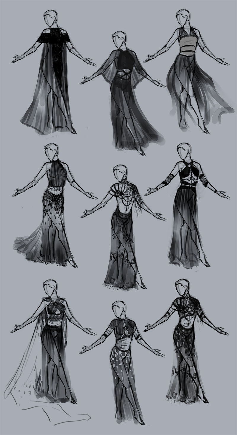
(06-13-2016, 05:46 PM)ZombieChinchilla Wrote: Wow, really nice work! I'm excited to see your full painting of your next illustration. I especially like the blue and yellow ones, particularly the upper right one and the bottom one, second from the left. The mood of those make her look very compassionate and caring. Lovely studies, keep it up!

Thank you! 

I didn't go with the blue and yellow colours, because although they're my favourite option, the illustration was supposed to be a daytime scene with bright sunlight. However, when I've finished rendering I'm going to use some adjustment layers and stuff and see if I can make a night time/evening variation with the blue and yellow colours :)

   -   Sketchbook   - 
Reply
#22
Feels weirdly repetitive putting crucible stuff here, when it's already on CC4 WIP and CC4 finals threads, but I guess those will get buried as future challenges come out, so I'll put a record of my work in here too.


Attached Files Image(s)


   -   Sketchbook   - 
Reply
#23
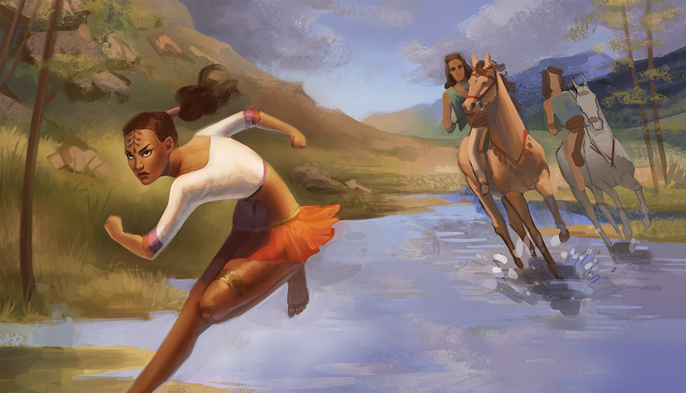
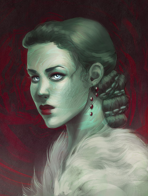
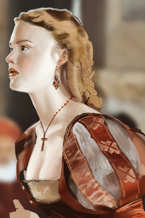
Finished... or should I say "finished":


Sketch:


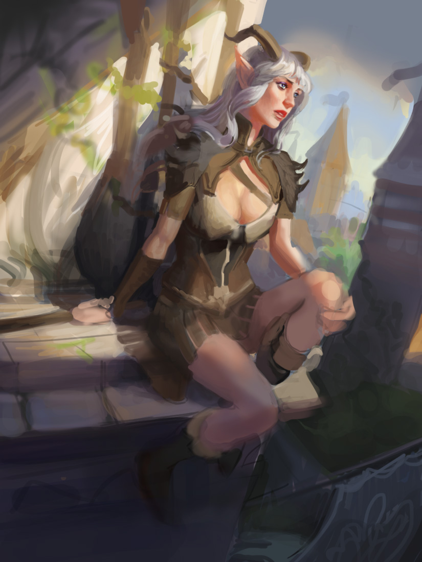
Still a WIP:


   -   Sketchbook   - 
Reply
#24
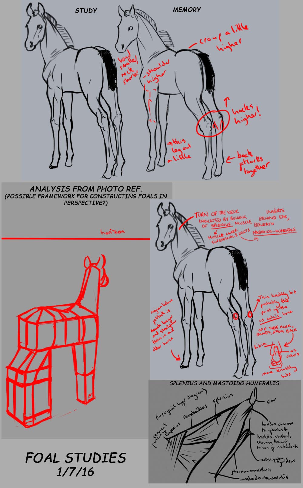
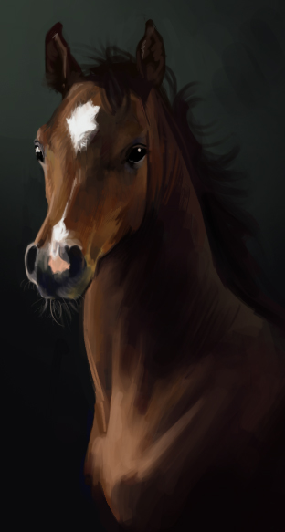
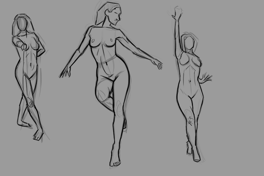
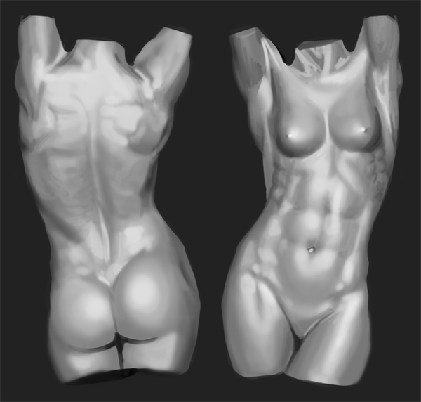
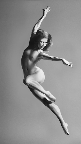
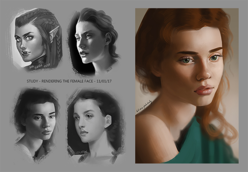
Studies:


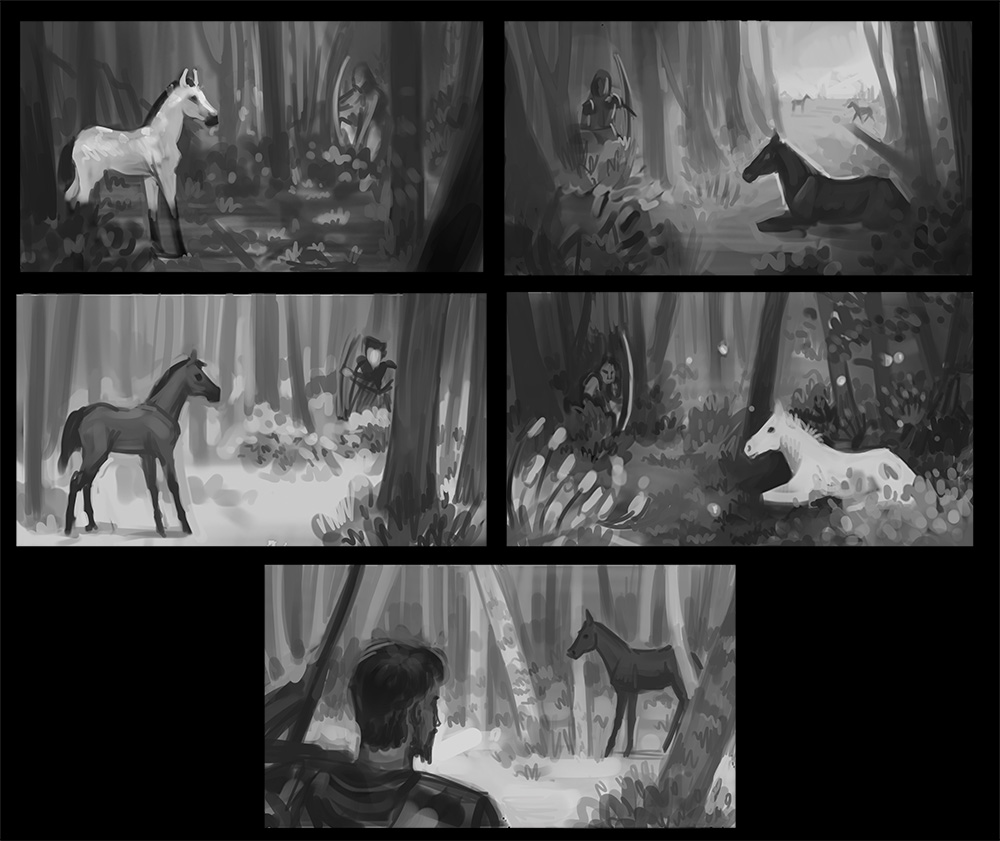
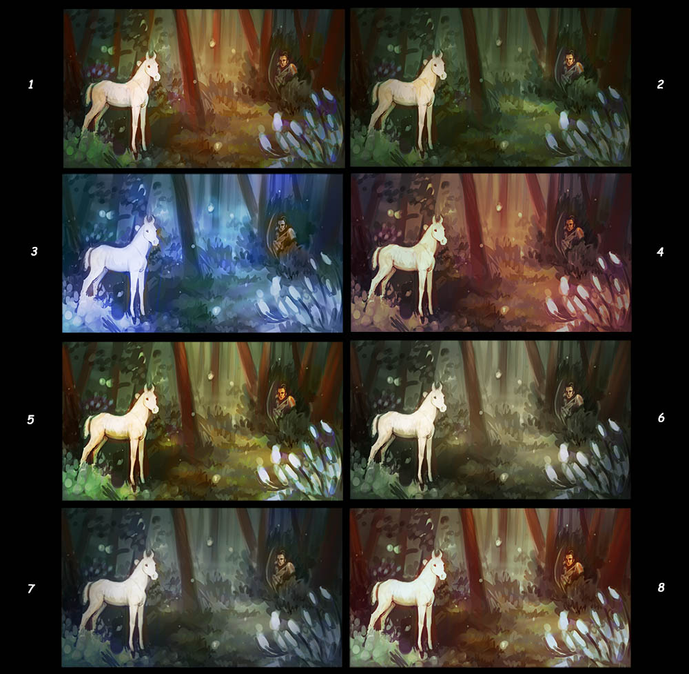
Thumbs (as usual I can't decide between them - any help appreciated!):


   -   Sketchbook   - 
Reply
#25
Oh wow really nice work with those latest illustrations. It's really nice to see some finished work in a sketchbook! Not that if people don't do it then they're horrible. Lots of people use sketchbook in very different ways.

The WIP one already looks like you pushed it very far. Nice work on the hard angle you chose!

As for the horse comps: I'd say go for a one where the horse is standing. I think it creates more tension. If the horse is lying down it needs a moment to get up but the standing position indicates that it sprint away at any second. The next step would be to figure out what the scene is all about, because it look like a hunting scene: If that's the case I would chose on of the comps on the right but make sure the guy is already about to shoot the animal while it's still oblivious/or has just noticed him.

That would be my suggestions. I hope that helps in anyway haha.
Reply
#26
(07-04-2016, 12:31 AM)Zipfelzeus Wrote: Oh wow really nice work with those latest illustrations. It's really nice to see some finished work in a sketchbook! Not that if people don't do it then they're horrible. Lots of people use sketchbook in very different ways.

The WIP one already looks like you pushed it very far. Nice work on the hard angle you chose!

As for the horse comps: I'd say go for a one where the horse is standing. I think it creates more tension. If the horse is lying down it needs a moment to get up but the standing position indicates that it sprint away at any second. The next step would be to figure out what the scene is all about, because it look like a hunting scene: If that's the case I would chose on of the comps on the right but make sure the guy is already about to shoot the animal while it's still oblivious/or has just noticed him.

That would be my suggestions. I hope that helps in anyway haha.


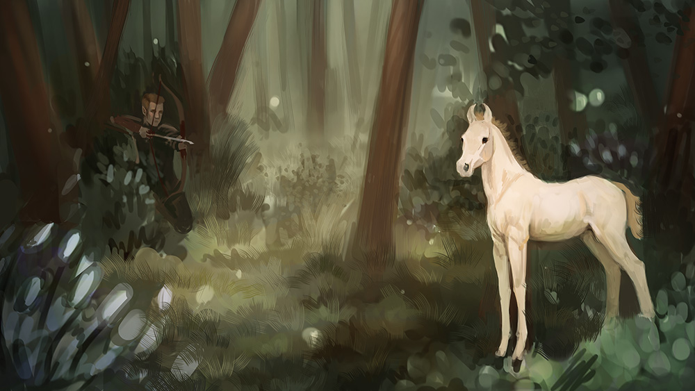
Yeah I think it's nice when you're looking at someone's sketchbook to be able to see how they use their sketches and studies to produce a finished piece. I'm also still open to crits on my finished work, so I post them up just in case people spot things that I can improve. Thanks for the suggestions on the horse illustration. I actually took one of the comps on the right, but I changed it so that the horse is standing instead of lying down.

Some stuff from yesterday and the day before:


   -   Sketchbook   - 
Reply
#27
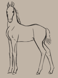
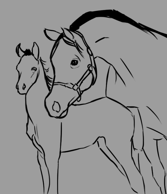
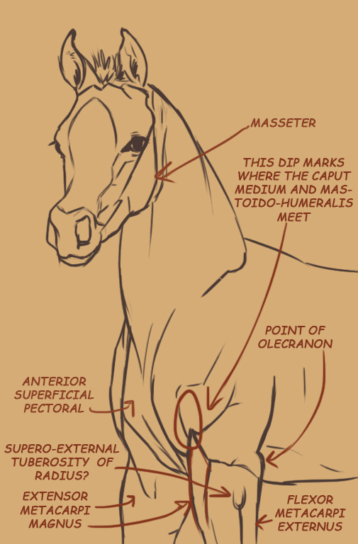
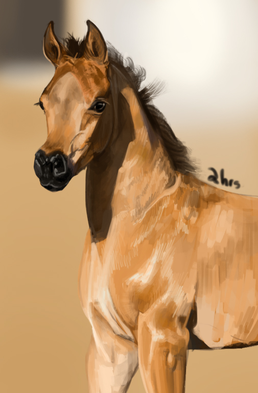
Great sketchbook Badwoolf, I love your values and colours. Good approach with the horse anatomy studies as well, I find it really helps to understand the underlying musculature.

Keep going - looking good :)

“Today, give a stranger one of your smiles. It might be the only sunshine he sees all day.” -- H. Jackson Brown Jr.

CD Sketchbook


Reply
#28
I came across your WIP of Freyja and instantly had to stalk your sketchbook. I really enjoy your use of color and value!

~
Reply
#29
Thanks so much for the encouragement guys!


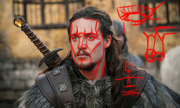
Study from art by Anna Steinbauer:


Photo Studies:


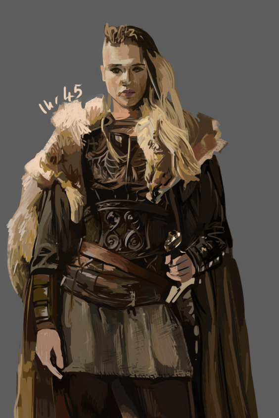
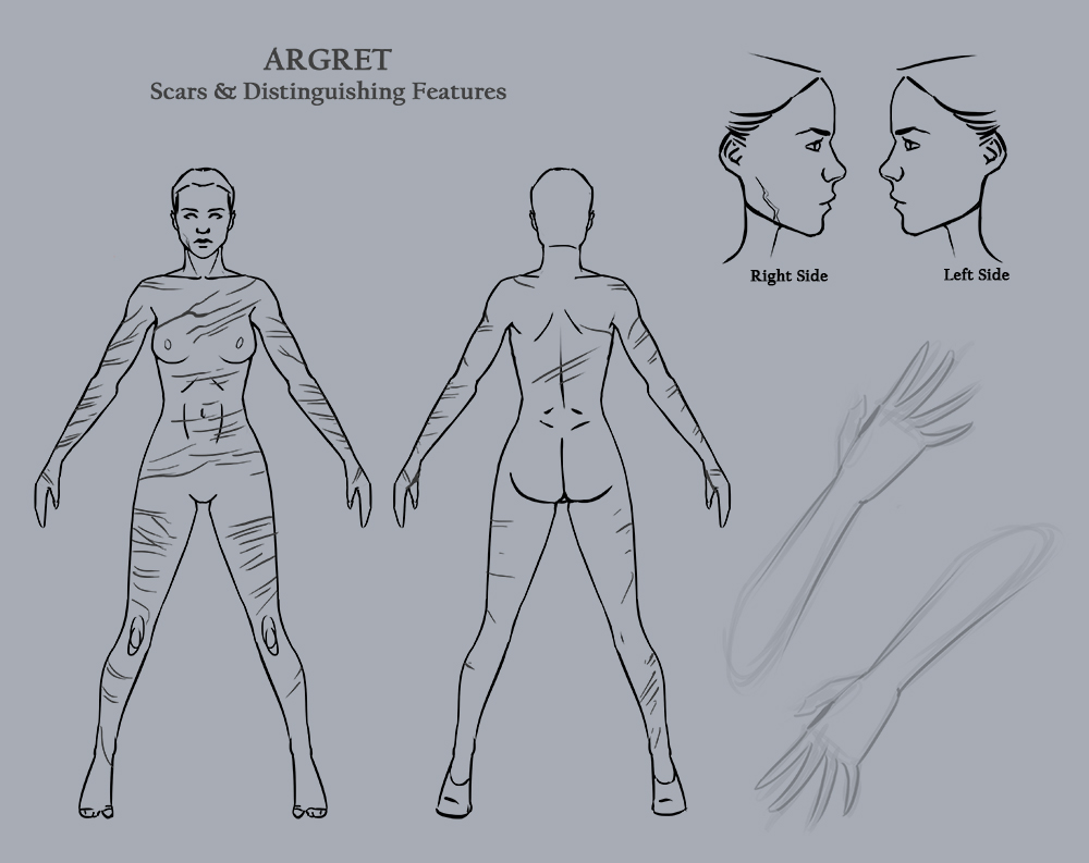
Character Stuff:


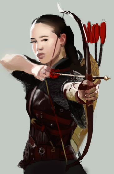
WIPS (critique welcome):


   -   Sketchbook   - 
Reply
#30
You're doing a lot of work, keep it up!
I like your structured approach to the horse studies. I'm currently learning horse anatomy a bit, too :)

Reply
#31
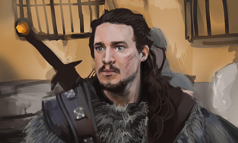
rad sketchbook. *spitting image of David T.* -good rendering! :D

*beware the mid-level value foreground figure on mid-level value background; for value is a treacherous mistress and sh will ruin you upon the shallows of muddy comp*
(doesn't seem to be an issue with the more recent pieces)

ugh. these studies doh! so damn sexy! XD

Reply
#32
You're doing great work -- I like the magic themes, as well as the women. Some of the color studies you did, and the perspective sketches for the Freja post really caught my eye -- good process.

Reply
#33
Thanks neopatogen, Heliux, and rootdraws for the comments!

@Heliux  Good advice. I'm always thinking about and trying to keep on top of values. For some reason I have this natural tendency to go more 'muddy' than bold, which is a shame. Can I ask which pieces you were looking at when you had that thought? I only ask because if one of those pieces has since gone into my portfolio then I might want to go back and do a value check on it.

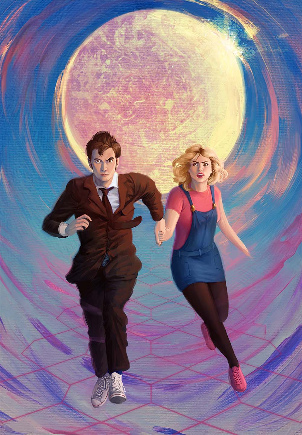
So. My studying has been lacking since my last update. But at the moment I'm kinda scrabbling to get together a portfolio for Industry Workshops which is 18th-21st of August, so I seem to have spent almost all of my time just polishing up and finishing and tweaking portfolio pieces. But I when I looked through my finished pieces I realised that I don't have many male characters for my portfolio (and the ones I do have aren't so well drawn), so I've done a bit of work on that.

Some things:


I've done some work on this piece:
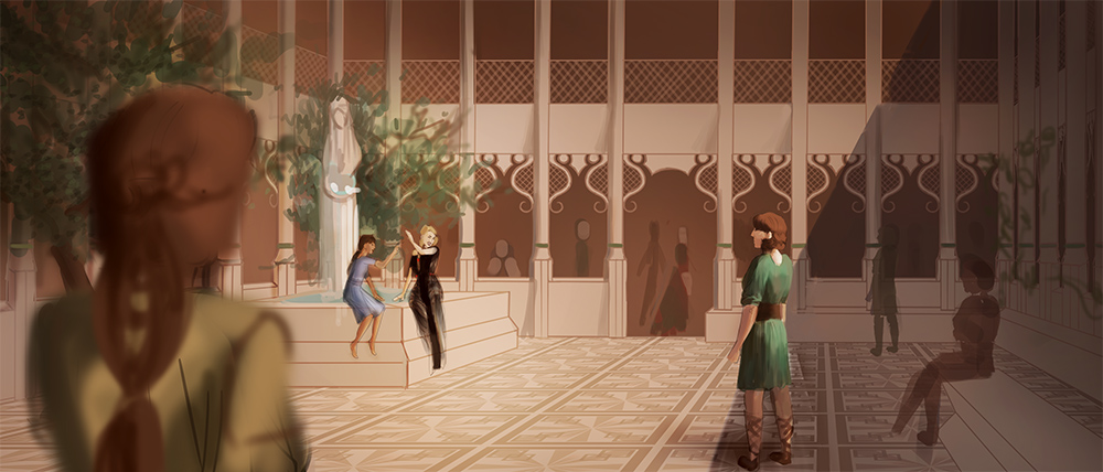
It could possibly become a thing? But I doubt I'll have time to finish it and put it in my portfolio before Industry Workshops

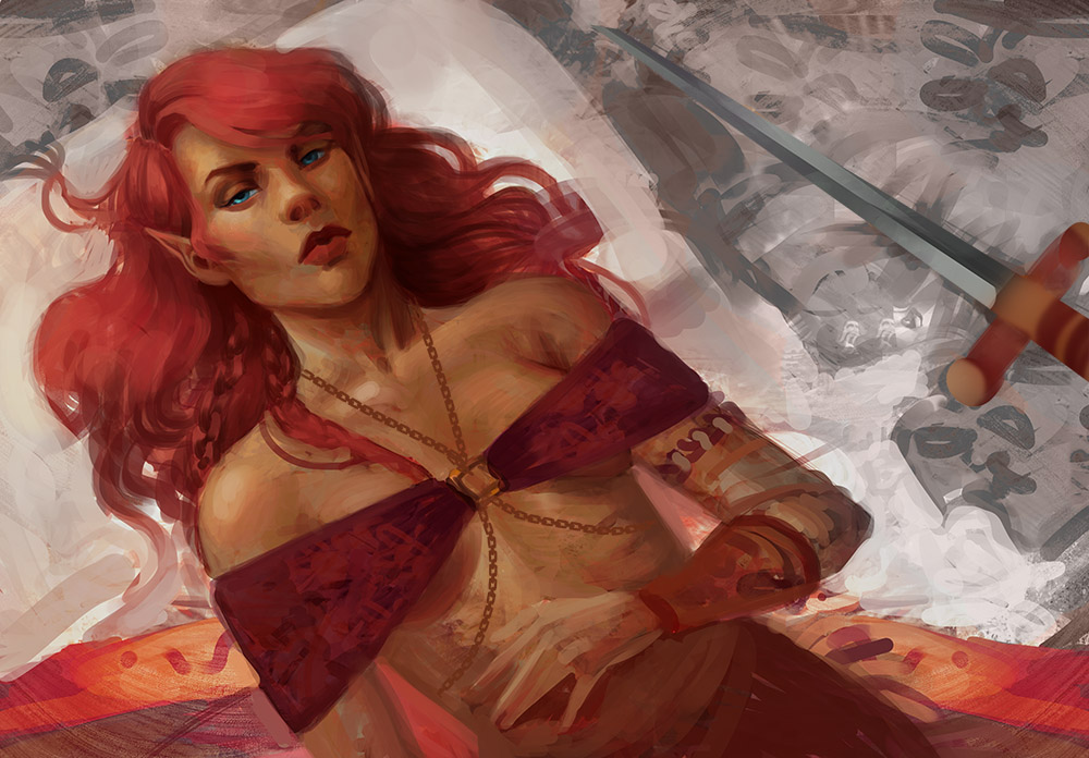
I worked on this, and it was really fun, but the result is kinda meh:


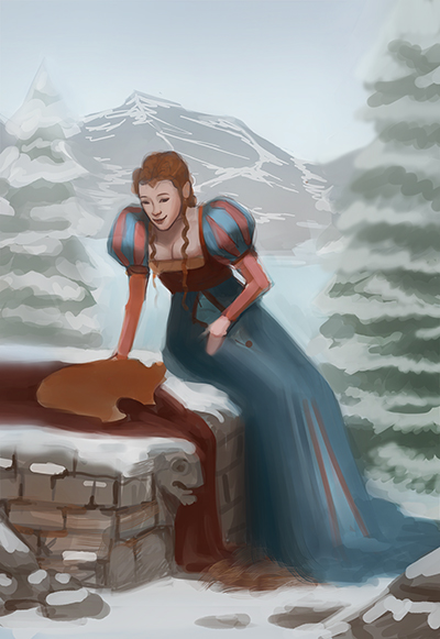
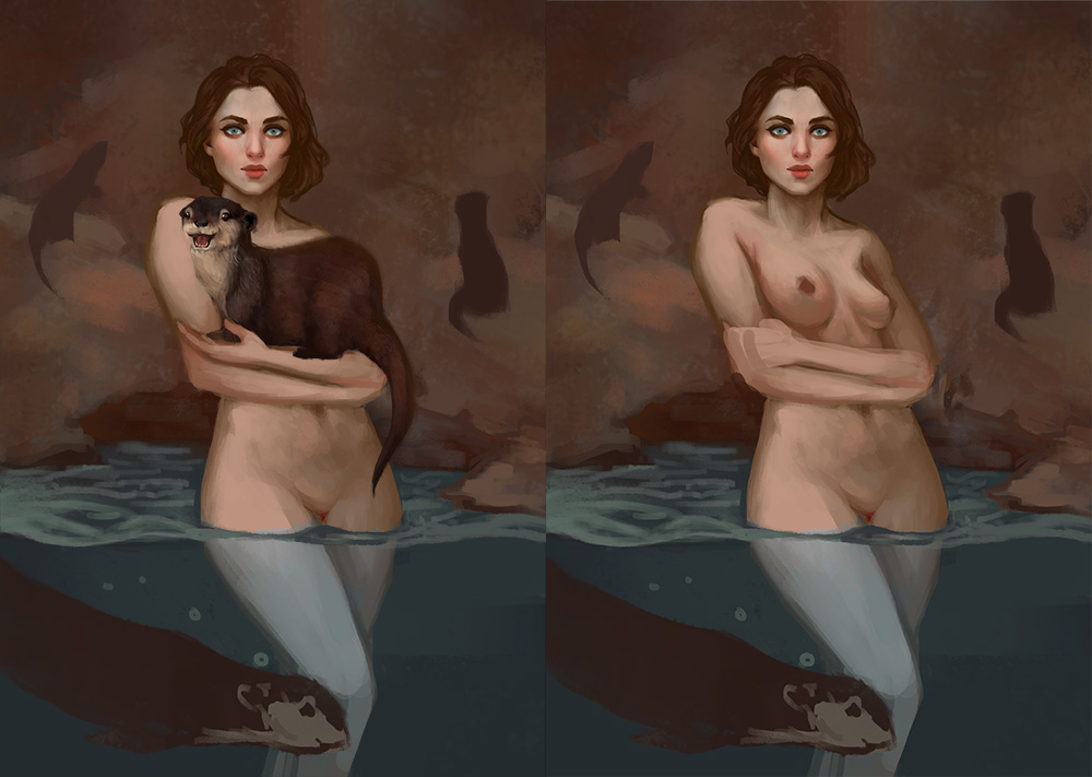
I found an old WIP from a year ago that I might continue, but I'm wondering about that otter in her arms and if that should be there or not....


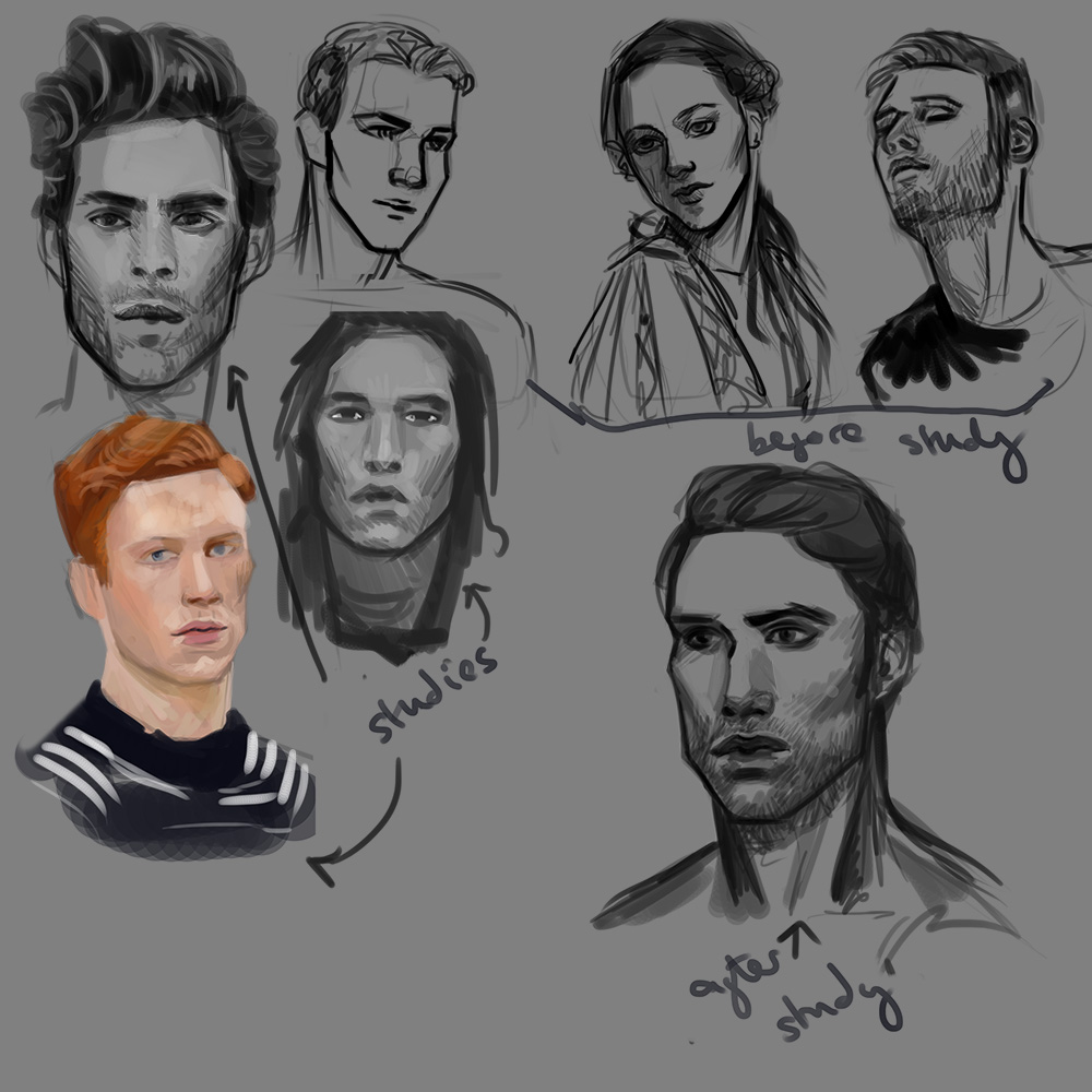
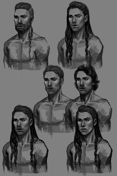
I tried to figure out how to draw manlymenmen. (Although there is also one little lady sketch in there, don't know why):


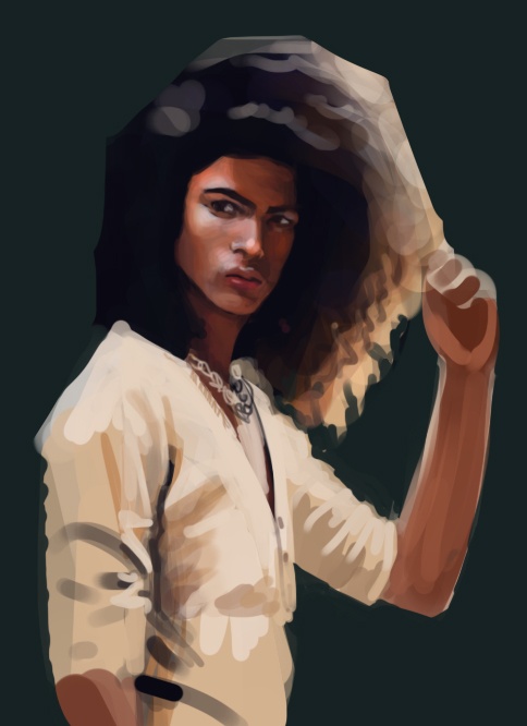
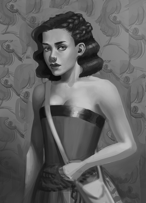
Tried to draw out some kind of character:


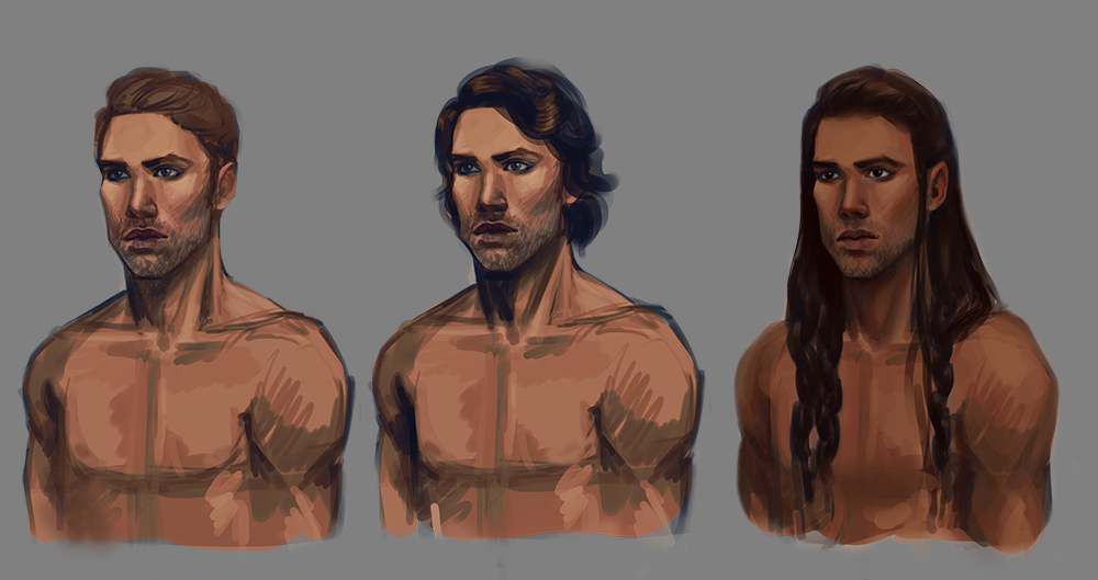
Tried some colours on him too, but it was all very meh:


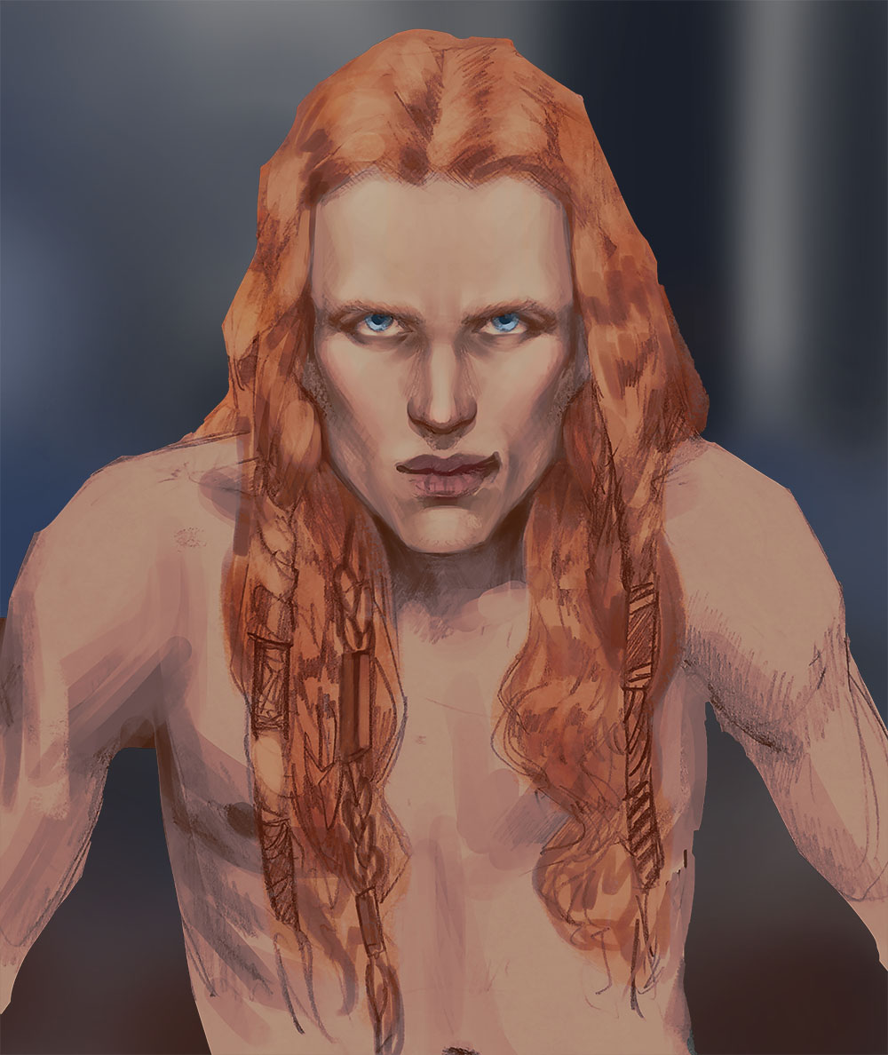
Then I was doodling on paper another night , and I finally got a sketch for a (male!) character from the project I'm working on. And I turned it into a digital sketch that I could develop:


So yeah... that's where I'm at with everything! The next time you hear from me I'll probably be over in the crit forum with my portfolio, looking for advice to strengthen it ahead of Industry Workshops. BTW if anyone is going to be at Industry Workshops in London this August, then drop me a message - we could meet up there and say hi. It would be cool to see a fellow dagger in person :)

   -   Sketchbook   - 
Reply
#34
what amazing sketchbook! I'm liking a lot what I've seen so far :D thanks for posting here, I'll keep an eye to get a little of inspiration, hehehe

Reply
#35
Meh? Whatdya mean Meh? This is beautiful. On it's own or as a start of a greater piece, this is a great addition to your folio.

[Image: attachment.php?aid=89015]

Sketcherinos

Link Tree

Discord: emnida
Reply
#36
I'm glad you like it Rotten Pocket. I might finish at some point, but I'm not sure.

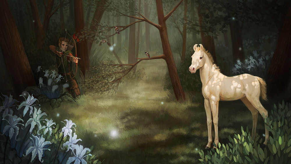
Got a portfolio sorted! (Well, some semblance of a portfolio, anyway) 

http://crimsondaggers.com/forum/thread-7821.html

In other news, did some male torso studies, buuuut they're on paper and I can be bothered to digitise them right now, so I'll be back at some point with that. 

Check out my portfolio and let me know what you think :)
   -   Sketchbook   - 
Reply
#37
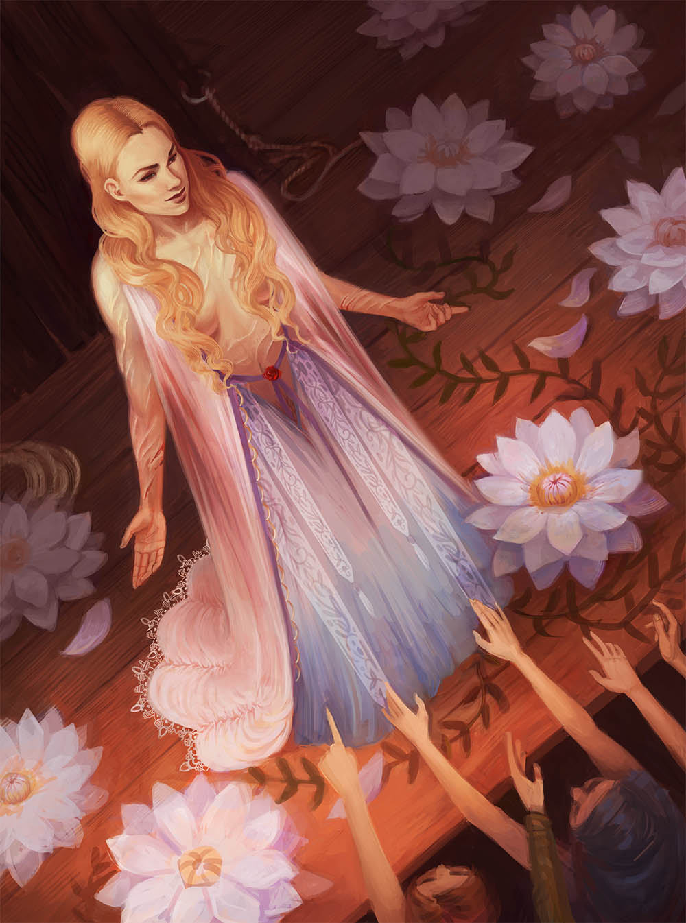
Love the way the girl in front of the crowd turned out. Only crit for that (even though its done) is that you can push the contrast around the focal points and something about the feet looks off, kind of like you were trying to hide it. That is a really tough angle though and I think its your best piece yet. Keep pushing outside the comfort zones . Looking forward to that next update
Reply
#38
Hey,


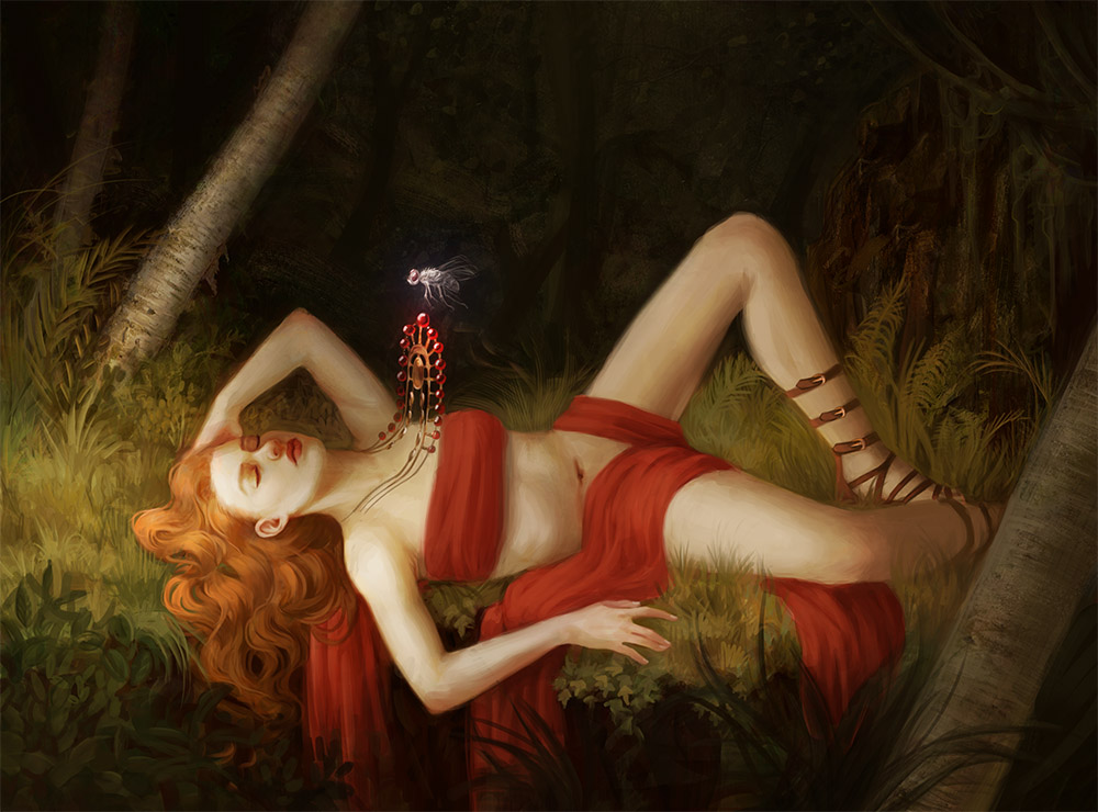
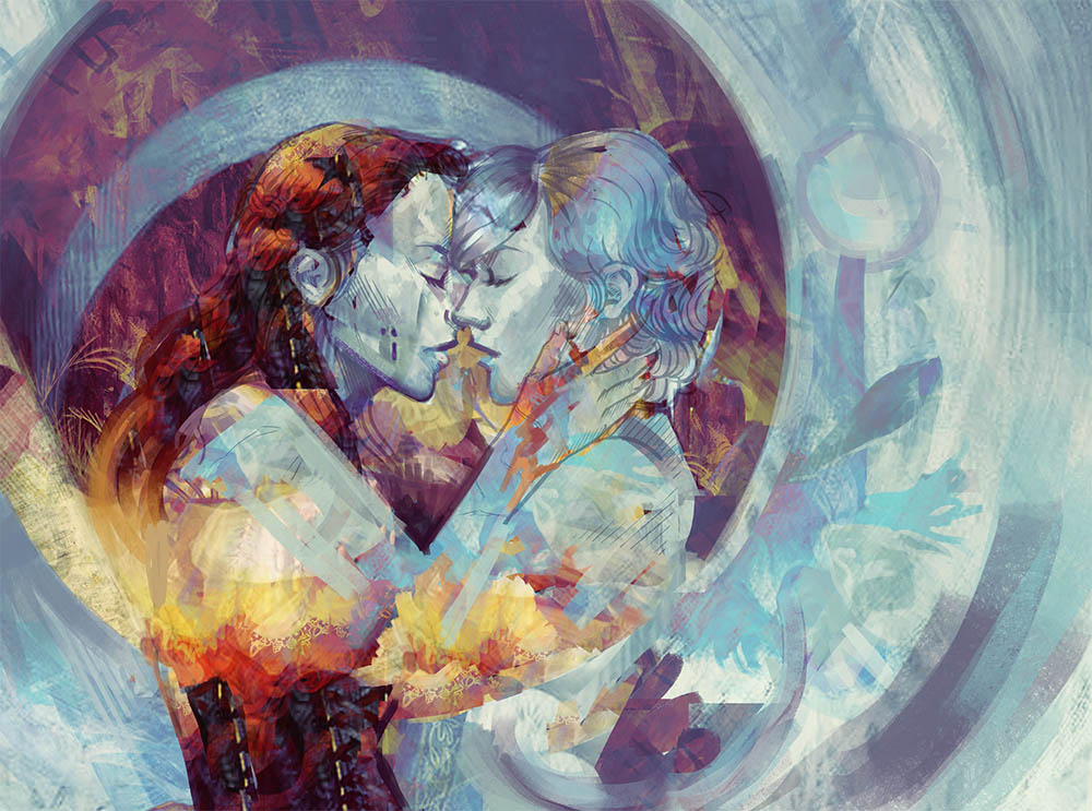
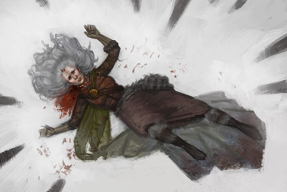
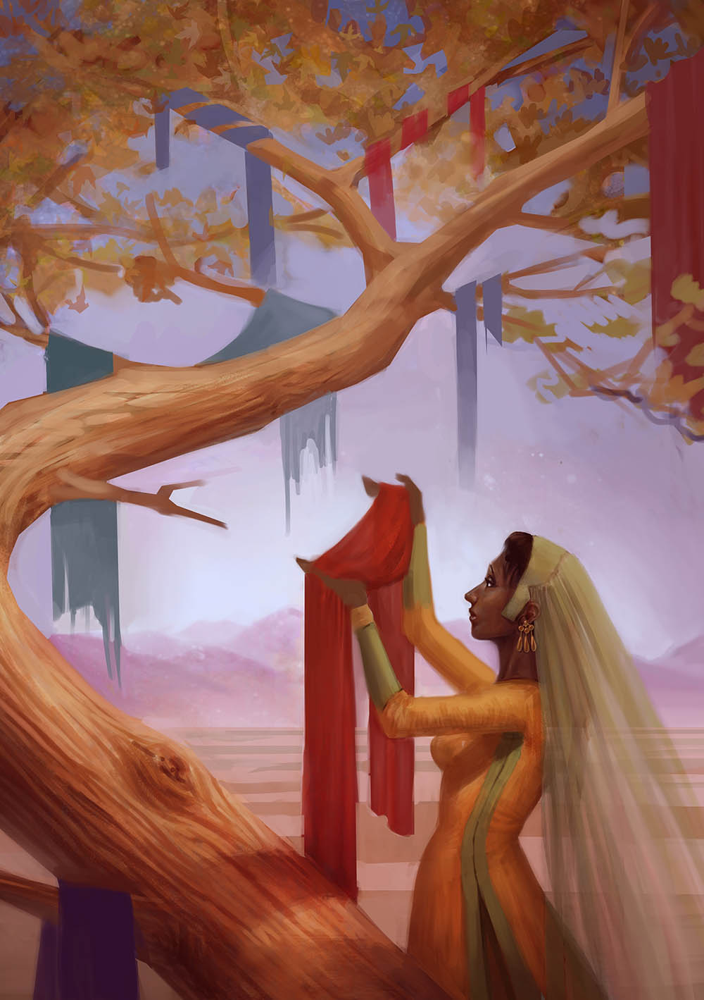
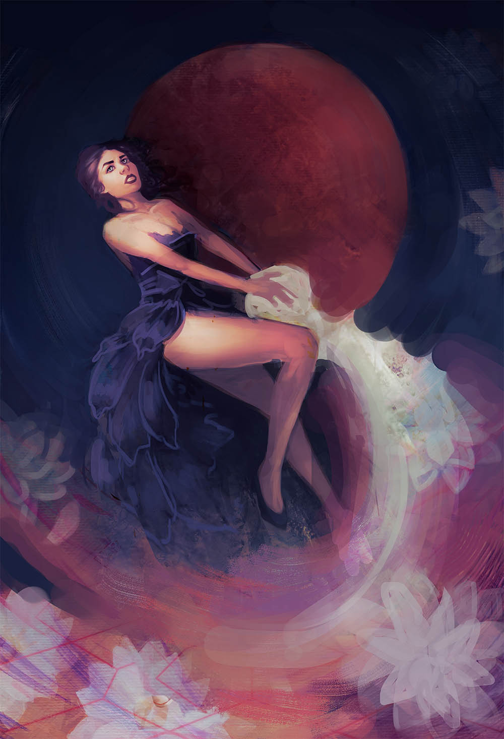
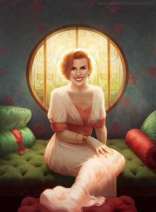
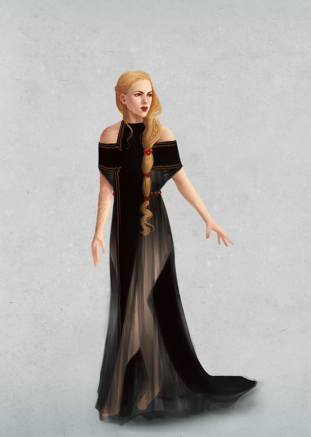
So, I'm back. I'm not going to upload all my studies and sketches from the last few months. Here's something I just finished:


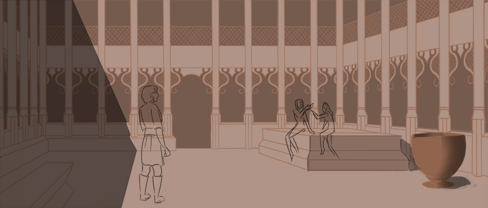
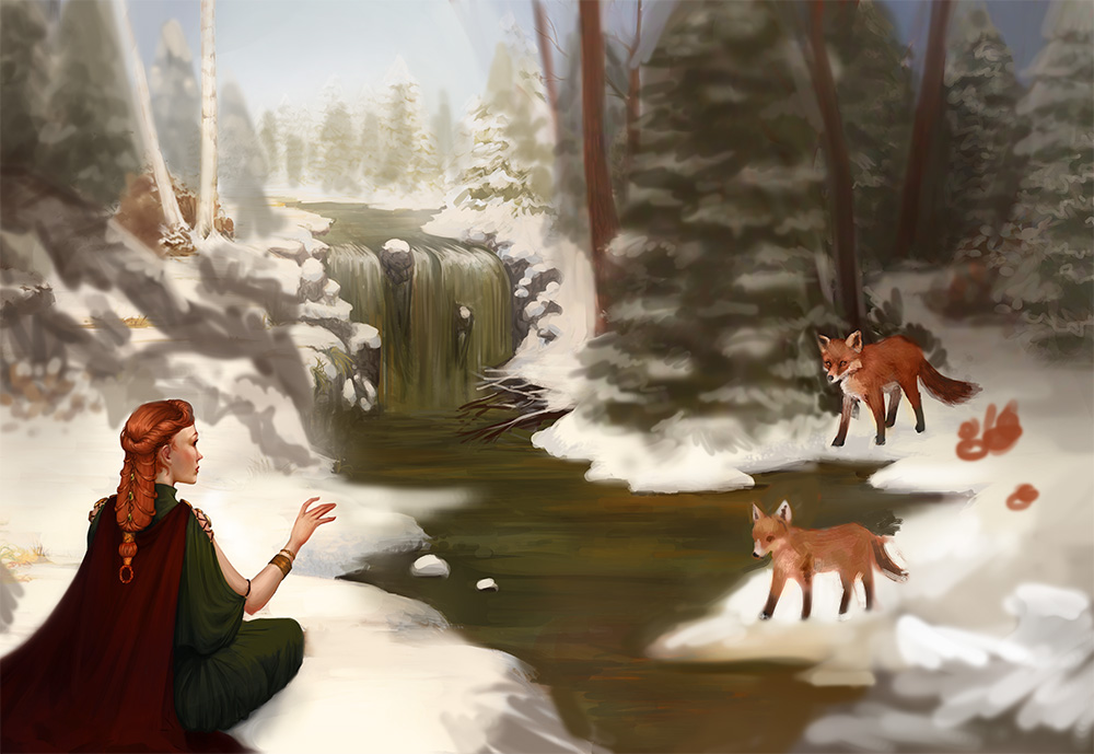
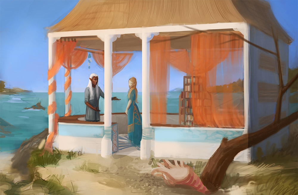
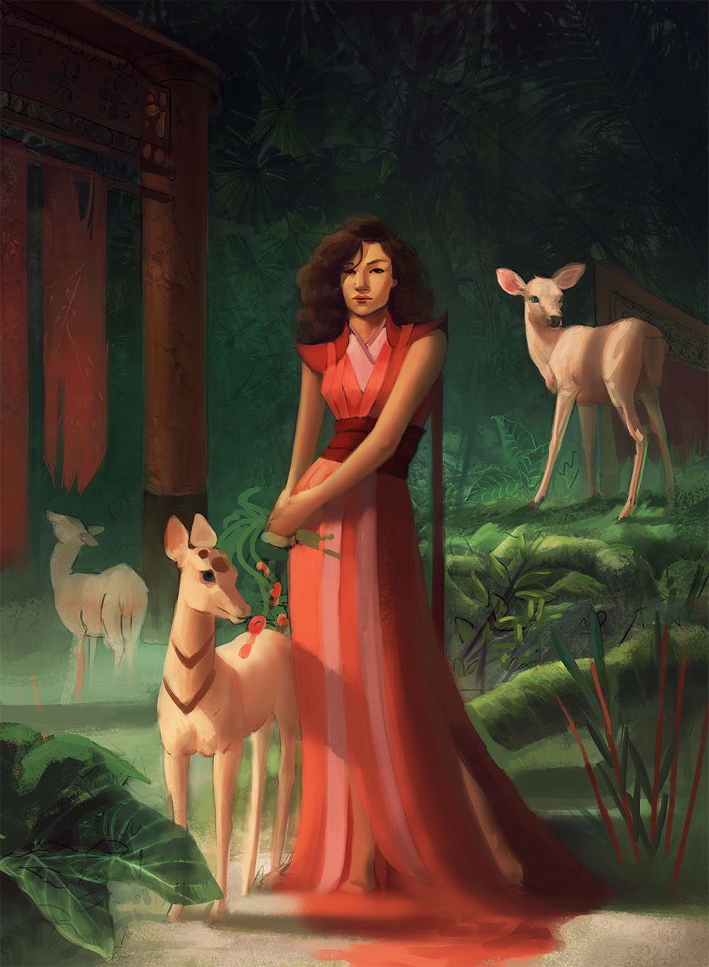
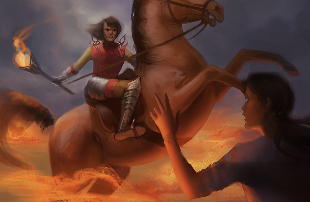
Here are my WIPS. Paintovers welcome. I'm still working out stuff like values, and trying to make things less muddy and vague. So if you have ideas about that, then hit me with them :)


   -   Sketchbook   - 
Reply
#39
The anatomy of the animals in that last post is very good (at least to me). I'd watch a bit more the human anatomy tho (for example, the right arm / pelvis and leg on the main figure of the 3rd image, and the overall gesture of the figure in the left of the 4th image - you pushed the twist of the torso too much and the way the neck is turned is very odd).

But overall, they look very promising. I specially like the first image, although i'd throw the legs in the front in shadow, cause they are taking away some attention from the focal point.

Reply
#40
Thanks for the feedback :)
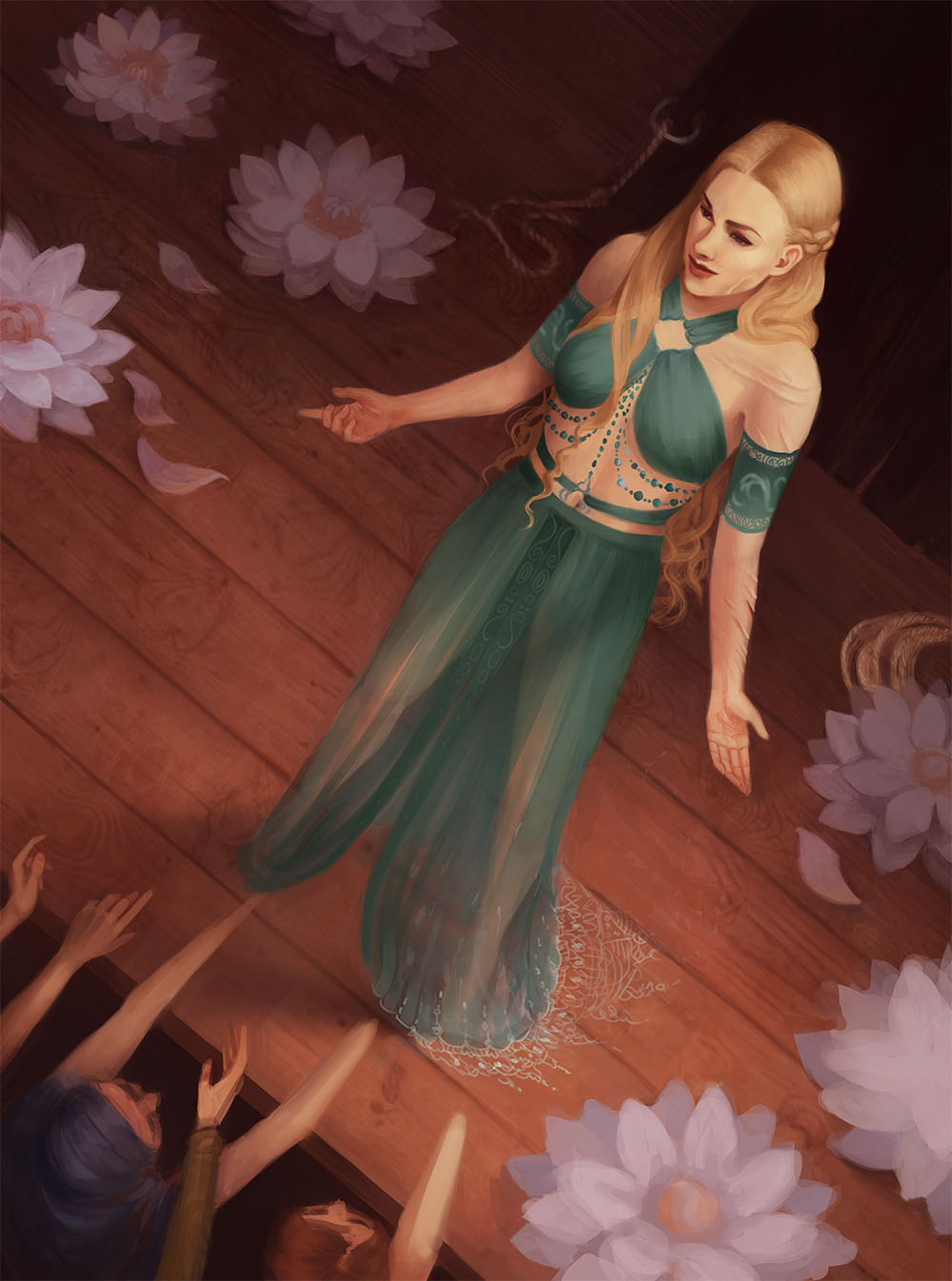
My horse anatomy is pretty ok from imagination because I'm a rider and I was obsessed with horses as a teenager, so historically my horse anatomy was always better than my human anatomy! I'm the opposite of most artists in that sense. The deer are a bit iffy, but I'm going to do some studies and get some ref to help with that.

Anyway. 

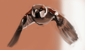
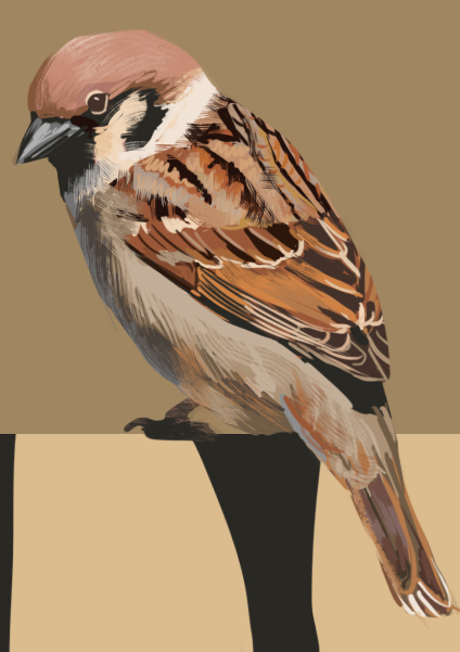
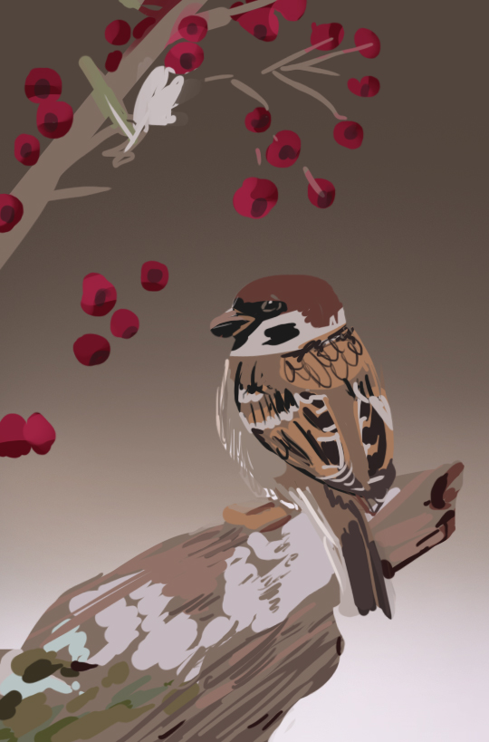
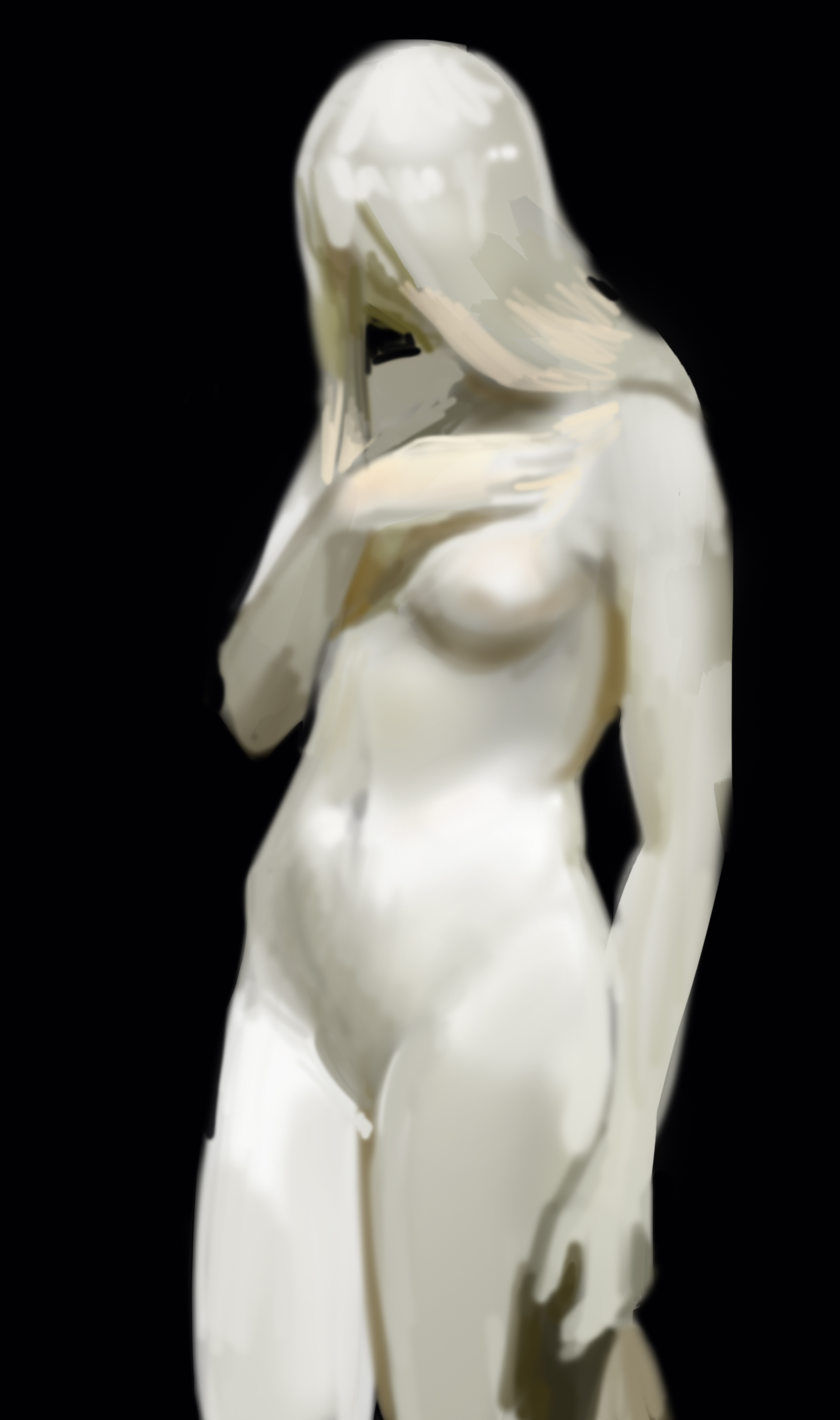
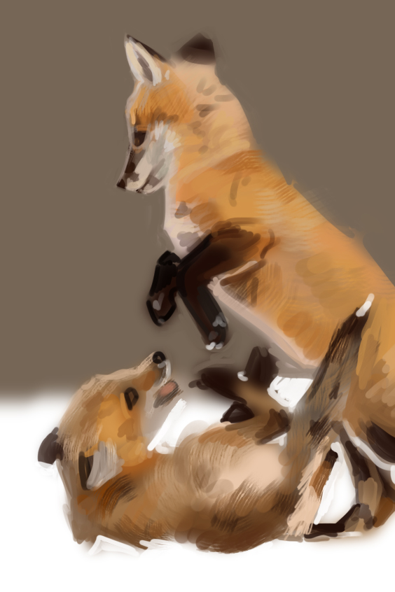
Studies:


WIPS (from imagination):


   -   Sketchbook   - 
Reply


Forum Jump:


Users browsing this thread: 16 Guest(s)