07-17-2016, 01:32 PM
|
Ixspen's Sketchbook
|
|
07-17-2016, 01:32 PM
   
07-18-2016, 08:05 PM
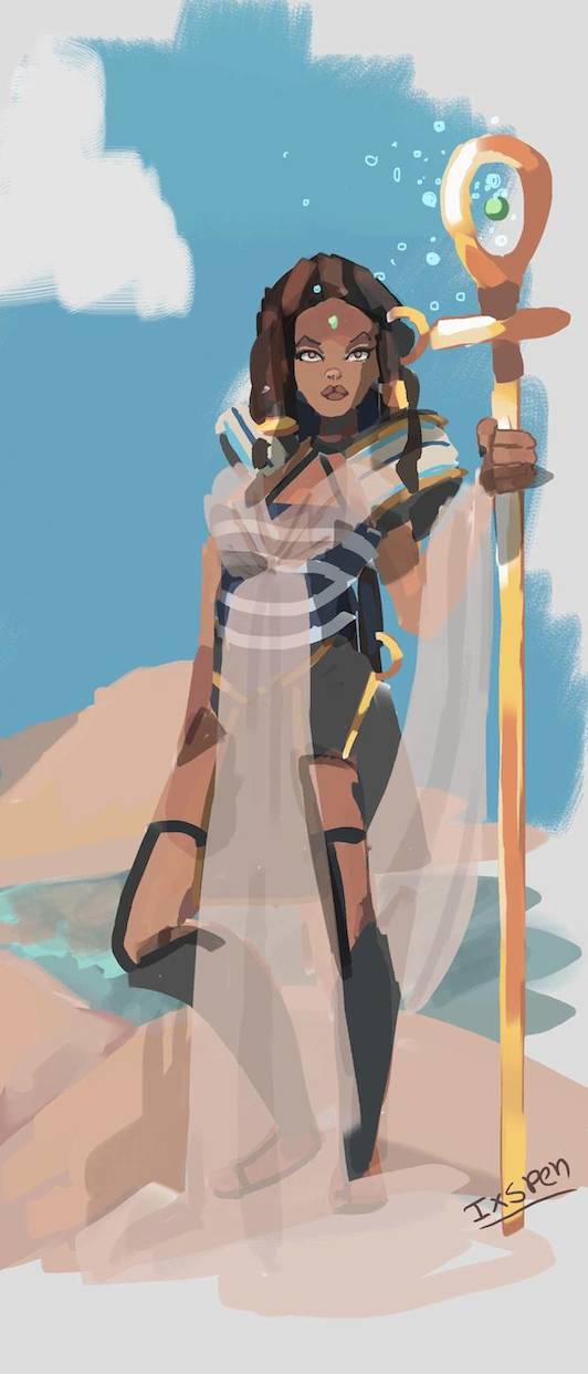
Good work Ixspen, your painting of Jalila is looking good.
If you're into constructing animal anatomy, Michael Hampton talks about this subject on his blog: http://figuredrawingdotinfo.blogspot.co.uk/ Keep up the hard work :).
“Today, give a stranger one of your smiles. It might be the only sunshine he sees all day.” -- H. Jackson Brown Jr.
CD Sketchbook
07-19-2016, 12:36 AM
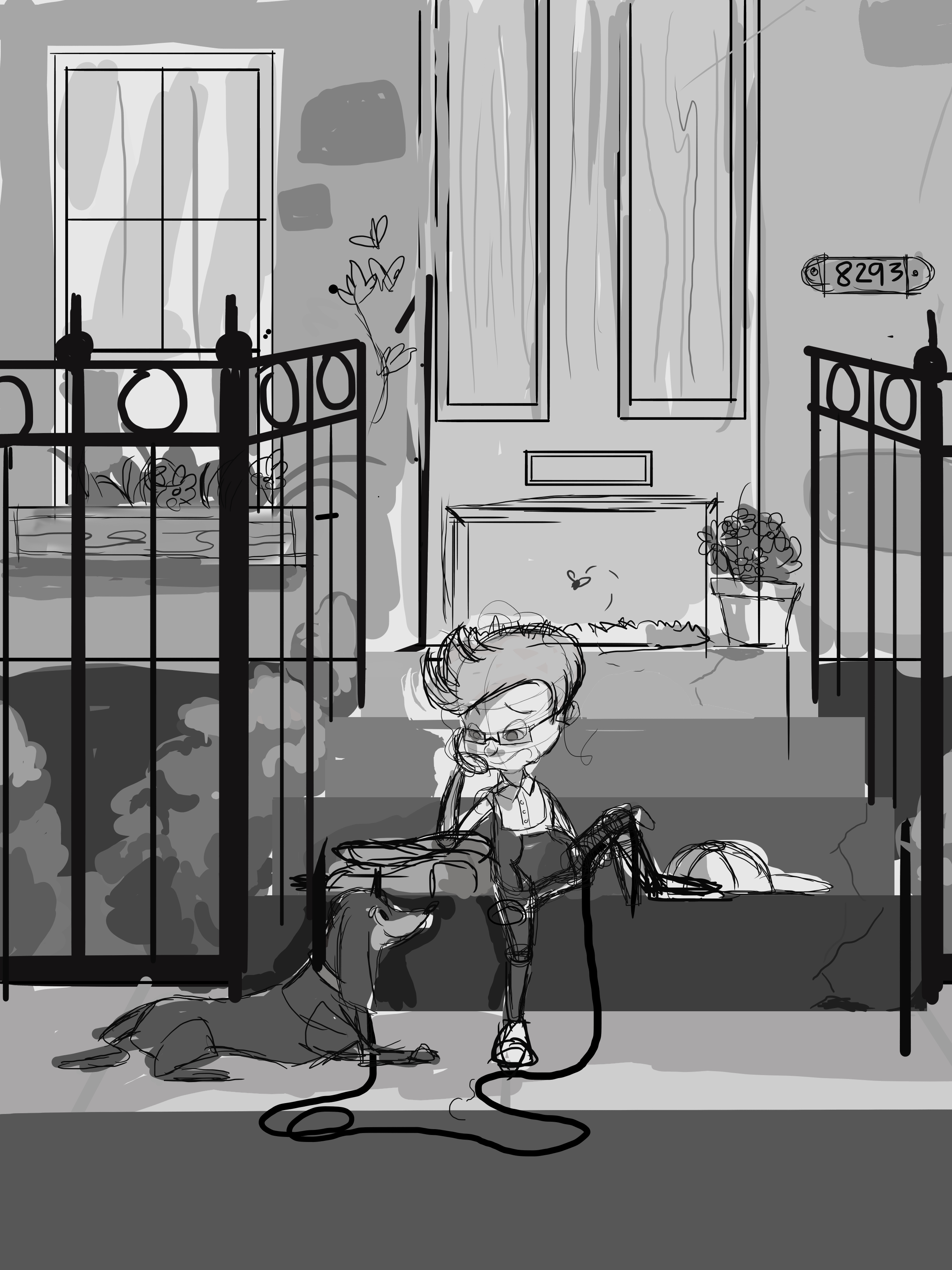
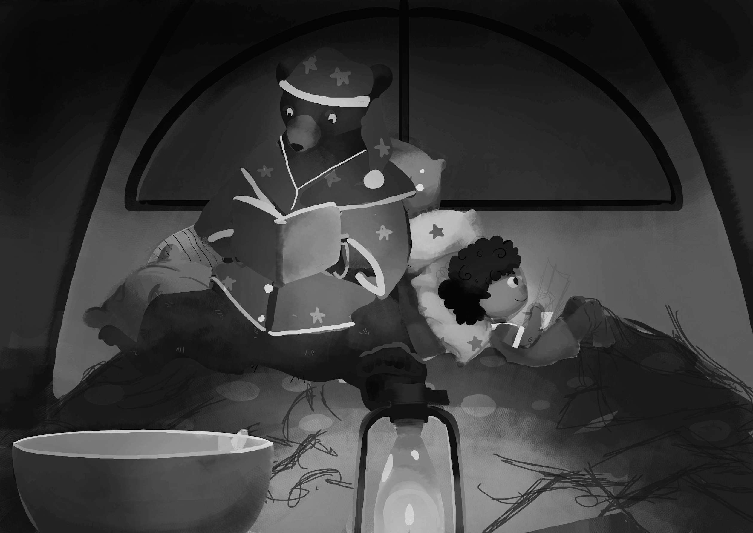 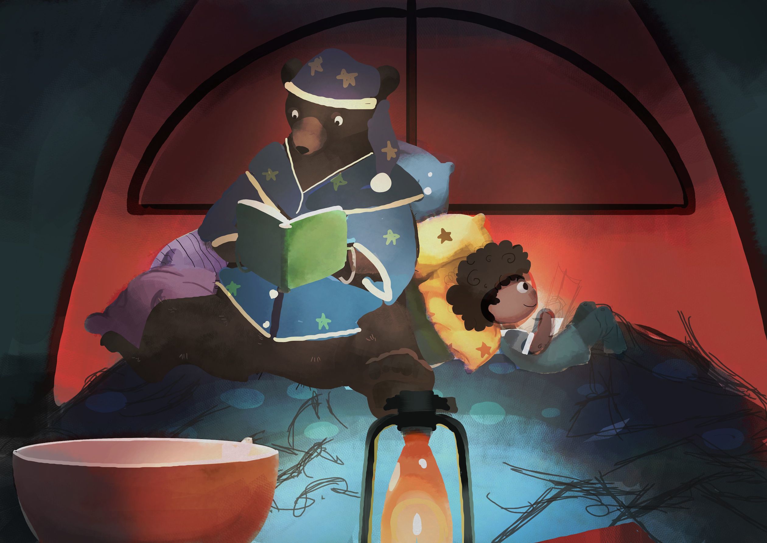 I still have to go back and finish a lot of things, but this is my first time coloring in grey scale so I added a color layer to see how it would turn out and where I need to adjust tones.
07-19-2016, 12:49 AM
(07-18-2016, 08:05 PM)Artloader Wrote: Good work Ixspen, your painting of Jalila is looking good. Thank you, Artloader! I try to break down the animals into shapes, but I had never thought of using the human skeleton as a guide. That takes some of the frustration out of posing. Thank you for the link!
07-19-2016, 01:34 PM
Got some feedback and did a lot of editing today...and forgot to save the editable file after I made the JPEGS. :/
Doing the final re-drawing and clean up is going to take a while... 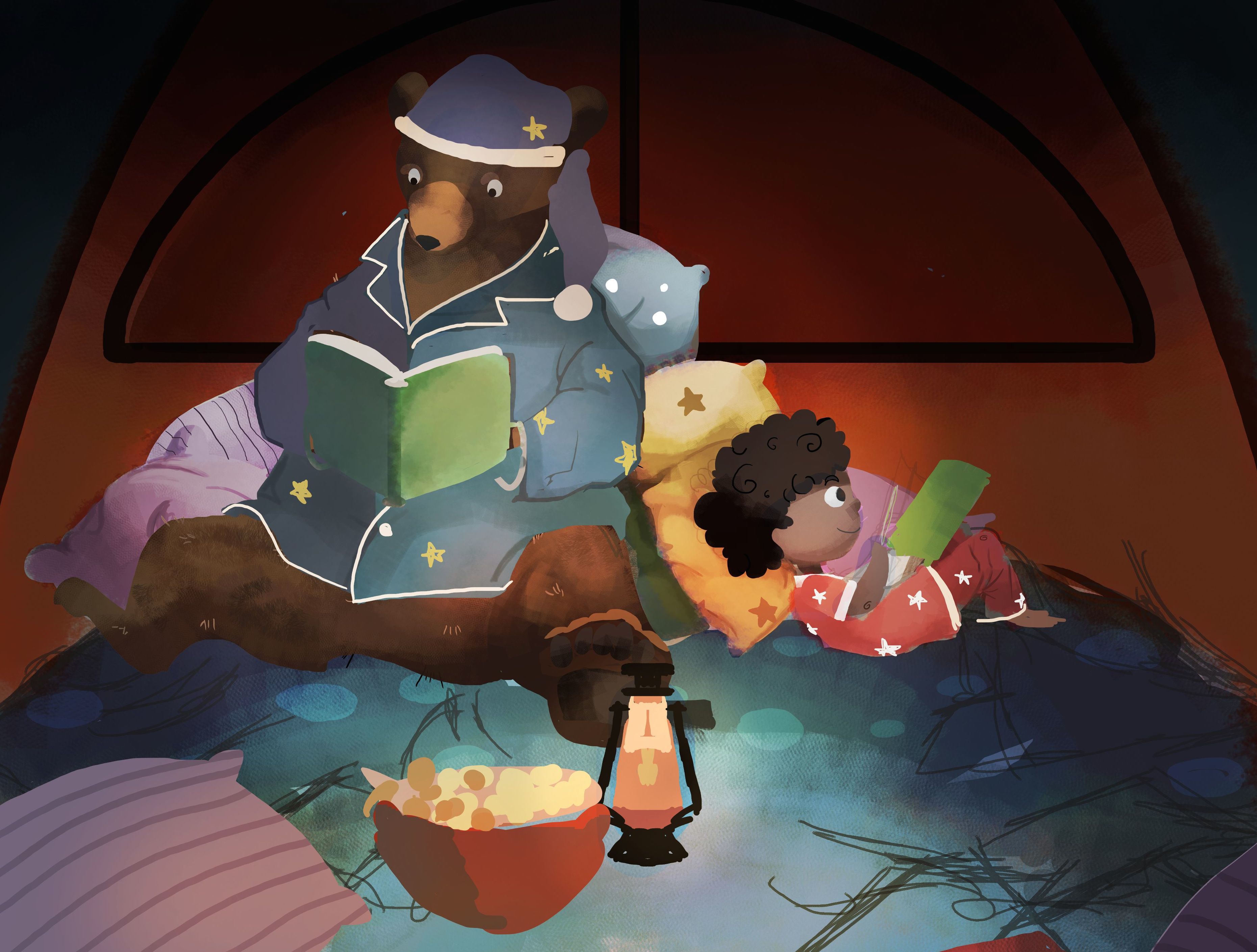 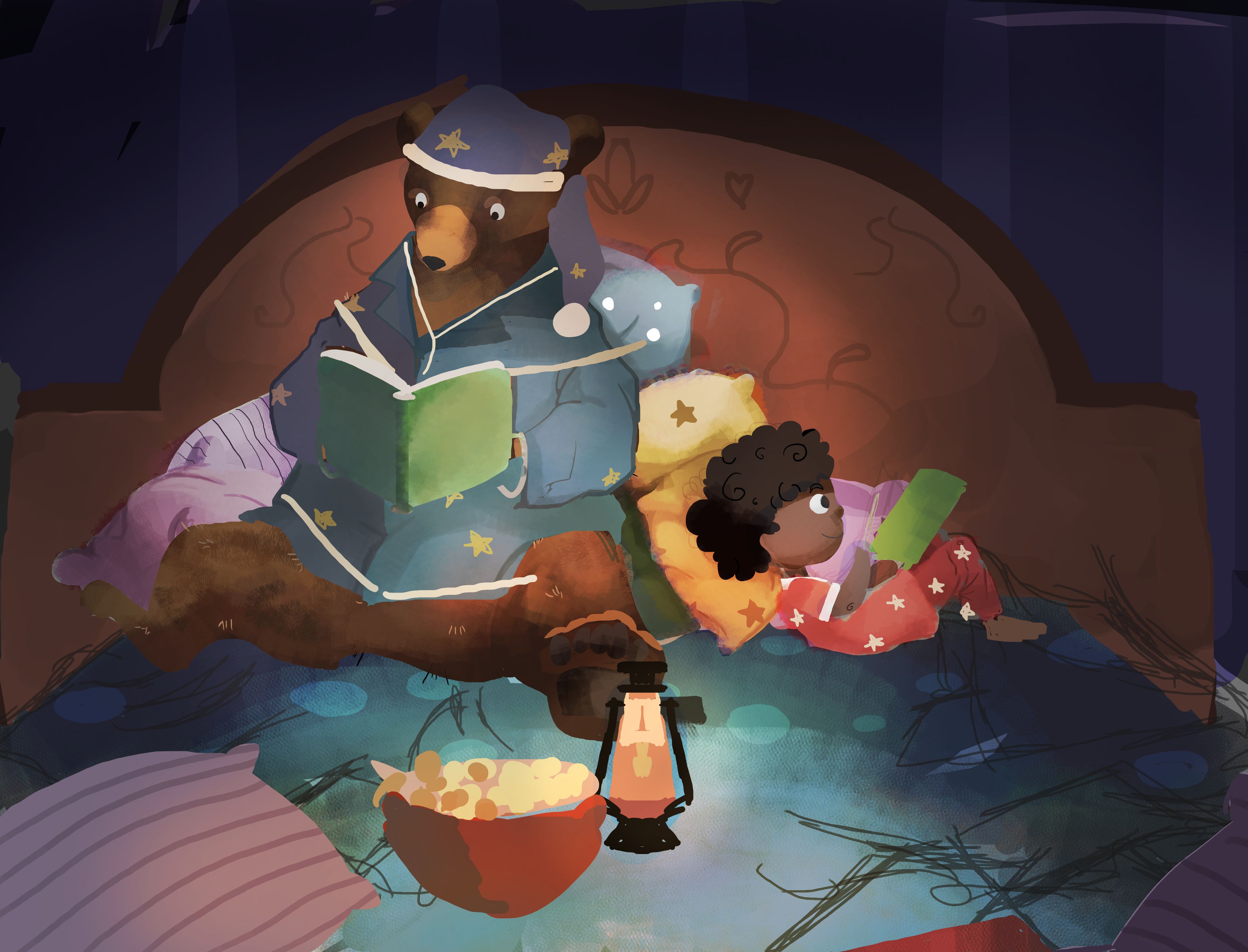 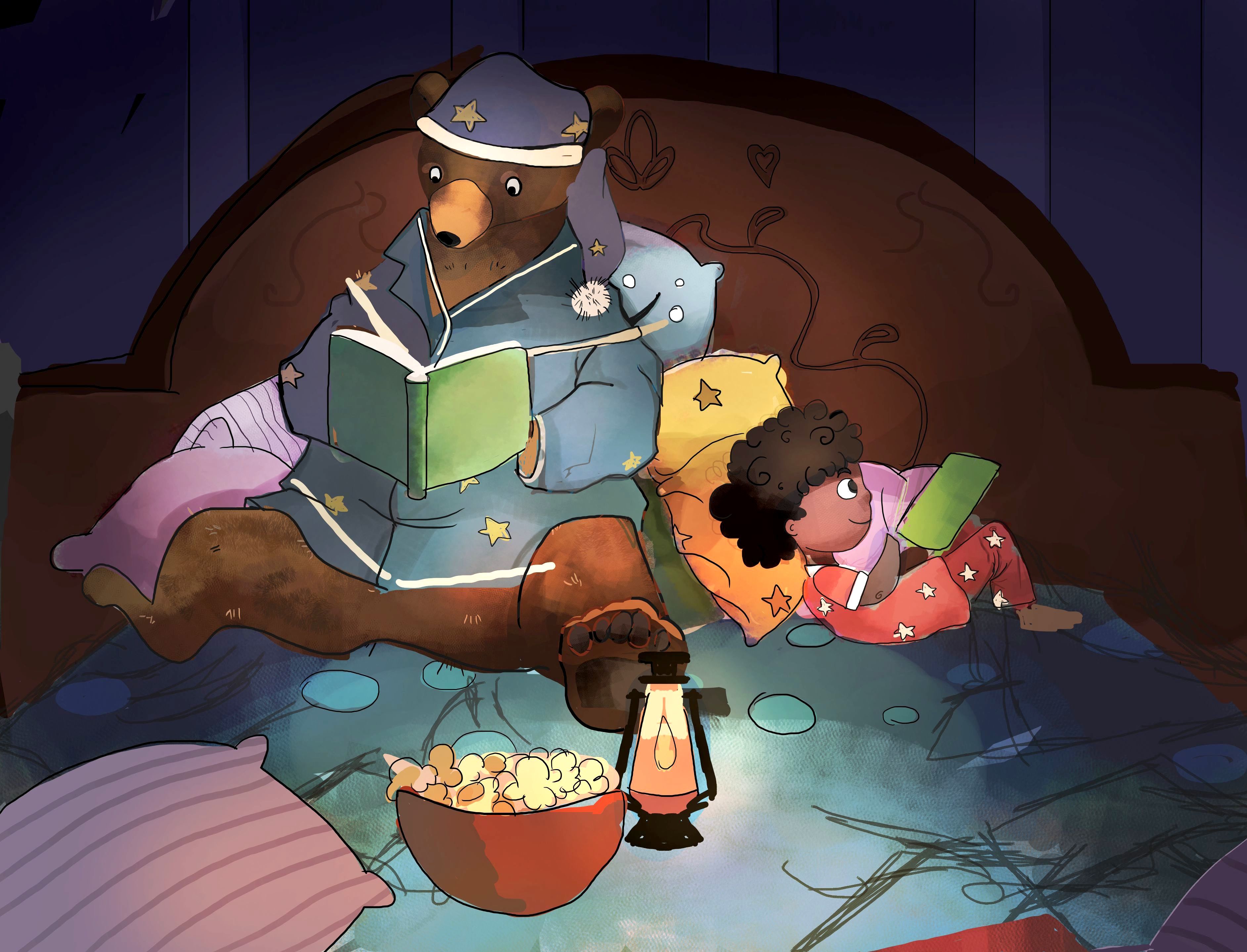
08-17-2016, 09:43 AM
03-12-2017, 09:53 AM
.jpg)  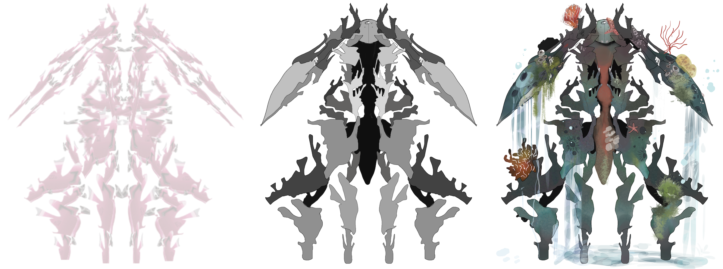.png)
03-12-2017, 10:04 AM
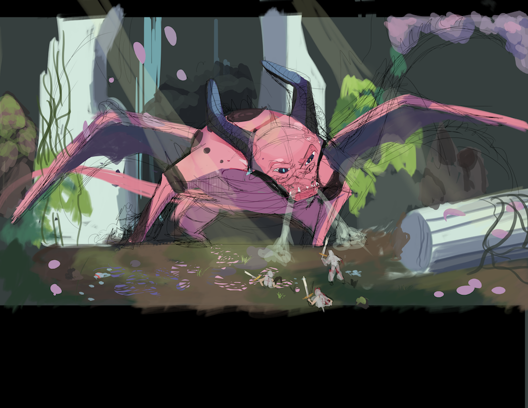
Any feedback on wither of these WIPs would be much appreciated. (・∀・ )
.png) 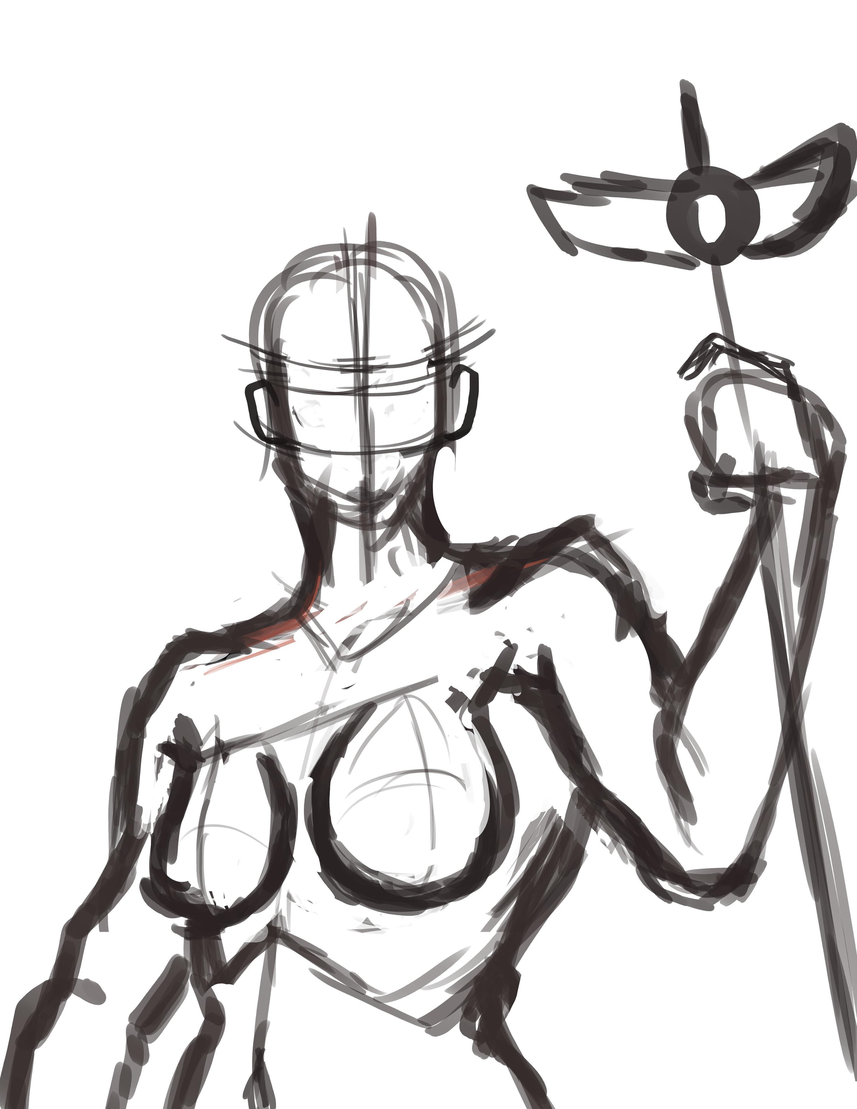
03-13-2017, 01:05 PM
03-25-2017, 01:44 PM
03-25-2017, 02:35 PM
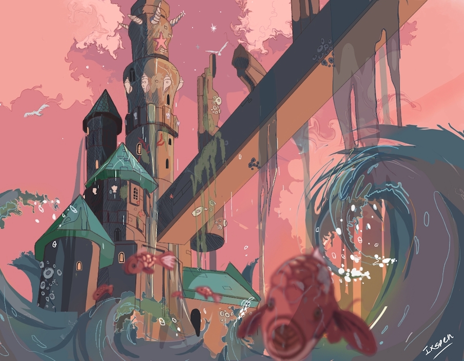
Cool stuff man! Your very first piece in this sketchbook is particularly cool.
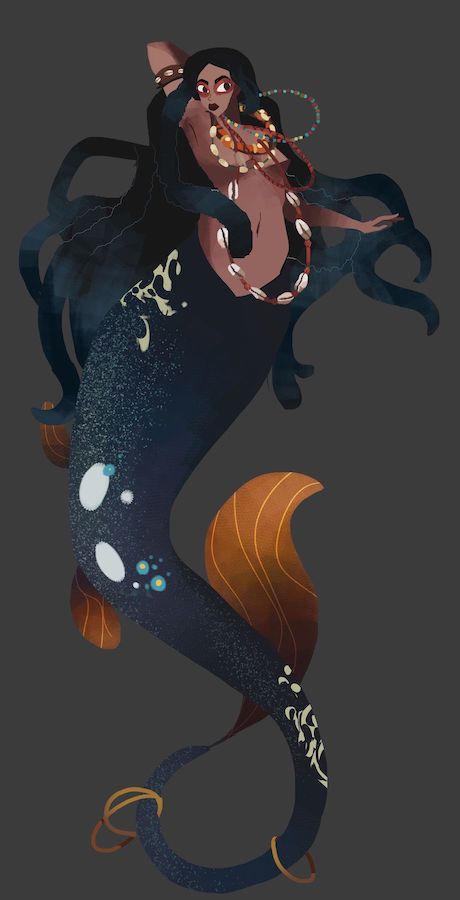
With your most recent post, watch the size of the woman's head; the 2017 version's head is a bit too small compared to the rest of her body. Also, her arms/hand are a little big and too masculine. Keep up the good work my man
Sketchbook: http://crimsondaggers.com/forum/thread-7776.html
DeviantArt: http://epoch-owen.deviantart.com/
03-28-2017, 10:55 PM
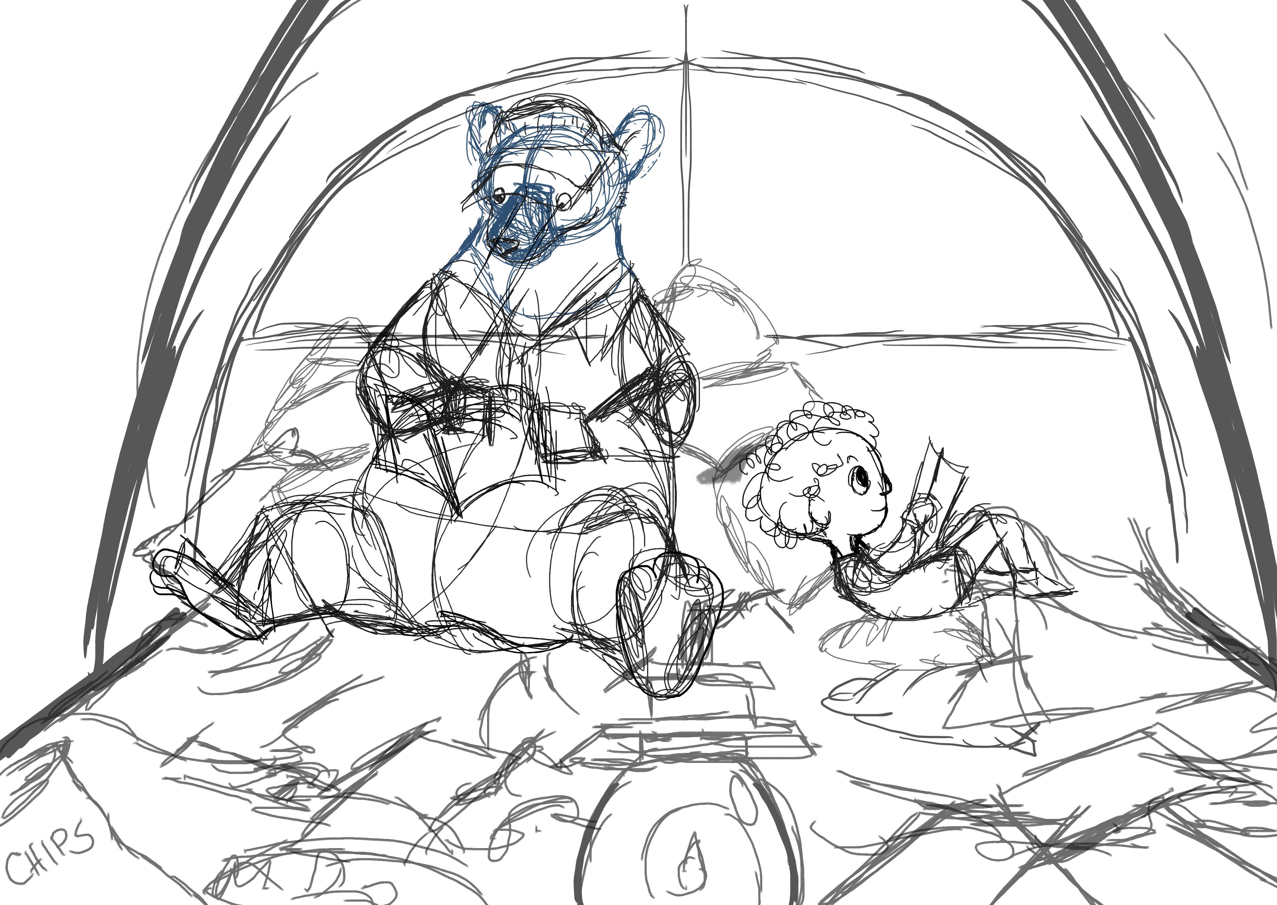
Really nice storytelling with the bear and kid illustration, Very nice storybook feeling to it. You should do more!
Sketchbook : http://crimsondaggers.com/forum/thread-7501.html
04-29-2017, 03:00 PM
(03-25-2017, 02:35 PM)Nick Waldinger Wrote: Cool stuff man! Your very first piece in this sketchbook is particularly cool. Thanks, Nick! I poured a lot of time into that. Ah...I'll have to go back and correct that later. Thank you for pointing that out! I had posted my sketch in some forums elsewhere but no one gave much feedback. And this lady certainly shall try!
04-29-2017, 03:05 PM
04-29-2017, 03:06 PM
.jpg) 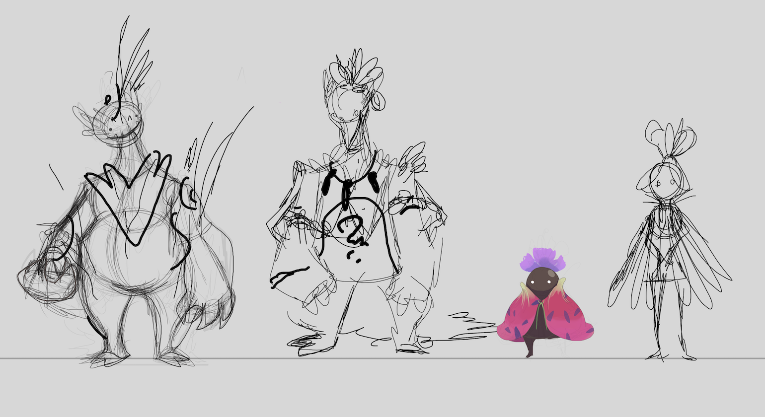.png) 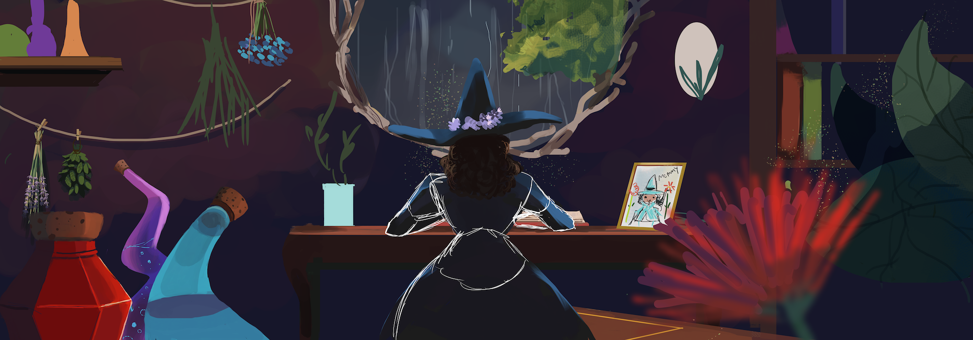.png)
04-30-2017, 07:49 AM
Colourful and interesting! Can't wait to see more. :)
05-03-2017, 01:10 PM
05-07-2017, 04:55 AM
I love your style! Yeah very interesting. I suggest that you use more construction fwith your creatures, like the one in post 8, it helps even for cartoony kinda style to get the simplified shadows right.
I can see that you constructed the girl in posts 9 and 10, and the hands, torso and hair got better. You coukd use some shadow on the neck as well. However, it does not look like a finished work so let's see how you develop it further. As for the creature illustration, also pay attention at the column, it does not converge in perspestive right. Looking forward to see more progress on your wips!
01-22-2018, 06:38 AM
(05-07-2017, 04:55 AM)neopatogen Wrote: I love your style! Yeah very interesting. I suggest that you use more construction fwith your creatures, like the one in post 8, it helps even for cartoony kinda style to get the simplified shadows right. Thank you so much, neopatogen!! I'm so sorry I had never replied to this. I haven't been here probably since my last post. I've been trying to work on construction and I plan on re-starting that dragon piece very soon. I lost access to my mage piece, but I'm trying to get better with my painting. Happy New Year. |
|
« Next Oldest | Next Newest »
|