08-01-2016, 11:22 PM
Hey, guys !
It's Inspirational Kickass for me.
I'd be glad to hear some critique and advice.
It's Inspirational Kickass for me.
I'd be glad to hear some critique and advice.
|
Chronicles of insomnia. sketchbook
|
|
08-01-2016, 11:22 PM
Hey, guys !
It's Inspirational Kickass for me. I'd be glad to hear some critique and advice.
08-01-2016, 11:35 PM
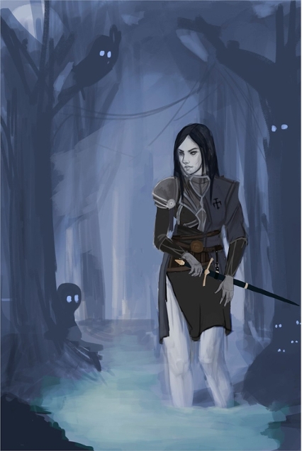
working on the illustration
08-08-2016, 06:27 AM
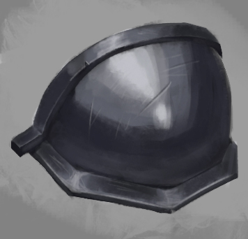
i got stuck with pauldron, so pauldron-week has begun
08-08-2016, 09:00 AM
Hey welcome to Crimson Daggers Ep4eg!
Nice start - that illustration is looking good - your proportions look nice on that girl and I like the pose. I had to Google pauldron! Good luck with Pauldron week - keep up the hard work :)
“Today, give a stranger one of your smiles. It might be the only sunshine he sees all day.” -- H. Jackson Brown Jr.
CD Sketchbook
08-09-2016, 08:41 AM
woot! applied studies! -and welcome! ^^
-look forward to seeing more! :D
08-10-2016, 01:34 AM
Hey man welcome to the daggers game. Continue learning, continue posting :D!
▲ SKETCHBOOK ▲ WEBSITE▲
08-11-2016, 05:29 AM
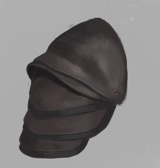
Some leather
08-12-2016, 05:48 AM
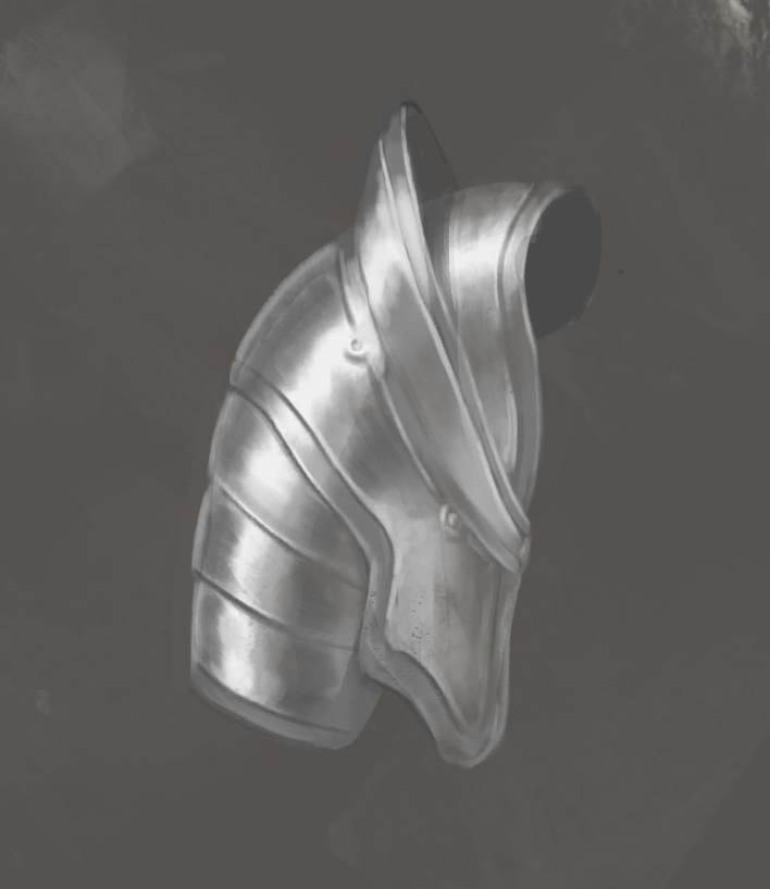
Tried new soft brush. Looks weird
08-26-2016, 06:17 AM
I had enough time to jerk off, it's time for new sketches
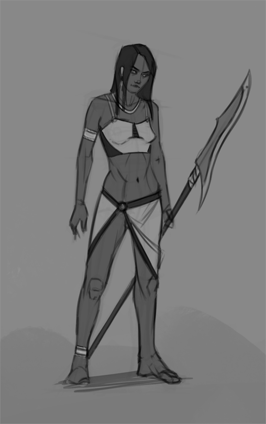
08-27-2016, 08:48 PM
Nice linestyle on that last drawing. You should do a series of characters like that. They'd look boss all lined up
08-29-2016, 06:17 PM
09-01-2016, 06:52 AM
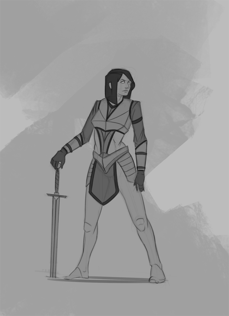
09-14-2016, 06:13 AM
critique is welcome as always
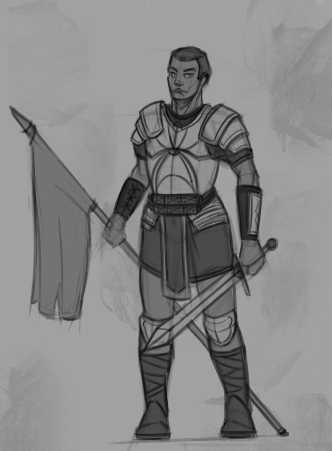
09-29-2016, 01:04 AM
This isn't 'the' critique, but I hope you get to finish an illustration or design. The latest one looks like it got shelved for some reason.
---- On to the critique: The latest figure's upper half is twisting to the left, while the bottom looks like it's faced straight on. If there's a twist to the body, the angle of the twist should be titled at a vanishing point. And the foot looks as if it's rendered if the camera is at the level of the foot. I've adjusted the figure, having the horizon line near the waist level of the subject: 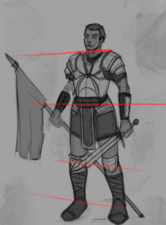 I admit it's not that accurate but I hope it drives my point home. Hope this helps, and don't hesitate to point out if what I said was confusing, or god forbid, wrong.
If you are reading this, I most likely just gave you a crappy crit! What I'm basically trying to say is, don't give up!
---- IG: @thatpuddinhead
10-05-2016, 10:56 PM
Thank you for reply, @John.
Quote:The latest figure's upper half is twisting to the left, while the bottom looks like it's faced straight on. Yep, it's because initial gesture was twisted Quote:If there's a twist to the body, the angle of the twist should be titled at a vanishing point. You're absolutely right =) Overall, it's looks weird head and neck also. Actually, I put the accent on design here.
11-16-2016, 05:44 AM
Hey, guys, almost forgot about the sketchbook, here is some recent sketches with strange anatomy
 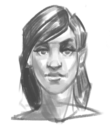 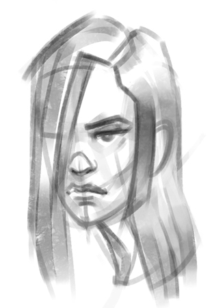 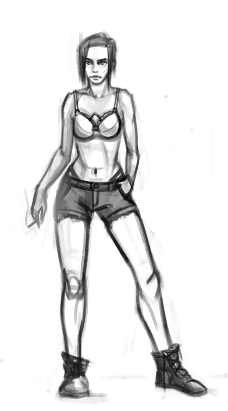
11-16-2016, 05:50 AM
and little bit study
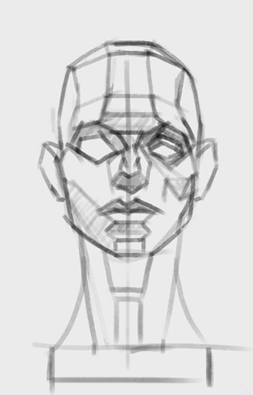
11-25-2016, 01:35 PM
Really nice stuff, Ep4eg. Keep going.
One thing I'd like to add: you should focus on movements...Natural movements of the body to be precise. While your characters look anatomically pretty good, they do look stiff. Try to imagine them in the motion...like what were the doing before the picture...what was their movemnt? Walking? Jumping? Running? Turning around? Brooding? It'll help add more personality to the characters...Play with the realtionship between the pelvis & the rib cage too..for added dynamicness. Keep going...post more!! |
|
« Next Oldest | Next Newest »
|