Posts: 671
Threads: 8
Joined: Feb 2016
Reputation:
113
I'm making a "Josie and the Pussycats" print! Love the cartoons. Love their sporadic stint in the old Archie books. Maybe it's a good time to spread that love.
So here's some process work:
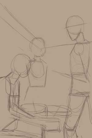
1. Sketching ideas phase. It's where I throw in figures in space, or scribbles. No perspective, no anatomy stuff. None of that nonsense! Just put whatever's in my head onto the canvas!
I think I had 2 initial sketches, but went for the first idea. This is where I put in the placeholders for the characters:
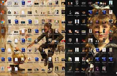
2. Now that I have more or less a direction where I want to go with the piece. I gathered a lot of reference photos to a point in which I cluttered my desktop! A lot of Chrome tabs opened. It's a constant gathering of photos til the end of the piece and it's depressingly time consuming. Here's what I ended up with:
3. I work out the perspective, and give characters faces, and figure out the anatomy. This is a rough pass, because at this point I'm trying to make sense of the perspective, and anatomy.
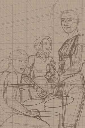
4. After all that neurotic behavior, I turn the lines down to 20% opacity so I can make a cleaner pass on a new layer. Basically, choose the best line I've thrown from the rough pass, and commit by do a cleaner line over it.
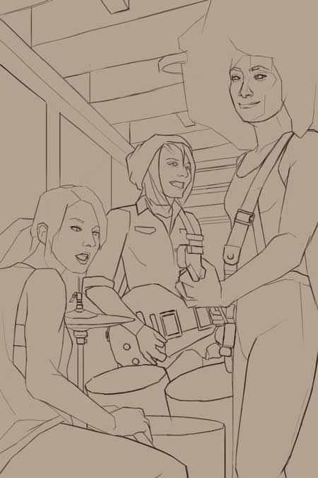
I'm done with doing the line work! Next entry will be coloring!
If you are reading this, I most likely just gave you a crappy crit! What I'm basically trying to say is, don't give up!
----
IG: @thatpuddinhead
Posts: 1,424
Threads: 12
Joined: Dec 2015
Reputation:
139
Coolness John - nice process - I like how you do a clean line pass - I might give that a go myself.
Looking forward to the next step mate.
“Today, give a stranger one of your smiles. It might be the only sunshine he sees all day.” -- H. Jackson Brown Jr.
CD Sketchbook
Posts: 671
Threads: 8
Joined: Feb 2016
Reputation:
113
Artloader : Oh Loader. Always so pleasant. By the way, this isn't a tutorial by any means (which will be very evident in the next entry!). I'm just tracking what I'm doing like a journal so I can point out how good or bad my process was!
If you are reading this, I most likely just gave you a crappy crit! What I'm basically trying to say is, don't give up!
----
IG: @thatpuddinhead
Posts: 671
Threads: 8
Joined: Feb 2016
Reputation:
113
Coloring time!
At this point of the process, I was so tired of doing line work that I was raring to go with the coloring! So excited, I thought to myself: "I think I'm pretty good at coloring stuff. I'm gonna cut the time short by going straight right in! Dive in and get the colors right the first stroke. That's how Sargent did it anyway! This will be my happy place."
Here's a quick breeze through (it's mirrored here just to show I flip often) :
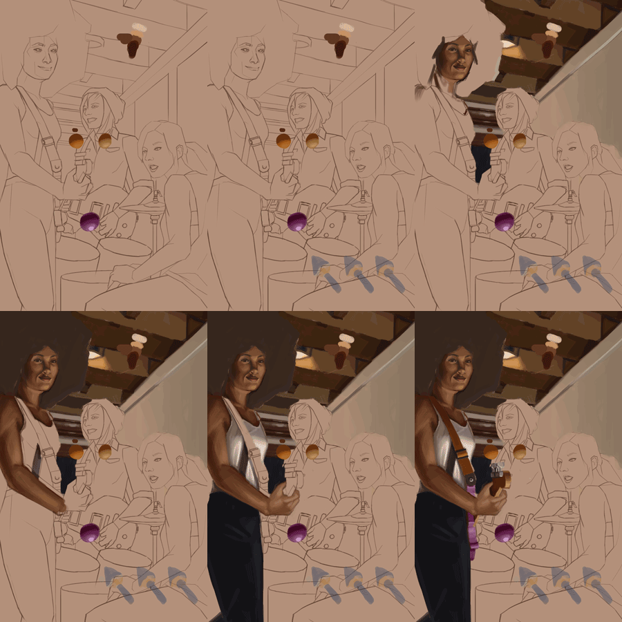
This took me a long time. Like 2-3 days!
It's so horrible! I can let out a chuckle now since I'm finished with it! An uncomfortable, sweat-inducing chuckle to be more specific. But at that time, boy was I miserable, especially that day when I got a fresh pair of eyes on it.
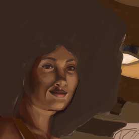
I did everything by the book. Got my references. I knew where my light sources are. I have a pretty decent copying skill. Read a lot of Sargent. Saw a lot of Alla Prima videos. But kept asking myself "why the hell am I stuck?" followed by an assuring "but I should be awesome!"
Eventually, self loathing sets in. I'm screaming at myself in my head (all caps for emphasis!):
"YOU'RE NO SARGENT! YOU'RE A FUCKHEAD. WHO DO YOU THINK YOU ARE? YOU THINK YOU'RE BONHAM READY TO DO SOME IMPROVISED DRUMMING IN THE MIDDLE OF THE SET? YOU ARE A MOCKERY TO ALL ARTISTS OUT THERE. DO YOURSELF A FAVOR AND THROW YOUR COMPUTER, FOLLOWED BY YOURSELF, OFF A CLIFF."
Those weren't the exact lines, but the feeling is the same!
I am shit!
Next entry would be me trying to get rid of some of that stink away!
If you are reading this, I most likely just gave you a crappy crit! What I'm basically trying to say is, don't give up!
----
IG: @thatpuddinhead
Posts: 112
Threads: 1
Joined: Aug 2016
Reputation:
6
Hey, man, just chill out. Im bad at coloring stuff too, we all were at some point. The problem I see is you didn't check your values. For me it's easier to do black&white first and then coloring it. If you think that most of digital artists can do color right away - i can tell you that you're wrong. It's nothing to be ashamed of if you'll do b&w first, if you use refs and such. You said that you're not Sargent. And that's exactly whom you will never be. You will be yourself. Also check your perspective. Every character has different perspective. Sorry for just texting, im at work and i dont have photoshop and my tablet here. Hope you'll find a way to understand what you don't know yet. Cheers.
Posts: 671
Threads: 8
Joined: Feb 2016
Reputation:
113
Hey Anton!
Thanks for the kind thoughts and the advice. Btw. I'm already done with the piece! I'm just too lazy to make consecutive entries on the process work! This is the first time I saved the part where I miserably failed. Normally, I'd just delete the layers (saves memory!) or paint over to fix it!
I think I got some of the kinks worked out in the end.. But it still might very well be a horror story! Let's collectively shit on it if it's out!
If you are reading this, I most likely just gave you a crappy crit! What I'm basically trying to say is, don't give up!
----
IG: @thatpuddinhead
Posts: 671
Threads: 8
Joined: Feb 2016
Reputation:
113
Continuing onto the Josie and the Pussycats print process:
What to do when I'm stuck: Like most of any modern video game story mode, load the last checkpoint! Nothing sophisticated. I usually divide my save states into three stages: 1) Sketching and line art; 2) Coloring; 3) and Polishing. Sometimes more if I divert a lot.
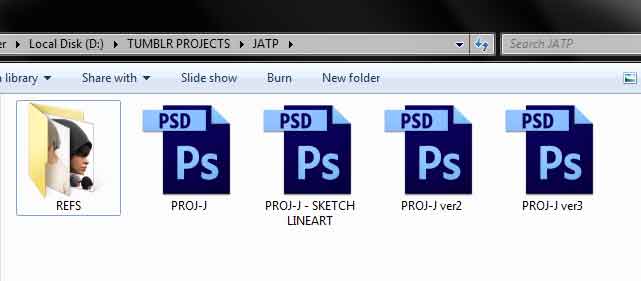
"Proj-J Sketch Lineart" is self explanatory. "Proj-J" would be the coloring stage where I just left off from the last entry. Ver2 is where I diverted from the original process, which eventually became the finished coloring stage. Ver3 is the polishing stage.
After every iteration, I merge the all the layers that I'm likely to not screw around any further. It clears hard drive space, saves a lot faster, and causes my PC not to lag or choke harder than it should.
Moving on. I decided to load the Lineart PSD and start from there again. This time, rather than fast tracking myself into rendering, I make a sharp turn to the right! I plan the whole coloring process by putting color placeholders. See how the colors would relate to each other in broad strokes. It doesn't have to be perfect. It doesn't need to be colored within the lines. Zoom out and look at the big picture.
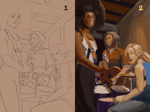
Add to that, as Anton_Fort pointed out earlier, it's always a good idea to check the piece's B/W value relationship.
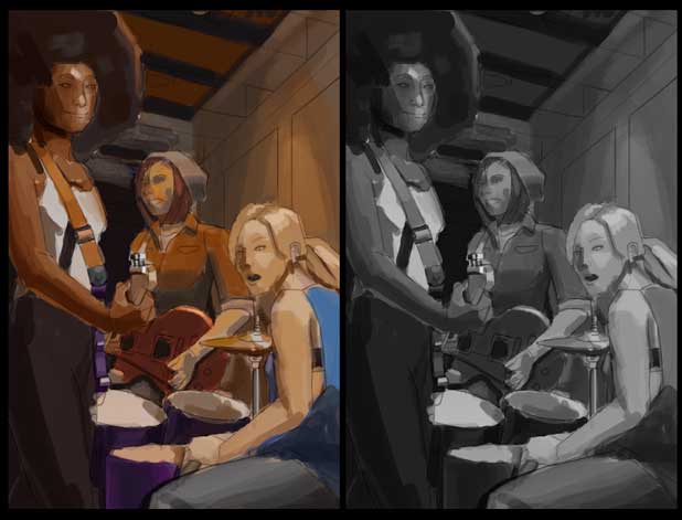
(Side note: this is the proofing colors to grayscale tutorial by Thomas Scholes: http://www.artofscholes.com/checkingvalues/)
I introduced another light source (warm incandescent light) above the redhead's character. It was difficult for me to make sense of the lighting setup. So I extended my canvas and painted that light source in!
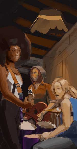
Next entry: a lot of coloring, a lot of changes, and more of the digital painting equivalent of face plants!
If you are reading this, I most likely just gave you a crappy crit! What I'm basically trying to say is, don't give up!
----
IG: @thatpuddinhead
Posts: 112
Threads: 1
Joined: Aug 2016
Reputation:
6
Sorry for bothering you again, John, but I have to tell you again that your values are off. Color is not important, color is kinda like a cherry atop of a cake. Values are more important imo. The girl on a background has the same values as other two girls, walls have the same values. And i cannot understand which of these girls on a foreground - the drummer or the guitar player. You have to add aerial perspective (i believe it's called aerial in eng), you have to add plans, accents. I know it could be annoying that i keep talking about values, but the values is the basis, foundation of your work. Plus i think that it is too tight for them to be in this format.
Posts: 101
Threads: 6
Joined: May 2016
Reputation:
10
Hiya. So I had an idea about your values and colours: separate the image into three or four distinct layers according to how close things are to the viewer. Give the 'closer' layers (eg the drummer and her closest drum) a light value range, and give the furthest layers a dark value range. And limit the range of value that each of these layers has, so that no layer goes really bright and really dark at the same time. Also, saturate the closer areas, and desaturate the further areas.
This sort of assumes, of course, that the light source is a) next to viewer and b) warm light, not cool.
But here's how my idea looks:
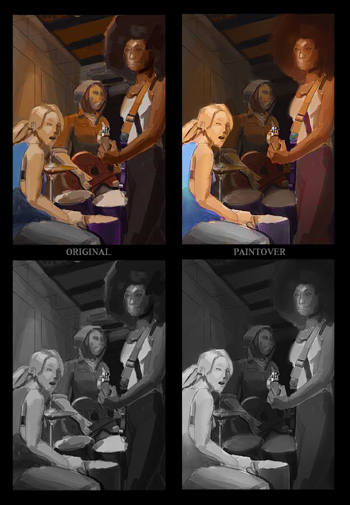
I think it reads better, but it might not be your preference. It's just how I'd go about things. Good luck with the piece :)
Posts: 671
Threads: 8
Joined: Feb 2016
Reputation:
113
Again, The work is finished. Any criticism about the process work is as good as criticizing a recording, wishing any input has a chance to make the work look another way when it's done.. But! For the sake of argument..
Anton_Fort - No doubt about it. My values are incorrect. Probably better if I said the colors/values are placeholders where the lights and shadow sides are. An approximation if you will. Highlights are still close to mid tones, some parts that are meant to be in shadow are too as well. The reason for that is, I always bump the values up or down during rendering. I tried doing a piece as close to the right values before, and I still had to correct the values during the coloring stage. Like I'm doing a perfect value pass twice. And you are right, the values of girl's shirt blends into the wall. It is awkward looking.
I disagree, color is just as important as values. First and most importantly, colors inherently have values by nature. Second, saturation plays a role, like pulling off depth perception (as BadWoolf explained it). I would go out on a limb to say, maybe the hue isn't as important, because there are colors where I can get away with it looking a certain way without giving it the "right" hue. Like how a desaturated yellow can give you "blue" given the right colors surrounding it. But, then again, I'm sure there are counter arguments how hue is important as well.
You can have work that has perfect values on it. But having to critique it as an entire thing, you still run the risk of making it look muddy without the right hue or chroma. Unless of course, you're intentionally going for muddy.
So nope. Color is important. But I see what you are saying.
BadWoolf - Thanks for the P.O. I do appreciate it. I might be wrong but your P.O. reads like it has a singular light source (the light coming from the camera) that just diminishes as it gets farther from it. The problem I was trying to address is, what if you have a light source (cool) from the camera, and another light source (warm) above the red head girl's head. Would it still be as dark as you painted it on?
---
Thanks for the response, both of you! I hope to get a follow up to get a discussion going. Hmm... it actually got me thinking about revisiting the piece. It's been sitting on the shelf for quite some time now..
If you are reading this, I most likely just gave you a crappy crit! What I'm basically trying to say is, don't give up!
----
IG: @thatpuddinhead
Posts: 671
Threads: 8
Joined: Feb 2016
Reputation:
113
Continuing onto the third and final part of Josie and the Pussycats print process:
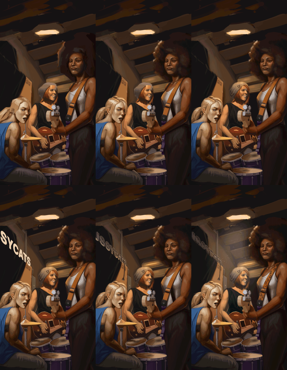
From where I left off, I established where my lights are and which colors are going to be in the piece. All planned out and ready to go. So here comes monotonous rendering leg work which I'm going to gloss over.
I work one character at a time. The character in the fore front gets through the wringer first:
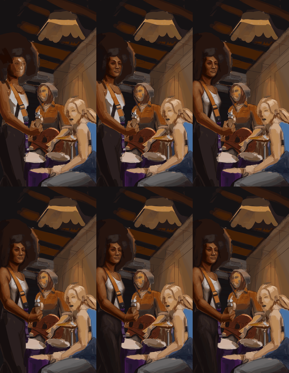
Then the drummer:
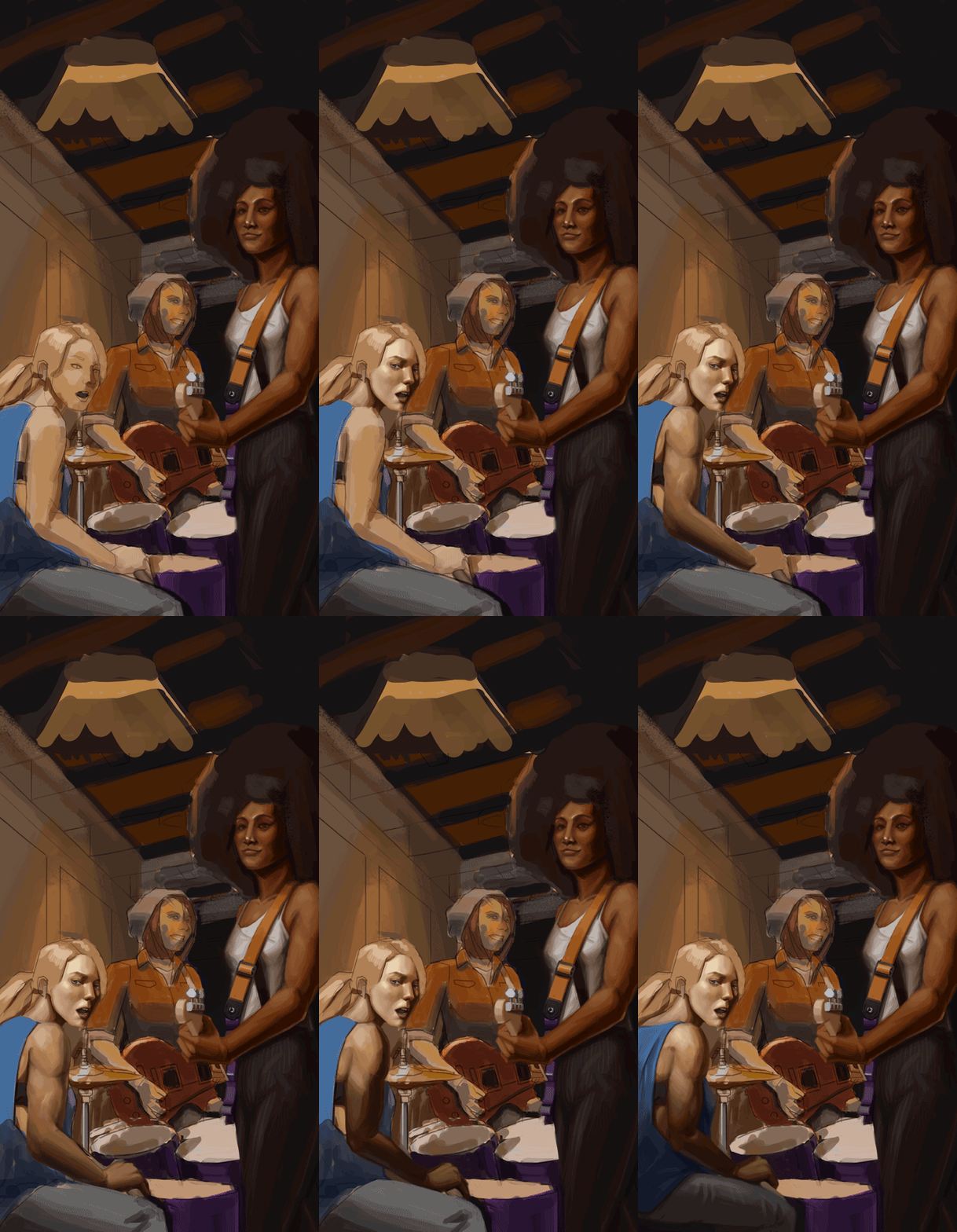
Then the guitar player at the back, which I redid the face 3 times over. Twice on the same file (which will be shown here). Another in a different PS file, where I made a short study (line art with little shading) of the head :
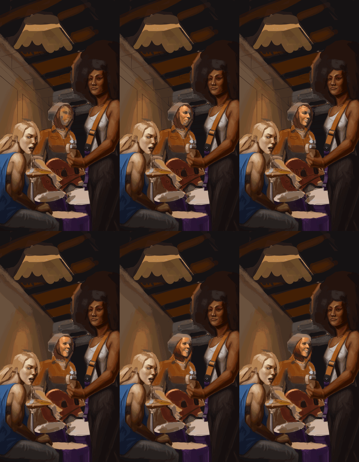
At this point in time, I realized the shirt wasn't working well given it's background. So I took the liberty of changing the wardrobe up, testing out a couple of shirts and finally deciding on black that'll just fade into the darkness of the environment outside.

I gave the background more elements to frame the drummer better. Given her light hair color, I thought of putting on a dark background so it will make her pop. That and more changes (tightening of the details, change scales, etc...)
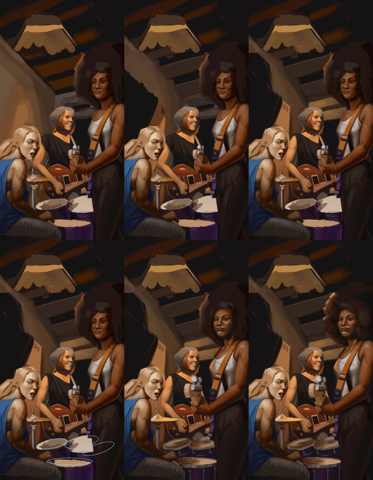
At this point, I save the piece to a new document (ver3). This is pretty much a good checkpoint to do so.
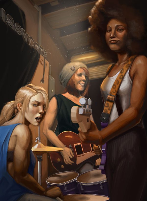
And finally, more tightening, more elements in the background to give that Josie and the Pussycat feel.
Cropping to the original 11 x 15 and final!
If you are reading this, I most likely just gave you a crappy crit! What I'm basically trying to say is, don't give up!
----
IG: @thatpuddinhead
Posts: 671
Threads: 8
Joined: Feb 2016
Reputation:
113
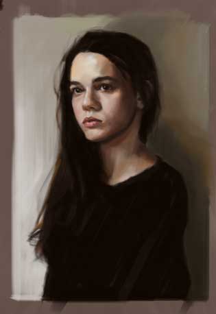
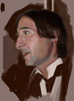
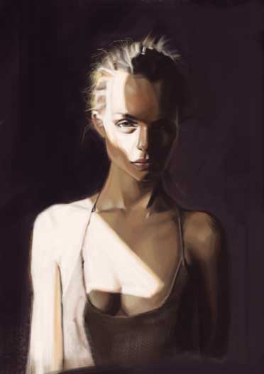
I'm so much of a design dolt that I get too much creative downtime.. Which is why I turn to portraits.. These are long sessions, didn't even bother to count the hours.
Portrait studies:
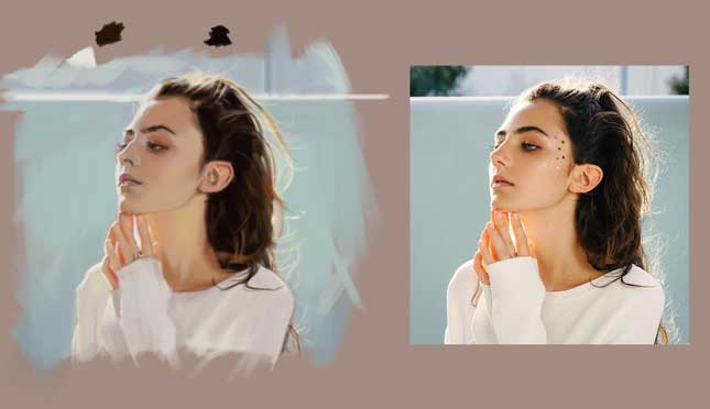
If you are reading this, I most likely just gave you a crappy crit! What I'm basically trying to say is, don't give up!
----
IG: @thatpuddinhead
Posts: 671
Threads: 8
Joined: Feb 2016
Reputation:
113
Portrait study:
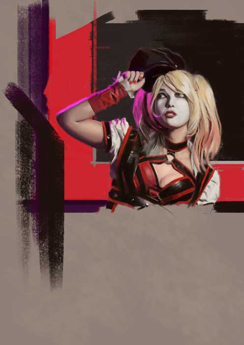
If you are reading this, I most likely just gave you a crappy crit! What I'm basically trying to say is, don't give up!
----
IG: @thatpuddinhead
Posts: 530
Threads: 14
Joined: Dec 2015
Reputation:
51
Damn that print looks good! Portraits as well. Keep it up!
Posts: 671
Threads: 8
Joined: Feb 2016
Reputation:
113
neopatogen - Shucks... thanks neo!
123 - Hey numbers! Swear to god, there's this one study I keep screwing up..
---
Portrait study:
I redid this at least 3 times. Maybe I'll do more back lit stuff in the future
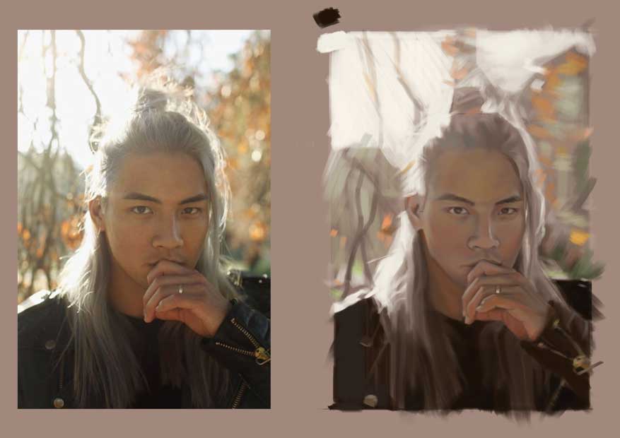.jpg)
And a decent one:

The process gif because sometimes I forget how I manage to get from point A to B.

If you are reading this, I most likely just gave you a crappy crit! What I'm basically trying to say is, don't give up!
----
IG: @thatpuddinhead
Posts: 20
Threads: 0
Joined: Nov 2016
Reputation:
3
John maybe you can take a break from that one portrait and come back to it (at least a two week break). It looks right to me, but you've probably been looking at it too much lately to see that it's fine. And, on the off chance that it really is incorrect, you'll have an easier time spotting your mistakes after a visual break.
Posts: 460
Threads: 10
Joined: Mar 2016
Reputation:
64
Hey John! Thanks for visiting my little corner in the sketchbook session!
Your portrait studies are really beautiful, and I can tell that you rly think and study while you make them. But where are the applied studies? I want to see some portraits done from imagination! :D
Posts: 671
Threads: 8
Joined: Feb 2016
Reputation:
113
dangelowallaceart - Yeah.. you're totally right. That back lit portrait I did, I'm starting to see my mistakes. Matter of knowing how to correct them the next time I tackle another piece like that. Thanks!
Zorrentos - You have no idea how much I visit your SB. You're definitely one of those guys who really explore design and get their hands dirty throwing in ideas. Especially those CC7 studies! Man, exciting stuff.
I needed that kick in the butt. But what can I say! Doing portrait studies from photos is comfortable..
---
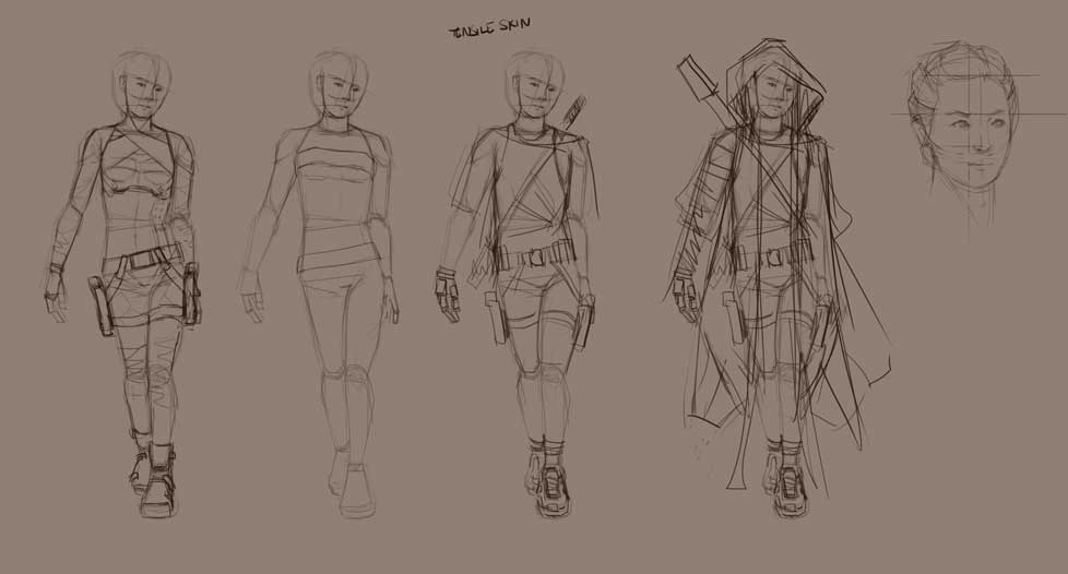
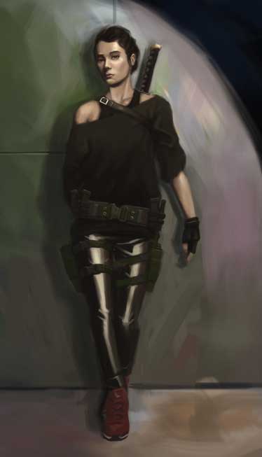
Got to try to world build. It's been awhile since I've done anything like this. First time bouncing ideas around by myself. A lot of indecisions and a lot of complacency.

Rendered an idea out to see how it looks

I'd do her head shot next. And do an alternative wear. And I might draw lots and lots of men to compensate for the lack of male drawings ever since I've started this thread. Keyword is "might".
If you are reading this, I most likely just gave you a crappy crit! What I'm basically trying to say is, don't give up!
----
IG: @thatpuddinhead
Posts: 671
Threads: 8
Joined: Feb 2016
Reputation:
113
Found an interesting nugget of information from none other than CD (inactive) member, Alex Negrea!
"And since I want more vibrant colors I go even more saturated with colors. I do not color pick from my painting either except when I am closer to the end and I want to loose a bit the saturation. Colorpicking its great if you want to remove the vibrancy:)"
Makes me want to rethink my process. I do a whole lot of color picking, maybe it's time to minimize that habit.. No wonder the paintings I do tend to be muddy the more I noodle around..
(Whole article here: http://muddycolors.blogspot.com/2016/12/...egrea.html)
----
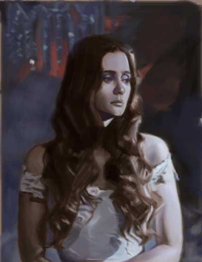
Had an interesting chat with dodeqaa about light few days back.. That conversation made me realize I don't know how to paint night scenes, among other things.. Have to give props to that guy for the push.
Portrait study:

Needs more work, but I'd rather go to another piece and start all over. Learned a lot of things with the study.
If you are reading this, I most likely just gave you a crappy crit! What I'm basically trying to say is, don't give up!
----
IG: @thatpuddinhead
Posts: 671
Threads: 8
Joined: Feb 2016
Reputation:
113
Among other things we talked about was color temperature. That theory where it states if your light is warm, you'd have cool shadows. And vice versa. This made me think about whether or not cool red light and warm blue shadows were possible..
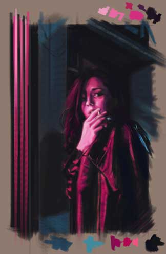
Which prompted me to do this study: Pink neon lights, as that cool red light, as the main light source, under the blue-ish moonlight. (again, shout out to dodeqaa for the information on these things)
Portrait study:

Changed my process a little bit. Gave my brush higher opacity. Same brush with different spacing to pull off textures. Put paint blobs on a layer (like a digital palette) that I can hide/unhide so I can pick the colors from there and not on the piece itself.. I will paint like this in the foreseeable future.
Now that some of that nagging feeling is out of the way, I'm hoping to focus on personal stuff!
If you are reading this, I most likely just gave you a crappy crit! What I'm basically trying to say is, don't give up!
----
IG: @thatpuddinhead
|


.jpg)
