01-05-2017, 12:28 PM
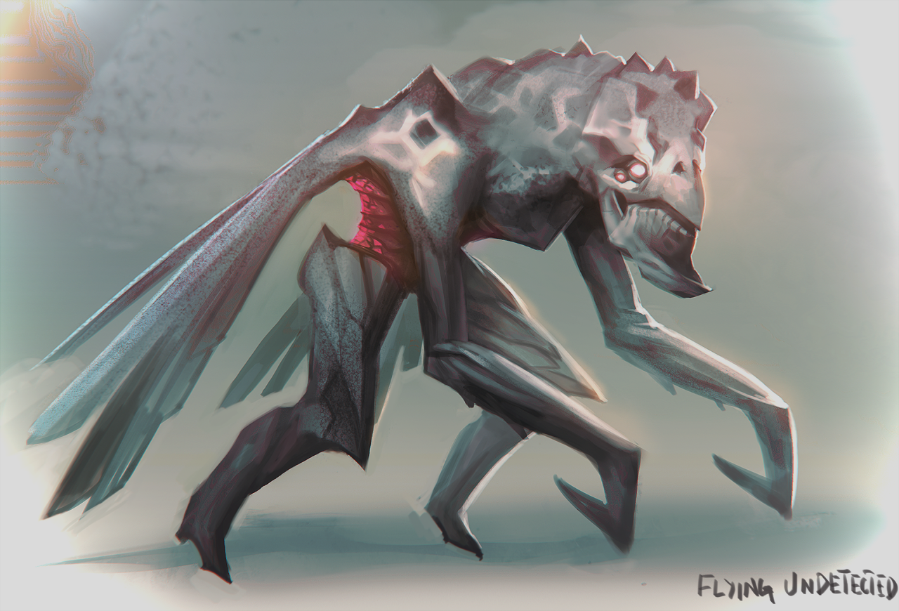
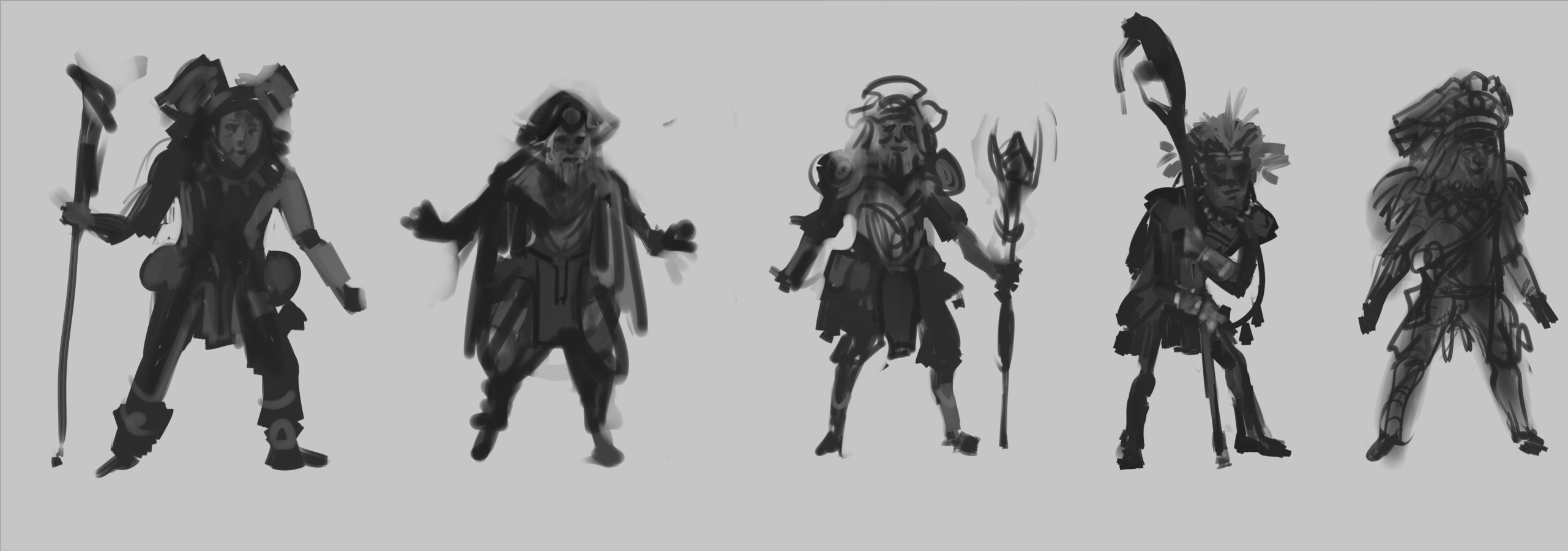
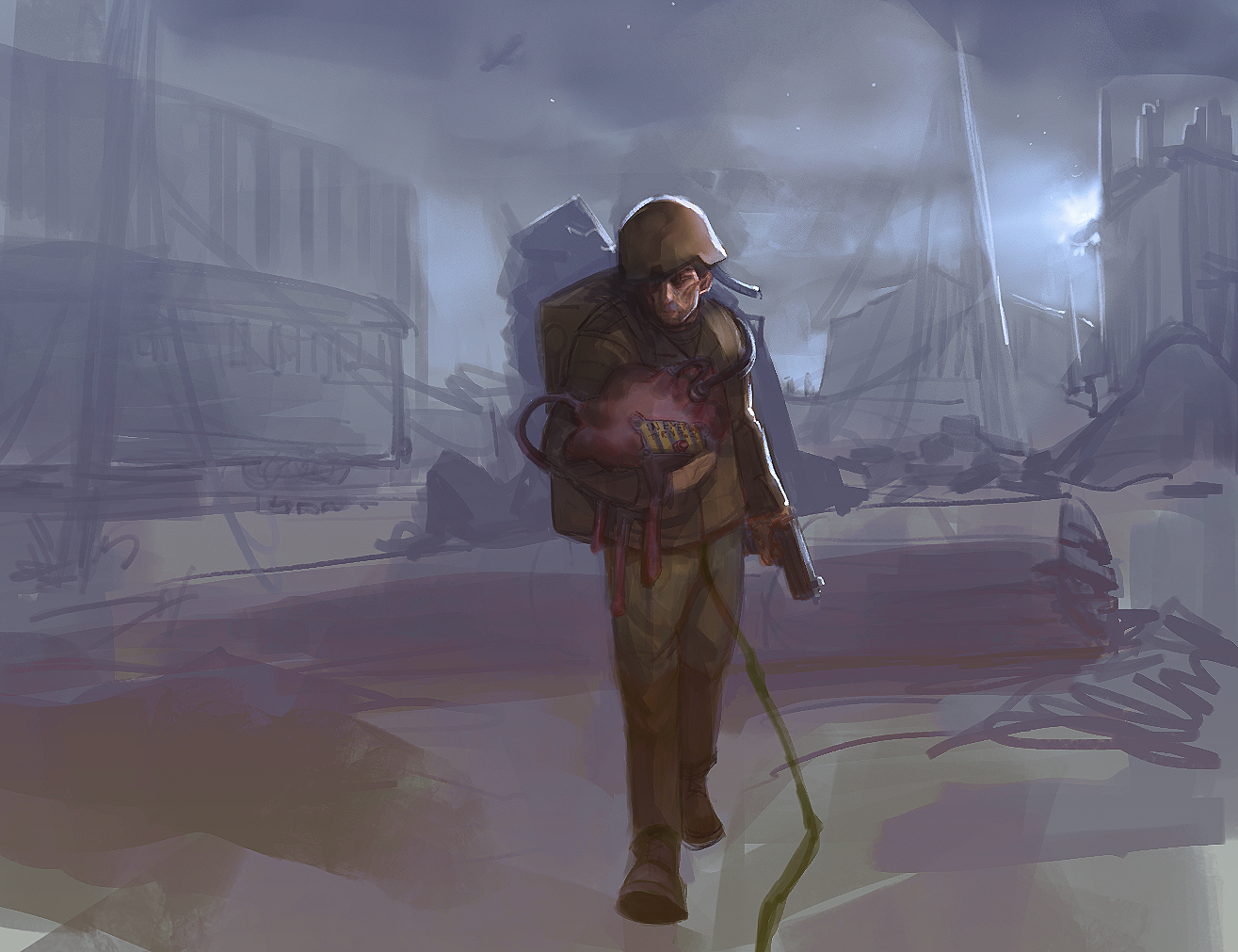
Let's start C&C most highly uber appreciated
|
Please excuse me for scribblin' i can barely draw my name.
|
|
01-05-2017, 12:28 PM
   Let's start C&C most highly uber appreciated
01-06-2017, 03:42 AM
Hey man, nice start, and welcome to CD! These don't look too bad, names on the other hand, can be tough. ;)
The only thing I would say is that the last piece has a bit of disconnect between the character and the background, since the character doesn't have a shadow and the values are a lot darker compared to the background, which is very low-contrast. It looks like a sketch, though, so that may be an intentional decision. Keep posting, I'm excited to see more! |
|
« Next Oldest | Next Newest »
|