Composition and shape design help
#1
Hey guys, my first post here :)

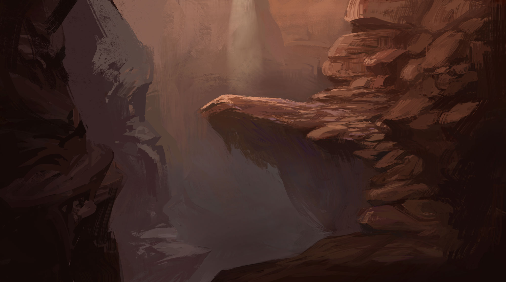
I've been struggling with this unfinished piece for a couple of days now, particularly the left side of the composition. The rock formation shapes don't feel dynamic or add to the overall environment. I'm also struggling with creating a canyon feeling with the rock shapes on the right; it looks like a big rock pile. I'm open to any suggestions and critiques.

Please keep in mind this is unfinished--there is a lot of polish work left to do. This is an assignment for a Skillshare class I'm taking right now, and the overall requirements were to create a hidden path in a cave-ish area and add a single blue flower amidst lots of warm colors. I plan on adding the flower last.

Reply
#2
I think all your rocks on your main pathway all look the same try to vary the sizes large medium small atm they mostly all small which throws the viewer off also its not showing depth and scale, the closest cliffs on the other side maybe make the path wider you could maybe add a character to that path with a torch? Birds flying to fill in blank spaces?
Showing depth is a biggie to me I could do a quick paintover to show you what I mean... If you want? Let me know

Otherwise great job great idea love the colours... Sounds like a cool course your doing....
Reply
#3
(01-03-2019, 07:40 AM)slash razor Wrote: I think all your rocks on your main pathway all look the same try to vary the sizes large medium small atm they mostly all small which throws the viewer off also its not showing depth and scale, the closest cliffs on the other side maybe make the path wider you could maybe add a character to that path with a torch? Birds flying to fill in blank spaces?
Showing depth is a biggie to me I could do a quick paintover to show you what I mean...  If you want?  Let me know

Otherwise great job great idea love the colours...  Sounds like a cool course your doing....

I'd love a paintover, please do :))

Yeah, I agree with the lack of shape variety, but I don't really want to make the path any bigger because I'm also trying to communicate a hidden/precarious kind of path. I like the idea of adding a character--it'd help show scale too, but since I plan on putting the flower on the cliff, the flower's gonna look huge compared to the human. Also, what do you think of the left side of the composition? I don't like the shapes of the rocks but I'm having trouble finding a good dynamic rock shape.
Reply
#4
The hardest thing is to add element that would inform people of the scale because this scene take place in a ravine it become even harder to find good object to renforce the scale.I think you used most of the trick you could such as atmospheric perspective and overlapping.I think the only thing you have not use enough is overlapping smaller vs big element all you have is big shape creating a shape that read as a wall you would need element that read as being individual but not big enought to distract from the flower.

My Sketchbook

Perfection is unmeasurable therefor it impossible to reach it.
Reply
#5
hey sorry just finished work..... yea I see what you mean about scale and having the flower on that ledge.... anyway the main thing I wanted to show you was to bring out the ledges/paths more to make it stand out and give it depth.... all I did was lasso around the main ledges /inverse put a new layer underneath and just added more light to pop out the middle from the backgrounds.... added some foreground fog and some posts/poles to show scale also blocked in the rocks more..... anyway just wanted to give you some ideas so hope this helps


Attached Files Image(s)


Reply
#6
(01-03-2019, 01:34 PM)darktiste Wrote: The hardest thing is to add element that would inform people of the scale because this scene take place in a ravine it become even harder to find good object to renforce the scale.I think you used most of the trick you could such as atmospheric perspective and overlapping.I think the only thing you have not use enough is overlapping smaller vs big element all you have is big shape creating a shape that read as a wall you would need element that read as being individual but not big enought to distract from the flower.

Yeah I think that's what's needed most, too. Do you have any suggestions for a shape I can put in? Also what exactly you mean by overlapping smaller vs big element? Just shape variety?
Reply
#7
(01-03-2019, 01:59 PM)slash razor Wrote: hey sorry just finished work..... yea I see what you mean about scale and having the flower on that ledge.... anyway the main thing I wanted to show you was to bring out the ledges/paths more to make it stand out and give it depth.... all I did was lasso around the main ledges /inverse put a new layer underneath and just added more light to pop out the middle from the backgrounds.... added some foreground fog and some posts/poles to show scale also blocked in the rocks more..... anyway just wanted to give you some ideas so hope this helps

Thank you so much, this helped me immensely! I can see what you meant by adding some birds--it adds motion and scale to the whole image.
Reply


Forum Jump:


Users browsing this thread: 25 Guest(s)