Posts: 369
Threads: 6
Joined: Sep 2019
Reputation:
23
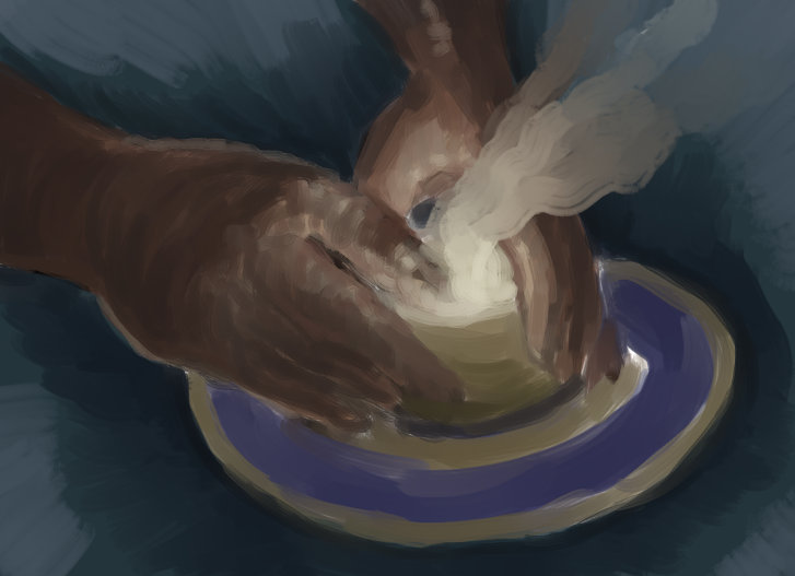
Hello, as I said in my introduction post, I'm back to drawing after a very long break. Instead of resuming my comic projects or doing exercises, I'm letting random inspirations flow out, sometimes doing automatic drawing, which helps me reconnect to a whole world that got suppressed when I was too focused on studying and planning. A few characters from my comics do pop in here and there, although washed out or distorted. I'm afraid these samples will look more like doodles, but that's fine I guess, at least for a while. Thank you for passing by.
Posts: 369
Threads: 6
Joined: Sep 2019
Reputation:
23
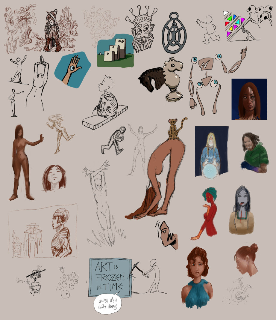
Another batch of doodles - sorry about that :/
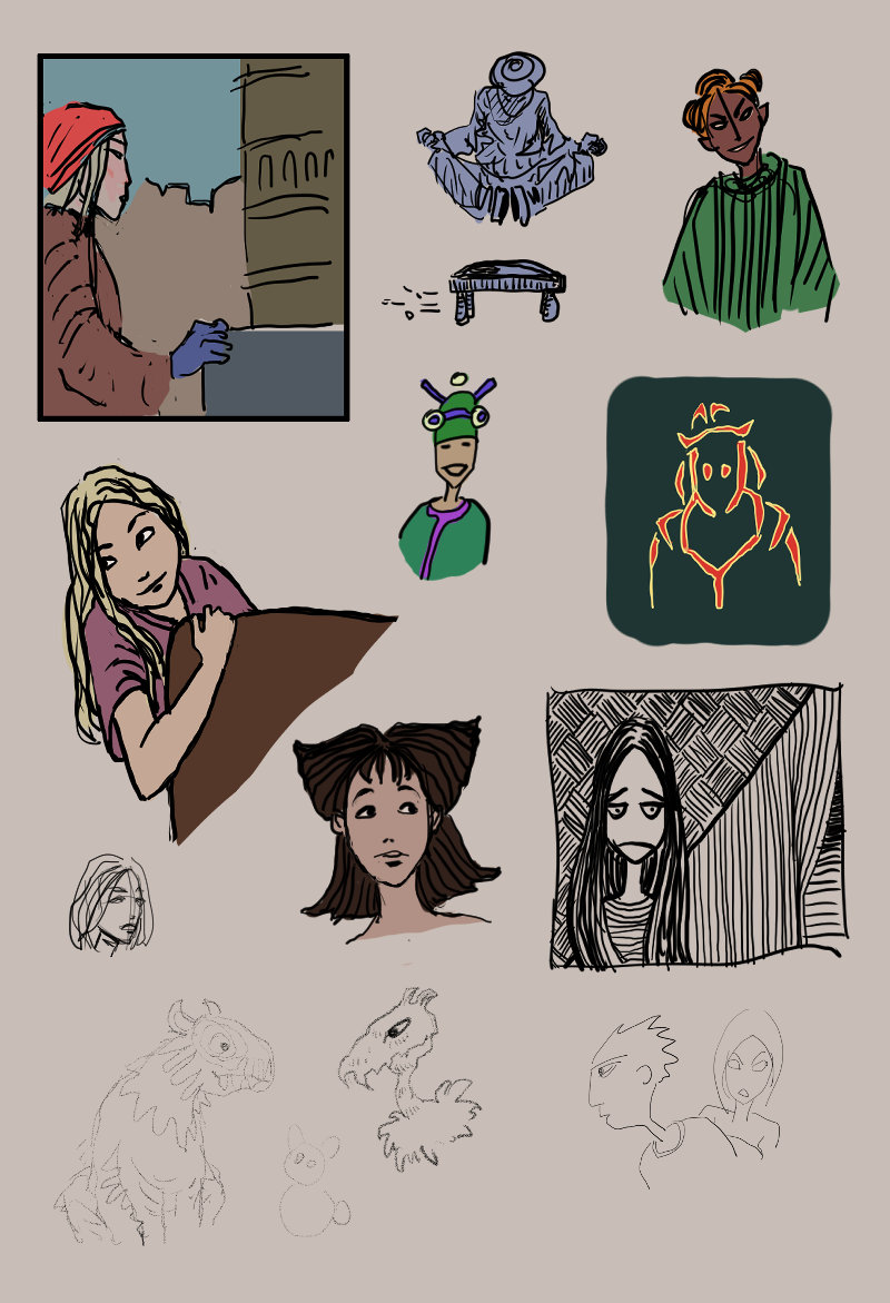
Edit: Inktober started:
Posts: 3,357
Threads: 37
Joined: Aug 2013
Reputation:
234
Doodling is a form of procrastination in my book but if you think it can get you back into drawing than give it a shot.But in my opinion you should cut short in the distraction and get back to your fundamental i know you probably want to keep drawing funny and everything we all care to much about that at first...not gonna lie it can be draining to dive into the theory and application of those fundamental but like there name say they are the basis that will support your artistic journey.If you are going to doodle atleast try to keep sometime for the more serious stuff keep the funny stuff at the end as a reward.That would be my advise.Can you name a few of the fundamental or maybe it a leak of knowing them that is stopping you?
Posts: 369
Threads: 6
Joined: Sep 2019
Reputation:
23
@darktiste - I'll try to explain my mindset: When I have a story to tell and characters to develop I can muster all my strength into the art and the writing, but I got burned on my comic book projects a decade ago - these things take an insane amount of time to make and time is limited. Having lost the hope to tell my stories, I lost the taste for drawing. What is happening to me now, as far as I understand, is that the more recent layers are collapsing and I'm reconnecting to the ancient core where things are less structured but the drive is stronger. In other words, no more projects but an urge to express something (not sure what exactly) in a more primitive way.
I don't deny the importance of the fundamentals. I've actually been drawing a gazillion spheres, boxes, perspective chaos, wire bodies, etc... since childhood. I'm not sure what's left of it after the long hiatus, and I probably lack in all departments, plus I'm suffering from a new shortcoming that appeared with using digital tablets: slanting and skewing the figures, can't fight that off.
I hope this makes sense?
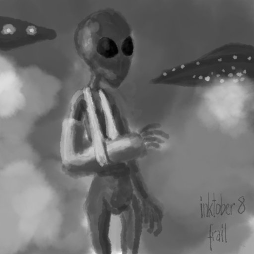
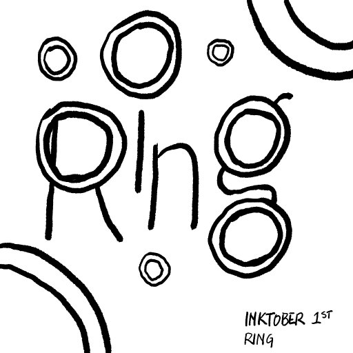
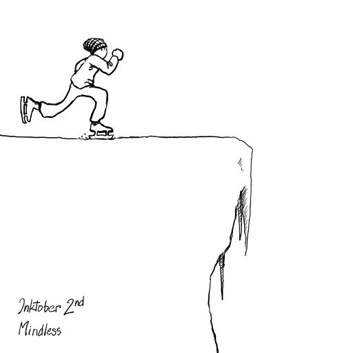
Inktober 2. Feeling bad for spamming the forum with a daily post when I have only this to post - but Inktober is a daily thing by definition.
Posts: 3,357
Threads: 37
Joined: Aug 2013
Reputation:
234
In your case it the art burn out and leak of artistic expression that as made you come back to it if i understand you correctly.But if you had a story there nothing but you to stop yourself from working on making this story come to life slowly you might not have all the time in the world but you can surely take step to bring it to life.Of course since you probably leak time to practice and come up with a story you will probably have to sacrifice sometime you spend on other thing you can afford to push on the side.I think you should look into illustration rather than comic but that an other story.It depend if you like to tell long story or short story.Comic can do both but illustration generally tell a shorter story.One other form of expression i would maybe encourage you do go toward is graffiti since you seem to be leaking time in my opinion graffiti can lead to illustration but it also touch doodling it fun and quick but i can become complex as you progress.One other thing is call a short story it a collection of small story you can put together.So that you don't have to work on a long story.It pretty much depend how much you need to express and the amount of time your willing to put.My final suggestion would be to try a style that combine matte painting and speed painting but this require a great deal of pratice to pull out to be honest.
Posts: 76
Threads: 1
Joined: Oct 2019
Reputation:
5
Very nice style you got going, love the compositions and ideas. Looking forward to more inktober drawings. :-)
Posts: 369
Threads: 6
Joined: Sep 2019
Reputation:
23
@darktiste - All you say makes sense. I did try illustration, wasn't satisfied with how static it is compared to comics. Also tried short stories but guess what - I kept expanding on them XD I just love to develop worlds and characters. Speed painting is really hard indeed, I gave up on it but might give it another go.
@Ash - Thank you! I can't help seeing everything as a page panel. Hope you keep the Inktober pace too!
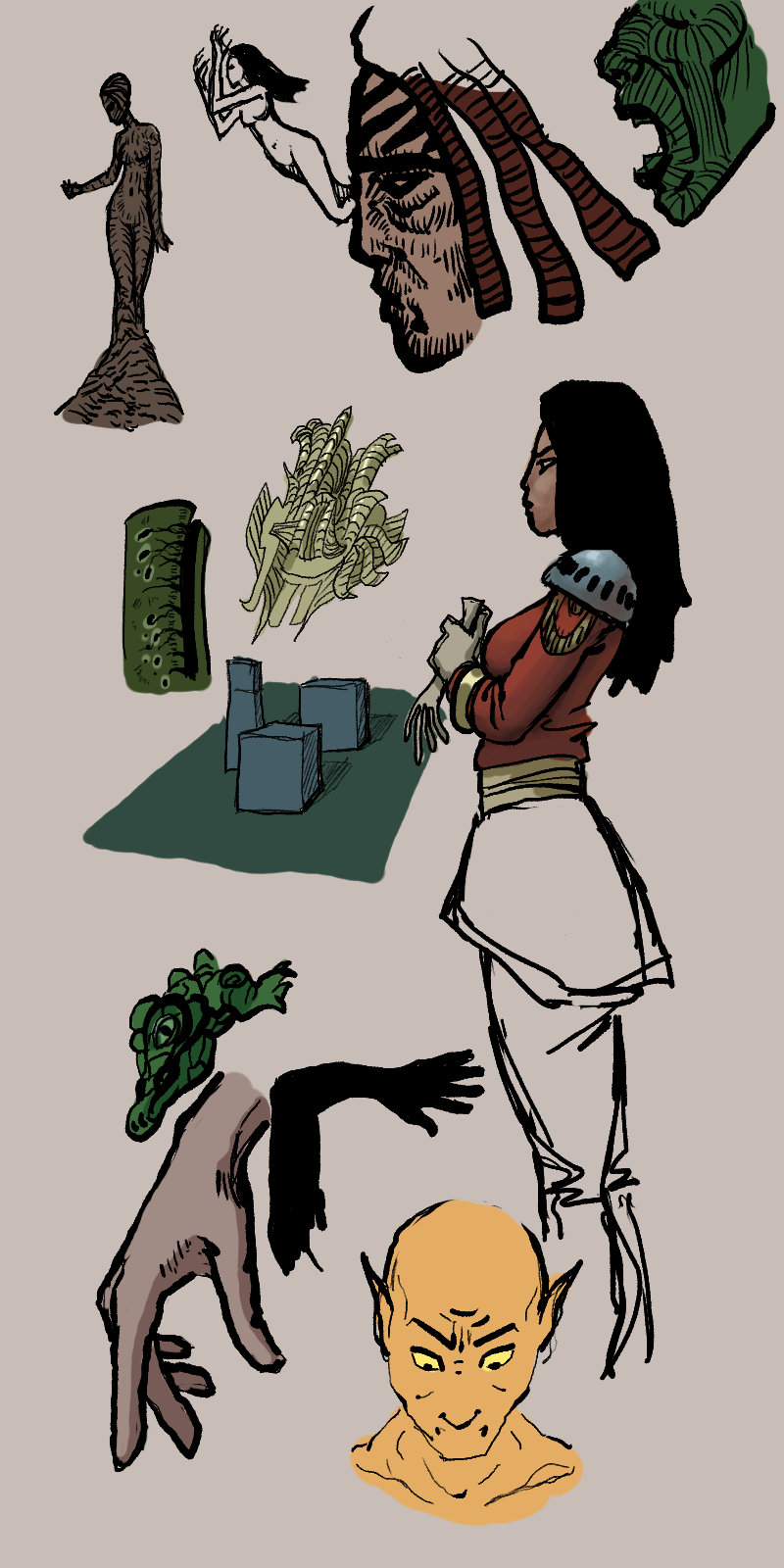
Still doodling from imagination but taking progressively more time to refine:
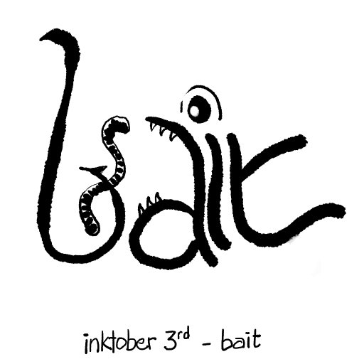
Uninspired inktober:
Posts: 3,357
Threads: 37
Joined: Aug 2013
Reputation:
234
For illustration you need to look into the principle of design such as composition,gesture and exaggeration and how to use those concept to do the storytelling for you if you want to destroy that static feel your talking about.Try to look at comic poster for idea on how they do it.You surely can't say this look static.
![[Image: large-DCD460868.jpg]](https://images-nitrosell-com.akamaized.net/product_images/14/3346/large-DCD460868.jpg)
Posts: 2,817
Threads: 15
Joined: Jun 2013
Reputation:
109
I see what youre going through, i went through it some years ago, one thing that really helped me was getting away from the computer for a solid month. burnouts a real thing for sure, dont take mr darkiste too seriously...
I dont think reccomending studying fundamentals will help you, as from what youve written it seems youre in a different headspace from trying to be a bigshot pro. Just try something wildly different, get away from the computer, maybe even drawing for a month, try something totally different, see how it resonates.
Posts: 3,357
Threads: 37
Joined: Aug 2013
Reputation:
234
(10-04-2019, 09:42 PM)Fedodika Wrote: I see what youre going through, i went through it some years ago, one thing that really helped me was getting away from the computer for a solid month. burnouts a real thing for sure, dont take mr darkiste too seriously...
I dont think reccomending studying fundamentals will help you, as from what youve written it seems youre in a different headspace from trying to be a bigshot pro. Just try something wildly different, get away from the computer, maybe even drawing for a month, try something totally different, see how it resonates.
The reason to going back to the fundamental is because without this he will eventually burn out once again running in circle not understanding why is idea don't translate into what he want to express.But i think the biggest factor at the end is how much time can he put daily what the goal behind is drawing.Some people are more into abstract expression and some are more into realism or storytelling etc.The fundamental are what got me back into drawing so i pay respect to there importance.Yes you want to be able to enjoy drawing first but it can stop being fun when the fundamental get in the way that why you want to get them out of the way first in my opinion so you can enjoy the fun once you got them down.There still way to make learning the fundamental fun.
I certainly encourage you to do the inktober challenge but don't force yourself you should focus on getting back and don't mind my over suggesting tone.Everything i say is not an obligation in any shape or form.
I think my big wall of text can be overwhelming but i just want to share my energy so you can feel supported.
Posts: 369
Threads: 6
Joined: Sep 2019
Reputation:
23
@darktiste - I used the wrong word. By 'static' I meant that an illustration stands alone in time whereas a comic panel is always part of a tightly knit series. I agree with all the principles that you list for illustration, which are used in every comic panel too.
@Fedodika - Well, I'm just back from a ten year break so I'm not burned out yet - I hope ;)
@both - I do value the fundamentals but as I tried to explain, I'm currently exploring a different kind of basics - the drive for expression rather than the means of expression.
Sorry if this is still not clear, I'll try again later with better words. This weekend doesn't leave me a minute for art. I still managed to do (or botch) the inktober dailies:


Posts: 369
Threads: 6
Joined: Sep 2019
Reputation:
23
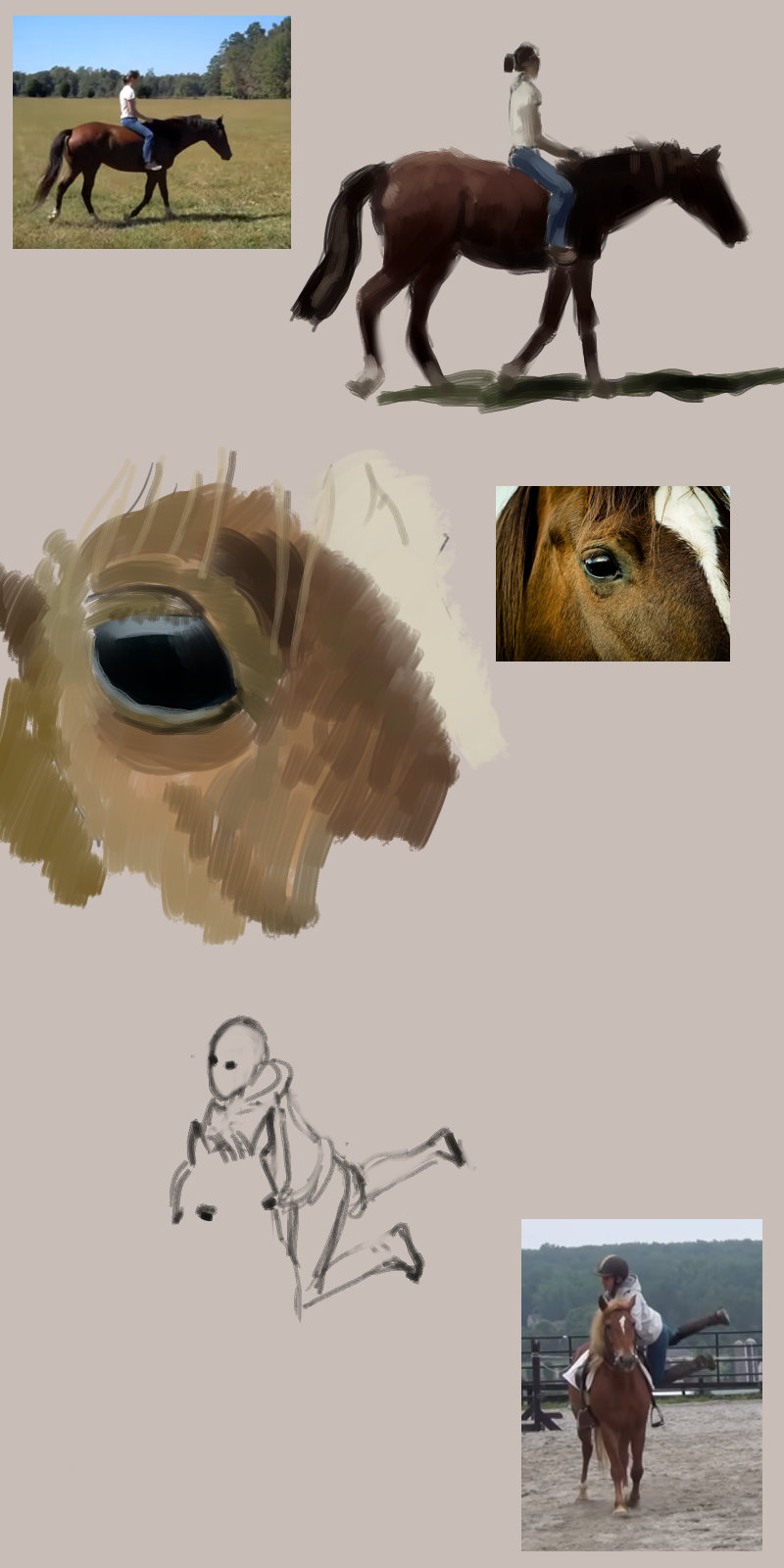
Went back to an old comic project of mine, trying a mix of two formats: endless scrolling and slide show, the latter is the reason for the monotonous panel size. This is the rough "layout" for the first scene of it, by which I reconnect to the story and realize I don't know what a horse looks like anymore. Time to drill these studies again.

And Inktober:

Posts: 151
Threads: 2
Joined: Oct 2019
Reputation:
20
Thanks for leaving feedback back on my SB!
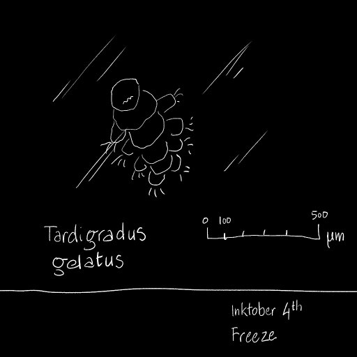
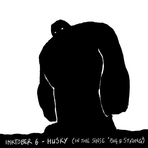
For the husky the low vantage point was a good idea, but since it's a silhouette maybe adding some tiny trees or other composition aid would get the point across better. The freeze one I don't get very well, is it like a microscopic view of a frozen slice of something? I just don't know what a tardigradus is, so I lack context. I comment this because when you are trying to communicate an idea, if you make it very obscure, or needs specialized context, it can be tricky for people to understand and so it can make them not pay attention, on the other hand maybe that is exactly what you want, to only very few to connect with it. Like a close friend joke.
From the small storytelling strip, I agree they feel monotonous, but you are aware of it. I'm personally not too fond of such paneling for that kind of interaction. I could see it working well if you do high density shots, with detailed environments and long exposition, like a street filled with people, busy, showcasing intricate interactions or complex situations , but for close ups and back and forth dialogue feels overbearing.
Nonetheless, from the initial 3, you could get rid of the "Again?" one, put that bubble on the top one as an out of focus comment. Then use that last 3rd one for a different view, maybe showing what I'm guessing is happening, that character turns into a horse? Like show a bit of how it happens.
You could also merge the last 2 of the second page into a big large one, showing her riding and both talking inside the panel to one another. that way you break a bit the 3 panel pacing.
Also, have you read "Scott McCloud, Understanding Comic: the invisible art" by any chance? Someone recommended it to me a few months ago and it really blew my mind on how I was looking at comic books, things I had never understood like how abstracting a character can make it more relatable to a reader, well, that was just enlightening. If you haven't maybe there's a few things in there that can be helpful.
Aside, if you want to storytell, or do storyboards, you don't necessarily need huge skills, so long is understandable you can make them, just try to put the right info on each panel, important details or design choices.
Let's keep it up!
Posts: 76
Threads: 1
Joined: Oct 2019
Reputation:
5
Hey I'm liking those inks, nice style!
So now I had to find out what a tardigradus is, found some videos on youtube, that's a pretty cute creature ... in it's own way. 
Posts: 369
Threads: 6
Joined: Sep 2019
Reputation:
23
@Rotohail:
It crossed my mind to make the inktober husky guy a giant but I couldn't decide on this. Maybe I should have. His looking down seems to lead to this naturally indeed.
I was really dry of any idea for the inktober freeze until I suddenly remembered the experiment when they deep froze water bears and woke them up thirty years later: https://blogs.scientificamerican.com/art...-lay-eggs/ . I should have included the link with the image, you're right.
I totally see your point about the panel rhythm. I was trying to set up a slide show type of comic similar to the one here: https://turbointeractive.fr/episode-1/ (Select the language, click in the center of the image to go full screen and use the right and left keyboard arrows to read.) I didn't use the tricks that this medium allows because it wouldn't show here, and I'm still torn between this and the endless scrolling down medium (no pages).
I also see your point about the dialog. Here I was torn between two contradictory needs: This being the first scene, I have to include introductory panels of the characters; and the need for conciseness. As for showing the character's shapeshifting, I was torn again between the mystery and the explicit (introductory material); the former won.
I will probably redo the first scene several times. I did at least ten versions of it years ago XD So I appreciate immensely your feedback on it, it helps me put all the doubts into words. I have not read the whole of Scott McCloud but I did read about comics from various sources, it's a very complex matter that has never ceased to haunt me even during my long break away from anything art-related.
Doing layouts (storyboards) is actually what I ended up doing exclusively when I was slowly giving up on my comics. It was a way to work fast while still staying connected. After that I started looking for artists to collaborate on the projects - and this proved quite a challenge too.
Thanks a ton for all your feedback!
@Ash:
Lovely bears, aren't they? :D Thank you!
So, study I said, study I do - as painful as it is to start again:

Inktober. This is supposed to be digital diluted ink but I'm not sure:

Posts: 369
Threads: 6
Joined: Sep 2019
Reputation:
23
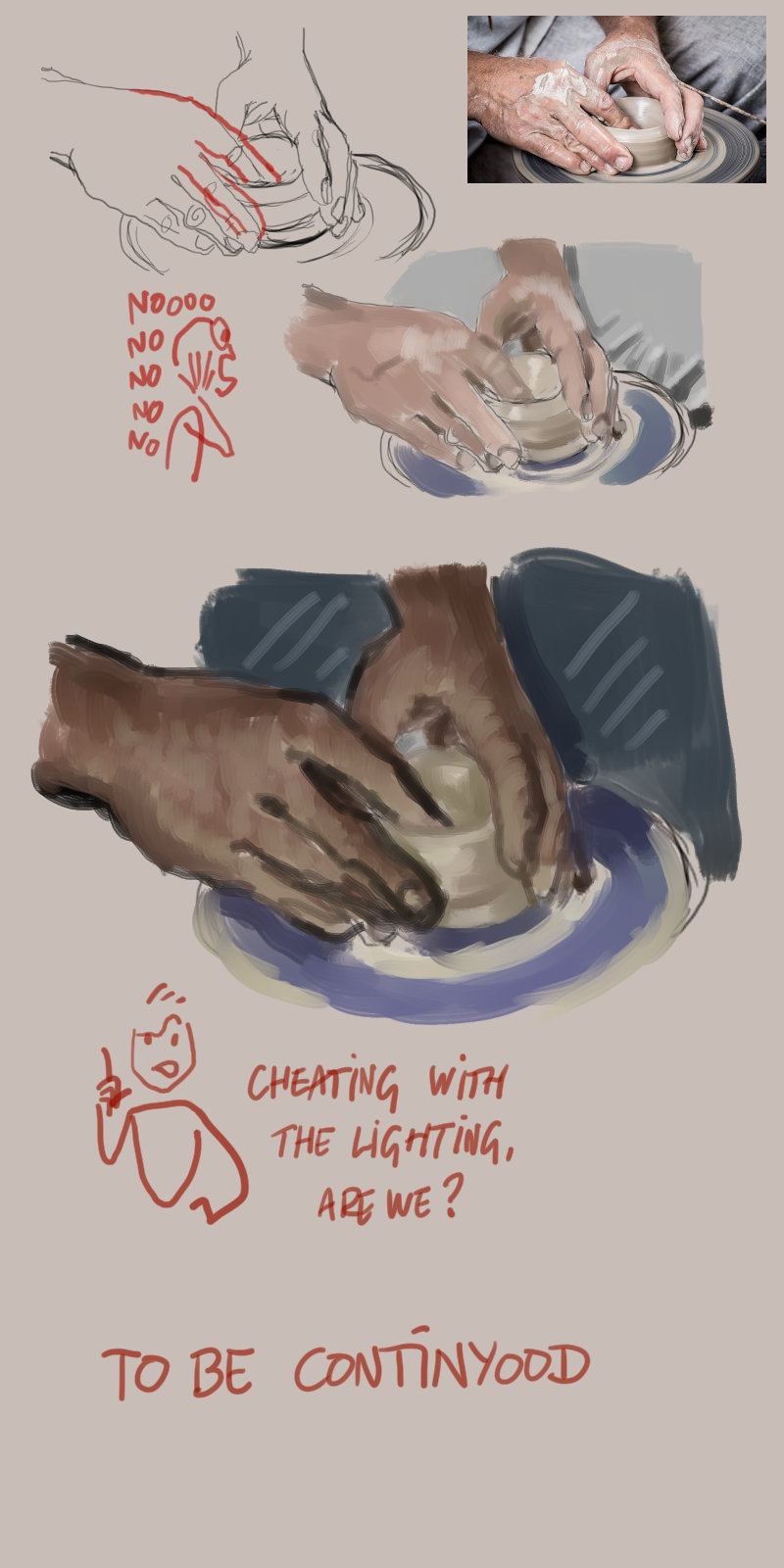
Today's lesson: How not to study:

Inktober:

Posts: 3,357
Threads: 37
Joined: Aug 2013
Reputation:
234
You should work toward being able to work in greyscale before you work in color.For this you use your photo reference and you use the option desaturation.You than only use grey tone and focus on value rather than work on color right away since it much challenging to estimate color temperature and saturation than it is to estimate value.
Posts: 369
Threads: 6
Joined: Sep 2019
Reputation:
23
@darktiste - I was initially going just for the line but got carried away into painting until I realized the lighting in the original photo is horrible, and I started changing everything. I did a lot of grayscale in the past, then a lot of color, both mostly as direct painting; in the end, I was mostly doing layouts in solid grayscale to save time.
The study gone totally something else for fun:

Redoing the layout of the first scene of the comic (in solid grayscale, hey). Gave up the slide show format, doesn't make sense when displayed here. Turned to the vertical pageless format. Rotohail, I integrated some of your critiques into the new version, thank you for these.

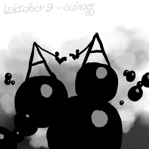
No inktober today, the word, 'pattern,' didn't inspire me.
Posts: 3,357
Threads: 37
Joined: Aug 2013
Reputation:
234
I think there definitively to much space being use for the text it steal the show to much white space around also text.Also you should think more about the rythme and format of the box.I never have seen a scroll like comic and i think that there a reason for that.Also there some missed information i feel like there should be a transformation box for when he turn into an horse you didn't bother doing for it would be to complex to figure out... but the fact that the horse talk kinda help sell the idea he just transformed so idk up to you.
Posts: 151
Threads: 2
Joined: Oct 2019
Reputation:
20
Ha ha ha! That not to study made me chuckle quite a bit! Hey! That's the right mood to have, so thumbs up! I guess the advice that should be given is that you focus on something at a time when studying, do you want to get the proportions, angles, the drawing right, do you want the values/colors? Try to set yourself a gold and focus on a stage, repeat as necessary. You have the picture! So is easy to check where you are failing at. It takes time and patience so just keep trying!
I see you still trying with those panels! I think I like the changes on format. I have to agree with darktiste, best to show a bit more the transition to horse or if you want to leave to the imagination go a bit surreal or do like an in between centaur for example or give it a funny horse head! Bojack. Ha. Joking aside, I'm sure you can come up with something. Is an opportunity to make the reader be in awe!
|


![[Image: large-DCD460868.jpg]](https://images-nitrosell-com.akamaized.net/product_images/14/3346/large-DCD460868.jpg)
