04-26-2020, 11:22 PM

|
Osmium's Sketchbook
|
|
04-26-2020, 11:22 PM

04-26-2020, 11:45 PM
 
04-26-2020, 11:51 PM
  
04-27-2020, 12:06 AM

04-27-2020, 02:34 AM
Welcome
Minimalist so far.I suggest if you go this route to invest time in your line weight and invest in learning the rule of composition.Are you more interested in illustration,animation storyboarding or comic book?It seem to be the path you been following right now.In term of style,story telling.Your first two paint are more like study but your personal work look more like it fit those field.Don't feel limited by what i am saying maybe this can help you take a more precise direction in the future.
04-27-2020, 04:20 AM
(04-27-2020, 02:34 AM)darktiste Wrote: Welcome Well, you are absolutely correct. Still an art hobbyist, my progress has been made by following the work of animators and comics book artists more than any other entertainment industry. The word "Composition" is hitting hard on my mind lately, that's why I've been making short comics (which I'll post later), so I won't keep drawing my characters floating around on a blank white canvas... Line weight wise, i still don't feel the appeal of varying the weight of my linework but I do see it everywhere. Thanks for welcoming me!
04-27-2020, 06:14 AM
Some artists make a whole style out of not varying line weight (e.g. ligne claire). It all depends on what you're going for.
Which artists do you most aspire to be like? The pieces you've posted make me think of French comic artists like Moebius, especially the hooded demon fellow (which happens to be my favorite piece).
04-27-2020, 06:30 AM
(04-27-2020, 06:14 AM)Pubic Enemy Wrote: Some artists make a whole style out of not varying line weight (e.g. ligne claire). It all depends on what you're going for. Yes, I do believe the amount of detail on top of common art foundations is a matter of personal flavor. My inspirations include Moebius, but I didn't thought of his work while making my hooded character - that is an interesting topic to talk about: How unconsciously does visual library work? Thanks for your comment!
04-27-2020, 08:19 AM
Welcome!
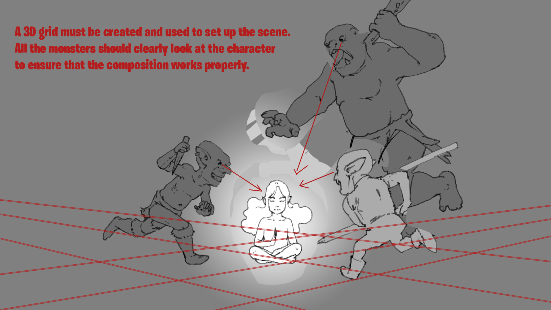
Well line weight matters, all elements of design act like, with music, parts of a melody. Line by itself is like a beat, a single beat, can be the core of a really good song, but by itself, it's too monotone, too boring. You can also try breaking your lines, play with opacity, even stack them or use them to build texture somehow, not just varying weight. There's a lot you can do. The more you can think of, the better the songs, when you know when to play the right notes that is. Alright so what's the deal with the orcs attacking the lone peaceful... eh, elf?
04-27-2020, 06:17 PM
12-15-2020, 02:49 AM
I think your art is really neat and looks good so far! I look forward to seeing where you decide to take it!
 I have some feedback for one of your images. Basically, you should take more care when planning out your image and where to place your figures. Try to measure out a grid before you start placing them to ensure that you maintain the illusion of objects in 3D space:  Keep up the good work! |
|
« Next Oldest | Next Newest »
|