Posts: 4
Threads: 2
Joined: May 2020
Reputation:
0
 05-19-2020, 03:43 PM
Hey there,
I've been pretty overwhelmed on where I should start with improvement so I've flocked to here looking for second opinions ^^
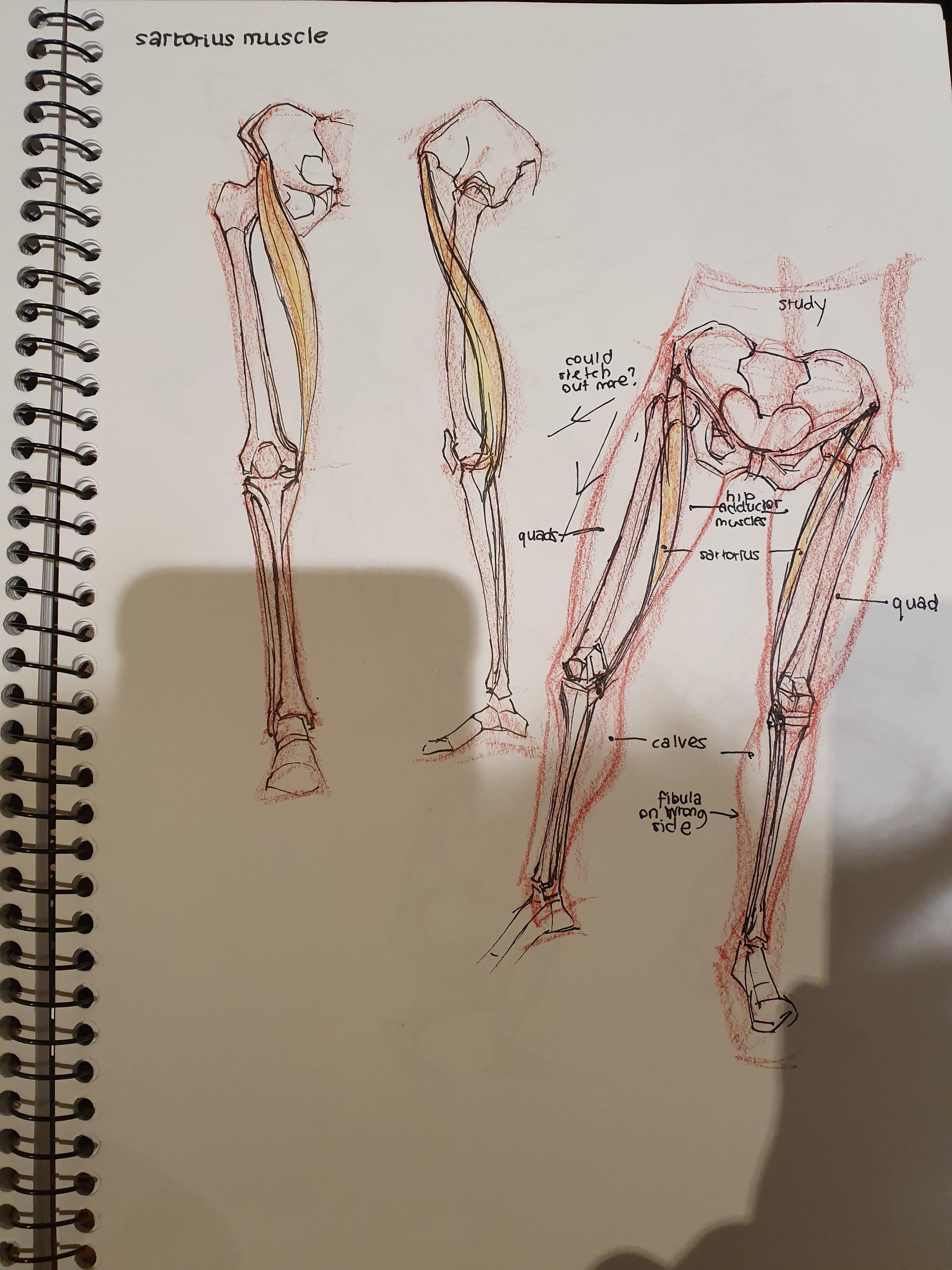
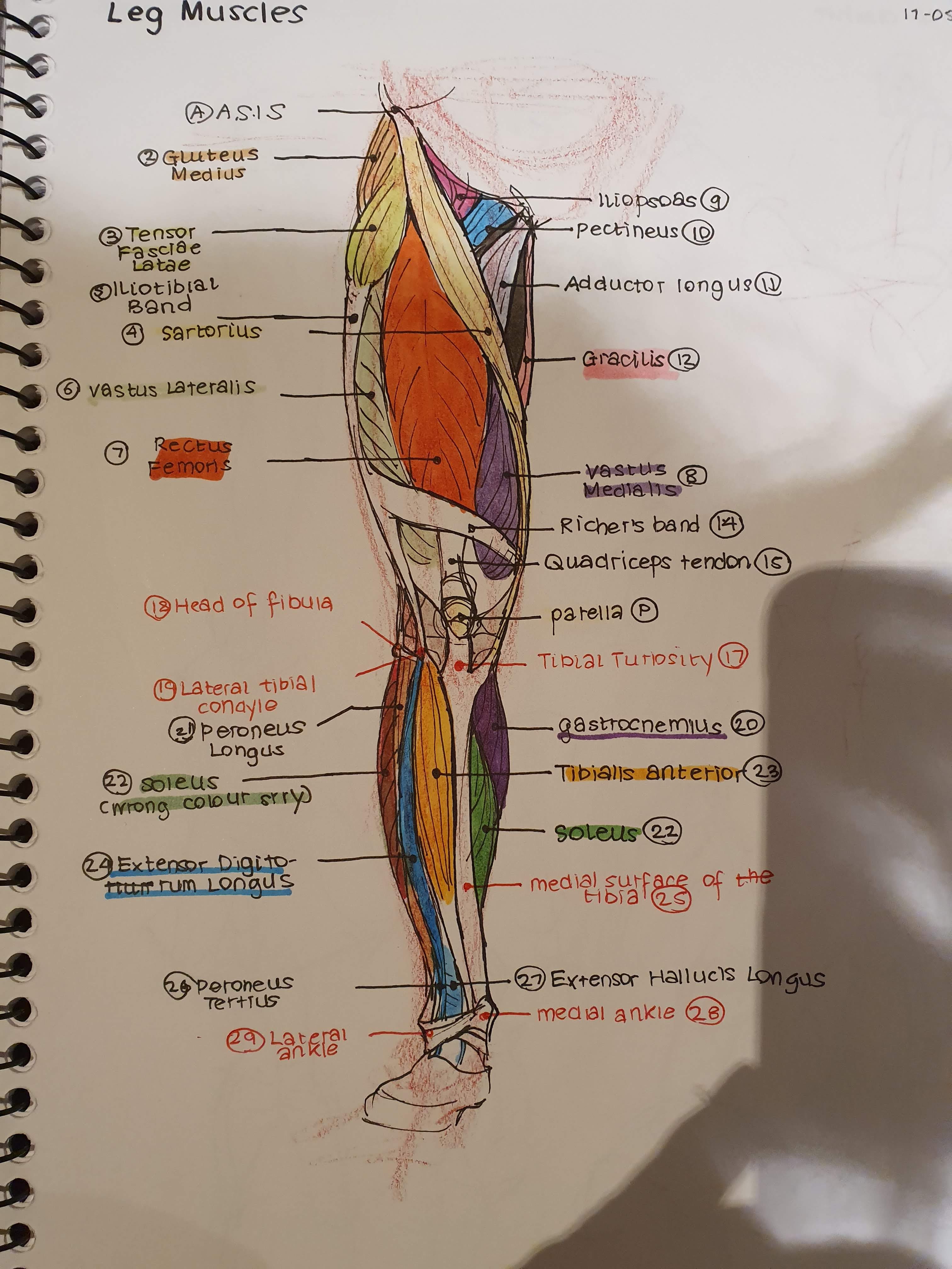
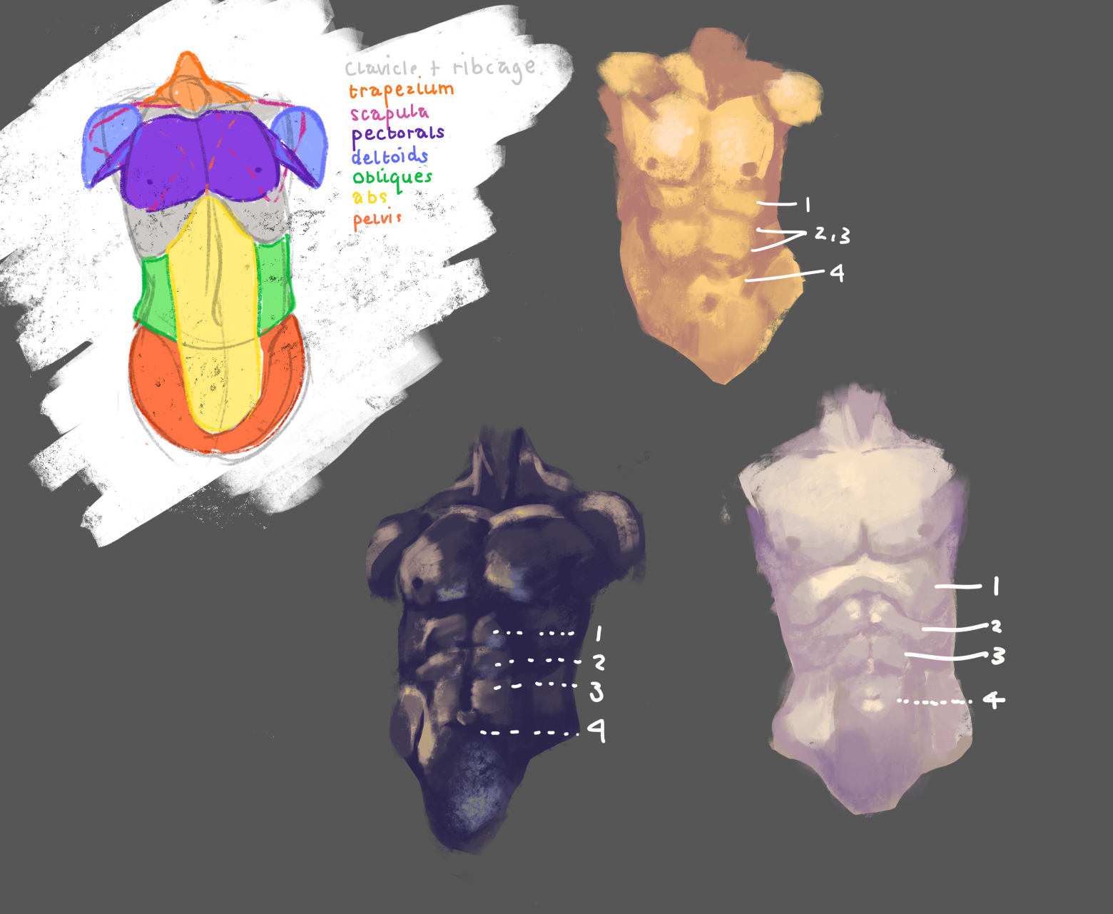
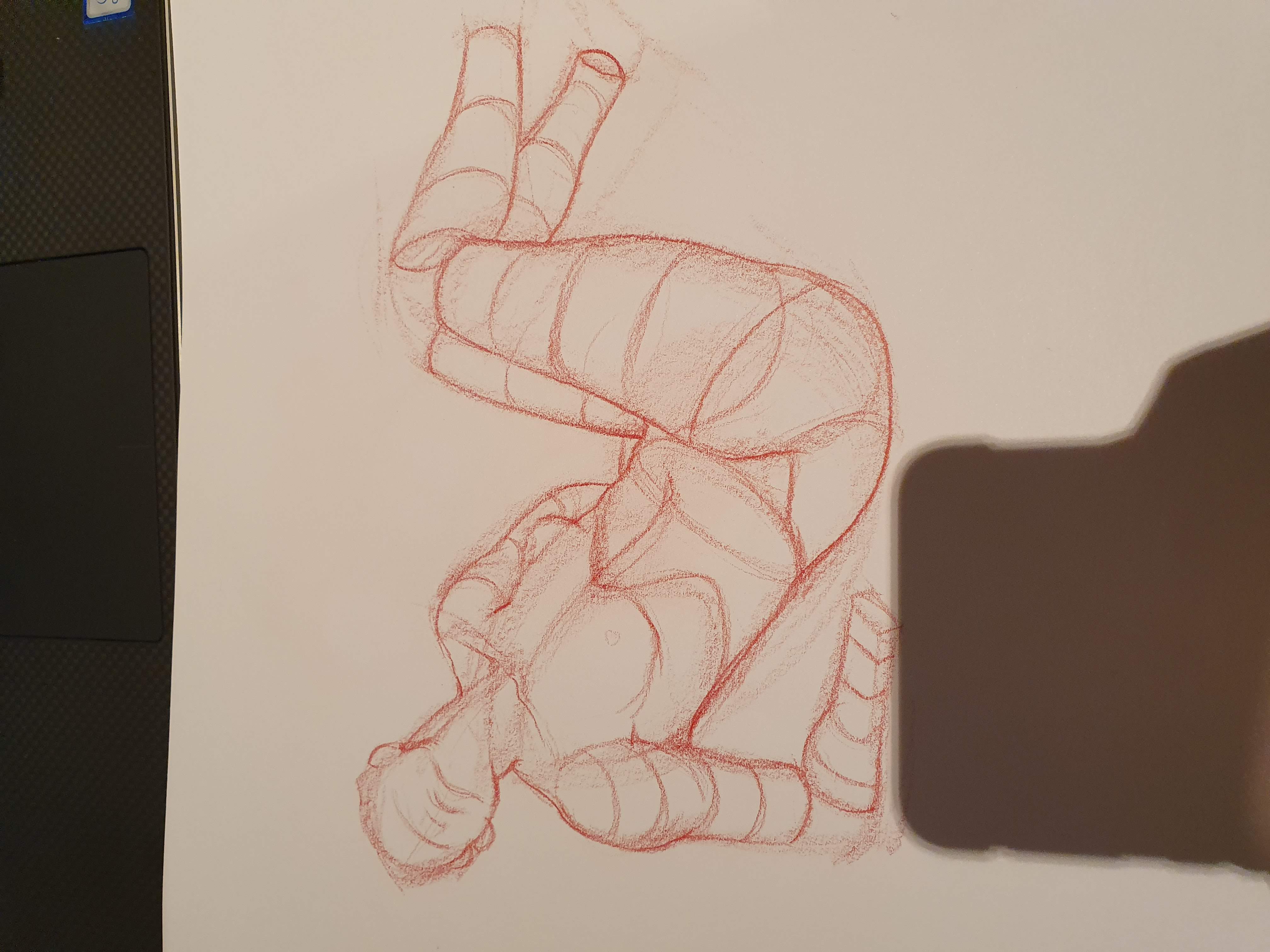
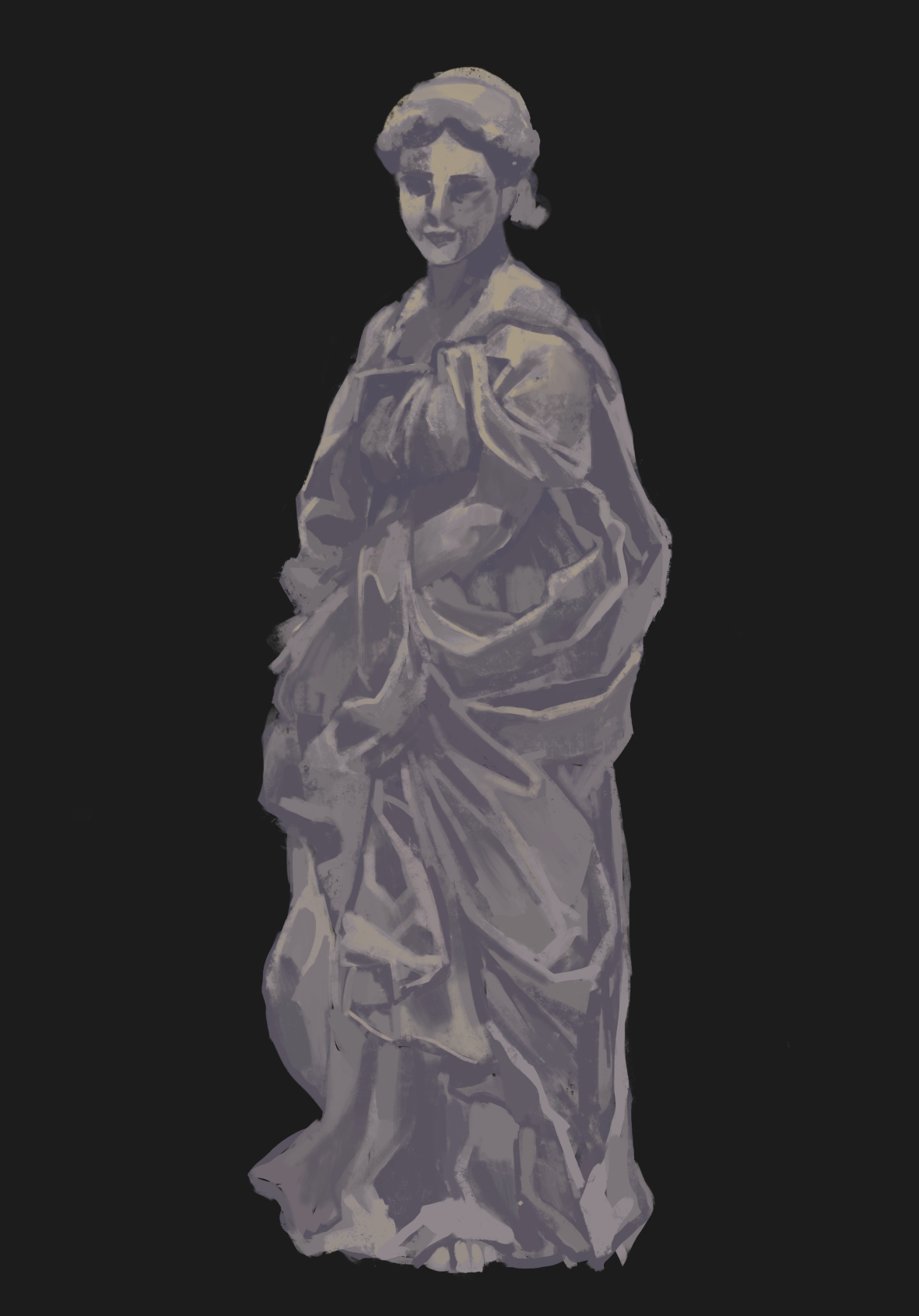
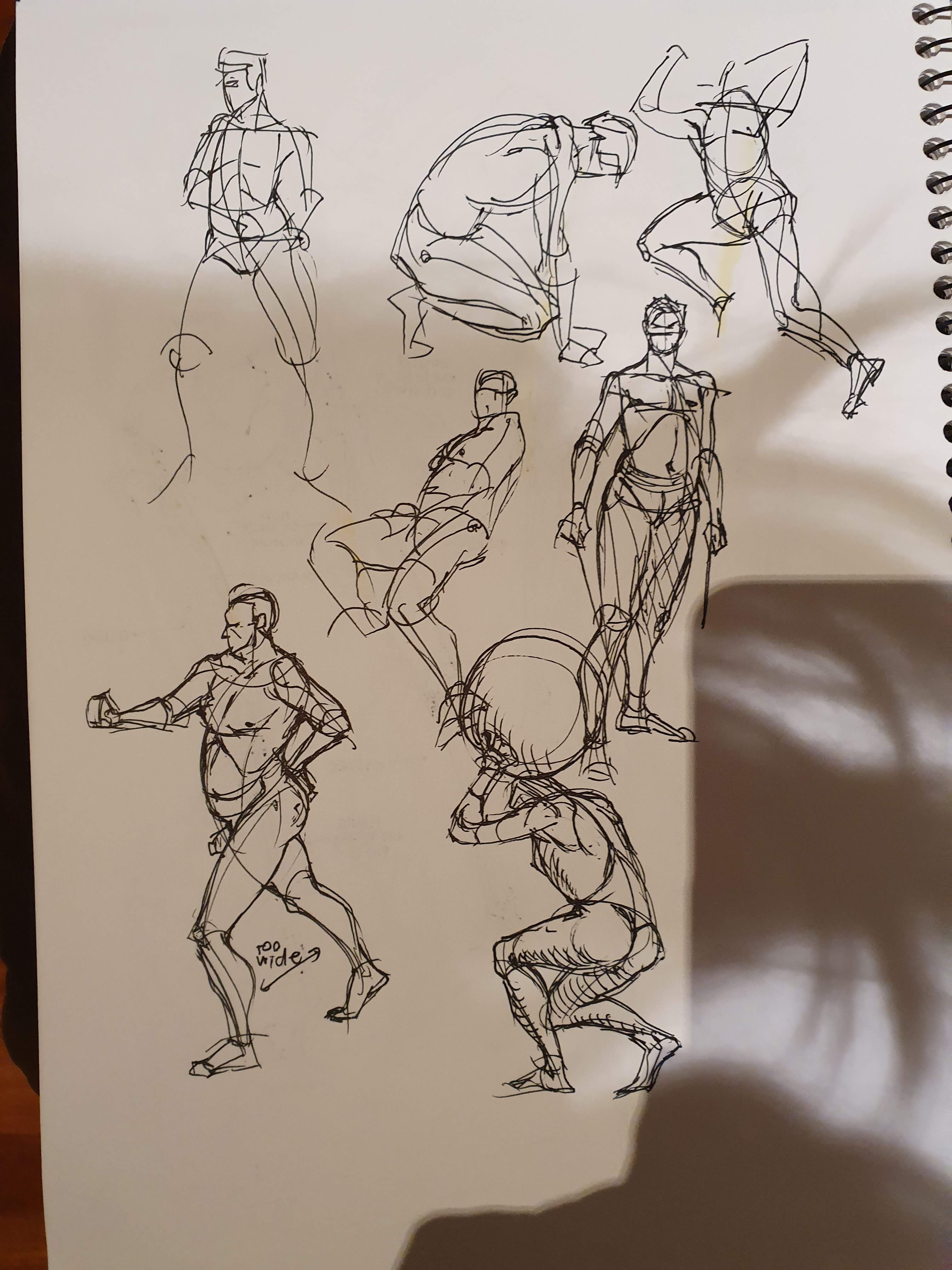
Will be uploading some of my recent artworks as well as studies for which I would love to get feedback - I'm particularly looking for feedback on anatomy (mainly specific body parts) or perhaps any pointers to fundamentals I should revisit :)
Many thanks in advance!
P.S I'm not sure if attachments are working so if you don't see any images please bear with me
P.P.S I'm adding new attachments but they don't see to be showing up so :(
P.P.P.S Just seems like my files are too big so I just had to resize them - though it doesn't seem like I can add some of my artworks despite resizing them
.jpg)
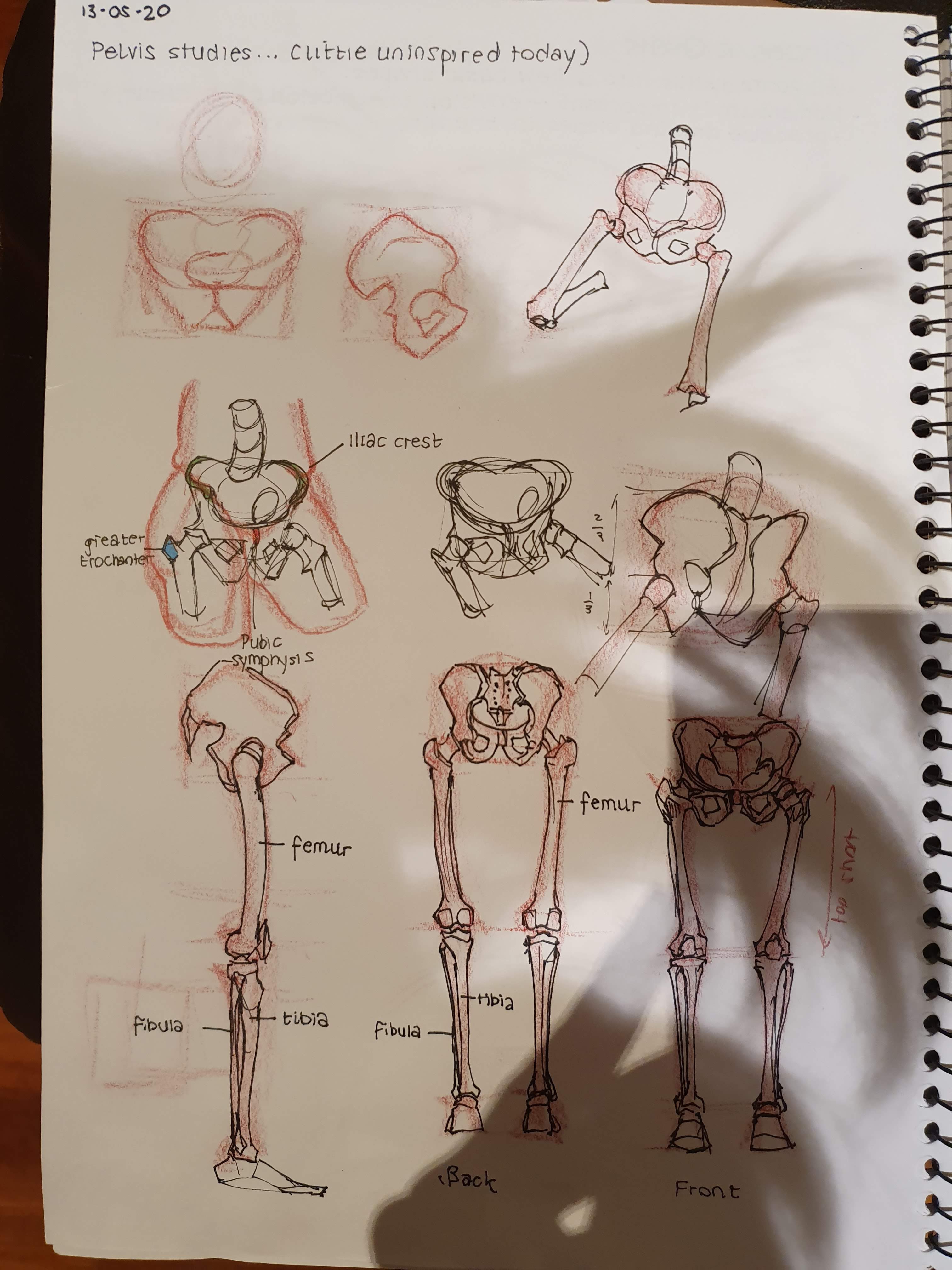.jpg)


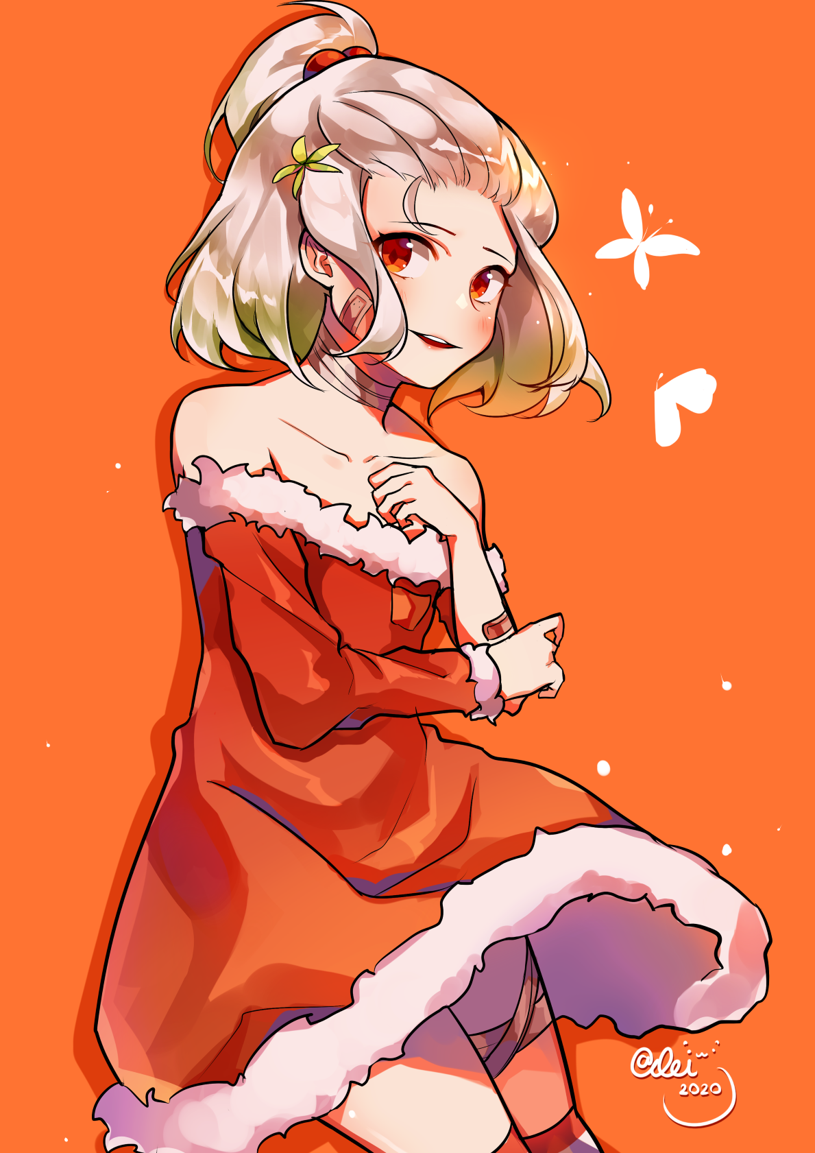
And some of my (recent) completed artworks:


Posts: 432
Threads: 70
Joined: Mar 2020
Reputation:
69
If you have a file that's too big, try compressing it instead of resizing. You'll get a picture of the same size that takes up a mere fraction of the harddrive space with no noticeable loss in quality. https://tinypng.com/
When adding artworks, make sure you click the "Add Attachment" button every time, or the file will be replaced when you add another. If you did that already, I don't know where the problem could lie.
I think you have a very good practicing approach, actually. Keep this up and improvements will come.
One thing I can suggest is to do more studies of real people in all sorts of different poses, similar to those quick studies of a guy, but with cleaner contours. You might be doing this already, so feel free to disregard me if so. I'm mentioning it because even if you have perfect technical knowledge of anatomy, it is still very hard to figure out how all the bones and muscles look in different poses and from different angles. The main thing that learning anatomy is helpful for is that it enables you to figure out what you're looking at on a real person.
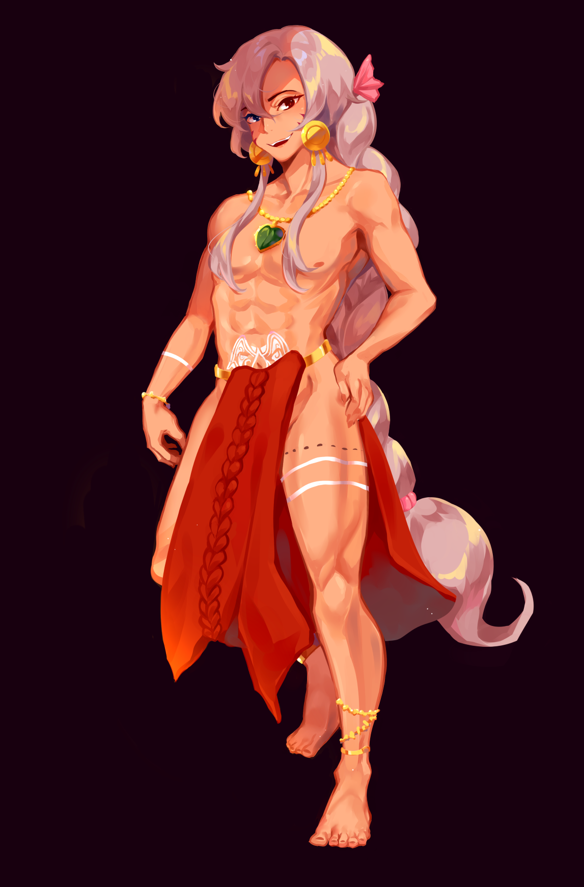
Since you asked for feedback on specific body parts I'll give you some nitpicks. In maobaby.png (nice style on that one, by the way-- was it inspired by Rei?) the shape of the arm that's on his hip isn't outright incorrect but it could be made more naturalistic, if you want. Here's a picture of a BodyWorlds cadaver with the arm seen from a similar angle, although the hand position is different: https://i.imgur.com/ISgspDg.jpg
Mostly take note of how convex the whole upper arm and elbow is. Also, on the leg that's in front, the lateral malleolus (you've probably encountered that word, but if not, it's jargon for "pointy part on the side of the ankle") is higher up than the medial one, when it should be the opposite. Lots of anime artists do this, and I don't know why; it looks weird to me! It's your world though, you gotta do what you want. Also, while the lighting is mostly good, it's a little inconsistent in spots. Based on the shadows it looks like he's mostly lit from the upper right, but the leg that's up front looks like it's lit from the opposite side, mostly because the medial side of the tibia is brightest. It doesn't hurt the overall impression much though. The rest of the shapes mainly look like stylization choices so I'm not gonna nitpick further.
Overall though, I think you're doing really well. Keep doing what you're doing.
Posts: 3,357
Threads: 37
Joined: Aug 2013
Reputation:
234
In photoshop i tend to change the file type to jpeg so you can actually control the file quality to fit the file size limit if i can't have my image in pgn.I certainly know nothing about image quality right now but that the trick i use if an image doesn't want to upload.
Posts: 4
Threads: 2
Joined: May 2020
Reputation:
0
(05-19-2020, 09:26 PM)Hello there!I just read your reply and it honestly made my day, I don\t think I could express enough gratitude for you taking the time to look at my art and to give me very lengthy and valuable feedback - It means a tenfold to me! :DI Wrote: If you have a file that's too big, try compressing it instead of resizing. You'll get a picture of the same size that takes up a mere fraction of the harddrive space with no noticeable loss in quality. https://tinypng.com/
When adding artworks, make sure you click the "Add Attachment" button every time, or the file will be replaced when you add another. If you did that already, I don't know where the problem could lie.
I think you have a very good practicing approach, actually. Keep this up and improvements will come.
One thing I can suggest is to do more studies of real people in all sorts of different poses, similar to those quick studies of a guy, but with cleaner contours. You might be doing this already, so feel free to disregard me if so. I'm mentioning it because even if you have perfect technical knowledge of anatomy, it is still very hard to figure out how all the bones and muscles look in different poses and from different angles. The main thing that learning anatomy is helpful for is that it enables you to figure out what you're looking at on a real person.
Since you asked for feedback on specific body parts I'll give you some nitpicks. In maobaby.png (nice style on that one, by the way-- was it inspired by Rei?) the shape of the arm that's on his hip isn't outright incorrect but it could be made more naturalistic, if you want. Here's a picture of a BodyWorlds cadaver with the arm seen from a similar angle, although the hand position is different: https://i.imgur.com/ISgspDg.jpg
Mostly take note of how convex the whole upper arm and elbow is. Also, on the leg that's in front, the lateral malleolus (you've probably encountered that word, but if not, it's jargon for "pointy part on the side of the ankle") is higher up than the medial one, when it should be the opposite. Lots of anime artists do this, and I don't know why; it looks weird to me! It's your world though, you gotta do what you want. Also, while the lighting is mostly good, it's a little inconsistent in spots. Based on the shadows it looks like he's mostly lit from the upper right, but the leg that's up front looks like it's lit from the opposite side, mostly because the medial side of the tibia is brightest. It doesn't hurt the overall impression much though. The rest of the shapes mainly look like stylization choices so I'm not gonna nitpick further.
Overall though, I think you're doing really well. Keep doing what you're doing.
Posts: 4
Threads: 2
Joined: May 2020
Reputation:
0
(05-19-2020, 09:26 PM)Gah I wrote a very lengthy response to your comment but it all got cut out- I don\t think I properly understand how replies work in forums yet T-T Wrote: If you have a file that's too big, try compressing it instead of resizing. You'll get a picture of the same size that takes up a mere fraction of the harddrive space with no noticeable loss in quality. https://tinypng.com/
When adding artworks, make sure you click the "Add Attachment" button every time, or the file will be replaced when you add another. If you did that already, I don't know where the problem could lie.
I think you have a very good practicing approach, actually. Keep this up and improvements will come.
One thing I can suggest is to do more studies of real people in all sorts of different poses, similar to those quick studies of a guy, but with cleaner contours. You might be doing this already, so feel free to disregard me if so. I'm mentioning it because even if you have perfect technical knowledge of anatomy, it is still very hard to figure out how all the bones and muscles look in different poses and from different angles. The main thing that learning anatomy is helpful for is that it enables you to figure out what you're looking at on a real person.
Since you asked for feedback on specific body parts I'll give you some nitpicks. In maobaby.png (nice style on that one, by the way-- was it inspired by Rei?) the shape of the arm that's on his hip isn't outright incorrect but it could be made more naturalistic, if you want. Here's a picture of a BodyWorlds cadaver with the arm seen from a similar angle, although the hand position is different: https://i.imgur.com/ISgspDg.jpg
Mostly take note of how convex the whole upper arm and elbow is. Also, on the leg that's in front, the lateral malleolus (you've probably encountered that word, but if not, it's jargon for "pointy part on the side of the ankle") is higher up than the medial one, when it should be the opposite. Lots of anime artists do this, and I don't know why; it looks weird to me! It's your world though, you gotta do what you want. Also, while the lighting is mostly good, it's a little inconsistent in spots. Based on the shadows it looks like he's mostly lit from the upper right, but the leg that's up front looks like it's lit from the opposite side, mostly because the medial side of the tibia is brightest. It doesn't hurt the overall impression much though. The rest of the shapes mainly look like stylization choices so I'm not gonna nitpick further.
Overall though, I think you're doing really well. Keep doing what you're doing.
Posts: 432
Threads: 70
Joined: Mar 2020
Reputation:
69
I hope I helped you out. This forum is a bit hard to figure out since it doesn't show the plain text of your post unless you click the little "View source" icon when making a reply. I've also noticed weird things happening when previewing posts.
I can't help you much without being next to you at the computer, so feel free to reply without quoting for now if there's something you'd like to say or ask.
Posts: 460
Threads: 10
Joined: Mar 2016
Reputation:
64
Nice work so far on your studies and personal work! Nice to see some stylistic work on the forum!
Anatomy can be a pretty overwhelming subject, and in my experience, you never get fully "done" learning it. Are you working with any special books or resources at the moment, or are you just studying from photos? It may be beneficial for you to sign up to a life drawing class as well if thats a possibility.
Keep up the good work!
|


.jpg)
.jpg)


.jpg)
.jpg)
