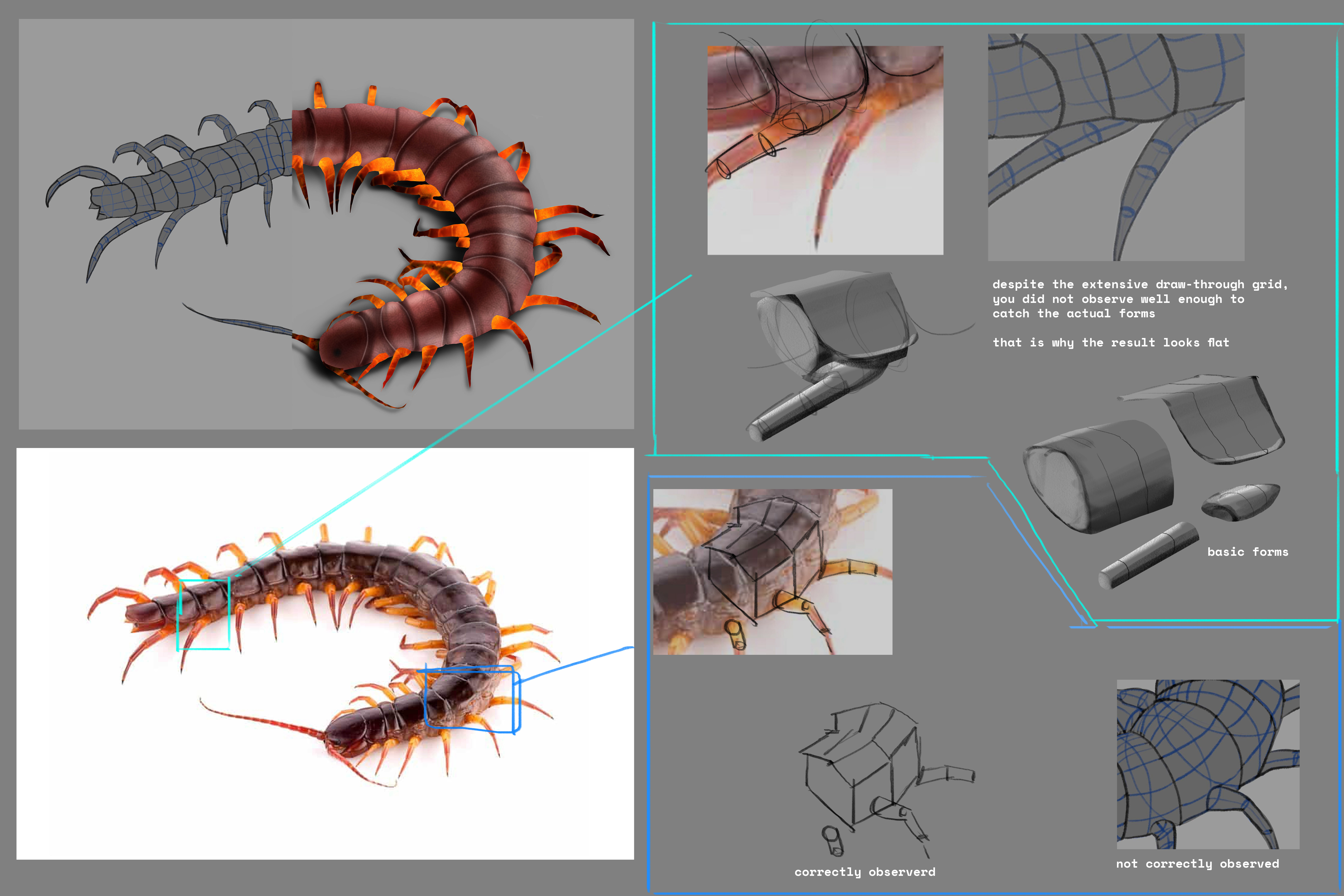
critique/paint over wanted
#1
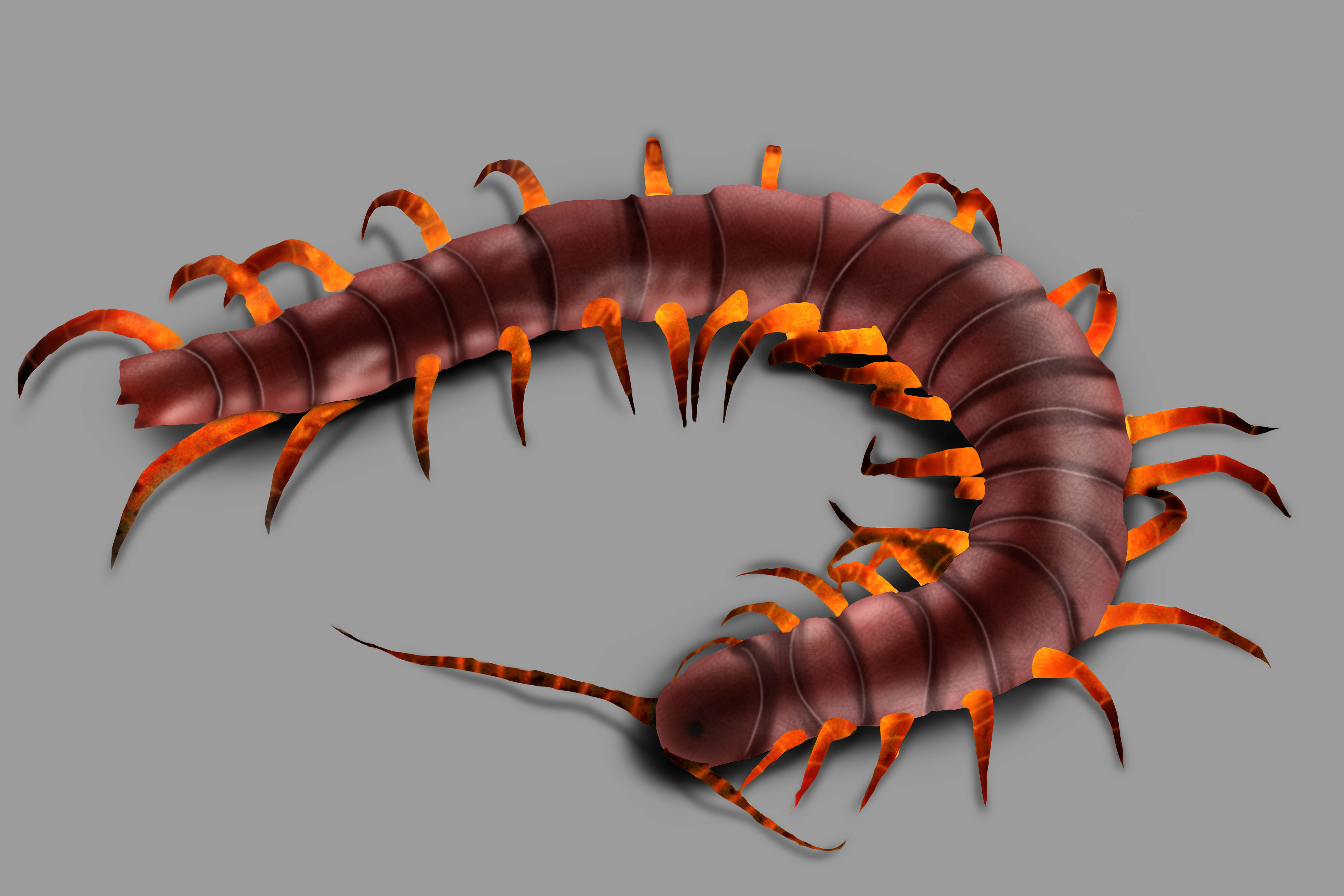
this is a drawing of a centipede that I did. Any feedback or critiques would be appreciated.

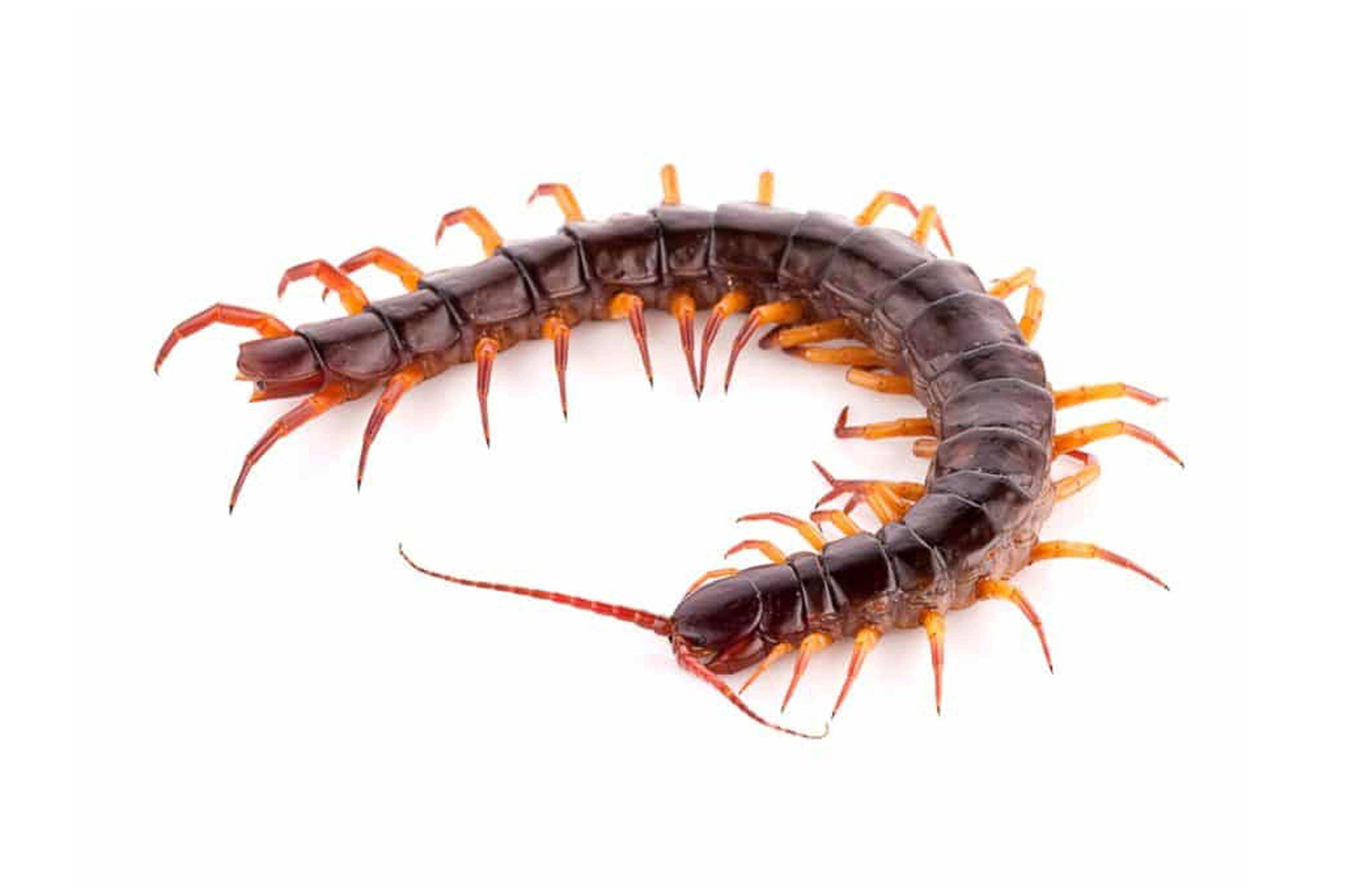
this is the reference shot.


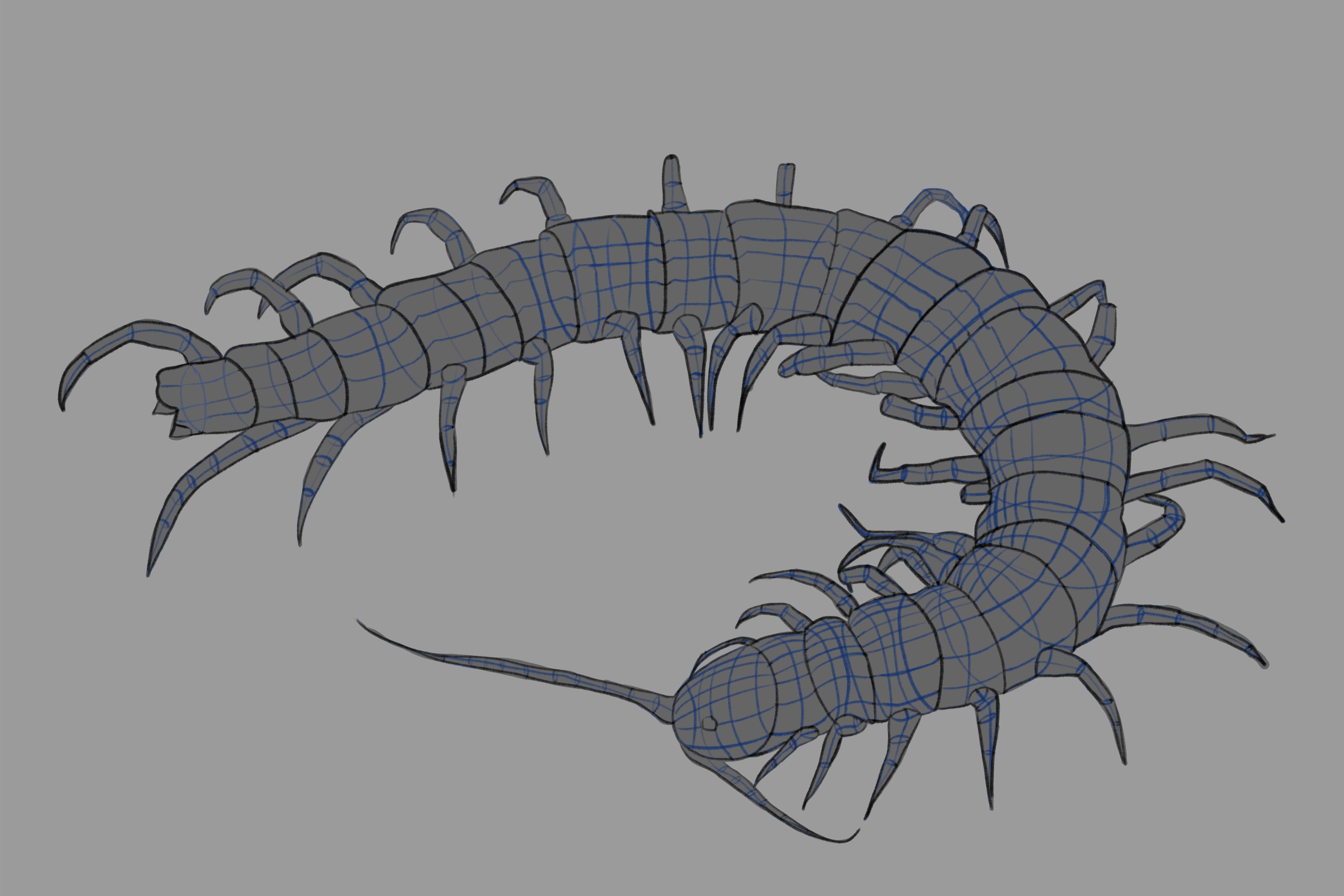
this is the perspective grid that I drew.


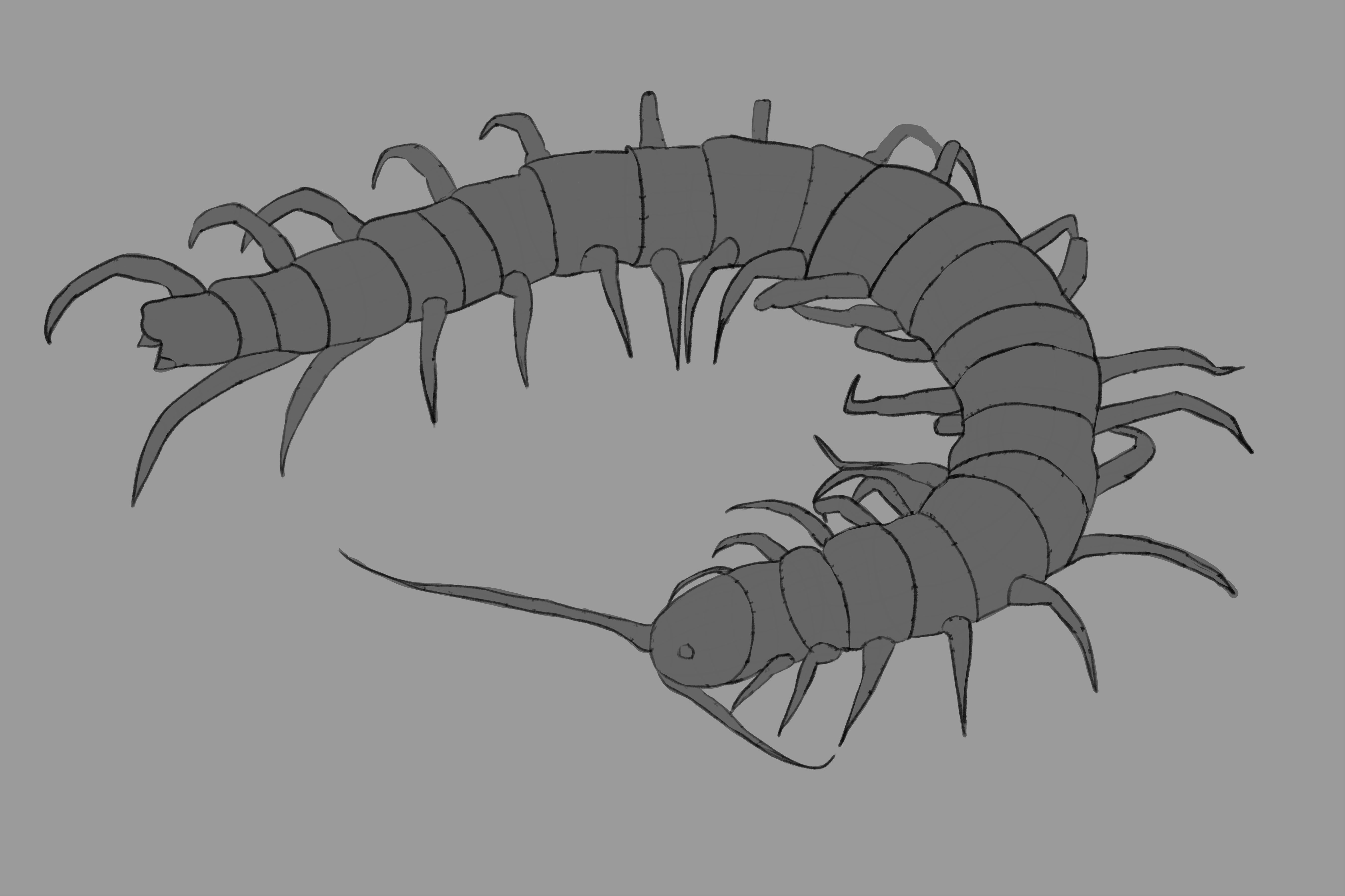
this is the outline of the centipede in perspective, (without grid) that I drew.


Finally, this is the painted version.

Reply
#2
Good now try to draw it without tracing.It ok to trace but it gonna hinder your progress if you make it to much of an habit.It ok to trace over your own drawing for example as you refine the drawing.The trap is really how easy it is compare to drawing your own interpretation of what you.Ideally you want to use many reference this will help you get a better understand of your creature.

You seem to have a good understanding of volume when tracing but you need to practice your brush work in regard to shading.Also if you were trying to match the color of the reference i would say it not there yet.

Keep going you got the right attitude which is a big plus to your sucess.

My Sketchbook

Perfection is unmeasurable therefor it impossible to reach it.
Reply
#3
(01-15-2021, 08:53 AM)darktiste Wrote: Good now try to draw it without tracing.It ok to trace but it gonna hinder your progress if you make it to much of an habit.It ok to trace over your own drawing for example as you refine the drawing.The trap is really how easy it is compare to drawing your own interpretation of what you.Ideally you want to use many reference this will help you get a better understand of your creature.

You seem to have a good understanding of volume when tracing but you need to practice your brush work in regard to shading.Also if you were trying to match the color of the reference i would say it not there yet.

Keep going you got the right attitude which is a big plus to your sucess.
Thank you so much. I was trying the perspective idea that you had told me about. So this was all fun experimenting.

Reply
#4
Very thorough job with perspective grid, but as said above shading can be impoved. I think problem here might be with not the best reference choice. On your ref light is coming from everywhere and there is almost no sign of shadow. You could find another ref for form painting preferably with strong direct light, maybe like here https://imgur.com/a/pfJnoVZ
Reply
#5
(01-21-2021, 03:35 AM)RonyaSekira Wrote: Very thorough job with perspective grid, but as said above shading can be impoved. I think problem here might be with not the best reference choice. On your ref light is coming from everywhere and there is almost no sign of shadow. You could find another ref for form painting preferably with strong direct light, maybe like here https://imgur.com/a/pfJnoVZ

In contrary to what the people above have said I think the perspective is also wrong. Yes, the shading needs some love but before you can shade a cube, you first need to draw the cube


Also note that the picture is taken with a long lens; that means there is hardly any perspective distortion. This is not wrong, just be aware of it. It helps to draw the floor as a grid in perspective, so your mind's eye can form a picture of the space. Without the floor that becomes a lot harder. 

Keep it going, hope that helps. Work those grids!

"No man is more unhappy than he who never faces adversity. For he is not permitted to prove himself." - Seneca
Reply


Forum Jump:


Users browsing this thread: 3 Guest(s)