Posts: 24
Threads: 1
Joined: Apr 2022
Reputation:
1
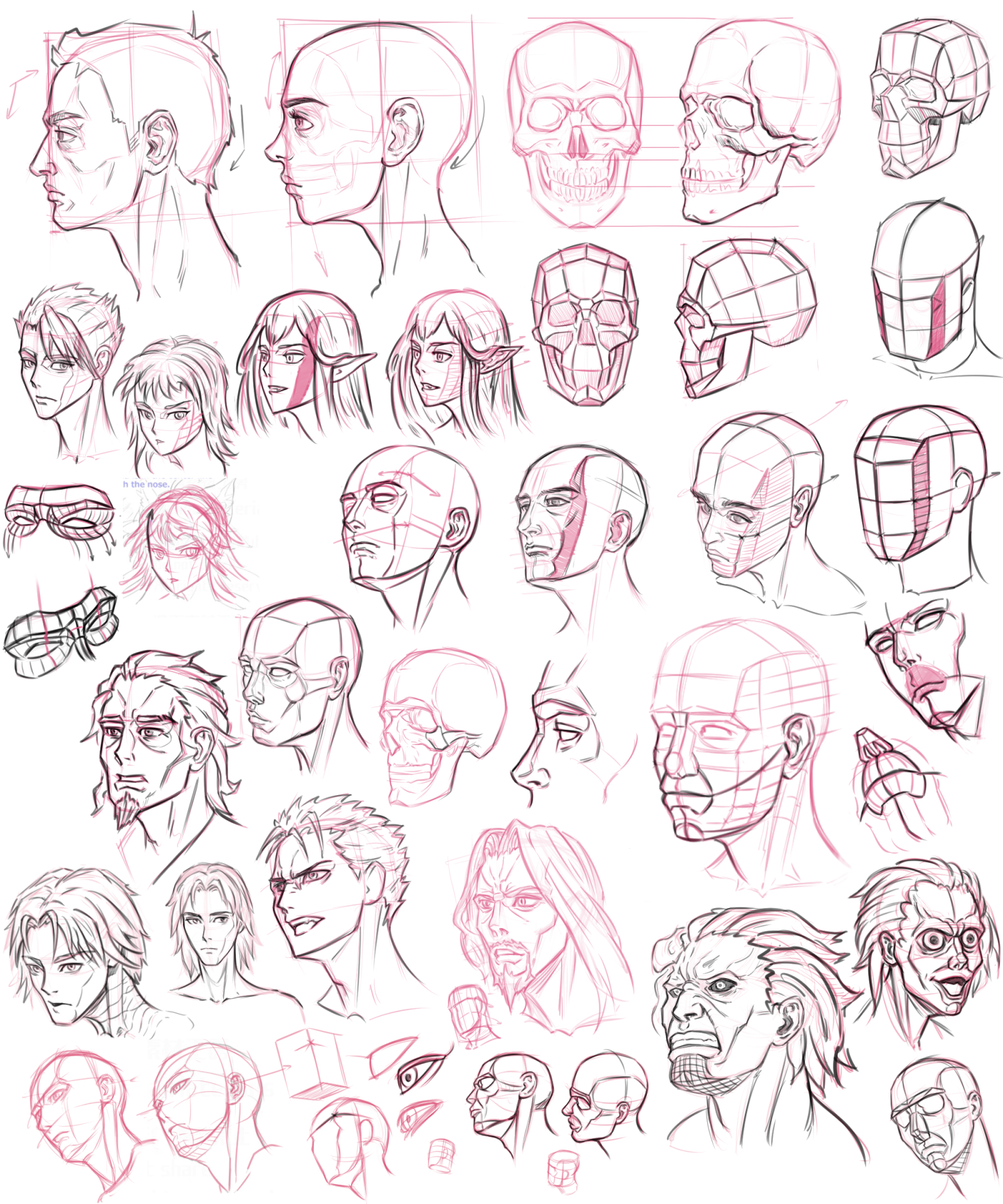
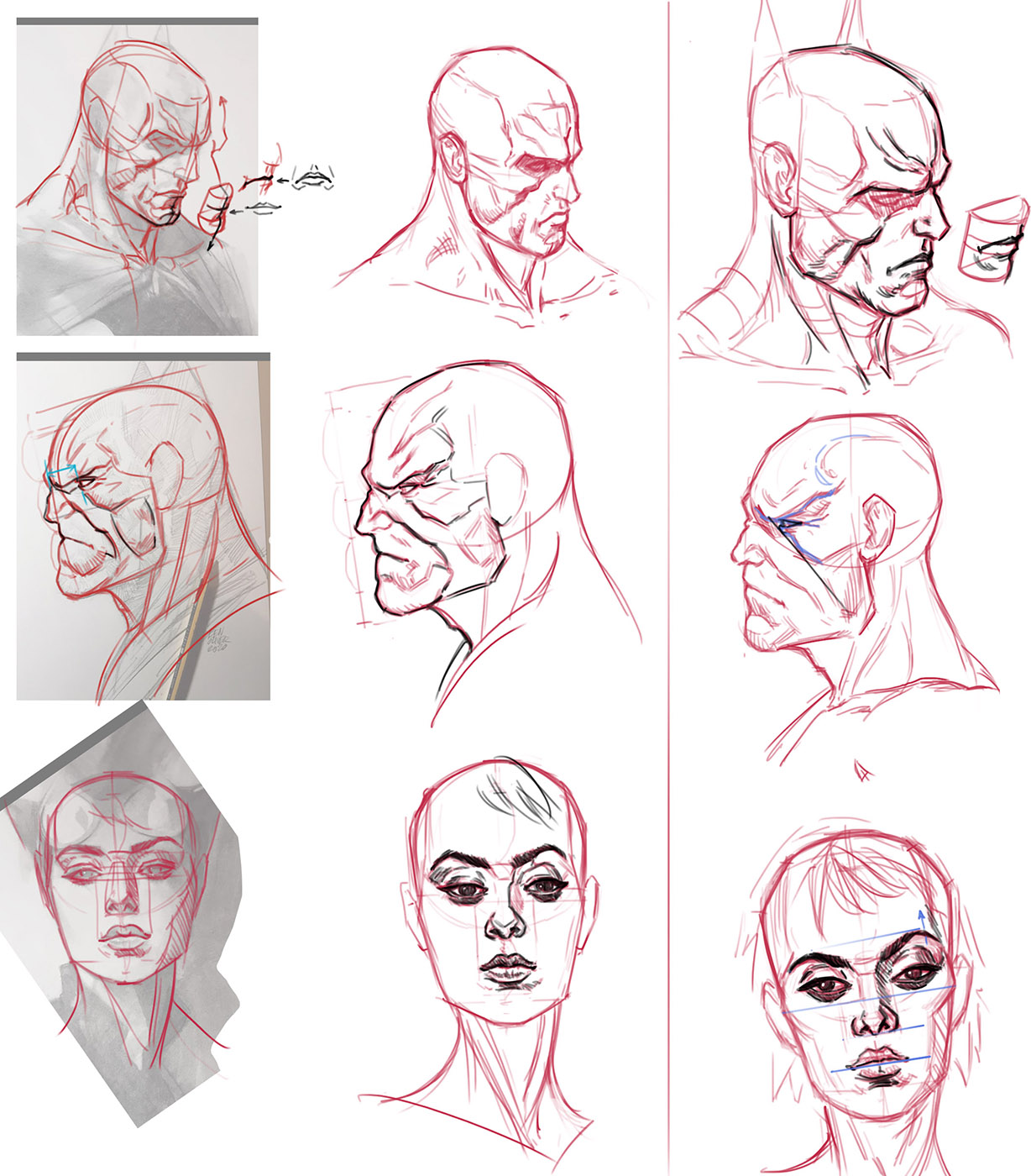
Studied head\face construction by "Manga Materials". I think it is good source if you looking for head drawings for character design or comics, or animation, becouse you don't always need to do well-constructed face features like in portrait drawing\painting.

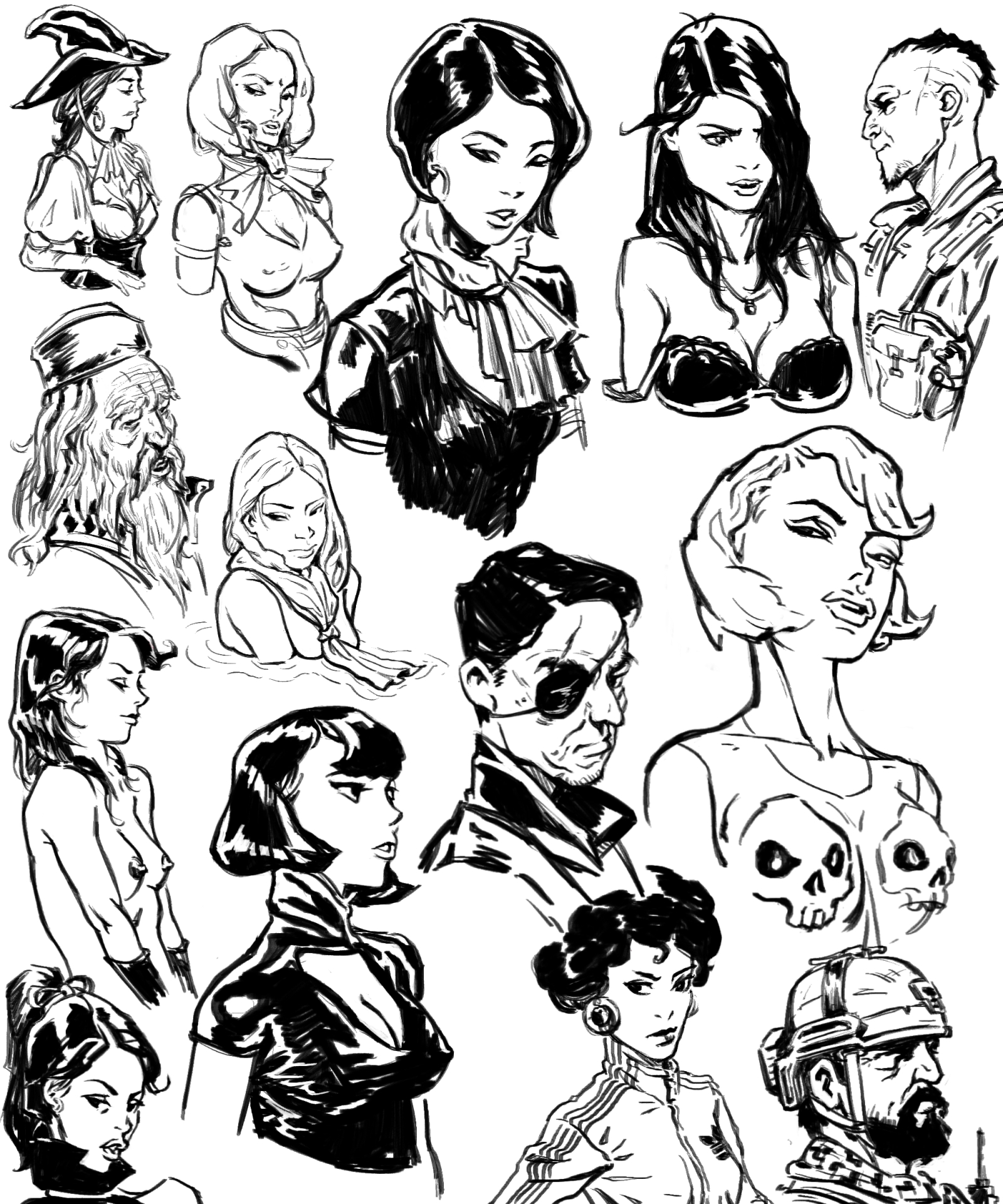
After that i just wanted to draw some faces without construction lines and ended up copying Kim Jung Ji drawings. it was interesting to see how he simplifies facial features. For example I would say that it draws the "symbol" of the eye in the correct perspective, not the eye itself. If it make sense...)

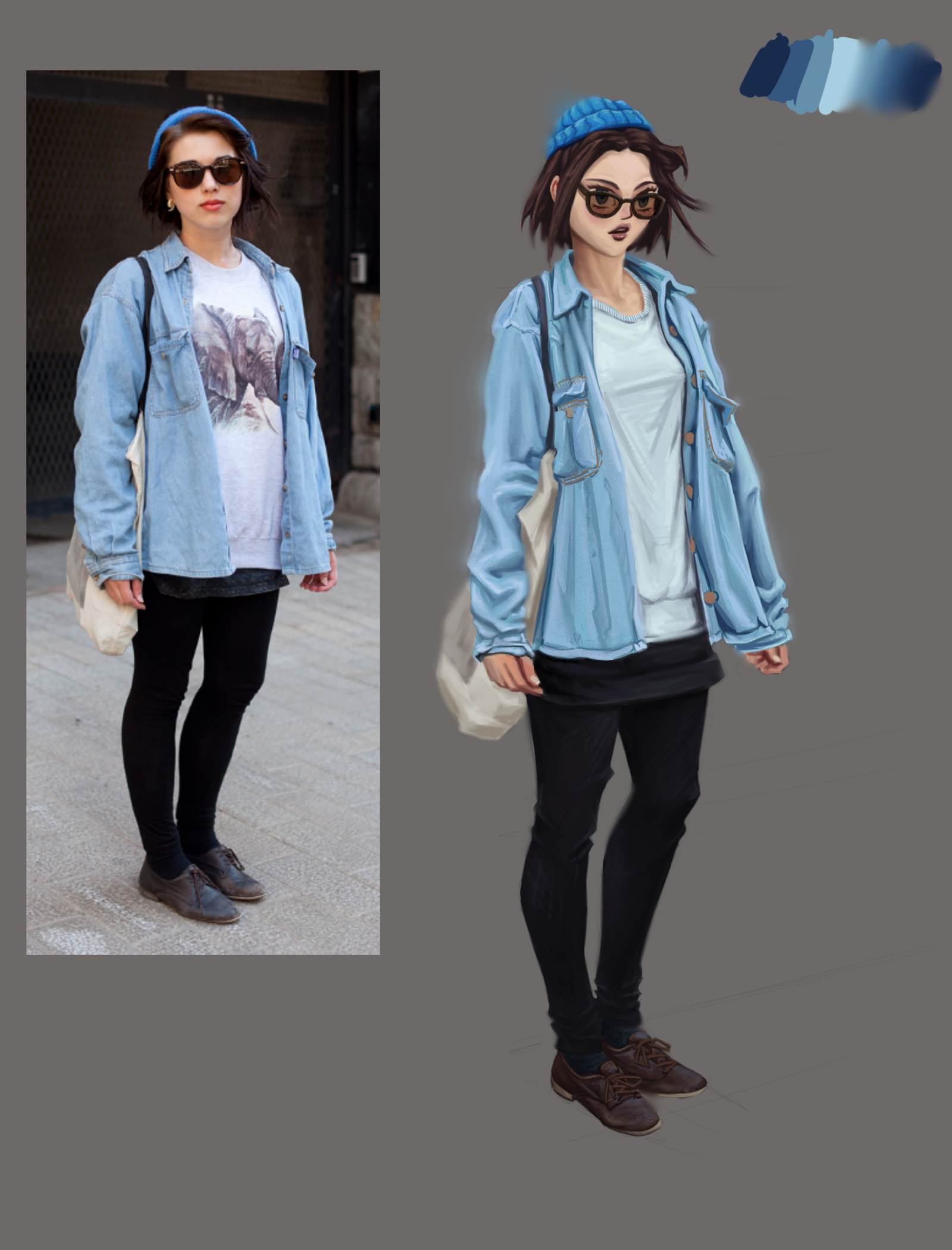
And finally, studied Daniel Clarke painting process. Hope it will help with my character paintings.

I don't like the result, but for the first try, I think it is fine...
Ref:

Posts: 24
Threads: 1
Joined: Apr 2022
Reputation:
1
My second try on this dressed figure painting. Still looking for nice brushes for blending during the process.

Posts: 3,199
Threads: 37
Joined: Aug 2013
Reputation:
209
A few thing to note
1.More reflectivity on the shoe and adding more blue.
2.Darker hue for the pant if you want to go for 1 for 1 value.
3.I think your wrinkle need a bit more finess but i accept that it stylized i just think it to high detail around the center will in the picture the detail is just the right amount to move the attention toward the face.
4.You seem to be using soft and hard edge in a few place i just think you need to use smaller brush when cleaning the silhouette it kinda intense for the soft brush.
5.For the shadow that wrap around the finger where it not in between the two figer use a more desaturated darker fleshy tone.
6.The lips doesn't follow the perspective of the rest of the feature of the face it to extreme of an angle.The hand is a bit to big i would say hand size varie between female and male just a tips.The collar seem beated but not in the ref it pretty circular.
7.Equalize the realism with the stylize level of detail.
But even with all that it a very good result.
My Sketchbook
Perfection is unmeasurable therefor it impossible to reach it.
Posts: 7
Threads: 1
Joined: Jun 2022
Reputation:
0
Nice stuff, i like the jung gi studies, lineweight seems to be quite on point.
The figure paintings also look good, but on the one with the guy (with the hat) i think you could get the forms to "pop" more by pushing the darkest dark values a bit more, i.e. just adding som darker occlusion shadows, also maybe pushing the shadows on the face a little. Could be as easy as placing a low opacity gradient over the face... would need some experimenting, so take it with a grain of salt, hehe.
Posts: 24
Threads: 1
Joined: Apr 2022
Reputation:
1
darktiste, Fjellmund thanks guys for critic! It is definitely harder to find weaknesses in your own work.
Haven't been posting for a while... Was busy with my daily stuff, trying to earn some money for a living) Hope to post more frequently.
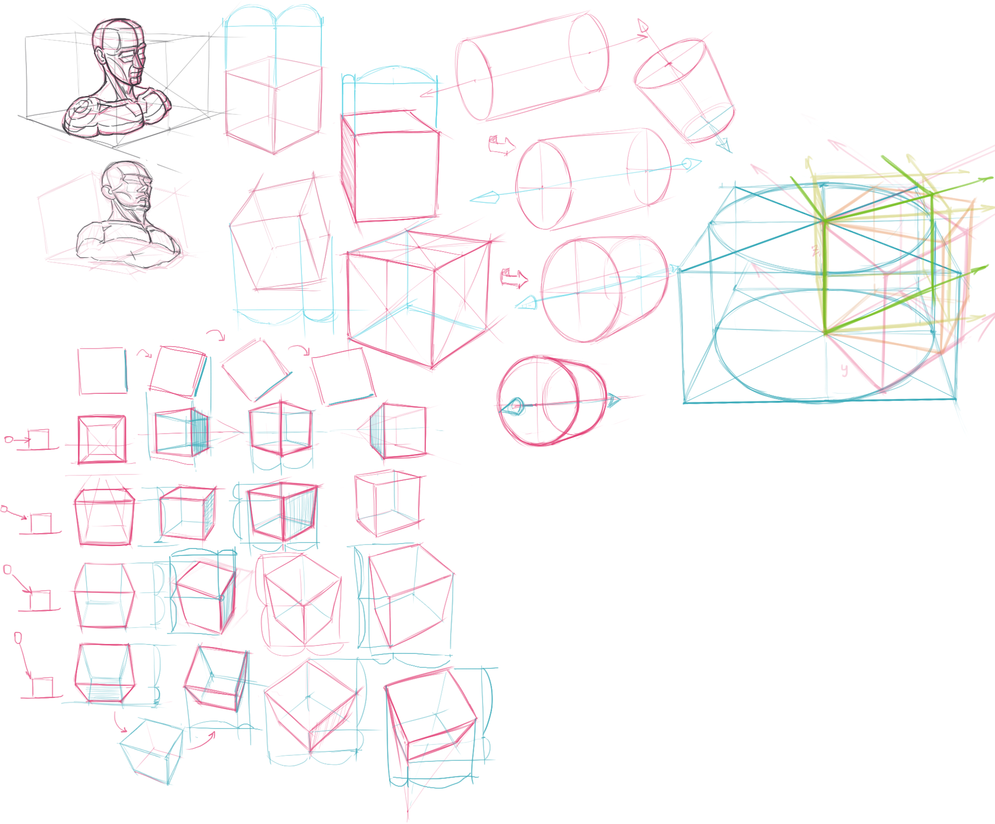
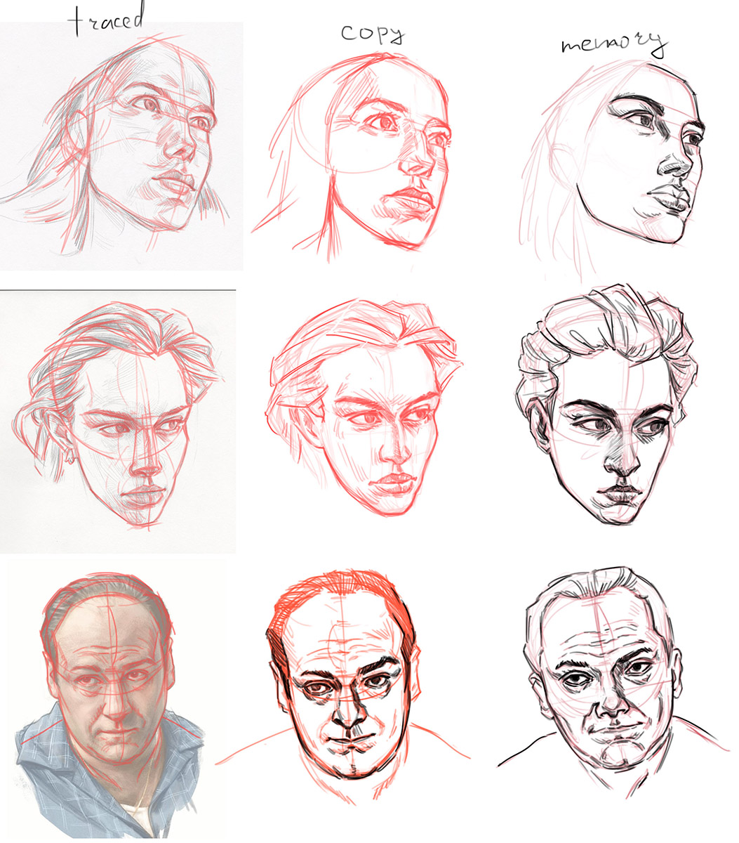
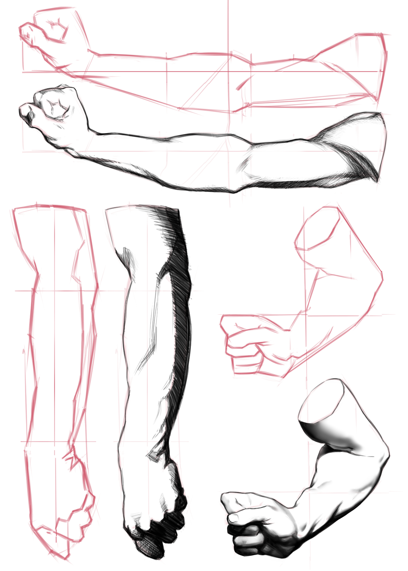
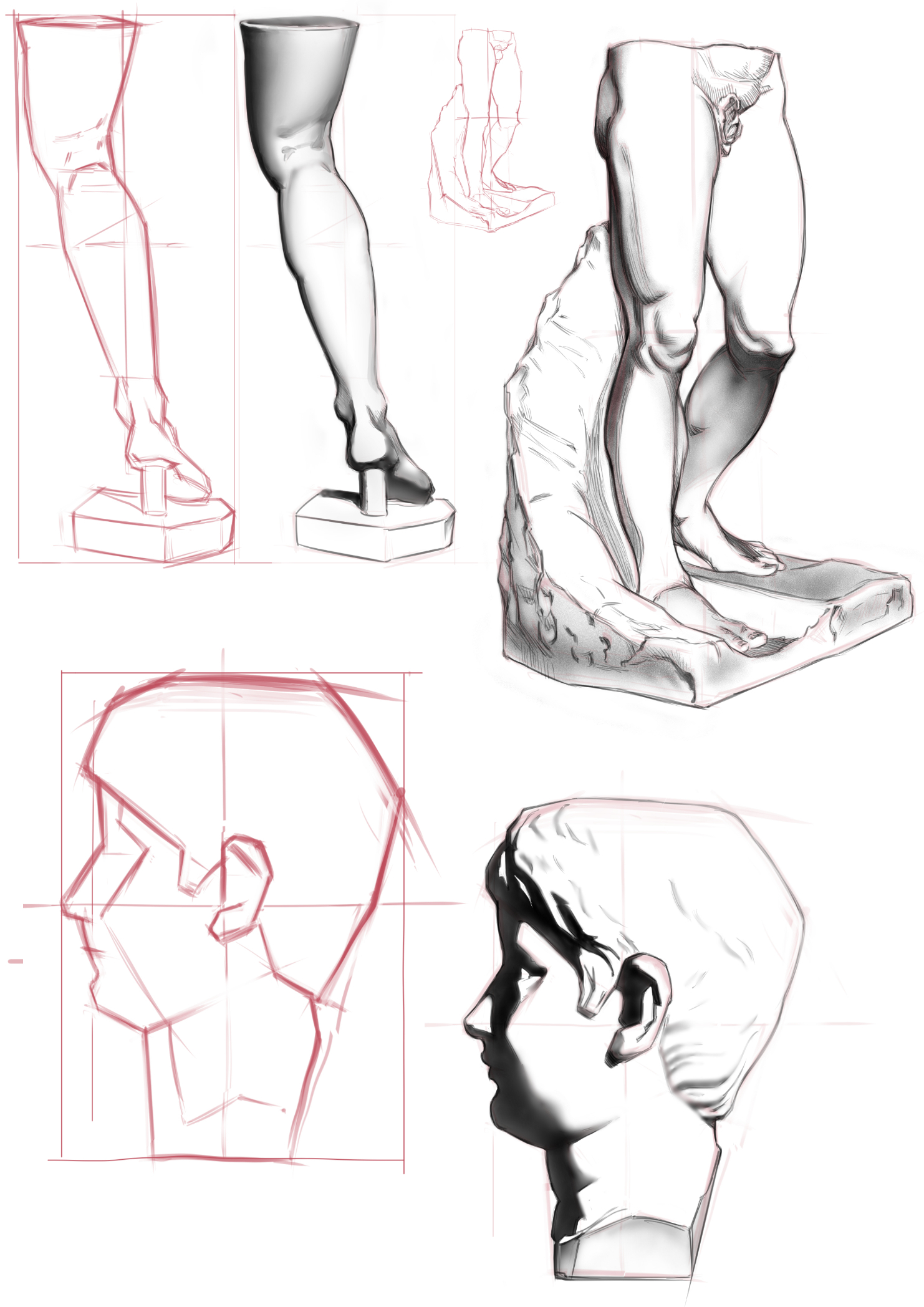
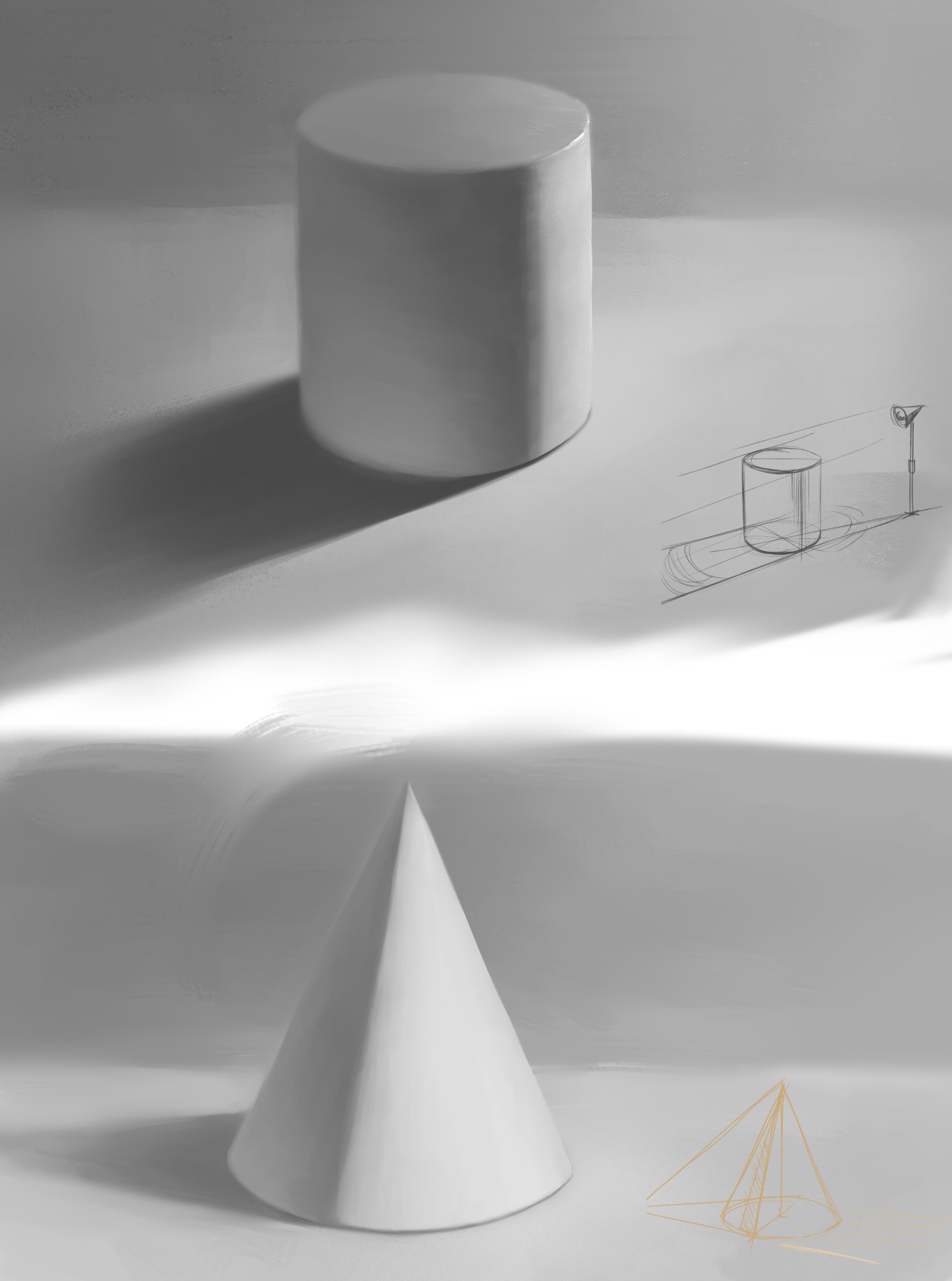
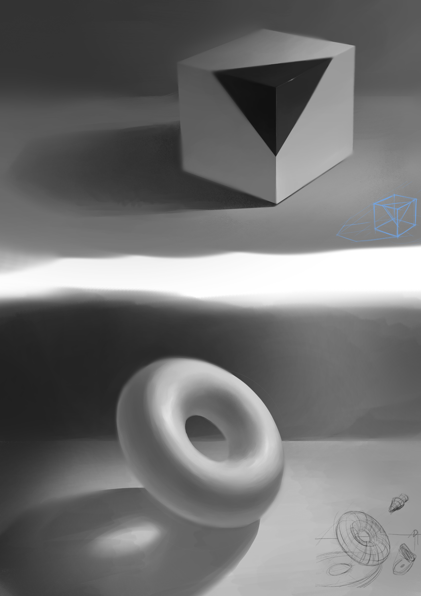
Here couple studies for this period. Think, all of them were pretty quick. The one with basick shapes - from moderndayjames video.


Posts: 923
Threads: 4
Joined: Jan 2016
Reputation:
38
Nice updates all around. The construction studies was a good idea as that's always very useful for tackling more revised images. Some of your faces do look a bit overstylized, not sure if this is a personal choice but they feel a bit juxtaposed against the more lifelike bodies of your figures. Great work otherwise, looking forward to seeing more!
Posts: 76
Threads: 1
Joined: Feb 2020
Reputation:
4
(06-08-2022, 10:20 PM)MangoTango Wrote: Studied head\face construction by "Manga Materials". I think it is good source if you looking for head drawings for character design or comics, or animation, becouse you don't always need to do well-constructed face features like in portrait drawing\painting.
After that i just wanted to draw some faces without construction lines and ended up copying Kim Jung Ji drawings. it was interesting to see how he simplifies facial features. For example I would say that it draws the "symbol" of the eye in the correct perspective, not the eye itself. If it make sense...)
And finally, studied Daniel Clarke painting process. Hope it will help with my character paintings.
I don't like the result, but for the first try, I think it is fine...
Ref:
really dig the perspective on the head studies, especiqlly the perspective of the chin. keep it up
Posts: 24
Threads: 1
Joined: Apr 2022
Reputation:
1
cgmythology, handsomekorean , thank you guys for the feedback!
cgmythology, When i did this clothed figure studies I wanted to do a little stylization, move away from the reference a bit. But I did not know how to do it and what I want to get in the end. It didn't work out very well)
handsomekorean, To be honest, when I draw portraits today, I got the impression that I did not remember even 10% of the previously studied materials on this topic.
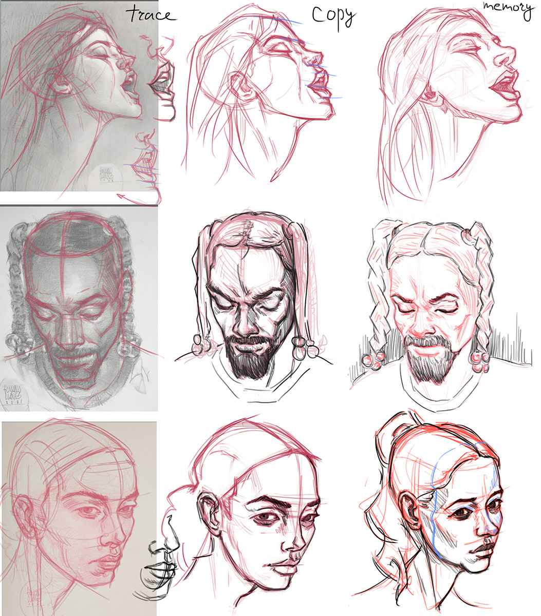
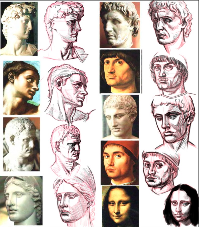
Lately I've become interested in drawing portraits. I would like to improve my skills in this area. So here some studies:


I preferred to do the works of artists that I like this time, because it's more interesting than do studies from photos of strangers and helps to stay motivated.
Posts: 283
Threads: 3
Joined: Sep 2019
Reputation:
22
Looked over this last page. Lotza nice studies here — and I really like the two full body 'caricatures.'
The female portrait and copy study at the end are quite good too.
You have a very good understanding of proportion and our construction and line value is top notch.
Keep it up!
Posts: 24
Threads: 1
Joined: Apr 2022
Reputation:
1
Jephyr, thanks! I remember like your reply, literally inspired me to open Clip Studio and create new canvas for portrait studies 
Even despite this, I did catastrophically little during this time...

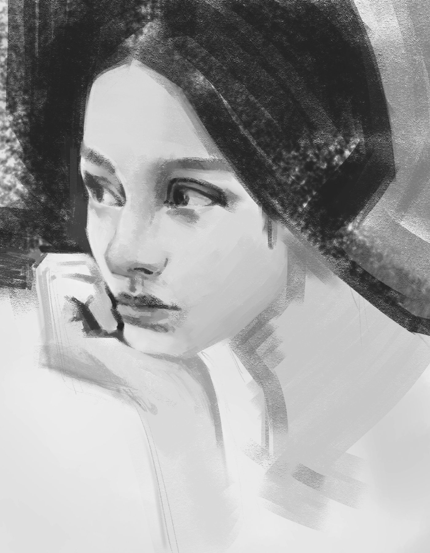
I started this master studie abot 2 weeks ago. Returning to it today I realized that I didn't want to finish it. It would be better to start over after a while.

Here I focused on copying what I see, on proportions and relationship between angles and distances. Still struggling to see the whole picture and not to dive in to facial features and details...
Posts: 24
Threads: 1
Joined: Apr 2022
Reputation:
1
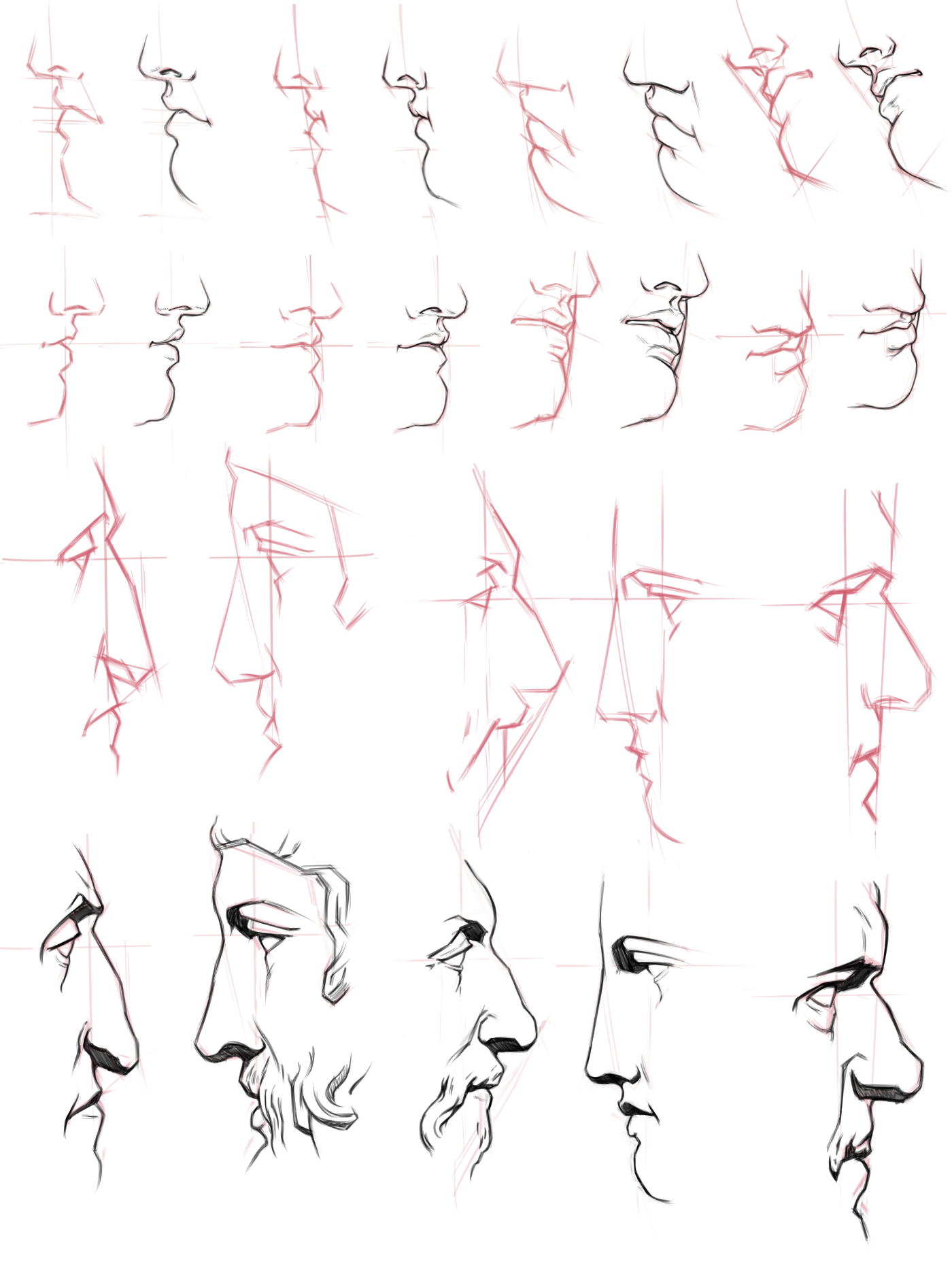
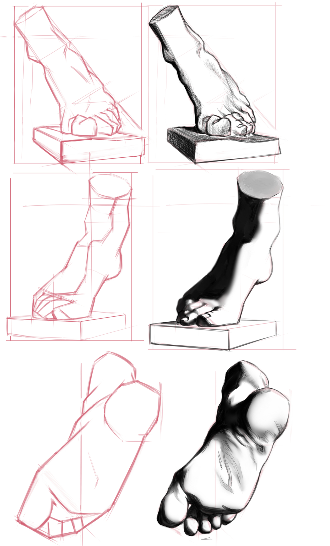
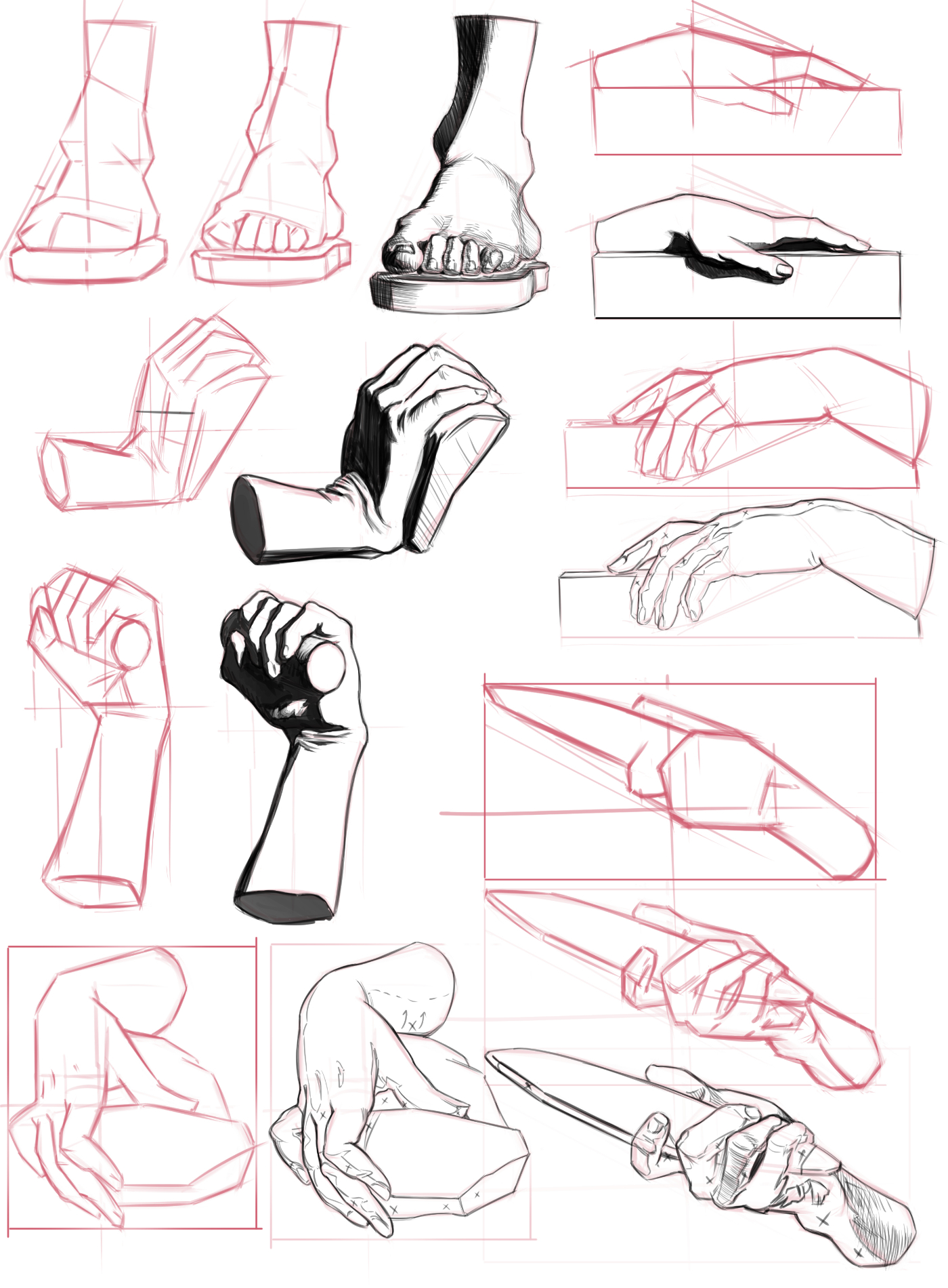
I continue to train my eye. This time with Charles Bargue's Drawing Course, which is basically a collection of drawings for copying. Most of them show the stages of building a drawing.
I remember, when I first saw this course, I thought that it is more like "how to draw ..." instrictions, which is not very useful in my opinion. But having learned more, I realized that it should be treated more like a training for your eye.


Posts: 18
Threads: 1
Joined: Jun 2022
Reputation:
0
Baaaaargue! <3
Really cool to see you doing so many of these. It's a great simplification exercise and how to abstractify whatever you're looking at into simple shapes and angles. It's definitely not a "how to draw an eye, step by step" and like you mention just a training for the eye; to learn how to observe shapes and their proportions, as well as angles and also to set aside any bias you may have currently of what things "should" look like if that makes sense. Truly one of the best exercises out there in my opinion.
Keep it up!
Posts: 833
Threads: 6
Joined: May 2018
Reputation:
113
These look great! nice job. It definitely helps you learn to see
Posts: 3,199
Threads: 37
Joined: Aug 2013
Reputation:
209
Becoming good at measuring can be done doing alot of 3/4 view and tilting the head in different angle because the curve and angle are alot more extreme in the way they curve around the volume i would say in those moment in defining likeness.What also important is getting alot of thing right in the beginning meaning that proportion is often overlook because most artist make the error of starting to fast to lay down something that look like something.But really it might sound dumb but good observation come from being able to compare a from b and adjust.Not just merely working on one thing being accurate but each feature relating to one an other which can make the work look abstract at time.
The problem with overlooking proportion is that the less thight you have them figure out the more you are fighting with your drawing down the line.
Angle and curve are not that hard if you deconstruct them into a serie of curve and line they are hard because they require good muscle memory in tradional medium.Proportion on the other hand it tricky because it require someone to understand how to simplify what it see.
Do you generally work one drawing at a time or do you do multiple drawing and try to keep them around the same level of finish moving from one sketch to the other?
I ask this because to me it important to have a fresh eye when observing and by having multiple sketch you avoid the trap of i can't see anymore which happen when your eye get tired at look at the same object.
One thing you are probably aware but might not be actively doing and you should probably get more in touch with is setting pause to refresh the eye but also to aid the brain take a break because observing take it tool on you after a moment it can be very taxing.15min break is probably enough to still feel enough engage with the work but yet be refresh.It doesn't serve us to fight the drawing sometime you just gotta come back and realize you commited to hard and should move on.Sure being able to finish what we start is something we need to strive as artist but we also need to keep it honest when thing take the wrong turn and are beyond repair.
Oh and before i forget i suggest you frame you subject... your doing yourself a diservice by not doing so the frame is a valuable tool when it come to seeing negative shape.The frame will keep you honest and humble.
My Sketchbook
Perfection is unmeasurable therefor it impossible to reach it.
Posts: 24
Threads: 1
Joined: Apr 2022
Reputation:
1
Thank you guys! I definitely gonna continue with this Bargue studies and integrate it in my portraits and figure drawings.
Darktiste, generally I do one sketch > copy/paste it > lower the opacity > doing render version on top. With faces and ears, I did all sketches at first and then rendered versions, but still one by one.
"your doing yourself a diservice by not doing so the frame is a valuable tool when it come to seeing negative shape.The frame will keep you honest and humble." I will try. As far as I understand, it should be a tight frame, where all sides of the frame touch the object.
Posts: 76
Threads: 1
Joined: Feb 2020
Reputation:
4
really like the way you focus on fundamentals a lot instead of jumping to the fun stuff right away.
something i should be doing and should have done as well. woudl have saved me a ton of time.
Posts: 157
Threads: 3
Joined: Apr 2022
Reputation:
3
Wow! Awesome to see Bargue studies digitally. Good stuff.
Posts: 24
Threads: 1
Joined: Apr 2022
Reputation:
1
Posts: 3,199
Threads: 37
Joined: Aug 2013
Reputation:
209
You should also add color proximity or color relativity if you prefer to the list i think it a very under estimated study.You can find more about it in that scott robertson book.It basically when two color influence each other.But you might want to keep it for when you want to study color before that you would study how a bright surface reflect into a dark surface or how a cast shadow can darken a side that near it.
One thing on the last torus(donut shape) you didn't seem to bother putting a occlusion shadow is there a reason to that?Where two object touch you get a darker shadow.
My Sketchbook
Perfection is unmeasurable therefor it impossible to reach it.
Posts: 24
Threads: 1
Joined: Apr 2022
Reputation:
1
(09-17-2022, 12:50 PM)darktiste Wrote: One thing on the last torus(donut shape) you didn't seem to bother putting a occlusion shadow is there a reason to that?Where two object touch you get a darker shadow.
It's all an unfortunate coincidence) The occlusion shadow would better land the object on the surface. Most likely I added it at the beginning, but lost it during rendering. Specifically with this drawing, I lightened and darkened the same places many times...
|
