Posts: 261
Threads: 9
Joined: Dec 2021
Reputation:
43
@Spectralpainter you make a great point about pushing the relationship more. I feel like my initial indecisiveness to making them friend or foe shows in the final composition and leaves it up for viewer interpretation, which is never good ha! I played around with using her free hand to “command” the beast to show obedience but didn’t like any of the gestures without redoing her pose entirely…will keep this in mind on any further piece for sure. Great feedback
I decided to complete the family and use up some free space that was bothering me, gonna call this one done for now and start a new piece.
Thanks to all for the feedback, inspiration, and help

Posts: 261
Threads: 9
Joined: Dec 2021
Reputation:
43
Having some more fun today and fleshed out another thumbnail. I wanted to have a go at this one for a few reasons but most of all I wasn’t quite sure how to tackle the snowy scene and wanted a challenge. On this I Experimented a lot bit with some much larger brushes than I would normally go with and stay a lot looser with 90% of the image. I’m liking the contrast so far, but maybe I’ve just been staring at it too long :)
Thumb:

Progress:

Posts: 261
Threads: 9
Joined: Dec 2021
Reputation:
43
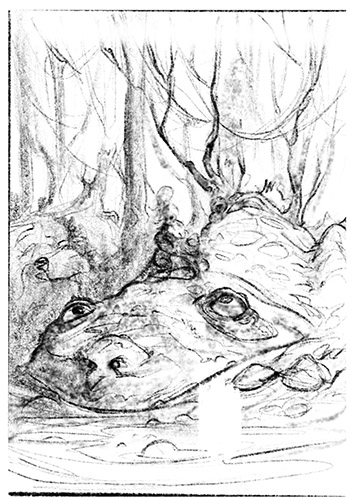
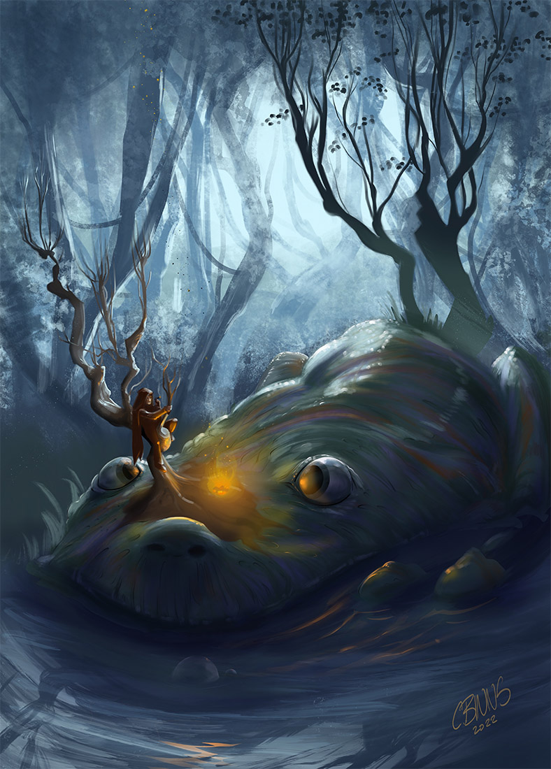
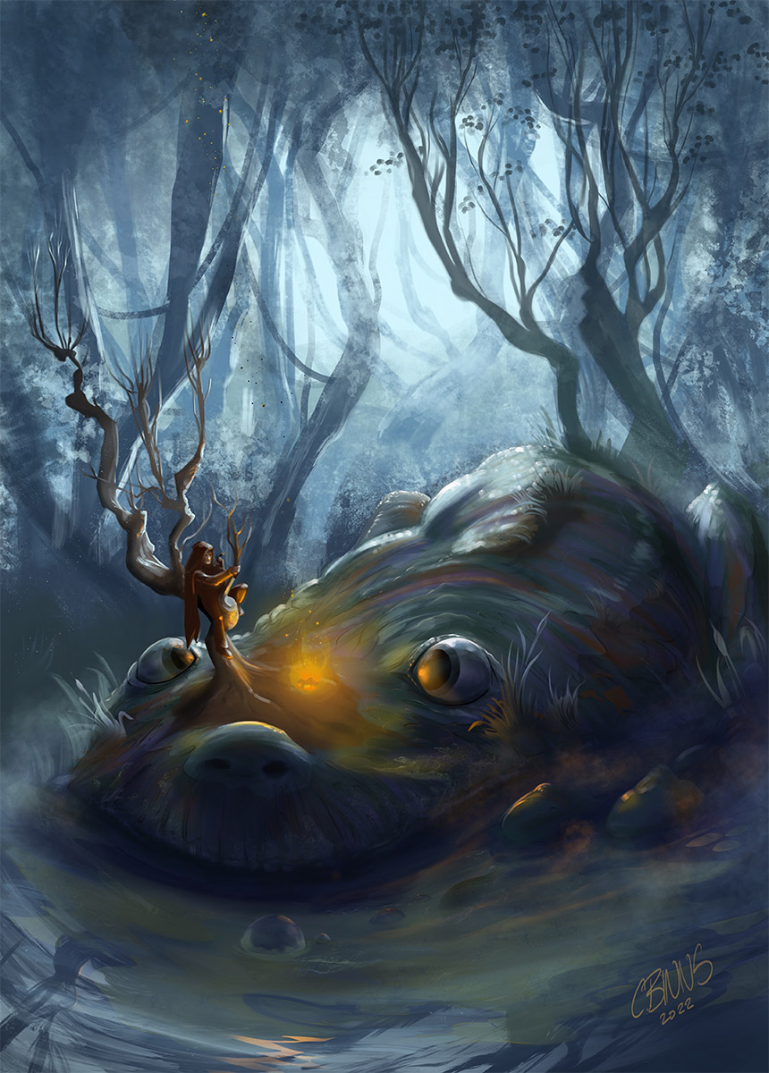
Had some more art time today to flesh out another recent thumbnail. Took on this giant tree-horned frog, swapped out the Princess for unsuspecting traveler stuck up the wrong tree. Stuck with a much looser approach with this one with larger brushes and refrained from zooming in until almost finished. I feel it really helped with maintaining a more consistent feel and overall mood. Crits welcome as usual.
Thumb:

Progress

Posts: 3,337
Threads: 37
Joined: Aug 2013
Reputation:
234
There not and strong enough difference between the water reflectivity and the wet surface of the creature.
Also back lit object still receieve that back light so you wouldn't be getting those tree like silhouette on the right like this unless it was like a cast shadow they would recieve less light but swamp tree density isn't enough that it would appear as 1 value since there not enough overlapping object to block the light source.
There also a weird thing happening with the water it curving as if there a wave forming from something else than the creature.It should feel flat and pretty calm with a few ripple.I suggest turning most of the water into a mud.
Frog eye aren't sitting on the top of there head but a little bit on the side.A rule of thumb to determine where the eye of a creature is.Would be to know what they eat.Most predator have foward looking eye will prey generally have eye on the side of there head.
As for the frog i am not sure if the character is aware or unaware but if he unware it kinda strange because alot of the frog skin is still showing which make it strange that he wouldn't recognize the floor of the swamp compare to the wet skin of a frog.You might want to throw more algue or vegetation on top of it but not so much that we lose the frog but just enough that it to to obvious either.
Posts: 261
Threads: 9
Joined: Dec 2021
Reputation:
43
Thanks Darktiste, as usual very detailed feedback and helpful tips. I wasn’t going to spend too much more time on this one but you inspired me to revisit a few things. I adjusted the silhouetted trees on the right to push them back a bit, added some vegetation to the frog and surrounding elements.
I personally feel this particular frog evolved to have his eyes much more on top of his head as he would have had no known predator to worry about that would have required him to evolve more side sitting eyes, this allows him to fully submerge his whole body besides his eyes, snout and tree horn. And calling it fantasy allows me to take some liberties as usual :)
The story behind the image is the character is quite aware of the Frog and has baited him out of his hiding, sitting in the tree and calmly smoking a cigar insinuates he isnt too worried, with the question being prompted…why is he terrified?

Posts: 261
Threads: 9
Joined: Dec 2021
Reputation:
43
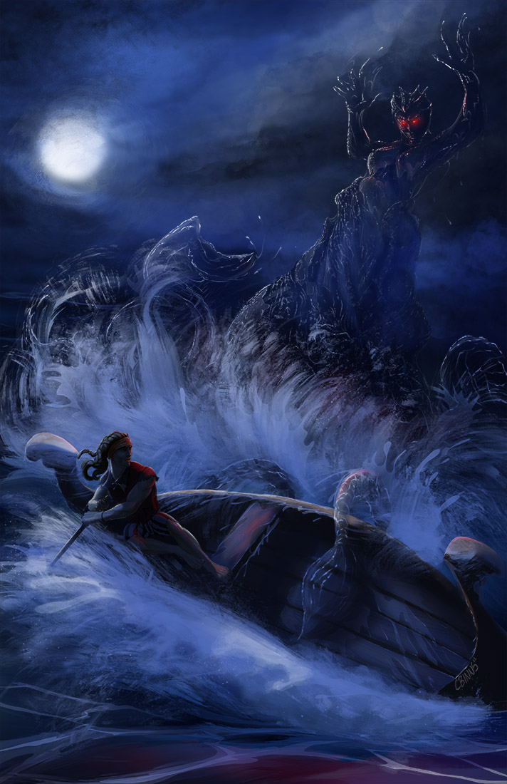
Still working through some of these thumbnails and wanted to give this one a bit of attention. I’ve not done a stormy sea piece before and wanted to get a bit chaotic with this one. I’m still playing around with the water elemental and getting the right mixture of transparent but made of water and not invisible but covered in water. I’m thinking it might need a more contrasting background ( a few lighter clouds that stretch across the sky perhaps) and distort it within the elemental, will have to think about it some more
Thumb:

Progress:

Posts: 3,337
Threads: 37
Joined: Aug 2013
Reputation:
234
The same problem with back light here there no indication of what could create that front light for an artist vs viewer perspective in my perspective it doesn't make sense since i understand how light work and it not necessarly bad but i wish we would have a better justification as why we see this light scenario. Maybe i am just to nerdy about light.I think when you test lighting you are generally better asking someone who isn't an artist there general feeling if they bring up the lightning then you might have more of an argument to tweak it.
Side note for the thumbnail i suggest not to necessary fleshing them all try to pick like 3 or 4 and create a new set you shouldn't feel like every idea as to be precious and explored allow yourself to see some of them trial and error.You can even try to go for more thumbnail option for example instead of making 9 you can try set of 12 this will help you get rid of the less flesh out idea but a balance is necessary not to start being sloppy.Aslong as you feel in the flow.
An other idea would be to have previous thumbnail open and see what you did already what didn't work and what would be a mix of thumbnail you could recycle into something more well thought.
Posts: 261
Threads: 9
Joined: Dec 2021
Reputation:
43
Thanks Darktiste, you are totally right about the lighting. I was reluctant to put 90% of the FG into shadow due to the moon being the only real light source so i took some liberties. Might have another stab a version with more deliberate lighting and see how it plays
Yeah my thumbnail process consists of many 5 minutes doodles and i tend to throw 9 on a board to get the juices flowing. sometimes i like all 9, sometimes i dont like any. The trick is if a piece excites my eye then it gets some more attention. The last few pieces I have done demanded my attention since they were still painting a picture in my mind....and once that happens as im sure all artists know...needs to be explored or i wouldn't sleep at night :)
Posts: 261
Threads: 9
Joined: Dec 2021
Reputation:
43
few modifications to this one before I call it a wrap. Took the plunge and threw most of the image into full moonlight and accentuated it with a subtle glow from her eyes. I do think it reads a lot stronger now... but that could just be me staring at it for too long now :)

Posts: 261
Threads: 9
Joined: Dec 2021
Reputation:
43
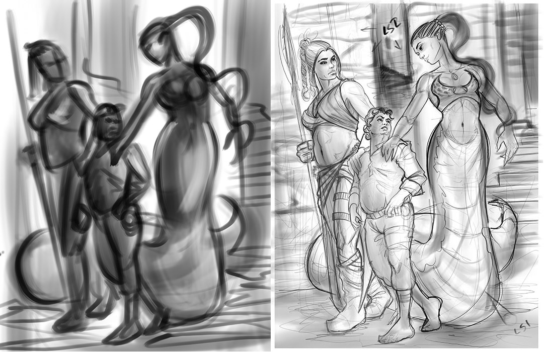
Got some time for a new piece…outside of CHOW entries that is :), started with one of my thumbnails I’ve been holding on to. Gonna shoot for a halfling thief in a precarious position. Maybe even a sexy snake lady for added fun.
Time for some fun.

Posts: 261
Threads: 9
Joined: Dec 2021
Reputation:
43
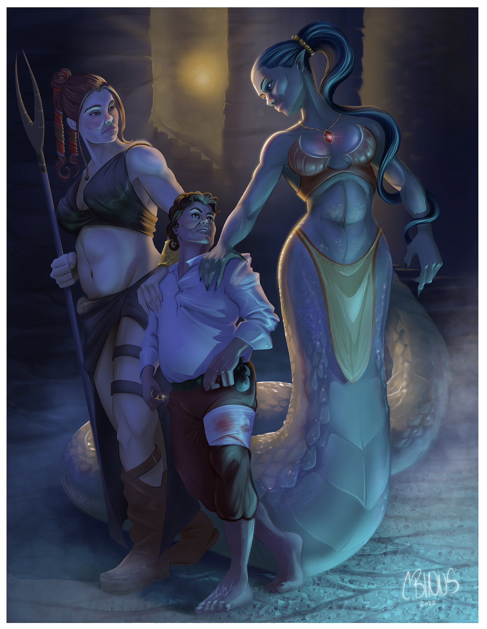
Sunday funday Color time, crits and suggestions welcome as usual, not 100% calling it done just yet
My story on this one is our pilfering little Halfling friend has broken into the wrong keep and now finds himself being escorted to his “punishment”, what that might entail is anyones guess. However, something tells me he has shinier assets on his mind.

Posts: 142
Threads: 2
Joined: May 2022
Reputation:
6
Nice piece! doing a piece with more than 1 character for me is a struggle, so mad respect for having 3 all interacting in one piece ^^
Posts: 261
Threads: 9
Joined: Dec 2021
Reputation:
43
Illustration time has been severely lacking lately and my inspiration has taken a slight hit. So its time to throw some more thumbnails down to see if anything pops out at me and screams out for some further attention. Not sure if any of these will be the lucky one(or unlucky one depending on how you view it), but i may take the royal bathers (top left) piece a little further and see what comes of it, might push for more comical feel to this one and keep it less ominous.

Also adding my latest finished piece im calling “The Great Race and the Imposter” had a lot of fun with this piece and thought I would throw it on my sketchbook for posterity :)
Thumbnail:

Final:

Posts: 1,065
Threads: 4
Joined: Jan 2016
Reputation:
43
Great updates! Your poses are very well done in general, always very dynamic. Loving the style of your latest painting as well, colors are on point and the image looks ridiculously lively!
Posts: 261
Threads: 9
Joined: Dec 2021
Reputation:
43
I’ve seriously neglected my sketchbook for a few months. Time for a small update. I certainly haven’t had the time to create art at the rate I could last year this time, but I’m still managing to have some fun and continue this journey to improvement.
Some thumbnails and doodles I’m interested in developing a bit more

Took the bottom left thumbnail and gave it a lot more attention quite pleased with how it turned out. May revisit in a month or too for any glaring issues but for now she is my first 2023 piece.

And a bonus doodle splashed with some color, nudity sensitive avert your eyes now. Left this one quite rough to mix it up a bit and colored while in a slow meeting this morning. This horny hog and foxy babe bid you all a Happy Friday!

Think I might tackle a new piece this weekend. Not sure if I’ll pull from these sketches or spin up some more doodles…
Posts: 1,065
Threads: 4
Joined: Jan 2016
Reputation:
43
Love the dynamic flow of your work as always. The spider illustration is particularly impressive, love how you split the composition in two with both subject matter and colors, and the lighting is ridiculously good. Great job!
Posts: 261
Threads: 9
Joined: Dec 2021
Reputation:
43
(01-19-2023, 04:29 AM)cgmythology Wrote: Love the dynamic flow of your work as always. The spider illustration is particularly impressive, love how you split the composition in two with both subject matter and colors, and the lighting is ridiculously good. Great job!
Thank you so much for the feedback! I fought with that piece for longer than I care to admit to mesh the two comps to make them feel connected but disconnected at the same time. Haha
Posts: 353
Threads: 5
Joined: Sep 2019
Reputation:
23
(01-14-2023, 08:52 AM)CBinnsIllustration Wrote: Think I might tackle a new piece this weekend. Not sure if I’ll pull from these sketches or spin up some more doodles…
I vote for the lancer on crocodile back in the center of the sketch page. Don't change the pose or angle or anything, it's perfect as is!
Will get back later with some more feedback.
Posts: 261
Threads: 9
Joined: Dec 2021
Reputation:
43
(01-19-2023, 11:17 AM)Leo Ki Wrote: (01-14-2023, 08:52 AM)CBinnsIllustration Wrote: Think I might tackle a new piece this weekend. Not sure if I’ll pull from these sketches or spin up some more doodles…
I vote for the lancer on crocodile back in the center of the sketch page. Don't change the pose or angle or anything, it's perfect as is!
Will get back later with some more feedback.
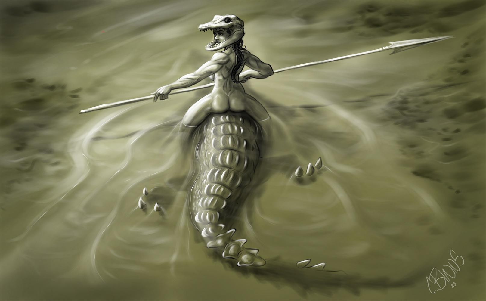
Just for you! Didn’t have much time tonight so going monochrome sketchy with this one but she was a fun one to flesh out. Might revisit her this weekend or might just leave as is for now And work on a new one. Thanks for the suggestion, hope I did it justice enough :)


Posts: 3,337
Threads: 37
Joined: Aug 2013
Reputation:
234
I think the story just doesn't work i have no idea what i am looking at if you don't tell me there isn't anything to really get hook into the piece.The way the anatomy is now i can't say if it a she/he? it kinda androgynous the muscle and physic look rather masculine even the face but than i can see boob so i am even more wondering what i am looking at is that a mustache?But than it get even weirder with the tail and paw i assume it two dfiferent being but so much information is under water and hidden with overlapping that it kinda hard to see where one thing start and where it end.Also i don't see why the character would wear the skull of what i assume is the same species as it riding it would be strange but that just my opinion.
I think it a perfect opportunity to realize how feed back can help before to much is commited.But i think you didn't really go into this piece with a story in mind it was just rendering something for the sake of rendering i feel correct me if i am wrong.
|


