Posts: 261
Threads: 9
Joined: Dec 2021
Reputation:
43
As usual thanks for stopping by and providing such targeted feedback. While all feedback is great and welcome not all need be consumed or considered accurate. I have to disagree with you on a few points and I may have even had this objection before but art doesn’t always need a story, or one that makes sense anyways. I feel this thinking can really limit you in your creative process or doodle phase. Girls can look like boys and vise versa and sometimes making that line blurry gives a viewer space to make it up. And most importantly sometimes a drawing just a drawing and we take it as that. In these pieces that start from a very expressionistic foundation are driven solely by imagination and flow onto the page. No reference, no stopping to think about stuff, just keep going and see what falls out. I find it freeing and recommend for anyone with artist block. This process also helps you see all the fundamentals you have that are becoming more ingrained and less forced and for me personally keeps the movement in a piece if im not fighting with anatomy or story elements too much too early. I find this helps big time when moving to bigger, more detailed and time consuming pieces, plus it’s just fun.
So I’m essence you are right this piece was just a few hours of playing around and was not intended to be a story illustration, even with that being said the most important point is sometimes we realize that some people will flat out not like your illustration for their own reasons and that is totally ok too. It’s what makes us all unique. Thanks again and keep up with the feedbacks, I can appreciate the level of effort and detail you provide within them.
Posts: 3,338
Threads: 37
Joined: Aug 2013
Reputation:
234
Yes art doesn't need a ''story'' but it become abstract and more subjective in that case. There a line between mysterious and confusing and i think that what my critic is trying to bring to the table.I absolutely encourage abstract it a great way to actually find something from within the ''ether'' but it shouldn't be a surprise when most of what you did in this sketchbook was story driven that i get confuse interpreting the intent of something that goes counter to this establish norm.
I very much enjoy pushing people imagination maybe you could do some chimera (mix of creature) since this piece bring this idea to mind.You seem to focus alot on illustration but i am wondering how much do you care about composition, anatomy and design and why do you keep it out of your sketchbook why is there no study in here. Not even attempt do push further than the first draft of an image.
Sorry i am probably asking question you already answers before but if not it a great opportunity to consider what might be necessary if you want to push your artwork to a new level.I would certainly not want to propose anything that is not enjoyable to you or to your growth.
Posts: 261
Threads: 9
Joined: Dec 2021
Reputation:
43
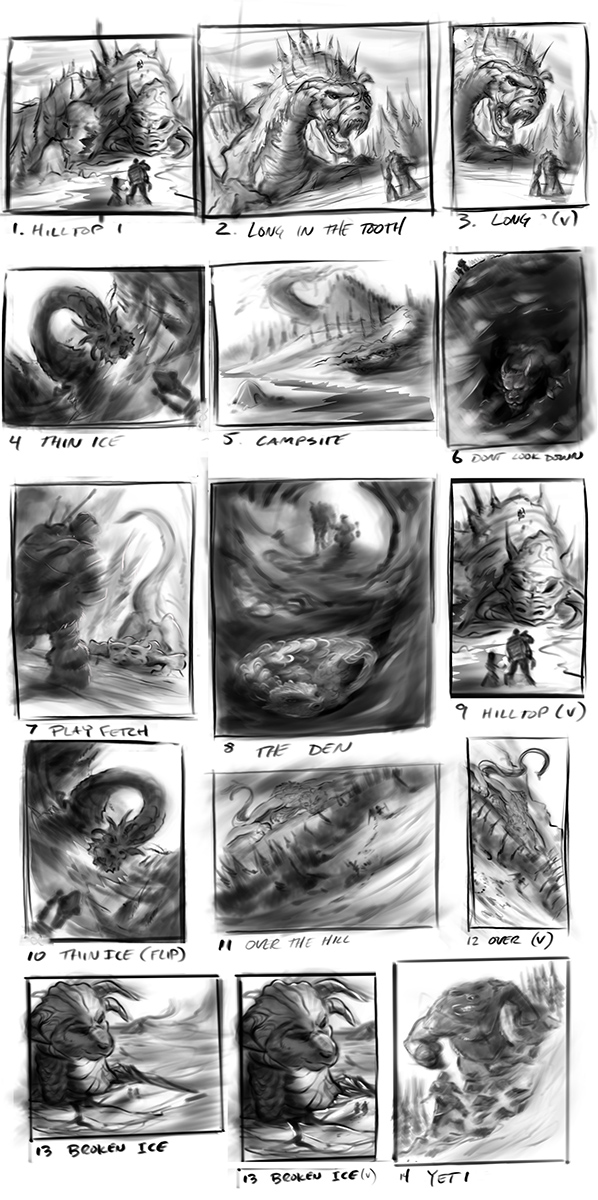
I wanted to set myself a loose brief for this weekends fun, general idea is “weary traveler stumbles upon an arctic beast/dragon.” Cliche I know…don’t care…Haven’t done a dragon in a while thought it might be time. Plus is just watched episode 1 season 2 of Vox Machina and got inspired :)
Spent a little time on a few thumbs and thought this time I would get your guys’ input before I go with the one I would pick…any preferences? Happy Saturday y’all!

Posts: 3,338
Threads: 37
Joined: Aug 2013
Reputation:
234
I think sometime the feedback can be slow in here so i encourage people to work on multiple project to stay productive if necessary.
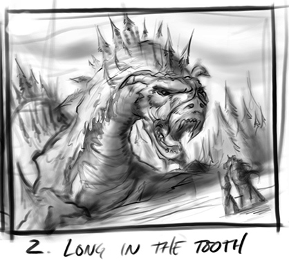
For me personally i would say number 2 i like the territorial vibe coming out of this one some of the other have more of a neutral npc vibe like a gentle ancient dragon you go to ask for advise or that have a quest for you.
I think something to try to think about for next time is trying to avoid putting your character in a position where they are facing away from the viewer make the character less passive it easier to design something where there is something very dominant but it take a good deal of thinking to create a second read that balance the primary focus.I find that scene where we see character with there back facing use are more of the real of environnement so here it working because of the dragon being sometime part of the environment
Of course with massive creature it can be normal to have unbalanced primary and secondary read.
Posts: 261
Threads: 9
Joined: Dec 2021
Reputation:
43
Cheers dude! Totally agree on the character read especially with the travelers having their back to us. FOr this i wanted to keep them turned primarily to direct the viewers gaze to emulate their gaze, but i do have a few where i flipped the narrative (8 and 6) but im not sure i want that for this one.
Yeah the forum certainly slows down over the weekends and was just throwing this out there to see who was browsing. I Actually like a few of these and may sharpen a few if i get more time.
I agree i like 2 as well, it was the one i was thinking about also as i wanted to challenge myself to give the feeling of scale and which i don’t normally aim for a lot. Should be a fun one to flesh out and experiment with.
Posts: 353
Threads: 5
Joined: Sep 2019
Reputation:
23
Wow you were so fast with the crocolancer! Monochrome looks fine, the thumbnail actually evoked a comic panel to me so I wasn't expecting a grandiose tapestry with a zillion secondary focus points. The tribe sent her to scout where an intruder from the Shark tribe was spied last moon, and she suddenly hears something unusual on the left, all clear to me!
And talking about focus points, reading your entire sketchbook I noticed that you initially tended to introduce too many focus points by detailing the texture of all the surfaces. You gradually grew out of it and this is a good thing.
You have a great sense of composition but once in a while you get some postures a bit stiff, and the characters' gazes absent-minded. I can point them out more specifically if you wish, but you may already know what i'm talking about.
Out of your latest thumbnails, Thin Ice (number 4) is an interesting composition and setting, with many challenges if the sun is low on either side. I also like vertical 3 for the dramatic mood (and horizontal 2 to a lesser extent).
Posts: 261
Threads: 9
Joined: Dec 2021
Reputation:
43
(01-22-2023, 10:42 AM)Leo Ki Wrote: Wow you were so fast with the crocolancer! Monochrome looks fine, the thumbnail actually evoked a comic panel to me so I wasn't expecting a grandiose tapestry with a zillion secondary focus points. The tribe sent her to scout where an intruder from the Shark tribe was spied last moon, and she suddenly hears something unusual on the left, all clear to me!
And talking about focus points, reading your entire sketchbook I noticed that you initially tended to introduce too many focus points by detailing the texture of all the surfaces. You gradually grew out of it and this is a good thing.
You have a great sense of composition but once in a while you get some postures a bit stiff, and the characters' gazes absent-minded. I can point them out more specifically if you wish, but you may already know what i'm talking about.
Out of your latest thumbnails, Thin Ice (number 4) is an interesting composition and setting, with many challenges if the sun is low on either side. I also like vertical 3 for the dramatic mood (and horizontal 2 to a lesser extent).
Thanks dude! I really appreciate all the feedback, yeah I totally agree with some the growth I see in my own work in regards to fighting the urge to render everything. Things like you pointed out about character gazes is certainly one of those elements I look back on and cringe, hard to see at the time but in retrospect stick out like a sore thumb. I try to be more conscious of it these days but sometimes my impatient gets the better of me.
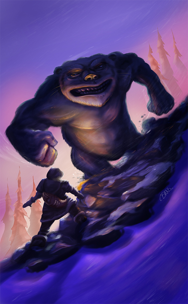
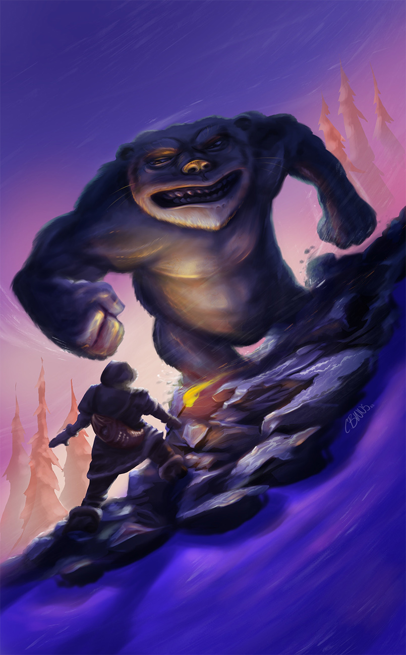
I agree with thumb #4 as well and will be pushing this one further also as its one of my faves too. For this morning however I needed to flesh out this bad-ass abominable gorilla-kitty :) as I woke up thinking about it ha! stayed pretty zoomed out on this one just have a little fun with brush strokes snd let the contrast and composition drive this one, I’m pretty happy with the progress so far, I know the characters may be reading as a little dark but nothing a little photoshop can’t help with later on.
I’m gonna focus on my dragon piece now

Posts: 353
Threads: 5
Joined: Sep 2019
Reputation:
23
Oh, I forgot to tell you that the hind claws of the crocodile popping out the water is a very nice touch.
For the yeti piece, maybe, just maybe, making the ambient light a tad bit darker may allow for the torch light to have a more dramatic effect? Also, the torch being right on the edge of the slope next to the lightest point of the sky kind of drowns it.
Psst, the yeti's right eye (our left) doesn't seem to be looking at the adventurer.
Posts: 261
Threads: 9
Joined: Dec 2021
Reputation:
43
(01-23-2023, 11:07 AM)Leo Ki Wrote: Oh, I forgot to tell you that the hind claws of the crocodile popping out the water is a very nice touch.
For the yeti piece, maybe, just maybe, making the ambient light a tad bit darker may allow for the torch light to have a more dramatic effect? Also, the torch being right on the edge of the slope next to the lightest point of the sky kind of drowns it.
Psst, the yeti's right eye (our left) doesn't seem to be looking at the adventurer.
Cheers for the feedback! I made some changes per your suggestions and I think it made the piece stronger for sure. Moving the torch and pumping the levels a tad really helps. That will teach me to use 100% brightness on my iPad, I know better than that lol.

Posts: 261
Threads: 9
Joined: Dec 2021
Reputation:
43
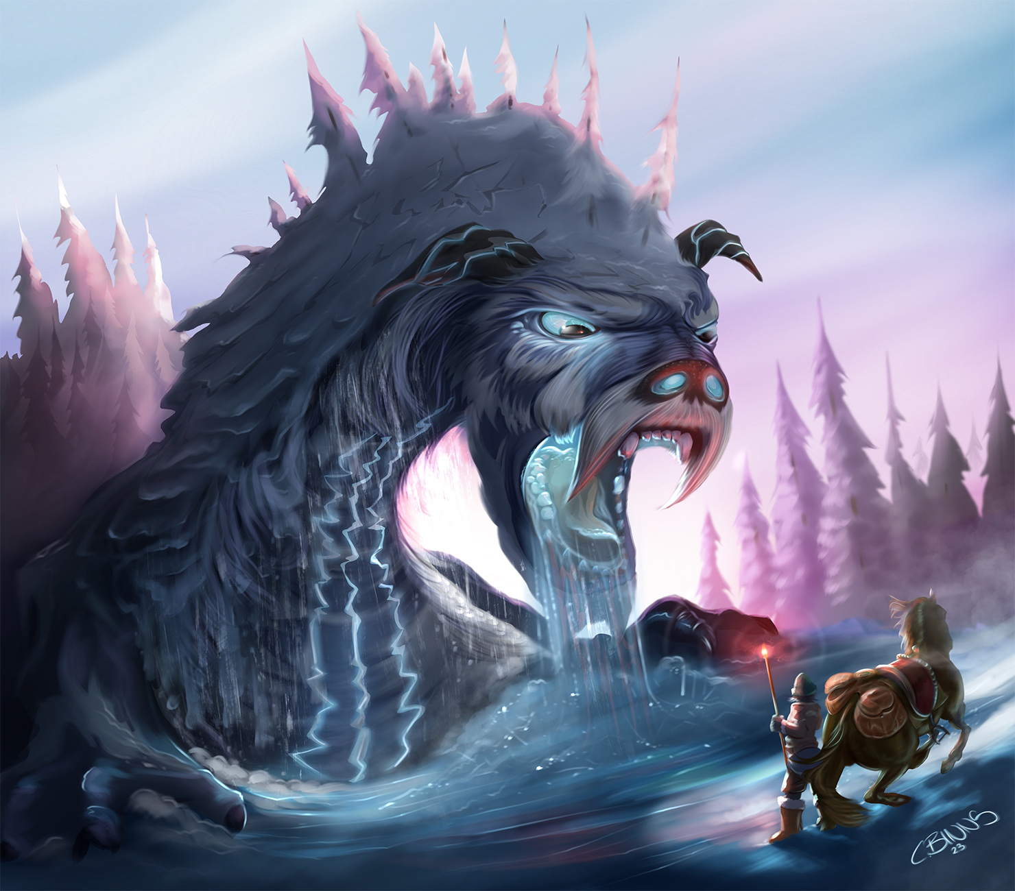
Made some progress on my old ass arctic Dragon… yes he has fur, no rules with dragons! Thumbnail 2 for reference of where he came from. I might play around and have some fun with thumb #4 and y’all can be the judge of which of the 3 is the best fit for the brief I set for myself. “Weary traveler stumbles upon an arctic beast/dragon”


Posts: 353
Threads: 5
Joined: Sep 2019
Reputation:
23
It makes perfect sense for an arctic dragon to have fur. Otherwise it would be hibernating all year long.
I like how the stylized trees look like ice spikes.
Since the dragon is just getting up, I would imagine big chunks of snow crumbling down from its neck and head. I think you painted some snow powder falling down but it's not clear to me.
Posts: 1,066
Threads: 4
Joined: Jan 2016
Reputation:
43
Loving your latest dragon illustration, great style and composition. Lots of great lively colors as well, great job with that!
Posts: 6
Threads: 1
Joined: Jan 2023
Reputation:
0
Love the dynamism and story telling you put into each of your pieces!
Posts: 261
Threads: 9
Joined: Dec 2021
Reputation:
43
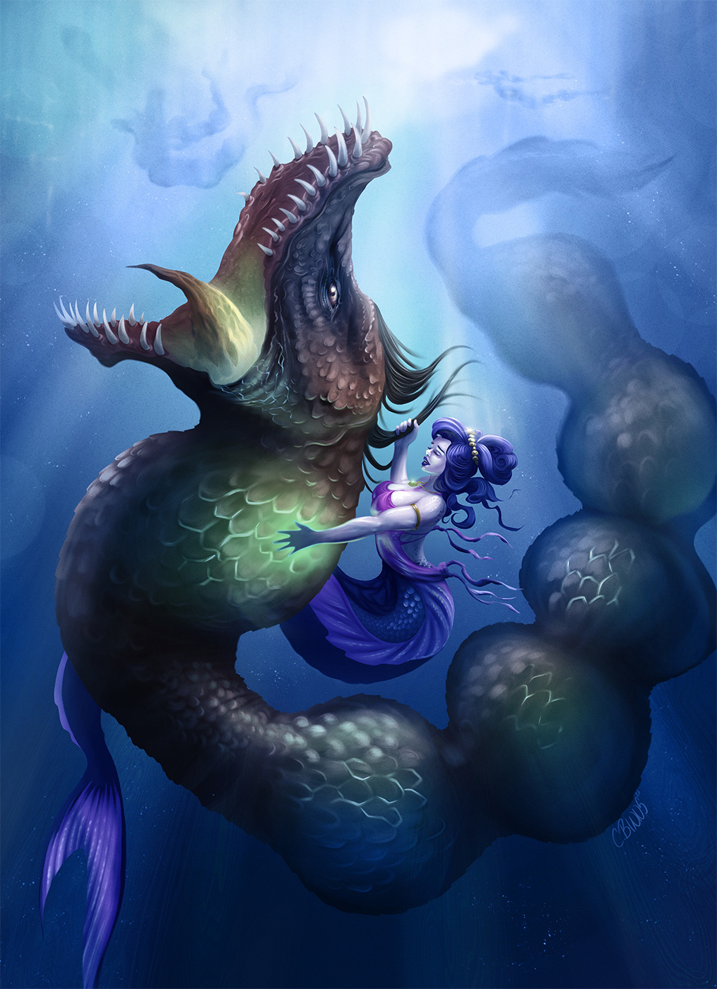
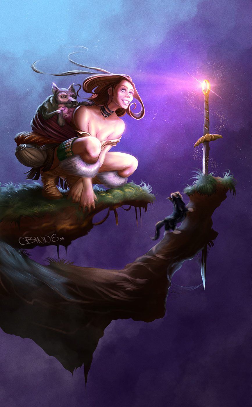
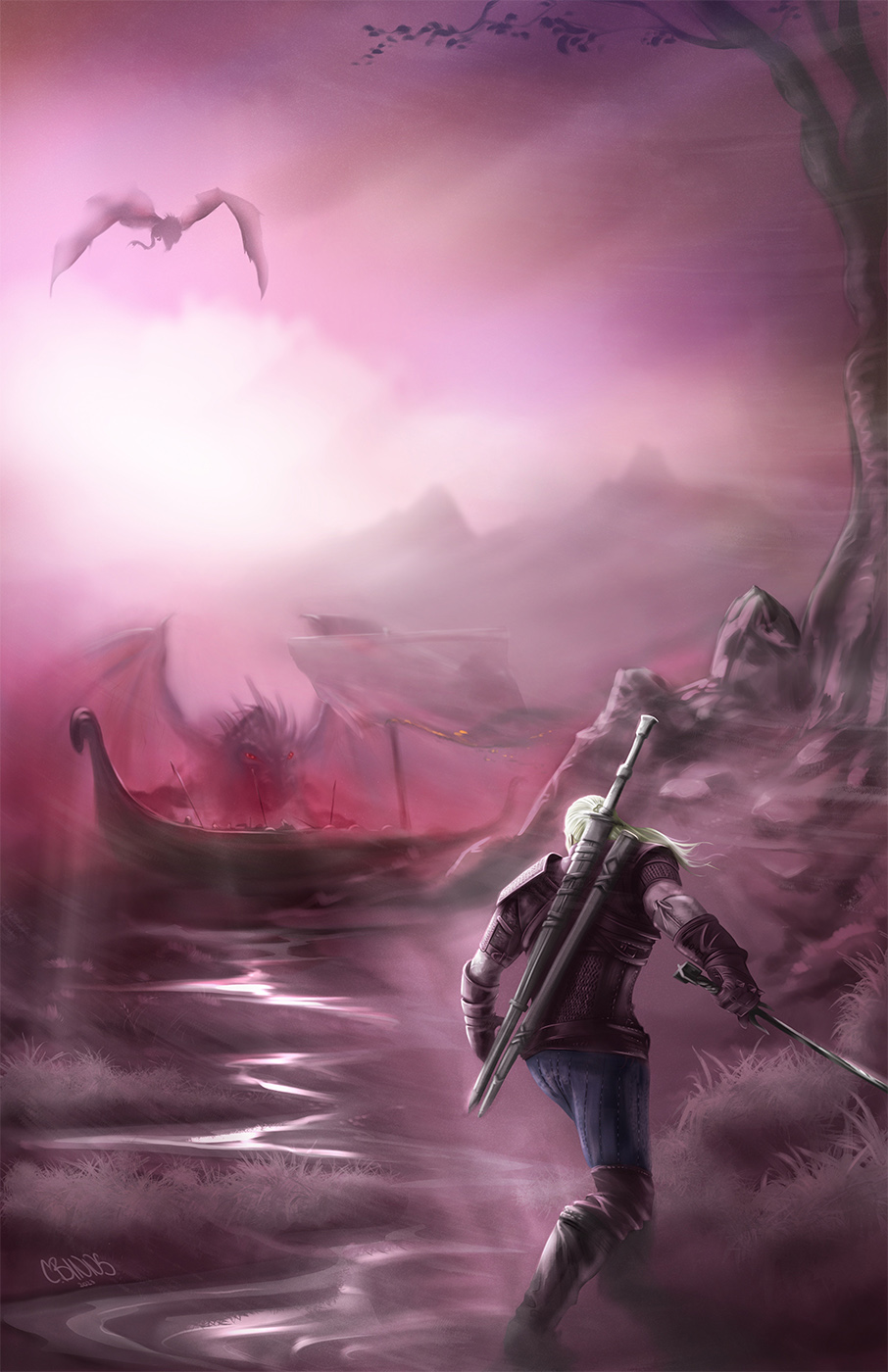
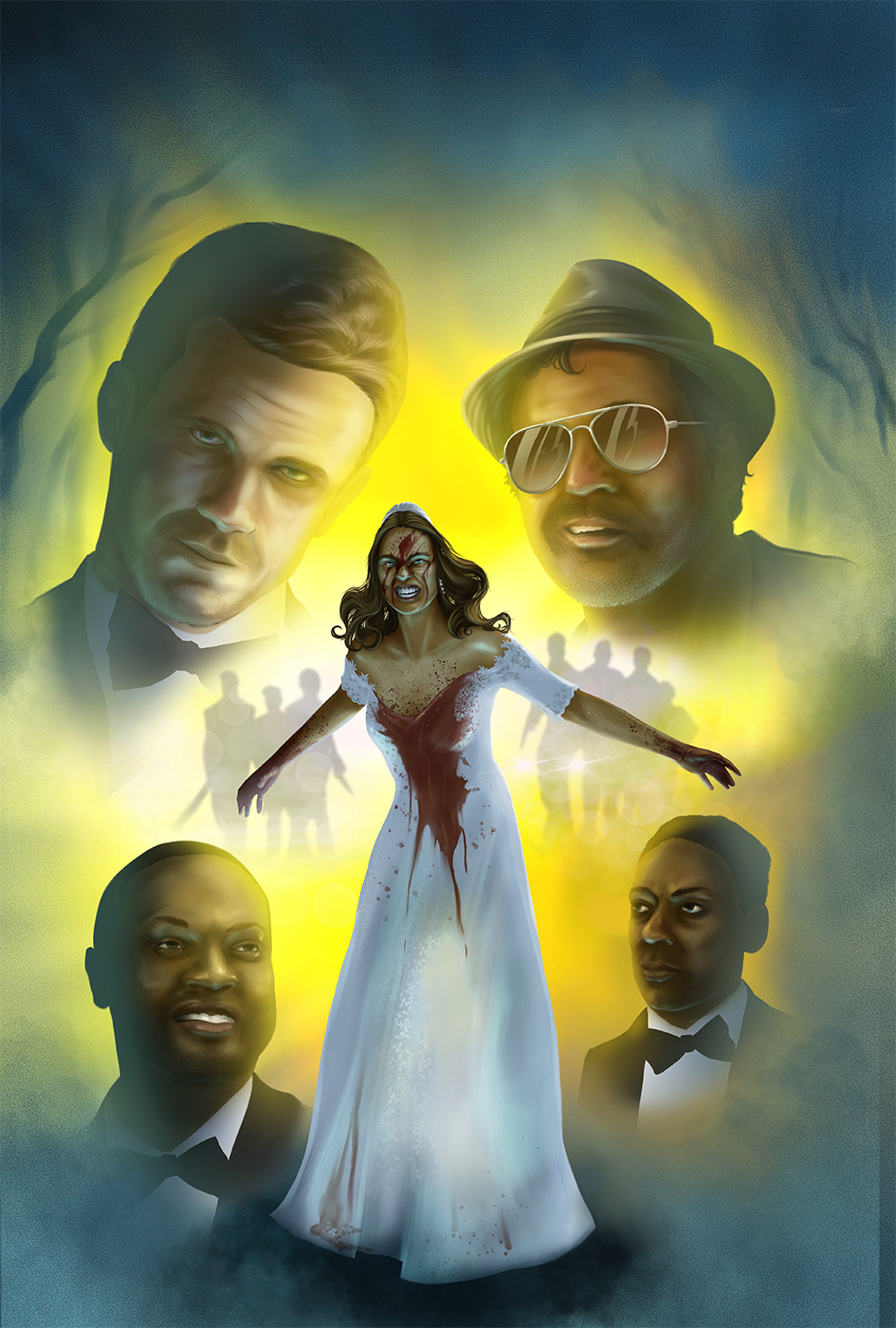
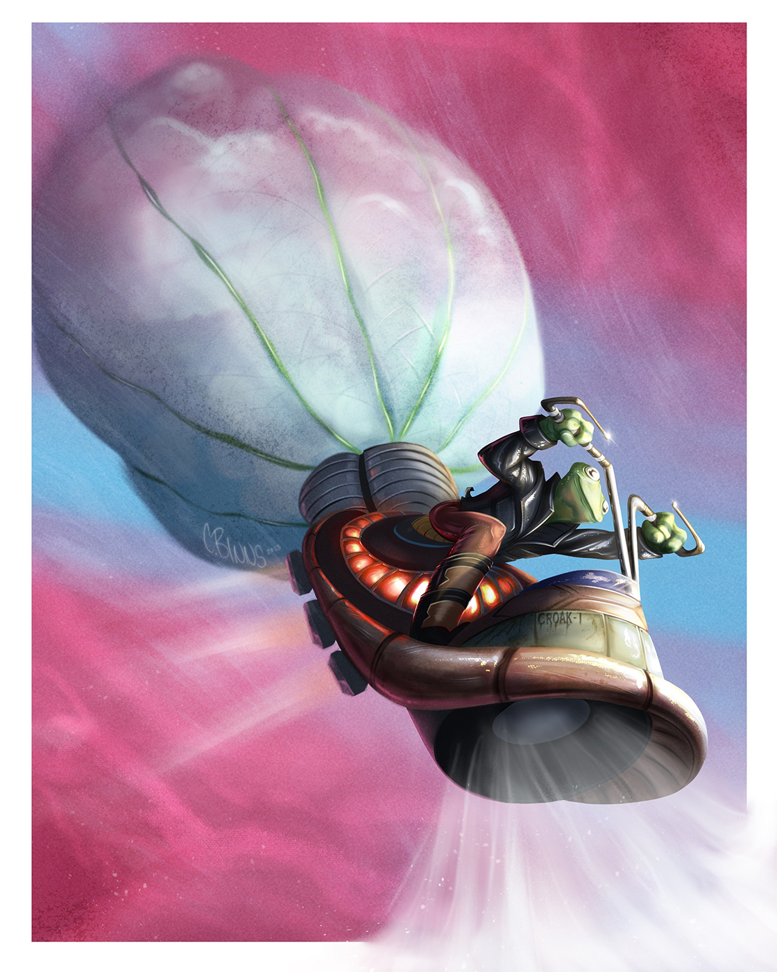
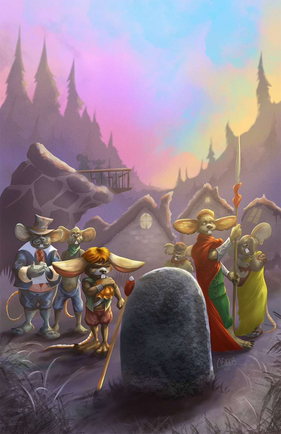
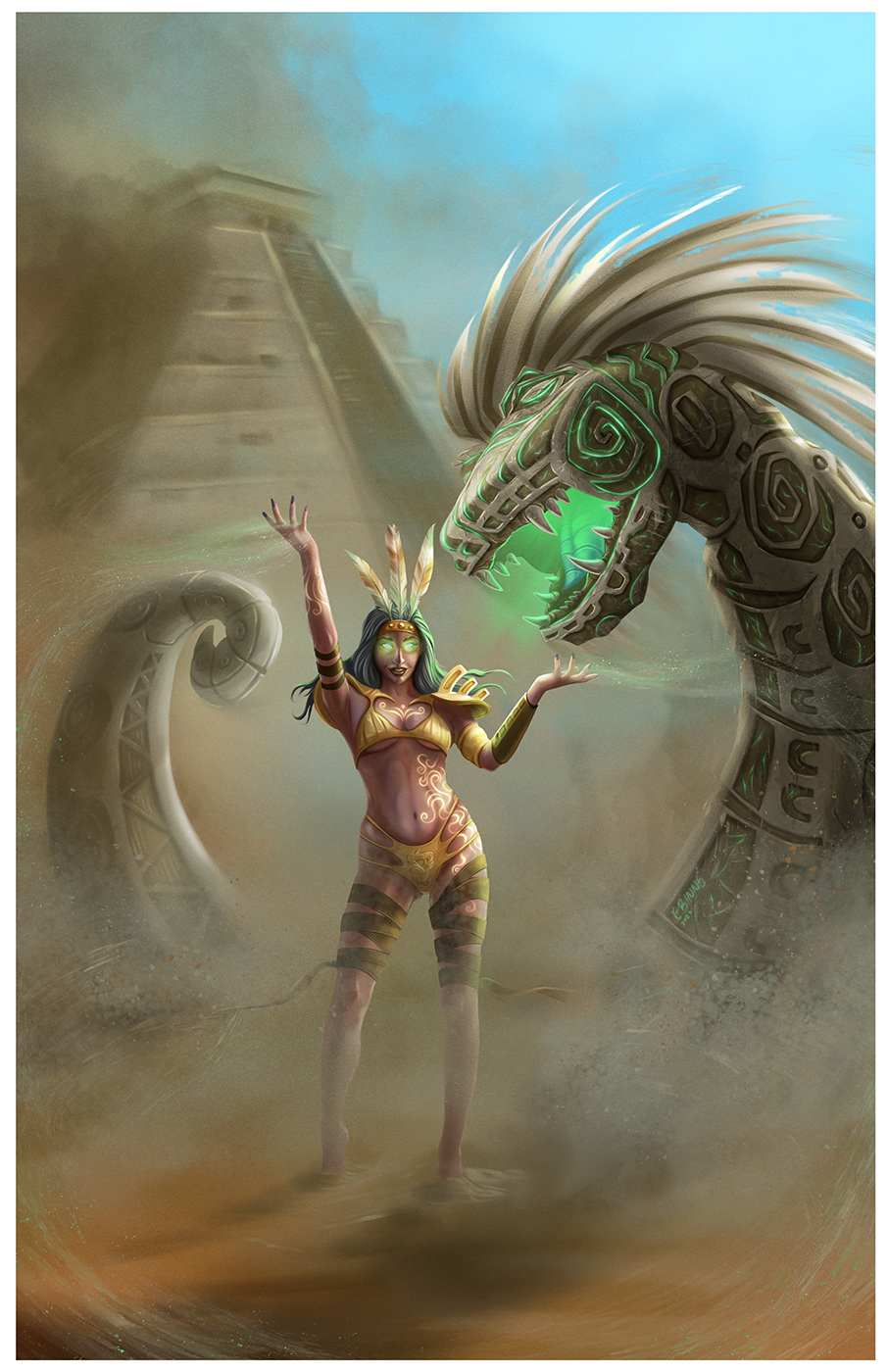
I have probably neglected my sketchbook journey for long enough now, time for a mid year 2023 update on how my coloring and illustration journey is progressing for posterity. This is a collection of a few different pieces I have finished over the past 6 months or so, some commissions, some CHOW pieces and some personal project pieces. All in all I’m quite pleased with the progress I’ve made over the last few years when I look back. Well if looking back a year or two is concerned and wanting to burn most of what you thought was good at the time (like all artists I’m sure) is has any indication then I should be happy.
Still lots of areas of improvement im working on and I continue to drive in those directions, in regards to color pallets and lighting but I’m starting to see coloring/rendering in a new light these days and just can’t wait to get to the stage in a piece where I can just experiment with everything. What was once a dreaded chore is now my favorite piece.
I might spend a little more time this year going back to traditional art for a refreshing change and see if I can’t apply some of what I’ve learned over the years with my oils and acrylics. Should be fun if nothing else :)


Posts: 261
Threads: 9
Joined: Dec 2021
Reputation:
43
Posts: 1,066
Threads: 4
Joined: Jan 2016
Reputation:
43
Loving the strong lighting and vibrant colors of your latest updates, makes for some rich imagery. They all pop! Keep it up!
|


