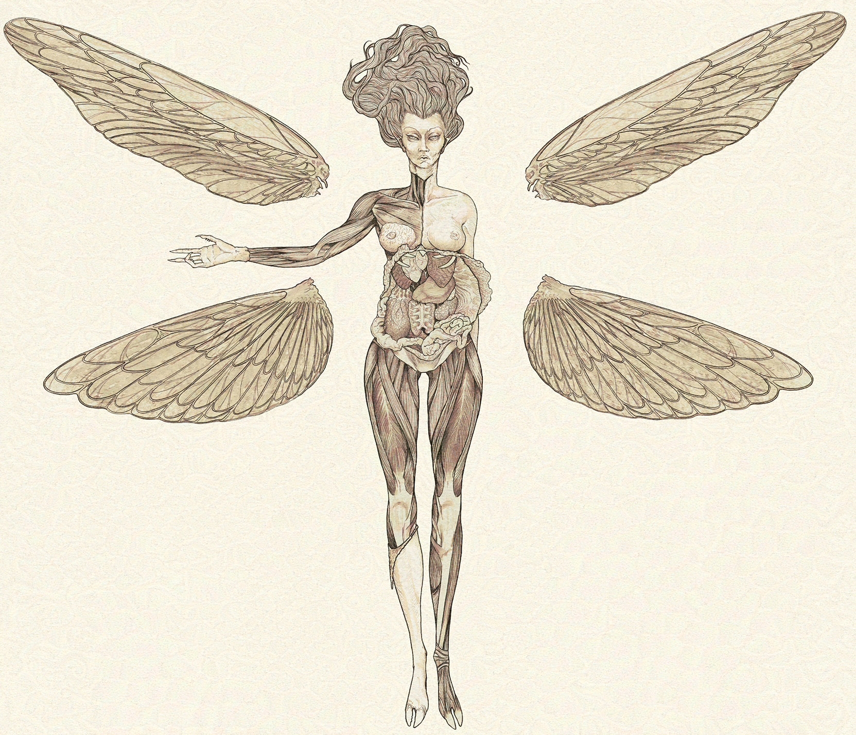
Crimson CHOW #52 - The Learned Observer
#1


This week's theme and brief by previous winner, RottenPocket


Crimson Character of the Week #52

Sorry I'm late! Life is a Vortex...

This week's challenge is going to touch on your design and worldbuilding skills - with one central theme:

THE LEARNED OBSERVER

Conceptualize, Display and Illustrate a Fantastical or Sci-fi Specimen as though you are the scientific observer. We will keep this Broad in the sense it could be Animal, Vegetable or Mineral - But you must exhibit some element of your character's artful journey in understanding the subject.
This is not just a 360° creature concept. Explore Scientific Diagrams, Alchemical apparatus, taxidermy or écorché, and illustrate a scene, or journal entry of the subject.
ł₦₴₱łⱤ₳₮łØ₦
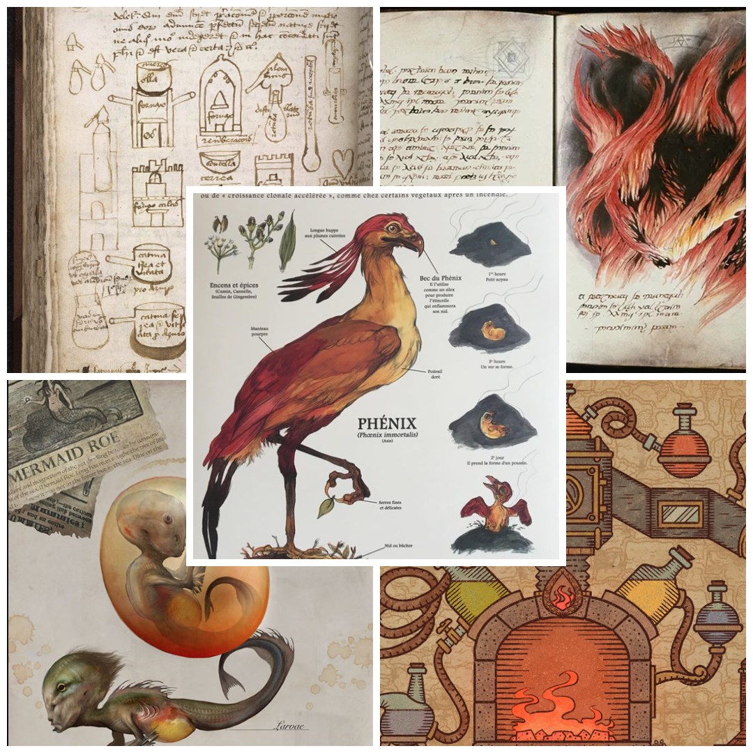

Examples from BL Sloane Alchemical Apparatus 1091; Alchemy Simulator the Game; Vincent Coviello Mermaid Roe; Saruman's Book - Balrog; Camille Renversade - Pheonix.
The best of the CHOWs will be picked by an anonymous poll in the Finals thread and the winner is given the opportunity to pick the theme of the next CHOW's design, as well as becoming the title banner for that week! So go hard, design something interesting and unique!


Guidelines:
  • No photograph paint overs, must be 100% original work. (See next rule for exception)
  • 3D is permitted and renders MAY be used as whole or in part of a painting, as long as YOU created the work. Pre-made and/or purchased, online, assets are forbidden.
  • AI may be used in the ideation process, but the final image must be 100% hand-drawn.
  • There is no restriction on the character's gender, time period or culture.
  • Studies are recommended, but not required.
  • There is no restriction on image formats (horizontal, vertical, square).
  • Environment backgrounds are optional.
  • Keep in mind you are not required to stick to what is in the passage. It is more of a guide in terms of mood.

Rules:
  • You must post at least one WIP in the WIP thread to be accepted into the final poll.
  • Finals must be posted in the finals thread before the deadline.
  • At least 3/4 of the character must be visible (minimum from the knees up).
  • Only ONE submission per person in the finals thread.
  • No fanart. We want to see your original, unique interpretations!
  • Voting will be held for 5 days after the deadline.
  • In an event of a tiebreaker, a winner will be chosen through a randomized name picker.

Deadline is Saturday, February 17th @ UTC: 23:59

-+|| WIP THREAD ||+-
Deadline is Saturday, June 14th @ UTC: 23:59
Reply
#2
Oh niiice love this idea!

Reply
#3
Firing up some studies......


LEGEND'S SKETCHBOOK_001
To all artists struggling to create and are intimidated by A.I. (anti-imagination)
Sun "Everything has been done, but not by you" Sun
Reply
#4
Lege1 -

I think you should go for the more sketchy feel for the face also.Since you already have the style and you dont need a ton of rendering you can go heavy on the amount of drawing.Like for example the look of the egg some anatomical dissection like for example what the eye look like when it detached from the eye socket.A drawing of what the diet consist off.

I would just move the date near the signature in future drawing to keep space for the text around your drawing.

You could and should probably do a couple of those since they dont seem to take that much time and you will be able to pick your favorite for submission.

I think the trap here is over rendering those are more scientific drawing so it more about creating a mood with the text and the presentation.

Also think creative like i would say don't necessarly go for something already existing try to mix real creature with mythology or extraterrestrial being like for example the autopsy of a harpies or the autopsy of a alien from uranus.

My Sketchbook

Perfection is unmeasurable therefor it impossible to reach it.
Reply
#5
Great start Lege! Your style certainly fits the brief it’s gonna be a good one. I think I agree that maybe keeping the head a tad sketchier would look awesome. But believe me I know how hard it is to not render something lol. Not sure I will be able to resist myself but you know what… who cares just have some fun with it :)

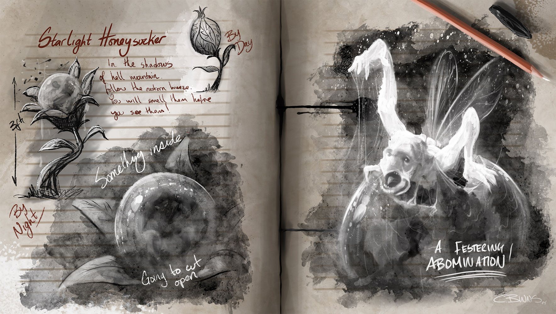
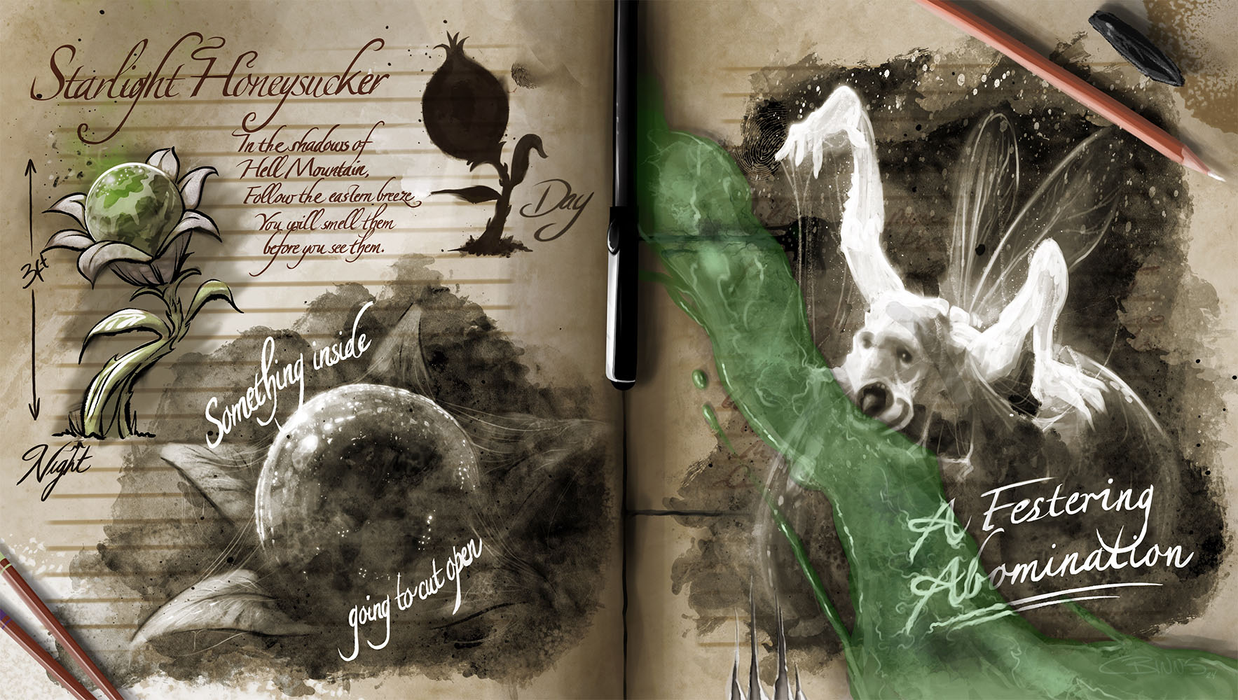
I had some fun myself with this today. I envision these little suckers squirting from poisoned scuttle  flowers that fester in the shadows of Hell mountain. 


Reply
#6
Ooooh guys. These are sooo good! Looking forward to this one for sure!

Lege1 - This reminds me of Feng Zhu's designs! That looks absolutely top notch!

CBinns - I'm so looking forward to seeing this develop. Love the journal look. It got such an Ark: Survival illustration look. Those images are incredible if your unfamiliar with them.

Reply
#7
Thank you guys!
Darktiste: Great suggestions and thank you, I'm taking those things into consideration. This is just a study to get the ball rolling and hopefully create some inspirational waves. The heads are rendered out simply because I was just experimenting with some rendering techniques.

CBinnsIllustration: Thanks so much man, and really dope concept you got going and I like the presentation your coming with on this as well. This should def be a great round.

Damian  Levs: Thank you and that is a big compliment to be compared in any way to Feng, I'm really glad you are liking it. I have two more studies of currently existing creatures I'd like to do before I get into the main course of designing the creature. Just taking my time and enjoying the journey on this one . Looking forward to what you will come with as well !


Attached Files Image(s)


LEGEND'S SKETCHBOOK_001
To all artists struggling to create and are intimidated by A.I. (anti-imagination)
Sun "Everything has been done, but not by you" Sun
Reply
#8
@Lege1
Great work diving in like that - with the labelling of features, pick some to highlight in a smaller sketch maybe? a close up of an eye or claw, through in some observations.

@CBinnsIllustration
Urrggh it's gross, I love it. Would probably suggest instead of flat black tones, a sepia to match with the worn book look. Otherwise, excellent ink texturing.


_______


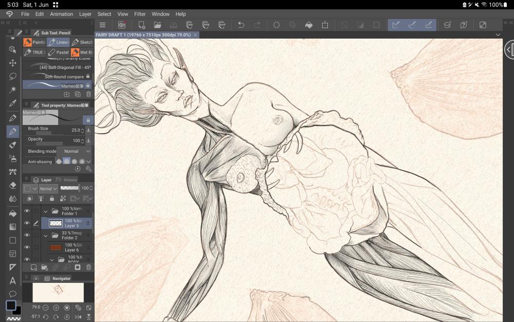
Oooh this is going to be a job and a half...

Sketcherinos

Link Tree

Discord: emnida
Reply
#9
The studies are looking great @Lege love the style so far on these it’s working well. Can’t wait to see what you develop out of these. Maybe a hybrid ?  :)

Cheers @Rotten I was certainly going for a gross little guy on this one. And good advice on a warmer sepia tone, I think that works better. Nice start on your piece, this has some gross potential itself lol. Looking forward to your progress

And thanks @damian I hadn’t seen those Ark illustrations but I checked them out and you are right it’s a very similar approach, those are pretty cool.

I played around with this bit today, added a few elements just for fun and gave the whole thing a slightly warmer tone. Might put this down for a bit and maybe try with some more ideas.

 I’m thinking this was observers final journal entry when this rotten pint-size pixie squirted from his festering bubble.


Reply
#10
Lookin good guys, Lege I had a small blast from the past when I saw your snap turtle sketch.
Back then I watched tons of FZD during work so its nice to see people keeping the tradition alive.

CB I really like the rendering especially the usage of white for the highlights and the texture indications
Whenever I try to use white tones it often looks off or out of place.

RottenPocket thanks for the cool briefing! 
Im curious how this sketch is going to look in the final stages.


So this week I was really sick and could barely even stay awake to read or to do anything.
Today I felt a bit better and tried to roughly sketch my first ideas down.
Since the briefing is so vague in a good way I decided to go for smth more surreal based
on the old alchemy world. 
Back then people where really eager to find out the "prima materia" - first matter - first material.
I plan to visualize the expirments of a alchemist who is done exploring the planet earth and plans to
discover more about the first matter in the skies. 
Based on the idea of a giant beanstalk from the fairy tale Jack and the beanstalk,
 the alchemist is developing a potion which enhances the growth of plants. 
In order to create the potion certain plants and flower have to be extracted, per exctraction
a new sigil is revealed. Once all sigils are revealed the beanstalk is able to grow into the sky.

I found this cool site about certain formulars from science 
http://hyperphysics.phy-astr.gsu.edu/hba...arfor.html

Im going to meetup with a friend who works as a theoretical physic to derive the barometic
formular to create a foundation for the world.
With this information I have a better foundation how the vegetation is going to look like
with less / more air pressure, oxygen etc. on top I also get a better idea what 
tools where used to extract materials and measure air pressure.


Attached Files Image(s)


Reply
#11
Just wanna share some inspiration


Voynich manuscript
https://www.britannica.com/topic/Voynich-manuscript

Straight up renaissance stuff.The Voynich manuscript is an illustrated codex, hand-written in an unknown script referred to as 'Voynichese.' The vellum on which it is written has been carbon-dated to the early 15th century (1404–1438). Stylistic analysis has indicated the manuscript may have been composed in Italy during the Italian Renaissance.


CODEX SERAPHINUS
https://agencespatiale.wordpress.com/wp-...s_1978.pdf

Codex Seraphinianus, originally published in 1981, is an illustrated encyclopedia of an imaginary world, created by the Italian artist, architect and industrial designer Luigi Serafini during thirty months, from 1976 to 1978. The book is approximately 360 pages long (depending on edition), and written in a strange, generally unintelligible alphabet. Originally published in Italy, the book has since been released in a number of different countries.

Mythical monsters
https://ia800905.us.archive.org/32/items...ulrich.pdf

Looking for the perspective of scholar that study myth and legend in the 19th centuary? Look no further. This book contain 93 illustration.

My Sketchbook

Perfection is unmeasurable therefor it impossible to reach it.
Reply
#12
[Image: f7GXfUvpLXNTyDnMS2.gif]
-------------------------------------------------------------------

Struggled a little to make time to finish the sketch layer - a little too fine to be doing on buses and trains. I've well and truly maxed out my screen time this week and it's only Tuesday. 


@Trashpanda I'm really keen to see what you come up with - really dive into the physics! 

Sketcherinos

Link Tree

Discord: emnida
Reply
#13
Threw around a few ideas of what I would like to do in sketch form before deciding a furry mammal would be my poison. I wanted to design something rather big and imposing yet also a little cute (think bear.) I ended up coming up with this guy taking inspiration from anteaters way of feeding by using their long tongues. 

Spent a while on the skeletal and ecorche drawings, I hadn't studied animal anatomy before and I had wanted to try science book like illustrations in a while; it was very fun and I am happy having the opportunity to do so now. Very pleased with the outcome.

Horns for goring trees or animals to make them release their nutritious juices. Long, oddly spoon-tipped tongue for licking up said juices. Strong climber. Known for dropping from the giant trees of their world and landing on the backs of much larger beasts to feed off them.

I wanted to do some kind of "keyframe" illustration for the final. Didn't quite hit the spot for what I imagined but maybe another time...


Attached Files Image(s)


Reply
#14
My apologies for not being able to be that active this round, been bogged down with work and trying to strike while the iron is hot. There are lots of cool developments this round and looking forward to seeing your finals.

RottenPocket: Thank you and I took your advice on spotlighting some of the creatures characteristics, tried to do it with interesting presentation.

Really cool creature/ character you have brewing, reminds me some what of The Thing movie.

CBinnsIllustration: Thank you and glad you liked the studies I put up, I enjoyed creating them. Definitely developed a hybrid on some crazy crack pot idea I whirled up.

Your piece looks amazing and I really like the fairytale like feel it has. Very cool additions with the pencils and pens around your work. Very nice font for the writing as well, you'll have to share that with me after voting, I could definitely use that in my graphic work.

TrashPanda: Thank you much and Feng Zhu will always be a big inspiration for me, the man is a concept art genius.
You have some interesting references and pre-sketches in the works, it will be interesting to see the conclusion to this.

FallingWater: Very cool concept and I like how you show the bone, muscle, and final anatomy of this creature. Very cool size reference too with the person there, I remember seeing this often on Conceptart.org's C.O.W. concepts a lot, and it's a great way to show the size of the creature.

LEGEND'S SKETCHBOOK_001
To all artists struggling to create and are intimidated by A.I. (anti-imagination)
Sun "Everything has been done, but not by you" Sun
Reply


Forum Jump:


Users browsing this thread: 8 Guest(s)