Komodo's sketchbook
#41
"But what i want to say is your drawing are way smaller about maybe 7-8 smaller then is critic/comment so don't take the comment on accuracy with a grain of salt."

Is this aimed at my feedback? He probably hasn't painted them at the scale he posted. Given your attempts at this exercise in the past I don't think you have much insight to add about being accurate and its importance. Of course things don't always have to be super accurate, but these value studies are also compositional in nature, and so spending some effort in nailing the placement of shapes can only add to what is being learned. 


"As far as time limit i am not aware if you had any so trying to compare someone who work with urgency and someone who is analyzing is a bit unfair also accuracy vary with experience."

I was not suggesting to compare time taken, so fairness has nothing to do with it. Suggesting someone take a bit more time to place shapes that are compositionally important, when studying values in compositions, simply upskills their ability to do this better.

Darketitse don't bother replying, I don't want to clog up this sb further with pointless discussion. Thx

Reply
#42
@JosephCow Thanks! Yeah regarding the simple shapes, I got tempted and couldn't resist... I tried to keep it in mind but will be focusing on it more next time.

@Noone Thank you for the time you dedicated giving me feedback and whatsmore giving a try to one of the studies I did. It is quite impressive too Shock You're absolutely right about the arbitrary value bucket. I think I saw or heard this somewhere years ago and it became a bad habbit. I should absolutely pick values that match the reference. My frog brain didn't understand that for a reason. You're very right too about the composition/shape placement. I tried to spend 10 to 20 minutes max on these thumbnails. This isn't in any way an excuse but my eye and hand aren't sharp enough (YET!) to be able to manage both of this aspects in so "little" timing. Nonetheless, that's something I had in mind and I think I managed to do OK with the first 2 studies. But yeah, 3rd one is a mess. I have the feeling that the original art is full of spots where the eye is tricked by relative values and shifts, and I couldn't handle that very well.
@darktiste Thank you for your feedback. I worked quite small, in fact, and tried not to zoom in too much, in order not to focus on details. I'd say I spent 75% of the time painting with the art being around a 12 cm*9 cm frame. But I don't think it really matters to be honest.

Reply
#43
I'm currently working on a rather bigger piece than I'm used to do so it's taking some time

I took a break from it and did this from reference. I may work on it again for an hour or so but this is the result after a 2/3 hour session from scratch. around 45 min getting the drawing right and the rest was pretty much straight forward rendering. I wanted to use one specific brush only to get a painterly look. Didn't use the smudge tool or any airbrush.

Still don't know what to do with hairs lol that's why I'm planning on working on it again to figure this out but I can't think straight a couple of hours deep in it so here you go


Attached Files Image(s)


Reply
#44
This may be a stylistic choice, but if you want to go for a more traditional classical painterly look, I think you will have to start adding more softer edges than you currently are using. A range of edge types across a painting will also give it more form and will be closer to how our eyes see things. I'd also perhaps start some trials and play with a brush setting that has a bit more texture built into it otherwise that flat shaded digital look will be prevalent.

Reply
#45
Thank you, Noone, for the pertinent feedback. I added softer edges as you advised but didn't find the right brush settings to texture it to my liking. I shifted the colors toward a less yellow overall tone and reworked a bit the face structure. I spent some more time going back and forth on details so I've decided to let it like this and move on.

I'll keep what you've told me and what I've learnt here in mind for my next portrait piece.


Attached Files Image(s)


Reply
#46
here is the piece I've been working on lately. I struggled a lot. I'd say I'm 60% happy with the result. I spent a fair amount of time rendering, doing, undoing, fixing things that didn't need to be, and so forth, I'm sure you know the drill lol.

Don't hesitate to give me feedback for me to consider. I'm not sure if I'll be able to work on it again for more than 2 or 3 hours, depending on your feedback.

I described some steps of my process, it may help you commenting on what I've painted and understanding the choices I made.


Attached Files Image(s)


Reply
#47
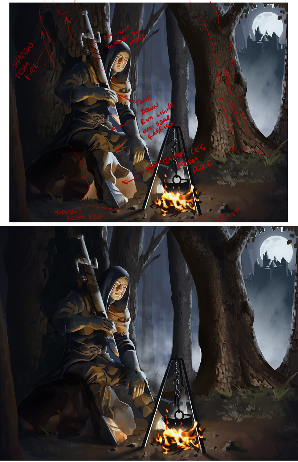
The foot is hard to read and the leg and the rock kind of blend together visually due to the strong rim light.I don't understand the choose of him wearing armor on is feet since he doesn't seem to wear armor anywhere else. That why i think that make it hard to read as a foot as it doesn't harmonize with the rest of the design. If you had let say replace the bandage with a gauntlet it would have been easier to read as a foot because now you can relate to other piece of armor.

Also remember that when block thing out it might look like thing read but as you add detail you might loose that readablity so remember to zoom in and out to see if what you want to read also read at a small scale.

The color of the light on the metal and elsewhere that light shine should be red orange yellow since it mostly lit by the fire source. Also you did not paint the shadow of one of the fire pole on the right side like you did in the thumbnail but not in the final .

Using a grey color for the rock would probably help get a better read using the idea of using a saturated color against a desatured color help separate element. You could also separate element by temperature like warm color against cold color.

For the pose i suppose he taking this pose so that if the sword fall it will make noise and wake him up otherwise i would find it othwuse hard to justify because you would want the sword to be where it easy to take it out that just an observation on the pose maybe you can elaborate if my observation was correct.

Also be careful with how you choose to make fold you want thing to be readable specially where thing overlap.

I also like the idea of something lurking and how the tree branch help move the eye in that color test but i think you also did a good job with how you use contrast to move the eye where it as to be.

That all i got for you.

My Sketchbook

Perfection is unmeasurable therefor it impossible to reach it.
Reply
#48
Nice piece! I like a lot of things about this. The face in particular is very nicely done. Darktiste made some excellent suggestions already but I could add that with the two defined light sources you could have had a bit more fun throwing shadows and bounce lights in this one. I would personally like to see the heavy white rim light toned down on some of the different materials and fabrics, and perhaps some care around overlaps where the rim light would avoid.

 I hope you don’t mind but I did a quick PO just to show a few things. The big items mainly being adding more dramatic cast shadows. If the fire at his feet is casting a shadow of him on the tree I would like to see it much higher up the tree. The added shadow on the tree on the right to break up the moon rim light and fire light to show a bit more form. The rock he is sitting on like dark called out could do with some separating from his leg. And if that is the moonlight rim light on his sword maybe we should have his head block it out a bit. But just my two cents,  these could all be intentional stylized elements and in that case rock on dude. Keep up the great work


Reply
#49
Thank you both of you for the feedback I'm very grateful

@darktiste For the piece of armor on the foot, I get what you're saying. The character is the one I designed and posted here about a month ago and I was ok with his overall look. But I totally agree with you, in this particular scenario, it makes it hard to read. I'll try to render a bit more the foot and see if it fixes it. If not, I might make him wear leather boots, I'll see. 

You're right about the light color I really don't know why it's white on the metallic poles I'll fix that. I somehow forgot to add back the cast shadow of the right pole, too, yeah.

Your observation about the pose is indeed correct. The idea is that he separated his sword from the belt to sit. Then he's in a "meditation" or "not-completely-asleep" state. The fact that his sword is kind of balanced under his arm conveys this idea of : if he falls completely asleep it'll slip and wake him up. i like the idea of knot knowing if his eyes are completely closed or looking at the fire, too. But yeah, this is the overall idea.

I'm still struggling a lot with fold. I understand how it works and I'm decent at drawing them, even from imagination, but I'm unable to paint them consistantly. I have to work on that as well.

For the bats hanging on the branch and lurking, I found that it was kind of competing with the castle/moon element (same size, type of contrast and colors, etc.). So I decided to get rid of them. But I loved the idea too. Maybe it was a mistake, but I wanted to simplify the composition.

@CBinnsIllustration Thanks! I'm glad you like it :) In general, now that I've slept on it, it strikes me that the rim light on the character is very inconsistant and that I have to tone it down in some areas. thank you for pointing it out.

I don't mind at all the paint over, I really like the little fixes here and there. I just have mixed feelings about the tree on the right and the shadow between fire light and moonlight. I do understand why, but I fear that this will bring too much attention on it. But I like the idea, I'll try to incorporate it nonetheless. 

I love the fixing you did on the shadows, overall. I wasn't sure about the shadow on the tree behind the character, and went back and forth between something like I did and something like you did. Now I much prefer the dramatic look of long cast shadows. 

I'll work again on it taking your PO into account, I can't thank you enough, gracias senor  Thumbs_up

Reply
#50
Nice job on the latest painting. I don't know how many illustrations of this type you've done so far, but especially if it's one of your first I think you did really well overall. It was a pretty effective use of 3D on the castle. Maybe it would cool to do a simple blockout of a foreground like this and use it as reference for the lighting, if you do another image like this in the future.

Reply
#51
(07-13-2024, 09:15 AM)JosephCow Wrote: Nice job on the latest painting. I don't know how many illustrations of this type you've done so far, but especially if it's one of your first I think you did really well overall. It was a pretty effective use of 3D on the castle. Maybe it would cool to do a simple blockout of a foreground like this and use it as reference for the lighting, if you do another image like this in the future.

Thank you! Yeah that's one of the first composition this complex I've ever done.

In fact I did do a simple blockout to solve some issues for the lighting, a few hours after I began the painting. I did not post it because I wasn't sure it was interesting to anyone.

+ I decided to deviate a bit because I saw a bunch of art pieces where artists were using rather light colors to paint the night, and I liked the look of it, so I took inspiration from there too

Anyway there it is, it's just a screenshot I didn't bother rendering it


Attached Files Image(s)


Reply
#52
Quick tips for blender there a rock generator 
 
Just type extra object in the addon menu section in the edit/preference menu in the top bar.

You can find the rock generator in the mesh menu. It not very necessary i give you that but it still help populate the scene it better then having the scene ''empty'' this way you can test composition and rock arrangement. Give a rock some friend...

Also you probably can find a model that as rigging function this way you can test pose just need to learn some basic about rigging... just get a model that pre rig to save time save it as an asset and if you want you get it ready for the next test...and the bonus is that with a model you have a better sense of proportion inside the scene probably not a problem since you don't seem to do scene where you don't put character so far but still good to know.

Also one thing be careful with the light if you don't import material everything is the same there is no change in reflectivity roughness of material which might end up in the final result if you are not careful i think your advance enough not to fall for this just something i mention because i don't see any material change between the object.


Attached Files Image(s)


My Sketchbook

Perfection is unmeasurable therefor it impossible to reach it.
Reply
#53
(07-15-2024, 08:30 AM)darktiste Wrote: Quick tips for blender there a rock generator 
 
Just type extra object in the addon menu section in the edit/preference menu in the top bar.

You can find the rock generator in the mesh menu. It not very necessary i give you that but it still help populate the scene it better then having the scene ''empty'' this what you can test composition and rock arrangement. Give a rock some friend...

Also you probably can find a model that as rigging function this way you can test pose just need to learn some basic about rigging... just get a model that pre rig to save time save it as an asset and if you want you get it ready for the next test...and the bonus is that with a model you have a better sense of proportion inside the scene probably not a problem since you don't seem to do scene where you don't put character so far but still good to know.

Also one thing be careful with the light if you don't import material everything is the same there is no change in reflectivity roughness of material which might end up in the final result if you are not careful i think your advance enough not to fall for this just something i mention because i don't see any material change between the object.

Thanks for all the tips!! I didn't know about the rock generator, it could come very handy, I'll give it a try for sure for sure!

In fact, I use a phone app (called poseit) when I need specific reference for a character pose, I take photos of me, too, that's what I did for the face, recreating a similar lighting scenario. But I want to learn to manipulate characters in Blender, for sure. I plan on learning that in order to cook all of my ingredients in the same kitchen lol

Yep I didn't bother applying materials to save time. I then relied on photo references for the aspect, reflectiveness/shininess of the differents objects. I think I wouldve done it if the materials were particularly shiny or with specific properties like glass or polished stone for example.

Thanks for the feedback, as always :)

Reply
#54
Hey it's been some time :) I kept doodling a bit but didn't really take time to study seriously drawing this past 2 months. Heat at home was a bit too much most of the time to use the computer anyways.

Here is a lil selfportait


Attached Files Image(s)


Reply
#55
I hope you fix that heat issue.

That piece as a nice very deliberate feel to it.But the skin could use more texturing some different color tone outside and some imperfection like acne or beauty mark some skin pore.

My Sketchbook

Perfection is unmeasurable therefor it impossible to reach it.
Reply


Forum Jump:


Users browsing this thread: 6 Guest(s)