03-14-2024, 08:09 PM
Great updates, loving the character designs of your latest post, very interesting and well drawn and rendered!
|
Cosmic Inhabitant's Sketchbook
|
|
03-14-2024, 08:09 PM
Great updates, loving the character designs of your latest post, very interesting and well drawn and rendered!
03-29-2024, 07:37 PM
@cgmythology - Thanks a lot! I do think I am improving a bit in rendering, specifically in texturing things. I use to not even attempt to texture much at all, but I am actually at least trying to show or indicate some sort of texture now more often.
--- So with my new piece I am working on currently (droid walking down the hallway) my plan is to go all in focus mode on it. Trying to bring it to a complete status as fast as possible (and as for "complete", I mean to a presentable standard relative to my ability). Cause usually I work on several pieces at a time, and get distracted by other ideas and what not. I want to see how long it really takes for me to finish a piece if all focus is put in to it, and I plan to keep track of roughly how long it takes me as well. Also I have been doing some 3D sculpting. I've done some before in Blender, but several months ago I found a simple in-browser sculpting app called SculptGL. I've been messing around with it and had quite a bit of fun making stuffs. Its completely free and as I said earlier can be used in-browser, but there is a stand alone app too. Here's a link to it for anyone interested - https://stephaneginier.com/sculptgl/ And here for the standalone version - https://stephaneginier.com/ I know there is Blender, and I have used it before, but it has a lot of features and is very complex compared to SculptGL. So I think for now I'll stick with SculptGL until I eventually start to out grow its limited features and then I'll slowly make the transition to Blender. 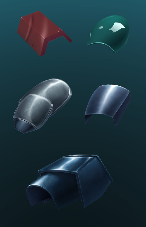 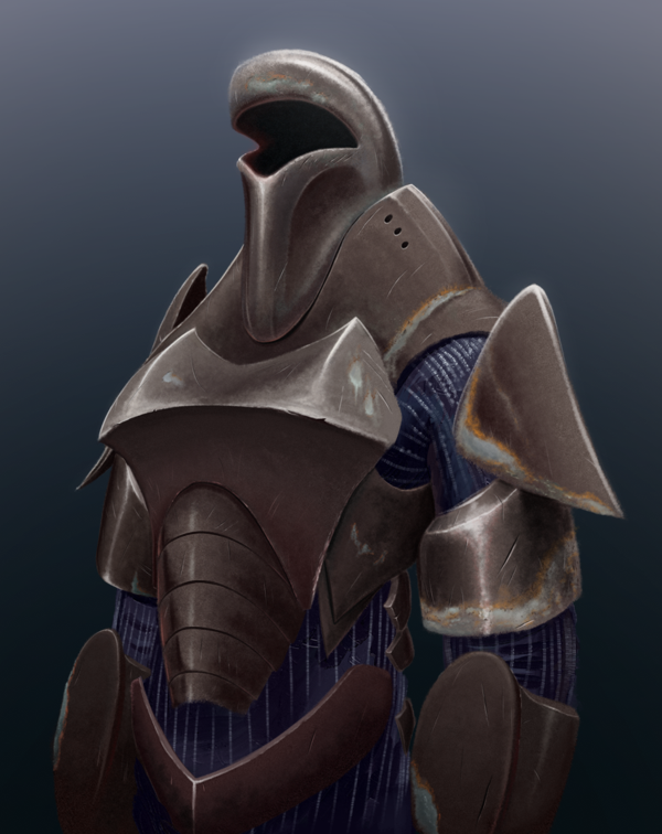 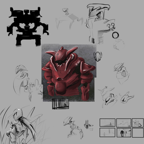 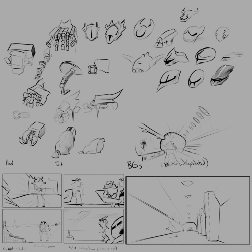  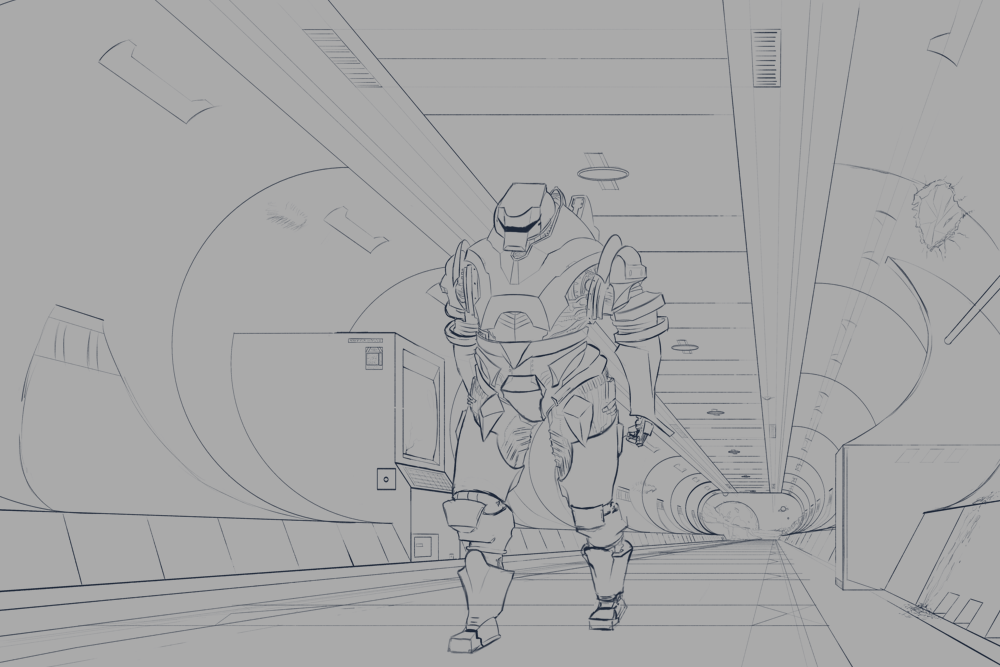 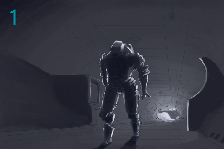 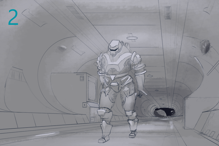 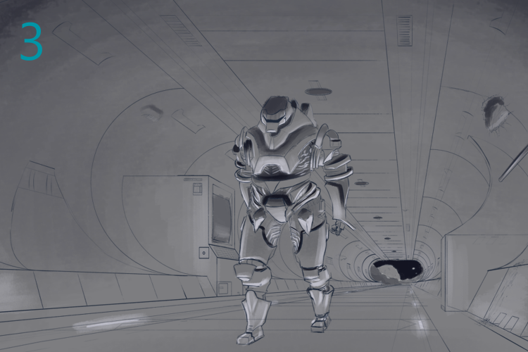 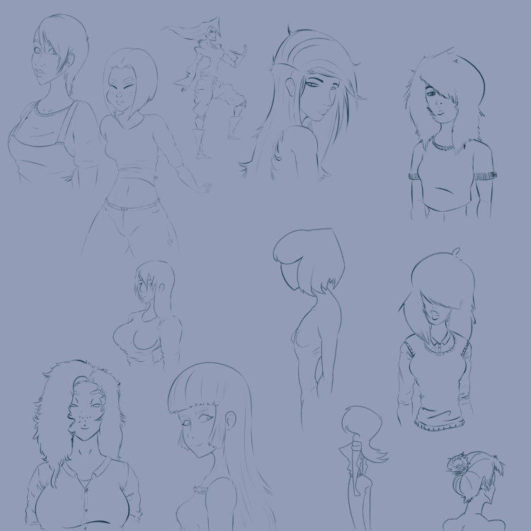 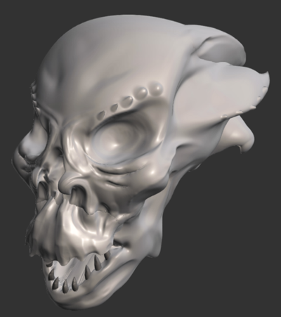 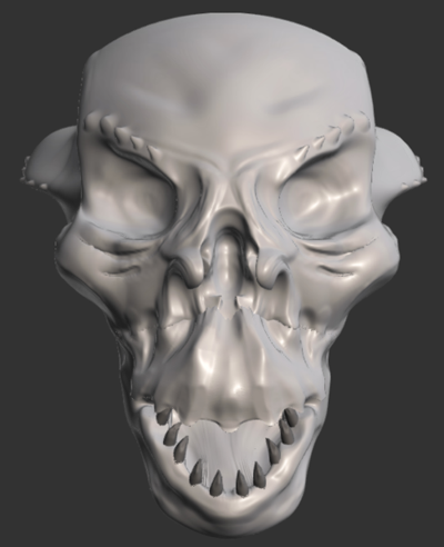  
05-04-2024, 11:28 PM
Great updates! Loving your 3D sculpts as well, it's great to try out different techniques and programs and you seem to have it down quite well already, good stuff!
05-05-2024, 09:24 AM
@[b]cgmythology[/b] - Hey thanks! Yeah, it was a good find when I was randomly looking around for 3D sculpting programs. 3D sculpting is something I am definitely interested in, even 3D animation I'd want to look in to at some point in the more distant future.
--- So I've made alterations to the piece, and thanks to the user who brought up the issue with the perspective on the droid. Not sure what happened to them, but their post here and elsewhere seem to have disappeared. It's funny how when I look at it, I wonder what I was thinking lol. The droids left leg and left arm were at an angle as if we were looking down upon it, even though the horizon line is from its knees and below. So I started out by just making a very simplified version of the droid to help with understanding things easier. I also altered the droids gesture slightly so it doesn't look as stiff, mostly just swung the arms out a tad bit more. I also tried out 2 different 3D poser programs where you can place a figure and move it around which helped nail down the perspective more and reinforce that it is now properly in perspective. The programs are called Design Doll, and PoseMy.Art (both are free, but have payed versions for more features). I'd say I am about 60%-ish done with this piece at this point. Got the base lighting down, decided to go with the main light being from the walkway lights, then a slight secondary light from outside. The combination of the outside natural light and walkway lights create a rim light around the main subject so it pops out more from the darkness. So now I gotta clean up the shading a bit and add texture, highlights, some reflections, then it is done. Hopefully with a bit more focus I can get it done within a week or two tops from now. (Oh, and also, happy Star Wars day! May the force be with you!) 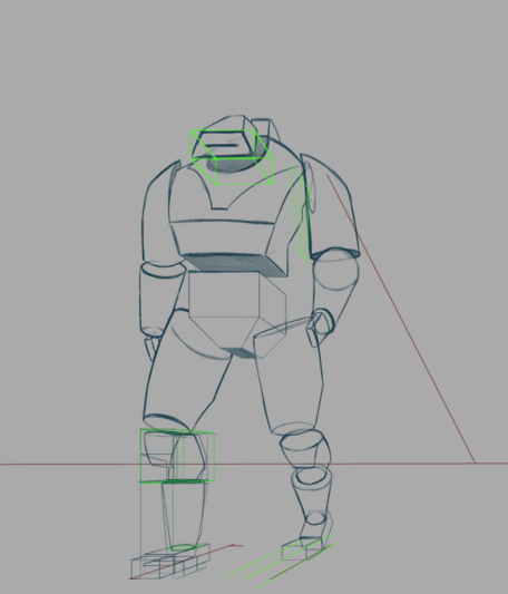 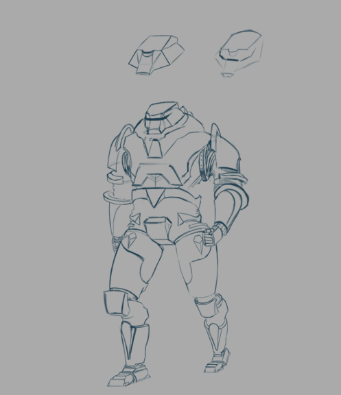 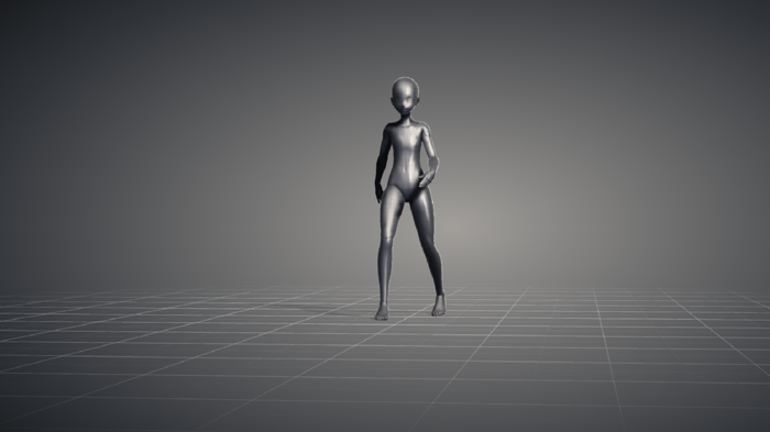 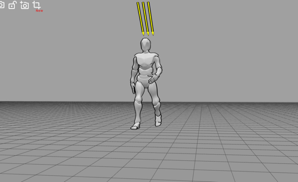  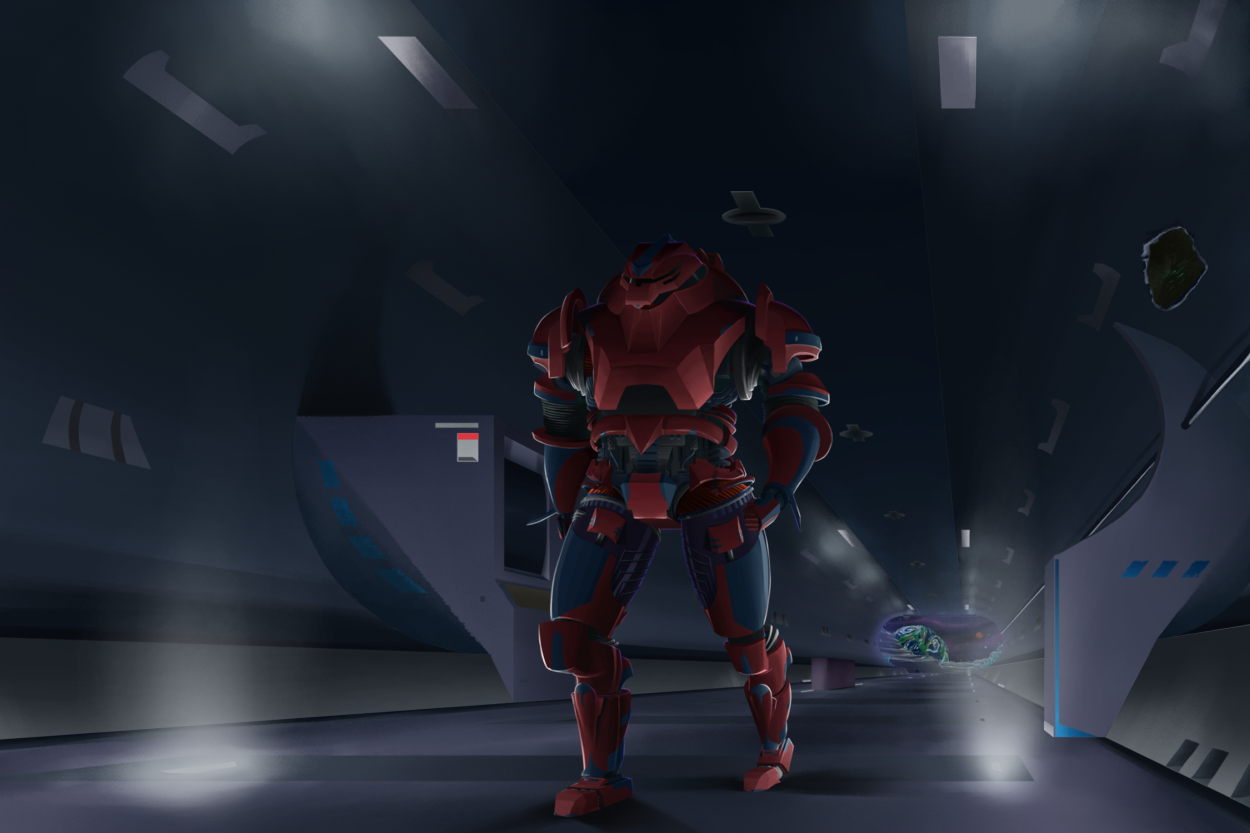 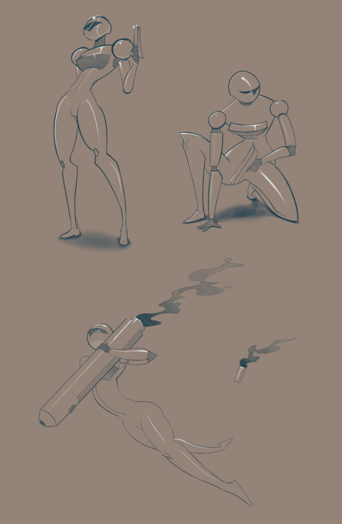
05-05-2024, 10:26 AM
Critic on ''minimalic character''
To me it appear that you are cutting corner and other trick to avoid dealing with tricky anatomy or just to save time which is bad practice. Sure you can foreshorten stuff to save time but not so much that you see like 10% of limb or an object a thing you want to aim for is like 30% atleast of the object visible.Foreshorten and hiding thing behind object create unecessary confusion that take away from the story.It also give a signature amateur look. Critic on ''robot in space station'' Right now i would say if i was you i would try to learn more about how to get pleasing light the lightning is inconsistent and don't play into a strong design it look more like it being place there to fill the space which doesn't help drive the narrative.The light on the celling doesn't look like it casting any light and whatever light is on the floor look more like smoke than a light source i know it work in progress personally it a disservice to you to present half bake lightning atleast if you gave us some thumbnail we would be alot further in knowing if you made good design decision much earlier and wouldn't have to cast doubt as to where this is heading. A problem with the piece is that there isn't anything that as a strong focal contrast there to many thing with equal importance in term of value.The only thing that really drive the eye is the level of detail being high on the character and low everywhere else and the color contrast with the red. The wall look just a bit to empty.I suggest you to thinking of how you could separete that empty space with small medium and big shape something that is more then just lighting and air vent.How are those thing put together it does not make sense to have a wall made of one giant piece but sure you can say ''ALIEN'' but no i suggest you think about how thing are put together it make thing look more believable and it show you care about what you design. Whatever is at the end of the tunnel is so small it hard to read i had to zoom in to see what it was so an idea would be to shorten the tunnel so we can see an appreciate a bit more what in the background and i think that monitor thing would make more sense if the tunnel was shorten and the exit was closer now it just sitting in what seem to be the middle of tunnel atleast for the viewer point of view.That would help give a clearer context to the story. Overall i think you use to much of the backlighting and floor lighting it almost seem like you don't want to deal with cast shadow.I understand that interior space really are a pain when it come to casting shadow again it just show that you can't just slap something and hope it work you gotta plan and be cleaver about the choose you make.For example is it necessary to have the character in full? How can you frame the character so you can avoid that cast shadow?Those are some question that save time sure making the choose of not having to deal with cast shadow save time but it not always logical if it add to the story and the more you push away thing you find problematic to deal with the more you are a slave to those decision that if repeated become crippling and limiting.
05-07-2024, 11:40 PM
Really nice studies and some really cool line work here! Keep up the good work!
LEGEND'S SKETCHBOOK_001
To all artists struggling to create and are intimidated by A.I. (anti-imagination)  "Everything has been done, but not by you" "Everything has been done, but not by you" 
08-01-2024, 01:58 PM
@darktiste - Yeah I get what your saying with those simplified figure studies, especially the one holding the large rocket cannon thingie.
For the droid, as you said it was (and still is) a WIP. The lighting of it has given me some issues for sure and from this piece I am really starting to see that perhaps creating thumbnails, with a lot more thought behind them or even in the early phases figuring stuff out would have helped make this piece a lot less painful. Having to go back and re-do the perspective on the character, then also the background several times and having to re-do the lighting too. I do plan to darken the piece a bit more, as stated it is still not complete, but I do also plan to add more highlights and contrast to the droid and perhaps even give it some more saturated colors. I've added more detail to the BG now, with metal panels and items in the hallway. Oh and also thank you for pointing out their being nothing at the end of the hallway in terms of a panel or lever or anything to operate the door, it completely slipped my mind to add such a thing there lol. Thanks for the detailed analysis once again! @Lege1 - Thanks a lot! --- Phew, it's been almost 3 months since my last post. The main cause being that I am trying out a different operating system. Going from Windows to Linux, mainly as a fun side thing, but I got a bit caught up in it and haven't worked on my main art piece for this while time up until about a week or so ago. So I decided to give an update on the piece and how it's coming along. At this point, I would say it's at least 75% done. All the main elements are in it now I would say. The lighting was a major issue for me to figure out, especially the cast shadows. Trying to figure out where the shadows go on the figure, plus the fact that there are multiple light sources and how to deal with that. I still think the lighting and shadows are a bit wonky, but decent enough. The last issue I have with the piece currently is just the overall contrast of the piece. I think it needs to be darkened, so I made 2 mock ups, version 1 I did manually, and version 2 using a filter mask. I think version 2 is better, so I might go with that, with some slight alterations. Besides trying to fix up the lighting issues, and contrast, I just need to add some more highlights, give it some texture, and add a few more details and it will be done. 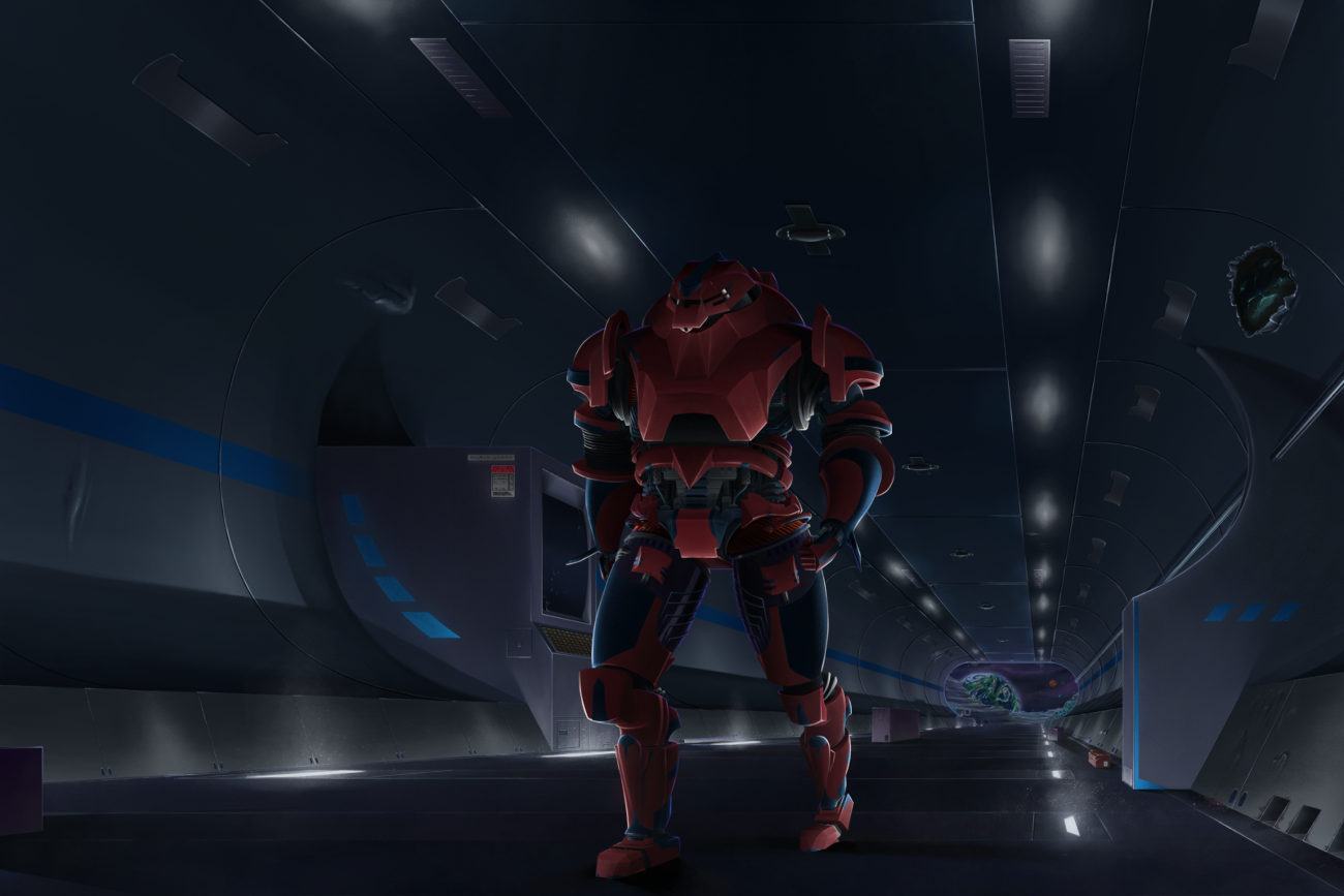 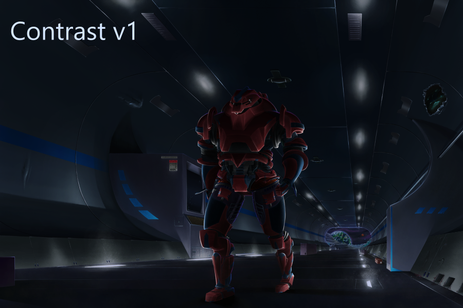 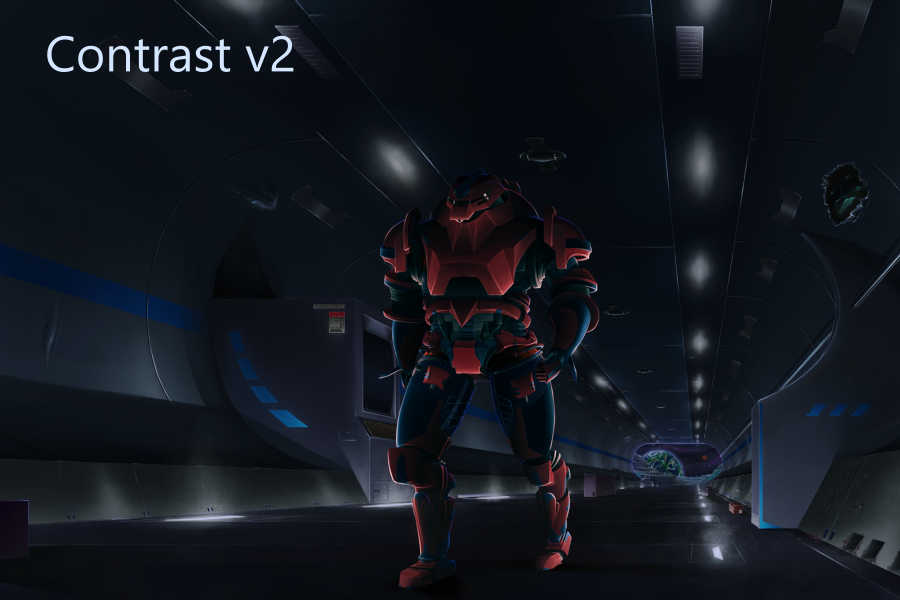  
08-03-2024, 10:23 PM
Nice updates, I really like how you tackled the light with the contrast set of images, I think they all look solid. Keep it up!
08-03-2024, 11:43 PM
For the metal i think just adding aging to the edge is a bit to obvious you can add a gradient of weathering to direct the eye where you want people to look but can and should probably also have to somewhat account where object would receiving impact or rub against one an other.
When you have a beat up surface the highlight loose some of it intensity and it loose it linear quality. What i am basically saying is if you got such a beaten edge you would have a lot more scratch then that since edge damage is often the result of rubbing or bumping against object which often glide along the surface. There a trick to do embossing effect which is a nice effect to create fast and easy scratch you just need to make sure the effect follow the light source and account for the surface direction (don't put all the scratch on the same layer that what i am saying) this way you can control the effect with the parameter instead of doing them by hand which can be very time consuming. Here an idea of how it done in photoshop. https://creativecloud.adobe.com/cc/learn...cale=en-CA
08-30-2024, 09:10 PM
@cgmythology - Thanks! Yeah the higher contrast ones do seem better here, making it pop out a bit more from the darkness.
@darktiste - Thanks a lot for the tips, helped with the current piece I made. That embossing idea might be useful to try out for scratches and dents and maybe punctures in metal, I'll have to see if their is an equivalent in Krita (which I am sure their probably is) and test it out. --- So I have finally completed the droid piece, took a hot minute. The big hangups on it for me seemed to be the perspective for the character and the background, which I had to re-do 3 or 4 times. Then the lighting which for me was difficult due to so many light sources and having to figure out how they interact with each other, and creating the cast shadows and how that works with several light sources. Then the overall contrast and darkness of the piece. But in the process of making this piece I did realize that I should try to plan things out more for these more in-depth pieces, especially ones like this that were a bit more complex for me. Having to re-do the cast shadows several times, adjust the perspective on things, and switch up the color & brightness on things was a big headache when I was already far into the piece. I could have cut a big chunk off of the time spent on this with a lot more planning and plotting out all of the major aspects of it. But nevertheless, I am pretty happy with how it turned out. I did make some alternate versions of it, 1 with even higher contrast & more fog/haze, and 2 color variants. Oh yeah, I made a little backstory to this piece as well. It's nothing groundbreaking, but I thought I'd add the basic idea of it here for context. A mining company discovered this relatively lush asteroid and thus in their eager pursuit they set up a facility on it. In the early phases of mining, pockets of an undetected aggressive toxic gas were released, the facility was then evacuated hastefully. With the toxic fumes released and too dangerous and costly to return, they abandoned the asteroid. But the droids still wander the unmaintained shafts on their never ending patrols as if nothing has happened. 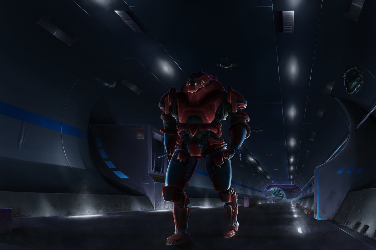 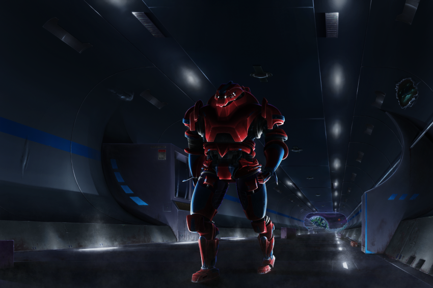 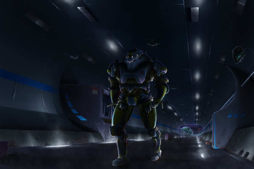 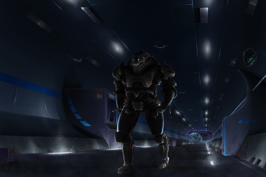
08-30-2024, 10:40 PM
I think it a good effort but as you stated alot of light source add complexity to a scene so planning before hand is key and you are aware of that i just want to hammer that in.
I see you use some kind of 3d assist you can always use sketch up or blender to test the lighting of the scene. When you use multiple light source you can to reduce the light bounce count if you have a low end pc or set a bounce box to limit the calcul of the reflection to be limited to the area within the bound box by baking the light .But you need to update the result because it not real time lighting. Also if you would model object with curve you probably would also want somewhat of a smooth curve and that add vertex count so making sure you make instance of object can be a good trick to reduce performance but it might not be necessary depending on the pc you have.If you have a low vertex count in a curve you will get a pretty angular curve and that start to make thing graphically different when light hit the surface. The light could be either an instance or an array of a object but it need to be turn into a special material that emit light before anything. Anyway i don't want to annoy you with vocabulary i don't have any idea if you are familiar or not with.
09-25-2024, 06:41 PM
@darktiste - Yeah for sure, I definitely am going to start trying to hang around in the construction phase a bit longer to ensure I got things right.
Yeah I got those assets from 3D figure posing tools (DesignDoll + PoseMy.Art). I do plan on using Blender at some point for creating 3D models, animations, and full blown scenes. Also, as you mention, for helping with 2D art as well - being able to quickly pose figures, change camera angels, lighting, etc. in a 3D environment to help come up with ideas, and interesting compositions and help figure out lighting and perspective and whatnot. Though, at the same time not relying on using a 3D tool completely to figure that stuff out, just as a helpful tool to help refine things. I am familiar with some basic stuff about 3D, having played video games (a bit too much) throughout my life, lol. Thanks for some intel on 3D stuffs, since I am a absolute noob at it. --- My next piece I plan to work on, I want to set a time limit on to see how much I can get done in a set amount of time. I plan to set it for roughly 20 hours, which is still a decent chunk of time. I've made a set of thumbnails, I want the next piece to have a bit more action in it. But I am still undecided on which one to go with. I did a bit of a self imposed exercise creating a 2D painting of something, then afterwards trying to recreate it in 3D. The hair came out a bit wonky. I might start trying to use Blender sooner than I thought, having hit into several limitations in SculptGL. Also more linework stuffs. I have been using a program called Drawpile for some linework recently. It has a pretty cool feature, letting you draw with other people on the same canvas. I've never tried it out though, but I was thinking it would be cool to do someday, especially with the peeps on Crimson Daggers, it's a completely free and open source program. But, I currently use it mainly for doing linework which feels a bit more smooth compared to Krita. Though, under the hood it is just using the MyPaint brush engine, which Krita also has and perhaps I need to mess around with more. 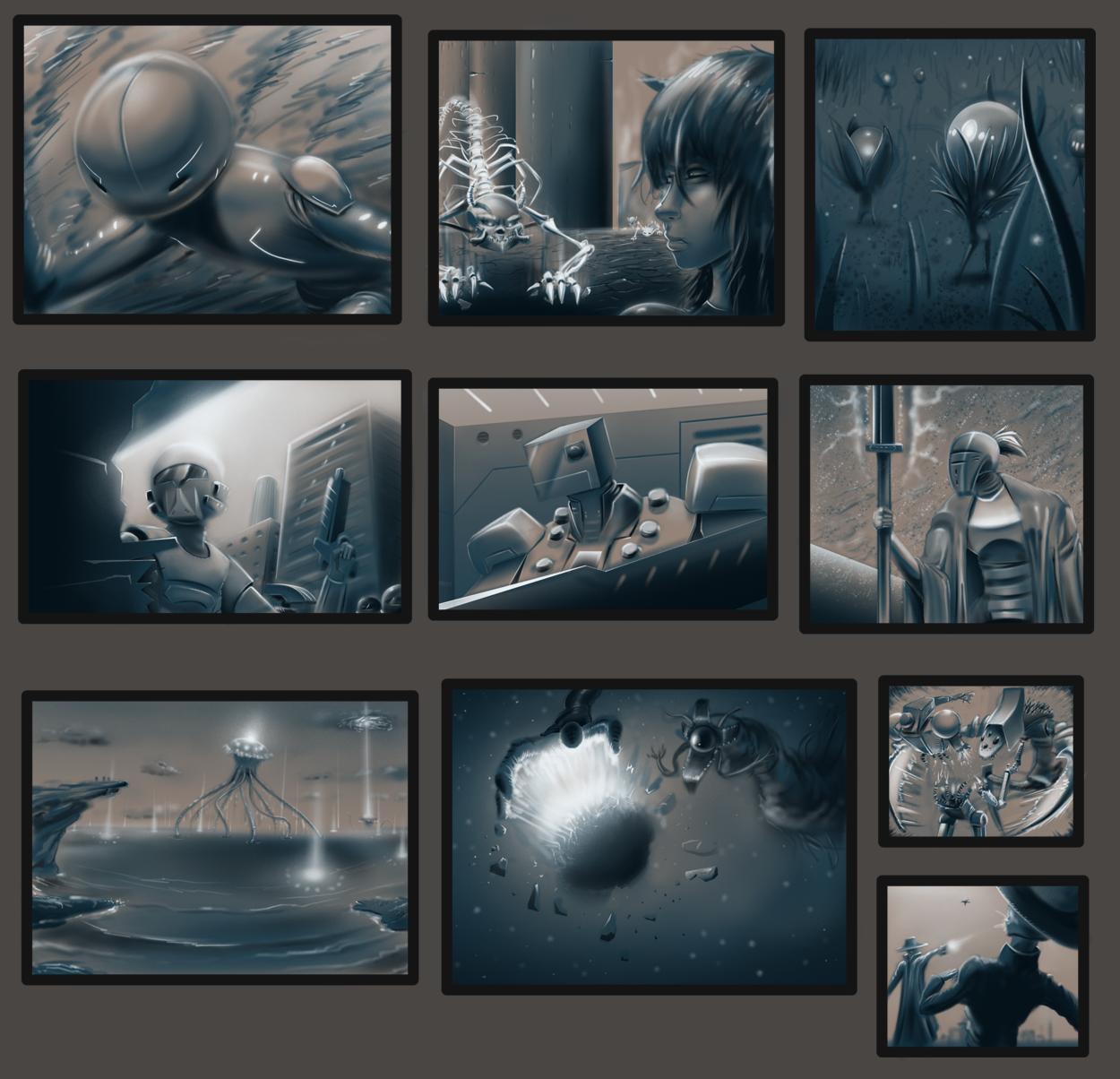 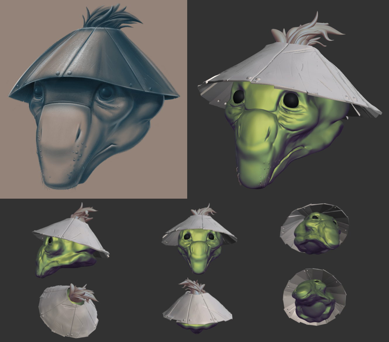 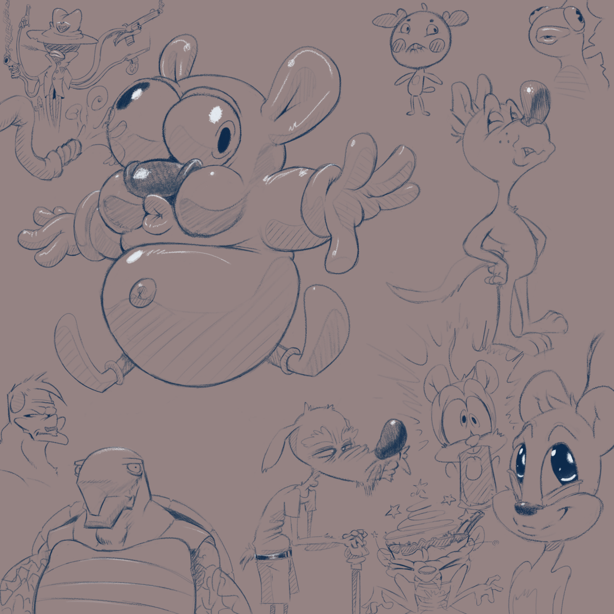 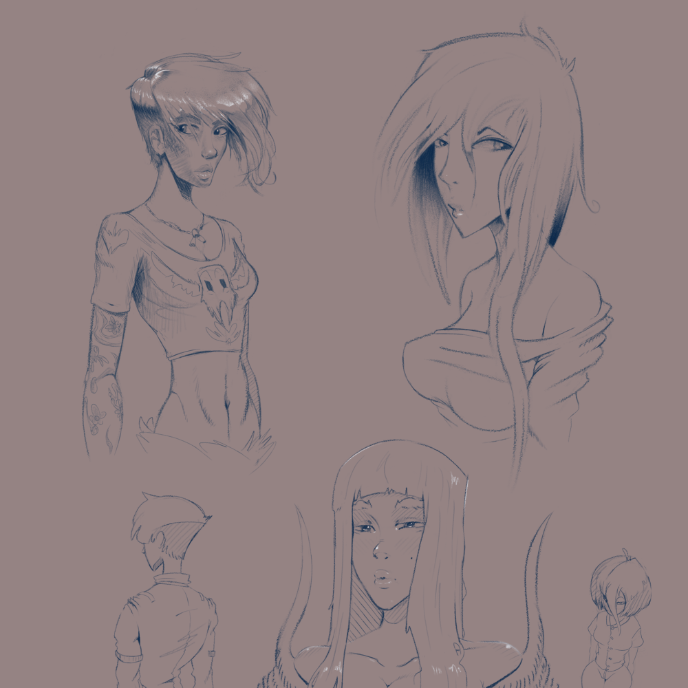 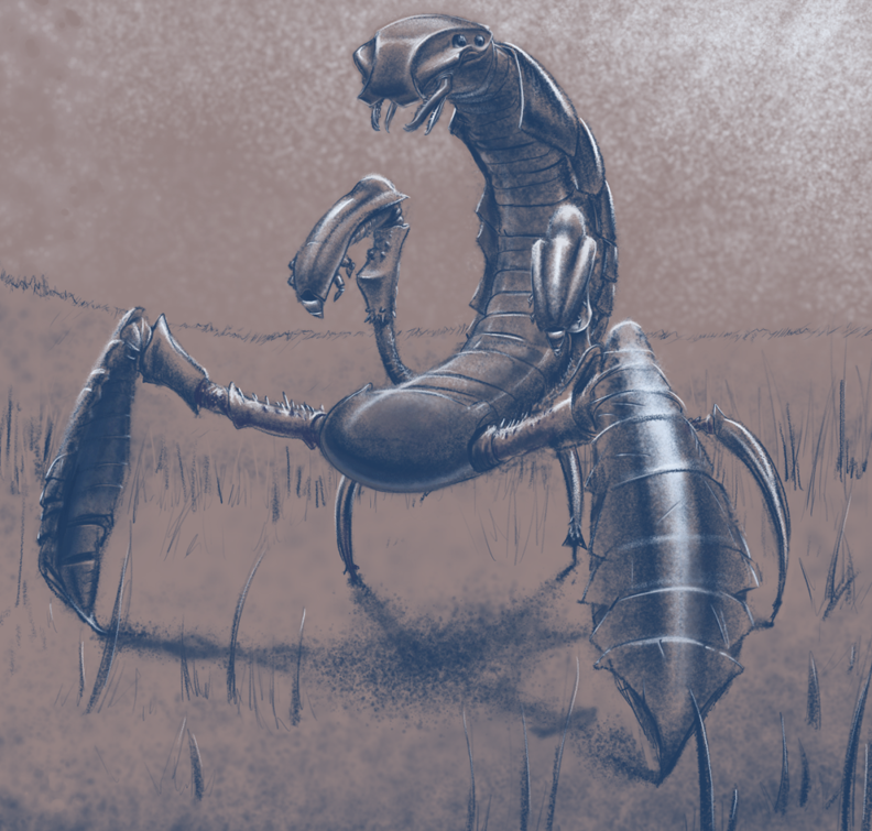
09-25-2024, 08:01 PM
I like the treatment of your recent batch of thumbnails. I think the use of 3d in your last piece wasn't made with the right choices in mind of where 3d would best help you. I think there are times to use 3d and times not to, depending on what end result you want. For the most part, the lighting information on basic forms as well as the efficiency in procedural generation, using arrays / modularity is probably the main reason to use 3d towards a 2d image. So modelling the tunnel, adding lights and maybe a blocky model of the mech would have been smart. Just using a poser model for perspective wasn't enough, which is why you ran into so many issues. I also didn't see a fleshed out lighting thumbnail which figured out what the final would look like beforehand and explains the issues with the final.
If you want to use 3d in your pipeline, and you're aiming for fitting it for commercial purposes eventually, that's fine and there will be a learning curve obviously, but atm your sketch work is far more unique and appealing. Perhaps figure out a general value scheme and thumbnail through painting, then try get the specifics in 3d done to aid you for the final render pass. In my experience, your 3d based work will suffer directly in correlation to how poorly fleshed out your intial idea was and your current 2d skills in general. 3d isn't a shortcut. Use that bit of feedback how you will.
09-26-2024, 12:27 AM
Planning is such a under estimated skill it the difference between improvising and having a battle plan. Improvising is high risk high reward but also time consuming because it more experimental. Planning is time consuming initially but there is less risk generally involve in the process it like visualizing basically.It like the difference between brainstorming with a list(planning) or just taking shape and trying to come up with something(improvising).
n a sense thumbnailing is like brainstorming further then just idea it the visual part of the brainstorm. I agree that thumbnailing is the skill that is the most useful to develop in general understanding how to use small scale test is such a time saver. Thumbnailling is not always about solving one specific question but it always a good place for low risk and high reward iterative process . Obviously it not high render but if it generally work small thing can be scale up The biggest time sink with 3d is starting manipulating vertex to many vertex that why being able to get alot done in low poly is very useful. You don't really know the time sink of 3d in your particular branch of work until you get a bit of mileage in the 3D tool you use also the time sink as alot to do with coming up with better way get a good result without investing to much time. But a good rule of thumb is make it stupid simple 3d is as much as thumbnailing tool as a thumbnailing in 2D you can easily arrange primitive form but it probably faster to draw them then it is to resize place and place them in 3d there exception . But it faster to manipulate a set of object in a scene then it is to redraw the same thing over and over. That why camera are so helpful for composition shot because you can just move around a set of primitive form without re drawing. Because you can move thing just slightly or just move the camera .When it come to planning i think you have to think in term of complexity in a scene the more object in a scene the longer it is to do correction in a thumbnail. Organic object should be reduce to primitive in thumbnail specially when looking for the composition. Drawing is a 2D skill it as alot to do with thinking but experience is also a factor the more you can leverage both 2D AND 3D the more you can solve problem. But it understanding the pro and con of each that really dictate the result and the time spent and how limited you are. It better to learn to draw because it both 2D and 3d will 3D modelling doesn't really teach you design which limit you creatively 3d doesn't help you develop a visual language just doing 3D is a bit like trying to speak math to the creative side of the brain you need the in between to get sometime pleasing. Also relying to much on 3d as the tendency to make thing look more symmetrical less organic and hard edge. Sculpting is nice but i don't find that it very useful apart from being use to test how a organic shape would cast a shadow and casting shadow is not always that hard it really depend on how much different surface the shadow fall on the more object it fall on the more i would say it would be useful to utilized 3D My rule for sculpting is make it stupid simple again leave the small detail to the drawing skill .I also think inflate(option)in sculpting is a really nice tool to test proportion it a bit like liquify but in 3d also proportional editing is a nice tool to deform object(not very intuitive i have to say) as well as the lattice cage modifier.(This specific paragraph refer to blender)
11-01-2024, 06:11 PM
@Noone - Hey, thanks for the feedback! Using 3D in the long-run hopefully will be more beneficially for my 2D work, but I also am very interested in just using and creating stuff in 3D as well too. I do agree I need to perhaps plan out and do more of the "boring" stuff of figuring out the structure, composition, and especially lighting in the early construction phases more so. I also would chalk it up to the fact that I've not really studied the fundamentals... yet... which I do plan to actually start doing kinda soon™.
Also my current 3D tool I use SculptGL, doesn't have any fancy features like lighting placement or anything like that. I probably will start using Blender shortly, now that I am starting to run into real blocking issues with the current program. Thanks again for your advice! @darktiste - Oh yeah thumbnailing seems to be a good way to go, but I do enjoy creating more spontaneous drawings as well, not planning out the structure of things, the perspective, composition, lighting, etc., etc. But I should push myself to do those things, and as I do it more and more it will become easier and almost second nature. Yeah 3D and 2D have their individual pro's & con's. I do plan to get into 3D at some point. But I do first want to get good at 2D. Also, once I've reached my desired outcomes with 2D and gone through all the fundamentals of art (perspective, color theory, anatomy, composition, etc.) that will hopefully aid me once I start studying 3D, as you stated. But for now I am just designating it as a complementary helping tool for my 2D work, plus as just something to mess around in every once in awhile. Thanks for the tips especially with the 3D stuffs! --- ☣ ☠ Happy Halloween!!!! ☠ ☣ (I'm a couple hours late, but I wanted to do some finishing touches on'em...) I've got a few spooOooOooky works for y'allz. For a few of the pieces I was mainly experimenting with different brush sets I found of Krita's website posted by users, and messing around with textures, gradient maps, and other tools. Also from the thumbnails earlier, I've chosen a idea to work on. I plan to spend extra time on the initial phases with this one, figuring out the perspective, structure, and especially lighting, so hopefully I don't run into as much of a hard time as with my previous piece. So far, I've done a rough layout of the full idea of what I want the piece to be, then I simplified the main structures (the 2 characters) into simple objects for the perspective, then did some basic lighting on those objects. Afterwards, I made a more detailed linework. My next plan of action is to make another, more detailed lighting layout, then to review it all making sure it looks decent and makes sense. Then to move forward with actually starting to paint the final piece. 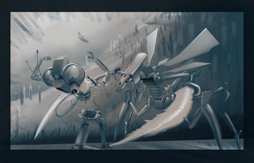 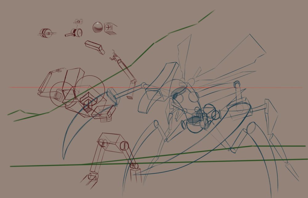 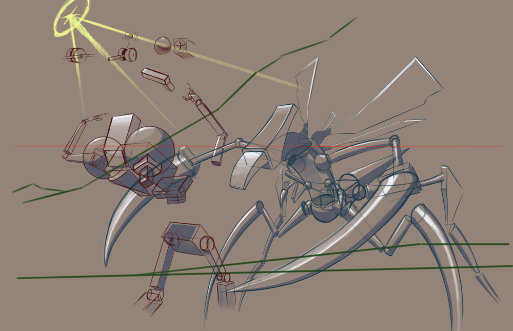 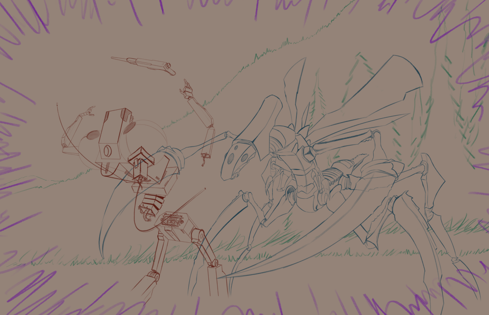 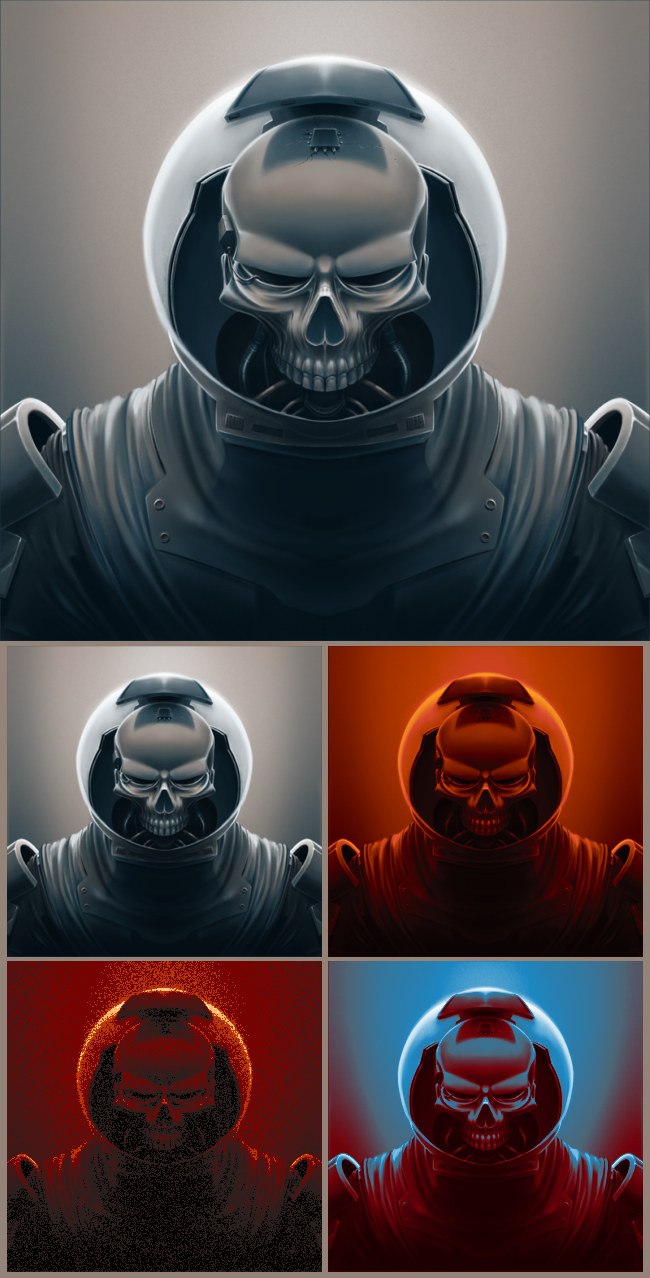 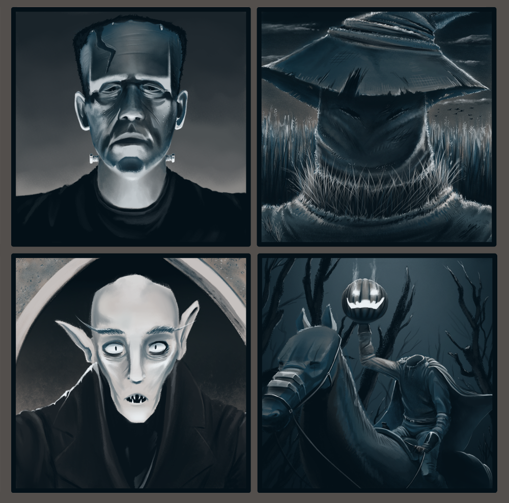 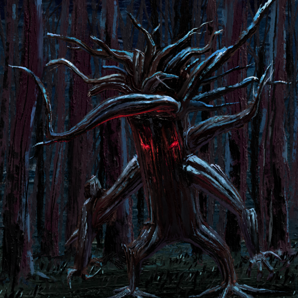 
11-01-2024, 06:15 PM
Really dig your sketches, man. Great line quality and I enjoy how clean they are.
11-08-2024, 02:45 AM
Awesome updates, especially on the first one - very dynamic! Great work all around, glad to see you being inspired by Halloween, really lead to some great work. Keep it up!
01-19-2025, 05:49 PM
@one_two - Hey thanks a lot! I think at the moment my linework is at a decent place, though I do often kinda use a trick of using rough textured brushes, which helps hide any inconsistencies in linework. But I also do like the look of it with the textured brush a bit, I wanna also make more nice smooth linework as well.
@cgmythology - Thanks, damn the last post was from Halloween. All the holiday madness occupied me quite a bit the last 2 months lol, but yeah I do like me some Halloween! --- So I've gotten back to work after the holiday whackiness on the insect creature, I've completed a light & shadow test. I was able to identify some areas of the main characters that where sorta blending in with the background, so I was able to darken the background more. Looking at it now I still think the insect might be a bit too dark still, at least its abdomen area. I'll probably hold off on working on it for a day or two to be able to look at it again with fresher eyes, then begin the actual painting. Also since it's early in the new year I wanted to setup some goals for myself this year. Roughly in order, I plan to start to actually get into studying the fundamentals of art, probably once I've finished this current piece I am working on I'll begin making a plan of action. Also I'm going to start to try to build up an online presence. Then finally at some point start trying to do commissions and/or setup crowdfunding (if I build up a viewership) or look into other ways to try to make a little bit of money from my art if at all possible. 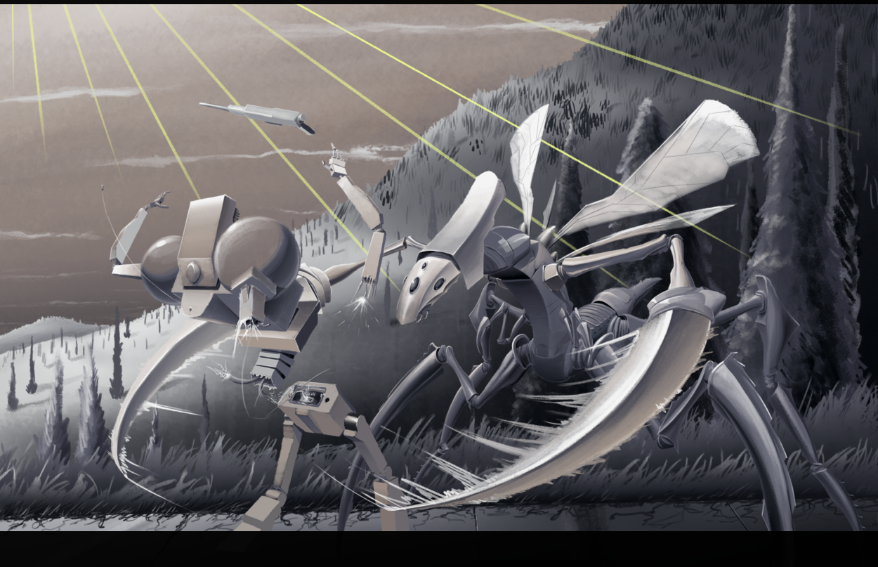 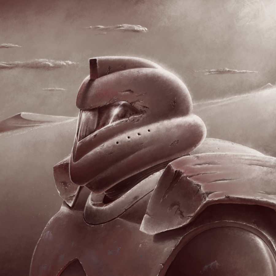 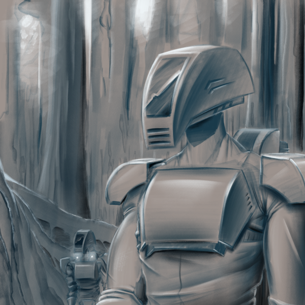 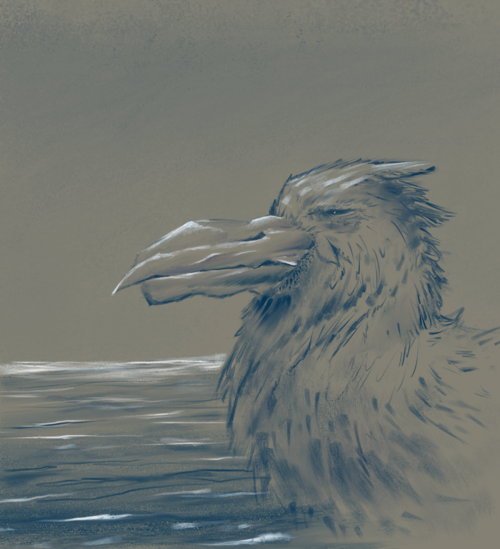 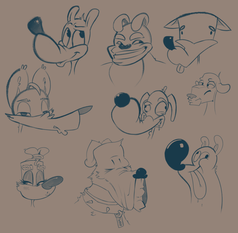 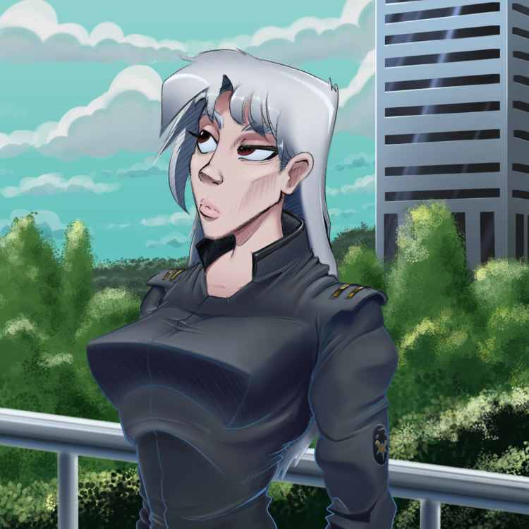 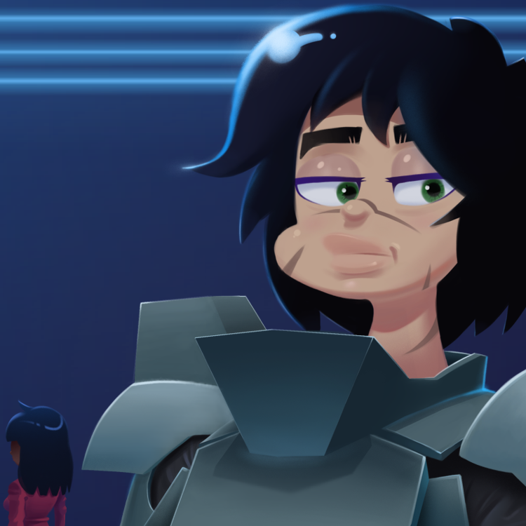
01-20-2025, 01:45 AM
Just joined the site and flipped through your sketchbook, the rendering on your mechs and creatures are incredible! Love your more cartoony sketches you've been doing to, it's a fun style that I haven't seen since watching cartoons in the late 90's, wish more people made art like that again!
I also bookmarked the two resources you linked awhile ago, unsplash and sketchdaily. It'll be nice to have a pintrest alternative that isn't being flooded with slop and sketchdaily might actually get me to practice more often! Thanks for making great art and getting this flaky hobbyist on track a little bit! |
|
« Next Oldest | Next Newest »
|