


05-20-2025, 09:53 AM
This once came out insane!!!!! I'm terrified to use super saturated colours, but you blended them in so well. plus the details like the tattoo and water droplets do so much for the piece
|
CGMythology's Sketchbook
|
|
05-20-2025, 09:53 AM
This once came out insane!!!!! I'm terrified to use super saturated colours, but you blended them in so well. plus the details like the tattoo and water droplets do so much for the piece
05-23-2025, 04:01 AM
darktiste: Me neither, lol. Initially I went for a daytime scene but I felt the values worked better with a night scene. It allowed me to push colors more as well. I revised the face a bit, made the chin look more natural and toned down the reddish skin tones on her cheeks, hopefully it looks more natural now. Thanks for the paintover as well, I really dig the shooting stars you added so I went ahead and incorporated it into the painting!
Crowbit: Thank you! It felt good to go for more saturated colors as that's within my comfort zone. I feel I can get away with more saturation during a night scene, just looks better that way which is probably why I went with a night scene in the end. Glad you enjoy the details as well! ............. Went ahead and updated the mermaid, did some minor refinements to her face and added some shooting stars in the background for a more fantastical feel. I feel it works quite well. I think I'll call it done now unless there is something major off, so do let me know if that's the case! Here is the current image:  Next up a new illustration, began on the sketch quite some time ago but just finished it today. The character design was inspired by the 'Diablo' game that came out recently (have yet to play it but I love the artwork for it!). I had a reference for the general pose which I did my best to recreate for the figure, you can view that here. I have a strong idea for the colors as well, but I just wanted to drop the sketch here before I begin the painting process for any feedback, so please feel free to let me know any input! Below is the sketch: 
05-23-2025, 04:42 AM
Ooohh, I really love thoose water splashes around the tattoo.
- - - Nothing major, just that the body of the guitar feels a bit top-heavy on one side. I would also probably try a different guitar model altogether, but that's just me being biased since I just don't really like Ibanez guitars lol. I feel they look a bit cheap. But they are pretty metal, so it works for the piece. 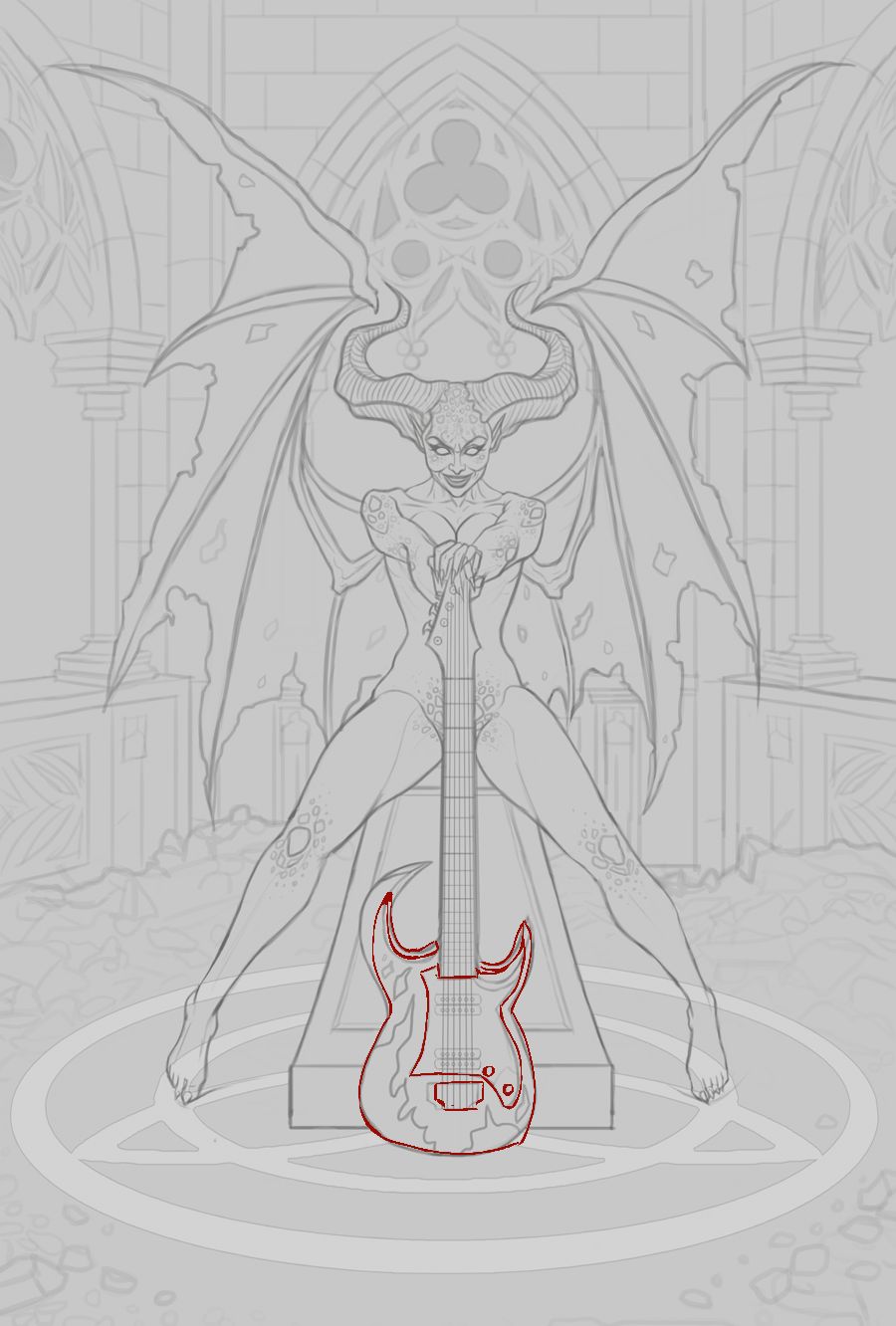.jpg "Filename: 5(1).jpg
Size: 111.66 KB05-23-2025, 04:42 AM")
05-23-2025, 05:18 AM
Good changes on the mermaid! In the earlier iterations the intense blue light and orange light was a bit too intense so it stole a little bit of attention, now it's a lot more harmonious. On your latest sketch, sexy demon mommy hehe! It's a pretty symmetrical composition which isn't bad in and of itself but you could make it a bit more interesting by breaking up the symmetry just a bit in places. I think giving the guitar an asymetric design is a good choice from a composition point of view. With that said I know nothing about guitars and brands and what is good and what isn't haha! For the background you could have one of the colums be destroyed or damaged, or a bigger pile of rubble on one side and less so on the other. Just throwing my ideas out there :D Cool to see!
05-23-2025, 05:31 AM
Yes, definitely. Honestly it's a fine design, I just have an irrational hate for them. All the ones I can think of using also have a square headstock (which would make the composition even more symmetrical) and rounder bodies which really doesn't work here.
Maybe throw an amp on a background?
05-23-2025, 07:17 AM
The right pillar is out of perspective(near the window) if you compare it to the ledge it sit on. I would also define what inside those window how much light is coming from them will be important i think as i don't see much other point for light source right now.
I am not an illustrator but for me when i try to put myself in your shoe i am like ''light is top priority''. Light is value it where the eye goes first. This scene appear to be a interior scene i am like where i am going to have artificial or natural light source and how can i use them to direct the attention to my focal point. Are you going to make that ground symbol emit light? I think that would be a nice idea since below light is often sinister looking.
05-26-2025, 11:21 AM
Love the look of the demon girl! I know he's not the same style as you but the composition is giving me massive BROM vibes!!!!!!
06-12-2025, 02:46 AM
Jaye23: Thank you, glad you enjoy those details! Thanks for the suggestion regarding the guitar as well, went ahead and tweaked it!
Maxilla: Thank you, and great suggestions! I feel the backgrounds gives it an iconic look even if it's a bit symmetrical, but hopefully it isn't too distracting. I kept it fairly low contrast as to not be too overwhelming in the final, even if cost me a bit of detail work. darktiste: I'm using mostly values to help the figure pop, with the lighting coming directly from the top to give it a more theatrical look. Hopefully it works in this context! Crowbit: Thank you! Brom paints some great illustrations so it's quite a compliment to hear it gives you that vibe! I don't usually paint dark themes but it's fun to experiment here and there! ............................ Went ahead and painted the image in. The values in the background gave me a bit of trouble, but ultimately I decided to use a neutral gray color mostly for it to help the figure pop even if it cost me a bit of detail work. Pretty satisfied with the image overall. I'm open to tweaking the image a bit further if needed if something feels off, so please feel free to let me know your feedback! Below is the current progress followed by the steps for those interested:  
06-12-2025, 03:58 AM
I feel like that bottom circle could be incorporated a little more to take into account the rubble from the floor have some actual overlap interaction otherwise it feel like the circle is just slightly levitating .Same for the element she sitting on. On other thing is the general destruction around it doesn<t isnt reflection those 2 elemen i feel like this also need to be bring to harmony with the rest.Break up some of those element silhouette and add aging to the stone with some crack and missing piece.
06-13-2025, 03:04 AM
darktiste: Great point! I wanted the symbol to pop out a bit so that was a bit intentional on my end, but I probably overdid it so I just added a bit more texture work to bring it together more. Hopefully it gives it a more natural feel now!
............ Here's another update, I think I'm calling it final unless there's something majorly off, so please let me know if that's the case! 
06-17-2025, 06:08 AM
That one's pretty cool. I'd guess a demon/succubus lives forever unless they get killed by magic or something? Lots of time to practice guitar.
There are a couple small things I would consider changing. The horns and the background design are overlapping in a strange way, tangent or near tangent. Might raise or alter the background elements? The other thing is ambient occlusion under her feet and the guitar. Small detail but makes a noticeable difference.
06-17-2025, 07:38 AM
Using a stylized lighting to add a Sur natural look. Had to try to see what i would have done differently.I Try to control the value to always have clear focal point i wanted to give a bit more translucent quality to the wing and a gradient to the lighting to account for the wing probably catching some of that bounce light. For the fog as far as i know it most going to be ''heavy'' where the natural light would come in but you would surely get a bit of bleeding into the shadow but rapidly decreasing well atleast in the way i choose to make my lighting i choose to have my lighting more from the back a lil bit from the front and more above then your version will i feel you choose a more all around the character lighting that can give a more flat look to the end product in my opinion.
06-20-2025, 03:16 AM
ThereIsNoJustice: Great feedback! I tweaked the background a bit so it doesn't overlap with the horns and also added ambient occlusion on the areas specified. Hopefully it's an improvement!
darktiste: I like what you did with the lighting but I wanted to avoid using harsh darker tones for the skin as it doesn't compliment her skin tone well. The down side to this is that it gives it a slightly flatter look as you mentioned, but I think I'm OK with that compromise. ............ Did some final tweaks on the image, I'm calling it done for now as I've worked on it for far too long. Here is the final:  Next up I finished up a sketch of Hades and Persephone in the Underworld. I referenced this pose for the characters here as well. I'm quite happy with it but I wanted to hear any input on it before I begin painting it in, so please let me know if something feels off. Below is the current sketch: 
06-20-2025, 04:24 AM
The arm resting on hades shoulder is a bit to ''squared'' making it stiffer and loose the ''squeeze''and weight she putting on her arm there also the curvature of the arm in the negative shape that also been lost which also to me just cheapen the realism that could added to the dynamism i feel it important to maintain a good gesture and form even if muscle can be simplified sometime ''shaving of the shape'' take away some life that should have not be shaved off. Personally when stylizing women i say try to keep thing curve rather than straight unless your doing anorexic girl and when something is straight balance it with something that curved.
The dog in the back is he suppose to be that small? . Instead of having the dog be like small i am thinking of making the dog as some kind of like ''familiar spirit'' it like 3 head that protect them but from the astral like in a more ghostly form this allow you justify the way i frame it in the piece instead of having a body that hard to frame and would add more noise. I feel you have already use those pillar before it getting repetitive that why i am think of the dog to take more space. Right now hades eye look to be looking no where meaningful i would say it be best if they look at the viewer he as a very dominating gaze and stance leaving is gaze looking else feel a bit like missing an opportunity. Anyways i play a bit around with liquify on the girl arm and head to see how i could push the shape see what stick and what doesn't.
06-20-2025, 01:03 PM
I like this new one it looks good!
My two nitpicks are wouldn't his crossed leg be more like this? His kneecap would be under his hand, right? And then his shin faces front and his calf is behind it, hanging down. But on yours it feels like the shin is like on top so it seems like maybe interpreting the ref weird. I also tried to just clarify the overlap of foot and ankle. And then it feels like the left delt is kinda drawn around Persephone's hand rather than the other way around. Like that would be more to the side I think. Especially because people typically have kind of a pit under the collarbone between deltoid and pectoralis where there isn't really much muscle attached.
06-21-2025, 06:33 AM
Hi George, great translation of the initial ref and integrating it into your design. Your lineart is as clean as ever! The things that glare out to me are her hands. Her palm on the right is truncated and her left hand, especially her fingers appear very flat. I would make Hades mouth longer than his nose so it looks more balanced and I would make it clear which direct his eyes are looking at. Down or up, there are ambiguous.
[Can I ask is one of his horns supposed to be foreshortened and appear further back a stylistic design choice?] Looking good!
06-29-2025, 10:11 PM
darktiste: Good point on the arm, just fixed the issue. Love what you did with the dogs, works much better compositionally and makes the image more interesting, so I just implemented that as well. Thanks again!
JosephCow: Thank you! Thanks for the draw over as well, went ahead and implemented your feedback! Dominicque: Thank you! Just fixed the horns as well. I think the hands will look more natural now that they are painted and shaded, please let me know! ............... Went ahead and painted the image in. Pretty happy with how it turned out, especially in regards to lighting. I'm open to hearing further feedback, so if something feels off or can be improved please free to let me know! Below is the current progress followed by the steps for those interested:  
06-29-2025, 10:17 PM
Really nice.I feel the skin just need a bit more work like it feel like ''clay'' just adding like beauty mark and maybe like making hades arm more like masculine with hair.Also the beard color doesn't work with that color scheme.
But yeah great job on the atmosphere here i feel your really getting there in term of having focal point and flow keep going.
07-03-2025, 10:09 PM
darktiste: Thank you! I agree with your critiques, so I refined the skin for what is hopefully a more natural look. Glad to hear my focal points are improving as well!
.............. Did some minor updates, mainly refined the skin and experimented with textured brushes a bit for a more natural look. I had a blast with this image and I'm quite happy with how it turned out, and I'm open to refining it further if something is off, so please let me know! Below is the current update: 
07-03-2025, 11:49 PM
I would suggest changing the shape of the beard so that you can have a silhouette .I feel a beard give him a more ''likeable'' facial feature i think a clean shave would make him look more cold and also sharp feature .One other thing that doesn't work is the eye i suggest adding like smoke and fire coming from the eye i feel it as more flavor and it play into the angular menacing shape language i feel can work here.I would also shift t he eye color toward red i feel yellow not the right pick.
I would also try other thing than those horn i feel they should not come out so high on the skull but more from the forehead. There some serious problem with the spike collar of giant dog the spike are not centered or align properly also the collar itself doesn't properly wrap around the neck. I am so going to have to say i don't have an idea what that yellow spot between is head and horn is for. |
|
« Next Oldest | Next Newest »
|