CGMythology's Sketchbook
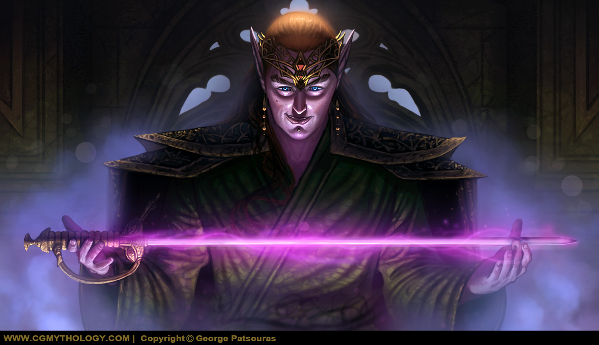
Thanks everyone for their input on the sketch, made some changes to the fabric for a more natural look.  I've been working on the image and I'm calling it done for now, as I'm not entirely happy with it. I think I'll rework the image from the beginning in the future and try out a new character design and lighting setup, we will see.  Below is the current and final update for this image:


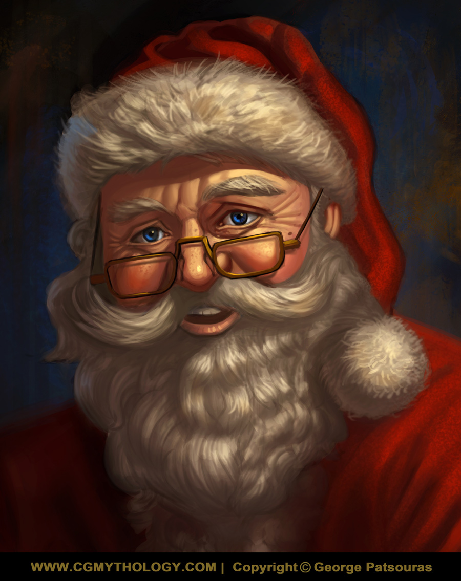
Next up I wanted to illustrate something for the holidays, something a bit simple and within my comfort zone so here is Santa!  


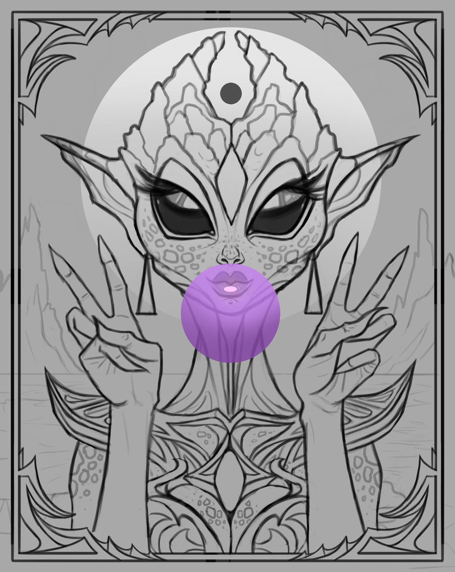
Finally I decided to start on a new personal project.  I got the idea from this out of nowhere so I wanted to sketch it out as soon as it inspired me.  It's drawn mostly from the imagination although I did use photo references to help me with the hands.  Overall I'm quite pleased with how the sketch turned out and wanted to hear feedback specifically for this sketch in particular before proceeding with color, so any input would be greatly appreciated!


Lastly I also wanted to thank everyone who has supported me with their constructive feedback throughout the years, I learned tons and have a stronger portfolio as a result, so I'm truly grateful.  Please enjoy the holidays and have a great new year as well!

Reply
Congratulation of the portfolio and wishing you an other a good years to come.

I will be resuming feedback for next years i have been hammering your last piece and there surely thing that cannot be fix just by pointing at them specially principle that are not necessary fully intuitive to execute without a large amount of time spent perfecting the propriety that make something believable.

My Sketchbook

Be yourself
Reply
Works looking sick my guy. You truly did grind it out this year, you made a mad amount of work ^^
Reply
Hiya George, Long time no see. You continue to develop! Loving all the amazing art you've posted since I last looked in.

Lovin' the last alien idea your working on just above - and queencastle and oracle on page 53 are excellent. You continue to push your lighting very well and oracle has very pleasing color and lighting.

Hope you have a fantastic 2026!!!

Reply
darktiste:  Thank you, much appreciated!  Great advice as well, I'm doing a lot of studies traditionally to improve on my fundamentals, so hopefully it'll pay off!

Crowbit:  Thank you for the kind words.  Glad to hear I've been productive as well!  Hopefully I can keep pushing forward this year as well with more illustrations!

Jephyr:  Thank you kindly!  Glad you enjoy the 'oracle' image as well, had a blast bringing it to life and learned a lot in regards to light with that one.  Hope you have a great new year!!

.............


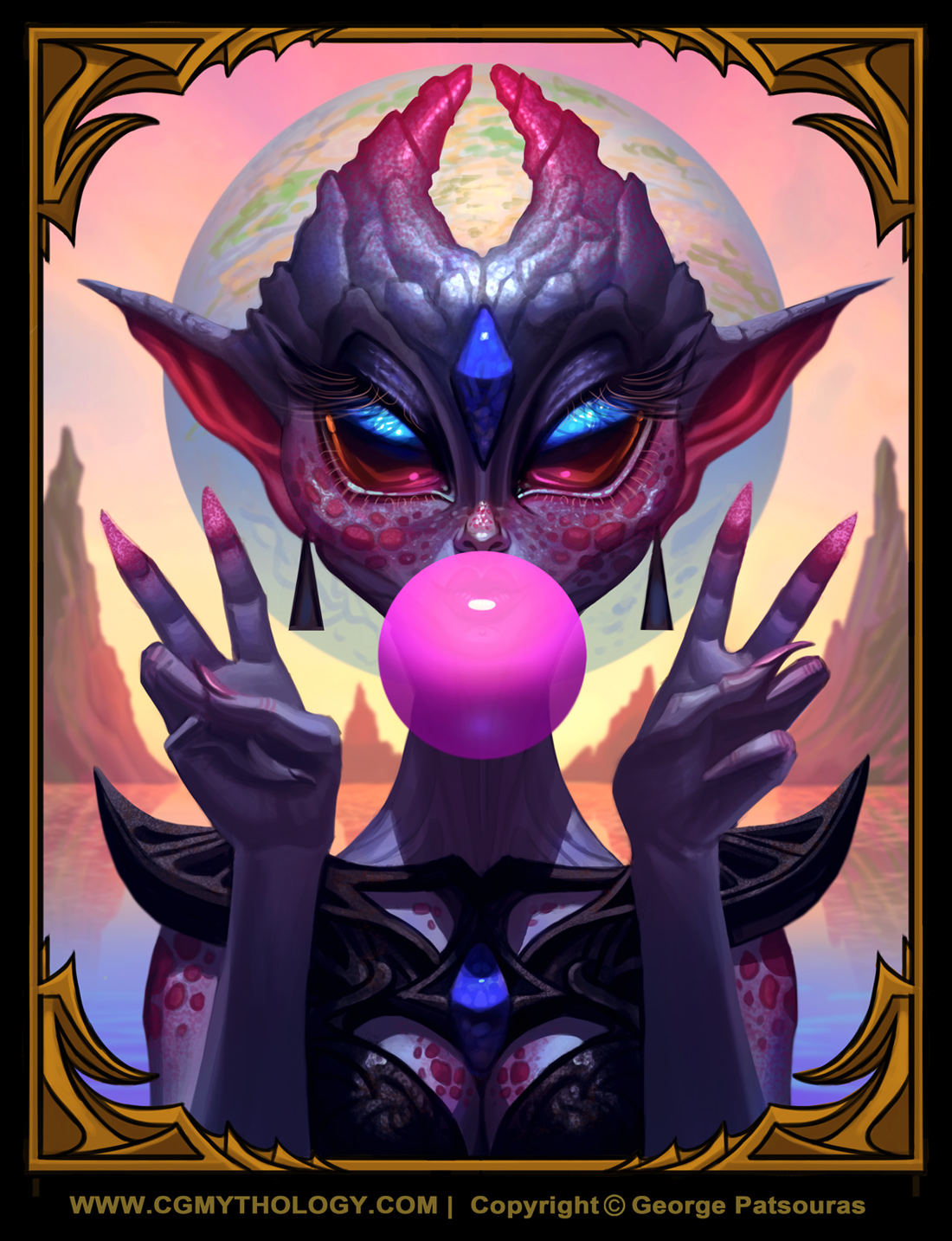
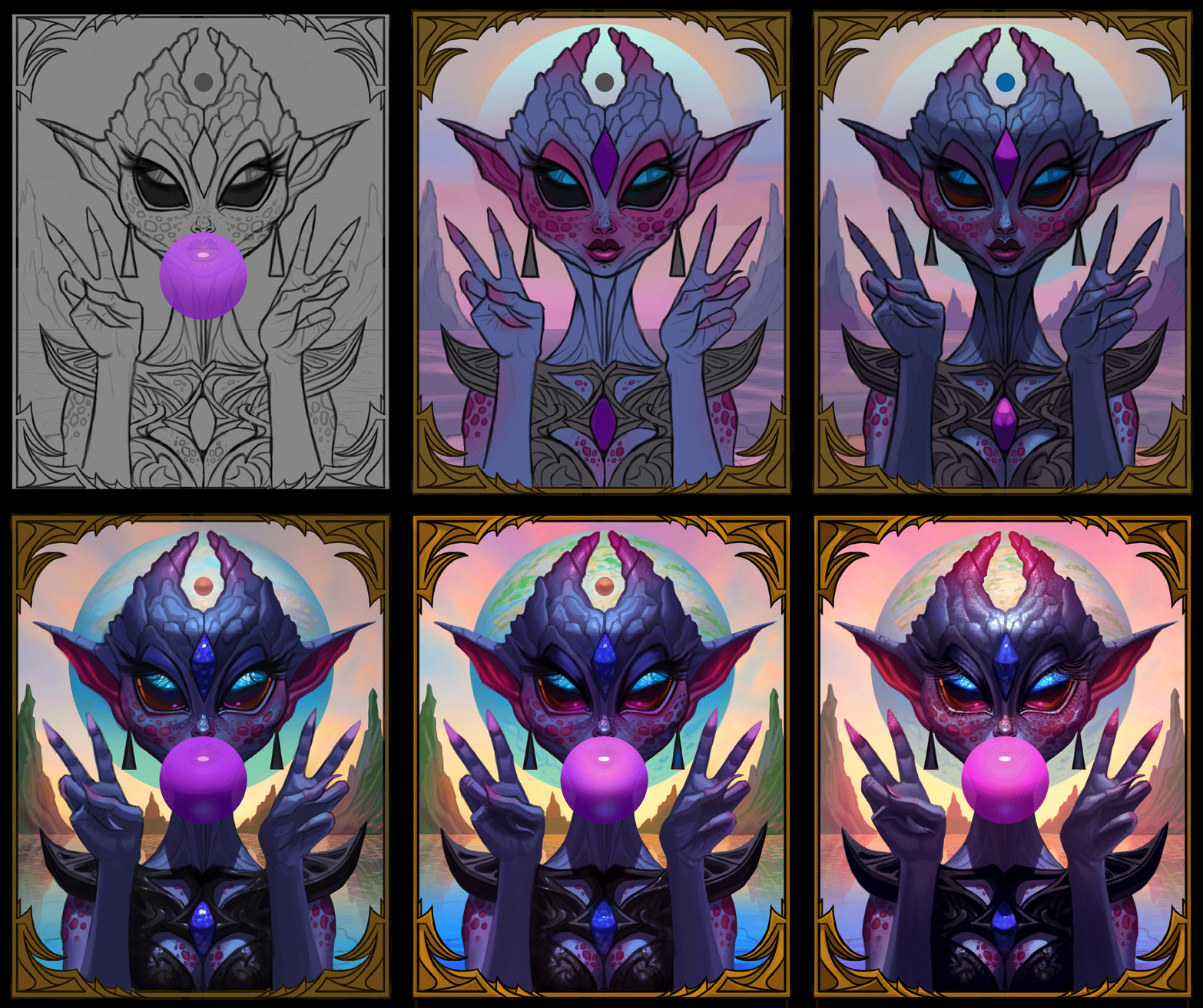
Hope everyone had a great New Years!  Found some time to work on the alien image and pretty much finalized it.  Pretty pleased with how it turned out.  Of course there's still some time to tweak it further if necessary, so if something feels off please let me know!  Below is the current progress followed by the steps for those interested:


Edit:  Did a few minor tweaks to the image.

Reply
YO!!!!
This is so different for you but it looks so cool.
you think you might do more Aliens/si-fi?
Reply
Crowbit:  Thank you, glad to hear you enjoy the illustration!  I'm definitely going to explore more aliens and sci-fi, it's a lot of fun to draw and paint them!

..............

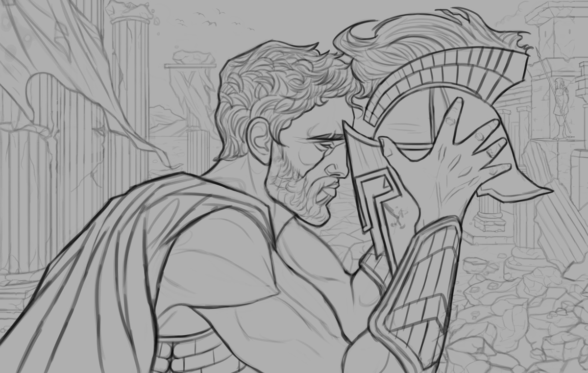
Went ahead and finished a new sketch.  I actually started on this one quite a while ago with a much different concept (the figure was surrounded by dozens of soldiers) but I felt the figure worked better in solitude.  This depicts a spartan warrior reflecting after a battle scene.  I know the background looks a bit too 'clean' to reflect that, but I plan on adding a lot of destruction, cracks, etc. when painting it in - it was just easier to draw this way.

Any feedback before I begin work on colors would be greatly appreciated as well.  Below is the sketch:


Reply
The spartan helmet hair socket is not respecting historic example.

So it either a leak of referencing or a deliberate choose i don't full support as i find it not a good design choose because it just not something you see in helmet design and that probably because they don't want the hair going into there eye.

Also the hair use in those helmet is generally stiff toward the front looking like a medium to short hair broom end and a bit more flowy toward the back in some case.

The beard and simplification of hair is to well kept in my opinion and a leak of silhouette detail can cartoonify something that could use added detail .Also the flow of the hair doesn't follow the natural direction of the weight of the hair. You need to try to have a better gradient of strand of hair right now it like medium and small but you can also go for individual loose hair. For the beard i would say get rid of that ''jawline'' contour make the bear more random and curvy it the same thing like the hair give more attention to your silhouette even if the beard is short and you get to see the jawline consider it not just a fake beard he glue on is face.

The arm furthest arm is not following a proper perspective it as if is left shoulder is raise when he clearly in a more resting gesture . We can already see is big arm no need to force the other arm to be shown more than necessary.

Try to applied some restrain on line weight in the hair otherwise it will contribute to the feeling of flatness instead try to learn or apply some line weight fundamental.

Obviously if you go for painterly style ignore this. I would still encourage you to try something a bit more graphic here for a change. Trying new thing it important and alot of fun when you can afford it.


Attached Files Image(s)


My Sketchbook

Be yourself
Reply


Forum Jump:


Users browsing this thread: cgmythology, 54 Guest(s)