12-07-2012, 11:59 PM
You have lovely warmth and light scattering when you paint skin, particularly when there's strong light on it. Really enjoying your recent experiments with environments too. Keep it up!
|
Martijn's book
|
|
12-07-2012, 11:59 PM
You have lovely warmth and light scattering when you paint skin, particularly when there's strong light on it. Really enjoying your recent experiments with environments too. Keep it up!
12-09-2012, 01:29 AM
Much appreciated Hollin.
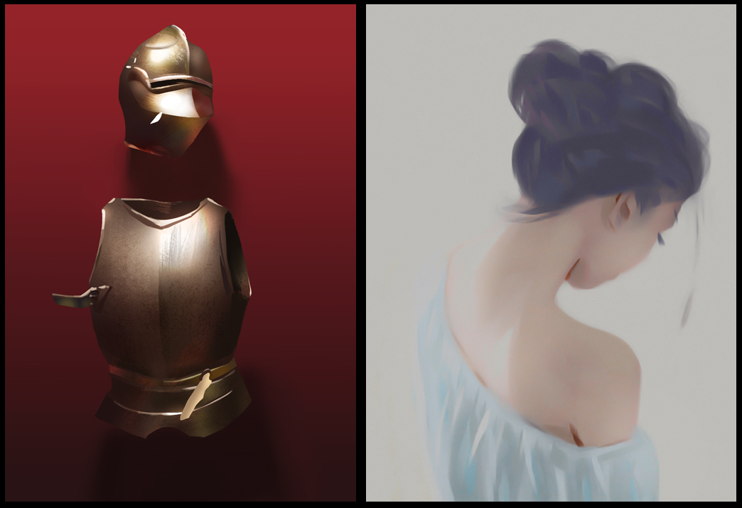
so..dark souls 2 trailer came out  did some studies of the screen caps.
12-09-2012, 02:30 AM
(12-09-2012, 01:29 AM)Lumens Wrote: so..dark souls 2 trailer came out 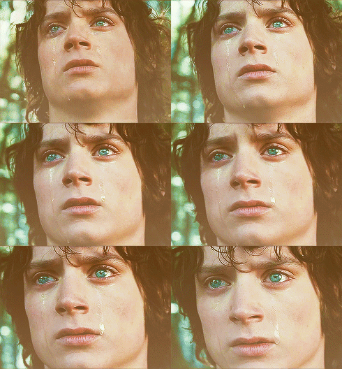 Also, I like how the helmet turned out.
12-09-2012, 04:35 AM
Love the metal in the first study!
The second one need a bit more refinement... maybe some softer edges would help sell the mist effect more :) I mean, not only on the edges of the form, but softer edges on the textured brushes as well.
12-09-2012, 01:33 PM
Woah I don't know how I've missed this sketchbook before now. Just browsed through the whole thing and I'm really impressed with your progress and dedication to experimenting! It's paying huge dividends for you. Keep it up!
12-10-2012, 12:30 AM
Atrenr, beautiful... the downside is that all signs are hinting at the new director's going to make it alot more casual with this one.
Ursula Dorada, cheers! i'll keep that in mind. Pierce, thanks for the encouragement! With this little speedpainting i tried to show through some of the underpainting. 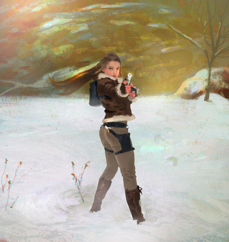 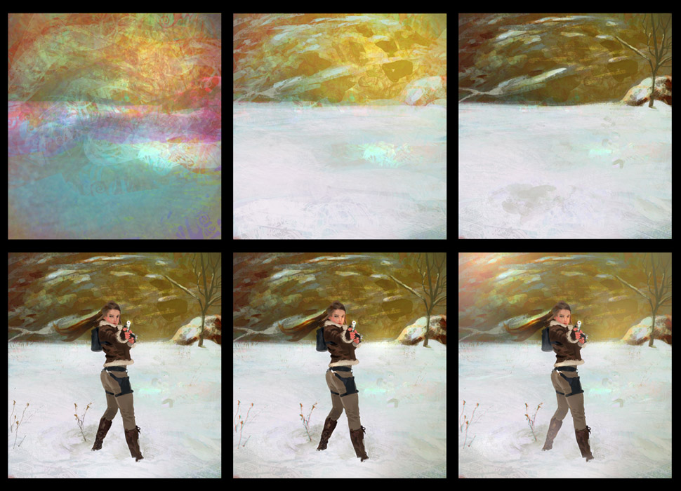
12-10-2012, 01:13 AM
your studies .. are .. FUCKING AMAZING!
CD Sketchbook: http://crimsondaggers.com/forum/thread-1404.html
Facebook: https://www.facebook.com/RamanDjafariArt dA: http://ramandjafari.deviantart.com/
12-10-2012, 03:01 AM
I'm in love! this is too awesome. I'm jotting down notes.
12-10-2012, 03:33 AM
nice stuff Martijn, like seeing the painting process of your work in your last piece
12-10-2012, 06:15 AM
the dark souls 2 study is awesome!
And it seems like i´m not the only one excited by that game! the chick on your last painting looks good too.
"Stand tall, and shake the Heavens!"
Tumblr for my comic!: http://rainfallcomic.tumblr.com/ Sketchbook: http://crimsondaggers.com/forum/thread-1227.html Facebook: http://www.facebook.com/eduardogarayart Deviantart: http://eduardogaray.deviantart.com/
12-10-2012, 06:56 AM
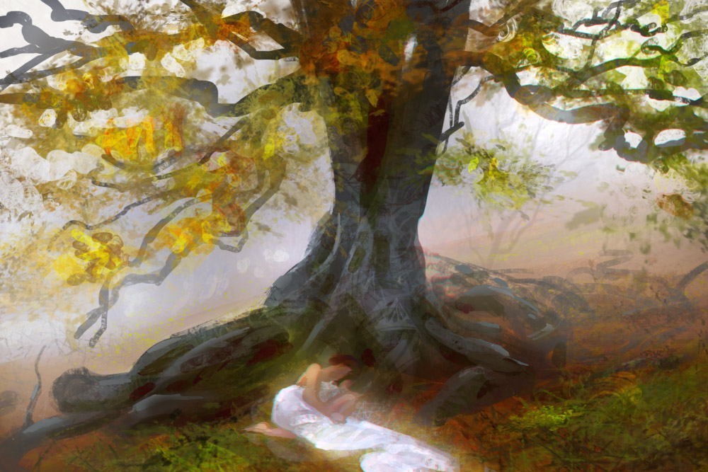
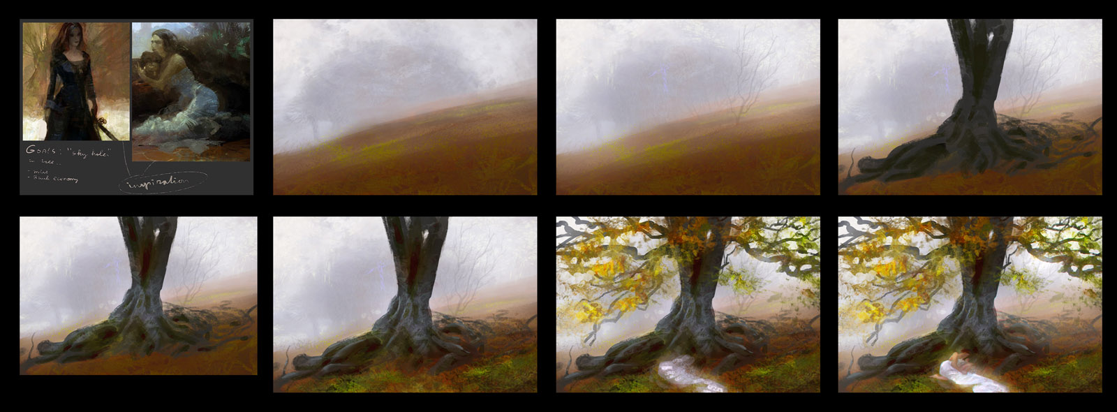
I appreciate the feedback <3 some more process stuff inspired by craig mullins.
12-13-2012, 09:43 PM
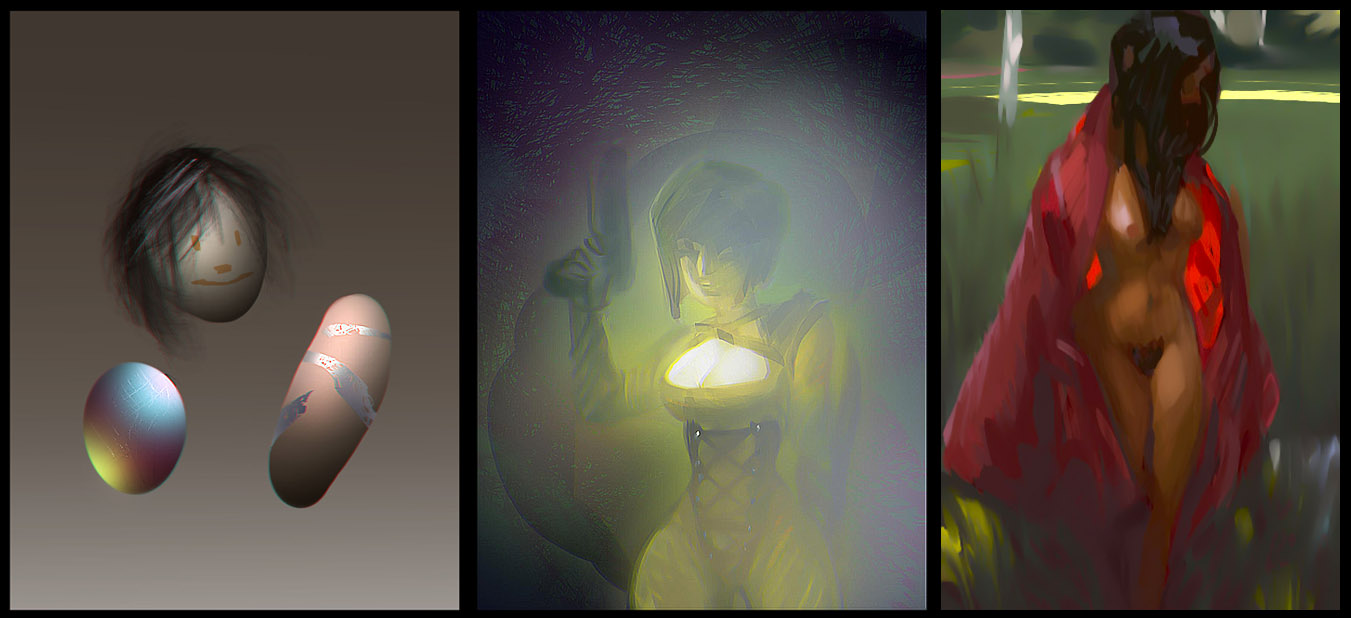
Chromatic aboration is the new motion blur lol, jump on that bandwagon.

12-13-2012, 10:06 PM
hahaha yeah i´ve seen a lot of works with that effect recently, how you do it btw?
"Stand tall, and shake the Heavens!"
Tumblr for my comic!: http://rainfallcomic.tumblr.com/ Sketchbook: http://crimsondaggers.com/forum/thread-1227.html Facebook: http://www.facebook.com/eduardogarayart Deviantart: http://eduardogaray.deviantart.com/
12-13-2012, 10:22 PM
Bro- that girl under the tree thing... wow. It speaks.
P.S. Goddamn 'chromatic aboration'. now i know what it's called so i can form 'anti-chromatic aboration' movement.
12-13-2012, 11:44 PM
Finally. after milenia I rediscovered your sketchbook again and this time. I'll subscribe to it so I'll never loose track again. I appreciate your work and look forward to see more in the furture. Keep it up
12-14-2012, 03:11 AM
Nice updates! Inspiring as always. Nothing but love sir.
12-15-2012, 12:23 AM
Pierce, You're too kind!
Ramalooke, i am humbled :o Ici, i would love to see that haha. EduardoGaray, I made a mini tutorial here: 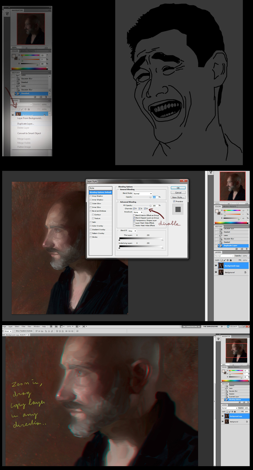 some craig mullins study.. 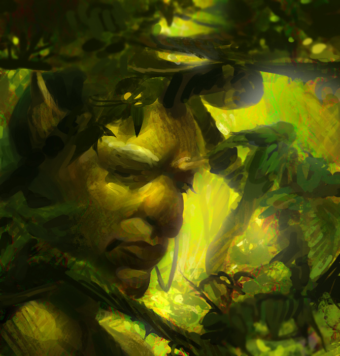  and a portrait. 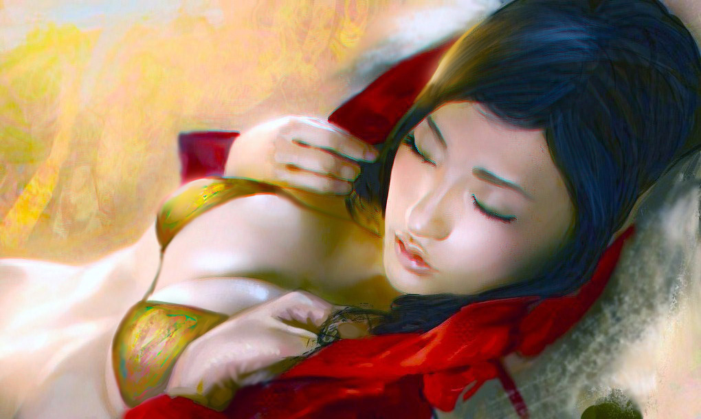
12-17-2012, 11:35 PM
I love your edges and colors! So envious xD. I like the notes on some of your studies as well, like how you sketched the 'essence' of the trees :D. Since you seem to like experimenting, have you tried out lab sliders? They are really fun i promise.
12-21-2012, 12:11 AM
ImSkeptical, nah i haven't tried the lab sliders yet. whats it for?
  |
|
« Next Oldest | Next Newest »
|