12-25-2012, 03:48 AM
Merry christmas daggerss!
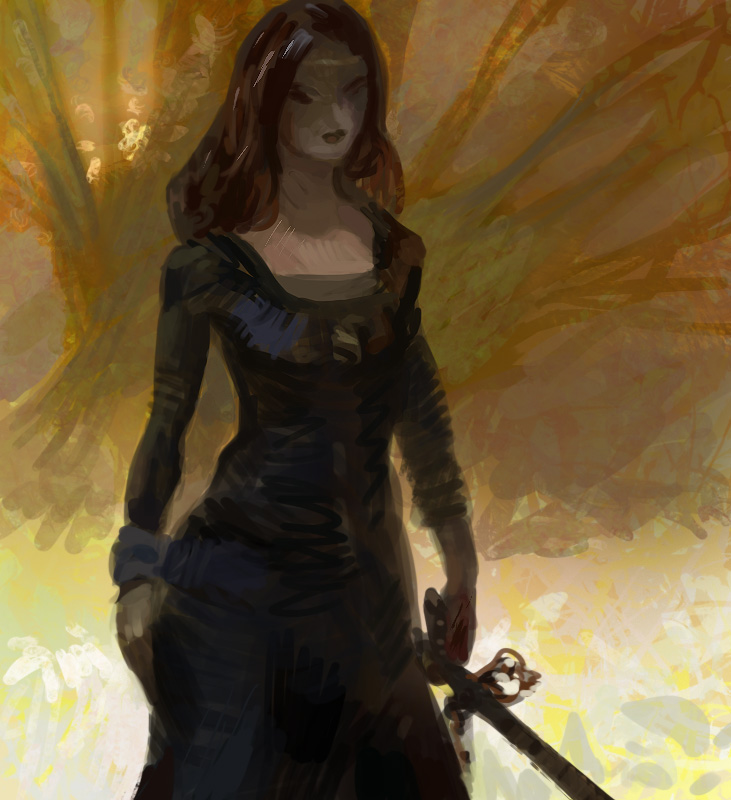
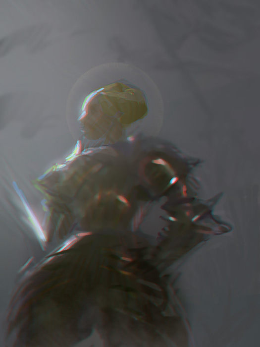
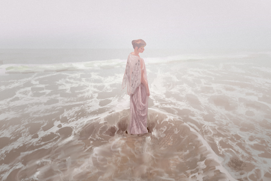


|
Martijn's book
|
|
12-29-2012, 12:08 PM
You have such lovely work! The way you paint skin and use colours - AGH :D
01-14-2013, 01:51 AM
First post of the year!
Testing out the razer nostromo for shortcuts. thread: http://crimsondaggers.com/forum/thread-1...l#pid21234 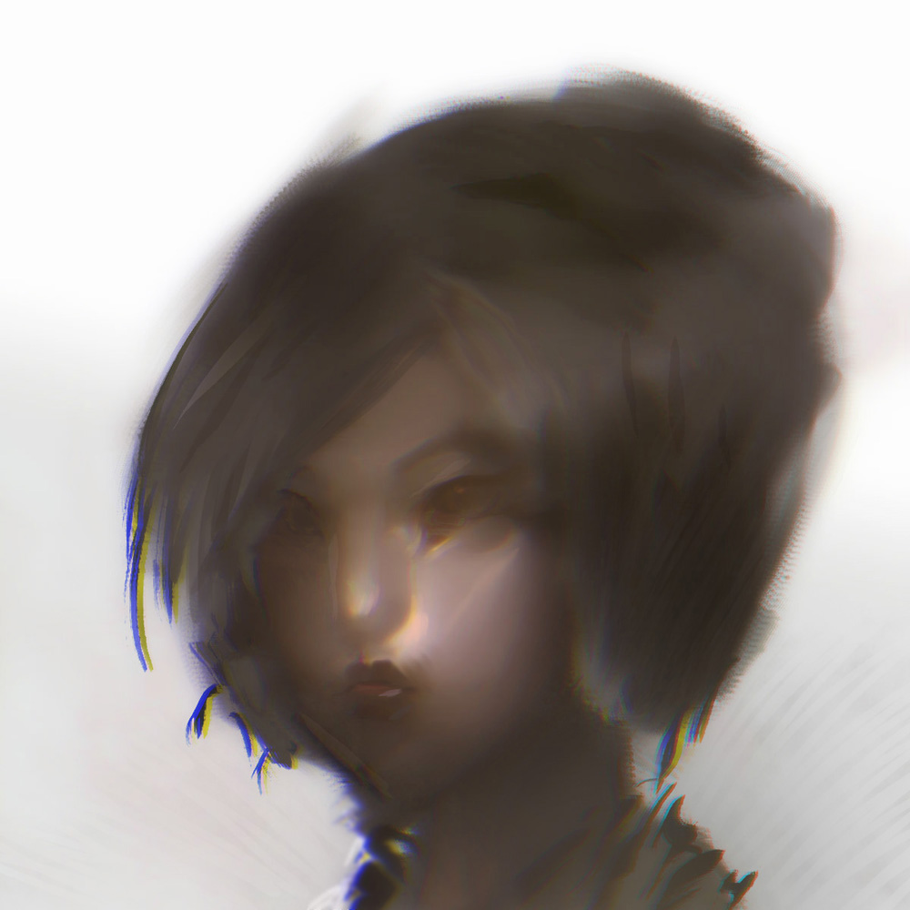
01-17-2013, 11:20 PM
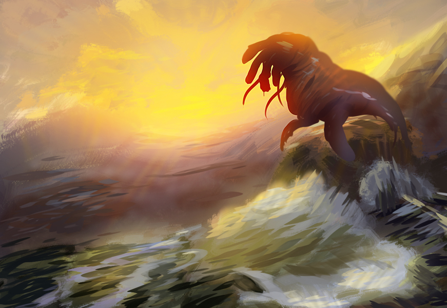
Sketch from imagination. dogsquid cthulhu thingy. she enjoys long walks on the beach.
01-24-2013, 06:43 AM
Love your mix of hard and soft edges. It's something I've been struggling with for quite a while now!
01-24-2013, 07:24 PM
Whoa, I'm in love with the lightining <3 I think You found the right style here heh. Last two pieces are just so good :)
01-24-2013, 09:01 PM
the last one is just, beautiful :D
"Stand tall, and shake the Heavens!"
Tumblr for my comic!: http://rainfallcomic.tumblr.com/ Sketchbook: http://crimsondaggers.com/forum/thread-1227.html Facebook: http://www.facebook.com/eduardogarayart Deviantart: http://eduardogaray.deviantart.com/
01-25-2013, 07:15 AM
As everyone's saying, awesome lighting man. Great work on the red head btw. The rendering's really cool. Definitely gonna be checking this thread more in future.
Website - www.ohbullocks.com
Blog - http://blog.ohbullocks.com Sketchbook - http://crimsondaggers.com/forum/thread-678.html Working towards 10000 hours at http://10000hourrule.com
01-25-2013, 08:17 AM
you're lighting is looking really strong and i love the softness to your work, its awesome how sparingly you use hard edges, but i think you could push this even further, otherwise i would just say be cautious about overusing that photoshop blur effect thing with the colours.
great work though so keep it up! :)
01-25-2013, 09:26 AM
Still fancy that 'chromatic abomination' or whatever it's called, eh? :)
I love the last few, you have very nice flow going on in there,personally I'd really like to see you expand on that
01-25-2013, 11:57 AM
youre killin it! im still wondering how you get that look in your work
01-25-2013, 01:12 PM
YOu are really coming into your own style
If you dont feel a kick in the pants, allow me to get a bigger boot..
http://www.livestream.com/mrahart http://www.youtube.com/user/mrahsart http://mrahart.deviantart.com/ http://www.mrah.org
01-25-2013, 05:03 PM
i see you are getting more comfy around your work that is very very good, but you could work a bit on your perspective, i think that will give you more freedon to do what you wish with your design choices, also you miss some big shapes in your portraits sometimes, there are some parts that dont read as well as others, i love your lighting tho and the hard vs soft edges are very good too, but then again i think you focus too much on it do some master copies and see how the good ol masters of painting managed to imply form and more importantly volume and depth with value, hue, direction and weight of the stroke, this people thought their stuff through not one stroke was wasted ir without purpose every one is confident and attacks a certain area of the picture think on this and i think you will improve immesely in the mean time i will wait patiently for the next batch of drawings!
01-25-2013, 10:39 PM
The red head painting in post 88 looks great. Love the striking color.
|
|
« Next Oldest | Next Newest »
|