04-08-2013, 03:02 AM
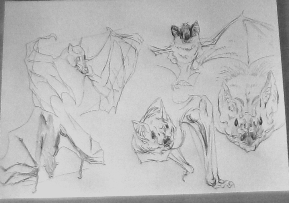
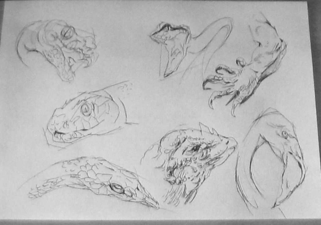
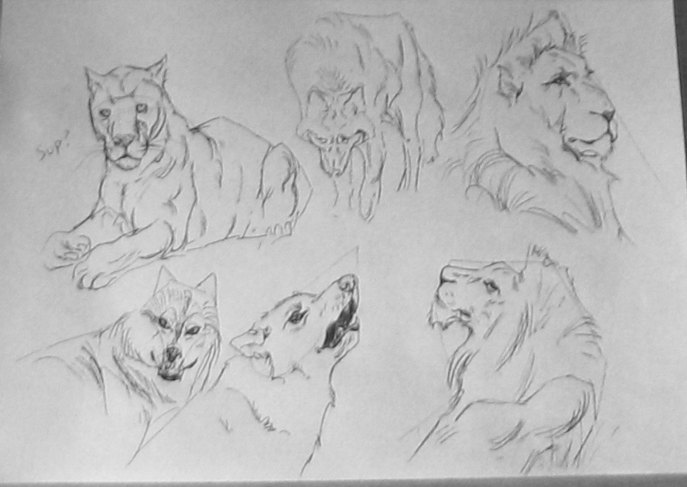
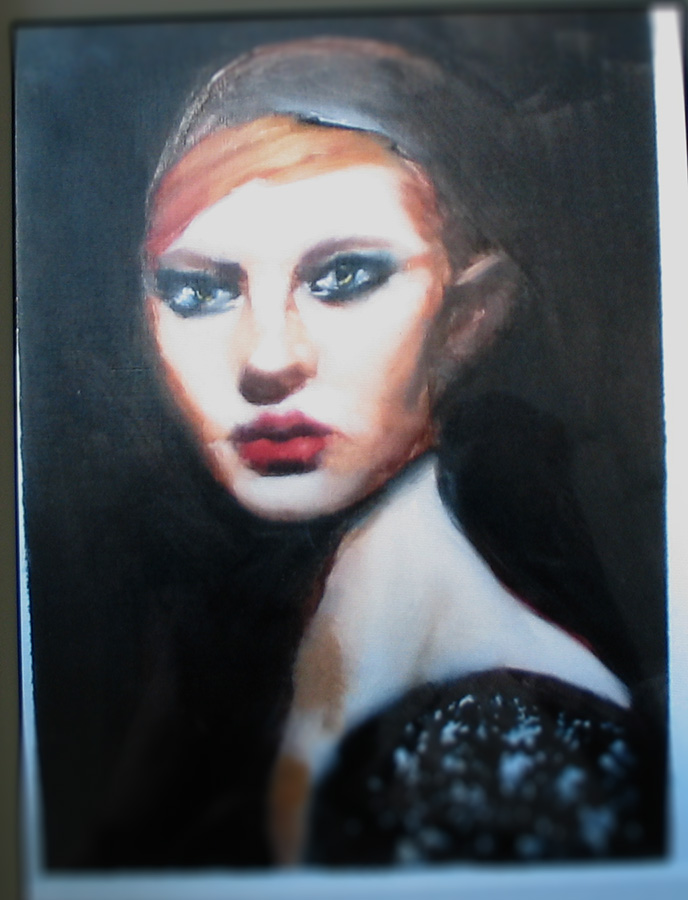
drawings and an old painting.. i think it was my first try with oils.


|
Martijn's book
|
|
04-08-2013, 03:02 AM
drawings and an old painting.. i think it was my first try with oils.
     
04-09-2013, 10:16 PM
Lion painting
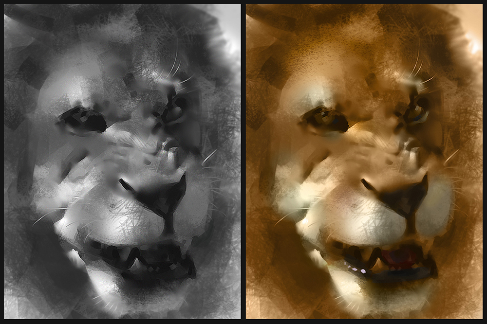 and simplefied statement, inspired by Nathan Fowkes. 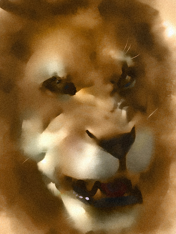 ''If you put anything in your drawing that varies from its simplest shapes and values you'd better have a darn good reason. Variations in shape and value that don't convey form to the viewer are the first and fastest step to drawings that dont hold together.'' 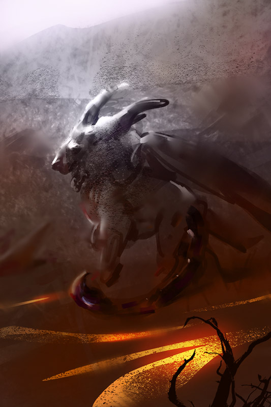 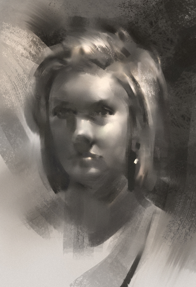
04-11-2013, 01:38 AM
I've tried grouping the values more in places of interest.
gotta paint something with a better value range next time. 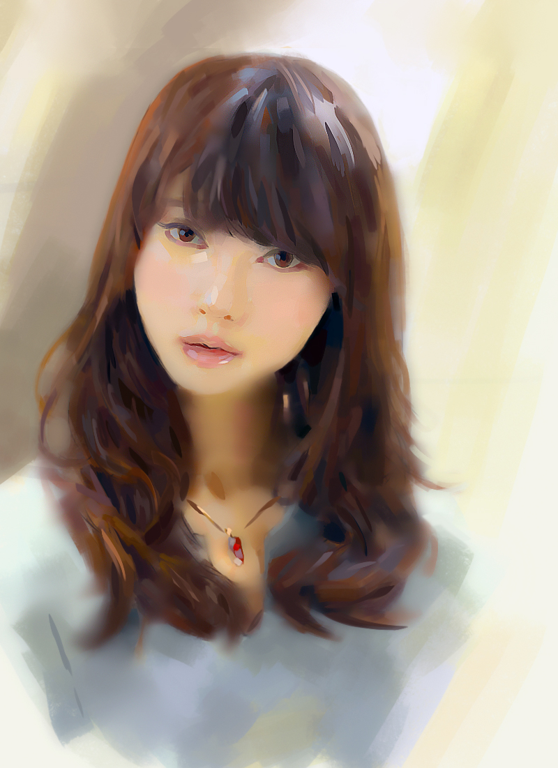
04-13-2013, 04:23 AM
I love the mood of this last piece! Such a good silhouette!
Blog | CD Sketchbook | dA | Facebook |
04-13-2013, 12:29 PM
Making breakthroughs i see :D cool value control dude
04-13-2013, 01:33 PM
Wow! Amazing work and studies! I love the demonstration on how Nathan Fowkes influenced you lion study, keep posting:)
04-14-2013, 12:38 AM
Damn!
You're really awesome.
04-20-2013, 09:45 PM
Thanks guys!
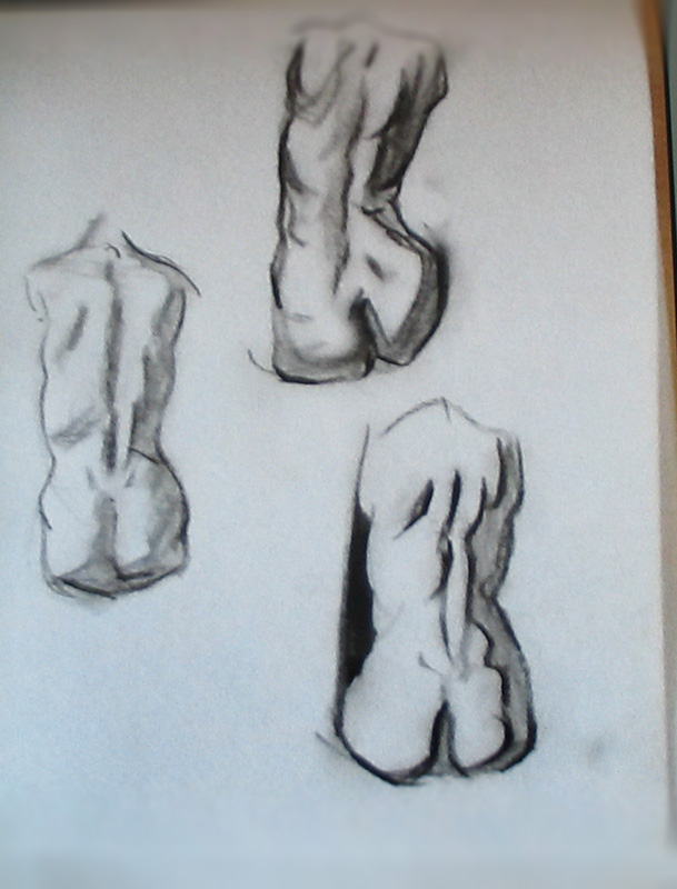
I bought a drawing clipboard with toned paper and charcoal pencils. Its time to stop neglecting my poor drawing skills. http://www.youtube.com/user/ProkoTV http://www.youtube.com/user/ronlemen1 Aside from anatomy and proportions, i've lost confidence in my linework when trying to handle the charcoal like your supposed to hold em. 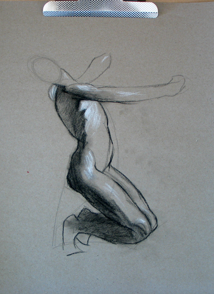 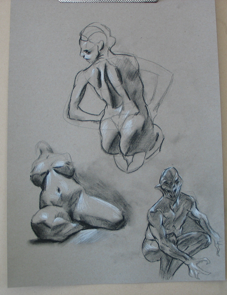 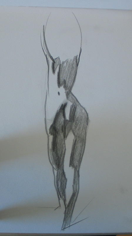 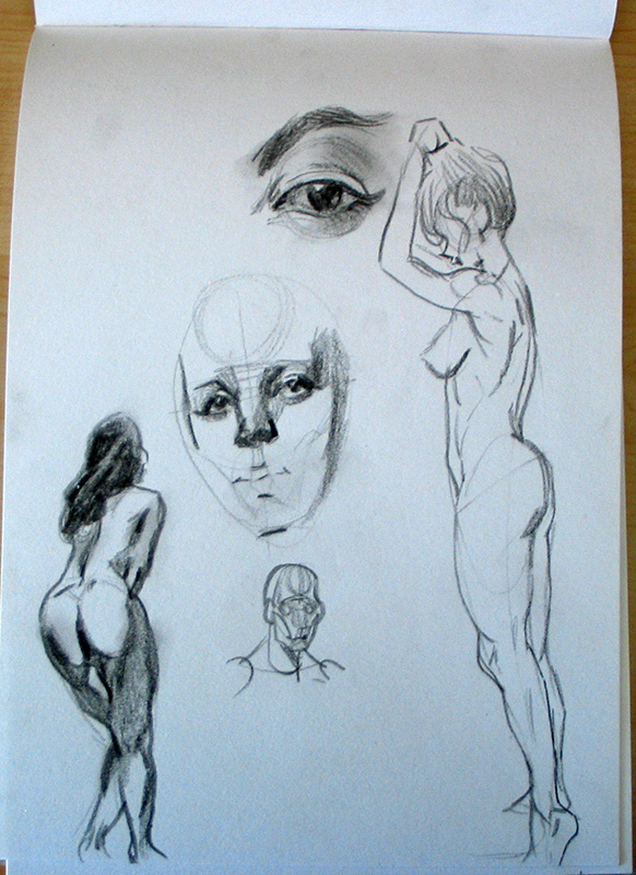 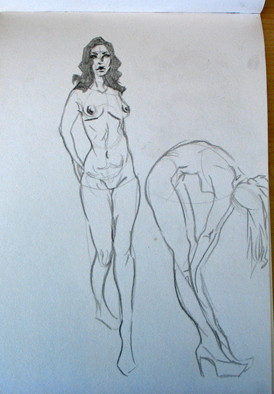 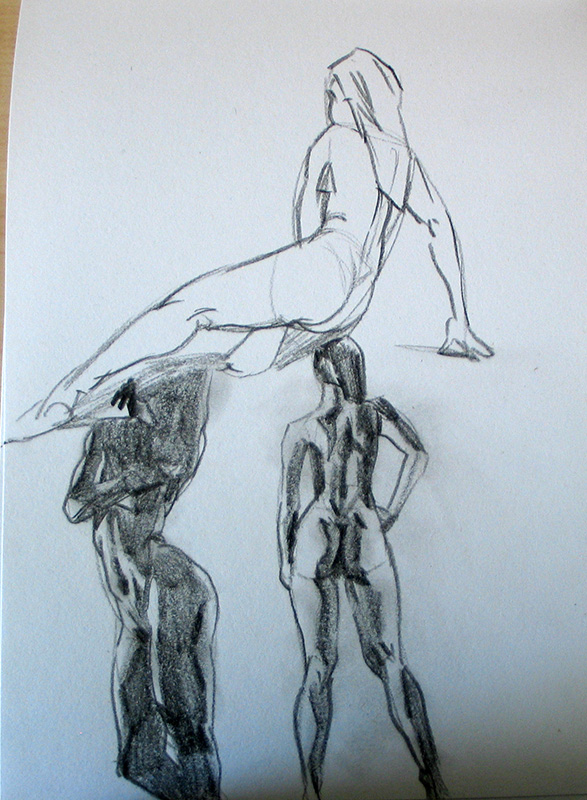 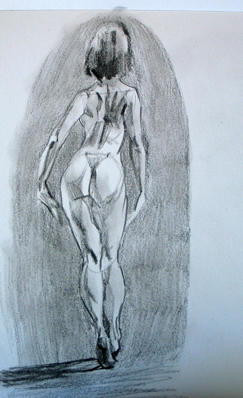 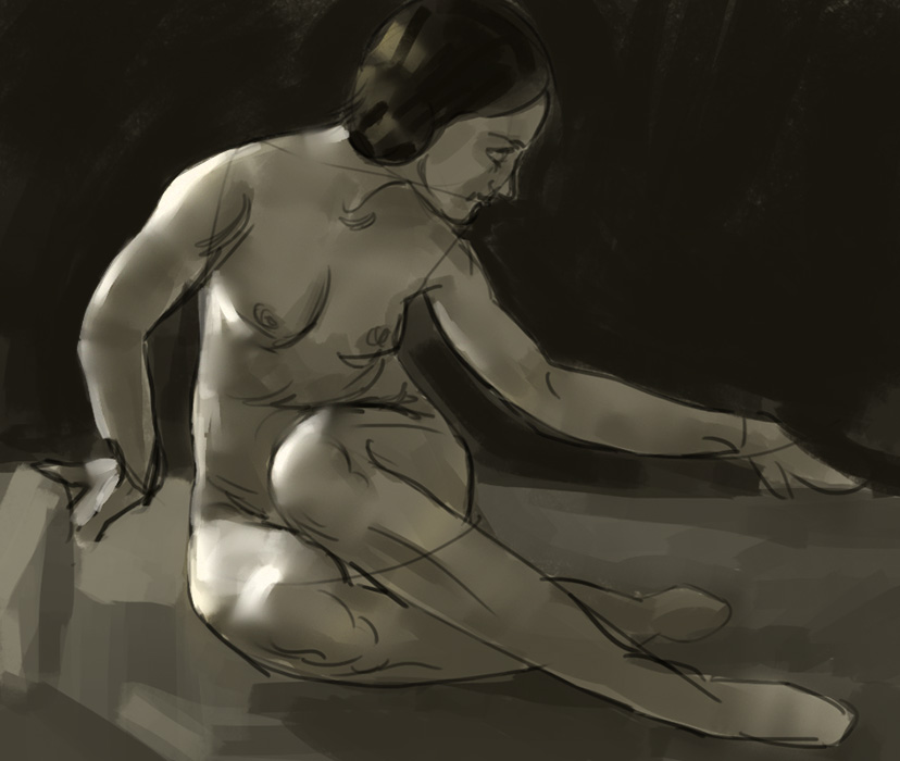 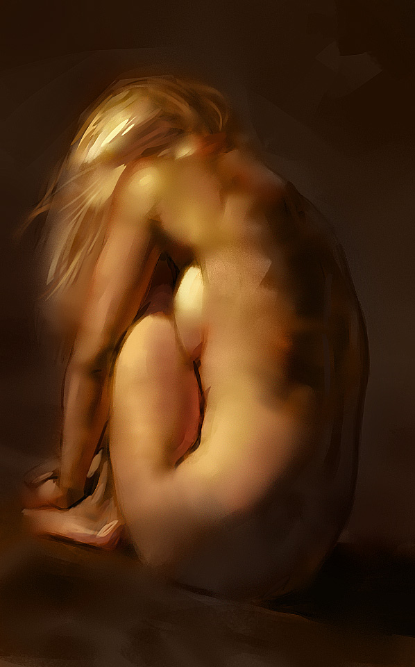 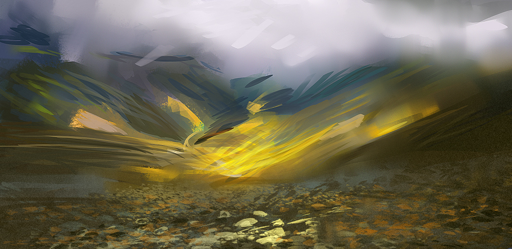 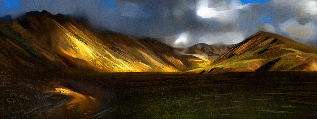
04-22-2013, 06:53 AM
man i love this sb, went thru every page, some incredible color studies :) love the way u r really pushing the edges, but sometimes wish u would include some harder edges. still great work so beautiful cant wait to see what comes next.
04-23-2013, 09:13 PM
Appreciate it Pnate! you got sweet colors yourself!
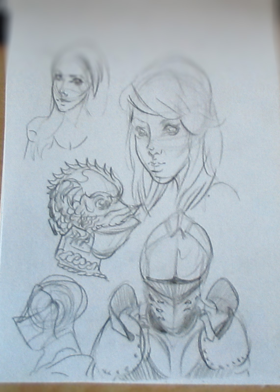
Yolo, *giggles* thanks for the heads up, the way i normally manage edges is by starting with hard edges , then soften some up. easier to soften hard edges than starting all soft and making crisp ones IMO anyway. I quess its whatever you'd prefer. my first mediocore attempt at some charcoal portraits. had a lot of fun though some proportion and anatomy issues. these where not from photo ref but from some youtube demos. wow..now that i look at them on the screen the second one has insanely stupid mouth, looks like batman level of kissy face. 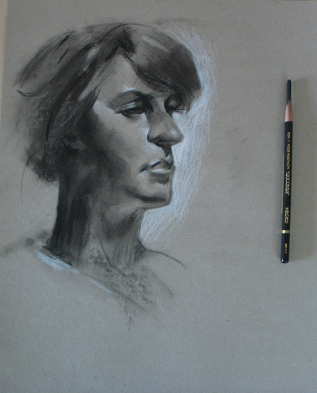 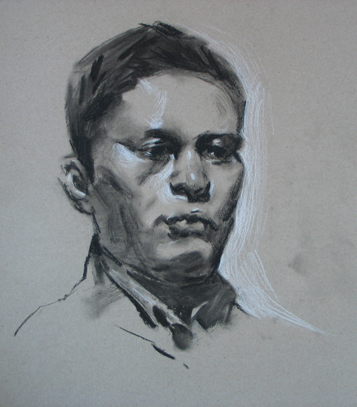 oh well..off to the drawing board.
04-24-2013, 04:59 AM
Lungcell, my hand starts to hurt, like really bad from using charcoal :(
so thats it for today. 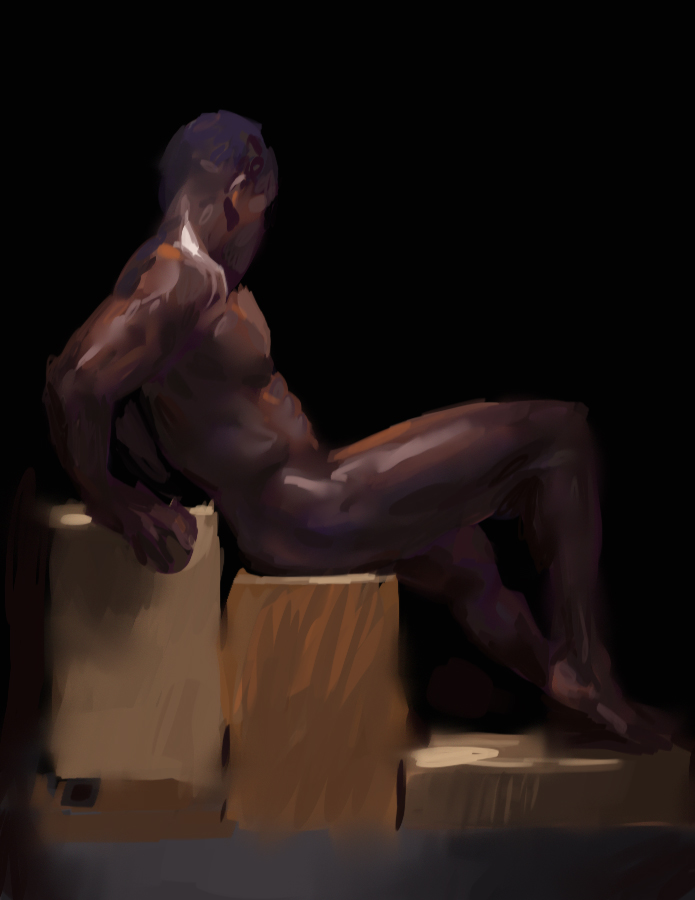 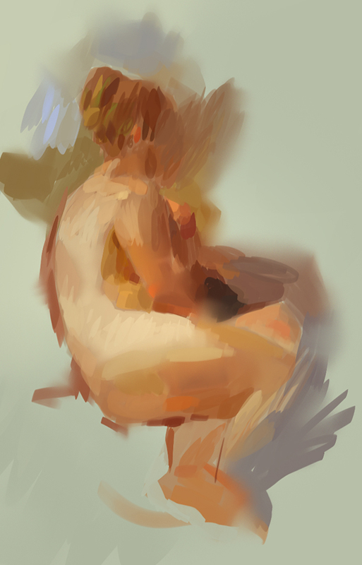 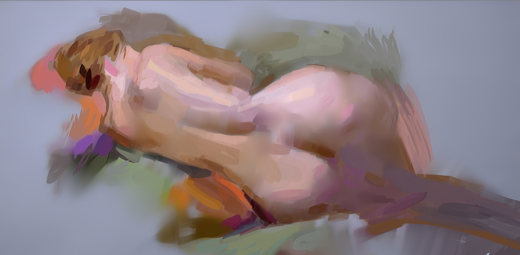 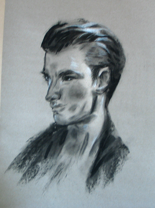 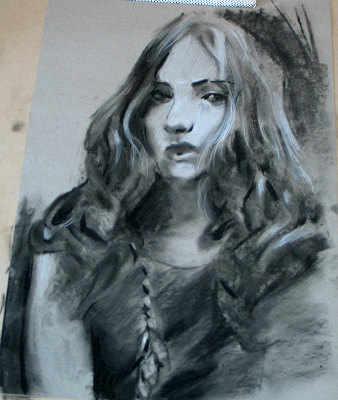
04-24-2013, 09:45 AM
Awesome stuff man like the painterly quality of your work
04-24-2013, 11:09 AM
<3 ur use of hard vs soft edges :D so nice
Also ur charcoal drawings were so nice they inspired me to pick up some charcoal pencils and give it a shot! Any tips?
04-24-2013, 12:33 PM
Last figures are looking sick! so is the Woman in post #148, so rad! Keep at it! How do you get that grain effect you have in some of the pieces in #146?
04-24-2013, 05:47 PM
James, thanks! you inspired me to use white pencils for highlights.
Matt, sure you can start by looking at some of these: http://www.youtube.com/user/ProkoTV/videos?view=0 http://www.youtube.com/user/ronlemen1 < gesture drawing I bought this nathan fowkes demo of portraits in charcoal: http://laafa.org/art-classes/nathan-fowk...d-version/ well worth it! Jneumann, thank you. The grain effect is from using big chunks of charcoal , not the charcoal pencils. use the whole side of the chunk to create all kinds of textures. wipe it with the side of your hand or with a cheap brush to smudge/blend. I used willow charcoal sticks, cut them in half for better handeling. note they will crumble and leave alot of charcoal dust all over the place. |
|
« Next Oldest | Next Newest »
|