Coby's sketch book
#21
(10-18-2012, 01:07 AM)Sublimus Wrote: Nice stuff so far!

THe biggest thing I'm seeing is that you are using kind of low sat colors for your skin tones. Get some color in there! Some warm fleshy reds and pinks and oranges!

Yea i have noticed that as well and I am working on that. Thank you for the input.


Reply
#22


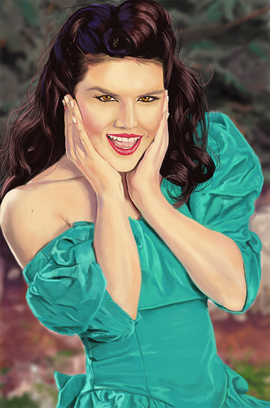
Mark newman study


Reply
#23

Reply
#24
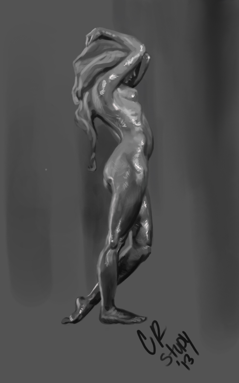
Great stuff. That last study is really neat!

Reply
#25
(04-17-2013, 10:42 AM)CoreyH Wrote: Great stuff. That last study is really neat!

Thank you.
Reply
#26

Study I did this weekend..........http://youtu.be/eZOYK8XlcIY
Reply
#27

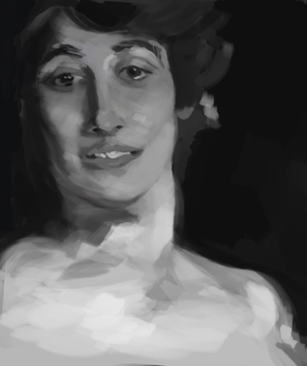
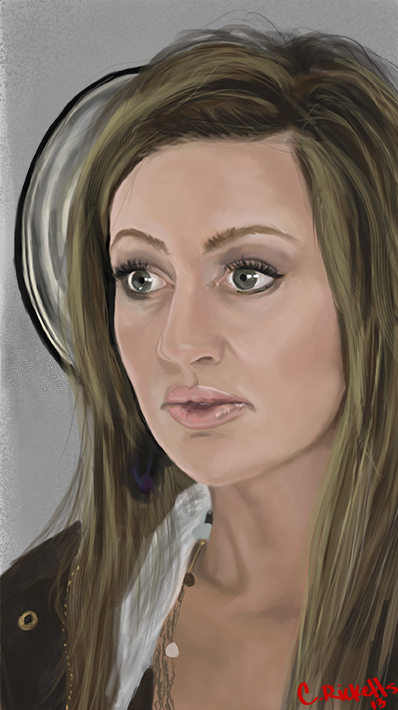
portrait study of my wife. im having issues with color and texture.
Reply
#28

Reply
#29
dude your studies are awesome, keep it up!

Reply
#30
(05-05-2013, 07:58 PM)rainbowsorknives Wrote: dude your studies are awesome, keep it up!

Thank you much.
Reply
#31
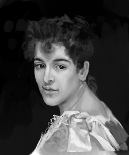
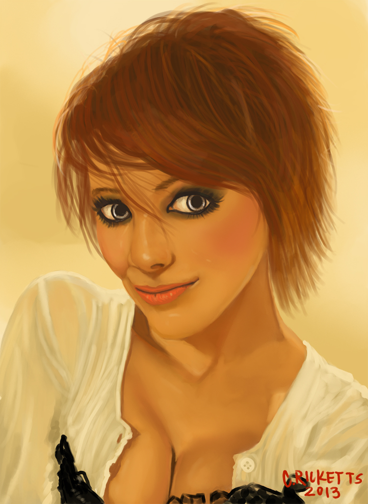
Another portrait study of my wife.


Reply
#32


Another portrait study but did not go for the realism.
Reply
#33

Reply
#34
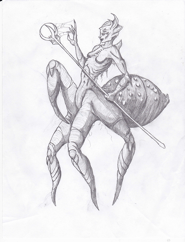
just trying different patterns from my minds eye.
Reply
#35

Reply
#36
Pretty cool studies cricketts! I think you should try being more selective with where you put the textures, you seem to be distributing them pretty evenly across the face and it's making something of a flattening effect. Your color choices are looking pretty good though! It would be easier to tell if you had the photos next to the studies though.

From your patterns from your mind's eye it seemed like you didn't understand where to put the highlights on objects, so I tried to explain it with a little diagram, and did some paintovers
[Image: specularreflectionscopy_zpse203732e.jpg][Image: ytjzp0sa_zps615811ce.jpg]

maybe I've gone a little overboard here, I hope you find these helpful, and not annoying XD

I think if you had some simple matte objects to study they would help a lot. Anyway, keep up the good work and hope to see more soon!

Reply
#37
(05-19-2013, 04:12 PM)Samszym Wrote: Pretty cool studies cricketts! I think you should try being more selective with where you put the textures, you seem to be distributing them pretty evenly across the face and it's making something of a flattening effect. Your color choices are looking pretty good though! It would be easier to tell if you had the photos next to the studies though.

From your patterns from your mind's eye it seemed like you didn't understand where to put the highlights on objects, so I tried to explain it with a little diagram, and did some paintovers
[Image: specularreflectionscopy_zpse203732e.jpg][Image: ytjzp0sa_zps615811ce.jpg]

maybe I've gone a little overboard here, I hope you find these helpful, and not annoying XD

I think if you had some simple matte objects to study they would help a lot. Anyway, keep up the good work and hope to see more soon!


Thanks i will do some light studies...........I do appreciate your input.
Reply
#38
hey man, some neat studies. I like the hair in post #35 better than the hair in the studies in post #31 and #32. that's because with the last one, you painted it more as if it were ribbons, instead of a mop. try to stick with that. here's an article that explains it better: http://gurneyjourney.blogspot.nl/2008/04...ecret.html
keep it up. try to draw some males, or old humans, I'd like to see something different than pin up's : p out of that comfort zone!
Reply
#39
(05-21-2013, 07:27 AM)Budgie Wrote: hey man, some neat studies. I like the hair in post #35 better than the hair in the studies in post #31 and #32. that's because with the last one, you painted it more as if it were ribbons, instead of a mop. try to stick with that. here's an article that explains it better: http://gurneyjourney.blogspot.nl/2008/04...ecret.html
keep it up. try to draw some males, or old humans, I'd like to see something different than pin up's : p out of that comfort zone!

Thanks for the link. will definitely do some male studies here soon.
Reply
#40

Reply


Forum Jump:


Users browsing this thread: 37 Guest(s)