Posts: 41
Threads: 4
Joined: Nov 2012
Reputation:
3
First work posted here, I feel like a virgin...
So I have painted this ent-something thing, and wrote a backstory to it.
Ents are not only animated trees. They are the greatest act of devotion to the circle of druids. Each druid can be sacrificially devoted on a specially created altars. Around the altar are placed plants from the forest, which was protected by sacrificed druid. Druids are sacrificed completly naked, separated from everything that could remind them in their new form who they were. After stab the obsidian knife in the center of the chest, began the transition. Tricking blood in turn reaches other plants, animating and combining them together. Druid's soul moves to the newly formed body, but was deprived of any emotion. His only role is to protect the forests from destruction.
![[Image: walking_ent_by_typhonart-d67vrow.png]](http://fc00.deviantart.net/fs70/i/2013/156/6/e/walking_ent_by_typhonart-d67vrow.png)
May you do paintovers, critique, and throw everything at it to show me what is ok and what's not?
Posts: 41
Threads: 4
Joined: Nov 2012
Reputation:
3
I don't know if I'm allowed to do double posts. If not I won't do it again :P
Here is new artwork. I think it will be second portfolio piece. What do you think?
![[Image: 024_tiger_hunter_by_typhonart-d6818vk.png]](http://fc04.deviantart.net/fs70/f/2013/157/d/0/024_tiger_hunter_by_typhonart-d6818vk.png)
Posts: 140
Threads: 7
Joined: Aug 2012
Reputation:
6
Of course you may double post in your own finished piece thread haha, it's there to be updated! :-)
Now I hate to be that guy, but I think what you are doing with the tiger piece is pretty dangerous, it's way too close to this Slavomir Maniak piece in every aspect http://cghub.com/images/view/63735/, and I don't wanna accuse you of anything, but when I looked at your thread as saw this, it looked like you had pretty much used the color picker on Maniaks image to get all your values and colors :-)
Just a heads up, keep working hard!
Posts: 41
Threads: 4
Joined: Nov 2012
Reputation:
3
Yeah, It was one of the references I found while creating this. But at the beggining The pose and overall cadr was fully mine. Before starting I had in my memory the picture of Maniaks painting, but no colourpicking and redrawing were done. Inspiration came from Smite game and Anhur champion, and Tiger race from Titan Quest. Unfortunate concoidence. I have to care more:D
And if it's not portfolio piece and any commision, just practice it's not that dangerous, isn't it?
And be that guy, without solid critique I won't get better.
Posts: 140
Threads: 7
Joined: Aug 2012
Reputation:
6
Yes, when it's just your personal work or practice there's no problem of course, you can't get in trouble or anything :-) By dangerous I mean that artists from the community or Art Directors might disrespect you if they see this and proper credit to the refernece is not shown. I personally don't care overly much, but I felt this was instantly recogniseable and you said you thought about making it your second portfolio piece. An AD browing portfolios would probably instantly think "Oh, he's ripping off Maniak, next!", and you certainly don't want that!
Sorry about the attached image in my first post haha, totally didn't mean for it to show! Just wanted the link!
Posts: 41
Threads: 4
Joined: Nov 2012
Reputation:
3
Yeah, true. I need to credit him as inspiration before posting it anywhere.
Another one. Done today. Remake of my old work from 2011. After 2 years and 1 month.
http://www.gimpuj.info/gallery/26746_05_..._23_37.png <- Old one.
![[Image: subject_51_by_typhonart-d685i19.png]](http://fc02.deviantart.net/fs70/i/2013/158/f/c/subject_51_by_typhonart-d685i19.png)
Quite a transformation! Final result looks great! Keep up the good work! :)
Posts: 374
Threads: 16
Joined: May 2013
Reputation:
59
Hey man! Didn't know you were on the daggers forum. Sucks that you got your tiger dude so similar to Maniak's painting. :/ I'd suggest taking inspiration from things that aren't art or game related. That way you won't be taking anything from other artist and the result will be more "you"
A tip/crit for your latest upload: Think about what he is doing there. Right now he's just a dude with stuff going into his head and he has some star wars/Sith looking breathing thingy. I'f he's a subject for experimentation the have stuff that looks like stuff you find in labs. Have equipment that looks like it's measuring his vital signs, have something more interesting in the background. I said on DA that you should do this visual storytelling and really work at it because just a few of those details can make something a lot better :)
Keep up the good work man!
Discord - JetJaguar#8954
Posts: 41
Threads: 4
Joined: Nov 2012
Reputation:
3
I finally finished this. I know I should push this a little more, but at the moment it's everything I can do. Thanks for Tristan berndt and monkeybread for avesome ideas on composition and design.
![[Image: death_speech_by_typhonart-d68khd9.png]](http://fc06.deviantart.net/fs70/f/2013/161/5/b/death_speech_by_typhonart-d68khd9.png)
Posts: 656
Threads: 6
Joined: May 2013
Reputation:
12
Wow, really love the undead looking ent, which beautifully fits the story around it. Really gives a new feel to that creature's origin.
_________________________________________________________________________
The best time to plant a tree was 20 years ago. The second best time is now.
-Chinese proverb
Sketchbook
Heya Typhon! Thanks for your comment and critique in my thread man. You got good things going on here. First, I really like the undead ent, the story behind it is interesting and it looks really cool too design-wise. A tiny bit darker shadows to give more contrast is what I think is all that it needs as improvement. In the second submission, I think you should study the planes of the head and how light and shadow falls on it.
The last piece is awesome, great composition and colors in it. The undead necromancer lord is so cool. Although I think here that you could bring forth the closest zombies a bit, making them more lit-up since they're a bit hard to read and melt into the background.
Great work, mate! :)
Posts: 41
Threads: 4
Joined: Nov 2012
Reputation:
3
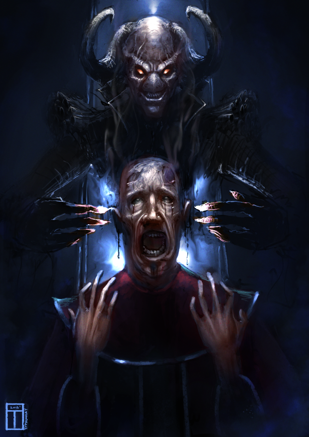
I finished next one. Qucker one. I'll upload it to deviantarts etc later :P
Here is work related to the last one. Some demonish-necromancer-undead thing possesses poor priest. I wanted the priest face to look like melting and decaying. I know the cadr is kinda boring, but I wanted more to practice hard, overburned light situations with high contrasts.
Aaaand I know I know... hands... I have to practice painting them.

Posts: 41
Threads: 4
Joined: Nov 2012
Reputation:
3
Posts: 41
Threads: 4
Joined: Nov 2012
Reputation:
3
Here are two demons I have painted today. Fun fun fun. Reds are hard to paint well d: I know I kinda messed light on beard in the first one, and his shoulder. Not more than hour and half per one.
![[Image: dat_ass____by_typhonart-d69go22.png]](http://fc03.deviantart.net/fs70/i/2013/168/9/1/dat_ass____by_typhonart-d69go22.png)
![[Image: the_look_of_craziness_by_typhonart-d69hsv9.png]](http://fc03.deviantart.net/fs70/i/2013/168/8/5/the_look_of_craziness_by_typhonart-d69hsv9.png)
Posts: 29
Threads: 7
Joined: May 2013
Reputation:
0
Vanishing points 
Your traditional black and white works are extremely good , keep it up.
Posts: 41
Threads: 4
Joined: Nov 2012
Reputation:
3
![[Image: lying_zombie_by_typhonart-d6b6xo8.png]](http://fc05.deviantart.net/fs70/i/2013/180/d/4/lying_zombie_by_typhonart-d6b6xo8.png)
Film study from Exit Humanity. I have added few things, to make it a little more interesting. Around 1 hour :P
Posts: 25
Threads: 1
Joined: Mar 2013
Reputation:
1
Nice works, love the first image very much. And that b&w hallway, awesome!
Posts: 374
Threads: 16
Joined: May 2013
Reputation:
59
Niiiiice zaaaambie! There's just one little thing I have an issue with. His back is just touching the horizon and making a tangent. I would have lowered the camera angle and make his back go over the horizon. It would also give it more depth, or make the camera higher so he's not making that tangent.
I like that background and general theme of the painting. I'm currently reading World War Z and it kinda reminds me of it :)
Discord - JetJaguar#8954
Posts: 41
Threads: 4
Joined: Nov 2012
Reputation:
3
SO. After long break. Some of my new traditional drawings. First one is a tree, done with ink and stick, elemental battle done with Faber Castell 0,1mm inkpen. And derp animals :D
The tree is slighty darker in real :d
![[Image: strange_tree_by_typhonart-d6h1ppg.png]](http://fc01.deviantart.net/fs70/i/2013/219/1/a/strange_tree_by_typhonart-d6h1ppg.png)
![[Image: 1077487_442698252509948_567090403_o.jpg]](https://sphotos-c.ak.fbcdn.net/hphotos-ak-prn2/1077487_442698252509948_567090403_o.jpg)
![[Image: hababa_by_typhonart-d6h1vhy.png]](http://fc03.deviantart.net/fs70/f/2013/219/6/d/hababa_by_typhonart-d6h1vhy.png)
Awesome traditional pieces!
|
![[Image: walking_ent_by_typhonart-d67vrow.png]](http://fc00.deviantart.net/fs70/i/2013/156/6/e/walking_ent_by_typhonart-d67vrow.png)
![[Image: walking_ent_by_typhonart-d67vrow.png]](http://fc00.deviantart.net/fs70/i/2013/156/6/e/walking_ent_by_typhonart-d67vrow.png)


![[Image: 024_tiger_hunter_by_typhonart-d6818vk.png]](http://fc04.deviantart.net/fs70/f/2013/157/d/0/024_tiger_hunter_by_typhonart-d6818vk.png)
![[Image: subject_51_by_typhonart-d685i19.png]](http://fc02.deviantart.net/fs70/i/2013/158/f/c/subject_51_by_typhonart-d685i19.png)
![[Image: death_speech_by_typhonart-d68khd9.png]](http://fc06.deviantart.net/fs70/f/2013/161/5/b/death_speech_by_typhonart-d68khd9.png)

![[Image: mountain_temple_by_typhonart-d67e6qk.jpg]](http://fc08.deviantart.net/fs70/i/2013/152/e/4/mountain_temple_by_typhonart-d67e6qk.jpg)
![[Image: ars_moriendi__the_art_of_dying_by_typhonart-d67g6bc.png]](http://fc06.deviantart.net/fs70/i/2013/152/0/a/ars_moriendi__the_art_of_dying_by_typhonart-d67g6bc.png)
![[Image: 2_by_typhonart-d67bfux.png]](http://fc08.deviantart.net/fs70/f/2013/151/d/e/2_by_typhonart-d67bfux.png)
![[Image: dat_ass____by_typhonart-d69go22.png]](http://fc03.deviantart.net/fs70/i/2013/168/9/1/dat_ass____by_typhonart-d69go22.png)
![[Image: the_look_of_craziness_by_typhonart-d69hsv9.png]](http://fc03.deviantart.net/fs70/i/2013/168/8/5/the_look_of_craziness_by_typhonart-d69hsv9.png)

![[Image: lying_zombie_by_typhonart-d6b6xo8.png]](http://fc05.deviantart.net/fs70/i/2013/180/d/4/lying_zombie_by_typhonart-d6b6xo8.png)
![[Image: strange_tree_by_typhonart-d6h1ppg.png]](http://fc01.deviantart.net/fs70/i/2013/219/1/a/strange_tree_by_typhonart-d6h1ppg.png)
![[Image: 1077487_442698252509948_567090403_o.jpg]](https://sphotos-c.ak.fbcdn.net/hphotos-ak-prn2/1077487_442698252509948_567090403_o.jpg)
![[Image: hababa_by_typhonart-d6h1vhy.png]](http://fc03.deviantart.net/fs70/f/2013/219/6/d/hababa_by_typhonart-d6h1vhy.png)