Posts: 345
Threads: 4
Joined: Jun 2013
Reputation:
2
Personally I like the first one best, because it shows more of the environment, which might be helpful for the story :) Maybe a bit smaller main character and more "output" magic would give it a transition feel :)
Posts: 282
Threads: 2
Joined: Aug 2013
Reputation:
3
If I had to choose I'd say the second one. However in all fairness if I had the talents I would work on all of them to create a series. But that's just me. I do look forward to keeping an eye on how this develops!! But definitely "B" I just really like the pose and how the head is positioned looking up at the "magic". I think I'd like to see butterflies or something coming out of the "magic smoke"... that could be interesting/different. Good luck with your piece :)
mii
Posts: 280
Threads: 11
Joined: Mar 2013
Reputation:
4
Depending on what the most important part of the image is, I'm partial to:
Character: D
Magic: C
Environment: A
Posts: 87
Threads: 7
Joined: Oct 2012
Reputation:
2
Very nice thumbnails!
D is the winner for me. When you move into the value study be sure to use the rule of thirds and get that knee close to the lower third intersection and place one the flying insects on the upper right third intersection.
Really nice, can't wait to see more!
Posts: 48
Threads: 1
Joined: Jan 2012
Reputation:
0
I'm in love with C. The perspective is interesting and there's enough room to breathe, to show the nature and for the magic bugs to fly around without being cramped in there. B is fine, too, but I prefer C.
Excited to see which one you chose and how it's going to look finished =)
Posts: 282
Threads: 2
Joined: Aug 2013
Reputation:
3
oooh I like that. Good choice. :D
Posts: 282
Threads: 2
Joined: Aug 2013
Reputation:
3
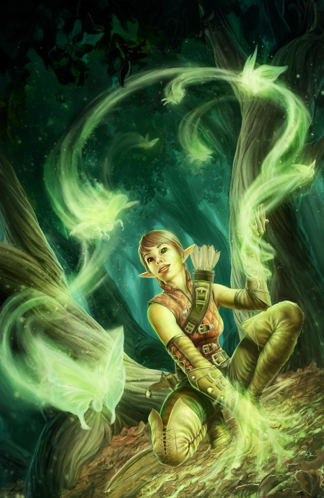
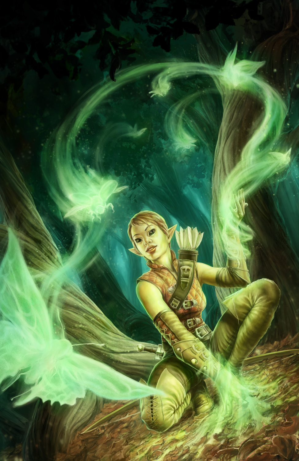
I didn't see the previous piece needed improvements. But the improvements you've made make 100% difference. Well done you. Fantastic :) Thank you for sharing :D
Posts: 345
Threads: 4
Joined: Jun 2013
Reputation:
2
Good choices, awesome piece of art! Very nice flow with the magic and the tree barks.. \m/


