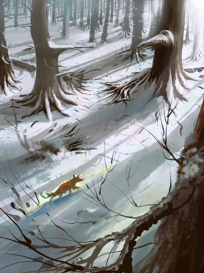
Snowy Forest
#1
Hello guys, standart procedure, I`ve got this drawing of a snowy forest and I`m seeking opinions!

Note: Please, comment design if you wish since the design is mine as well, I didn`t use reference, and I think that composition and design are as important as the actual technical work itself. Thanks in advance ;P :)

[Image: file.php?id=8453]
Reply
#2
Well that depends on what is the purpose of this drawing? Cuz for me looks like a cartoon background in meaning it have lot of empty space for characters to be added later. It's nice picture, I would maybe think about stronger bluish air perspective... but composition have nothing what would interest you, no story, nothing to direct your eyes. Missing the something or someone who would grab your attention and awake any emotions in viewer. It's just forest in snow nothing more but maybe it suppose to be like that...

Reply
#3
I agree with Madzia. There are also some perspective issues because it is a somewhat curvilinear perspective you are using so the distant trees seem off especially at their base. I did a quick paintover. Extended the canvas, created a focal point, exaggerated lighting and tried to add depth in foreground and fix some of the perspective issues, though not fully.

I think you are right that you should focus on comp and design not just rendering so since this piece has the possibility of nice shadow vs light shapes you could really think about using the abstract design of the shadowing and the lit snow areas to help drive the composition even more. Those very straight shadow shapes could be made a lot more interesting.


 YouTube free learnin! | DeviantArt | Old Folio | Insta
Reply
#4
Damn, thank you guys for the effort, really.

@Madzia I wanted it to be like a pic for a Magic card snow forest, like this - http://fc02.deviantart.net/fs70/f/2013/2...6p607p.png
And eventually I added blueish shadows on the snow, cuz now they`re grey, which doesn`t correspond to the real shading of snow (which is blueish).

@monkeybread, I agree about what you say, tbh the first idea for the pic was to have a dwarf and two black creatures on the branches of the 2 big trees looking down at him, but eventually I deleted them. THE FOX IS A GREAT IDEA :D
I think that the light is too much but you`re right about that I need more light vs shadow. After I finished the piece I looked at it from a distance and my first thought was how flat the shadows were - you`re right about this, but I didn`t want to start over again and change things. The shadows should really look more like they`re hitting a 3D snow and not a flat white ground. I love the strokes you did for the branches of the tree infront of us - it really makes everything look more like a well though Picture. :)

THank you, both of you :)
Reply


Forum Jump:


Users browsing this thread: 7 Guest(s)