Hey Ryonok,
You have some great work, man. I can definitely see your potential in working for Riot or similar developers in future. Some feedback on your folio as a whole:
You've nailed the 'cool' aspect of your paintings. Your ideas, designs, silhouettes are all fairly compelling, and will only continue to get better. The problem is that they're not all built on a solid foundation. There are aspects to some of them that don't look quite right, but they're disguised by rendering, polish, and the fact that it offers something more 'diverse' to your portfolio.
There are some concepts that don't look fully resolved, and they seem like they're victim of "that's what it started with, so that's what it will be" (mostly regarding your concept art). You need to be more discriminative in choosing what needs to be pushed/refined further to be resolved, or what needs to be culled because it's not strong enough.
This is where you will develop your standards as an artist. Only ever put forward your strongest work and best ideas, because you need to have that conviction and integrity before your work even goes back to your art director for review.
Even more important than having a body of a lot of work is having a body of work which consistently reflects a professional level of outcome. Companies will pass up on hiring someone with the coolest ideas that aren't supported by equally strong work, in favour of someone with blander ideas that are of a high, consistant quality in terms of art. I'm not saying this to nitpick; you have a lot of potential, but it's just a fact that Riot has very high standards to reflect the high quality of their brand.
A month is a short timeframe, so some advice on what you could do before graduation:
You can continue working on your Tera character sheet and splash art, but apart from that refrain from adding to your folio at this point, as you won't be able to resolve the work enough before graduation rolls around.
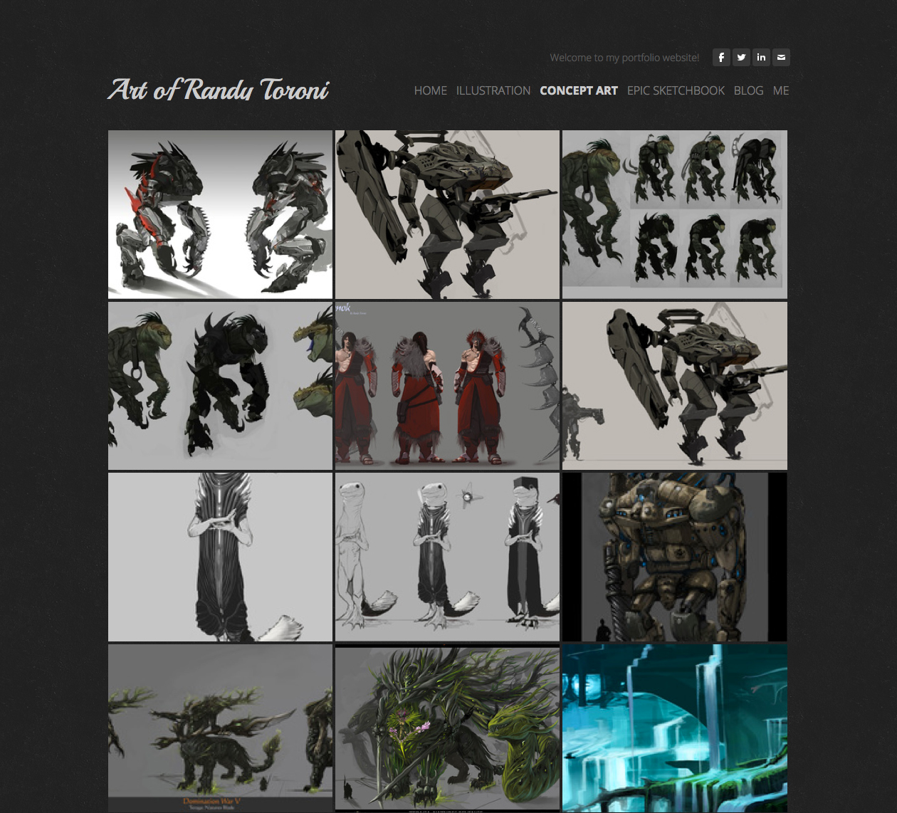
I'd probably focus on doing a cleanup of your concept art gallery. There are some duplicates that show cropped closeups of designs that have already been shown before. I don't feel these are necessary, as it's not cohesive in which painting belongs to what project. Keep them on the same sheet.
Be critical about culling paintings you honestly aren't sure about or don't believe are up to par. Your work is only as good as your weakest piece, and for a big player like Riot you definitely need to pay attention to this.
Do a beauty-pass and polish what remains. I don't mean overwork and hyper-render, I mean make sure all aspects of your paintings are consistent in quality. Set a 30 minute timer, know that you only have 30 minutes, and polish up a painting. At the end, stop all work, move to the next one, repeat. In a day you'll have tackled all of your work.
Your Dominance War designs are an example of something that's consistent in quality, but even this could use a bit of cleanup in presentation (artists can tell when things have been left tastefully loose and when they're just not refined enough; the construction lines on the ground strike me as the latter). Clean up your cast shadows, and an example of one of your mechs up the top of your page, render out the 'wing' receding into the background with some basic value, rather than leaving this as your thumbnail lineart.
Which brings me to my last (and most important) piece of advice- focus on presentation in this next month. Make sure the cohesive flow of work either reveals paintings that are obviously part of the same project or a standalone design.
If you haven't already, take a look at Paul Kwon (then Shiramune, these days Zeronis) as an example of good presentation, and model your work off his.
http://zeronis.deviantart.com/gallery/
He's now working for Riot, and if you dig through his gallery to the older pieces, his progression reflects not only an improvement in painting ability, but a marked improvement in how professional his presentation of concepts are.
All in all, you're doing good work. If you polish up your presentation, it will have more value, and will become a show-stopper at your graduation :)
-NC
![[Image: 4962953_orig.jpg]](http://www.randytoroni.com/uploads/1/7/3/3/17334835/4962953_orig.jpg)
![[Image: 2251957_orig.jpg]](http://www.randytoroni.com/uploads/1/7/3/3/17334835/2251957_orig.jpg)
![[Image: 1280728_orig.jpg]](http://www.randytoroni.com/uploads/1/7/3/3/17334835/1280728_orig.jpg)
![[Image: 873675_orig.jpg]](http://www.randytoroni.com/uploads/1/7/3/3/17334835/873675_orig.jpg)
![[Image: 8156666_orig.jpg]](http://www.randytoroni.com/uploads/1/7/3/3/17334835/8156666_orig.jpg)


![[Image: Terra_Concept_New2.jpg]](https://4.bp.blogspot.com/-Wjv9A--tNcw/UnaO_5NdKMI/AAAAAAAAJtc/mcRiWchy6Fw/s1600/Terra_Concept_New2.jpg)
![[Image: Terra_Concept_New1.jpg]](https://1.bp.blogspot.com/-sH4lfAKkj6A/UnaOfPoAG9I/AAAAAAAAJtU/2k8PjhjjTQY/s1600/Terra_Concept_New1.jpg)
