Posts: 848
Threads: 20
Joined: Jan 2012
Reputation:
29
You did a nice job on that desert rock study. The saturation sits pretty nicely. I would keep an eye out for some reflected light. In a desert like that, on warm sands, it means the reflected light will bounce and make the shadows even more saturated. It doesn't look like there are that many shadows in your study, but maybe when you apply it there will be a chance to add this in.
Nice job, keep it up :)
Posts: 320
Threads: 2
Joined: Jul 2012
Reputation:
7
Jaik: Thanks for that feedback dude. Guess that's the negative thing about studying from photos, subtle reflected light and other colors can become nonexistent. But the knowledge is the important part so will try to apply as much of it as I can when i continue working on that bugbear piece at the end of the page before.
Worked some more on this one but felt like I didn't like it enough for me to want to continue pushing it. Nice practice anyways. I think my laptop screen on which I painted it has a blue-ish cool setting to it, because it looks hella warm as I look at it now. Maybe a good thing, it's a desert after all.
The sketches are mostly random..well, sketches. Just working on forms and cross-hatching-ish shading.
![[Image: DesertRuins.png]](https://4.bp.blogspot.com/-UnpUQ7GliF8/Uu-_L418_kI/AAAAAAAABEQ/vJUJzcsf4wI/s1600/DesertRuins.png)
![[Image: ArmorOfBulk.jpg]](https://3.bp.blogspot.com/-h1Wkmo9KZdc/Uu_pvAe7DVI/AAAAAAAABEg/Hw9l7xNgJy0/s1600/ArmorOfBulk.jpg)
My gf challenged me to make something cute. Guess I rarely do that lol. He's..cute. Yes?
![[Image: CutsieBlobburu.png]](https://4.bp.blogspot.com/-gyxNoprV7vI/Uu_pwSFqlAI/AAAAAAAABEo/siFGkuN2wWo/s1600/CutsieBlobburu.png)
![[Image: MageNFreak.jpg]](https://2.bp.blogspot.com/-A5x5IT4Ch-Y/Uu_pyU_Pj-I/AAAAAAAABEw/PETNesR50_o/s1600/MageNFreak.jpg)
![[Image: UndeadNDragon.jpg]](https://1.bp.blogspot.com/-0cAQ_IgRHcs/Uu_p4-pUfXI/AAAAAAAABE4/045HbIK6954/s1600/UndeadNDragon.jpg)
Posts: 320
Threads: 2
Joined: Jul 2012
Reputation:
7
More stuff. The caster guy began as a fun late night painting, then it became frustrating. Well, at least I learned some from it heh.
![[Image: SummonerOfPestilence.png]](https://1.bp.blogspot.com/-2PgRGCJClSA/UvGIyO590II/AAAAAAAABFY/uzQFYb-uWrY/s1600/SummonerOfPestilence.png)
![[Image: DesertRuins_02.png]](https://1.bp.blogspot.com/-Uqv0ImufRfI/UvEBWpvXLGI/AAAAAAAABFI/Xn3jULvoE8M/s1600/DesertRuins_02.png)
Posts: 320
Threads: 2
Joined: Jul 2012
Reputation:
7
Posts: 320
Threads: 2
Joined: Jul 2012
Reputation:
7
Well, tried mixing up my process a bit, and at least now I kno I do not like to work this way (grayscale + color layer, then merge and colors on normal layer). That and I had a stressy pissy day while doing this knight. Well, im posting most of what I do on here anyway so xD At least I learned from this heh (slow down, plan more - edge and brush control).
Kinda like the stone study at least lol.
![[Image: DesertRocks_02.png]](https://1.bp.blogspot.com/-B5l1XwnPuaA/UwFEVfrSIeI/AAAAAAAABHw/9fgteANXJSU/s1600/DesertRocks_02.png)
Knight of sloppiness.
![[Image: FemKnight.png]](https://3.bp.blogspot.com/-98NJiezWKNs/UwFEWvXDxoI/AAAAAAAABH4/Y2VQdMfOg9c/s1600/FemKnight.png)
Posts: 320
Threads: 2
Joined: Jul 2012
Reputation:
7
Some four value sketches and some continued speedy painting on one of 'em!
![[Image: FourValues_01.png]](https://4.bp.blogspot.com/-SVnEnXiQG6k/UwPXmMi7-mI/AAAAAAAABIY/25cbRdttyHg/s1600/FourValues_01.png)
![[Image: BringerOfTheLeviathan.png]](https://1.bp.blogspot.com/-XbqDcTFpBBE/UwNr7sVIsaI/AAAAAAAABII/jQk6QPp5ltA/s1600/BringerOfTheLeviathan.png)
Posts: 320
Threads: 2
Joined: Jul 2012
Reputation:
7
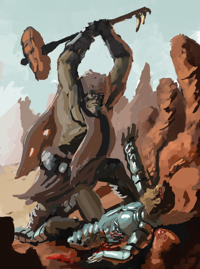
Here's an update on the bugbear piece. Critique is always welcome so I can change it around a bit before finishing it up. Might add another character in the background and maybe redraw the knights armor or something. Needs more contrast and color variation too. Fun to work at at least, would be hero meeting his demise xD
![[Image: Bugbear_WIP2.png]](https://2.bp.blogspot.com/-U4vQKWJ6usw/Uwk_sfq1eRI/AAAAAAAABIo/TIA0aqRQK0w/s1600/Bugbear_WIP2.png)
Posts: 573
Threads: 17
Joined: Mar 2012
Reputation:
7
hey there Adzerak,
I really enjoy your sketchbook. Your pencil drawings have a really great sense of volume and values (but I think I said that before).^^
Since a picture says more than a thousand words a made an crit - overpaint of your latest piece:

First I cropped the image, because I felt there was some unused space on the left side.
Then generally I tried to get a clearer sense of lighting in it. From left comes a blue light from right a reddish warm light from the rocks. So I quickly put them in.
The orc had some anatomie issues imho, his torso was a bit short. Then I tried to increase the dramatic moment by changing the dude on the ground. I made his hand stick out so there is a clear silhouette against the sky of him trying to defend himself.
I tried to make the armor read better against the ground and when I acted the knights pose out I realised that I always sticked out my head in front of my chest. So I did the same for him.
Also the orc should seem more to belong into that environment, to encrease the feeling that the knight went out of his depths and into orc - land where he met a too strong opponent. In order to do that I gave the orc stuff that was made from the surroundings like stone, horn and cloth to protect him from the sun, like nomad tribes in the desert. No metal, since metal is all over the knight, thus seperating them more.
The effect of his blood - red ears is cool but I don't think it would happen with that sort of lighting. It only happens when light travels through an translucent object and then into the eye. I don't know if that is the case here. But for dramatic effect, it could be added i guess ^^
I also changed his stance, making him more stable by opening the triangle of his 2 feet and his head more.
lastly I changed his face, to make him look more like a human and less like an animal. I think it makes the image more interesting, because maybe the knight bargains for his life, since the orc is smart enough to understand him. before it seems certain what happens, now there is a chance that the orc lets him go, if he decides. That way it is more interesting.
I hope it helps :)
Posts: 320
Threads: 2
Joined: Jul 2012
Reputation:
7
Whoa, that's one deep and thorough crit there, Flo :D Very much appreciated!
As it is with these kind of things, some observations you've made in your paintover are things that I think are a clear improvement over my WiP. Like the cropping (mentioned that I might have another character there, but I won't xD, so cropping it is!), the ears of the orc/bugbear/whatever and the varmer tones in the lighting.
Otherwise I guess it boils down to taste and what the image is trying to depict (where I've F'ed up if my idea doesn't read that well).
What I'm aiming to depict is a warrior in his last moments, he's mortally struck and the bugbear, void of any human emotions, brings the hammer down on him. The warrior is bleeding out, bearly strength enough to lift his own arm. Then it comes. The coup de grace.
Right now I'm trying to make the bugbear seem a bit less human actually, but I've added a bit more cloth to improve the silhouette and that the hammer is made from the rocks in the area is really nice ofc (I hadn't thought of that, or the hammers design at all yet. Probably wouldn't have thought of it so nice to point it out to me ^^)
Other than all that, you've made me really think about the piece and the idea I have, do I like that idea well enough to see it through? I like yours aswell, that there might be a moment of hesitation and a bargain between the two. Always inspiration for another piece ;D
Well, this was a long reply, but then again I love having discussions about arty things.
Feels a bit empty with just text so here's a sorcerer guy sketch. My gf thought it looked like some old Avatar the last aribender guy, so I added that downwards-pointing arrow haha.
Tried to give him less bright and saturated skintones than I usually do, looks kinda weird tho.
![[Image: AvatarDude.png]](https://4.bp.blogspot.com/-NgV6Br7N3gU/UwypgOmUPjI/AAAAAAAABI4/Sn-eVo-phM0/s1600/AvatarDude.png)
Posts: 320
Threads: 2
Joined: Jul 2012
Reputation:
7
Posts: 274
Threads: 0
Joined: Feb 2014
Reputation:
3
I really like the qualities of your graphite sketches you've shown. You demonstrate tones well with them.
Posts: 320
Threads: 2
Joined: Jul 2012
Reputation:
7
StardustLarva: Thanks! Graphite is what I've been drawing with the most and it often feels more comfortable than other mediums. Muuust do more digital painting xD
Two studies with model, kinda tricky how the lighting changed at midday, so I did a quicker new one instead of a continued render on the first. Maybe I should use softer brushes more when it comes to skin tones? For a more realistic look perhaps. A bit afraid of blending stuff becase it can just look smudged and flat. Guess it just takes more practice to be more precise with the brush too.
![[Image: ModelPaint_sitting.png]](https://3.bp.blogspot.com/--7vTwxFR7II/UxXqOqES_CI/AAAAAAAABKk/nbS7oJZm6Co/s1600/ModelPaint_sitting.png)
![[Image: ModelPaint_sitting_02.png]](https://1.bp.blogspot.com/-mRuKRoDKBMw/UxXqP3TRfLI/AAAAAAAABKs/cgMSywu_OYg/s1600/ModelPaint_sitting_02.png)
Just messing around xD Was fun to sketch around with and try new brushes tho.
![[Image: ArcaneEvoker.png]](https://2.bp.blogspot.com/-8YTCYlkU090/UxdGSfcRTuI/AAAAAAAABK8/U0BV2KTRip8/s1600/ArcaneEvoker.png)
Posts: 320
Threads: 2
Joined: Jul 2012
Reputation:
7
Posts: 320
Threads: 2
Joined: Jul 2012
Reputation:
7
Posts: 320
Threads: 2
Joined: Jul 2012
Reputation:
7
Two WIPs that should be done soon I guess xD Feel free to give a little crit if something pops up in yer minds!
![[Image: LandingZone_Wip.png]](https://4.bp.blogspot.com/-gy48UYk2v8o/UyDQhkBFh7I/AAAAAAAABNM/TXj7mfLeHMs/s1600/LandingZone_Wip.png)
The demon's right arm looks kinda rubbery, the way it bends, that's one thing that needs to change
![[Image: ForgedByFlame_WIP2.png]](https://2.bp.blogspot.com/-p2cwzaFVT_0/UyDQm5Ytc5I/AAAAAAAABNU/6O9ab4xyXHs/s1600/ForgedByFlame_WIP2.png)
Posts: 320
Threads: 2
Joined: Jul 2012
Reputation:
7
Trying out more water color. Not a study this time around, trying to apply what I've learned from observation.
Hard to make the colors dirty without getting too dirty I think. But it's a fun medium to experiment with, still surprises me when it dries up and looks different than when I put the stroke down. Like how his hood and splint mail turned out though!
![[Image: EnergyBladeWraith.png]](https://3.bp.blogspot.com/-vM1mNNz59uU/UyVuMjh00yI/AAAAAAAABNk/CprVCZIYFX4/s1600/EnergyBladeWraith.png)
Posts: 656
Threads: 6
Joined: May 2013
Reputation:
12
Those sci-fi ships in 102 are pretty cool--very organic ocean-y and the smoky arms/tentacles lend a sinister air.
_________________________________________________________________________
The best time to plant a tree was 20 years ago. The second best time is now.
-Chinese proverb
Sketchbook
Posts: 848
Threads: 20
Joined: Jan 2012
Reputation:
29
Dude. That last watercolour looks great. Very impressive.
THe life drawings look good too, you can see an influence of them in the improvement of your sketchbook characters as well. They look more dynamic and more informed. Really good job.
With the sci fi piece, I would move the main focus to the right a little, get their head on a third and hug the figure in the background because as it stands you have the same distance between all three firgures and the composition isnt as dynamic. Varying distances will make it look a bit better.
The dragon one, however, looks tops. Looking forward to that one coming to completion.
Posts: 320
Threads: 2
Joined: Jul 2012
Reputation:
7
Posts: 656
Threads: 6
Joined: May 2013
Reputation:
12
Great scene with the hammer wielding troll! It's looking pretty grim for the knight.
_________________________________________________________________________
The best time to plant a tree was 20 years ago. The second best time is now.
-Chinese proverb
Sketchbook
|


![[Image: DesertRuins.png]](https://4.bp.blogspot.com/-UnpUQ7GliF8/Uu-_L418_kI/AAAAAAAABEQ/vJUJzcsf4wI/s1600/DesertRuins.png)
![[Image: ArmorOfBulk.jpg]](https://3.bp.blogspot.com/-h1Wkmo9KZdc/Uu_pvAe7DVI/AAAAAAAABEg/Hw9l7xNgJy0/s1600/ArmorOfBulk.jpg)
![[Image: CutsieBlobburu.png]](https://4.bp.blogspot.com/-gyxNoprV7vI/Uu_pwSFqlAI/AAAAAAAABEo/siFGkuN2wWo/s1600/CutsieBlobburu.png)
![[Image: MageNFreak.jpg]](https://2.bp.blogspot.com/-A5x5IT4Ch-Y/Uu_pyU_Pj-I/AAAAAAAABEw/PETNesR50_o/s1600/MageNFreak.jpg)
![[Image: UndeadNDragon.jpg]](https://1.bp.blogspot.com/-0cAQ_IgRHcs/Uu_p4-pUfXI/AAAAAAAABE4/045HbIK6954/s1600/UndeadNDragon.jpg)
![[Image: SummonerOfPestilence.png]](https://1.bp.blogspot.com/-2PgRGCJClSA/UvGIyO590II/AAAAAAAABFY/uzQFYb-uWrY/s1600/SummonerOfPestilence.png)
![[Image: DesertRuins_02.png]](https://1.bp.blogspot.com/-Uqv0ImufRfI/UvEBWpvXLGI/AAAAAAAABFI/Xn3jULvoE8M/s1600/DesertRuins_02.png)
![[Image: Bugbear.png]](https://1.bp.blogspot.com/-_B2nphNFy8k/UvpdSrLSWcI/AAAAAAAABFo/bDsXI4jSsMg/s1600/Bugbear.png)
![[Image: DepthStudies.png]](https://3.bp.blogspot.com/-qBt3XjZMEgM/UvpdUtqof2I/AAAAAAAABFw/ubTrmIPr7AU/s1600/DepthStudies.png)
![[Image: Clicker.jpg]](https://3.bp.blogspot.com/-N-knRDzmYPQ/UvpdWdH8-6I/AAAAAAAABF4/AwJ68EHXPME/s1600/Clicker.jpg)
![[Image: OverlordOfMalice.jpg]](https://1.bp.blogspot.com/-wHSB_Qbn4Qg/UvpdghfrdjI/AAAAAAAABGg/QJZnszihc8k/s1600/OverlordOfMalice.jpg)
![[Image: SpellWranglerDemon.jpg]](https://1.bp.blogspot.com/-2iphw-w4ZSo/UvpdiDTR61I/AAAAAAAABGo/HjRj4IpCStU/s1600/SpellWranglerDemon.jpg)
![[Image: Thugguru.png]](https://1.bp.blogspot.com/-059RImivgMs/Uvpdj8CZTyI/AAAAAAAABGw/T-t81mtHF5k/s1600/Thugguru.png)
![[Image: FacesNFleshDog.jpg]](https://3.bp.blogspot.com/-vpVi7RlWeZY/UvpdbybkUqI/AAAAAAAABGI/XpEzoA5dY50/s1600/FacesNFleshDog.jpg)
![[Image: NorthenFighter.jpg]](https://1.bp.blogspot.com/-KZJPP8wXPCc/UvpdcxacFWI/AAAAAAAABGQ/BBttH3gR_bs/s1600/NorthenFighter.jpg)
![[Image: Facesketches.jpg]](https://3.bp.blogspot.com/-usqNfOLI8VQ/UvpdYPXC8NI/AAAAAAAABGA/zO7-qkjZh5I/s1600/Facesketches.jpg)
![[Image: Oldie.jpg]](https://2.bp.blogspot.com/-1U1RM_jZaVE/UvpdeTPsxOI/AAAAAAAABGY/FUJf7Fg6Dwk/s1600/Oldie.jpg)
![[Image: Dude_06.jpg]](https://2.bp.blogspot.com/-Z7zK22wBWGw/UvpduINc4KI/AAAAAAAABHg/m5sV3CQUnOc/s1600/Dude_06.jpg)
![[Image: Dude_01.jpg]](https://1.bp.blogspot.com/-YI94TeLWcjw/Uvpdm-vyYGI/AAAAAAAABG4/KWpkE4ZTLcs/s1600/Dude_01.jpg)
![[Image: Dude_02.jpg]](https://3.bp.blogspot.com/-CwYikLH6cAo/UvpdoPqbVEI/AAAAAAAABHA/nPhGwa-Q5eA/s1600/Dude_02.jpg)
![[Image: Dude_03.jpg]](https://3.bp.blogspot.com/-NmKSSgSlA5Q/UvpdpWf9YmI/AAAAAAAABHI/CQjnAmtp1ZI/s1600/Dude_03.jpg)
![[Image: Dude_05.jpg]](https://2.bp.blogspot.com/-4wUxA5zWWJU/Uvpdsgi-ueI/AAAAAAAABHY/FARr3vUR0_g/s1600/Dude_05.jpg)
![[Image: Dude_04.jpg]](https://2.bp.blogspot.com/-QD1rsca3eQE/UvpdrEip3jI/AAAAAAAABHQ/0Z5VmQXRo_A/s1600/Dude_04.jpg)
![[Image: DesertRocks_02.png]](https://1.bp.blogspot.com/-B5l1XwnPuaA/UwFEVfrSIeI/AAAAAAAABHw/9fgteANXJSU/s1600/DesertRocks_02.png)
![[Image: FemKnight.png]](https://3.bp.blogspot.com/-98NJiezWKNs/UwFEWvXDxoI/AAAAAAAABH4/Y2VQdMfOg9c/s1600/FemKnight.png)
![[Image: FourValues_01.png]](https://4.bp.blogspot.com/-SVnEnXiQG6k/UwPXmMi7-mI/AAAAAAAABIY/25cbRdttyHg/s1600/FourValues_01.png)
![[Image: BringerOfTheLeviathan.png]](https://1.bp.blogspot.com/-XbqDcTFpBBE/UwNr7sVIsaI/AAAAAAAABII/jQk6QPp5ltA/s1600/BringerOfTheLeviathan.png)
![[Image: Bugbear_WIP2.png]](https://2.bp.blogspot.com/-U4vQKWJ6usw/Uwk_sfq1eRI/AAAAAAAABIo/TIA0aqRQK0w/s1600/Bugbear_WIP2.png)

![[Image: Kroki_21.png]](https://4.bp.blogspot.com/-AbEV8vJKyw0/Uw3m-V7tnNI/AAAAAAAABJI/5NB2D0UKz5Q/s1600/Kroki_21.png)
![[Image: Kroki_22.png]](https://3.bp.blogspot.com/-TI1MNJLkQC4/Uw3m_nI2nZI/AAAAAAAABJQ/hfccthPjm50/s1600/Kroki_22.png)
![[Image: Kroki_23.png]](https://2.bp.blogspot.com/-hTARSckmDMY/Uw3nCWBEpEI/AAAAAAAABJY/CijgdaDshCc/s1600/Kroki_23.png)
![[Image: Kroki_25.png]](https://2.bp.blogspot.com/-hJFiFqZycfg/Uw3nFQRRX_I/AAAAAAAABJg/CwISIK-bNM4/s1600/Kroki_25.png)
![[Image: Kroki_24.png]](https://1.bp.blogspot.com/-fX9THXISDGU/Uw3nlZSx3xI/AAAAAAAABJo/hetPd_L3lZA/s1600/Kroki_24.png)
![[Image: Kroki_26.jpg]](https://3.bp.blogspot.com/-JGS0TT1TjbA/Uw3noCBlFGI/AAAAAAAABJw/BSE03u_TUXc/s1600/Kroki_26.jpg)
![[Image: Kroki_27.png]](https://3.bp.blogspot.com/-J1ds_QIB8Go/Uw3nqGXbeQI/AAAAAAAABJ4/RJ1MZjlIpqk/s1600/Kroki_27.png)
![[Image: Kroki_28.png]](https://3.bp.blogspot.com/-1AiKtAhO8eQ/Uw3nrPnGF9I/AAAAAAAABKA/W3Rucemgf6w/s1600/Kroki_28.png)
![[Image: FatMerc.png]](https://1.bp.blogspot.com/-q2PF7_NmT_M/Uw3ql54ASpI/AAAAAAAABKU/YelM9ABMTic/s1600/FatMerc.png)
![[Image: ModelPaint_sitting.png]](https://3.bp.blogspot.com/--7vTwxFR7II/UxXqOqES_CI/AAAAAAAABKk/nbS7oJZm6Co/s1600/ModelPaint_sitting.png)
![[Image: ModelPaint_sitting_02.png]](https://1.bp.blogspot.com/-mRuKRoDKBMw/UxXqP3TRfLI/AAAAAAAABKs/cgMSywu_OYg/s1600/ModelPaint_sitting_02.png)
![[Image: ArcaneEvoker.png]](https://2.bp.blogspot.com/-8YTCYlkU090/UxdGSfcRTuI/AAAAAAAABK8/U0BV2KTRip8/s1600/ArcaneEvoker.png)
![[Image: Overcast.png]](https://2.bp.blogspot.com/-hrcUf2s5HZ8/Uxi49pWuFnI/AAAAAAAABLM/RkS0krM_vf0/s1600/Overcast.png)
![[Image: SwampOfSunk.png]](https://1.bp.blogspot.com/-nMgusicAtr8/Uxi5Fq1FpRI/AAAAAAAABLU/wzJ38Sy-DKQ/s1600/SwampOfSunk.png)
![[Image: ZoomedOut_03.png]](https://1.bp.blogspot.com/-QRjU59DHcE4/Uxi5HjmLHwI/AAAAAAAABLc/pmK0z62tDMs/s1600/ZoomedOut_03.png)
![[Image: FlameForgedFiend_WIP.png]](https://4.bp.blogspot.com/-lVfaz-ke4vY/Uxi5KQBM6XI/AAAAAAAABLk/fz4ilu5Oym8/s1600/FlameForgedFiend_WIP.png)
![[Image: Akvarelsa.png]](https://3.bp.blogspot.com/-0aJEAsOA_DY/Ux7lGp31GyI/AAAAAAAABL0/rW2Ku_ZZyAQ/s1600/Akvarelsa.png)
![[Image: SmallPines.png]](https://3.bp.blogspot.com/-tvfJeuMwPZ8/Ux7lLssjMoI/AAAAAAAABL8/L_dVshyXzhg/s1600/SmallPines.png)
![[Image: Beasties.png]](https://4.bp.blogspot.com/-SOtyavlKmBE/Ux7lRod_RvI/AAAAAAAABME/axUsxDRct04/s1600/Beasties.png)
![[Image: FloatingSorcerer.png]](https://3.bp.blogspot.com/-uxCHkGfMvSA/Ux7lVDqOivI/AAAAAAAABMM/5FulSGfec08/s1600/FloatingSorcerer.png)
![[Image: Highwayman.png]](https://3.bp.blogspot.com/-AJzEFeo8paw/Ux7lY3nOamI/AAAAAAAABMU/HoAy_tYCao8/s1600/Highwayman.png)
![[Image: ScreechingHag.png]](https://3.bp.blogspot.com/-KZ-pf5hIpDw/Ux7lbrEFgXI/AAAAAAAABMc/mDoMYKZDhu0/s1600/ScreechingHag.png)
![[Image: JollyDead.png]](https://1.bp.blogspot.com/-I_px4Om9hEo/Ux7lf2rlxrI/AAAAAAAABMk/yBQIZ5fhDx4/s1600/JollyDead.png)
![[Image: Tyg_01.png]](https://1.bp.blogspot.com/-0OVT8_wERbM/Ux7lkWJkduI/AAAAAAAABMs/QCxEG0Vl8Zs/s1600/Tyg_01.png)
![[Image: Tyg_02.png]](https://1.bp.blogspot.com/-SMgUkloUtHM/Ux7lmZ4r_4I/AAAAAAAABM0/kHB4LrL_vzU/s1600/Tyg_02.png)
![[Image: JaVill.png]](https://4.bp.blogspot.com/-neOhSkuqnts/Ux7lpTVnIsI/AAAAAAAABM8/pFB2NlxnC4o/s1600/JaVill.png)
![[Image: LandingZone_Wip.png]](https://4.bp.blogspot.com/-gy48UYk2v8o/UyDQhkBFh7I/AAAAAAAABNM/TXj7mfLeHMs/s1600/LandingZone_Wip.png)
![[Image: ForgedByFlame_WIP2.png]](https://2.bp.blogspot.com/-p2cwzaFVT_0/UyDQm5Ytc5I/AAAAAAAABNU/6O9ab4xyXHs/s1600/ForgedByFlame_WIP2.png)
![[Image: EnergyBladeWraith.png]](https://3.bp.blogspot.com/-vM1mNNz59uU/UyVuMjh00yI/AAAAAAAABNk/CprVCZIYFX4/s1600/EnergyBladeWraith.png)
![[Image: AnatomyStudies_01.png]](https://1.bp.blogspot.com/-S4CE2m3_5aM/UzVKzpSaxLI/AAAAAAAABN0/GJ0pOCsrwMA/s1600/AnatomyStudies_01.png)
![[Image: Torsos.png]](https://4.bp.blogspot.com/-s9kF6Pm2Ers/UzVK1MSSz7I/AAAAAAAABN8/gDy1Tq37Pew/s1600/Torsos.png)
![[Image: GesturalTorsos.png]](https://3.bp.blogspot.com/-85_19SEIRPE/UzVK01-M24I/AAAAAAAABOA/5clJ23EbKf4/s1600/GesturalTorsos.png)
![[Image: Bugbear_FINAL.png]](https://4.bp.blogspot.com/-492CoAhWfCU/UzW5eCWcbXI/AAAAAAAABPY/lexmzVJknZ4/s1600/Bugbear_FINAL.png)
![[Image: ClassMate_01.png]](https://1.bp.blogspot.com/-D81MiU1mj6s/UzVK2Ddf48I/AAAAAAAABOE/QKFa7udQIyI/s1600/ClassMate_01.png)
![[Image: ClassMate_02.png]](https://2.bp.blogspot.com/-EHYGSuRczVk/UzVK45iRzbI/AAAAAAAABOo/Mej7zTQUrzU/s1600/ClassMate_02.png)
![[Image: ClassMate_03.png]](https://4.bp.blogspot.com/-uvyqO3CiPsc/UzVK2w0U45I/AAAAAAAABOY/pZp7O9EuEzU/s1600/ClassMate_03.png)
![[Image: ClassMate_04.png]](https://4.bp.blogspot.com/-CmSYccgnUiw/UzVK3QHZw7I/AAAAAAAABOU/5TSR61z-Kp0/s1600/ClassMate_04.png)
![[Image: ClassMate_05.png]](https://3.bp.blogspot.com/-ilDEbS_bU-k/UzVK4p6L6yI/AAAAAAAABOg/AHXtEmTfut0/s1600/ClassMate_05.png)
![[Image: OgreGirl.png]](https://1.bp.blogspot.com/-ddTg8zrYsbc/UzVK42-EmXI/AAAAAAAABOk/8WtSK-jDIAU/s1600/OgreGirl.png)
![[Image: Gubbar.png]](https://1.bp.blogspot.com/-yqwocOkzb7I/UzVK74GVG8I/AAAAAAAABPI/PFki67gHoZs/s1600/Gubbar.png)
![[Image: LineDwurf.png]](https://2.bp.blogspot.com/-NN9MKju5ZCQ/UzVK54AMYOI/AAAAAAAABO8/eLhXSb2Q-RA/s1600/LineDwurf.png)