Posts: 340
Threads: 10
Joined: May 2013
Reputation:
23
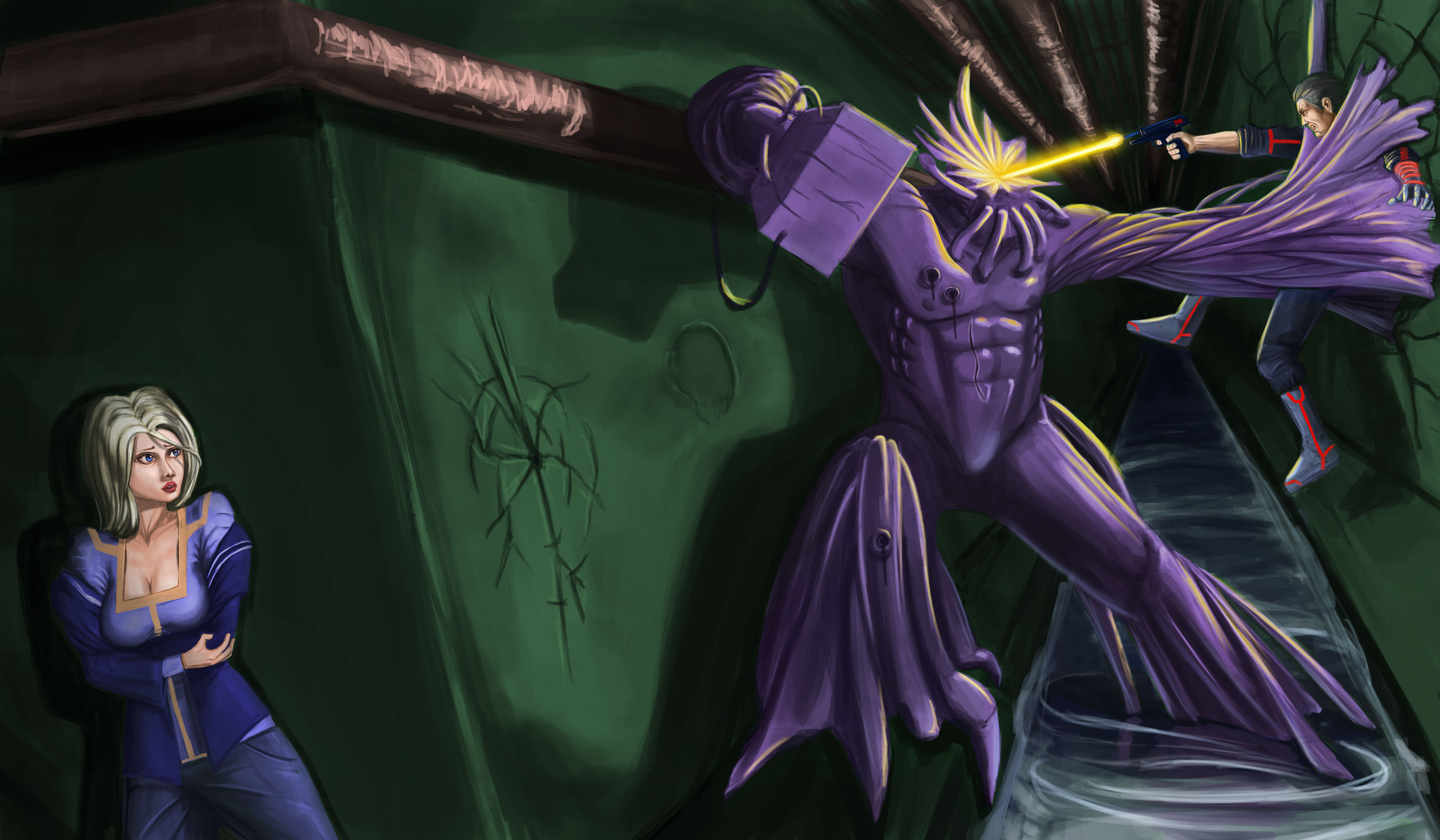
Boring is really good world cuz it immediately point the the problem. The story is boring. Not lack of details (that hardly ever help anyhow) I have no idea who is the main character here. Monster is the biggest and situated in strong point so maybe him? But i'm not convinced... You know the scenario and your task is to tell the story with picture. And you have two medium to achieve it Light and composition.
Monster is looking cool, guys shoes are cool, lazer pistol - cool! Tity girl also cool! But what connect them together?! You have too many main characters, everything is at the same level of importance (even crack in wall attracts too much attention) and in consequent all is flat.
Posts: 3
Threads: 1
Joined: Feb 2014
Reputation:
0
Thank you for your critique! The intended story is that the guy and the girl is hunted down by that monster. The guy is very skilled and so he fights the monster. The girl, however, is terrified by the monster. So she is hiding. Maybe I could give the girl a gun to show there is a connection?
Also, I want the focus to be the action between the monster and the guy. But I think that would just make the monster pop out too much because the purple is pretty bright. Maybe I should just darken everything around it?
Anyway, thank you again and I will change the piece according to your feedback.
Posts: 84
Threads: 6
Joined: Oct 2012
Reputation:
3
I agree that you shouldn't try to capture the moment the bullet impacts the monster. There's no suspense. Another reason it might look boring is the way the characters are all positioned in kind of the middle ground. It makes it all just kind of flat, despite the perspective. I would maybe move the girl into the foreground a little more to give the piece some depth.
The girl bothers me because of her pose and expression, not so much anything else. She doesn't look like she's in a life-threatening situation. She just looks sad, but not even sad like she's going to die; she looks more like someone ate the last Oreo. And she's just standing there. She's not making any move to save herself or the guy. Also, her hands are tiny. And she should be more in shadow, being around the corner from the gunshot and with no other light source.
The tunnel bothers me too. Behind the guy, the wall is the same value as the floor. I'm not sure if that's right, but for the sake of readability: form change = value change. Also, what is this place made out of? Why is it green? Are those walkways wide enough for those characters to walk down? Is this water clean? Would it be splashing around?
The monster, what's his skin like, scaly or slimy or metallic? His right arm is cocked back ready to punch, but that pipe on the wall looks too close to let him pull back that far.
I think that's about all I've got. Hope something in there helped.
Posts: 3
Threads: 1
Joined: Feb 2014
Reputation:
0
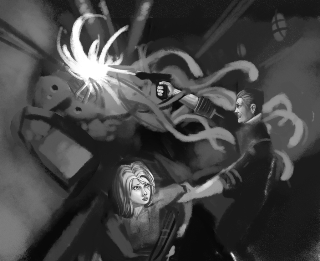
Thank you guys for the reply! I really like your idea, Madzia. I am think maybe I could have the monster popping out from the wall. Like he just break through the wall and the pipe and ready to attack.


