05-16-2014, 06:27 AM
Hope you'll get well soon! Those studies kick butts! You're developing really nice shapes of threes, clouds and other part of landscapes. I should go back to Gurney - it's like a mini bible of light and colour...
|
Lyraina's sketchbook
|
|
05-16-2014, 06:27 AM
Hope you'll get well soon! Those studies kick butts! You're developing really nice shapes of threes, clouds and other part of landscapes. I should go back to Gurney - it's like a mini bible of light and colour...
05-18-2014, 07:10 AM
Fedodika: Yes, the hand is painted, but I shot a couple of good quality references of my own hands in the mirror, which helped tremendously with getting it right ;) (More than a blown out webcam shot, which I normally use). Have to do that more often. Thank you.
Cyprinus: Haha, I actually don't even mind the smell [except that I know it's unhealthy], have to force myself to ventilate my room properly :P Maybe you could use just oil or odorless turpentine or something like that instead? denikina: Thank you and yes, studying Gurney always is a good idea :) sometimes you just can't ignore the sudden urge to paint a nebula, right? 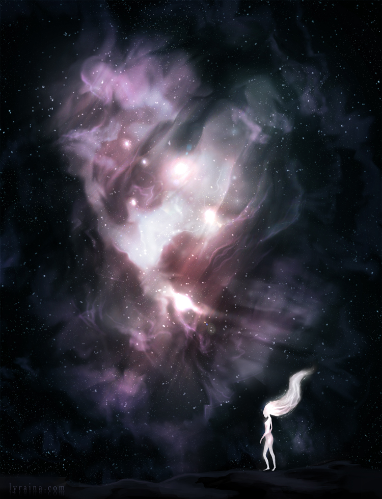 alternate version without glowgirl which probably looks better: link
05-19-2014, 08:51 AM
Hey, Tnx for stoping by my sketchy stuff.. :)
I still see you're rocking hard on the colour studies and the latest pic is so stunning my eyes are hurtin ! >.< xD Keep it up ! :D
05-19-2014, 04:57 PM
Your nausicaa piece has a nice composition, looking forward to see it finished. And that nebula is sweet!
Btw thanks for the advices on the serpent man :)
05-20-2014, 06:27 AM
Thank you guys!
New attempt at posting something, last post got eaten by the spam protection D: nausicaa final 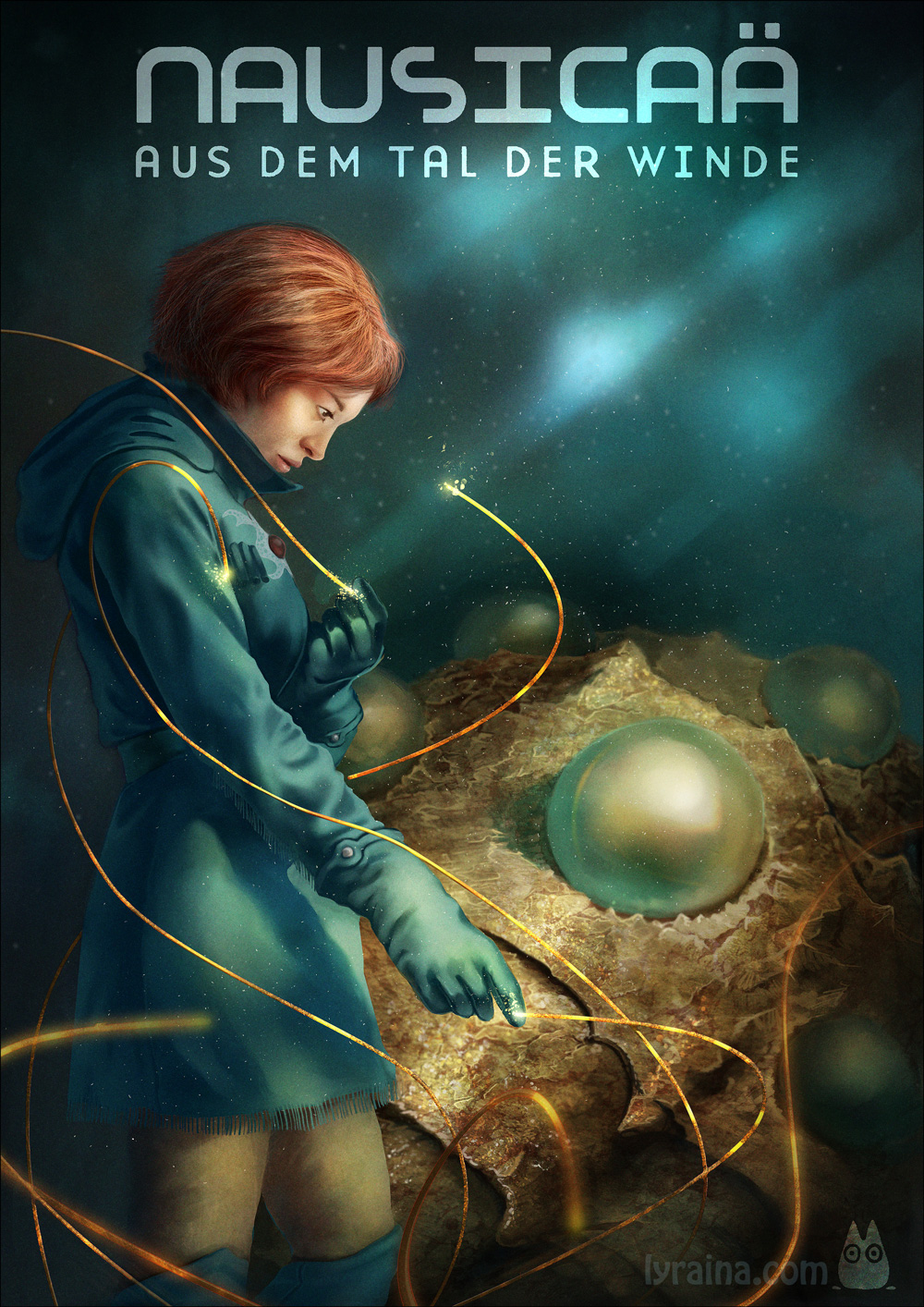 landscape failing at shaddy's technique, might have been a bit too ambitious (also I got bored by my own photograph) 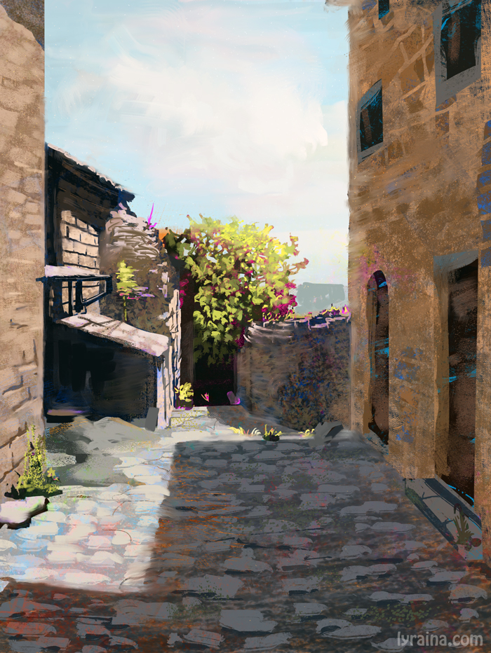
05-20-2014, 01:17 PM
Hi Lyraina,
Your latest piece for the Miyazaki poster is a serious step up from your previous work in this sketchbook. I think your effort to make exploratory thumbnails and shoot your own reference really paid off in a big way in the final piece. Great job! I think the landscape is actually pretty good. You could be a little more daring with saturated color (i.e. not follow the photo so closely) but overall the image is quite well done. Check out Rob Ruppel's blog as well, if you have not. He has a great approach to landscape that shares some similarities to Shaddy's techniques. Hope it helps and keep up the great work!
-Sketchbook-
"... for drawing is a thinking person's art." - Walt Stanchfield.
05-21-2014, 05:14 AM
The landscape painting is looking good, good practice! Maybe pay more attention on the reflective light on things since it's such a bright, sunny day.
Miyazaki poster turned out really awesome! Seeing you experimenting with a few things there - font integration, blur, and photo texture integration. The light and the mood is great!
05-21-2014, 09:55 AM
Yooo, nice job on the nausica piece! It's a really rad image, love the lighting. Not clear on what she's supposed to be looking at though
05-22-2014, 07:18 AM
JavierP: Thank you! I feel like I'm not using the full potential of the thumbnail process yet, but shooting good reference (with camera, not webcam) really helps a lot.The blog is awesome, didn't know it yet, thanks a lot for letting me know about it! :)
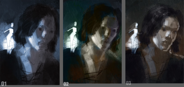
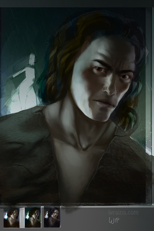
meat: Thank you. Hum, reflection... I kind of neglected that completely, just thought of color, texture, technique... D: And yeah, Nausicaä was a huge experiment :P Not much texture in there though, except for a bit of overpainted rhino leg - but I do plan to experiment more with including photos for a higher level of detail. Samszym: Thank you! Yeah she's kind of not really looking at the Ohmu, which was the original plan. Realized that way too late though. Since my last post got eaten by spamblocker and seems not to return, new attempt. Last batch of Gurney studies, you can download the whole bunch of them here if you want. Illuminated Foreground ...instead of illuminating the middle ground as is common - details in light - feels more immediate, closer ? Snow and Ice - denser and therefore whiter than clouds or foam - picks up surrounding colors (shadow often blue from the sky, cloudy = greyer) - subsurface scattering when backlit, softer, lighter than a solid form - older snow becomes darker and shinier Water: Reflection, Transparency - steep angle: more light refracts into water (we see the ground better) - shallow angle: more light reflects off the surface - light object's reflection is slightly darker than the object because not all light gets reflected back to the viewer (like a mirror) - dirty, illuminated water will lighten dark reflections and make them browner - wavelets distort and break the reflection Mountain Streams - usually clearer, faster, rockier than lowland streams - wet stones are darker/warmer, more blue when deeper in the water - farther away more reflections (sky, trees) are visible/color the water - foam similar to the ocean - fluctuating water levels can leave rocks darker (also think about what that means for vegetation) Underwater - red is absorbed quickest (ten feet), then orange/yellow, leaving a blue cast (also true for underwater flashlight) - impurities can color the water in different ways: silt/clay (brown), algae (green) photo study 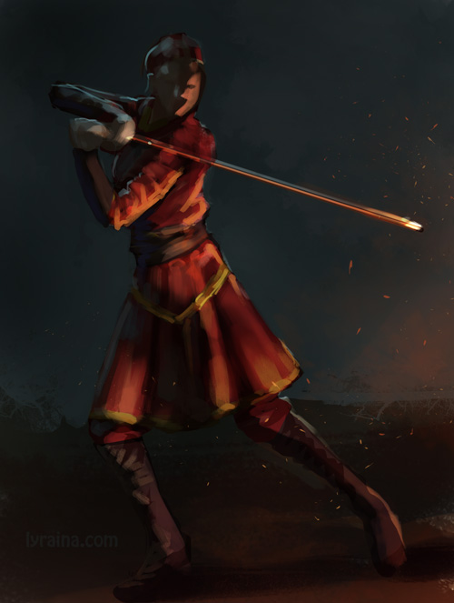 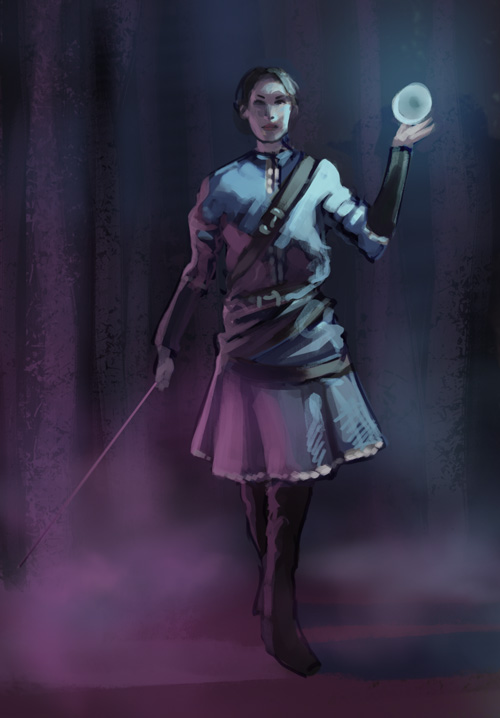  Dorje Bellbrooks study 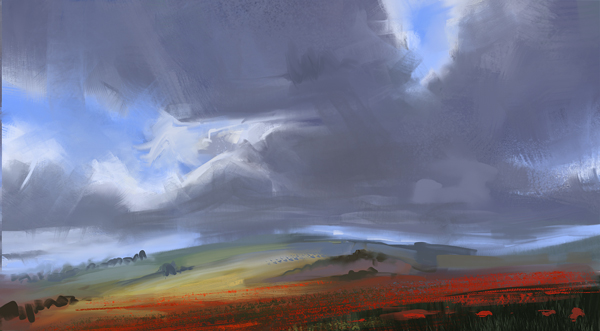 Kaladin update. Struggling with the light a bit. The girl (Syl) must be blue, but I may vary on how strong her glow is going to be. I want the mood to be depressed, rainy and dark, so I don't want to overdo the possible orange, although it would be a nice contrast to the blue. Cold light from above (night) could work as well, with a warmer background maybe. Decisions decisions... 
05-23-2014, 06:57 AM
mini update on kaladin, but I think I'll just start in black/white with 2 light sources, and do the colors later.
 master study (jace wallace, he's a god), I want to figure out how he gets that soft, glowy, divine look without making it look too soft; I suspect it's a mix of gaussian blur, mad edge control and several years of practice D: 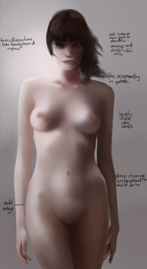 application from photo ref later on 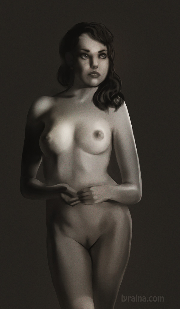
05-24-2014, 04:35 AM
Kaladin update
 Want to work on my compositions and bought 'Framed Ink', it is quite focused on movies though, so I am having trouble to translate it to my own work... did some screenshot studies from cinemasquid.com. I tried to do composition and colors at once, didn't work, so I did it in multiple steps instead. It's a funny feeling when perception first focuses on color, then suddenly switches to see values and forms. 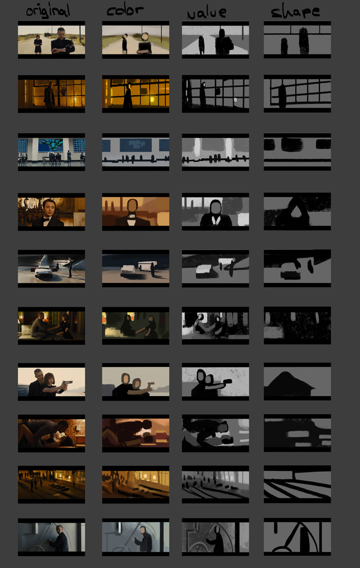 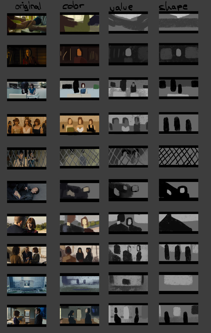 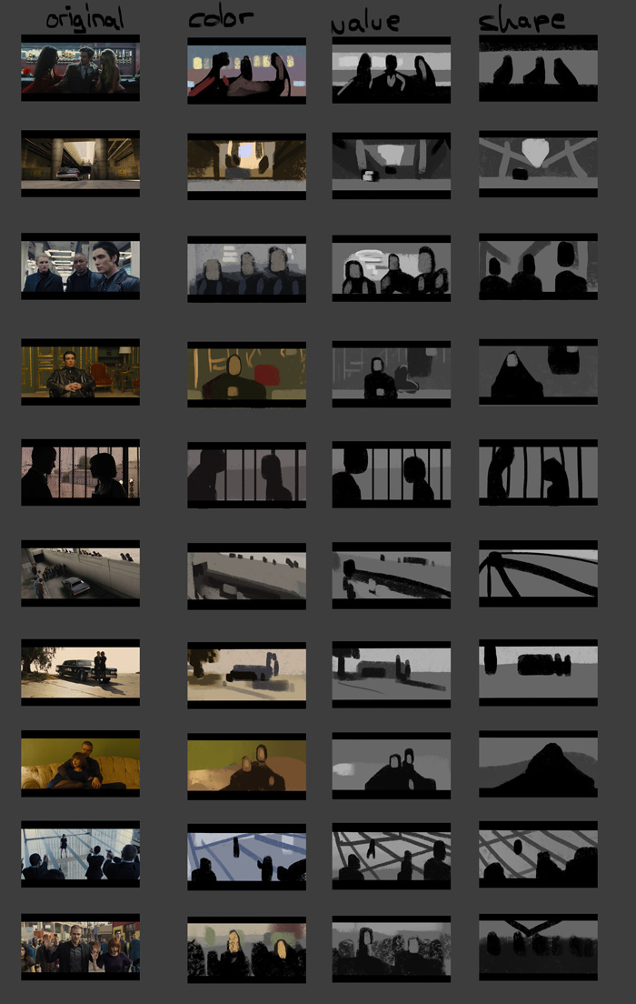 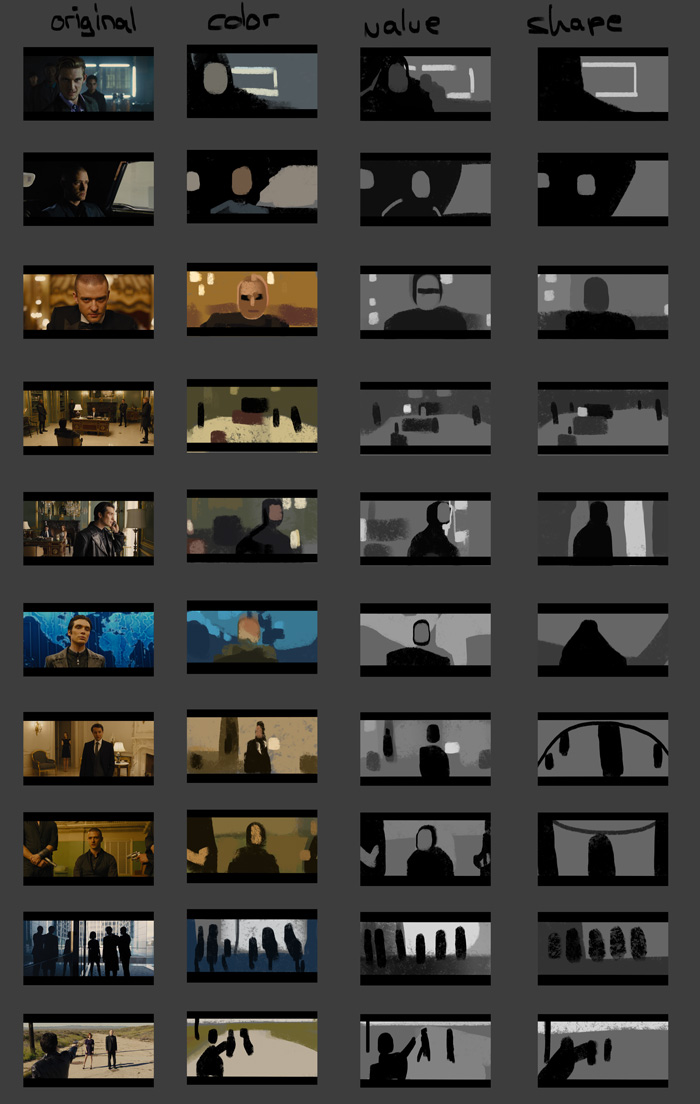 - every shot/scene has a strong color (temperature) tint, depending on situation, mood: cold blue/blacks with cold and pale yellows (feeling cold, sterile and as if people are going to be shot), sickly green-yellows, sometimes contrasted with warm red/gold (feeling uncomfortable), warm and golden yellows (feeling good), just warm tint with yellows or oranges or natural light (not sure how to feel about those). - often lit by only one direct light source, coming directly from one side of the image, leaving selected faces in shadows - brilliant use of soft curves and horizontals/verticals and diagonals for drama or stability - diagonals: floor tiles, falling perspective lines (wide angle), perspective, tilted horizon/camera - use background/design elements to introduce lines/diagonals/horizontals as needed (fence, ornamentation, shelf, ...) - introduce asymmetry in subtle ways to create more interest (both in color, value and shape language) - think about placement of figures and elements: how far to the side of the frame do you place something (and why), what does that convey? do elements get cut off while others don't? - within each shot and color scheme, colors are very beautifully orchestrated even if this is not immediately visible like straight on orange vs. blue -> pleasing result without being "in your face" - strong value contrasts (like lights in the backgrund) get balanced out very carefully (except in uncomfortable shots)
05-24-2014, 08:33 AM
Woo! Great job on that Nausicaa poster, and awesome studies as always. Critwise, the hair looks like it was painted strand by strand maybe? If you did, that's really intense 0_0 and although the values work, I think it would have looked better if you painted by mass with broader brushstrokes, and painted only a few strands here and there. But it looks like you're studying that in your later studies, so my point might be redundant. Compositionally, I think if you had added some stuff going on in the far background it would have really helped the depth, as it feels like it only has two planes right now (Nausicaa with the golden strands, and the worm thing).
![[Image: HFMOoLC.jpg]](http://i.imgur.com/HFMOoLC.jpg) Also, the image could be divided evenly in half vertically (by Nausicaa's body) and horizontally (by the worm's shape), which creates sort of a static feeling to it. In general, having anything divided in even halves compositionally is frowned upon, but as with anything in art, it's more personal opinion than rule. Anyways, hope I'm not being too nitpicky with the critiques, just trying to leave meaningful feedback :) You level up like crazy every time I visit your sketchbook, keep rocking it!
Sketchbook ~ Blog ~ Deviantart ~ Livestream
05-24-2014, 08:51 AM
Been following for a while, some really great artworks from you lately, really inspires me to see you go in depth in your studies and push your illustrations to the limit. Also thanks for sharing the gurney's light and color information.
05-26-2014, 02:08 AM
pnate: Thanks :) Yeah the hair was a pain in the a... :P I tried to do it like Serge Birault, because I don't know how do paint it realistically. http://muddycolors.blogspot.de/2012/12/h...-hair.html I'll try a different way next time. Thanks for the feedback on the composition... didn't realize it was such a strong division.. something to look out for next time. Thanks :)
crackedskull: Thank you! Ok guys now I'm officially scared. Since three weeks or so I'm having a kind of uneasy feeling in my drawing hand, hence going over to do my warmup sketching with no-pressure rollerball pens etc, but it's completely unpredictable :( Doesn't really hurt, just a mixture of numbness and prickling on the back of my hand (from middle finger to the wrist) and makes me want to stretch my hand towards the inside of my wrist. What scares me is that today it didnt even take an hour to start feeling weird, and I don't know where it comes from. It doesn't feel like the descriptions of artists who fucked up their arm/hand/tendons by drawing, so I don't even know if I should keep it cool, warm, flex it, use it, rest it, ignore it, whatever. It might very well be just me imagining it because I'm scared of hurting my drawing hand (I know I can provoke headache and stomach ache through my psyche, so why not this as well), but I don't know. skin in rain. not 100% happy. kind of stuck with how to paint skin. 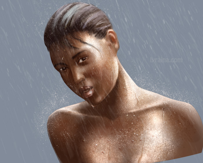 also not too happy with this - hair is giving me trouble. too much highlights look stupid, less highlights look wrong. 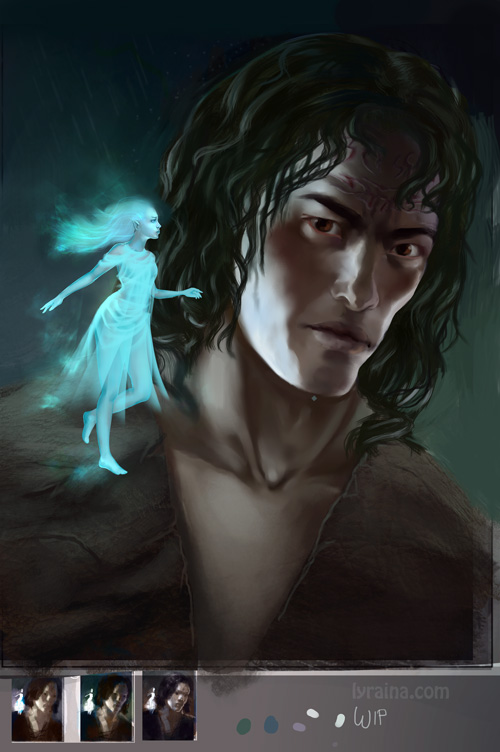
05-29-2014, 06:40 PM
damn, sucks to hear about your hand! really really take care of your hand and wrist. I think if it's starting to hurt like that you should definitely take some _days_ off if you can, really no point injuring yourself over a few days of lost practice. you can still read, observe and practice with your left if necessary. take photos...
does your wrist ever do small involuntary jerking motions when drawing? has it gotten to a point where all of its movements are somewhat like small twitches? if so, you really need to give it a break, and also make sure to always draw _really_ relaxedly and smoothly... i notice when i get a bit stressed or aren't drawing in a relaxed way that all of my motions become jerky and also subtly frustrating, little tensions build up over time. really important to keep those down! the other day i was thinking about how drawing on these little pen-tablets isn't very ergonomic. old artists used to always draw on large sheets of A1 sized paper, they didn't spend all their time drawing in tiny sketchbooks, yet with our tablets, no matter how big the painting, our range of motion when drawing is effectively always small and narrow, as if we never moved out of the confines of a small sketchbook. there is a pretty good app called AntiRSI which chimes you every so often (15mins or so), blocking your screen to force you to give your hands a little stretch, maybe try it out! http://tech.inhelsinki.nl/antirsi/ must be equivalents for other OSs out there too ah yeh, and great work on all these studies : ) great work ethic, i love how you break things down. the book cover looks fantastic to me, i agree with pnate's advice too
06-01-2014, 10:32 AM
Mannnnnnnn Look at all this damn work since I visited last. I take a month off and you sky rocket ahead of me. Looking good though. I love how many comps you did. Did you learn a lot from them? Shouldn't you be applying them to do some comps from your imagination to see what stuck?
Your description in your hand sounds suspicious. I guess doing things that help alleviate RSI would tell you what it isn't if they don't make the problem better. Only way I can think of narrowing it down is by working backwards and start with remedies :P
06-04-2014, 08:10 AM
aks9, thank you. I actually had to take last week off for different reasons anyway, so at least the timing was good. No jerking so far fortunately, I'll have to see and monitor if the problem returns.
Jaik: Yeah.. application.. need to do that more. I always stick with 'moar studies' because it's easier than thinking by myself >_> I have one of those gyrotwisters lying around here from my brother, I wonder if I should use that to train my arm. Just not sure if the additional strain might be a bad idea. view from my balcony (but done from photo) 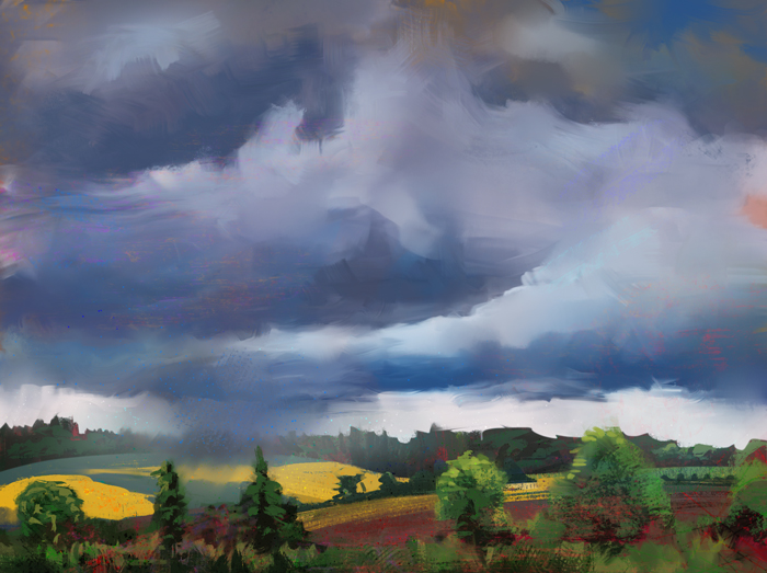 cathedral cove from photo, but tried to change the light and colors from rainy to .. not rainy 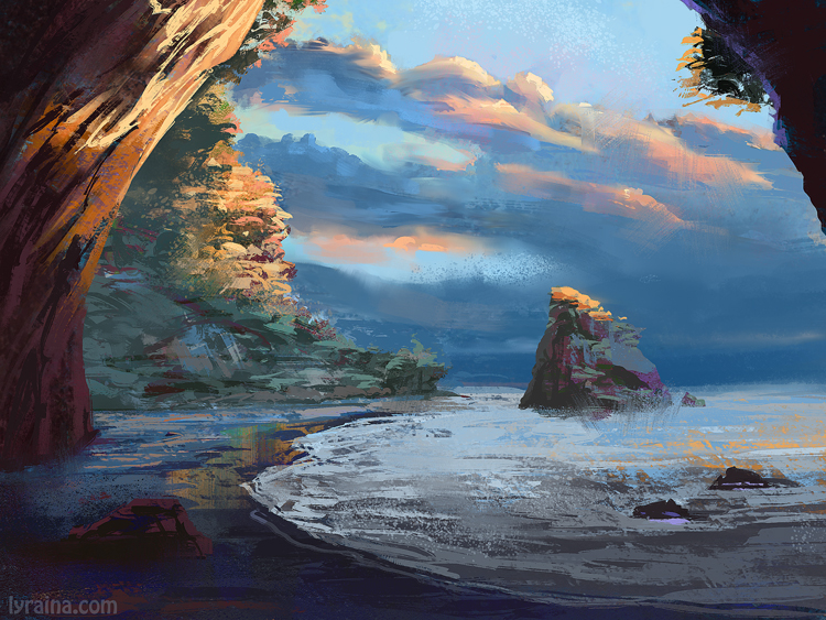 failing at creature design (but also run out of time a bit) 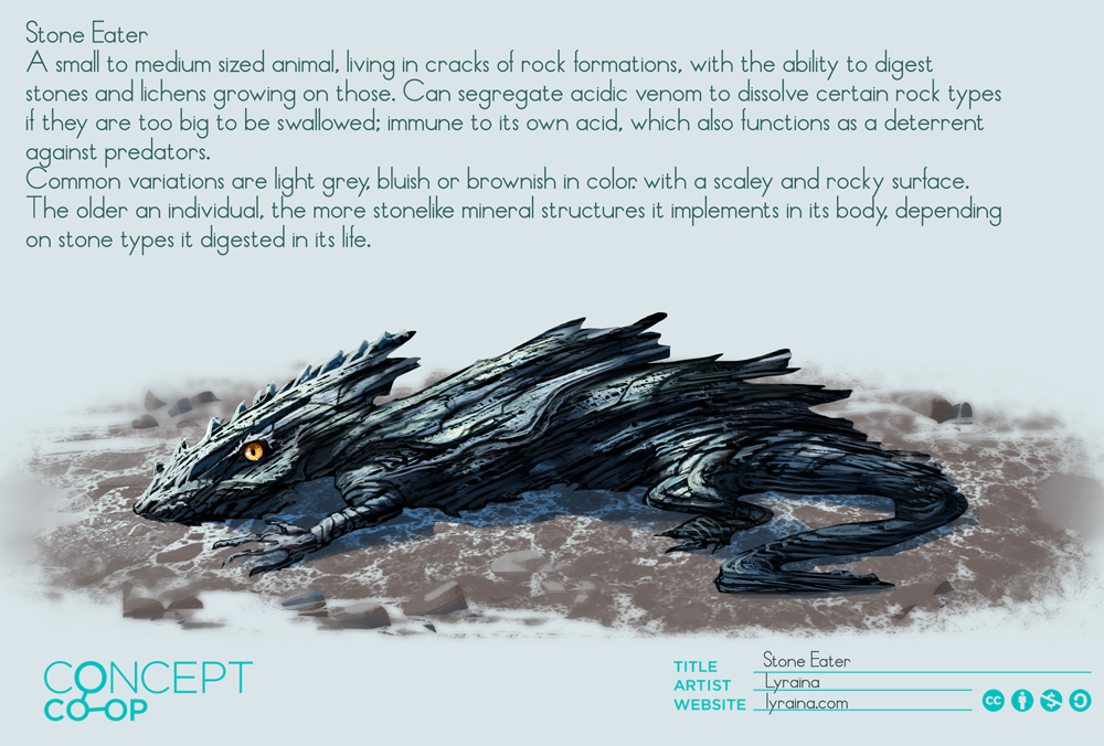 More failing, this time with oils. Next time I'll use references... This one was supposed to be done in one sitting, but looked so horrible that I took 2 or 3 in the end. 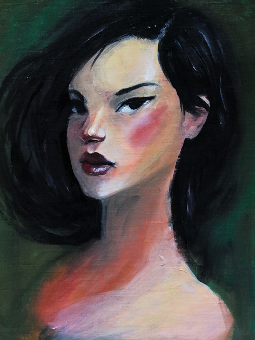 This was what I was aiming for (this is so embarassing) 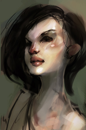 Here I started with a grisaille (?) underpainting and worked in layers. 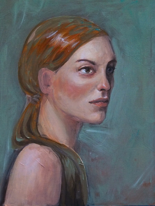 This turned out much more colorful than I intended, as I didn't really get nice greys (tried to avoid using too much black and white). 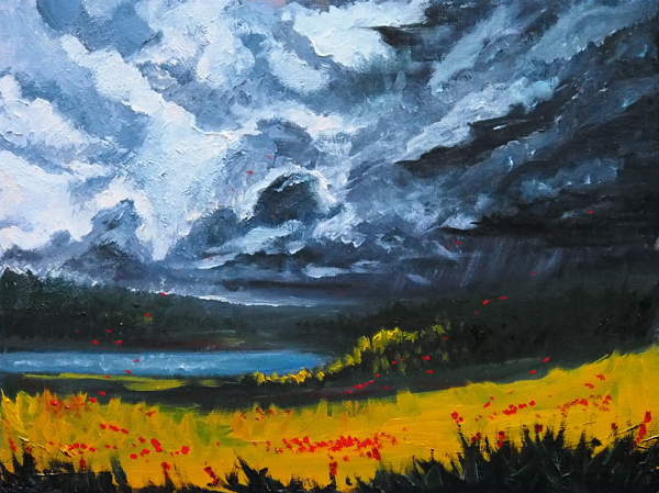 Trying out Jonas de Ro's technique, but over-did it a bit with the textures. It was fun though. 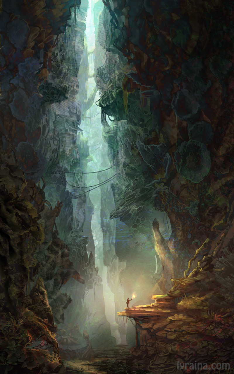
06-04-2014, 01:00 PM
Woohooo, nice updates! Keep it going with those landscapes, they are getting better. I think one thing to remember is to design your shapes and try to get them to be as appealing and helpful to the composition as possible, or to pick a shot from the beginning that is as appealing as possible. For example, in the balcony plein air, I'm not sure where the focal point is, although the colors are well done. It may have just been a bad day for photos :) but I think if you reinforced that perspective more with the trees and cloud shapes as if there was a perspective grid in the picture, it may have helped.
And even oils! very nice :) I have no idea how to use them, but I'm sure you'll learn all sorts of juicy secrets. I've been using this the past couple weeks to force breaks on myself: http://www.workrave.org/ Maybe it'll help? Take those breaksssss
Sketchbook ~ Blog ~ Deviantart ~ Livestream
06-08-2014, 07:52 AM
pnate: Thank you! Now that you mention it ... to be honest... I was so focused on the technique and layer management that I completely forgot to think about focal point or shapes. Oops! Next time!
Edible art! :D https://lyraina.files.wordpress.com/2014...pa60_1.jpg (ref: http://en.wikipedia.org/wiki/Nebra_sky_disk ) (Unfortunately the photo doesn't show that the cake actually had a metallic effect and the cookies were sparkling XD) monster hunter designs. a bit chaotic, my thoughts were all over the place this time. 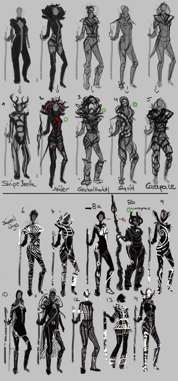 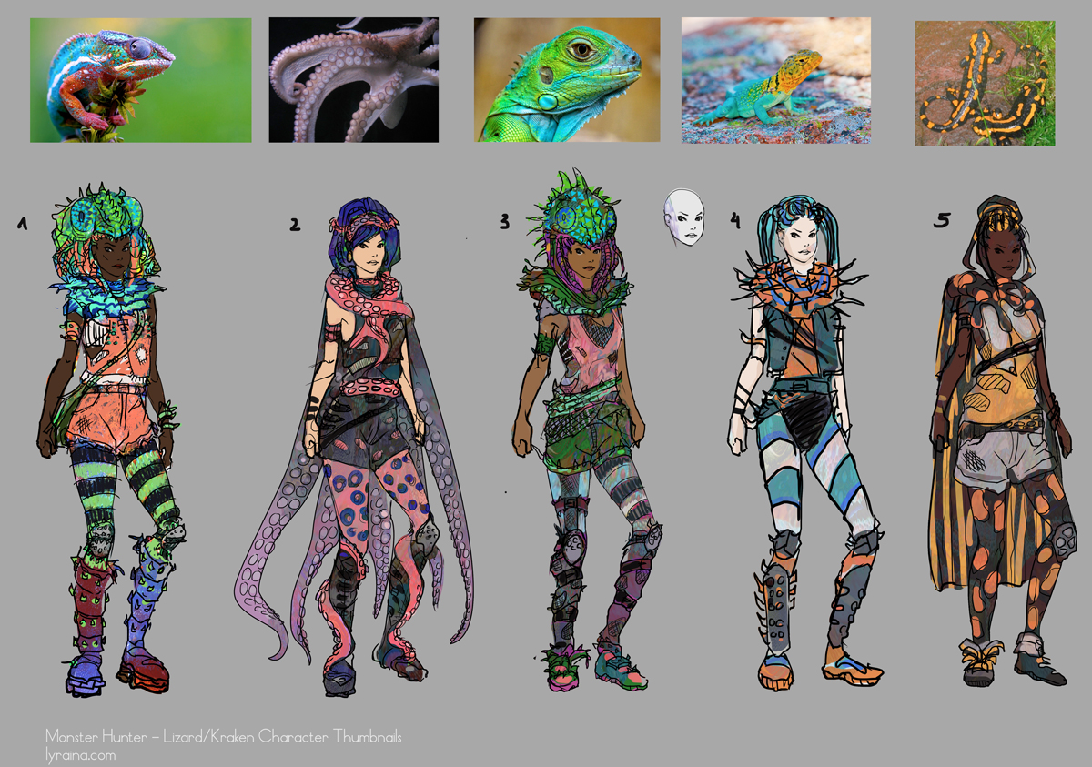 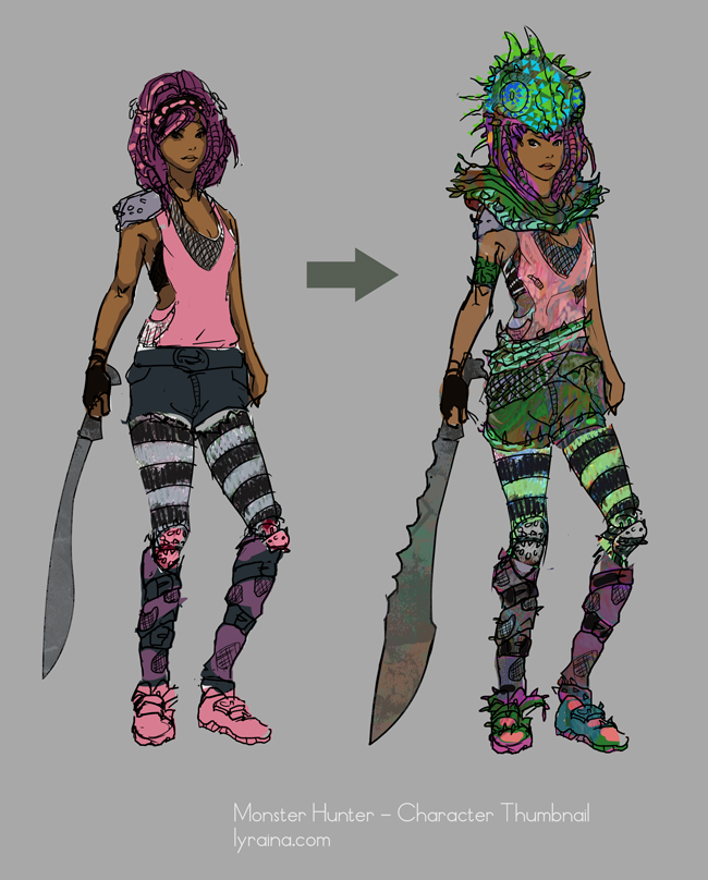 study/apply arms 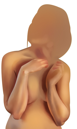 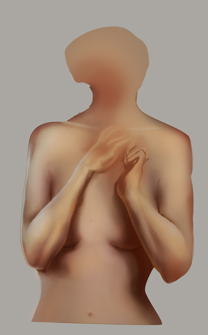 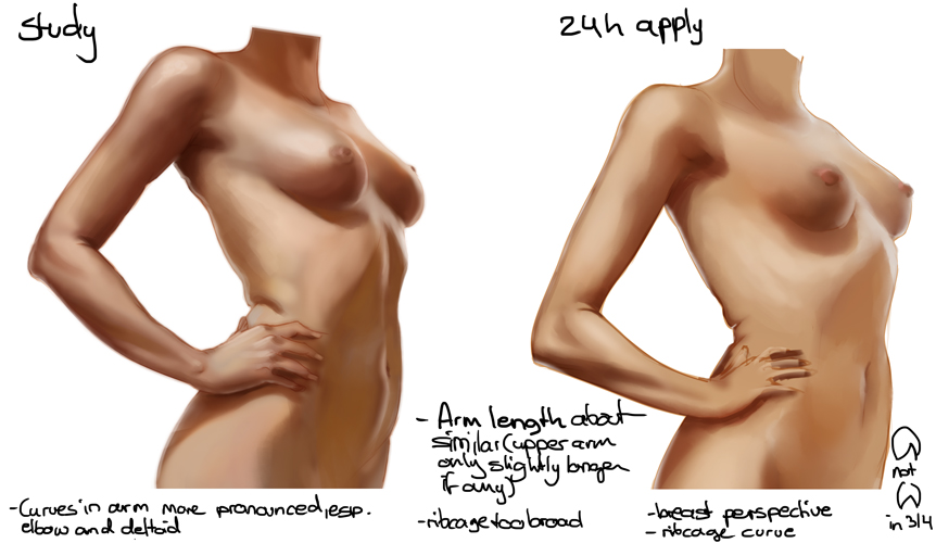 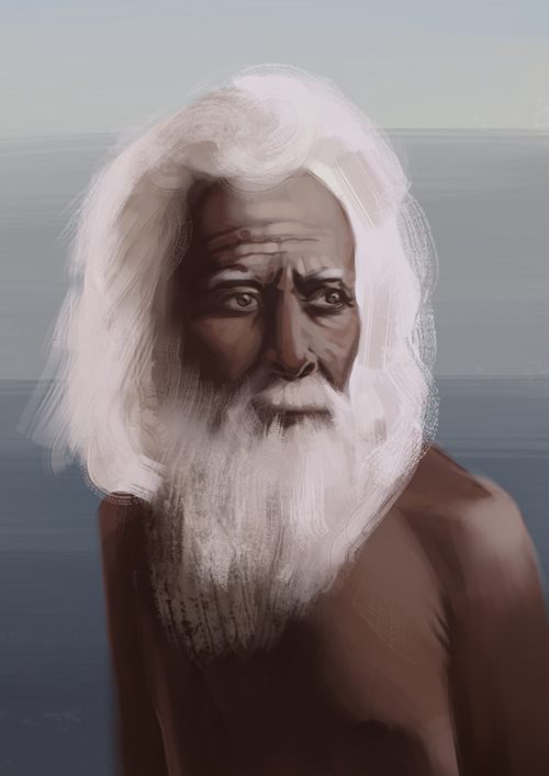 |
|
« Next Oldest | Next Newest »
|