Posts: 23
Threads: 4
Joined: May 2014
Reputation:
0
Hi!
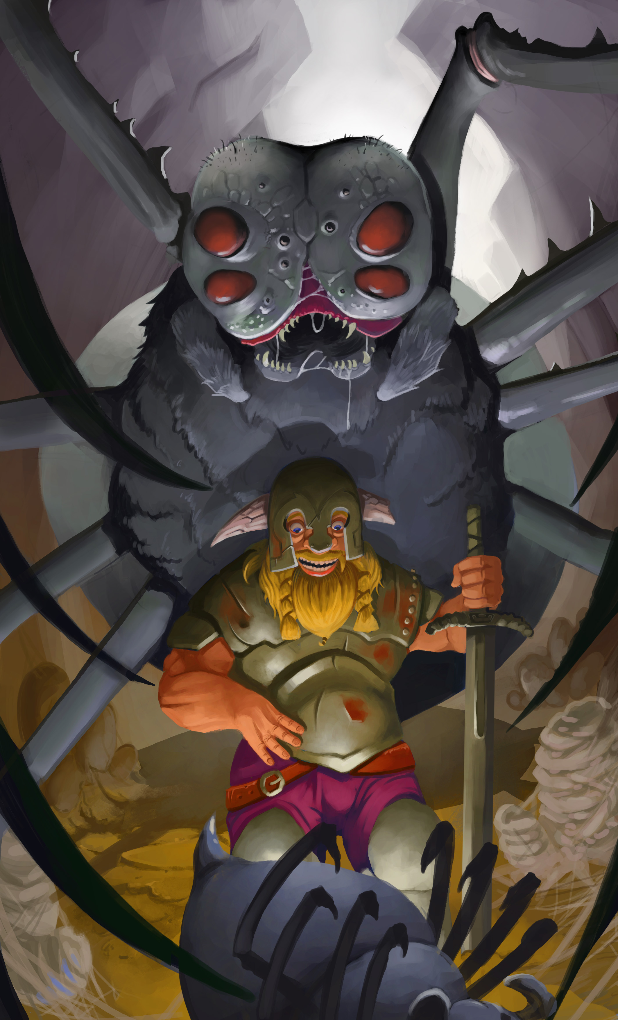
I'm seeking critiques for this one. My last work, I feel like I gave everything on it, still no one seems to like it on DA . I tryied to give it deepness, warm colors where I want ppl to look. I tryied to have a good composition. Still I dont have much views. I may be a bit over reacting or to proud.
Maybe someone could give me a hint for improving this one :)
thanks

And it looks awfully big, and I dont know how to fix the size of the posted image. please halp !
Posts: 1,118
Threads: 12
Joined: Nov 2013
Reputation:
63
I like the narrative element you gave it. Its funny and builds suspense. The big spider is kind of flat looking Id say. Also the hair and textures on its body and legs needs to be defined more. Do some studies of animal fur and/or insects to get a better rendering of the textures. I wouldnt worry much about getting likes on DA. That site is mostly full of softcore porn and shitty fan art.
Posts: 23
Threads: 4
Joined: May 2014
Reputation:
0
Yes, looking back at it. It lacks work, textures and details...
Thank Hypnagogic_Haze :b
Posts: 342
Threads: 37
Joined: Jan 2013
Reputation:
13
yeh good crit Haze, i would also add that you may want to ration saturation a bit more. at the moment your eye is wandering everywhere, and for me the focal point is slightly awkward- his lower chest plate/luminous crotch.
also the hand on our left needs some work i think, do some studies and nail it, or take photos of your own hand doing it and use that as a reference.
perhaps blurring/ using some looser strokes on the spider nearest to us would help draw the eye to the main focual point-the man. or the spider, depending on what you're going for.
personally, i'd go for the dude as the focal point (nice dramatic uplighting btw, but wheres it coming from?) and have the spider a darker more loosely painted presence behind him, lower saturation and fading in value into the background a bit more to suggest more depth, at the moment everything seems to be within about 10m of each other which makes the eye a bit cramped in movement.
all of that said, i really like the narrative you have going on here (something i need to work on for sure) and you've made a nicely dynamic scene, with a nice spin :)
All the best man.
Posts: 23
Threads: 4
Joined: May 2014
Reputation:
0
Thank you for the advices Daggers !
I feel like it is what my brain knew, but never told me !!
When I did it it seemed very logic !
I may have darkened a bit too much at the top of the spider, but it helps the composition for sure !
About the light I know...It looked so nice like that ! artistic freedom I guess :b
![[Image: 194738araignee6.jpg]](http://www.zimage.fr/mini/194738araignee6.jpg) Zimage Zimage
Posts: 1,970
Threads: 22
Joined: Apr 2012
Reputation:
243
Nice changes to the focus and value shifts you've implemented. The dwarf as the main focal point needs to be done immaculately, and at the moment there are anatomy issues you need to fix. As wardy said, his right forearm and hand is really off, so use references. I feel in general you haven't achieved a good sense of connected volumes with the dwarf figure and it still seems like a 2d cutout in places. Draw and render around forms to give the sense they are wrapping around in a 3d space, have the atmosphere interact with these missing edges to showcase depth. This goes for the spider as well.
I think what may help you is to block out primitive shapes of everything in a well constructed perspective space first to help you achieve the sense of depth and volume you need.
In terms of narrative, maybe you could have the babyspider split open, blood or goo on the dwarf sword, and the rays of some special hidden jewel emanating from its body, as the source of the light. Would also add more context to the oh shit mummy is not a happy camper.
Good luck
Posts: 23
Threads: 4
Joined: May 2014
Reputation:
0
I tryied to follow your advices, what do you think of this?
![[Image: 194840araignee7.jpg]](http://www.zimage.fr/mini/194840araignee7.jpg) Zimage Zimage
I m currently working on the light in the wound :)
Posts: 342
Threads: 37
Joined: Jan 2013
Reputation:
13
looking better man! the legs of the spider still need a bit of texturising though, and im starting to wonder how he is supporting himself if all his legs are wrapped around the dude?
references (lord of the rings ftw for this)
http://img3.wikia.nocookie.net/__cb20070...helob2.jpg
http://upload.wikimedia.org/wikipedia/en...elobpj.jpg
http://www.dakkadakka.com/gallery/69515-...20Sam.html
http://limited-vision-stock.deviantart.c...-131443715
i dont know if it is your style, but personally at this stage i would whack in a few photo textures like grungey metal for his armour, maybe some hair for the spider ad dirt for the floor, just to give the image 'teeth'. That is completely up to you though, its a matter of personal taste, im digging the look you've got going in any case so im just throwing it out there :)
Also watch the backlighting- what is that doing to the subjects? at the moment, nothing, which is slightly strange. for example there is no shadow underneath the spider, which would be cast across the floor towards the baby, and there would be rim lighting on the legs (which would also help pick them out from the background). A large shadow over the floor would also give that nice ominous feel to it, like the character would notice that first and then turn around to see the spider, which is a nice cinematic kinda influence.
hand looking better, but the forearm is still throwing me off a bit. Depends how stylised you want to be i guess, but something between the hand and the elbow is in the wrong proportion, i think the forearm is too big- the elbow according to this is ending under his chest which is too high. id add some more negative space between the armour chestplate and his inside elbow to make the forearm thinner, i think that may help a lot.
but definitely looking a lot better than at the start so nice work!
Posts: 23
Threads: 4
Joined: May 2014
Reputation:
0
Thanks Wardy ! I feel like I've been running a marathon with this illustration..out of breath, but still pushing more ! I'm giving everything !
Tell me what you think of this plz.
![[Image: 194925araignee9.jpg]](http://www.zimage.fr/mini/194925araignee9.jpg) Zimage Zimage
I tried to apply fur texture ton the spider'chest, doesnt render good for me. and also maybe texturing only the dwarf gives him more importance .
Posts: 342
Threads: 37
Joined: Jan 2013
Reputation:
13
great improvement, nothing more to say atm. maybe some more mention of what the back legs are doing though, he still seems to be 'tip toeing' a bit. That said, its looking 100x better already, i think the texture on the armour works very well and things are looking much more resolved. brilliant work mate, and well done for keeping at it! i know how much of a marathon it can feel trust me, kudos for determination, its really paid off :)
Posts: 23
Threads: 4
Joined: May 2014
Reputation:
0
Hi Wardy ! Thank you very much for all the support, I would never go so far without your help Daggers !
I may rework some parts but the main part is done :)
Thank you again !
|


![[Image: 194738araignee6.jpg]](http://www.zimage.fr/mini/194738araignee6.jpg)
![[Image: 194840araignee7.jpg]](http://www.zimage.fr/mini/194840araignee7.jpg)
![[Image: 194925araignee9.jpg]](http://www.zimage.fr/mini/194925araignee9.jpg)