08-26-2014, 11:33 AM
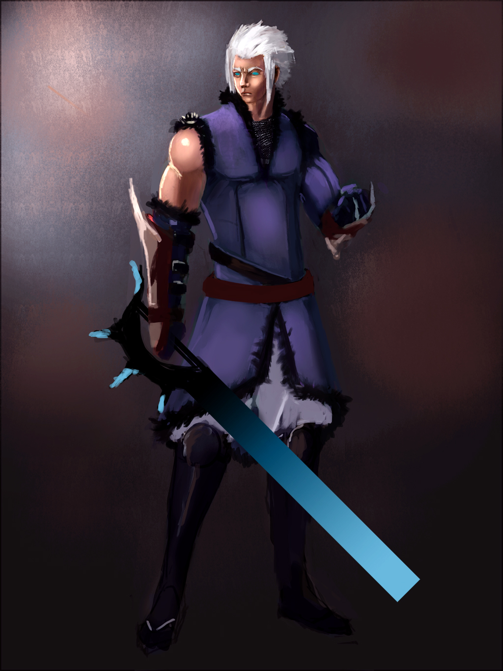
i really dont want to head any further into this without some suggestions. i feel like somethings are off but i cant tell what it is. thnxs in advance


|
Help
|
|
08-26-2014, 11:33 AM
i really dont want to head any further into this without some suggestions. i feel like somethings are off but i cant tell what it is. thnxs in advance

technical: The head is a bit small and the torso is way too long.
personal taste: Most people are probably going to hate that the blade of the sword is a perfect rectangle with an unembellished computer generated gradient.
08-26-2014, 12:52 PM
(08-26-2014, 12:23 PM)Jingai-Jigokumoto Wrote: technical: The head is a bit small and the torso is way too long. the sword is sort of there for as place holder. but i do see you point about the head and torso
08-26-2014, 11:37 PM
Put a temporary oval to cover his head (on a separate layer) as if a placeholder, then work on the rest of him first, then do the head last. Also will be helpful to find some reference of someone in similar pose, clothed, so you can see how clothe interact with body. Unless that's hard armor, then find armor ref.
His bare shoulder is shiny like plastic, but I guess that's WIP because his face isn't shiny. Also make his shoulder longer, they're not ball shape like that, even if he has bulging muscle it still won't be ball shape. Look up photos of body trainer and weight lifters.
08-27-2014, 01:59 AM
A really good rule of thumb on heroic characters is to make them be about 8 - 9 heads tall (anime being slightly lankier). So if you start with the head oval on a separate layer and duplicate it, you'll have the total length. If i remember correctly, you want to make the elbows line up with the belly button which should have your figure from the top of the head to the belly being about 3.5 heads long. The remaining distributed roughly 2/3's top heavy.
I would also say to take a look at the size/shape relationship between the shoulder, triceps and biceps in a few different positions to see how they feed into each other, and have different curves based on the orientation of the arm. http://swedinbalchik.wordpress.com/categ...-training/ There's also a guy on youtube I think you'll like named Cuberush - really good at characters. Hopefully this link works: https://www.youtube.com/user/bluefley00 Hope this helps!
08-27-2014, 03:55 AM
Thanks so much for your crits so far . But I was wondering if anyone let me know how the color and shadows are working. I feel like they might be off but I can't having a hard time figuring out why
08-27-2014, 04:27 AM
Depends on the mood you want for him. I don't see anything to change with color choices. His head is the most finished area, and it shows strong light and shadow, so you should have the clothes match that. Right now you have your clothes too well-lit to match how dark his face are shadowed. If you don't want to risk losing details in the clothe due to shadow, then consider different lighting.
I noticed the shadows in the hair are the same color as the background which would be the fill/ambient light color, that's exactly right! Keep doing that.
The strongest highlights in the hair are PURE BLINDING WHITE, so I slightly toned them down with the shadow color. The green in the eyes is way too saturated like a color you'd see in an Atari game. I turned down the saturation and boosted the brightness. ![[Image: BkM97B0.png]](http://i.imgur.com/BkM97B0.png) After "correcting" the eyes, I realized they were about the same color as the glowy stuff on the sword, which I think helps harmonize the character. Maybe subconsciously you were trying to do that!  ![[Image: yOHMFjY.jpg]](http://i.imgur.com/yOHMFjY.jpg) Here's a damn good color tutorial! https://www.youtube.com/watch?v=9kQllLy_...TN&index=1
08-27-2014, 12:37 PM
There is a tangent with the chin and the fur on the coat because the edges touch. The chin should overlap the fur because the chin moves towards us as the neckline is further in depth.
08-28-2014, 04:58 PM
This is looking good in general but its best to post a completed image for a Crit, that way we don't have to make asuptions :) I'm gonna crit this as a concept.
The head was too small. It almost feels like you painted the character seperately and then decided to make a full body shot. The Design doesn't say anything. This caracter could be fantasy or sci-fi. you need to have a clear theme or design before you start. The image currently has no focus. because of how bright the sword is i'm gonna asume that that's the focus. (you could use the glow of the sword as a secondary light source) You need to work on your textures. there is no distintion between the leather and cloth. Some studies should fix that. ![[Image: Untitled-1-2.jpg]](http://i254.photobucket.com/albums/hh111/vanstyl/Untitled-1-2.jpg) ps: it looks like the character is wearing chainmail or a metal sponge inside his coat and it feels out of place...the image is too low res to tell but if thats a photo, you should try to paint it yourself because that amount to detail stands out because the rest of the image isn't detailed enough to match it. I hope this somehow helps :) |
|
« Next Oldest | Next Newest »
|