Posts: 850
Threads: 4
Joined: Mar 2013
Reputation:
21
Nate, that is actually a really good catch. Scale is something I struggle with a lot, I love those huge, epic (concept art) pieces, but never seem to be able to replicate it. Even with adding tiny characters or lots of atmosphere. I think I'm still lacking somthing in terms of... perspective, density of detail, repetition/size of things and stuff like that. I will try to improve on that when I continue with the thumbs. It's a CGMA course so no, very much not free :( Could share my notes if you're interested, although I'm not sure how useful they would be.

crimson chow exploration
Posts: 448
Threads: 1
Joined: Feb 2013
Reputation:
6
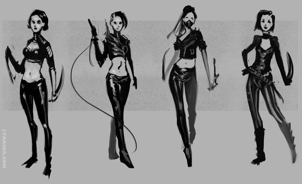
Sweet sweet studies Lyraina, and I'm really liking the flow on the character exploration. Is she going to be all leather? D:
Posts: 198
Threads: 2
Joined: May 2013
Reputation:
5
Loving your last updates, your new skills are really getting more stable so to speak, they're more consistent, and that is awesome.
Really digging these last CHOW concepts too, I specially like the second from the right, looks like a really powerfull pose and the design is also very promising.
About the huge scale deal, I'm not precisely a knowleadgeable guy regarding enviros, but to me, what made the mountains feel not so huge was the fact that the house was pretty big compared to them and that there was no other reference to their size in the picture, I made a quick overpaint to better show how I think a few simple changes would achieve the huge effect, hope it helps!
![[Image: photo_landsc54.jpg]](http://i267.photobucket.com/albums/ii308/Suira/photo_landsc54.jpg)
And keep the awesome stuff coming! ;)
Posts: 850
Threads: 4
Joined: Mar 2013
Reputation:
21
Rafa: Yesss, those are all leather. Although I'm not sure I want it to be this shiny, nor if I shouldn't bring other materials in. I usually prefer leather that's a bit more dull. Just had so much fun putting all those shiny reflections in there and coudn't stop... A bit like eating chocolate, you know? It never is just one piece. Never...
Suira: Thanks for the overpaint. That change does indeed make them seem a lot bigger. Also thanks for the input on ChoW!
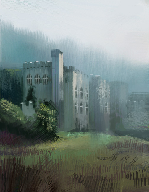
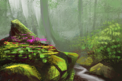
Here is two stages of a photo study. I like the first one better, not just because it is closer to the photograph, but because I don't think the haze looks all that good. However, it lacks dephth (again) and is harder to read... is there any way I could separate the layers more, but without haze? Pushing contrast only helps so much...

and this one is called 'I just wanna cry in a corner because I don't know how to get better than this crap'

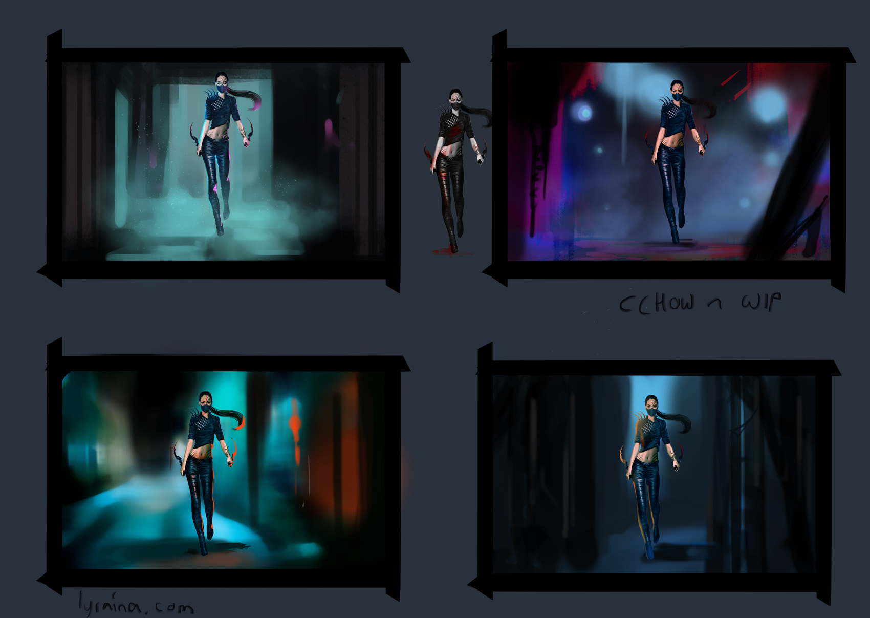
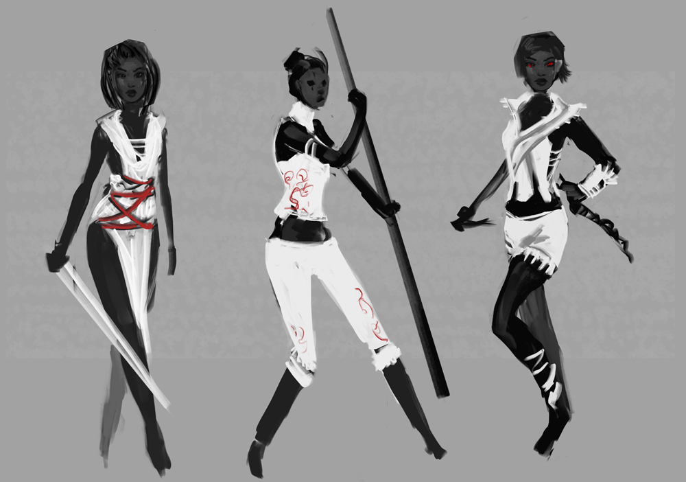
more chow exploration, but was kind of unmotivated because I want to go with the leather look anyway.
Posts: 1,342
Threads: 17
Joined: Jul 2013
Reputation:
45
Hey, good to see you updating your SB constantly. I like the 3rd CHOW design in post #421 seems the strongest in my opinion.
So in terms of getting frustrated with the results, maybe listening to Slayer will help. I found that In my case I embraced the frustration and used it as extra energy.
Posts: 198
Threads: 2
Joined: May 2013
Reputation:
5
You shouldn't cry on a corner , because that enviro is quite cool. The only crit I have for that one is that the trunk/foliage ratio is kind of weird, it feels unatural and that takes away from the feel of the painting, maybe some flora studies would help :)
The new CHOW designs are cool, but I prefer the leather ones, and if you do too just go for it! the contest is for fun, so just have fun!
On the thing about layering, I feel that the problem is not atmospheric but more of an edge issue, the middleground edges are as hard as the foreground, even more due to the contrast with the background, so toning them down in those specific areas, instead of just using a more general atmospheric effect would improve the layering I feel, I made another really lame overpaint to make my point, the result isn't really great cause I'm lame but I think you get what I mean:
![[Image: overpaint.jpg]](http://i267.photobucket.com/albums/ii308/Suira/overpaint.jpg)
keep the cool stuff coming ;D
Posts: 850
Threads: 4
Joined: Mar 2013
Reputation:
21
cracked: Thank you. That's the one I'm going with :) Use frustration as energy. Need to remember that.
Suira: It's weird, I think I remember from somewhere that edges don't really lose their sharpness, just contrast when going back in space. But thinking both of depth of field from photography as well as the fact that as an artist we can make everything a lost edge/painterly if we want to your point does make sense. Thank you for the overpaint!
photo ref

hand is better after the adjustments, still going slooow and careful with those


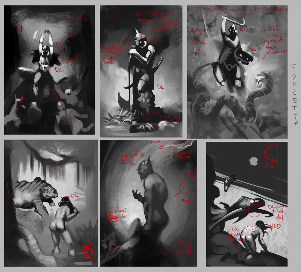
frazetta

feeling like a cheater using photos for ChoW (but it is interesting to play with and see its limits)

thumbs. thanks to Jaik for helping me and keeping me somewhat sane while doing those

Also, sorry for not commenting more on your sketchbooks guys. I feel really bad about that. But I also feel extremely overwhelmed lately and like a worthless shit for not getting more productive time out of my days (despite being super motivated), so I need to get that sorted out first. I'll return more comments when I'm back to a routine I feel ok with, I promise.
Posts: 448
Threads: 1
Joined: Feb 2013
Reputation:
6
Hey don't sweat it, sometimes I don't post much either.
Everything is looking sweet, especially these last studies, they're gorgeous, how long are you spending on them?
Posts: 1,074
Threads: 9
Joined: Jan 2012
Reputation:
53
Posts: 198
Threads: 2
Joined: May 2013
Reputation:
5
That first painting reminds me SO MUCH of Solitude from Skyrim! I think it's because of the shape of the rock with the hole in the middle hehe. Great work , your enviros are getting better and better.
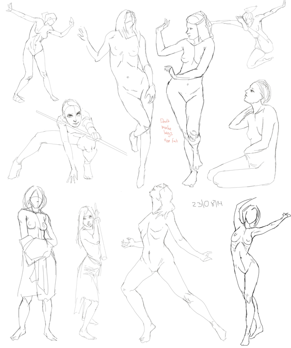
Steady with the figure drawing, it's getting better over time.
The thumbnails are coming along seriously AWESOME. Seriously loving the quality threshold you're reaching, they're close to pro for real.
What's the new thing of the CHOW piece? Looks a bit the same like the one you uploaded before, but maybe I don't see it.
And don't worry about not comenting back, this isn't the market, people comment when they can or when they feel like saying something, it's not like we're gonna mark every comment on our pencils and kill you if you don't give them back......or maybe we will!!!! MUHAHAHAHAAH! Nah seriously don't worry :)
Cool stuff, keep it up Lyra.
Posts: 850
Threads: 4
Joined: Mar 2013
Reputation:
21
rafa: thank you, which ones do you mean, the photo landscapes? With those, it depends vastly on subject matter, how much work the reference already does for me and what I focus on. When I focus on making sexy shapes and composition, I can spend hours just pushing different solid greys around until I like how it feels. Those in today's post were like 30-40 min each I think. Which is long for what it looks like, but I'm not good at both forests and architecture.
Sula: Thank you <3
Suira: Haha, I googled it, yeah that's a nice hole. Do a google image search for "iceland dyrholaey", looks even more like it!
Maybe you've seen the ChoW in the official thread already? I posted it there earlier. Still posting here because that's kind of my "hub" where everything comes together.
Regarding comments, I just want to give back when I recieve something, kind of a give and take. But you can gladly mark the comments on your pencils, because once you sharpened it enough there's no trace left ;) Thanks as always for the kind words!
photo


frazetta

Posts: 556
Threads: 5
Joined: Dec 2012
Reputation:
8
Whoa, those character exploration paintings are awsome. Great strokes! Those creative environment designs are looking nice and clean. Hope the wrist and whatnot is feeling better. :D
Posts: 448
Threads: 1
Joined: Feb 2013
Reputation:
6
The ones for you CGMA class (CGMA right?), you need to tell me how it is once you're finished, I'm really contemplating getting myself into an online class, I suck so bad at enviro.
These last "thumbnails" are really good too, I quoted that because they're basically a step away from being a full size painting, haha.
Posts: 848
Threads: 20
Joined: Jan 2012
Reputation:
29
Good studies as always.
That tiger and girl in forest frazetta study made me lol. Looks like he is really really shocked to find a naked chick on his casual stroll through the jungle...
Dont go copying photos when you could analyse and do perspective drawings instead xP I see you avoiding your weak spot there!
Posts: 93
Threads: 2
Joined: Oct 2013
Reputation:
8
Great studies and artwork Lyriana.
I really like your sense of colour. You always pick very tasty palettes :).
Posts: 903
Threads: 54
Joined: Feb 2012
Reputation:
18
Awesome studies as always! I will always notice the lack of feet in Frazetta's work from now on, thanks a lot Lyra :( And CHOW came out super coollllll; nice to see you experiment with photos and such. Can't wait to see the final enviros for that CGMA course!
Posts: 1,527
Threads: 24
Joined: Dec 2012
Reputation:
70
My goodness, the research and exploration for your CHoW really showed in your final design, Lyraina
- greeeeat stuff
And holy shit those environment studies are gorgeous!
I know that feel when it comes to losing time despite being motivated and stuff. Don't beat yourself up too much about it D: all you can do is look ahead and work smarter, not necessarily harder.
Looking forward for what's to come!
sketchbook | pg 52
"Not a single thing in this world isn't in the process of becoming something else."
I'll be back - it's an odyssey, after all
Posts: 850
Threads: 4
Joined: Mar 2013
Reputation:
21
Archreux: Thank you! Wrist is better, as long as I don't try to draw with my tablet. Now its randomly my back, stomach or head that complains... I think the main culprit was my mouse though, switched to a different one now.
rafa: Oh, those homework things? They currently take me about 3 evenings of planning, thinking and scrapping ideas, then 2 evenings of tearing out my hair and clawing at my face while trying to paint them, and 1-2 days of actually painting them (applying any trick available in my toolset) while crying blood. So in summary a couple of hours each after some "preparation", which is probably not the point of a "thumbnail"... but since I'm submitting those for critique I don't want the instructor to correct stuff that are just due to me working quick or sloppy :/ I wonder how detailed client sketches usually are...
And yes, CGMA. I'll let you know my thoughts about it later.
Jaik: LOL you're right about the tiger! And she's all like "woah I'm bathing go away!". BUT BUT BUT photos have *atmospheric* perspective I can analyze! ...But you're right, thanks for calling me out on that.. you're very good at spotting when I avoid my weaker areas D:
Farvus: Thank you! Glad you like the colors!
pnate: Hahaha sorry about that! At least now you know where to go if you want to learn about avoiding feet :) Experimenting with photos to that level was nice, still not sure how I should feel about it though...
smrrfette: Thank you! I'm trying to not beat me up about it, especially since I watched a talk about how you shouldn't do that... now I'm beating myself up for beating myself up... or something like that :P
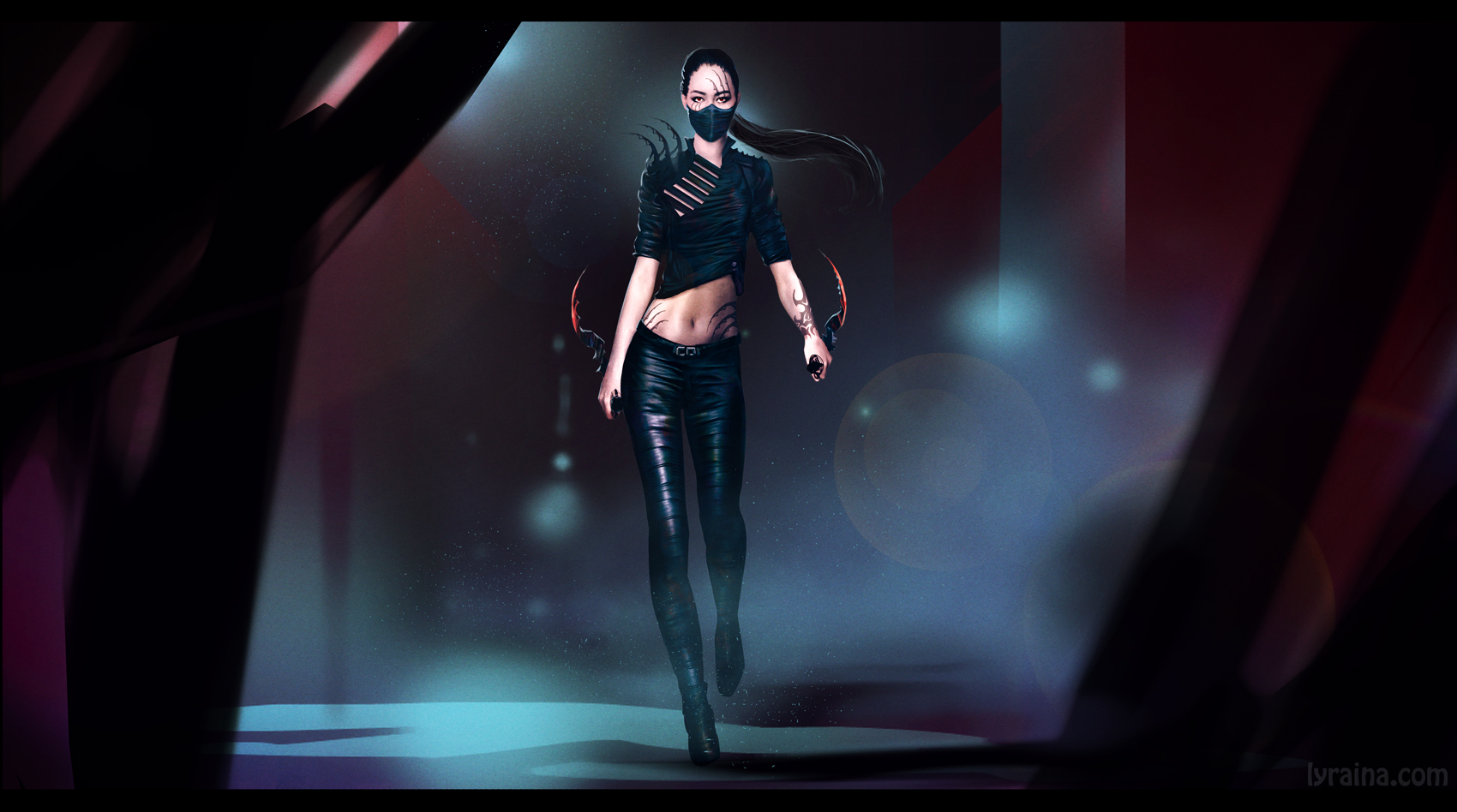
chow x2. I enjoyed doing this SO MUCH. Mostly because I allowed myself to go with the flow regarding the design, instead of trying to construct something with lots of research. With the photobashing I feel like I was trying to do what I think might be done in movie concept art to get a more realistic result, time wise it was not quicker than painting it.. just looking more photo-ish than painterly now. However, I still can't get over that feeling of "I didn't do that" and "It's not your work, its just photos", despite the design and everything clearly being mine since I started with a painted base. So... kind of confused :S


Not sure if this one made it in the WIP thread. decisions, decisions!

last batch of thumbnails (I think).

last frazetta for now

tomorrow is a scheduled day off though. visiting some outdoor stuff for my mother's birthday. :)
Posts: 198
Threads: 2
Joined: May 2013
Reputation:
5
BOOM! Killer thumbnails, you're just too awesome doing them, even if it takes time to do, the results are gorgeous, super sound comps and color schemes and enjoyable brushwork.
The frazzeta studies are dope too and the CHOW piece came out quite nice too only stuff I didn't fully like was the lens flare, but still, nice work!
Posts: 465
Threads: 2
Joined: Mar 2013
Reputation:
18
ARE YOU SERIOUS your thumbnails are more finished than anything I've done this month
Loving the recent updates, those frazetta studies look very helpful, I want to try and do some myself now XD
keep rockin'!
|


![[Image: photo_landsc54.jpg]](http://i267.photobucket.com/albums/ii308/Suira/photo_landsc54.jpg)


![[Image: overpaint.jpg]](http://i267.photobucket.com/albums/ii308/Suira/overpaint.jpg)

