01-24-2015, 02:53 AM
this sketches are epic man, cant wait to see it finished!!I love the composition on a B more. But for some reason the gesture of the of the sorceress on A seems much more dynamic.
|
pindurski's SB
|
|
01-24-2015, 02:53 AM
this sketches are epic man, cant wait to see it finished!!I love the composition on a B more. But for some reason the gesture of the of the sorceress on A seems much more dynamic.
01-24-2015, 05:50 AM
Dude, that b&w painting of the girl with horns is definetly one of the goals i wanna achieve in studying values, looks so epic !
And if i can suggest for the last piece, i'm liking the option A- feels more like "final boss battle", just my thoughts. : ) Keep it up !
01-25-2015, 04:49 PM
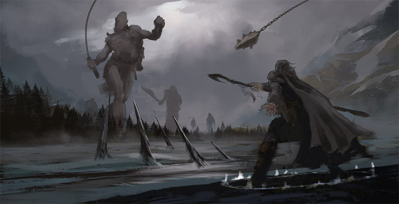 Working more on this. I did like A for the badass feel it had, but ultimately I wanted to tell a little more of a story with an uncertain outcome. So much to do. It's refreshing to not be doing card art style paintings:)
01-26-2015, 12:12 AM
Hey man, I finally registered here and you have the honor of being the first person I post a reply to! :P
Your stuff is looking great as always and I can't wait to see what you do with this latest painting. I was in favor of A too, but I agree about this one telling more of a story and your latest upload shows that you can make it work. The only thing I don't really like is the chain of the giants mace...the way it's curving...I don't know, it just doesn't look juuuust right. Great to see you finished your Applibot stuff, you worked so hard on that. Sorry to hear they didn't hire you, but eventually someone will. Your bookkeeper piece in by far your best yet I think and is VERY good. Did you apply for a studio job with them or just to get a single card illustration or what did you do? If you don't mind me asking. I hope things are well with your family. When you find the time be sure to join us on Skype.
01-26-2015, 03:44 AM
oooh you're here now too yay!
I have been watching you progress on your applibot application portfolio. Even if they didn't pick, keep working! You're improving heaps. Good luck!
01-27-2015, 11:29 PM
Agerkvist - Nice to se eyou here... Hoping to see some kick ass stuff from you!
Ursula - Thank you for the kind words. More on this... Wizard looks pretty damn boring... but I suppose this is more about the story then the character design. Need to find a better rhythm to the summoned spears com gin out of the ground... 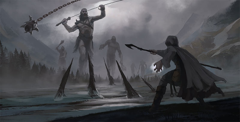
01-28-2015, 07:23 AM
I hope I can provide. Only uploaded a few things so far.
This one is going to be epic. But won't the giants just crush him from afar with those long chains they got...no way the're stepping on those spikes :P Got a Skyrim feel to it.
01-28-2015, 07:37 PM
Your last image is awesome, The giant in focus is especially nice.
I'd say you're well on your way to getting work from the likes of applibot; judging by how far you've come, keep it up.
01-28-2015, 10:38 PM
Thanks guys. I keep hearing Skyrim, but I've never played it! My ref/inspiration was actually the frost giants from Game of Thrones:)
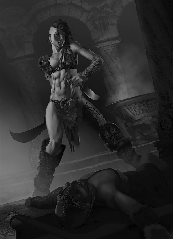
3hr sketch this morning before work.... inspired by Daryl Mandrak's RedSonja... Now THAT is fucking badass! https://www.artstation.com/artwork/red-s...7d951dfb5d 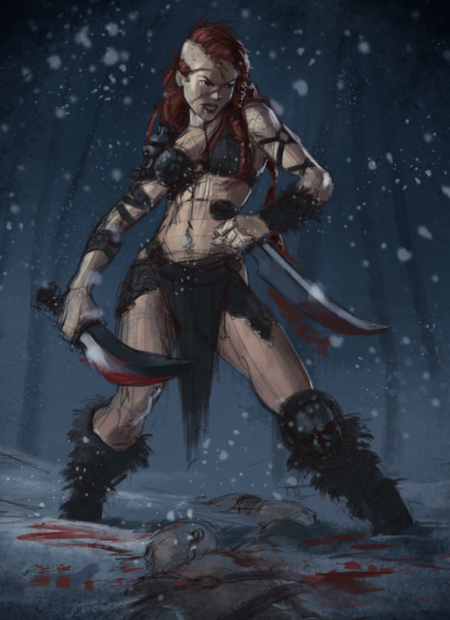
01-29-2015, 10:38 PM
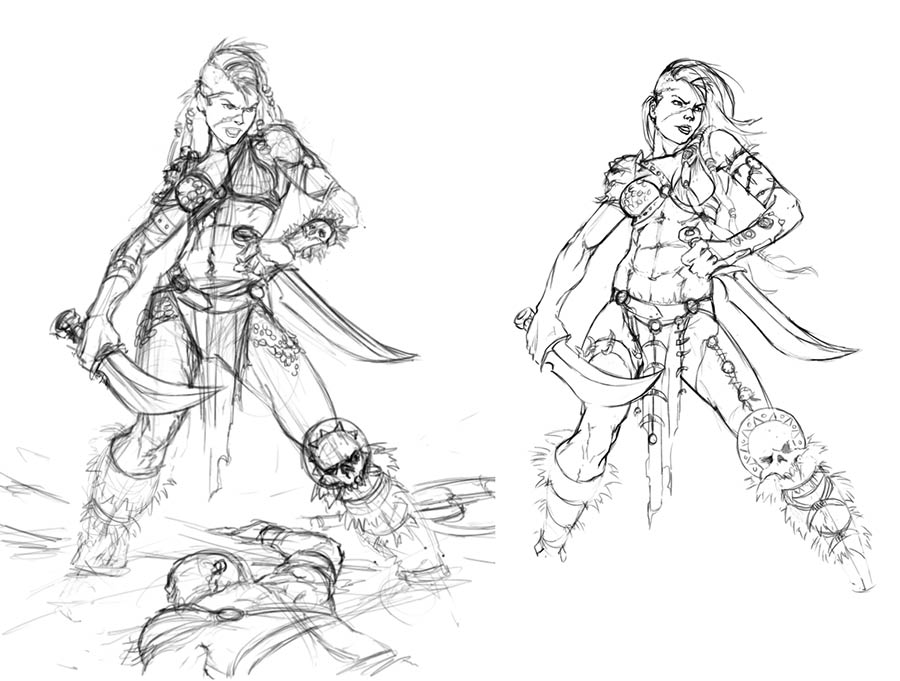 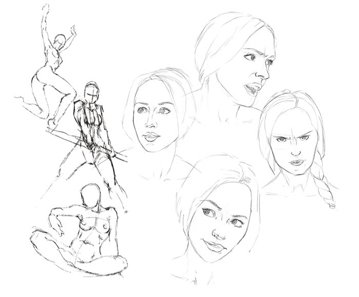 First studies (if you can even call them that) in 4 months. And I think the barbarian chick has some potential: fixing anatomy and general clean-up.
01-31-2015, 07:09 AM
Oh yeah, looking good.
Could you push the perspective on the pillars? Making the scene feel more dramatic perhaps. All the color thumbs work imo, just depends on what you're going for. I hope your family is well man :-)
02-04-2015, 10:38 PM
Good lord this site goes down a lot:(
Finished my wizard vs giants piece and took the barbarian in a different direction. 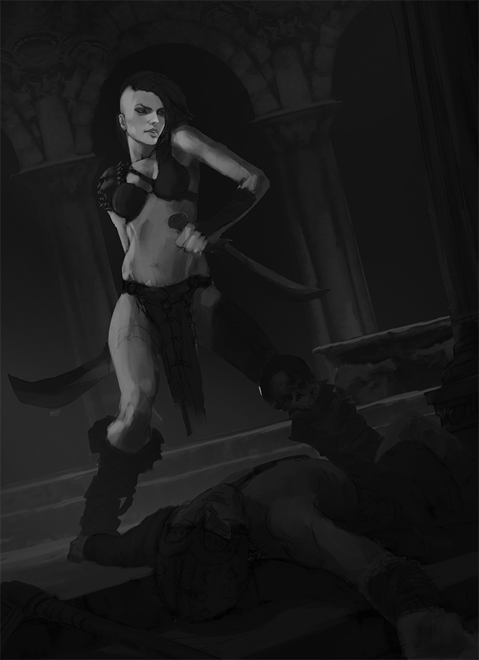 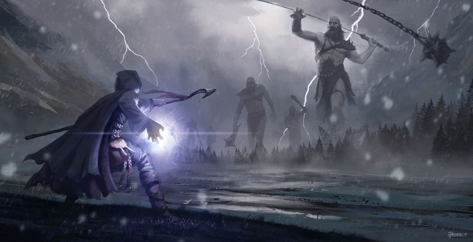
02-05-2015, 11:30 PM
Hey amn that last b/w looks good - i can almost touch those abs! Work on the face more to even things up! Im doing the same thing at the moment - rendering the shit out of boobs and forgetting the rest of the image. Good effort though! well done. Love the piece with the giant - the story telling is awesome.
02-05-2015, 11:37 PM
Yarr great work on giant piece, even if the colors and effects look a bit rushed when held to your usual standard. Or maybe I just liked the earlier color scheme better. Either way, great job man. Good storytelling indeed.
The barb lady is coming together. Love the coffin in the background. ';.;' If you can really push the 3d sense on her right most arm it's going to feel really solid I think.
02-06-2015, 12:18 AM
looking amazing O.o ... that giants piece specially picks my attention . keep them coming :)
02-06-2015, 11:11 PM
Thanks for stopping by guys!
Depending on the painting I will use some photo basin here and there, but lately I have pretty much just used brushes. I have decided that for this one I am going to use every single fucking trick, resource, and cheat I know to achieve the best possible image I can. I mean, at some point in an ideal world awesome painting skills and awesome photo bashing skills would come together and produce something amazing - now it's time to see what my bag of tricks can muster. I already had my painting well under way so now I'm applying some raw textures and photos... yeah it looks like dog shit right now... but it won't when I am done... at least I hope so;) 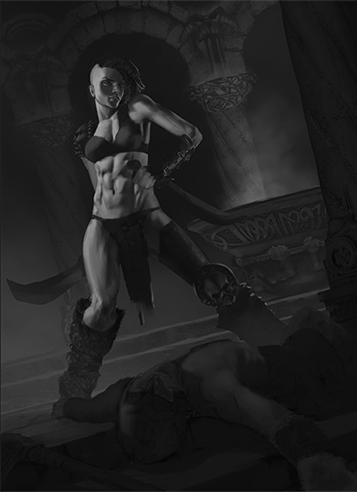
02-09-2015, 10:53 PM
The more I work on this the more I realize there is still so much to do.
 |
|
« Next Oldest | Next Newest »
|