Posts: 1,109
Threads: 18
Joined: Apr 2014
Reputation:
68
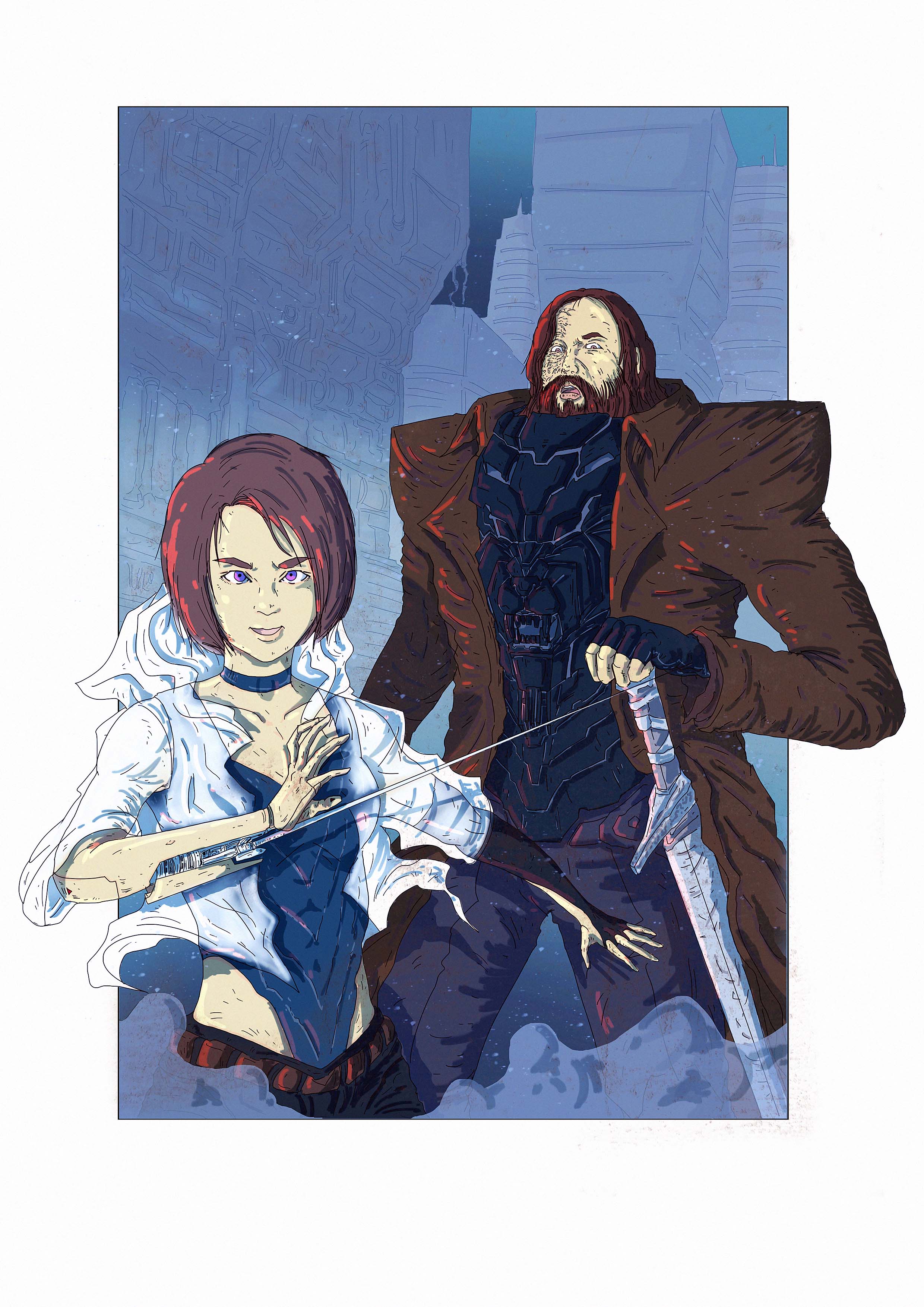
Hey man, it looks great! Could be the cover of an Arya & The Hound comic book ^^ they're really recognisable as who they're supposed to be and breaking out of the panel gives it a larger than life, in your face feeling. The character designs are great too, and its a nice contrast with his angularity and the more soft shapes of her (could be pushed a bit more maybe?). The little paint spatter effects are nice too to break up the linearity of that kind of drawing.
The thing that is confusing is that the needle from her arm connects right to the hilt of his sword, when I first looked I thought it was like a leash, since she is kind of like his prisoner when they are together. I realised it wasn't after looking more carefully but the first read made me think that. Other thing that could improve it is varying line weights - thick lines going to thin as they recede into the distance (illustrator is really good for adding those kind of variations and keeping things consistent), or even just using a thicker line around their silhouettes to clearly separate them (like if you removed all the colour and value do the elements still separate easily? This could also help clear the confusion about her needle overlapping him instead of attaching to him if there is a thicker line weight around it).
Looking forward to seeing your next entry in CC2 ^^
Posts: 30
Threads: 7
Joined: Oct 2015
Reputation:
3
Hey Jonny!
Thankyou for your kind advice, Ah I totally miss the needle sword thing. My Intent was to lead the flow of reading since arya is 1st read face then her arm then goes to the hound, maybe I should move this sword?
As for line weight I will try to be more aware of it onwards, practice practice haha.
Posts: 1,970
Threads: 22
Joined: Apr 2012
Reputation:
243
Nice nice nice nice. I'm so glad you finished it. Piotr and I will leave some crits for you, a bit later. :)
Posts: 671
Threads: 8
Joined: Feb 2016
Reputation:
113
That's some wicked armor design on that guy in the back. Props for finishing it!
If you are reading this, I most likely just gave you a crappy crit! What I'm basically trying to say is, don't give up!
----
IG: @thatpuddinhead
Posts: 164
Threads: 5
Joined: Feb 2016
Reputation:
7
wow very cool, I can tell who they are straight away, prob one of my favs...
Posts: 1,970
Threads: 22
Joined: Apr 2012
Reputation:
243
Dino, Piotr and I did a short crit of your piece after announcement on the CC 2 stream on Twitch. Check it out.
Posts: 30
Threads: 7
Joined: Oct 2015
Reputation:
3
@John&Slash Thankyou for you kind words!
@Amit and Piotr thanks I'd check it out now :)


