04-26-2016, 02:18 PM
Hey here's a quick crit and paintover!
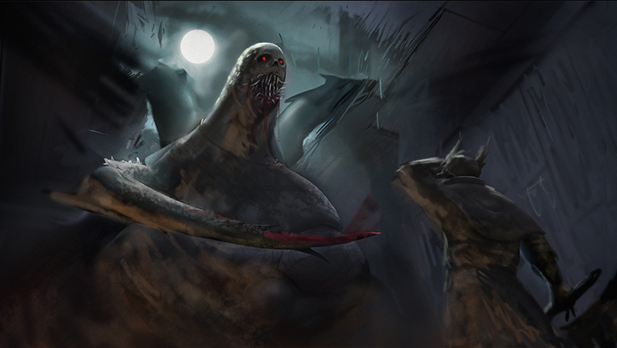
First thing that jumps out with your image, is everything is very smooth, as if it's all made of the same material. so I added some quick texture on the creature.
I enlarged the creature to make him appear more terrifying, and follow the rule of thirds a little better.
unified the lighting and added a secondary warmer light source to help define the forms in shadow and add cool vs warm contrast. Also darkened the moon and sky around his head a little so the creature stands out - light on dark dark on light.
Also may bay a little goofy but I added some red eyes just to push the monster as the focal.


