12-15-2016, 11:56 PM
What I'm about to say is just a matter of preference.
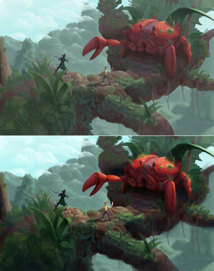
It feels like the values are too close to each other.. It's hard to tell that the guy in yellow is holding a sword when it's zoomed a bit far out. I think it would do the piece some justice if the values are more spread apart.
There's a grayness to your piece due to lack of vibrancy, not sure if it's intentional. I think it's a nice way of pointing out that the story is set in a lush environment if the whole thing is given more color.
Not sure how much of the paint over will help..

I gave (or over-exaggerated) the temperatures on this one. I played with the Curves Layer and I gave the shadows more of a blue tone to show that it gets a bit of light from the blue sky rather than the primary source which is the yellow orange-y sun (which I also bumped up a bit)..
Gave the yellow guy's sword some shine.
I softened some edges that kept catching my eye.
To add. I gave the crab part the most contrast because that's the main thing I'd want to present to people.
----
If there's any more questions to this, or any thing you think that may seem wrong in what I did, I'm open for discussing this with you.
I got to say, outside your studies, you're becoming more bolder with your color choices. I hope you're on the process of another breakthrough with your next piece.
It feels like the values are too close to each other.. It's hard to tell that the guy in yellow is holding a sword when it's zoomed a bit far out. I think it would do the piece some justice if the values are more spread apart.
There's a grayness to your piece due to lack of vibrancy, not sure if it's intentional. I think it's a nice way of pointing out that the story is set in a lush environment if the whole thing is given more color.
Not sure how much of the paint over will help..

I gave (or over-exaggerated) the temperatures on this one. I played with the Curves Layer and I gave the shadows more of a blue tone to show that it gets a bit of light from the blue sky rather than the primary source which is the yellow orange-y sun (which I also bumped up a bit)..
Gave the yellow guy's sword some shine.
I softened some edges that kept catching my eye.
To add. I gave the crab part the most contrast because that's the main thing I'd want to present to people.
----
If there's any more questions to this, or any thing you think that may seem wrong in what I did, I'm open for discussing this with you.
I got to say, outside your studies, you're becoming more bolder with your color choices. I hope you're on the process of another breakthrough with your next piece.
If you are reading this, I most likely just gave you a crappy crit! What I'm basically trying to say is, don't give up!
----
IG: @thatpuddinhead
----
IG: @thatpuddinhead


