08-10-2017, 09:46 AM
So, I started an account here a while back, but I never really got around to posting with it. Now I'm looking to level up and I need to seriously buckle down, so I thought I'd dust off this account and start a sketchbook.
I'm a self-taught artist and I consider myself to currently be at an intermediate skill level -- I have a hang on most basics, but I need to improve a lot of everything to get to the next stage. (I do take illustration jobs, but I'd consider myself a low-level professional at this point.) I hope to get better at anatomy, color usage, composition, and just about everything else you can think of.
Here are some pieces I recently finished to start things off:
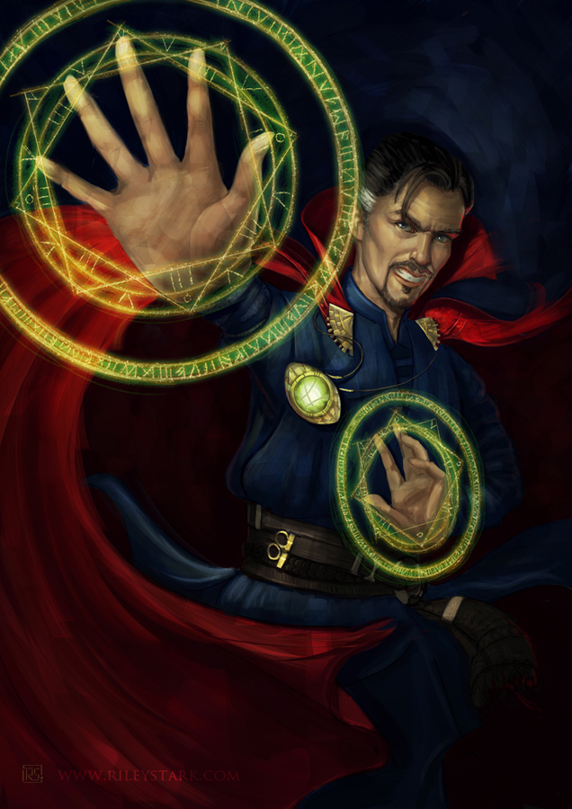
Doctor Strange -- trying something a little more dynamic in the pose than I usually do. My pieces often feel very static, so I tried to work on that in this one a bit. (Both with pose and with brushwork.)
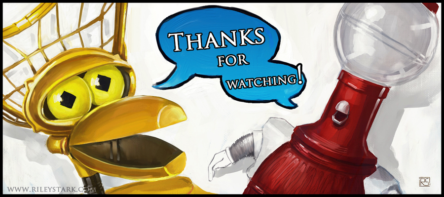
Just a 'thank you' piece for hitting a watcher milestone on DA. (Who doesn't love some MST3K?)
Check out the links in my signature for more samples of previous pieces. (And feel free to comment on anything here -- I welcome ALL feedback and I love criticism! The harsher, the better I will get! )
)
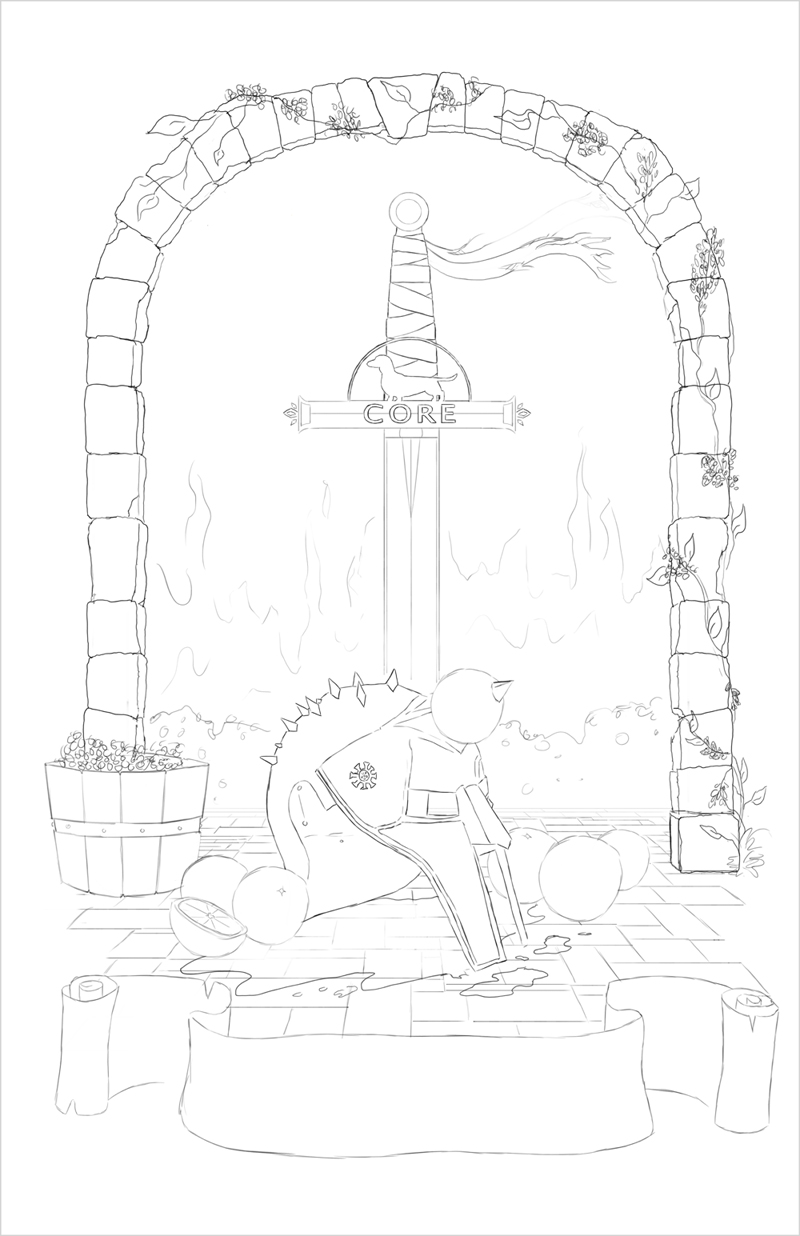
This is a piece I'm currently working on for a beer label/advertising poster for a brewery down south. The illustration elements are based off their upcoming blood orange IPA, which is themed after one of their employees. (The helmet and whatnot are a reference to jokes supposedly about him.) I just finished up the line work and I've sent it over for approval before I start painting everything in. (Comments on composition will be especially helpful!)

I'm a self-taught artist and I consider myself to currently be at an intermediate skill level -- I have a hang on most basics, but I need to improve a lot of everything to get to the next stage. (I do take illustration jobs, but I'd consider myself a low-level professional at this point.) I hope to get better at anatomy, color usage, composition, and just about everything else you can think of.
Here are some pieces I recently finished to start things off:
Doctor Strange -- trying something a little more dynamic in the pose than I usually do. My pieces often feel very static, so I tried to work on that in this one a bit. (Both with pose and with brushwork.)

Just a 'thank you' piece for hitting a watcher milestone on DA. (Who doesn't love some MST3K?)

Check out the links in my signature for more samples of previous pieces. (And feel free to comment on anything here -- I welcome ALL feedback and I love criticism! The harsher, the better I will get!
 )
)This is a piece I'm currently working on for a beer label/advertising poster for a brewery down south. The illustration elements are based off their upcoming blood orange IPA, which is themed after one of their employees. (The helmet and whatnot are a reference to jokes supposedly about him.) I just finished up the line work and I've sent it over for approval before I start painting everything in. (Comments on composition will be especially helpful!)
