01-17-2018, 06:51 PM
Hi,
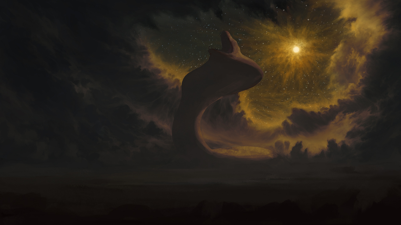
I think it's a great concept and it's good to see you analysing your own work. It's not so much that your shadows are too desaturated in comparison to the lighting, but more that your entire painting exists mostly in the same hue. By keeping contrasts in the same hue, your values appear dull.
Overall, the image is very warm. You said this was meant to be the moon emitting a strange light. I would have thought this was a desert setting on a world near a dying or far-away sun. By keeping this 'strange light' in the same hue as the rest of the image, it doesn't seem strange. Film is a great example of how directors use colour to unify their scheme. If you're trying to set it apart, there needs to be a lot more complimentary cool tones to flesh it out. i.e. purples and blues are on the opposite side of the spectrum as yellow and orange so they compliment each other. By picking those colours in cool/warm opposition you also increase vibrancy without having an over-saturated look.
Also, on the note of night-time setting... Stars. The moon is much smaller and much closer than the sun so there's actually not much light-pollution drowning out starlight. It would help portray the setting more to include stars.
I've attached a bit of an example of what this all would do, but ultimately it depends on what your intensions are and what you choose to do:


