10-19-2018, 09:47 AM
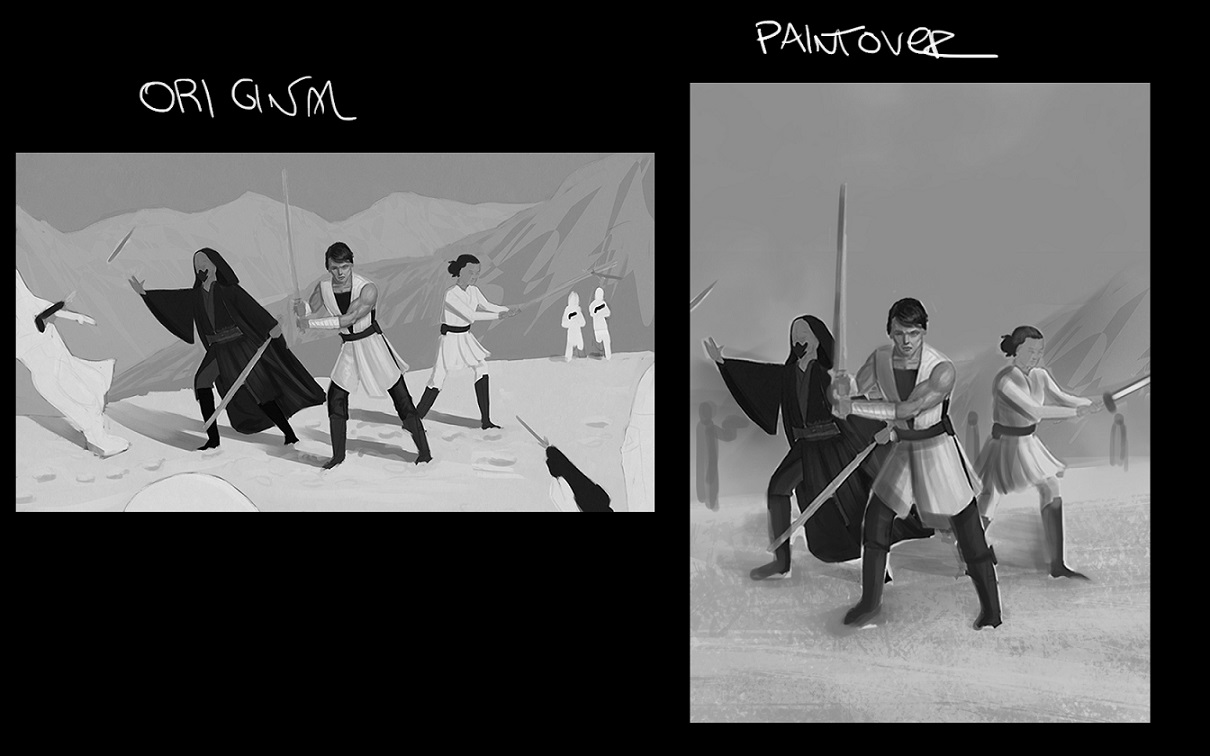
Hey Riley! I did a very, very quick composition paintover just to ilustrate a point;
Your Star Wars piece has a lot of character, i would just say three considerations ( and probably it´s late for you to change as much in the comp but it´s a 2 cent suggestion haha:

1- A vertical comp works better than a horizontal due the strenght of the piece being the three team characters, all of them with some unique elements and personality. They work well if you frame them together like a book cover/game cover/ movie poster. ( you can add storm troopers and they may work nice yet the focus is the team)
2- Did not have much time to delve into values but the piece has too much near white values, i would introduce sublte midtone shadows with very specific highlights (light saber, light source from right to left)
3- Movement dynamism & anatomy . The poses look very interesting and again, have a lot of character but i sense two issues; the poses are a little bit stiff anatomywise the center guy is on target, the two side characters have big heads in proportion to the body. ( if iyou intend realism/semi realism)
Don´t feel obligated to change the route of your piece just because of my suggestion haha. Just two cents, if they are helpful the better. Cheers!
Your Star Wars piece has a lot of character, i would just say three considerations ( and probably it´s late for you to change as much in the comp but it´s a 2 cent suggestion haha:

1- A vertical comp works better than a horizontal due the strenght of the piece being the three team characters, all of them with some unique elements and personality. They work well if you frame them together like a book cover/game cover/ movie poster. ( you can add storm troopers and they may work nice yet the focus is the team)
2- Did not have much time to delve into values but the piece has too much near white values, i would introduce sublte midtone shadows with very specific highlights (light saber, light source from right to left)
3- Movement dynamism & anatomy . The poses look very interesting and again, have a lot of character but i sense two issues; the poses are a little bit stiff anatomywise the center guy is on target, the two side characters have big heads in proportion to the body. ( if iyou intend realism/semi realism)
Don´t feel obligated to change the route of your piece just because of my suggestion haha. Just two cents, if they are helpful the better. Cheers!


