09-18-2020, 12:20 PM
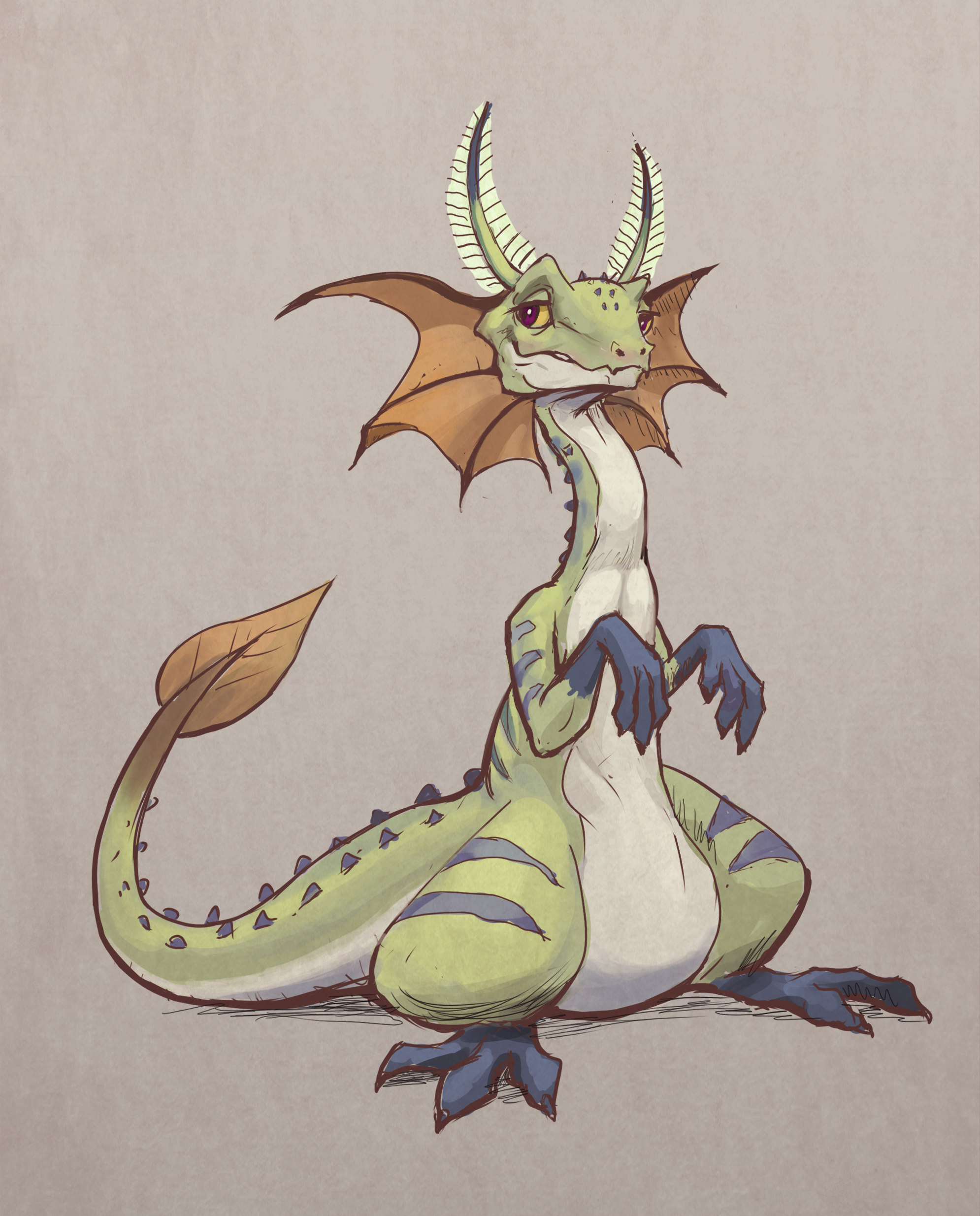
(09-07-2020, 04:54 AM)Zorrentos Wrote: I think its to hard to separate/read the materials on your lighting sketch from memory. Its important that you try to keep in mind the "glossiness" in the material of your subject. The eyeballs should reflect more light then the skin. The comb on the dragons back should have light shining through and bouncing thru with subsurface scattering since the material is more transluscant.Ah ok. That one I practically just did it before go to sleep, also without using any reference so to be expected that will have flaws
Really dig the character designs you posted as well! Keep up the good work! :)
 So I woke up in the morning to continue it. Well, still not that great but I think it is better than before
  Anyway thanks for the input. Really appreciate it :)
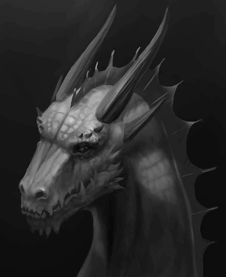
Updated early to mid september.
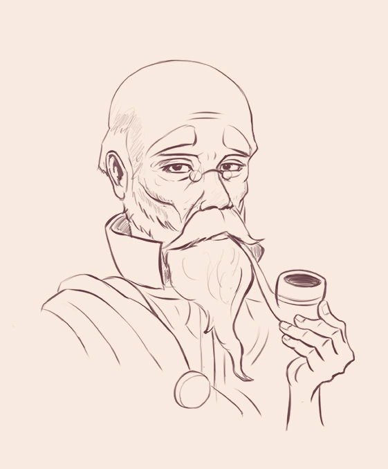
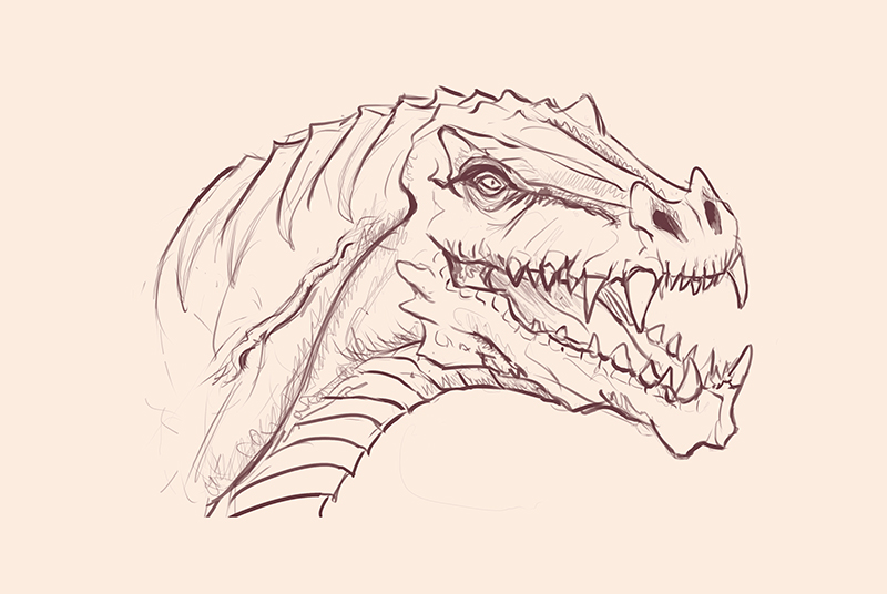
Random sketches and study
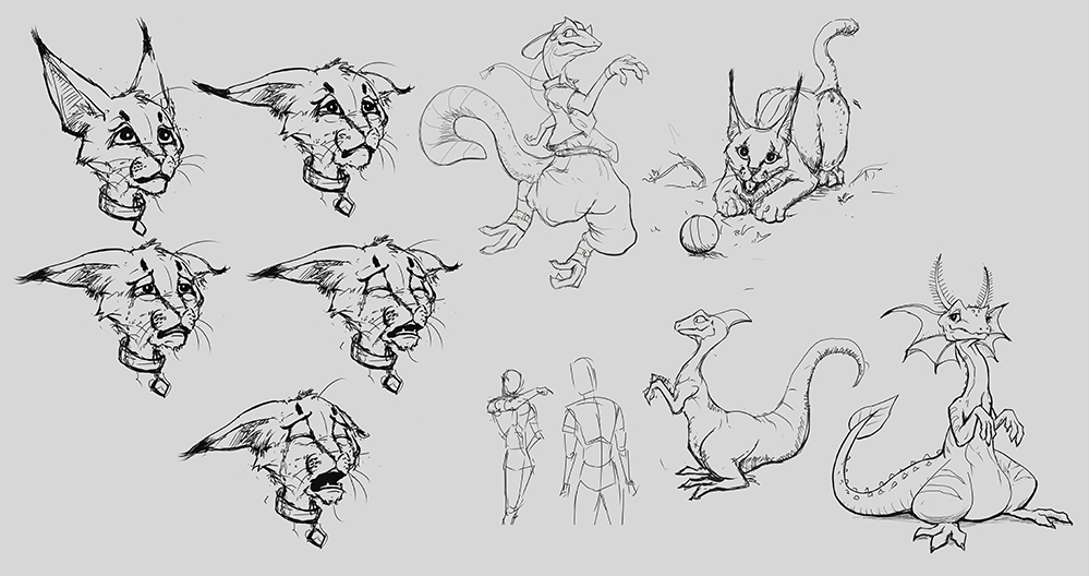
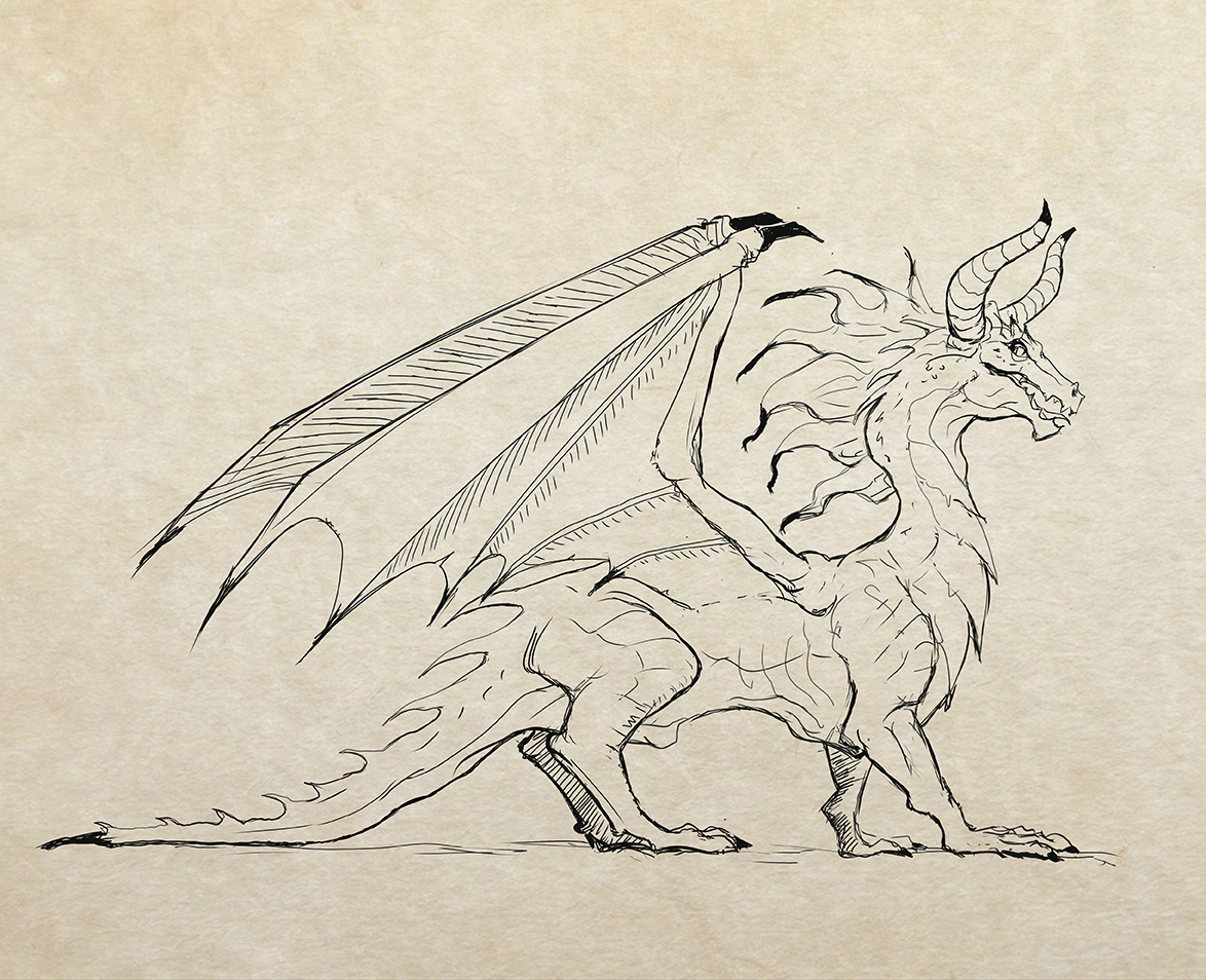
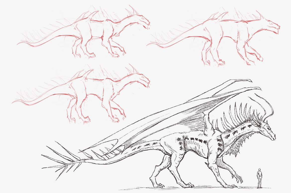
---------------------------------------------------------------
Devianart
Sketchbook
Instagram
Cara
Twitter/X
Artstation
Devianart
Sketchbook
Cara
Twitter/X
Artstation


