12-11-2020, 01:39 PM

Thanks for the feedback Xelfereht. Overly saturated colours across the board is something I'm struggling with atm, and er, these following ones don't seem to show much improvement in that area. Maybe in the top 2 mountain doodles. Marco Busso's video that got recommedned seems to move from grey to more colourful areas, although I find it more intuitive to apply flat base colours first, then decrease the saturation in areas that need it
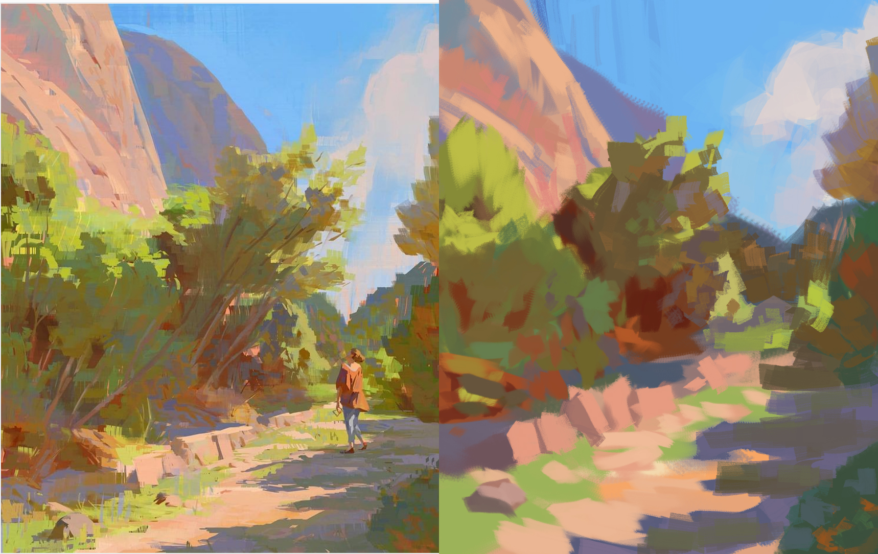
Colour study from slaweck on instagram, and then some doodles experimenting with colour and a more illustrationy style. I think for now I may get more use from doing master studies instead photo studies, to see how they control saturation, then attempt to apply what I learn in some more original work/work based on studies
Huh, also just realised that on my phone, the yellow skirt on the last picture is horrifyingly saturated, but on my laptop screen it's more muted and less eye watering. Not sure which one reflects the real colour more accurately.


