02-21-2021, 09:11 AM
Good for you on the casino thing! That's honestly a really cool opportunity and I'm sure you're going to nail it. I really like the design elements you have so far and the theme. The letters resembling old Norse runes is really clever. Was the theme your own idea, or something the company gave you?
Can I be really honest though? I don't think this reads well.
The reason is that I don't think you are working with the masses of value enough to get them to read against each other. The fact of life is, that light doesn't read against light, and dark doesn't read against dark. Whether it's realism or a cartoon or whatever, you just can't put something on a background that is the same value and have it stand out, even if you outline it and double outline it. You have made sure all the edges of your shapes stand out against the things directly next to it, yes. But not the whole mass. When you zoom out, and see it at a small size, you can still barely make out the main shapes, and the title is nearly invisible. Taking away the color also helps to judge it.
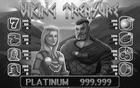
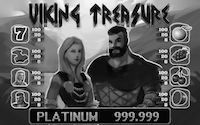
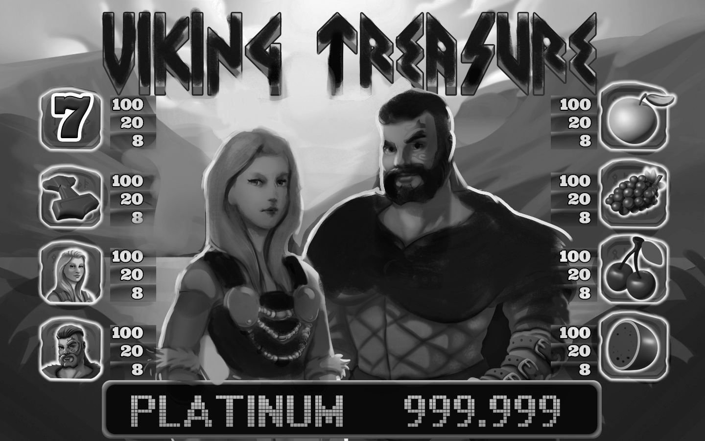
So something like this could be a solution. Maybe it would be better to go the other way and make the skin and hair light against a darker sky, I don't know. There's tons of things you could do, just as long as the large shapes that you want to read clearly are in a range which contrasts the thing they are in front of. but in any case I feel like there's like a battle going on in the image where you are fighting to make stuff stand out, and it is just ending up going toward the same grey value.
That being said, I don't think it's a bad painting, and it's not that it doesn't read at all. I imagine you could potentially be going for something more subtle than this. But I still think it's something to think about if you are trying to attract attention with the picture.
Can I be really honest though? I don't think this reads well.
The reason is that I don't think you are working with the masses of value enough to get them to read against each other. The fact of life is, that light doesn't read against light, and dark doesn't read against dark. Whether it's realism or a cartoon or whatever, you just can't put something on a background that is the same value and have it stand out, even if you outline it and double outline it. You have made sure all the edges of your shapes stand out against the things directly next to it, yes. But not the whole mass. When you zoom out, and see it at a small size, you can still barely make out the main shapes, and the title is nearly invisible. Taking away the color also helps to judge it.


So something like this could be a solution. Maybe it would be better to go the other way and make the skin and hair light against a darker sky, I don't know. There's tons of things you could do, just as long as the large shapes that you want to read clearly are in a range which contrasts the thing they are in front of. but in any case I feel like there's like a battle going on in the image where you are fighting to make stuff stand out, and it is just ending up going toward the same grey value.
That being said, I don't think it's a bad painting, and it's not that it doesn't read at all. I imagine you could potentially be going for something more subtle than this. But I still think it's something to think about if you are trying to attract attention with the picture.


