04-16-2021, 09:44 PM
Hi! I enjoy checking ur process, and I really like the last art u are making. Somehow enjoy this Card illustration style.
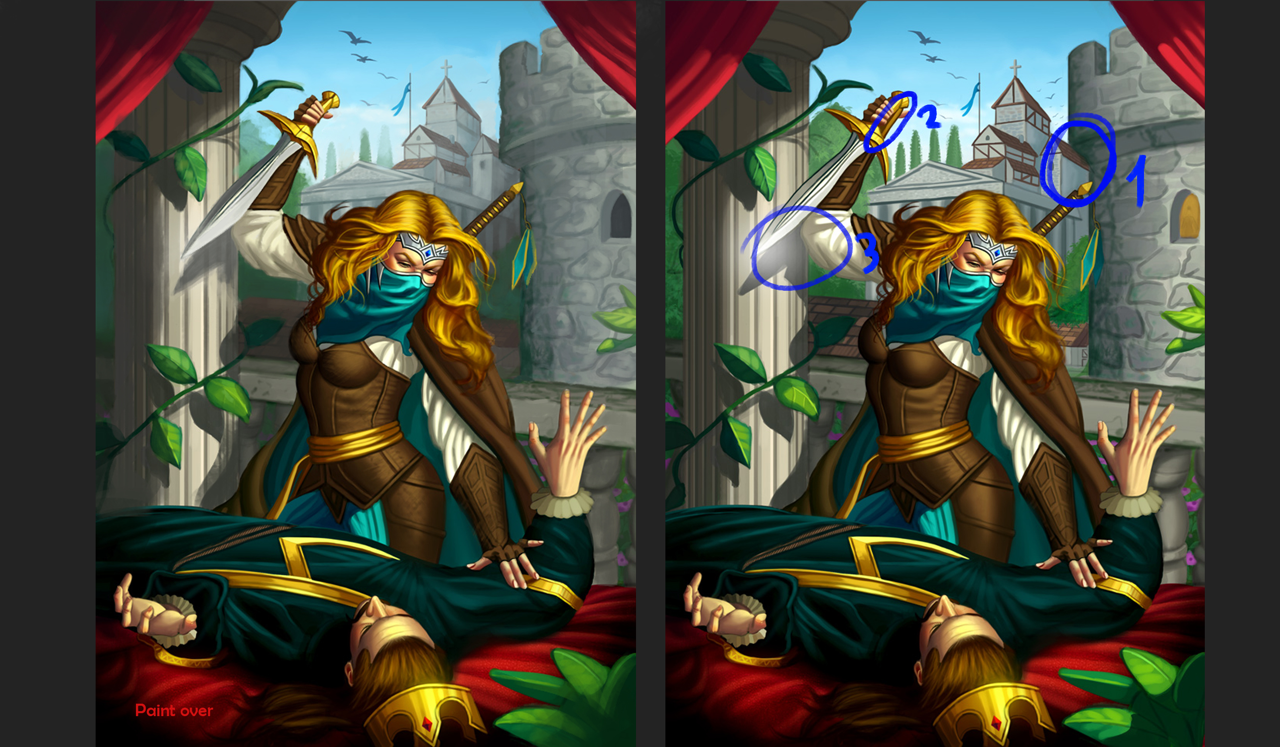
Here is my suggestion and paint over.
1) Overall it's nice, but the first thing I looked at on this was not the scene of killing or the girl, it was background church that interfere with the tower. In my opinion there are too much details on the background that moves the focal point there. As i look at the proccess the interfere church comes with u, I guess u just got used to ur drawing and couldn't see it.
2) I actually can't understand the sword hilt shape, if it should look like that, please tell me.
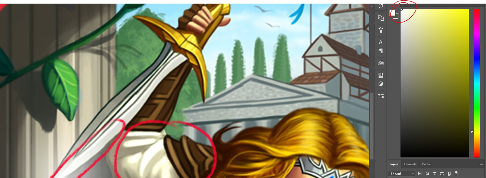
3) There is a 100% white on ur sword and shirt. It looks too bright, and I think u always should avoid the 100% black and white colour on ur drawing, except for the time when its style feature I guess.
And just a small things:
In my opinion u don't have enough variety of folds on their clothes. Leather armour looks too polished, but i guess u will add more texture.
And the guy in tower window.Right now he looks just off the place and too wooden, he is just standing and almost lost in this window. If u need him in ur storytelling, like he spot the scene, in my opinion, u should add more action to him, for example, let him pop up from window and scream.
I hope it will be helpful for u. Looking forward to see finished one!


