Posts: 12
Threads: 2
Joined: Mar 2021
Reputation:
0
Hello. Thanks for visiting.
The purpose of this sketchbook is to improve my skills. I'm stuck and need some social pressure and help.
Looking forward to your critique, advices and any other kind of help.
Will try to upload my shitty art every week.
Here is first dose of what I did on last week and some other stuff.
Materials studies
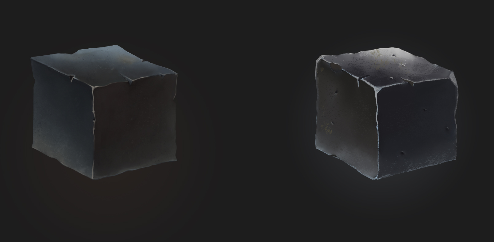
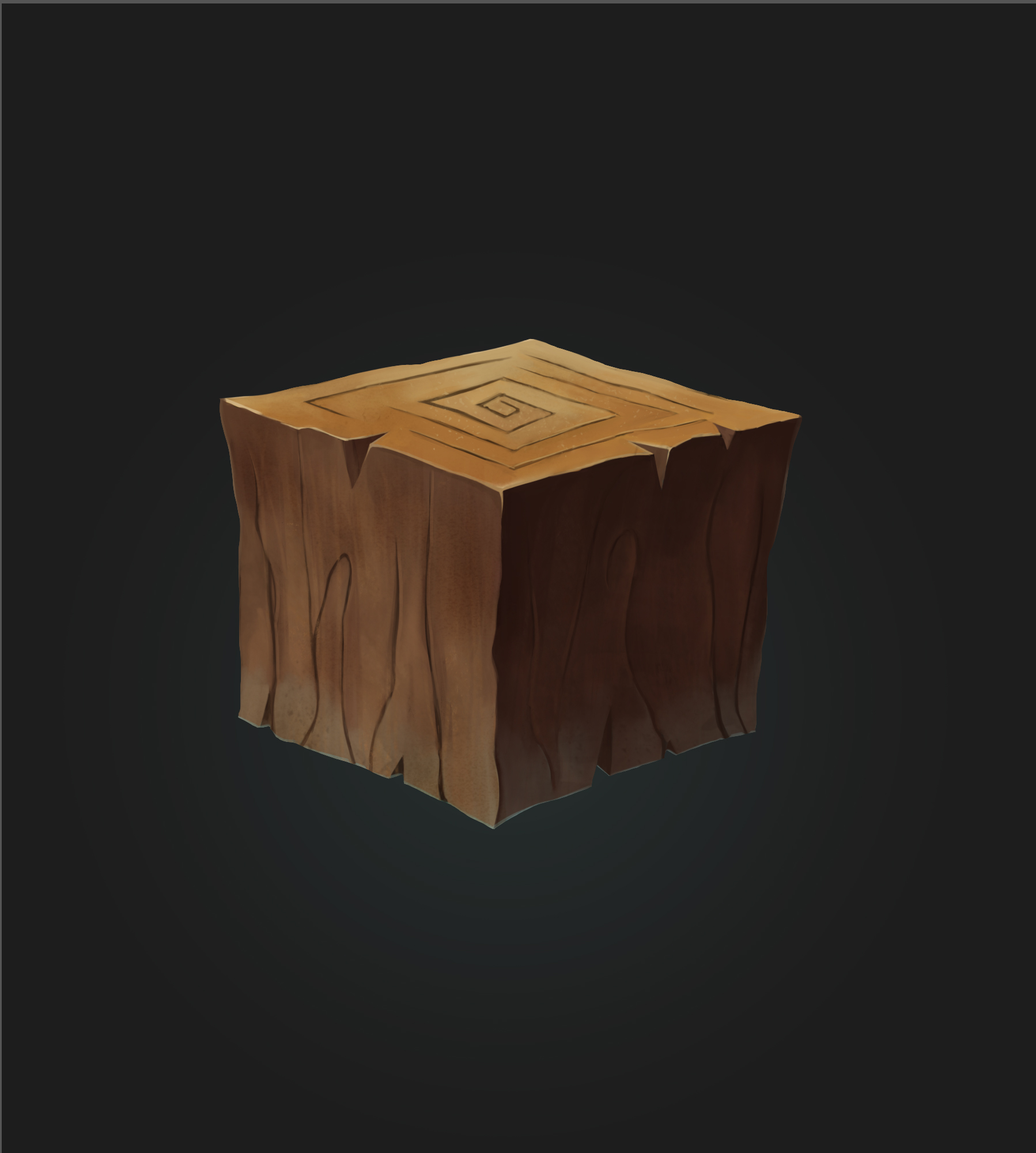
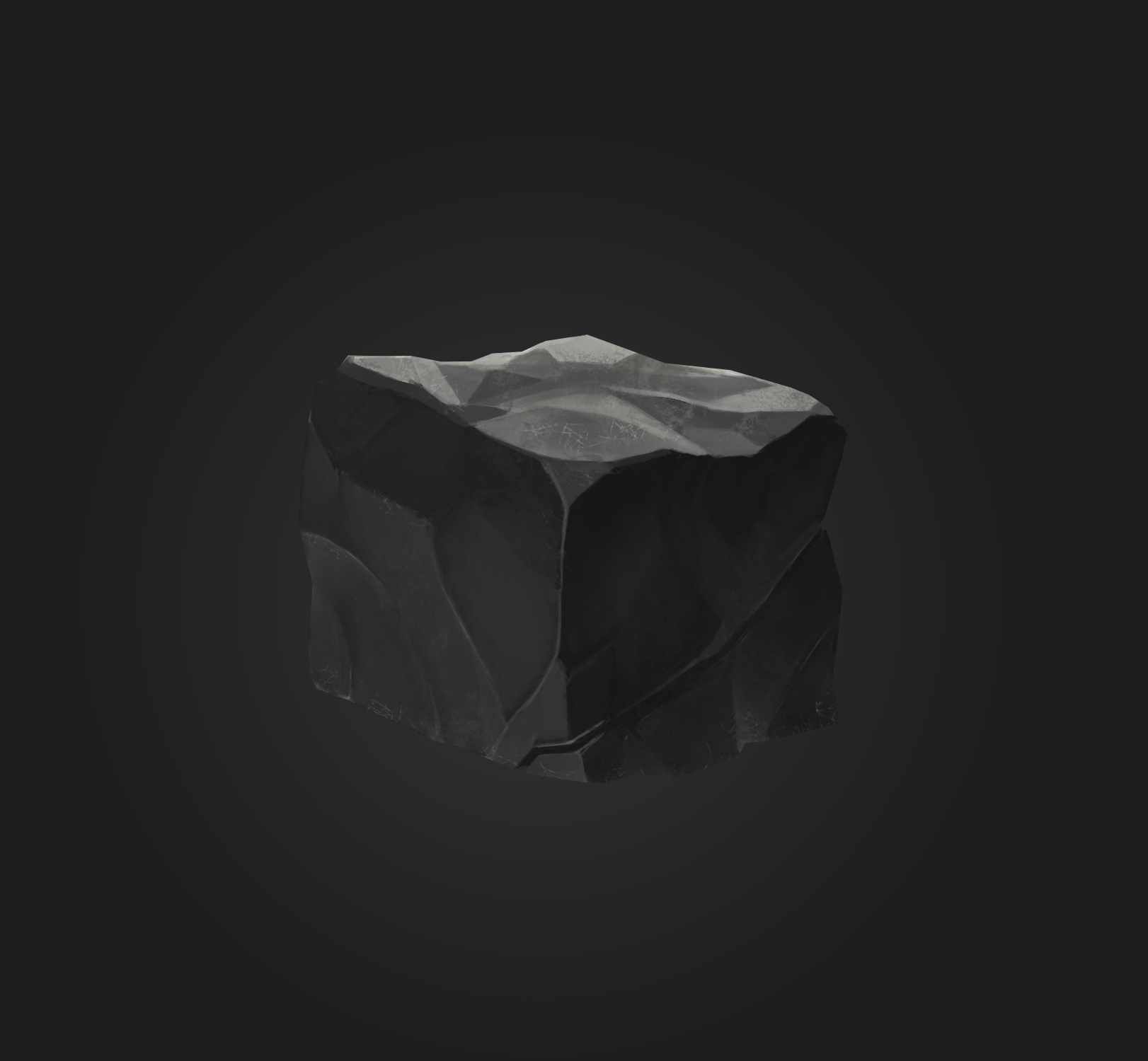
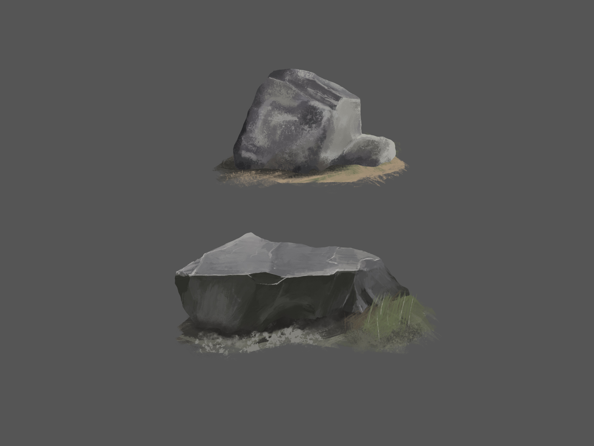
Some studies of brush work and colour
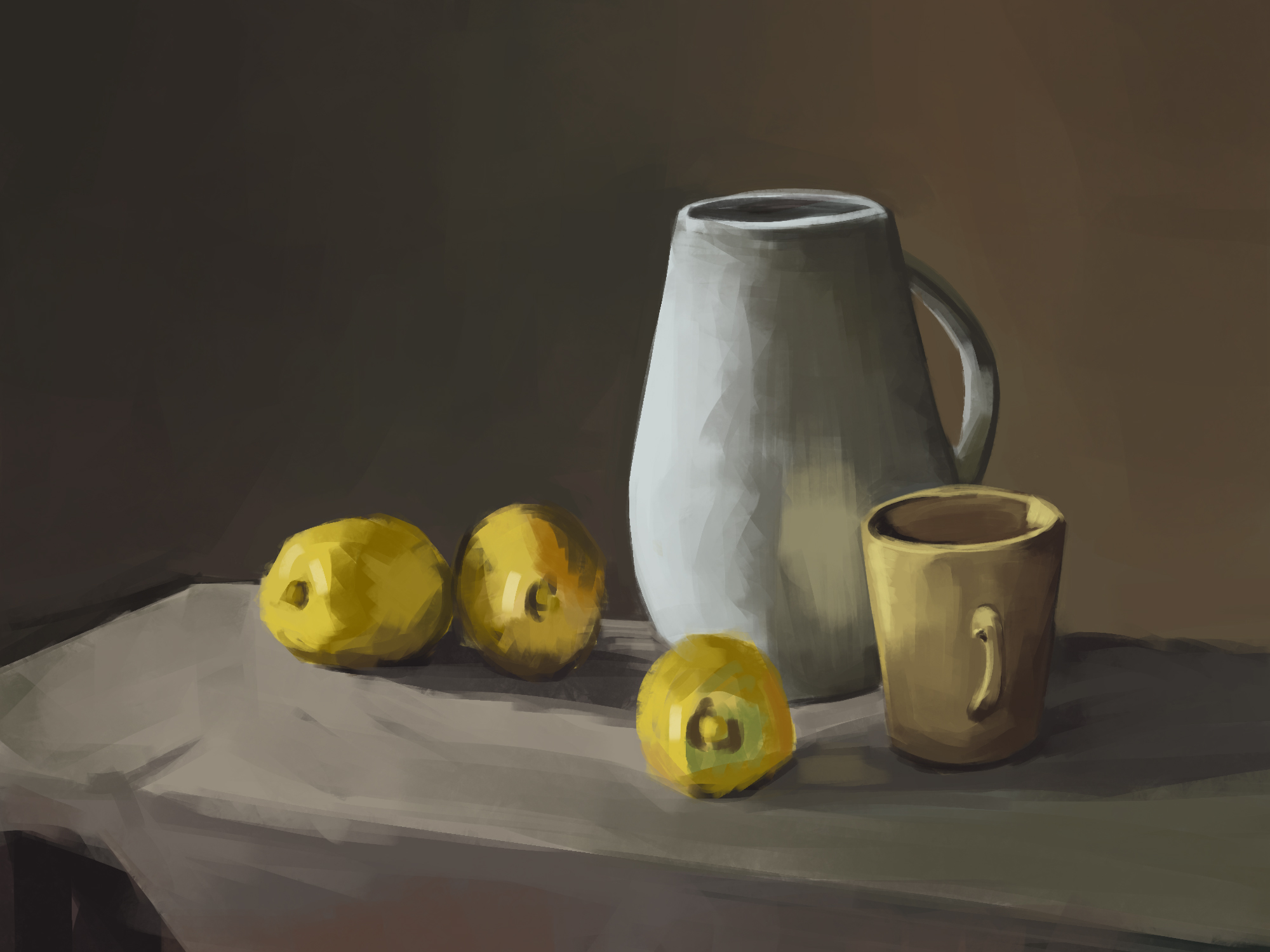
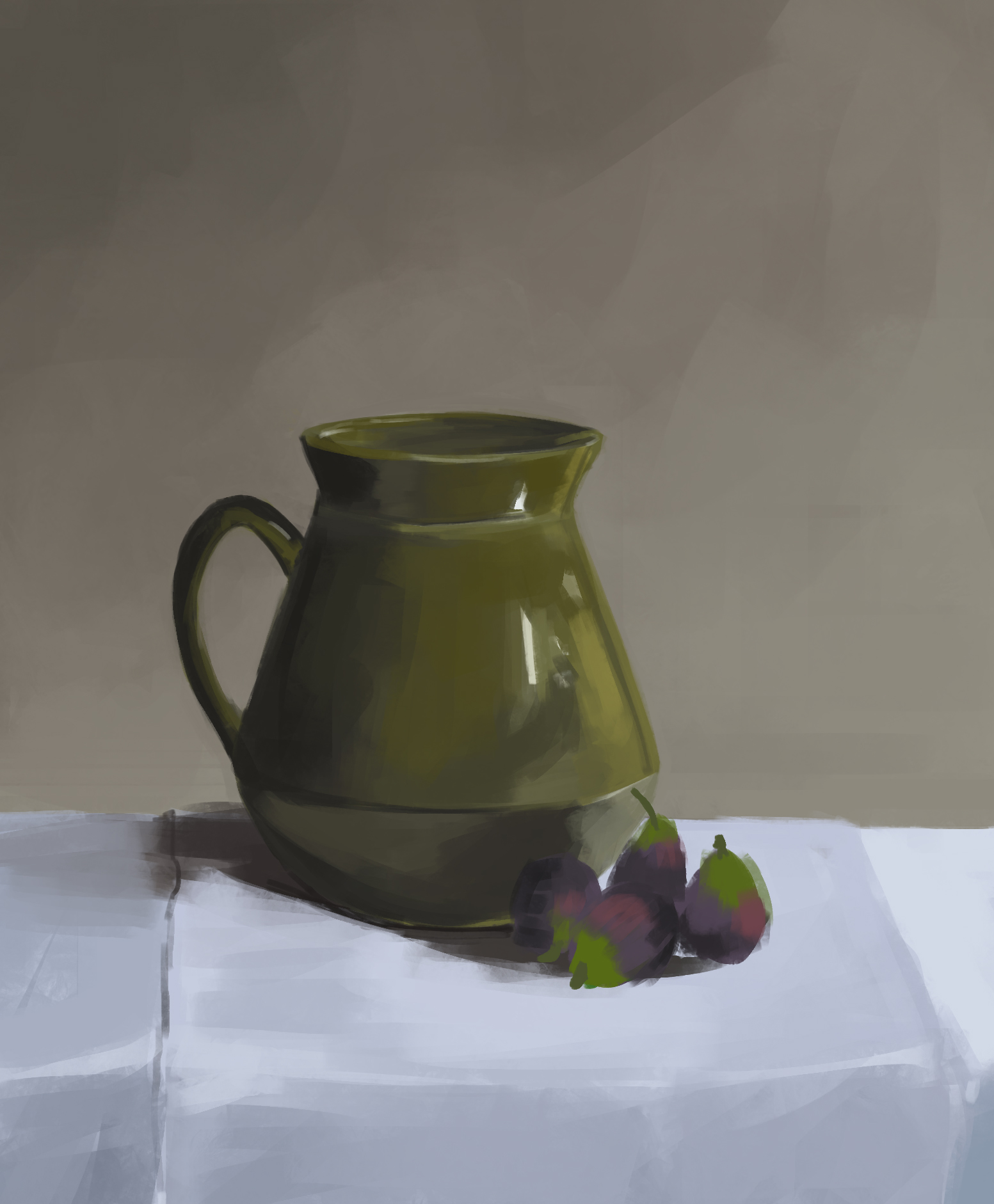
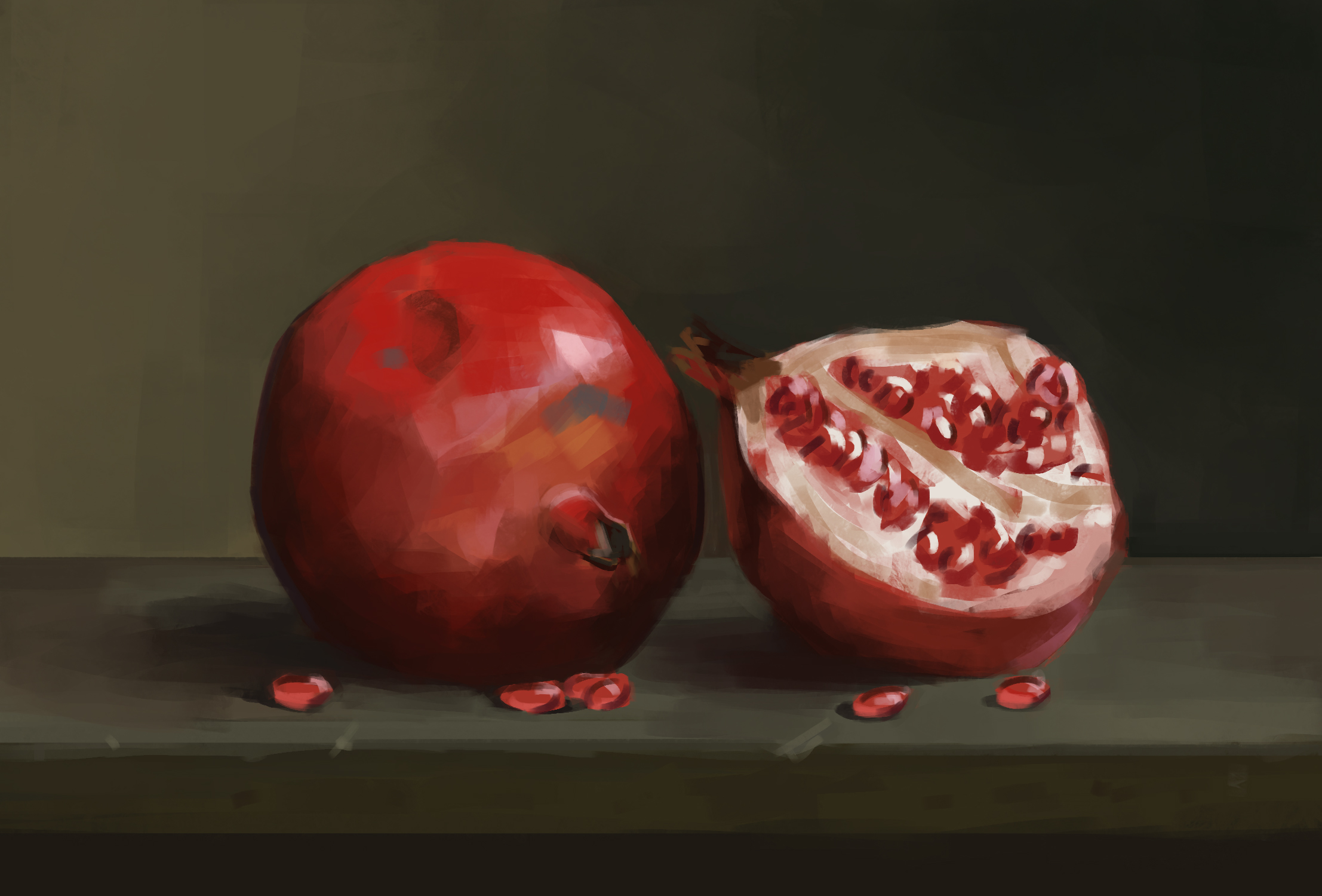
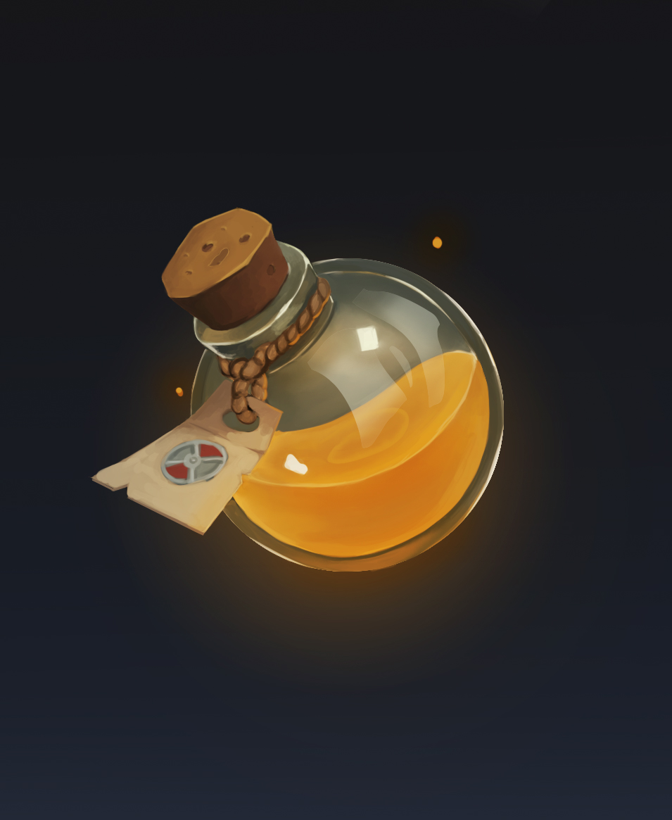
What i did for my Portfolio
Posts: 460
Threads: 10
Joined: Mar 2016
Reputation:
64
Welcome to the forums! You are off to quite a good start! The material studies you are making right now is probably a great thing for you to focus on at the moment.
Keep up the good work!
Posts: 3,357
Threads: 37
Joined: Aug 2013
Reputation:
234
I think you should visit my sketchbook i do similar texture study.Maybe there something to get out of that.
Posts: 76
Threads: 3
Joined: Feb 2021
Reputation:
6
Welcome Delorias! Your art does not look bad at all (at least to my unqualified eyes). The potion bottle looks great :)
Posts: 56
Threads: 0
Joined: Nov 2019
Reputation:
16
There will be many people out there enough to call your art shit or ignore it, no need to add to that sentiment yourself.  Self talk actually effects everything we do, so it is good to be mindful of if you may be being overly negative or self deprecating lest it becomes an unintentional habit.
Anyways, nice to see some still life work being done, though I assume these are studies of paintings or photographs of setups? Highly useful exercise to do irl. These are pretty well executed quicker studies in any event.
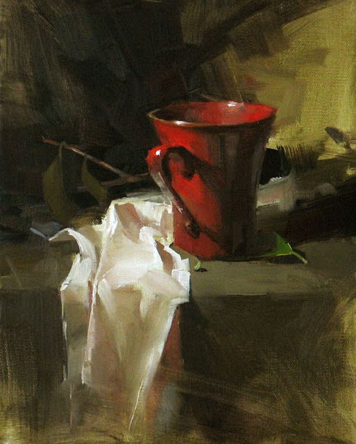
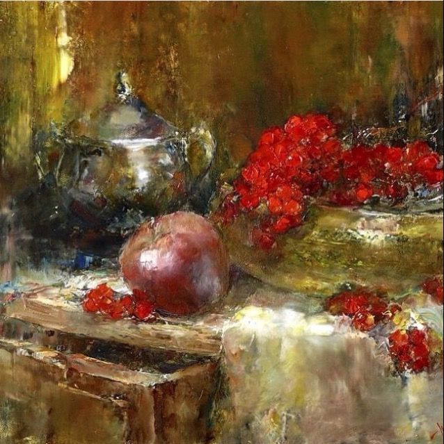
One quick thing I'd advise for those still life ones is to pay more attention to your edge work. Realism of a naturalistic form relies on a good balance between the harder and softer edges. You use a lot of hard edges and could make use of more softer edges in your work to balance them out. Example is around the contour of a round form like the pomegranate, the contour around the fruit could be softened in areas to balance the harder edges and to emphasise form turning away in places. Lost edges can be introduced into places such as the shadow areas so things merge together and unify. An intentioned control of the edge balance in yourwork will help you show 3d volume better. Be very mindful of where light and shadow meet and what kind of edges are present and useful to show.
If you don't already, perhaps you can try and setup and paint a still life from life. This will help you to see volume better and by squinting your eyes, be able to observe and decide how to simplify your value massing/grouping as well as identify where the soft and hard edges are. The more you squint down the more unified subtle halftone values become and the hardest edges stay hard to your perception and easy to identify.
Posts: 12
Threads: 2
Joined: Mar 2021
Reputation:
0
@Zerrontos Thank you. Yes, i think materials are important for the art finalization, especially when I'm doing my portfolio in casual style.
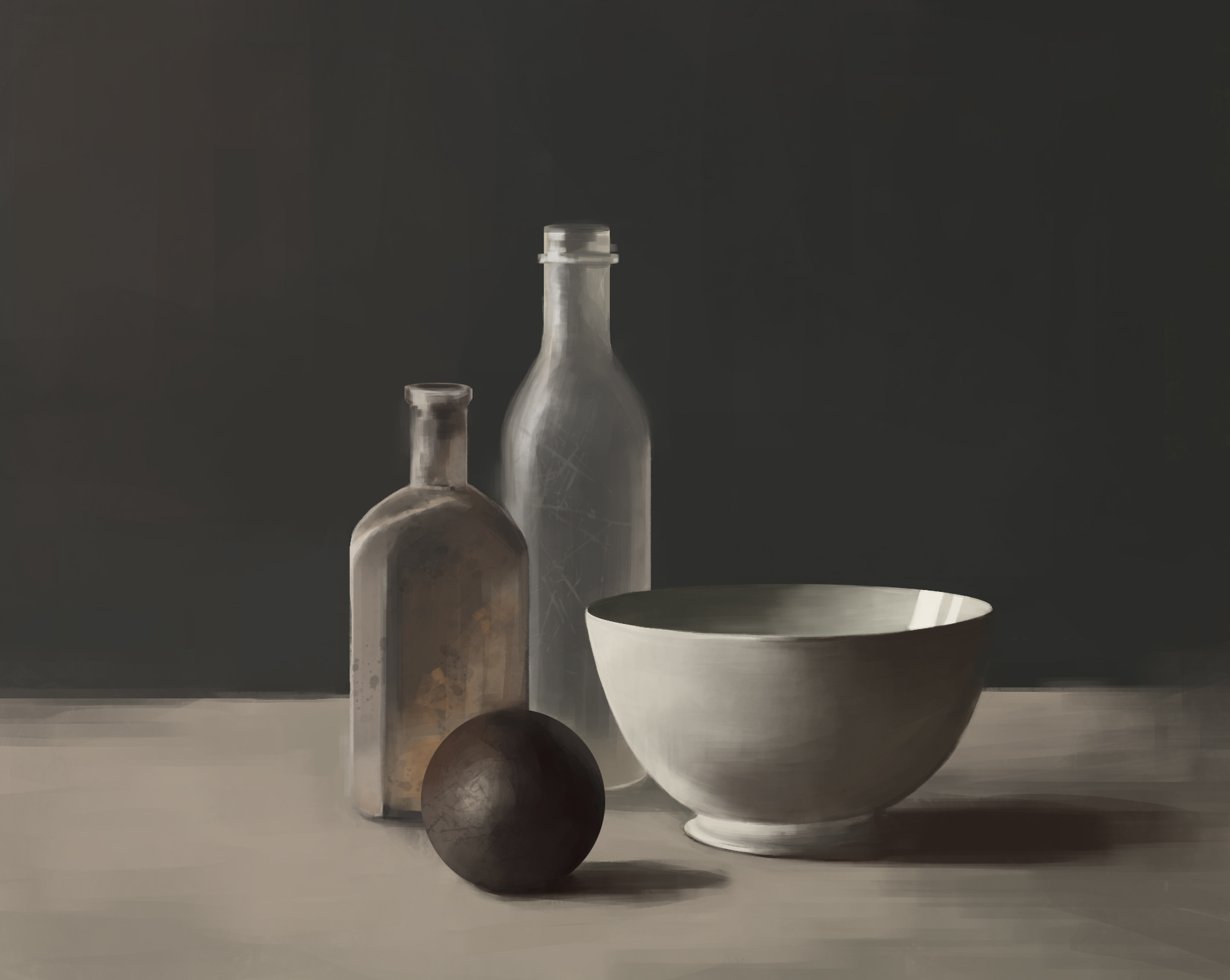
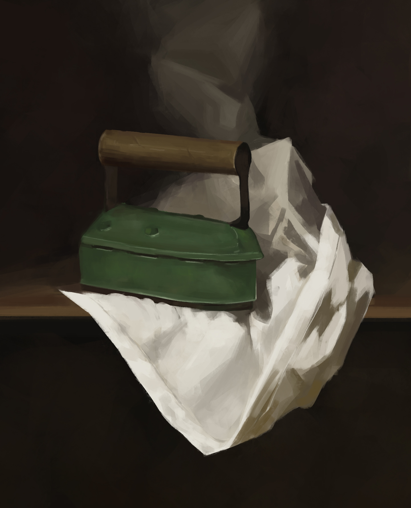
@Who Thank you for your advices! Yes, these still life art are all from photos. I think i have to work on irl reference, because photo's one are too easy (if there is not much rounded objects). Actually about edge control: i was trying to do it in previous art, but i failed. I'm actually not sure where I can make edge blurry except for the shadows. I'd like u to look at new one that i did recently.
This week was kinda intense for me... I found many thing that im bad at, at least it was helpfull.
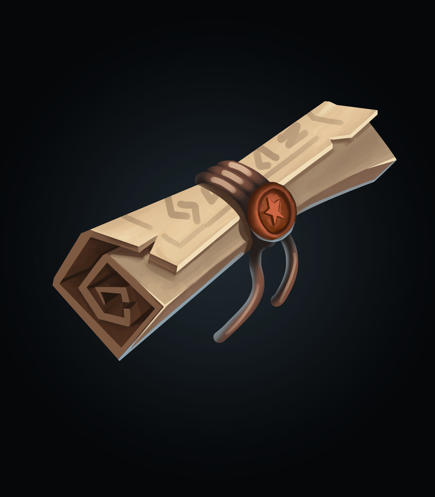
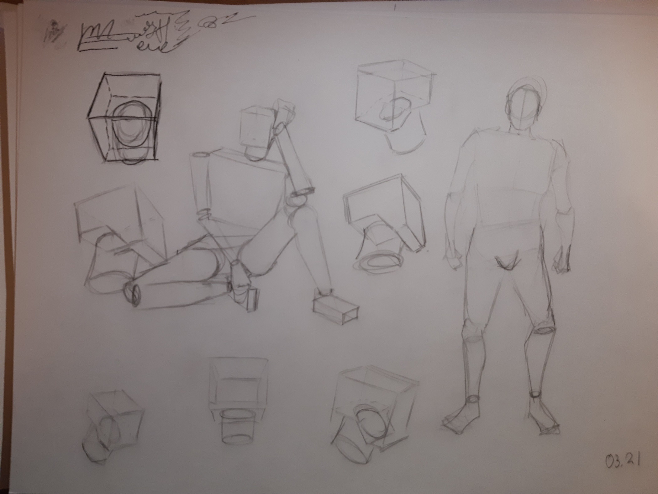
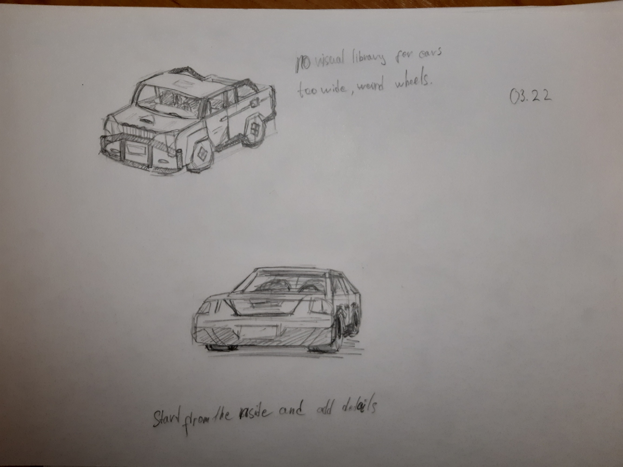
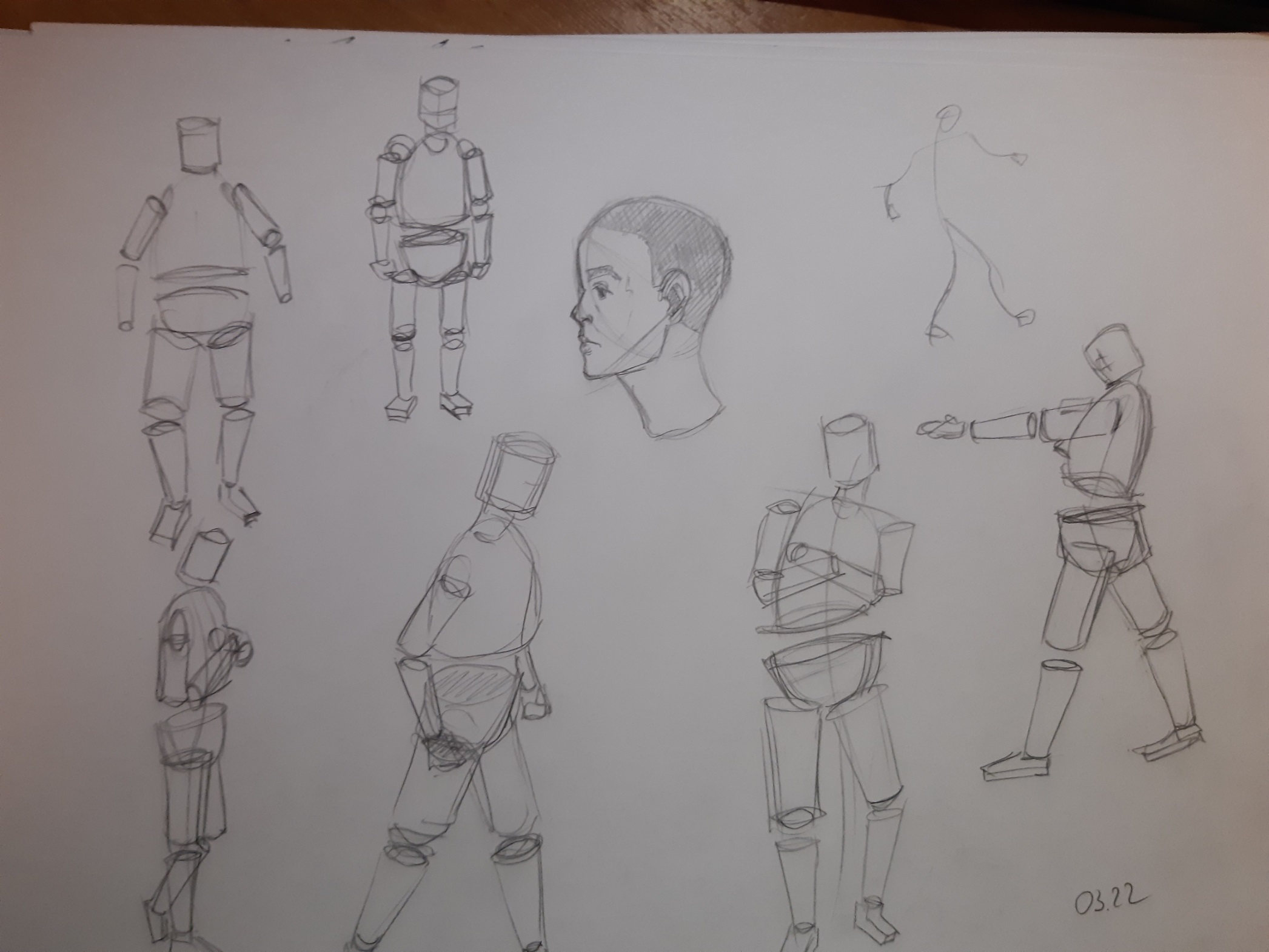
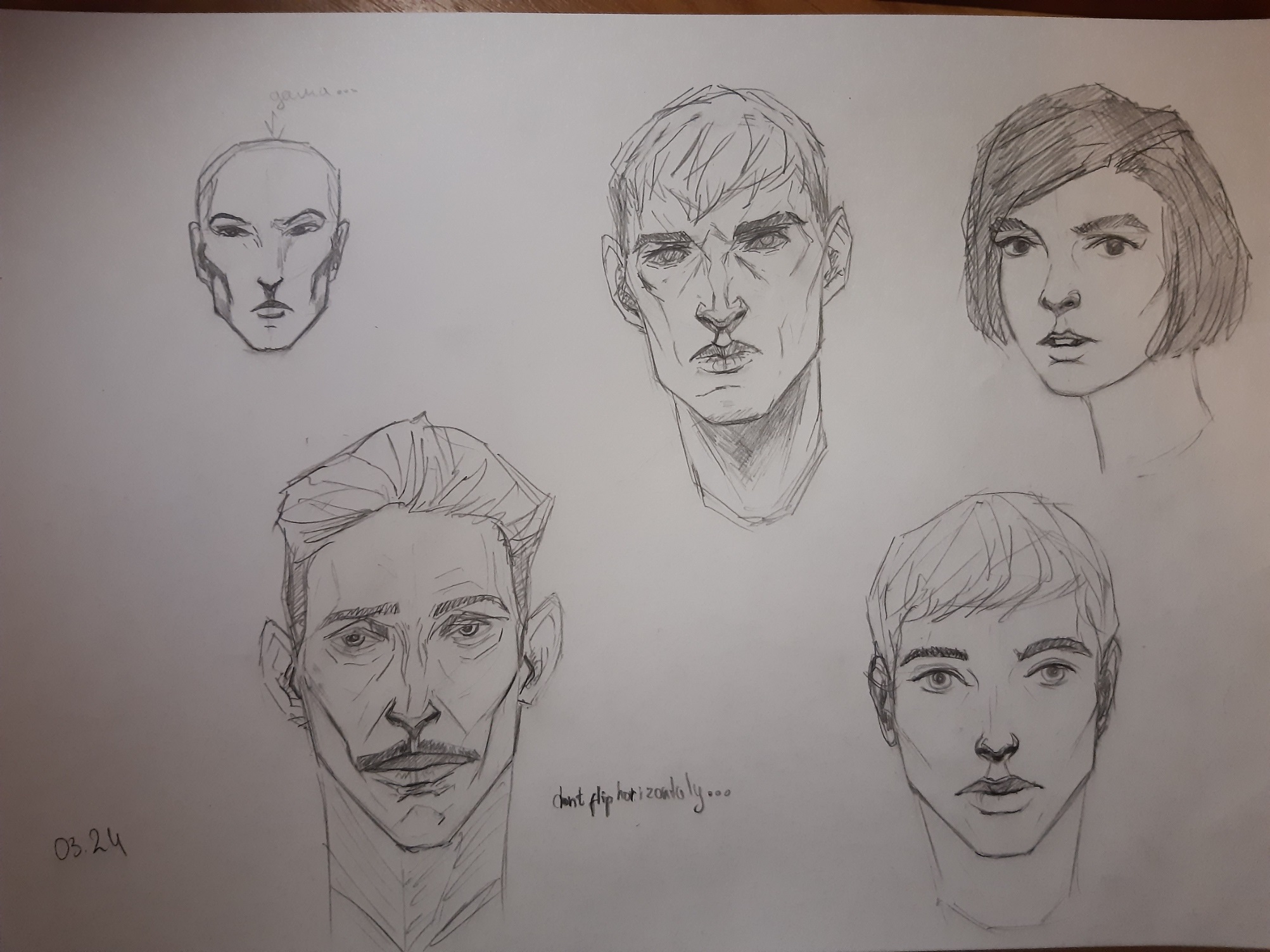
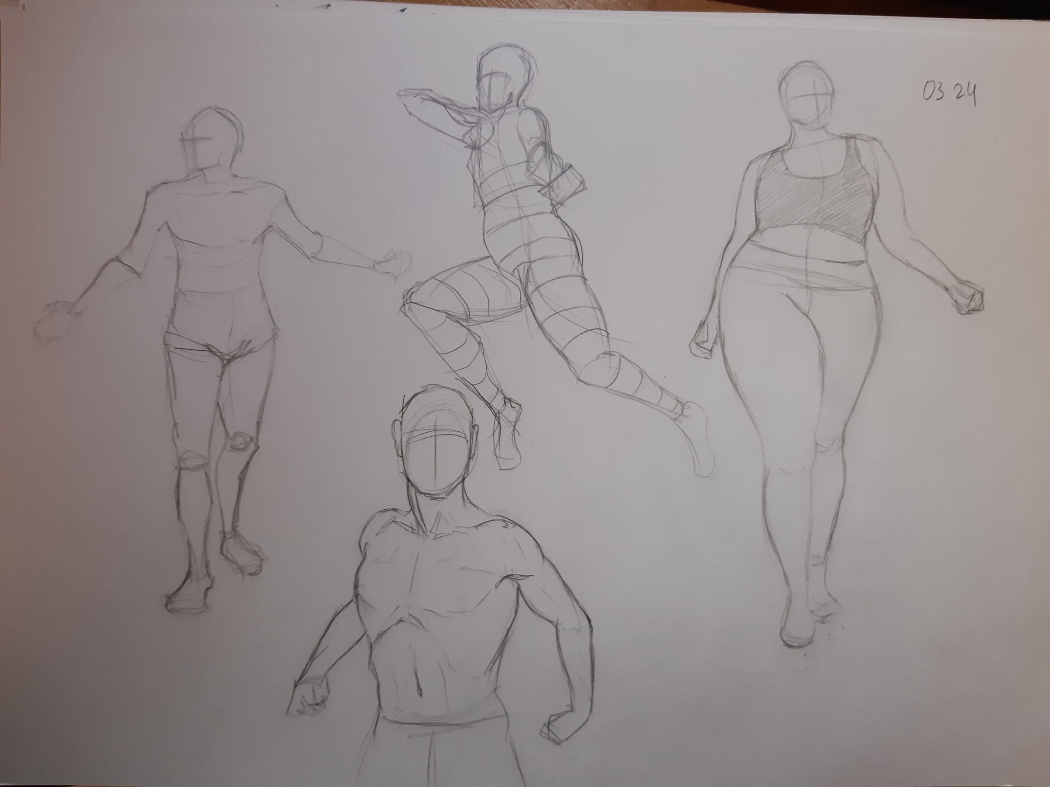
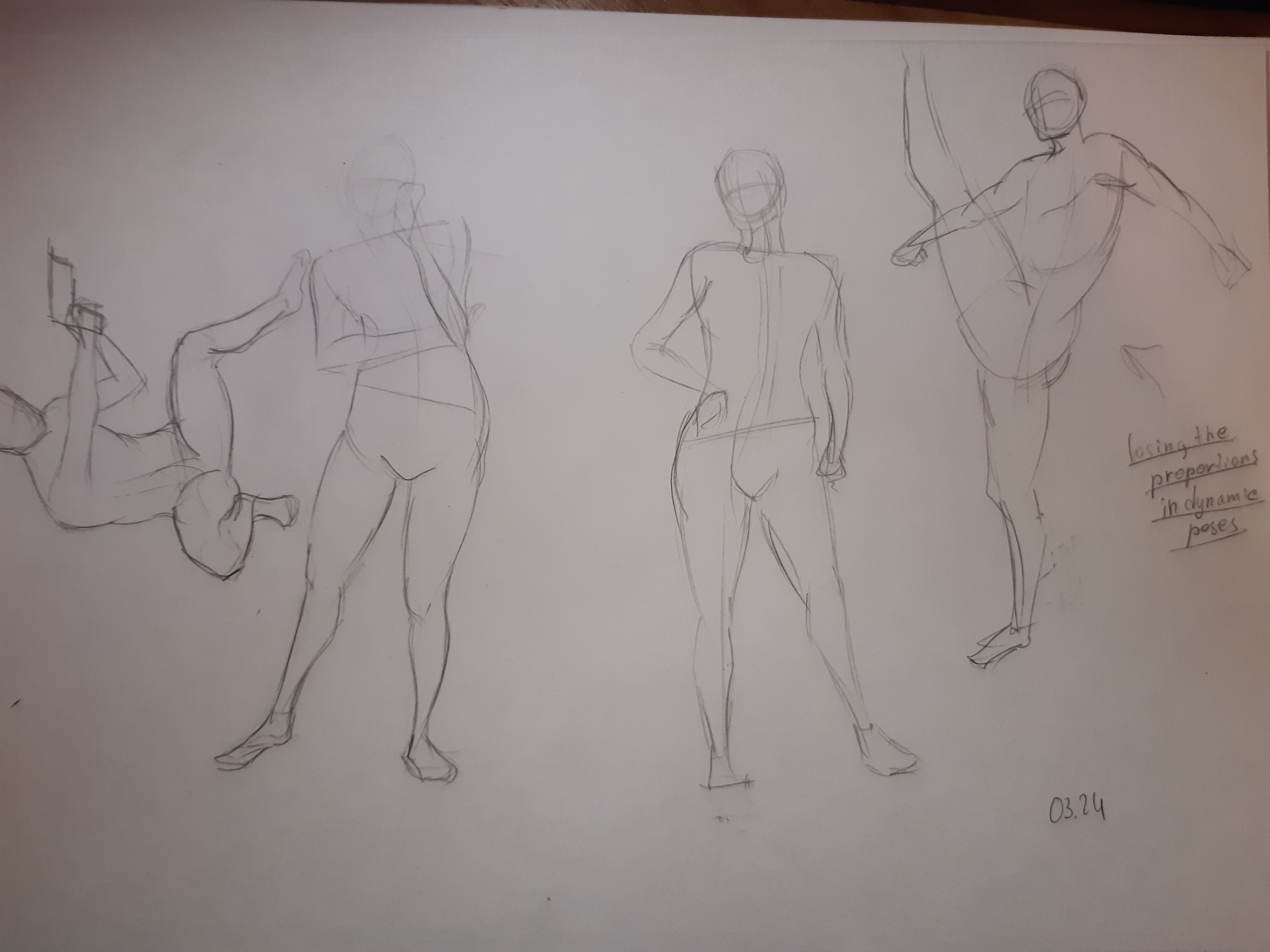
This time i worked a lot on paper, especially with human body and Especially with faces. Also i did one more icon for my portfolio. It's unfinished and I'm looking for your advices. I wonder if this kind of rope i did on my scroll is fine for putting in game? It looks not that good, but from user side that will see this icon in much smaller scale, i guess, it looks decent? Hope anyone here that worked on such icons can tell me.
Icon
Still life that I tried to make more edges merged
Paper time
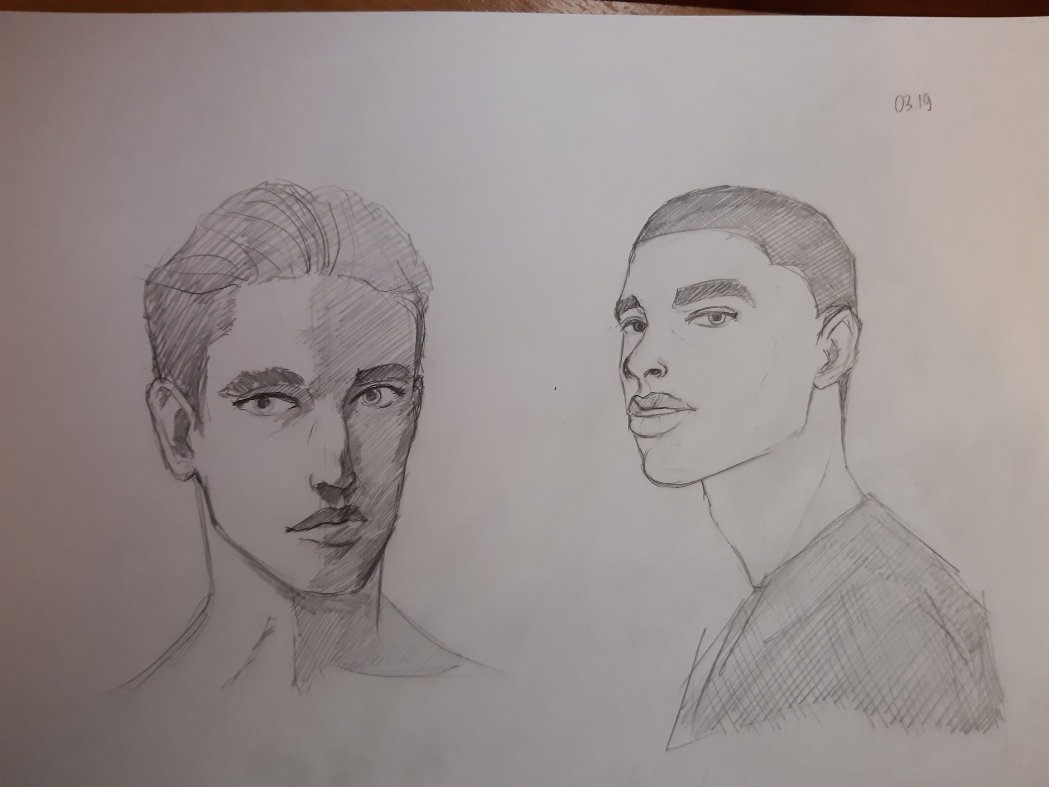
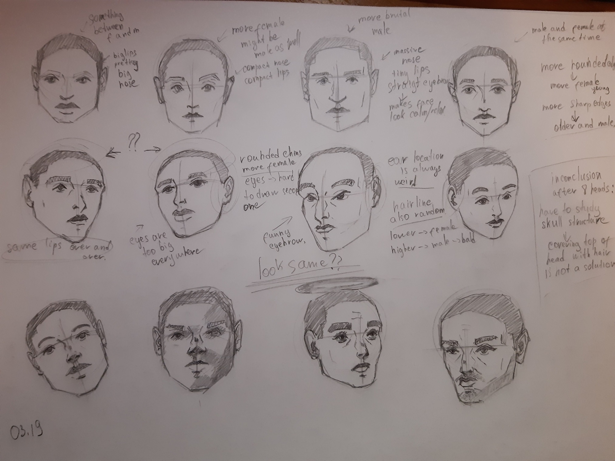
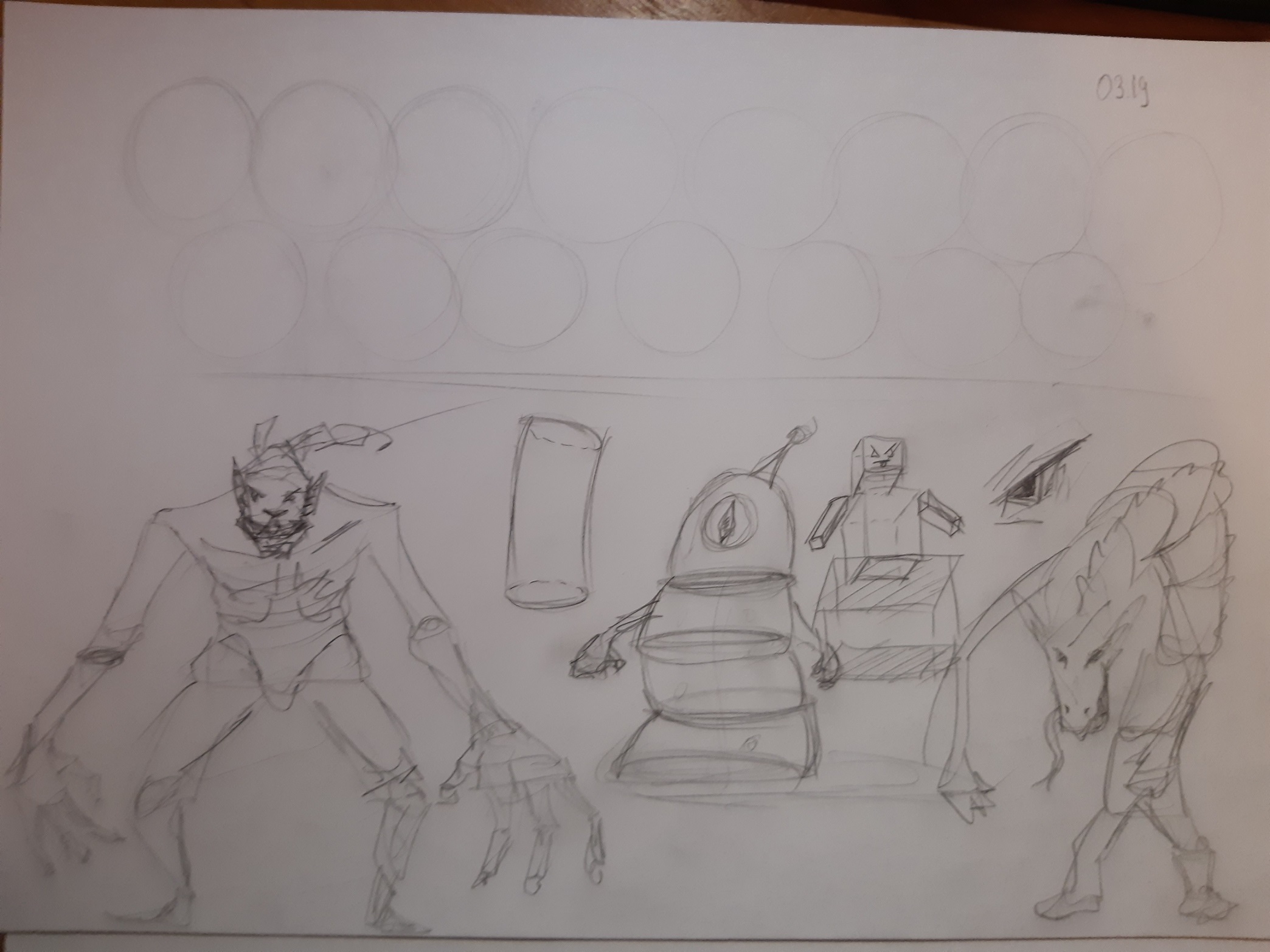
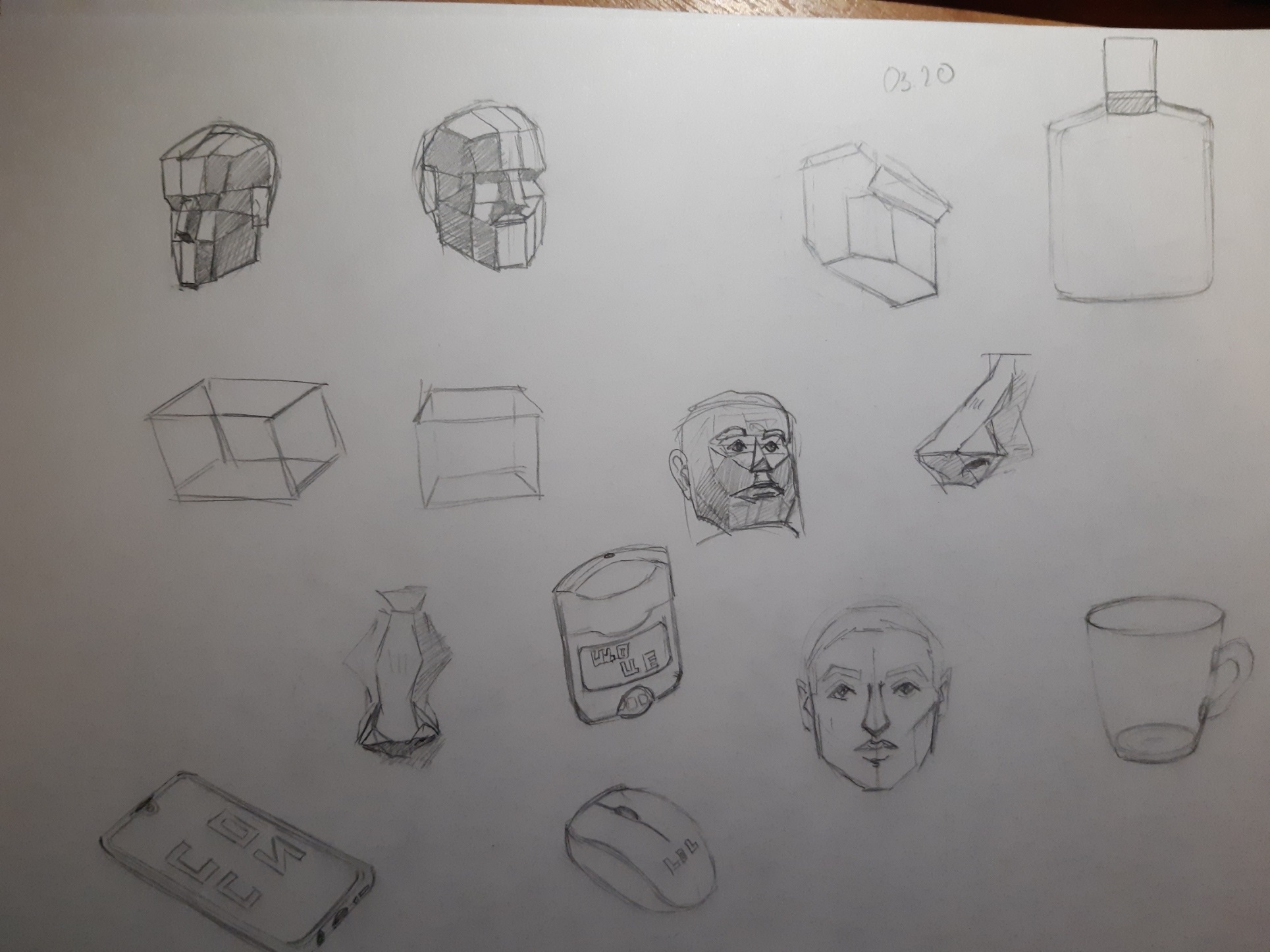
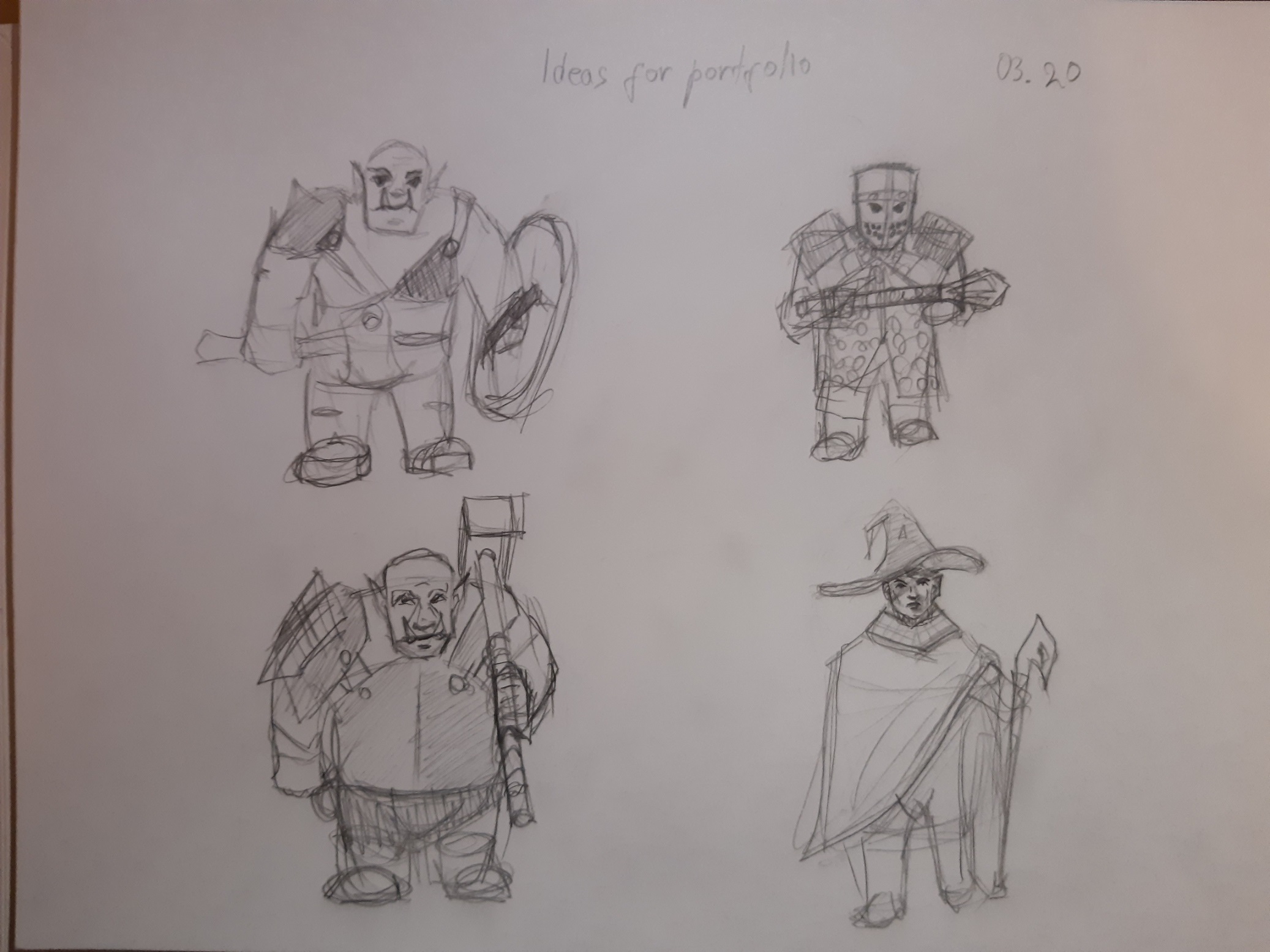
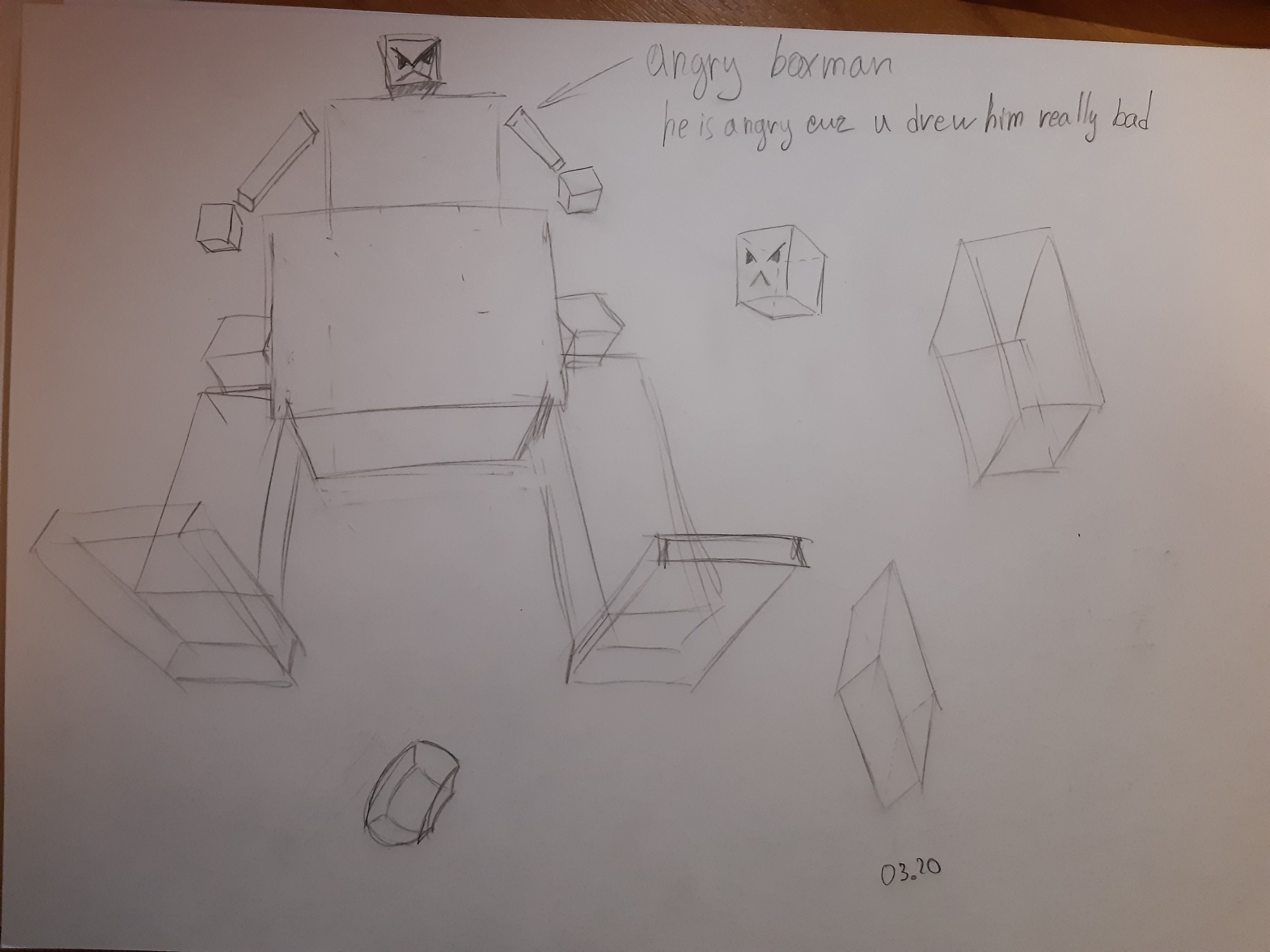
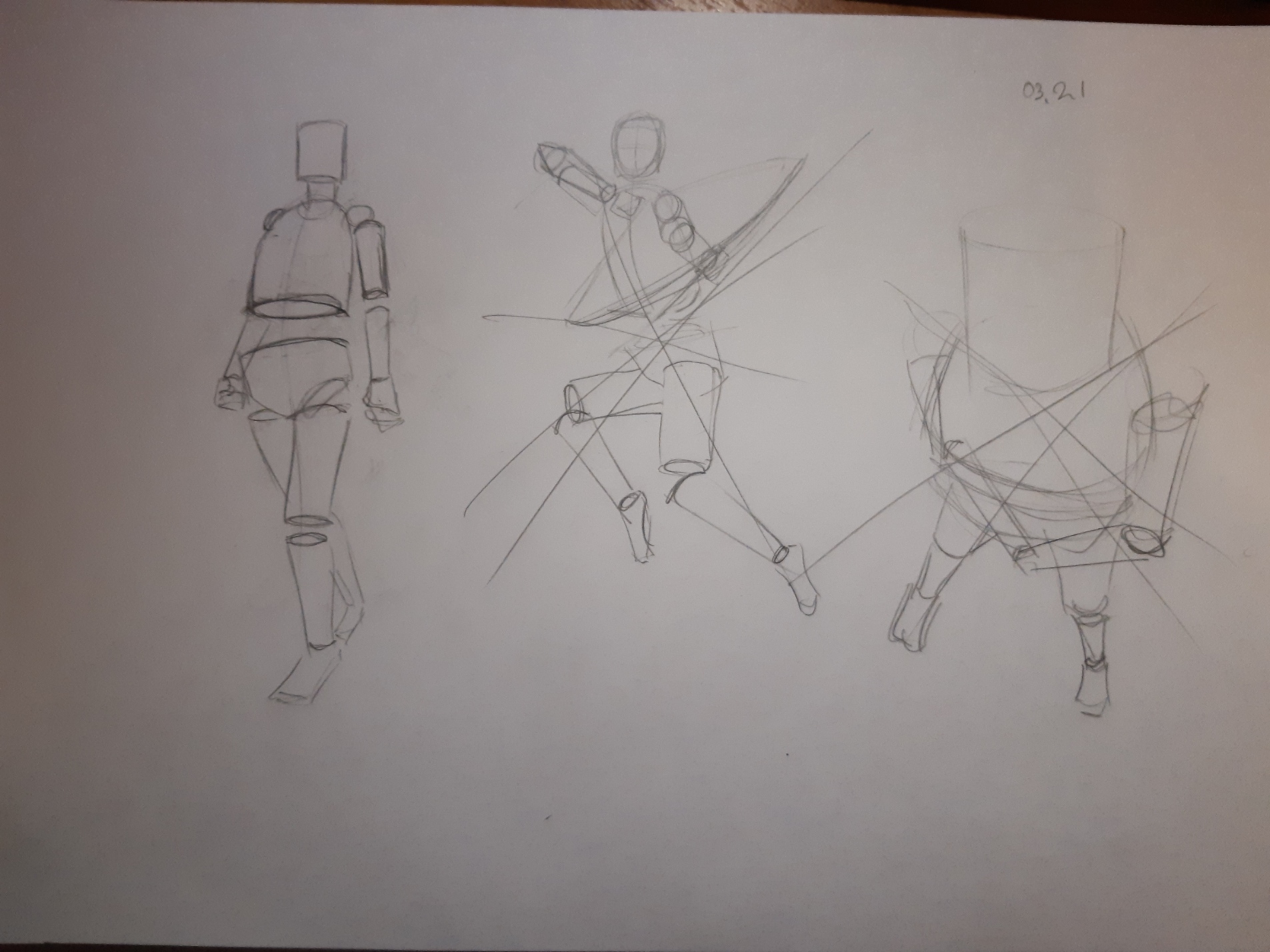
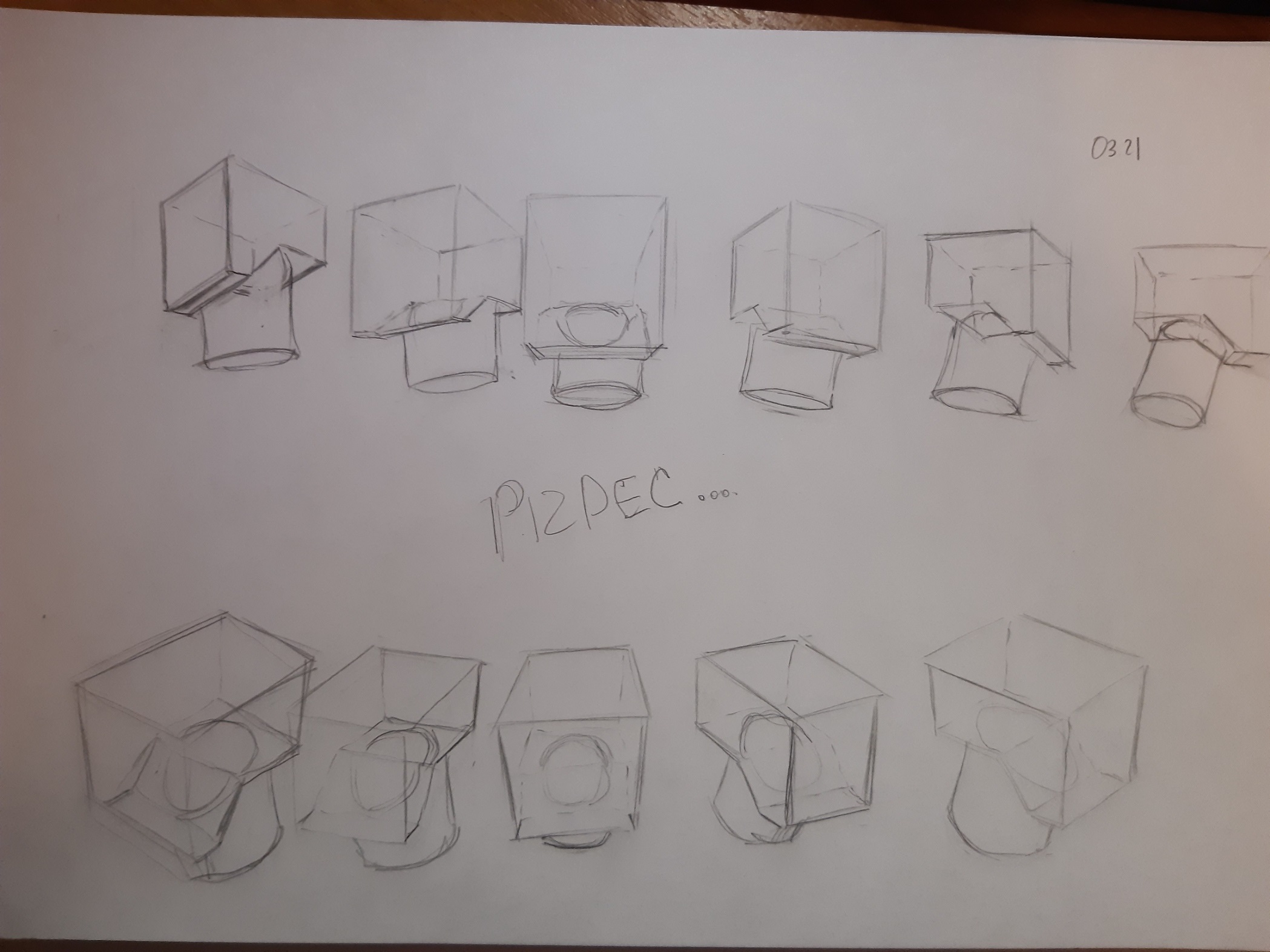
Posts: 3,357
Threads: 37
Joined: Aug 2013
Reputation:
234
Push yourself you want to show your best work in your portfolio if you feel you let yourself short that only you who get penalize.
Posts: 56
Threads: 0
Joined: Nov 2019
Reputation:
16
Quote:Delorias@Who Thank you for your advices! I'm actually not sure where I can make edge blurry except for the shadows. I'd like u to look at new one that i did recently.
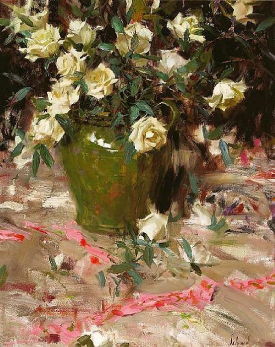
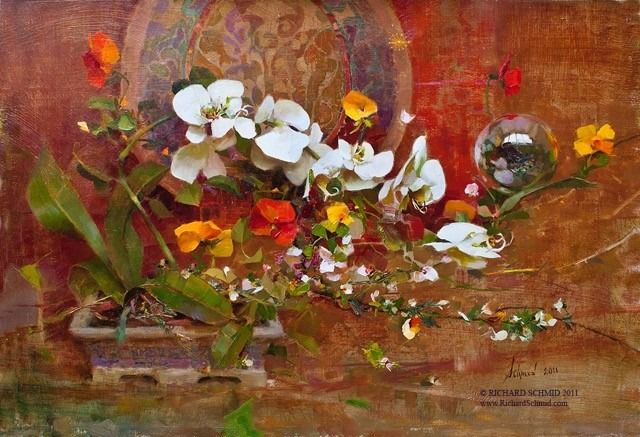
Here's a short article on some ways to use edges that may help you decide on edge variations to try in various situations. I think the majority of the decisions on how to treat edges in each painting really comes from your own aesthetic preferences and choices, but there are some general 'rules' like hard edges come forward in space, soft ones drop back. Hard edges draw a lot of attention softer ones allow rest areas to balance this.
https://www.muddycolors.com/2017/07/10-t...out-edges/
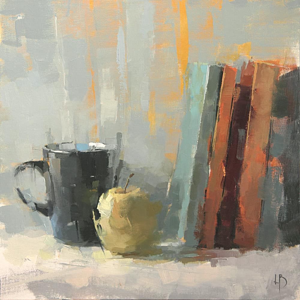
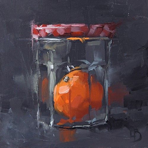
I like the iron painting you did, personally, much better than the other one. don't be scared to try go even bolder with edge variation if you enjoy a more loose 'painterly' presentation. I'm going to drop some examples here to look at. In general note the variety and rhythm and placement of the edge choices made by the artist overall, but also look at how they treat every edge on a single object. You'll notice quickly there is a lot of variation that drives interest but also, how bold they can be in really losing edges not only in shadows but in the light, and still retain form and the naturalistic overall visual impression without having to render everything out. See what you enjoy. A good way to learn to use edges is of course to observe/study various approaches on some high quality work and then experiment on your own paintings.
Posts: 12
Threads: 2
Joined: Mar 2021
Reputation:
0
@darktiste You are actually right. I somehow forgot about such a thing, was focused on invisible process in studio. Thank you.
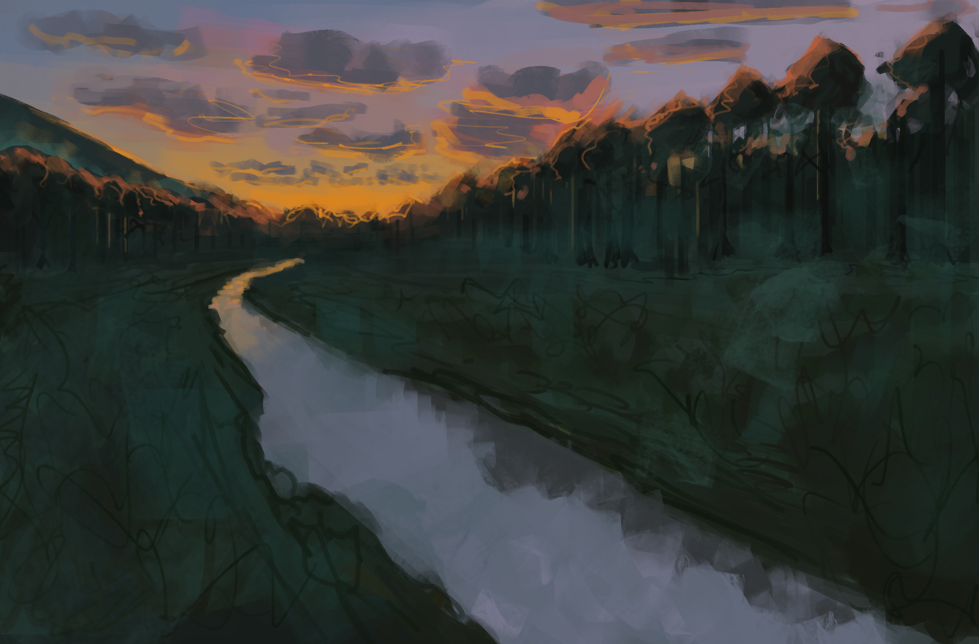
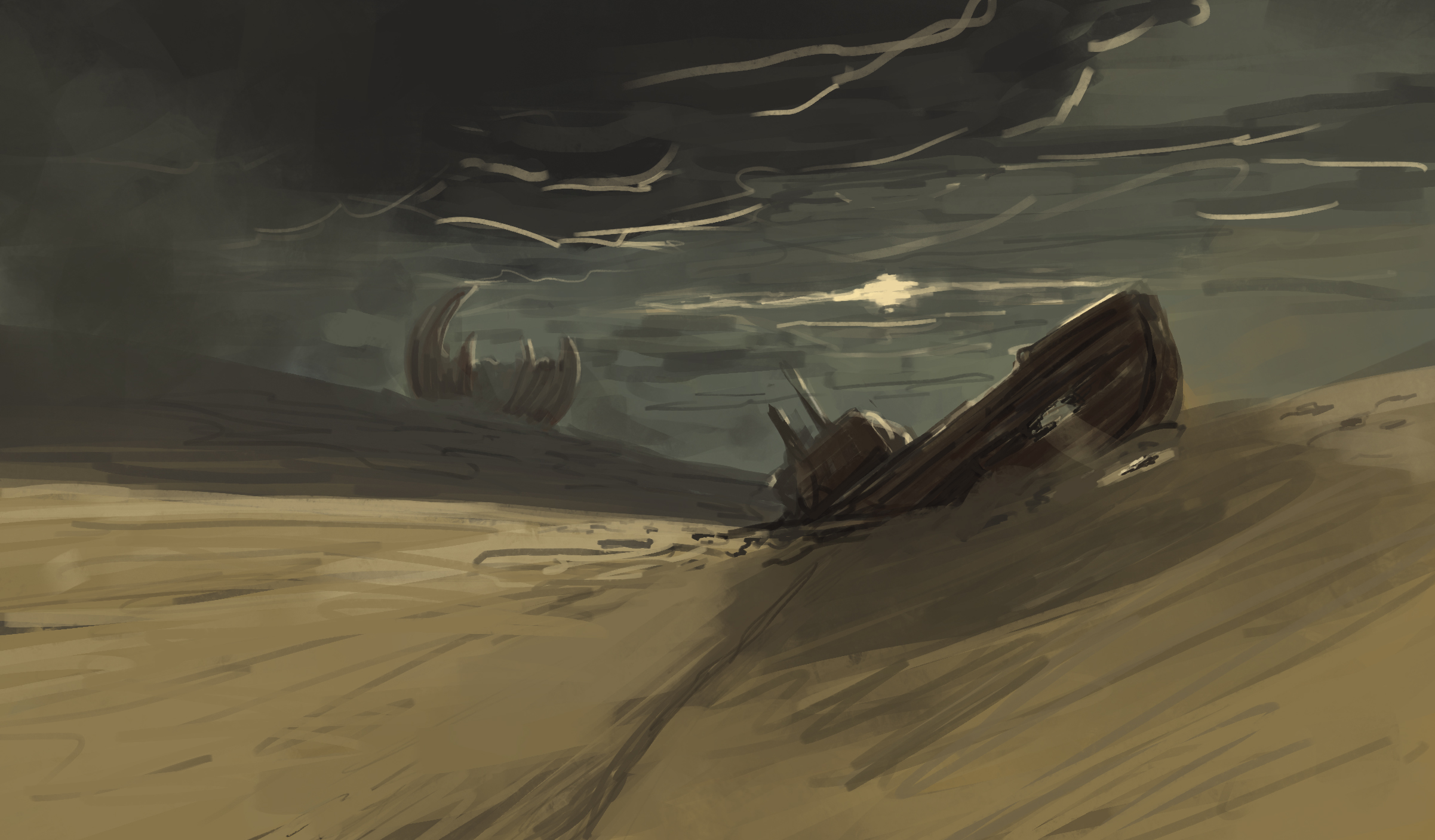
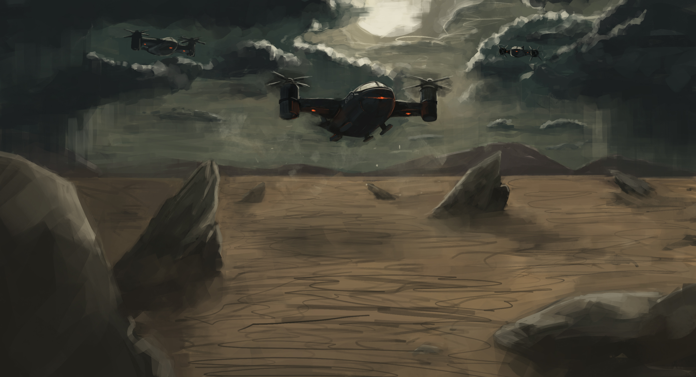
@Who Big Thanks for this material and examples. I was trying to implement this in my works, this time in environment sketches. But somehow when im being focused on edges the shape of object getting lost because of my weird brush strokes.
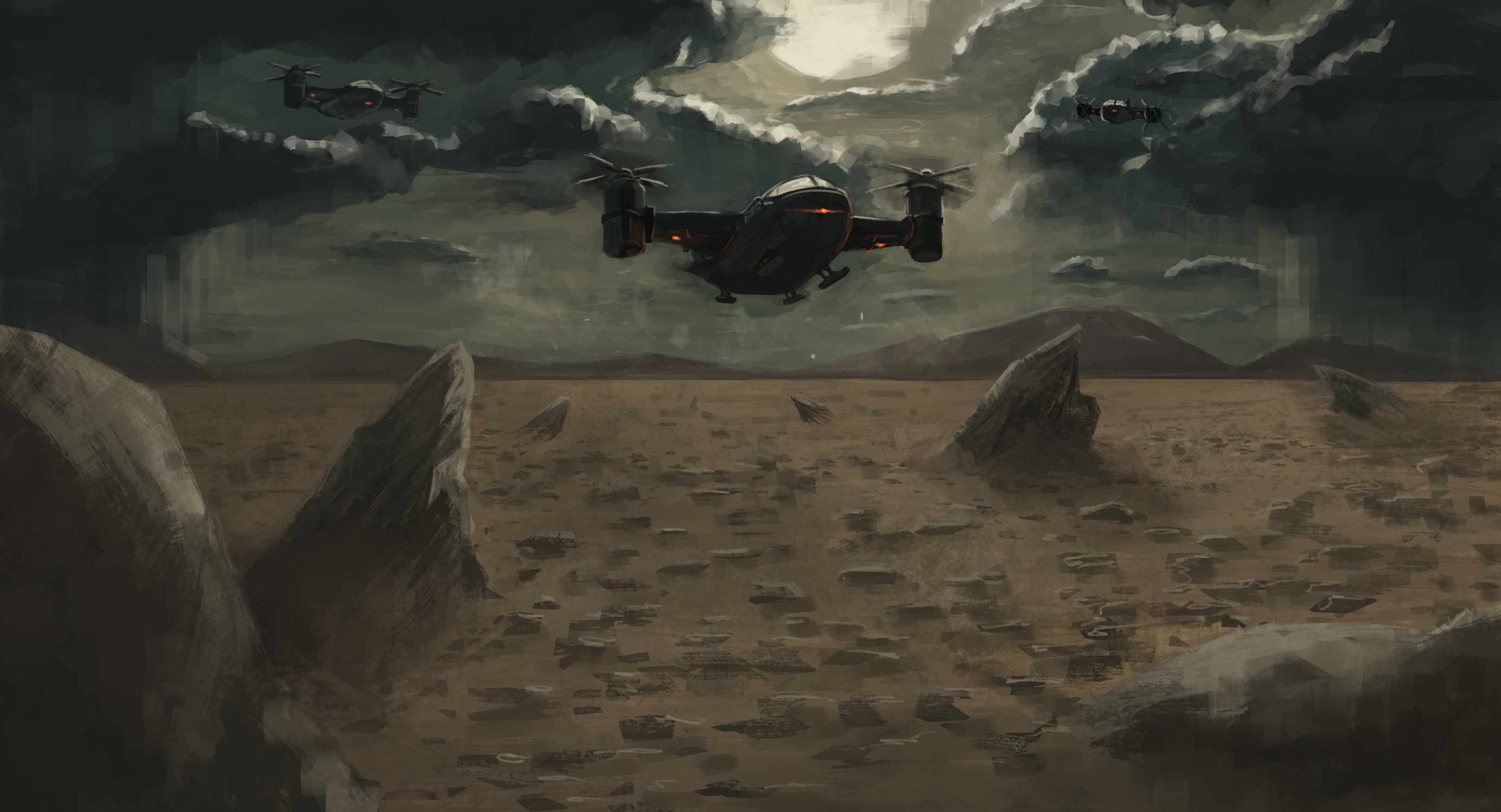
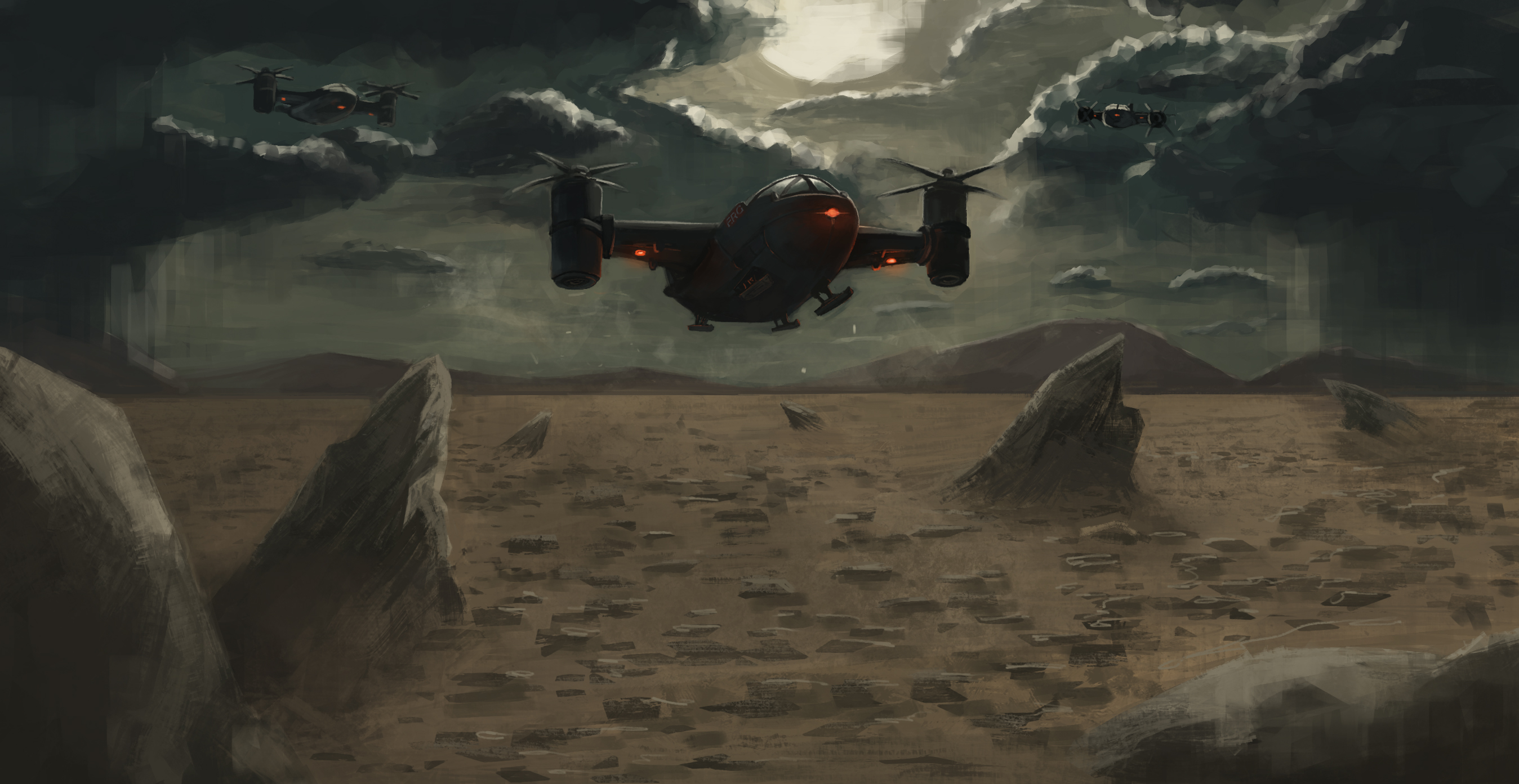
Some environment sketches from imagination.
Posts: 12
Threads: 1
Joined: Apr 2021
Reputation:
2
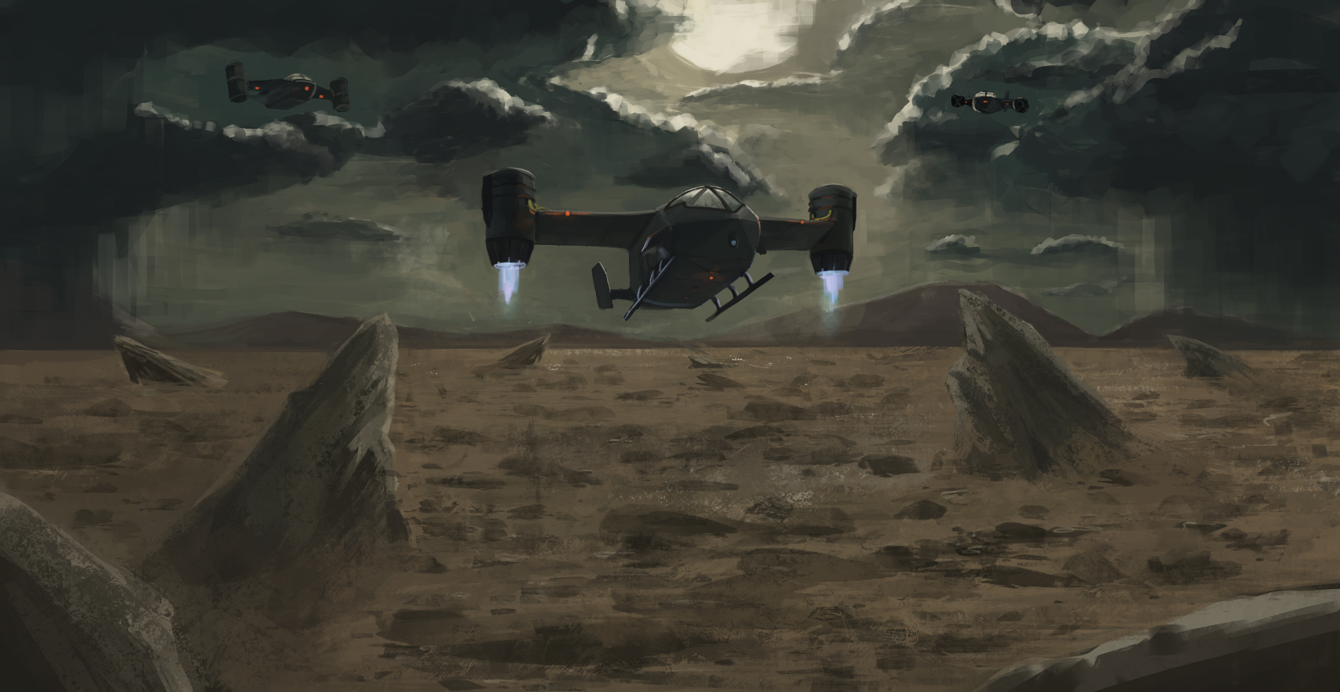
woah what a difficult study. the lighting in this one must've been a bitch lol. Still, I like your idea with the downward strokes stemming down from the clouds, it's a great solution that I think is slightly obscured by the jagged portrayals of the cloud highlights. I can't provide any advice on rendering the lifted dirt around where the plane is landing, but something looks off to me. Let me know if you do studies on this because I need to work on this as well.
The rendering of the plane is easily the most successful thing here, you did really well on the body especially, love those slight reflections of orange light.
Posts: 12
Threads: 2
Joined: Mar 2021
Reputation:
0
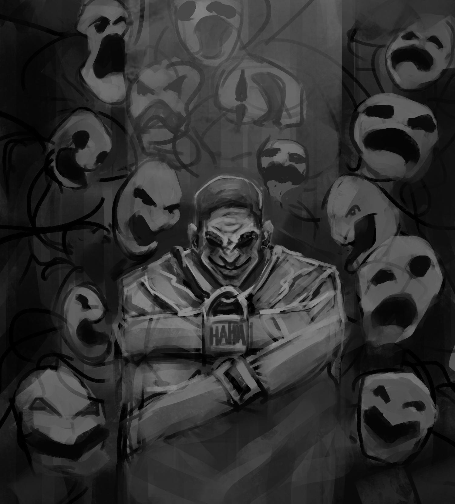
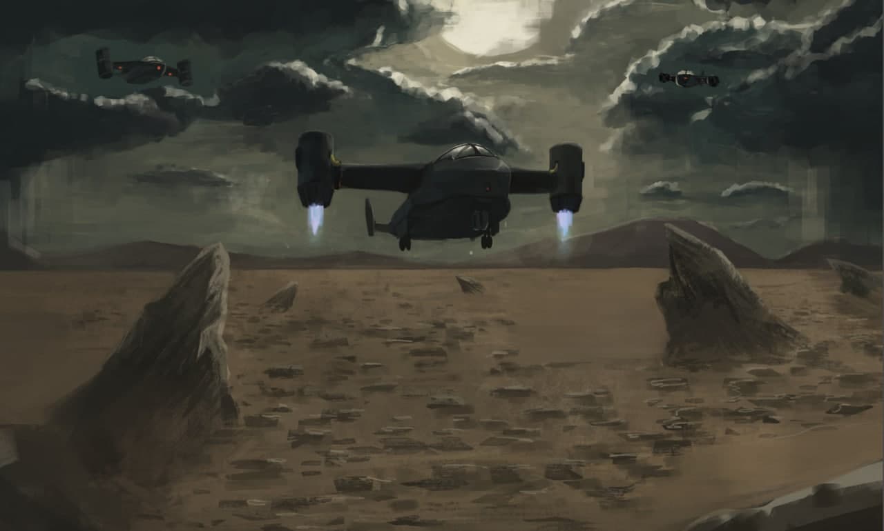
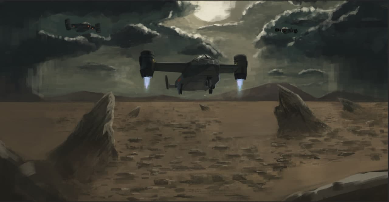
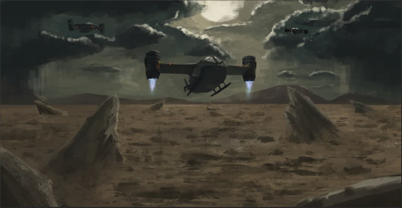
@daschign Thanks for visiting my sketchbook! I can't say that was a study, I actually just expressed what was in my mind. Yeah I wasnt rendering it too much, but currently working on this last peice, want to finish it. Right now it seems like fighting. Will show my process here. I can suggest u to do such a studies (let's call it like that) because it's fun. Personally dont use references in those, so it makes it even more fun for me.
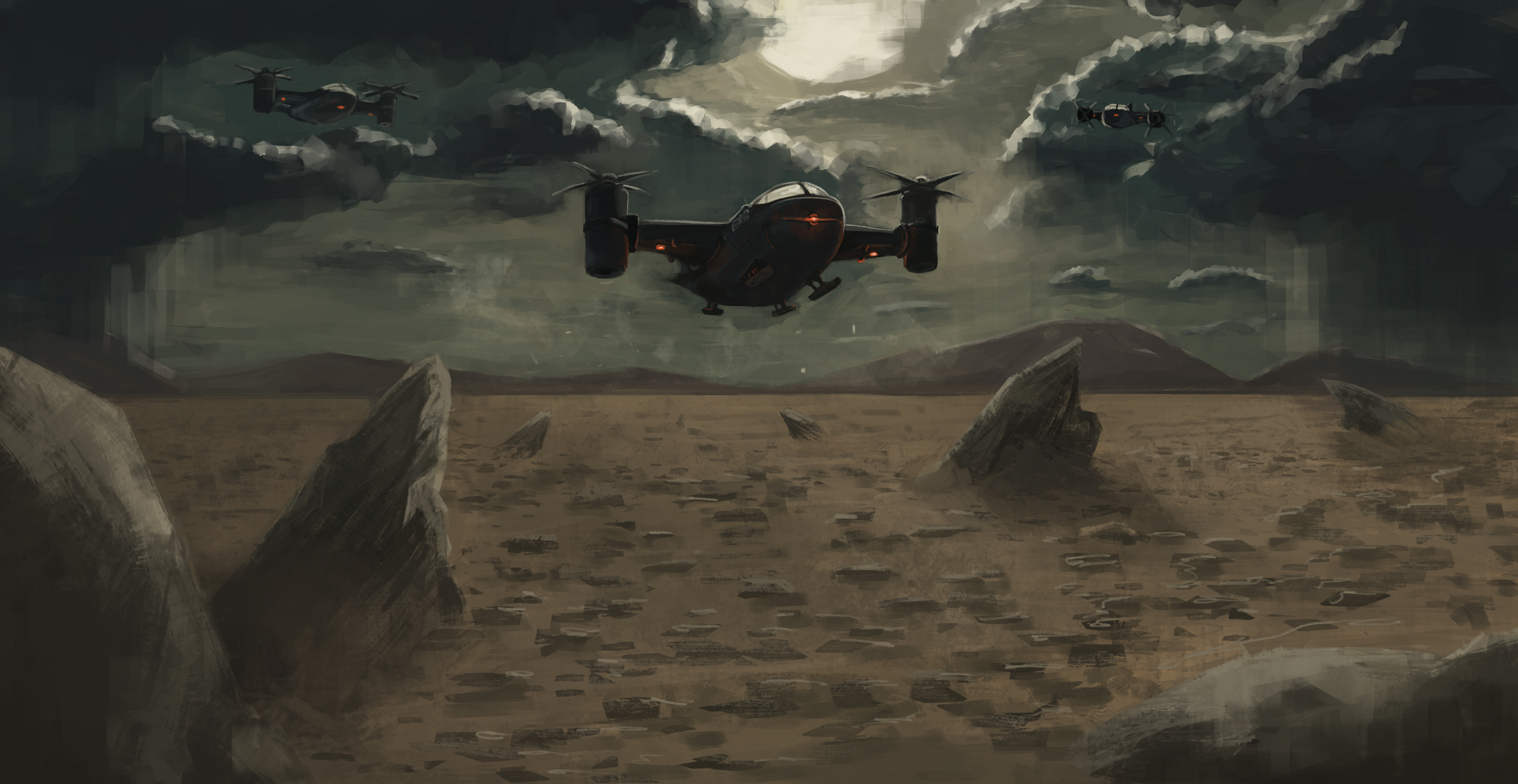
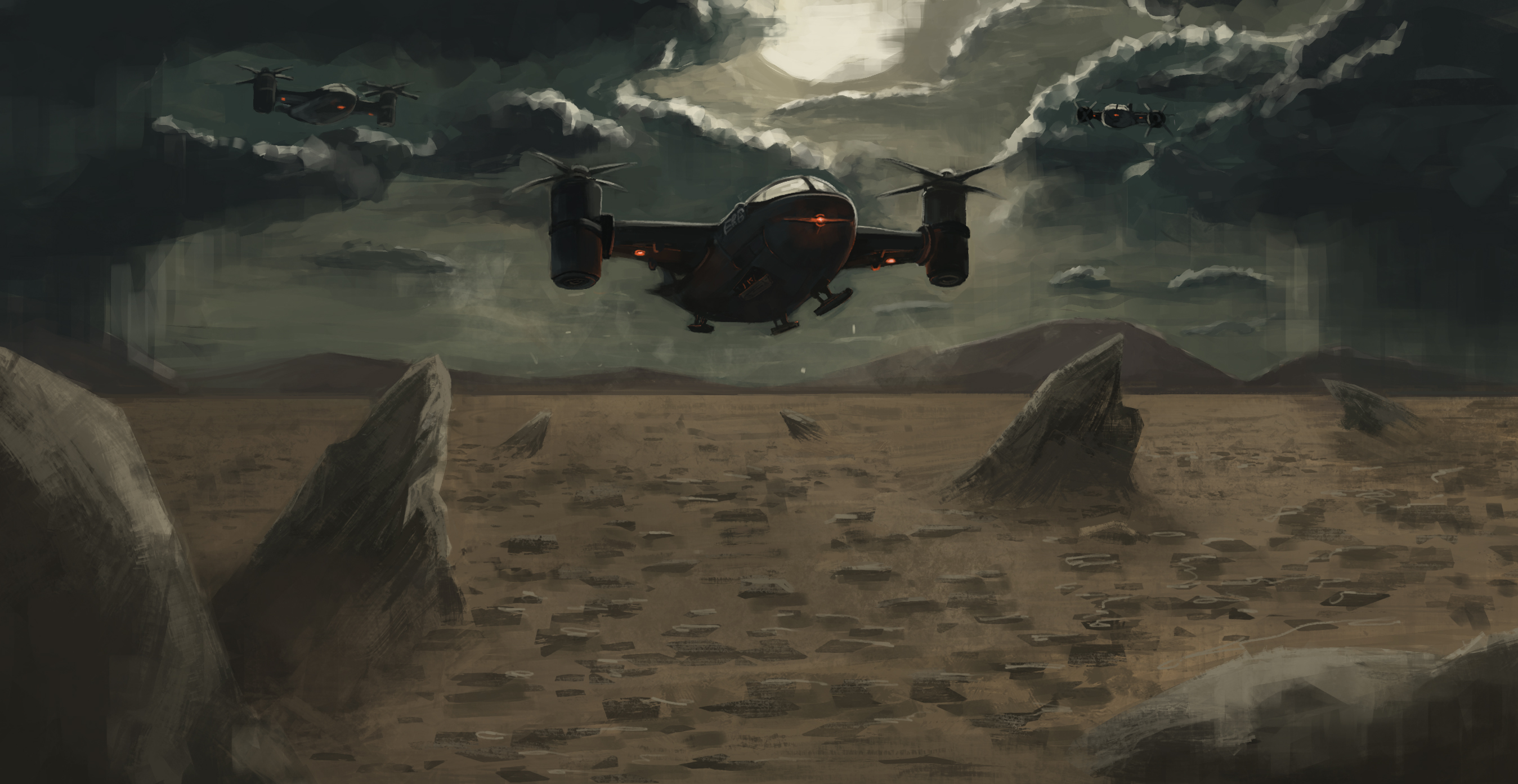
Just a small update
Posts: 1,076
Threads: 4
Joined: Jan 2016
Reputation:
43
Nice work with the most recent updates especially, loving those environments. They all have a dynamic feel, and the lighting is on point! Loving the new Joker image as well, very curious to see how it develops!
Posts: 12
Threads: 2
Joined: Mar 2021
Reputation:
0
There is an update, in this one I also want to share my thoughts about things I figured out, what if it might be useful for someone?
There was the main issue on the previous week: drawing portraits. From starting one I figured out that 1) I have no clue what is happening on a face, even though, I understand the shape of it 2) while drawing it my brain kept turning off and I wasn’t analysing what a hell am I doing.
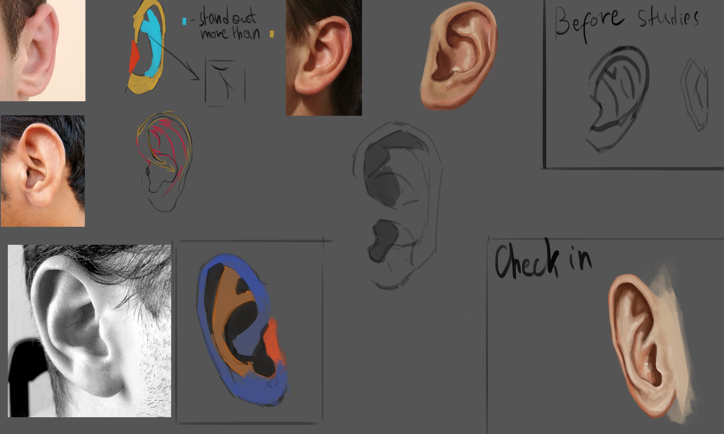
First issue as I think, comes from the fact that even though I understand the shape of the face, I don’t understand the element on it. I even didn’t even know how the ear looks like, I was just drawing “something” not the ear. You can see it in my study of ear, before starting I just drew how ear looks like in my mind. So the goal for next week is to study the elements of the face to not be embarrassed as I did with ear.
Second issue was, I believe, solved with help of forum. In Dimensional-knight’s sketchbook, they pointed about increasing the accuracy of lines in drawing, while you use reference. JosephCow showed the way how he analyses the reference, what he is drawing, and it helped me to figure out that I actually don’t even have any kind of approach to analyse the reference. THE REASON why my brain kept turning off was because my brain didn’t have instructions to work, lol. It might be obvious for someone, but it wasn’t for me till now. SPECIAL THANKS TO JOSEPHCOW, if you will ever read this! So from now on I will try to use his approach and with time I should figure out what is working for me and not.
Now about the things I have done.
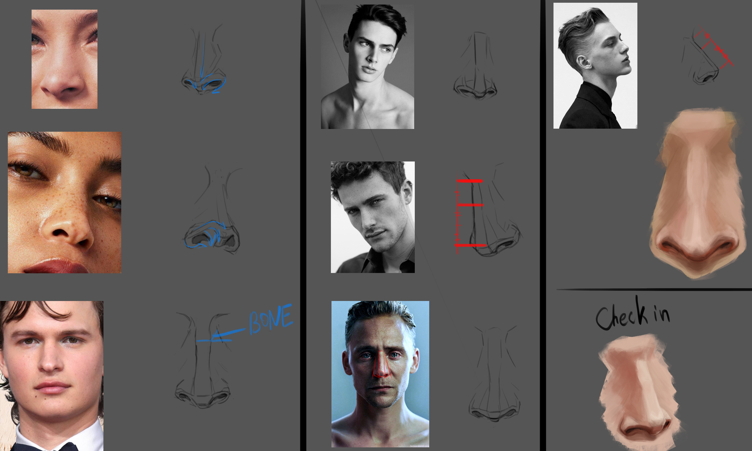
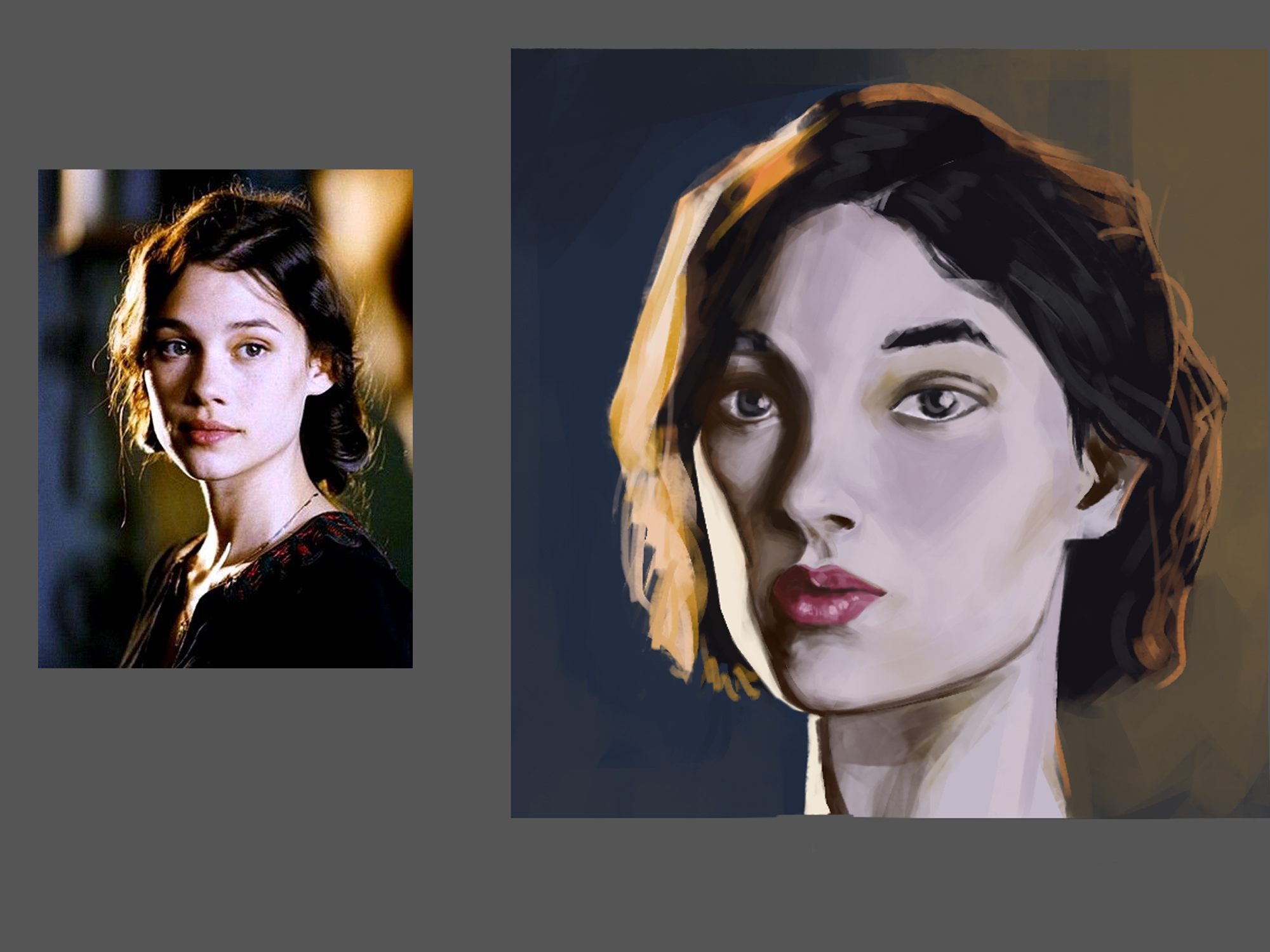
With face elements I started from Nose and Ear. I tried to do quick studies and then check in everything I learned. Works nice, should have done it a long ago. And the portrait study that started all of this.
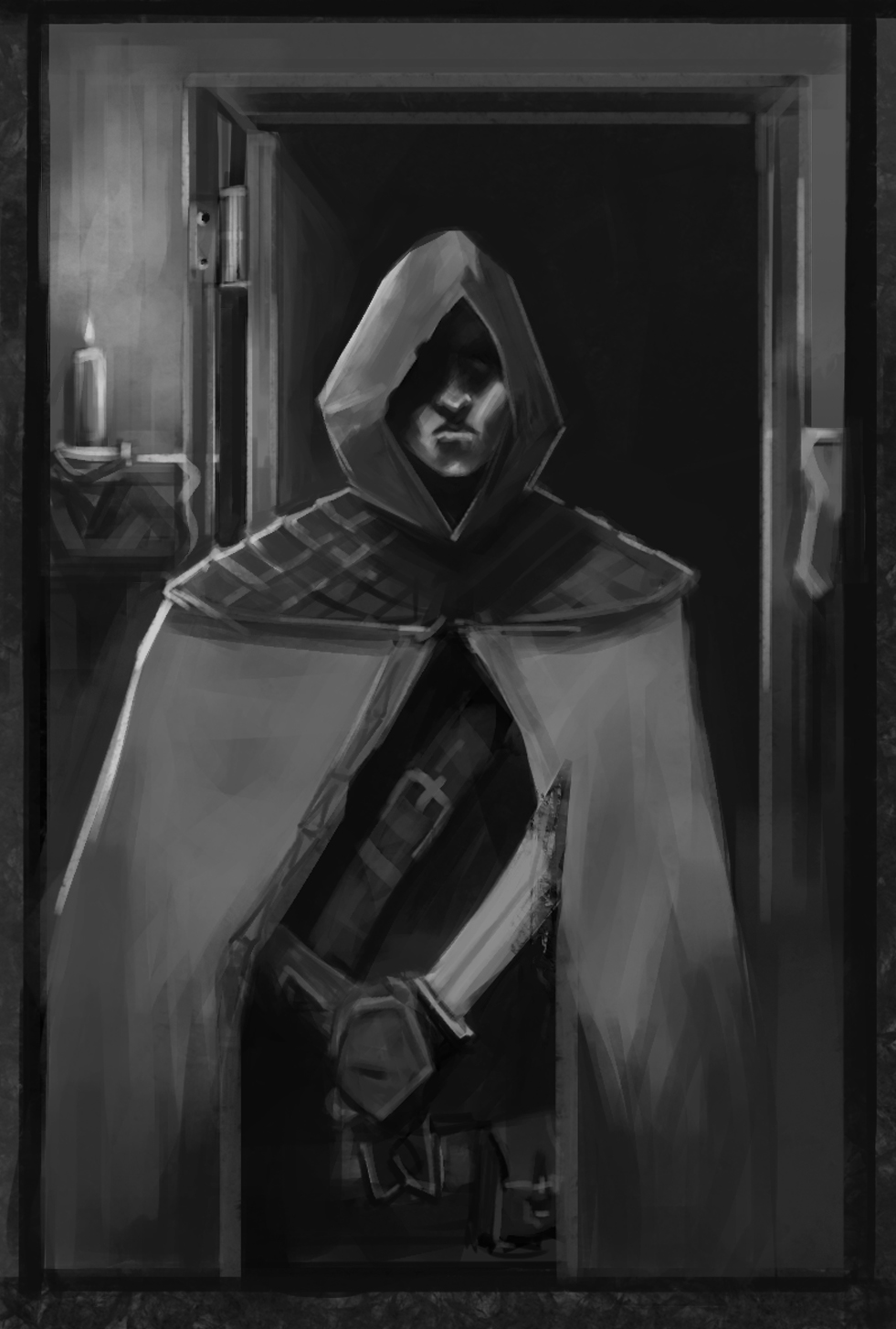
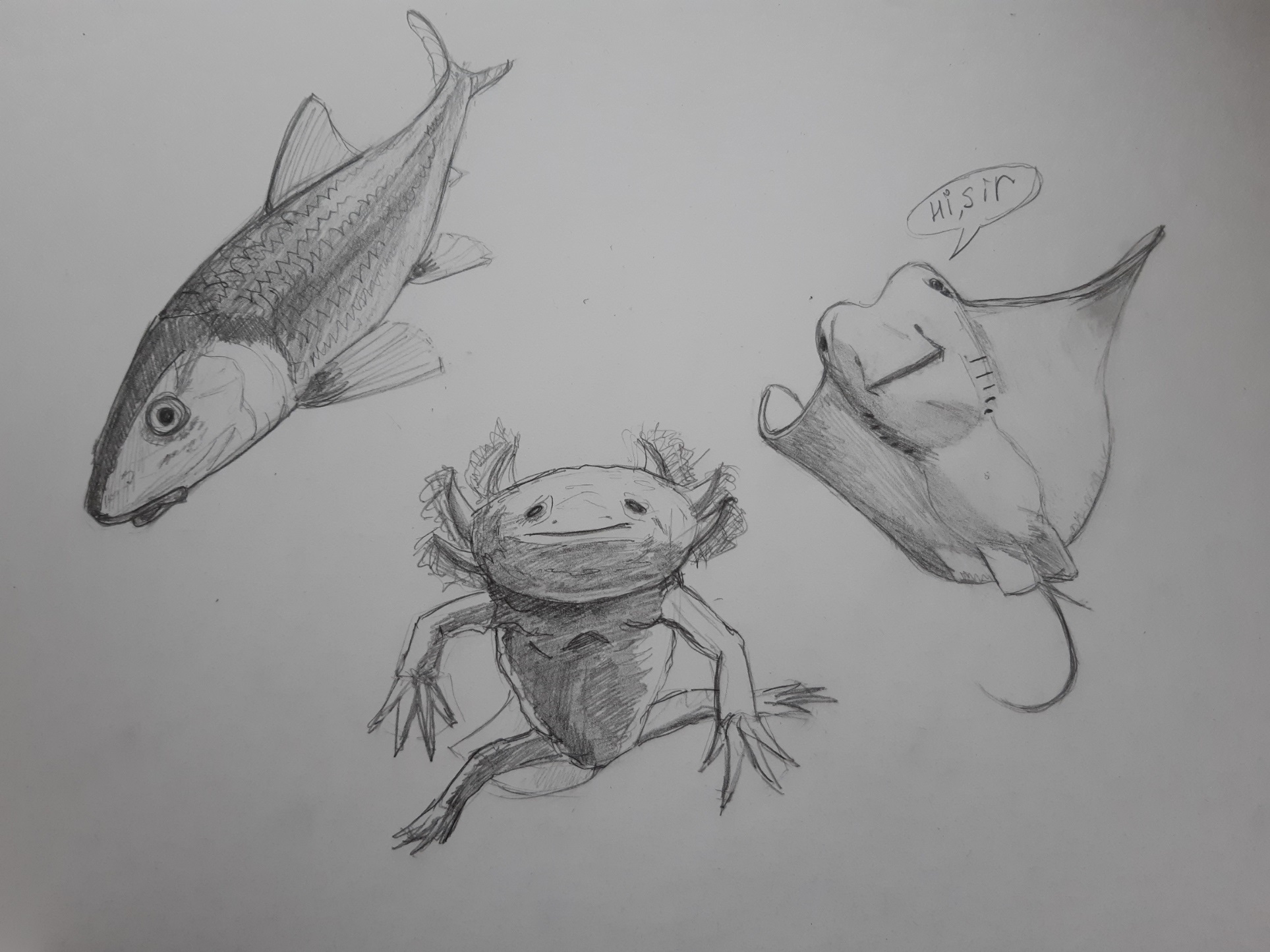
I got inspired from cgmythology and dimensional-knight sketchbooks, so I did a sketch of card looking illustration and was drawing funny fishes.
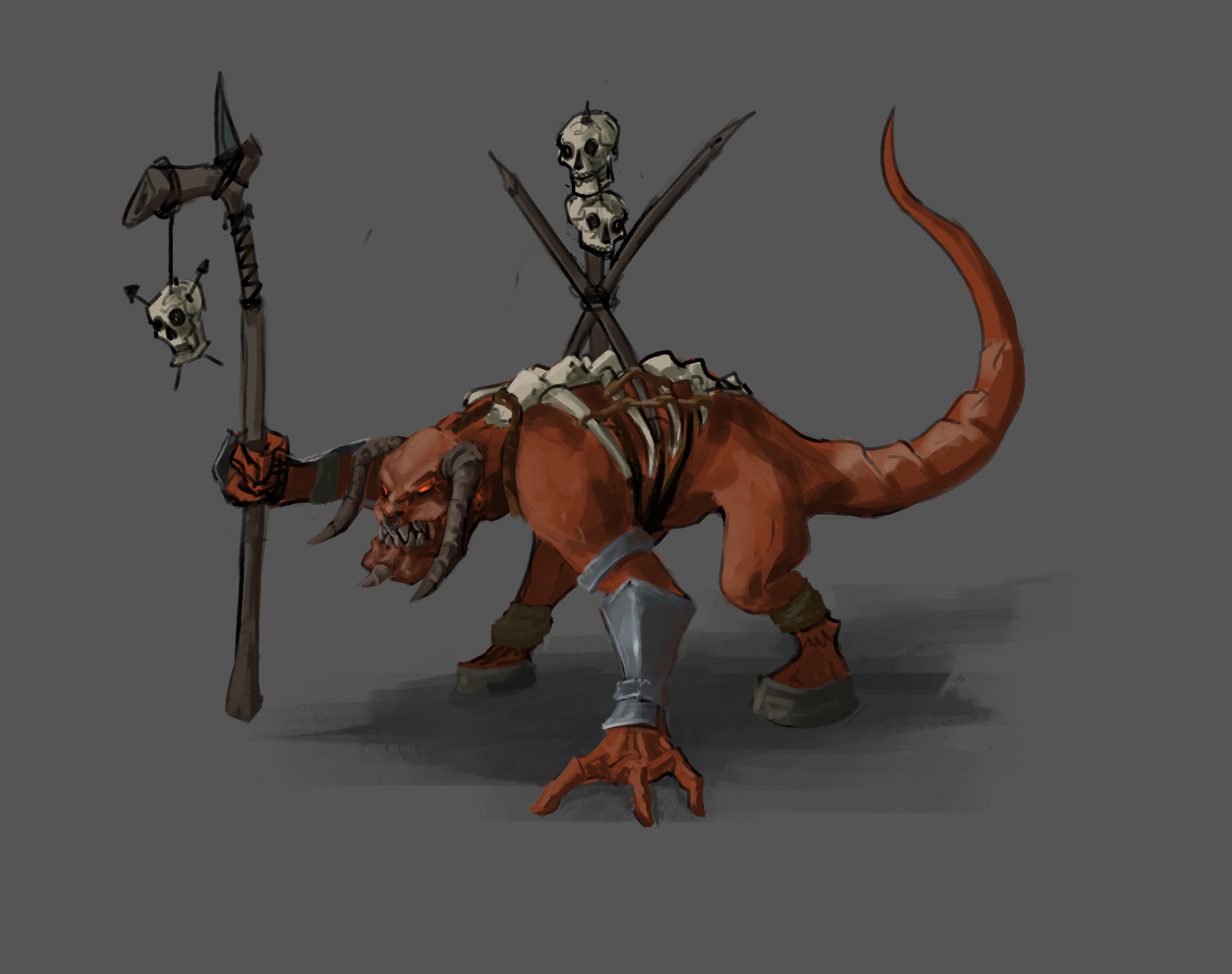
Weird looking sketch of something? I guess it's from heroes 5.
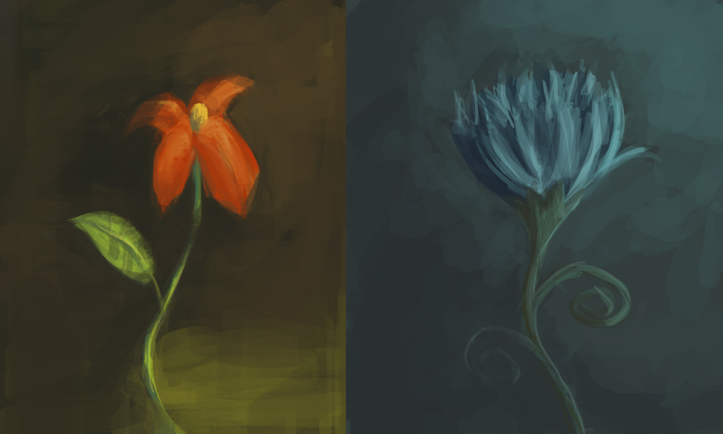
This flowers are just an expression.
Posts: 56
Threads: 0
Joined: Nov 2019
Reputation:
16
Hi Delorias, I was going to respond directly to your pm, but figured I'd post stuff here because it may help some others. Joseph's write up was a good rundown on various approaches to developing greater accuracy so good on you for taking it on.
I'll pop in a resource and an example of value grouping or value massing that you asked about.
This video from Dorien Iten is worth a careful watch. Explains much more in depth on some academic approaches, but very simply and well explained.
I recommend you also have a look at the free to download "Accuracy guide" also by Iten. It's a good beginner's look into some atelier methods for judging angles and proportions.
Your portrait attempt was nice, but I think a more structured approach can help you get to a better result.
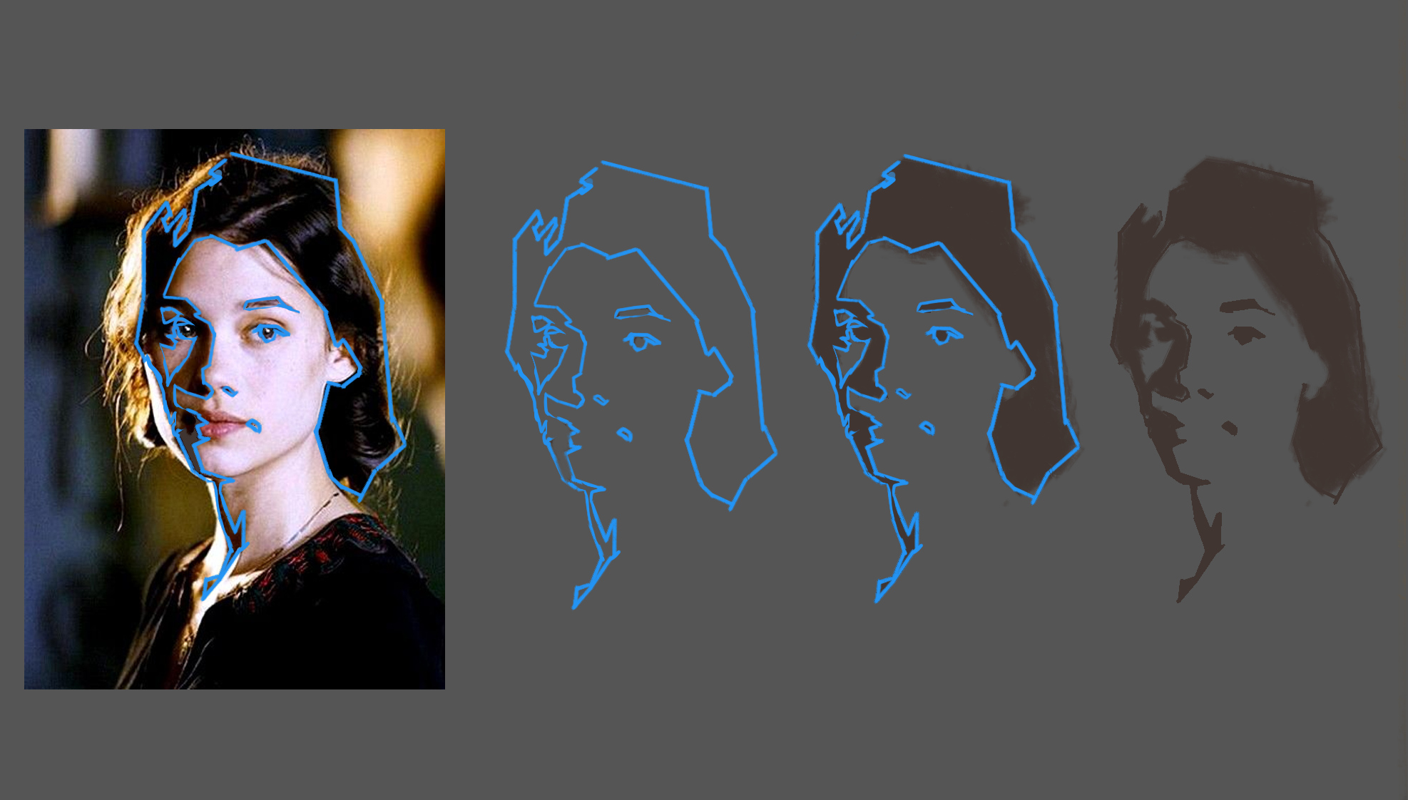
The key idea, is simplifying the values into two "families" or groups of Shadow and Light (or Dark Values and Light Values) to begin with and finding where those shapes are and refining them before going too far with modelling with more values. Iten's video above has a great demo halfway or so through.
One way of helping you judge these irl is at first to squint the eyes which reduces and compresses similar values into blocks. The equivalent digitally would be by using a median filter. I see people use Posterise filter to do this but I think it makes for far too detailed shapes and loses all edge quality.
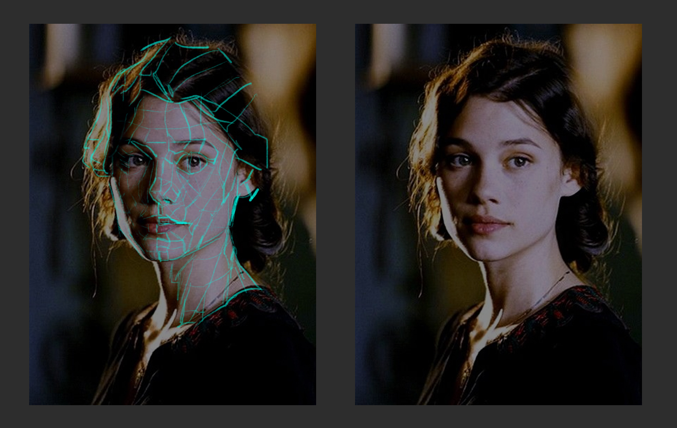
Drawing shapes that enclose the dark value family. Note that the shapes I've chosen are quite detailed, to get to the point quickly, but in practice, you really tend to start with more simple big angles and shapes and then refine as you get those relationships correct.
Filling in the dark value family into a two tone image. You can see how quickly the basic information describes her features.
How to go on from here, well you gradually add more halftones (values in the light) and dark tones as you need. Iten's video will go over that so I won't bother.
Finally checking the overlay ontop of yours, may be helpful to see where you went off. Handy if working digitally to check after the fact, but I wouldn't use overlays too much as a crutch as you work. You want to actually train your eye to become more accurate intuitively, and also, a reminder to keep checking and keep measuring as you work. Never assume any thing is correct without checking it if accuracy is your aim.
These kind of studies are great to do in traditional/pencil etc as well. Digital has a lot of crutches we can inadvertently use that make it easier than it actually is and as such we don't grow quite as much as we could.
So this is essentially a method of "flattening" of the form into basic shapes to help you see. How do we place those shapes accurately though? Well one way is to keep measuring angles and comparing proportional relationships until you get them right. The advantage of this method is it really trains you to observe patterns as they are, and get over the tendency to draw symbolically. For example your eyes are drawn symbolically, what you think an eye looks like, when actually the proportional shapes are very different. This happens a lot more with faces ofc, but good to keep in mind.
Another method we see a lot of is to use construction methods to lay a simple framework upon which you then start placing shapes. Any construction method can help. I tried a bunch for heads for example (Loomis, Reilly, etc) and mostly end up using a mix depending on the situation or just jump straight into trying to get the visual impression. It depends on many things, the medium, the subject, the lighting, just whatever helps me solve a particular problem. It's personal preference really.
Some thoughts on trad studies since you asked. Please keep in mind that doing more rigorous academic training may not be worthwhile depending on your aims. I personally love immersing myself in it as I have the opportunity now, but it doesn't necessarily help you to be more creative. It basically gives you a solid process and more rigorous technical skills and troubleshooting knowledge that you can then adapt however you like. Others say just study what you enjoy, or only study towards what you want to make as your finished work. Some even seem to hate the idea of study entirely or have ptsd because of bad experiences. It's up to you ultimately
What you have started of examining individual facial features is not a bad idea. Various art schools of thought, will start with Bargue drawing copies to give you a process and a result to aim for, and develop your eye accuracy and medium control as well as breaking down common anatomical features. Then it moves to drawing casts. Casts are good because you get a 3d object with form and shadow without additional texture/colour to complicate things. You can find images of casts of features, then busts and figures. Then difficulty gets raised up to still life where materials and colour come in, and then figures and live models etc. Note I have not been to a full time Atelier. The ones where I live are generally only run with one teacher and so they are limited, but this is what I have gleaned anyway on the more academic side since you were interested. Joseph will have more insight on his real Atelier experience. I feel academic training is best learned in real life, with real models and real objects. Studying photos isn't ideal but ofc they are more practical especially given the current plague, so you can still get much benefit from the excercise. I also Highly recommend life drawing. Find sessions and go to them regularly if possible. Not only are they a ton of fun, but are a brilliant challenge and frustrating, but incredibly beneficial. also you get to meet other artists irl. That's the best thing really.
Wrt to colour as you asked, I think your colour choices seem pretty good, so I think intuitive or preferential colour is absolutely a fine way to work. I did this for years, and still do. Colour is mostly intuitive for me. HOWEVER, once I started doing trad painting, I HAD to learn how to colour mix, and so all the theory starts to be necessary to really internalise it. When I was only doing digital, I still learned the most from traditional art focused blogs. So learning some theory or even doing some painting in trad will make your colour choices much more informed and deliberate imo. Again personal preference, but I think having theory under your belt is like a map that takes you towards certain places you want, rather than pure exploration, so definitely start to learn more about it if you like.
Hope that helps.
Posts: 105
Threads: 1
Joined: Apr 2021
Reputation:
18
*makes a funny noise at mention* Inspiration, my work?

So, I gave a lot of thought to whether it's wise to post this because it has pitfalls that may be confusing instead of helpful. As far as I know this is not something formally taught in art schools but a way of making sense of the world I came up based on what feels natural to me and the things I like to put in my work. It won't quite help with accuracy, technique or reproductions. It helps with building figures from imagination and eventual deeper dives into anatomy if you feel inclined to. The way one paints and draws is ultimately a mix of the approaches that feel the most natural for them, and to be able to concoct your own mix you need to be aware of their existence.
If anything use this as an example of how to not do things. Hey, a bad example is still an example!
I really like to think in terms of planes for shading reasons. When it comes to portraits one of the most influential things I've ever came across was Asaro's Planes of the Head:
![[Image: cTZfL.jpg]](http://imgur.com/cTZfL.jpg)
( thread containing zip w/ other angles)
This is a framework to look at the head in terms of volumes instead of features. It helped me by leading me to pay attention to things like the types of curves the area surrounding the inner corner of the eyes creates when it connects to the nose, small things I never minded or even noticed before.
So when I look at a face like Astrid's I'm doing something like this:

Studies based on this method won't be 1:1 copies, they're more like filtered interpretations of an image. Let's say I really liked her eyelids. I located them, I understood their shape. I now have ways to increasing the focus on them by exaggerating light or shadows. Or if I need a breather in a out-of-focus area I soften and combine and similar planes of, let's say, the neck. Before diving into details I tend to determine what the major shapes in a face look like just like the left side of the bust photo.
This is the perfect opposite of drawing what you see; instead of flattening you're 3Ding the image. 
Even if you ultimately decide to take the academic approach to studies and flatten this might still come in hand when building your visual library or to evaluate values or colors since they obey these planes changes thanks to the strong connection between light and surface angle.
That's it!
Regarding your work, I like your ears and the object studies in the first post in special for their texture, colors and brushwork. You seem to have an affinity for material rendering and light-based colors; as in you're not just adding black or white to them and that's really good!
Also, you seem to be interested in doing things from imagination, making this "studies interposed by something from mind" a spot on way to study. Keep up the good work!
Posts: 12
Threads: 2
Joined: Mar 2021
Reputation:
0
@dimensional-knight Heh, u don't know it, but i dig every thread u are replying to. Ur advices to everyone here useful for me. Somehow u keep mentioning topics that being confusing to me. So u keep inspiring me all the time.
And again! I actually use the asaro's planes as well when im painting heads! But till now I was using only the simplified one on the left. I chose the way of oversimplifying it, while u made it even wider in terms of planes. With my approach i keep making mistakes with faces that being unders strong light, and planes on reference disappear. From now I keep trying to stop thinking in too simplified planes. Thanks for ur suggestion! It finally showed me my narrowed view on faces.
U guys gave me so much information, so much suggestions. I'm so thankful for that! Somehow it's even hard to think about all those things u told me while im drawing. I guess, I just need more practice. My head is about to explode, heh.
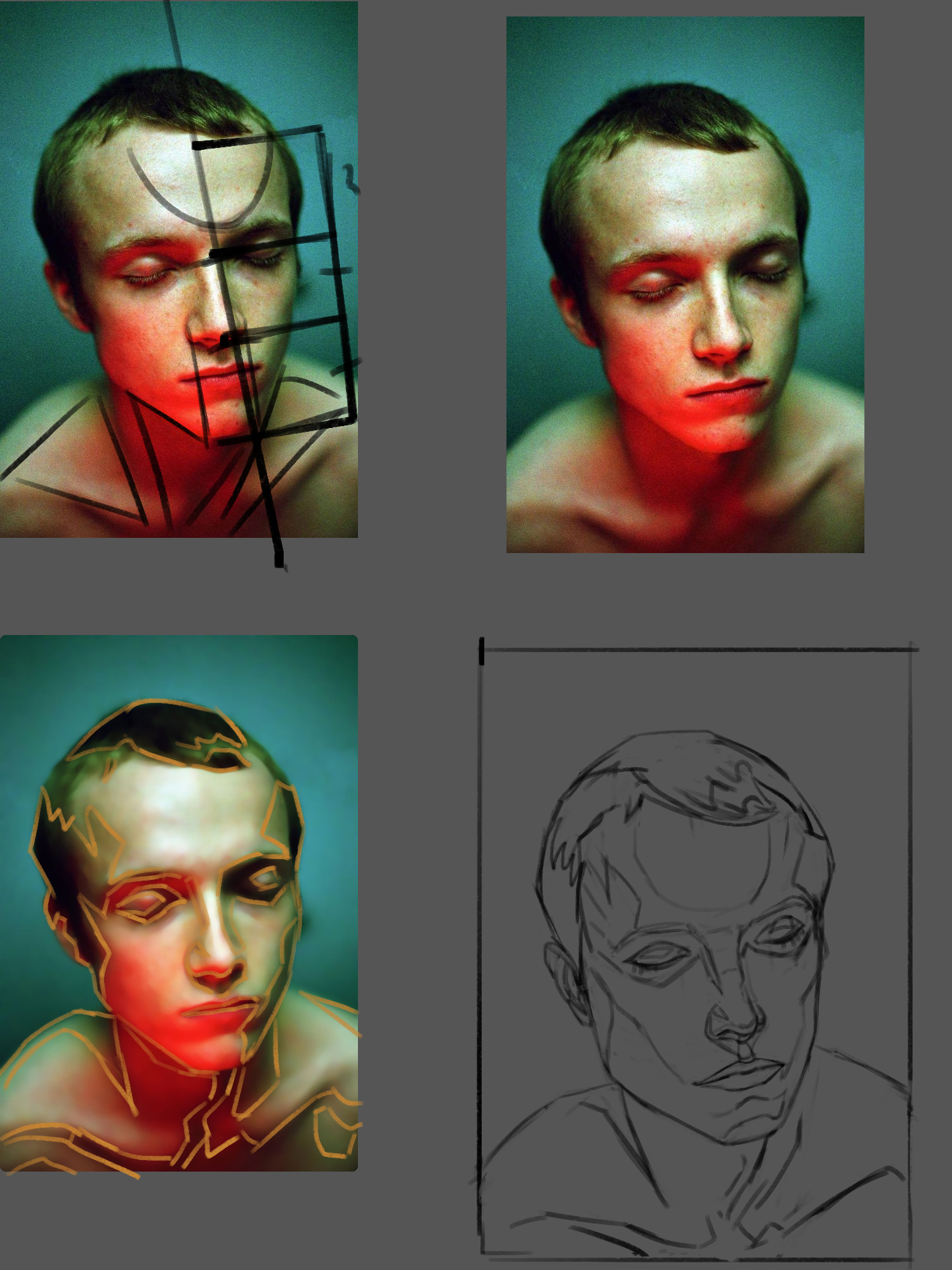
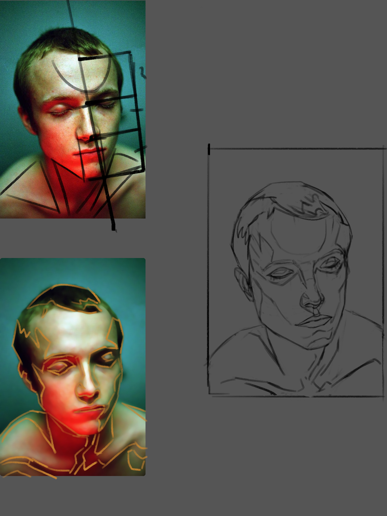
Yesterday i started to draw a portrait as a check in what i have studied for a week. Strarted from construction.

I tried so hard on it, i think even spent 1 hour, to just make my life easier while i will paint it.
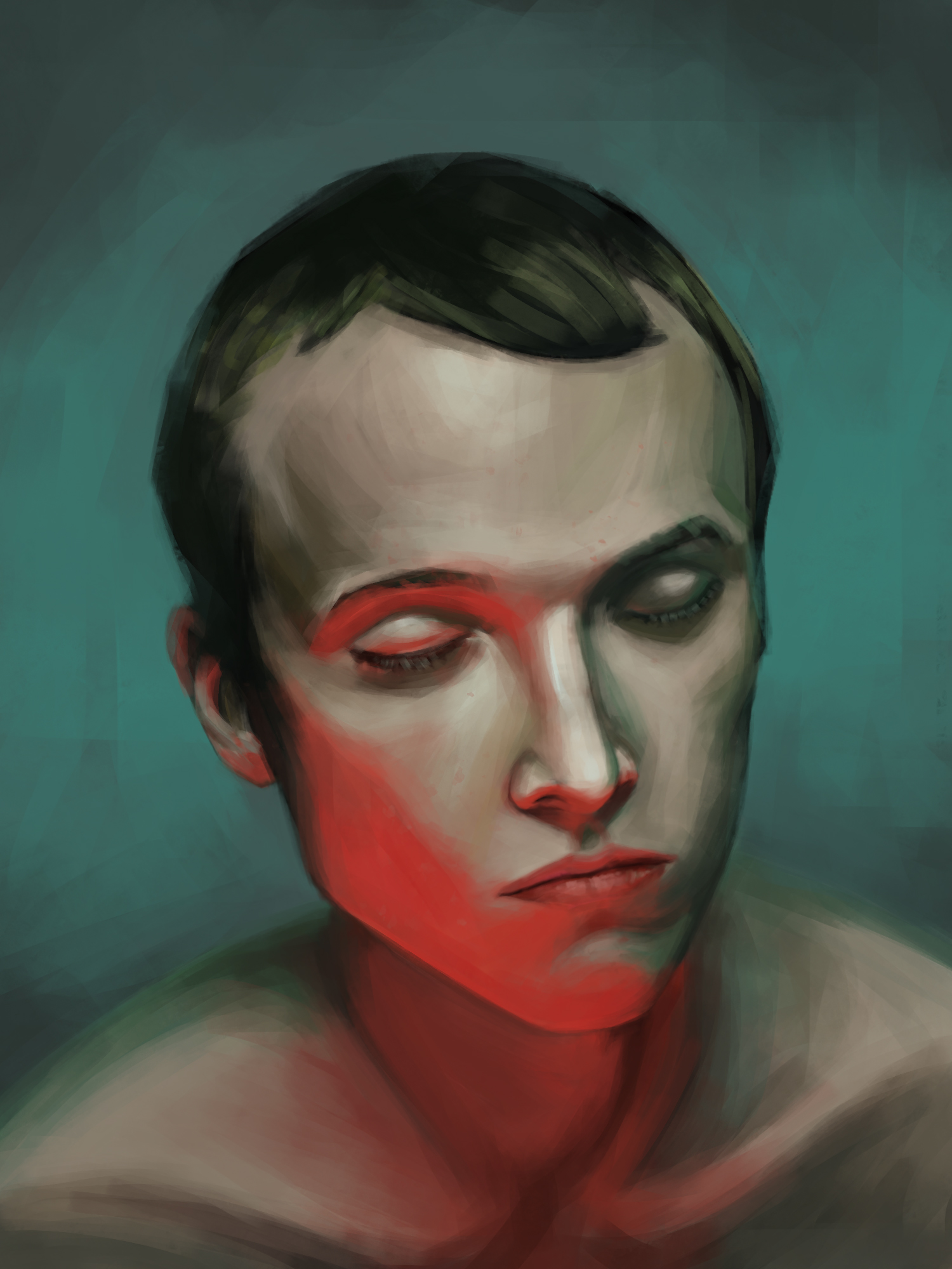
Today i finished it. My aim wasn't 1:1 copy of it. I tried to make this guy at least familiar to original as much as i could. With colours i wanted to make my own variation, with colours I like more.

I can't say, I don't like what came out. For example, I really like the way how i managed brushstrokes on light side of the face. But I'm not satisfied with the red part of the face, again it became flat with the strong light. Looking for ur critique!
have no idea how to delete image from post, so gonna hide it in here:(

Posts: 3,357
Threads: 37
Joined: Aug 2013
Reputation:
234
I think this conversation http://crimsondaggers.com/forum/thread-9...#pid131538 could be useful to you and i would actually recommend you actively seek JosephCow feedback on value and color.That skin as that particular grey muddy feel to it atleast that what i feel.
Posts: 852
Threads: 6
Joined: May 2018
Reputation:
116
Quote:SPECIAL THANKS TO JOSEPHCOW, if you will ever read this!
haha you're welcome. I randomly came across this SB and was surprised to find my name in it a few times! If i knew someone would actually take it to heart, I would have probably provided more explanation or presented it better. LMK if you want any more input.
Also nice ears. I can't draw ears without looking at one tbh. So confusing.
Posts: 1,076
Threads: 4
Joined: Jan 2016
Reputation:
43
Great likeness with your latest study, solid construction all around. Very confident brushwork as well, I'd definitely consider this one a very successful study. Great job!
Posts: 12
Threads: 2
Joined: Mar 2021
Reputation:
0
Thank you, guys, for your kind feedback. I guess, my magnum opus is this ear study, lol.
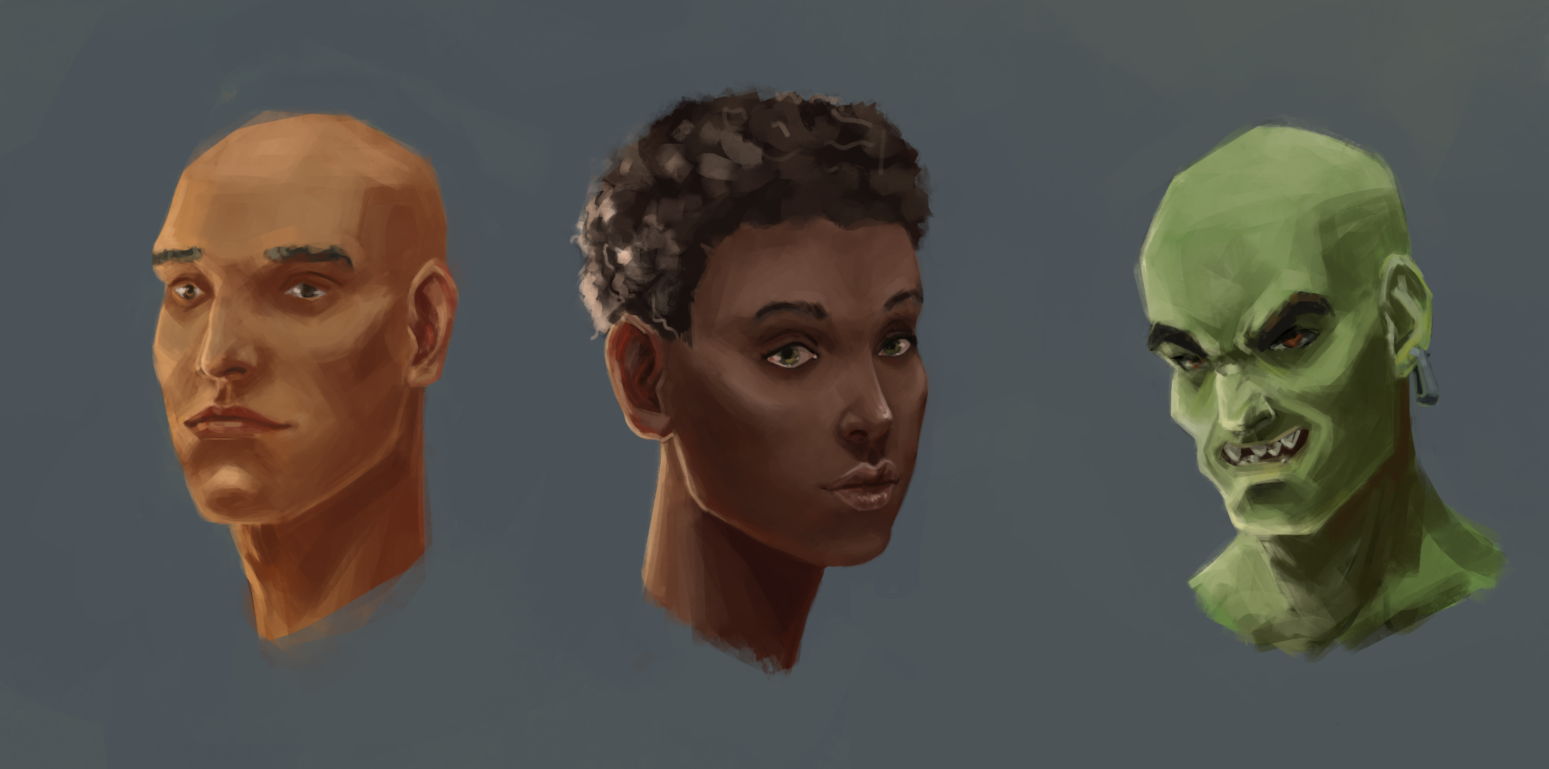
Had fun with faces from imagination, experimented with colours. Came out weird.

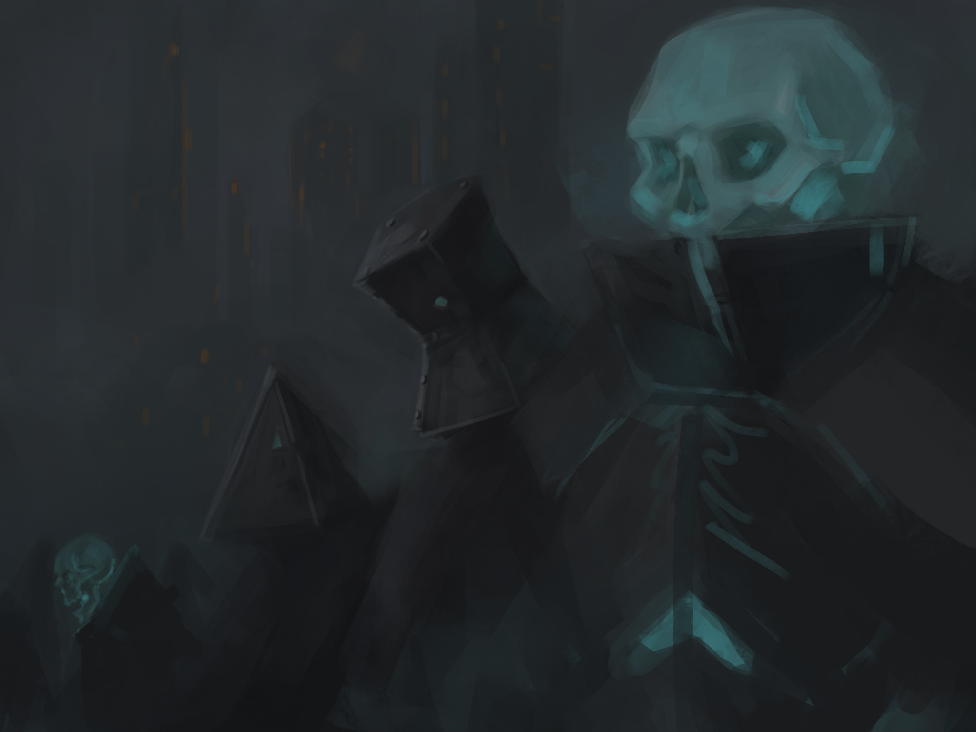
Did a speed paint and got inspired to make my first ever character concept from it.

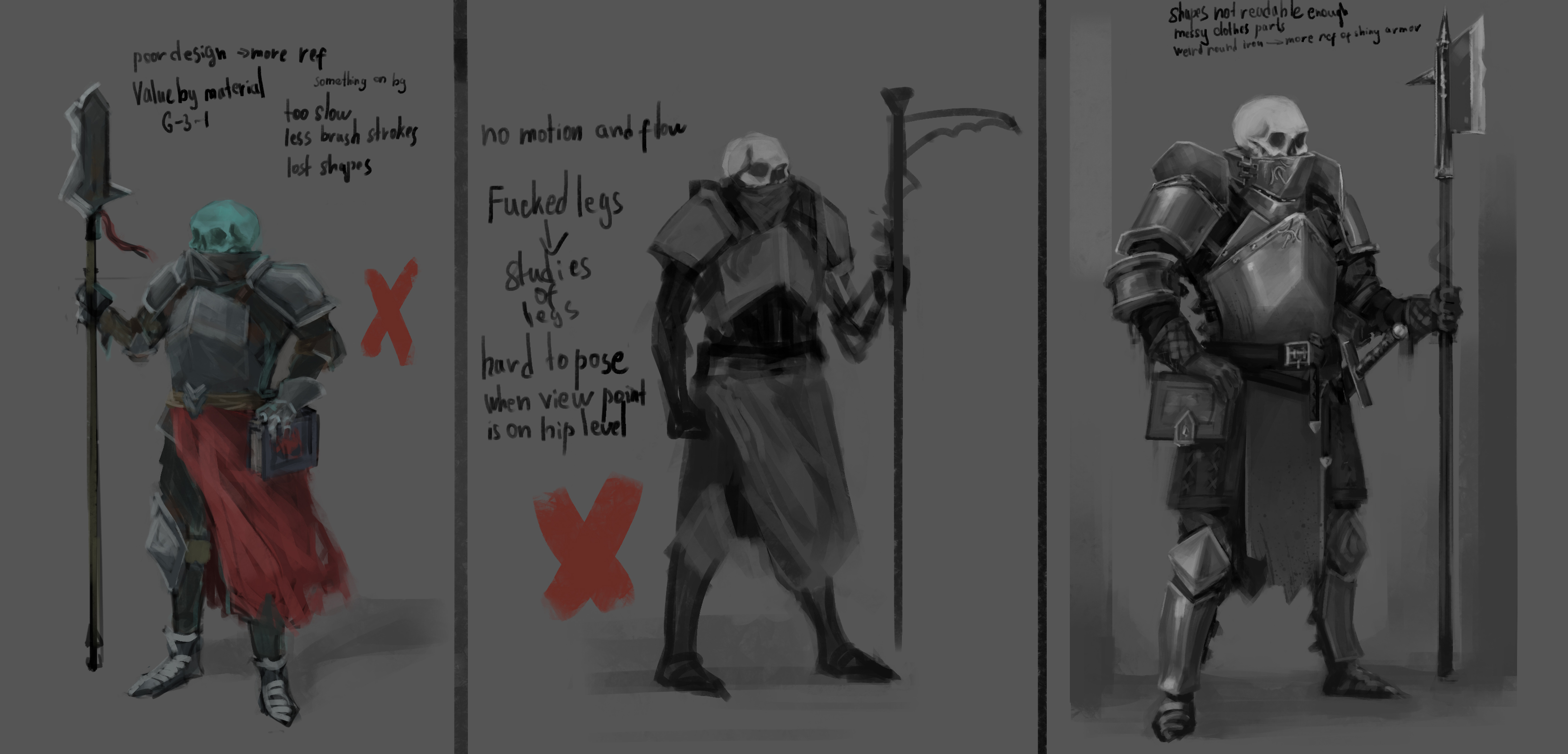
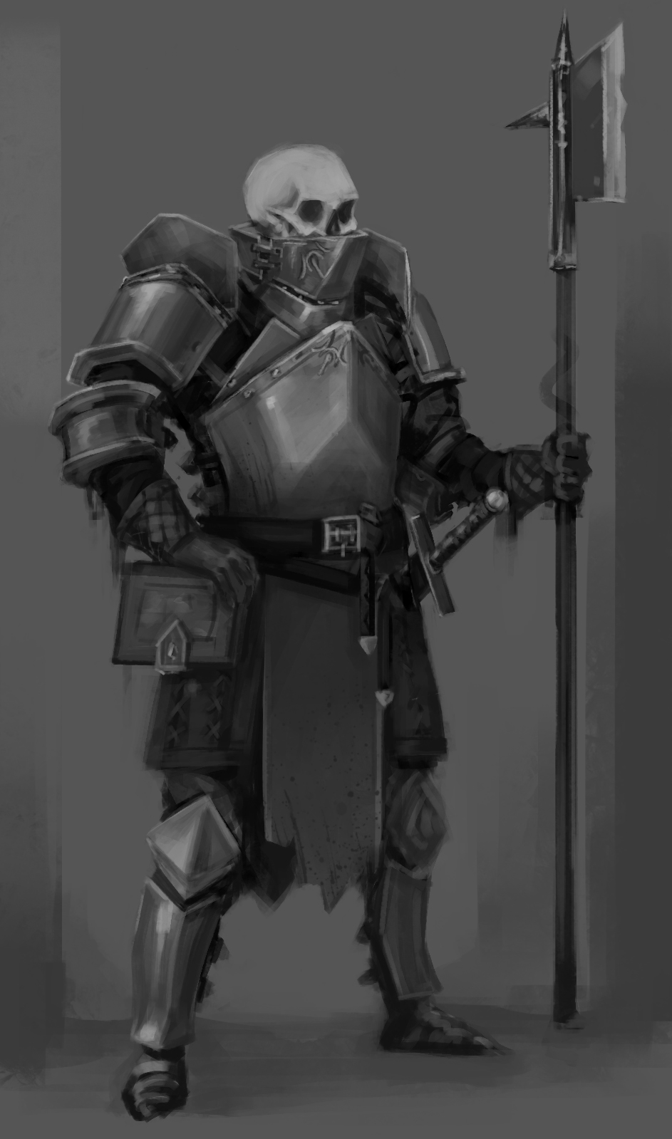
There were 3 attempts. Added my thoughts about what came out and what I should improve. I'd like to ask you guys the way to improve my design. Currently everything looks boring.


|


 Self talk actually effects everything we do, so it is good to be mindful of if you may be being overly negative or self deprecating lest it becomes an unintentional habit.


![[+] [+]](images/collapse_collapsed.png) Spoiler
Spoiler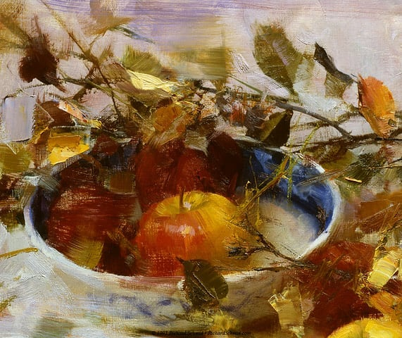







![[Image: cTZfL.jpg]](http://imgur.com/cTZfL.jpg)
