02-04-2024, 12:40 PM
I've been meaning to do this paintover feedback but had been too busy, but I had some free time today.
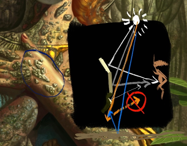
The reason why the stones on her still don't have enough fidelity is because the lighting on them doesn't match the lighting you have for the rest of the scene. I painted over one spot to show you how it should look, then a diagram on the right explaining why.
The brightest plane is the one that will form an optimal bounce angle from the sun to the plane and then to the viewer's eyes. It's a lot like billiard balls requiring the optimal bounce angle to nail the shot you want to make. Too shallow or too steep and the ball will not go where you want it to (from the sun to the viewer's eyes). The little ridge also has the same bright highlight for the same reason--it's also a plane facing toward the light source. Then the plane facing the viewer will be your mid-tone because the plane's angle does not have an optimal bounce angle to get the most light into the viewer's eyes. Then the planes facing downwards will have the darkest value because the photon rays can't even bounce off of them and towards the viewer's eyes--they can't even reach the down-facing planes. But those planes aren't just pitch-black because there will be ambient light bounced off the ground and upwards and fill in those shadows and light them up a little bit.
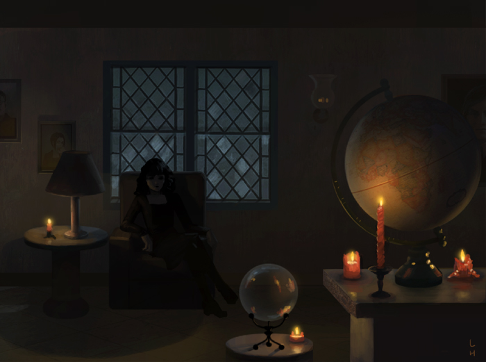
Right now, lighting is one of your most glaring weaknesses and my recommendation is to do a ton of lighting studies to improve your understanding of how lighting works. There are some excellent books on the subject you might want to check out: Amazon.com : lighting for artists
Here's also a good free resource to get started on deepening your understanding: itchy animation - quirky illustration and characters by Richard Yot (itchy-animation.co.uk)
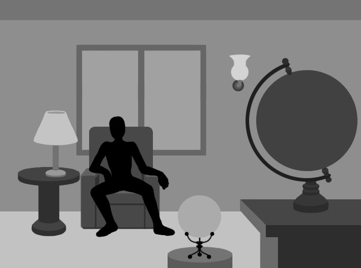
One of the assignments I give my students to train their ability to light a scene with believability is to take this flat image with no lighting and then paint the lighting on and make it look convincing:
Here are examples from past students:
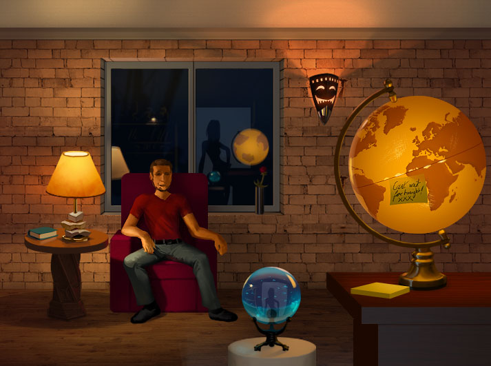


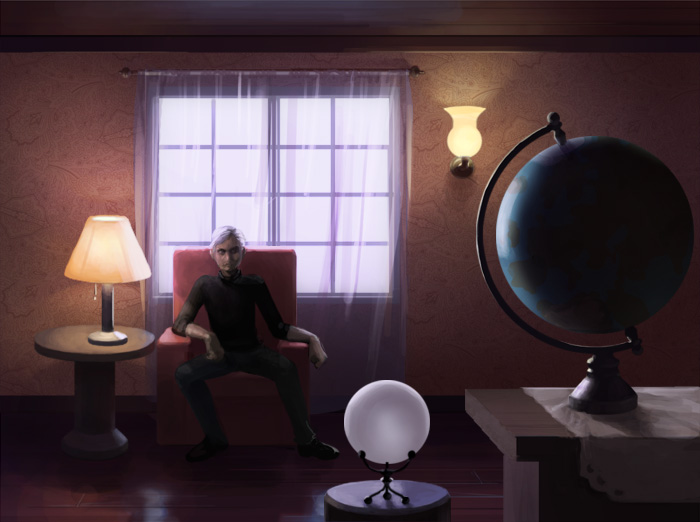
This is one of the most difficult assignments in the workshop I taught because it requires a thorough understanding of lighting and form and materials, and the students ranged from hobbyists to professional concept artists and art directors already working in games, film, and animation. These are the best examples from among hundreds--the rest all had glaring issues.
If you study lighting and form and materials enough, you might be able to nail this assignment. It might be fun to think of it as a long-term challenge to conquer.

The reason why the stones on her still don't have enough fidelity is because the lighting on them doesn't match the lighting you have for the rest of the scene. I painted over one spot to show you how it should look, then a diagram on the right explaining why.
The brightest plane is the one that will form an optimal bounce angle from the sun to the plane and then to the viewer's eyes. It's a lot like billiard balls requiring the optimal bounce angle to nail the shot you want to make. Too shallow or too steep and the ball will not go where you want it to (from the sun to the viewer's eyes). The little ridge also has the same bright highlight for the same reason--it's also a plane facing toward the light source. Then the plane facing the viewer will be your mid-tone because the plane's angle does not have an optimal bounce angle to get the most light into the viewer's eyes. Then the planes facing downwards will have the darkest value because the photon rays can't even bounce off of them and towards the viewer's eyes--they can't even reach the down-facing planes. But those planes aren't just pitch-black because there will be ambient light bounced off the ground and upwards and fill in those shadows and light them up a little bit.
Right now, lighting is one of your most glaring weaknesses and my recommendation is to do a ton of lighting studies to improve your understanding of how lighting works. There are some excellent books on the subject you might want to check out: Amazon.com : lighting for artists
Here's also a good free resource to get started on deepening your understanding: itchy animation - quirky illustration and characters by Richard Yot (itchy-animation.co.uk)
One of the assignments I give my students to train their ability to light a scene with believability is to take this flat image with no lighting and then paint the lighting on and make it look convincing:

Here are examples from past students:


This is one of the most difficult assignments in the workshop I taught because it requires a thorough understanding of lighting and form and materials, and the students ranged from hobbyists to professional concept artists and art directors already working in games, film, and animation. These are the best examples from among hundreds--the rest all had glaring issues.
If you study lighting and form and materials enough, you might be able to nail this assignment. It might be fun to think of it as a long-term challenge to conquer.


