02-14-2013, 11:38 PM
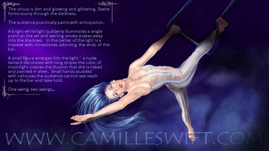
Hey Camille, I like the general comp of the piece. It works quite well. Anatomy wise, the figure is pretty good, the only thing I can see is that her right leg at the angle it's at looks quite chunky because there isn't much curve and taper between thigh knee and calf on the inside. It's a small thing. In general I thought she was quite bright so perhaps having some of her in shadow / out of the spot light would make it a bit more dynamic and interesting.
The only other thing was that I thought the font choice while I understand why you chose it, is actually quite hard to read especially when it's all in one block like that. I also added some small border elements to the text really quickly. Not sure if these made anything better though? I addressed all these in a quick paintover. Hope it helps

The only other thing was that I thought the font choice while I understand why you chose it, is actually quite hard to read especially when it's all in one block like that. I also added some small border elements to the text really quickly. Not sure if these made anything better though? I addressed all these in a quick paintover. Hope it helps


