03-22-2013, 12:51 AM
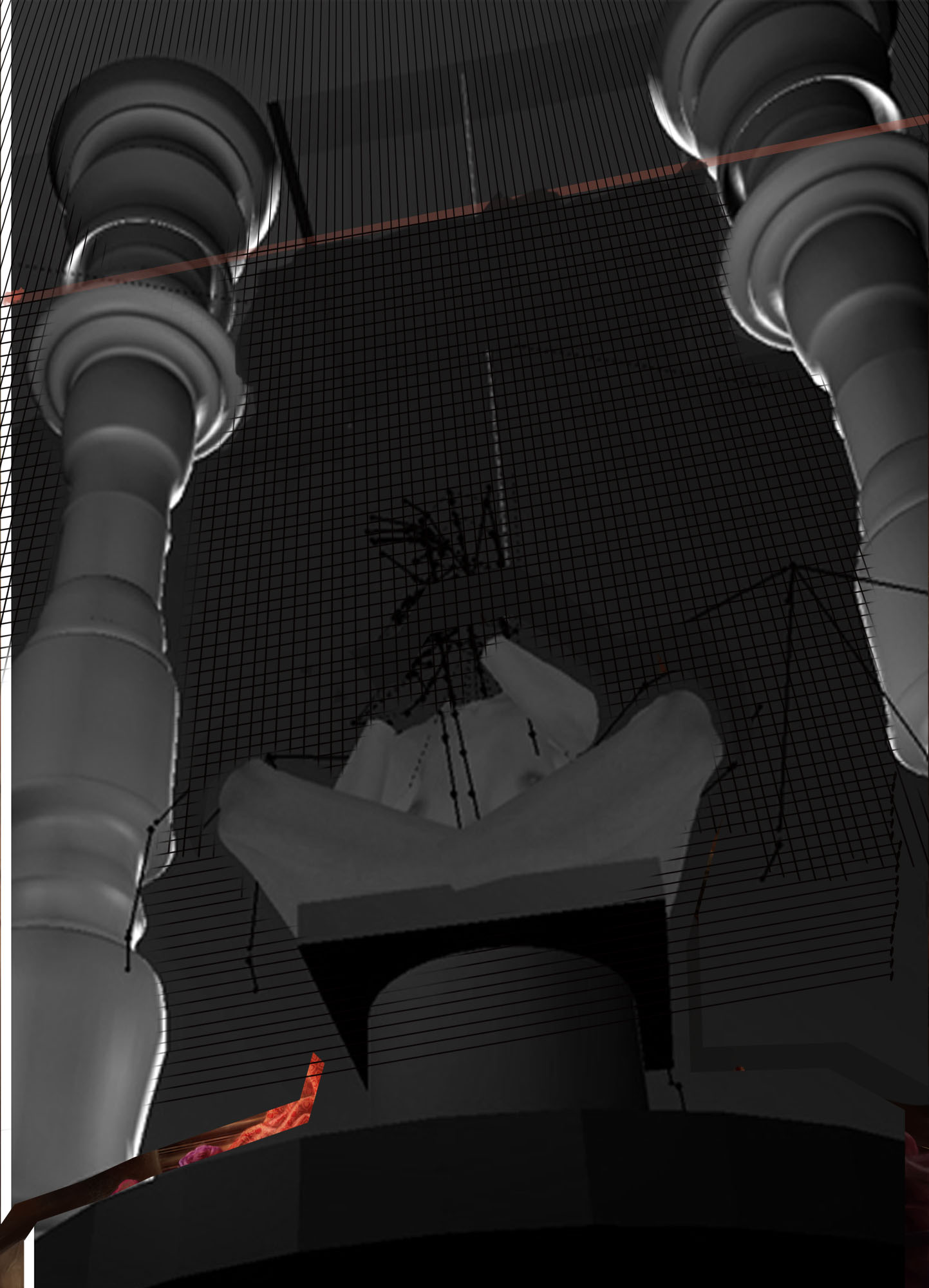
Here is the 3d ref that I used for the piece. I can see little fixes that I should make with the pillars and the pedestal, but overall I think I followed it pretty close. Does the reference itself look like it's wrong? Is that why the pillars in the painting look strange? I originally had the ceiling farther back, but I moved it closer to the columns (where I drew the red line) in order to give more space for the mural. I also drew a grid for the tiles on the wall and just painted on top of it. Do the tiles look like they're out of perspective here?


