04-04-2013, 09:35 PM
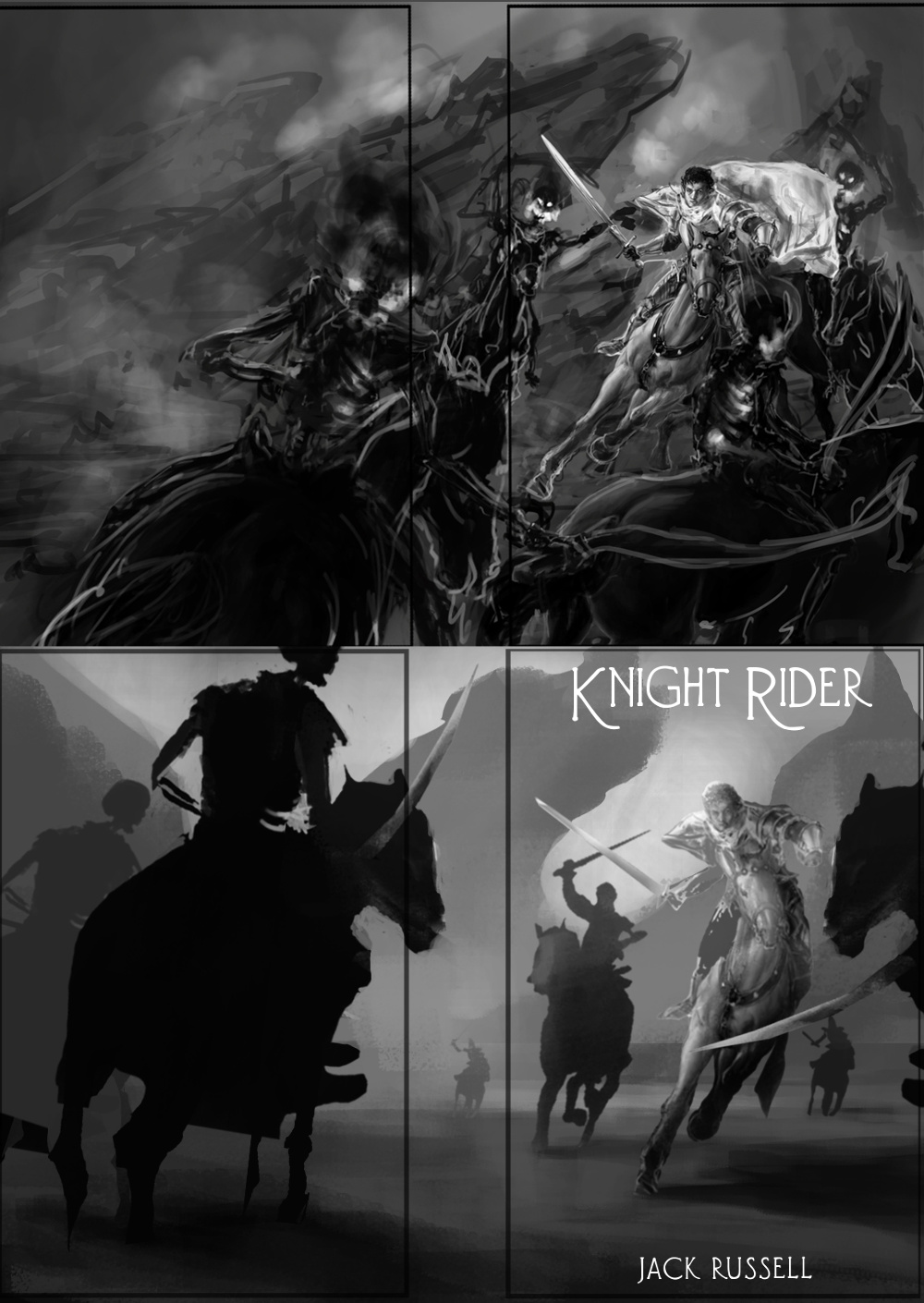
Hey man, I think the main issue at the moment is that it is pretty hard to see what is going on because you haven't actually "finished" your value sketch. Most things are very dark and it is also pretty flat and lacking depth so you can't really get a sense for the comp without closer inspection. If it doesn't read at thumbnail size you need to keep working on it.
From what I can tell the picture is pretty dynamic, and the main dude and the ones behind him work quite well with the bg, but, I can't really tell what the perspective is supposed to be as there are contradicting cues between the main rider and the background rocks. I think the idea of a foreground rider might work if you played with it, perhaps even going in much closer so we can see just an elbow and a sword or something like that. You do seem to be more concerned about showing off all of that nice horse drawing you did especially because you have spent the most time rendering that already so that does restrict what you can do with the comp in terms of overlap. Also the main horse is looking good but it's not the best idea to go that far in a value sketch if you haven't nailed the comp already. You would just have to redo all that work if the comp changes and actually, you're less likely to not want to make the hard decision to make changes to give the piece what it needs because you don't want to erase what you've spent time on already.
I'd say if you want to showcase the main character then really just go for it and make the foreground guy much less prominent and simplify your comp.
In general for comps something I'd suggest would be to simplify your values into fairly discrete flat areas of shape and value until you nail it. There's no point adding scribbly details and vague airbrushing as you have because these tend to muddy the comp. and you're after the big shapes anyway.
I didn't exactly paintover what you had to address your specific comp issues but I did a comp. sketch the way I would if I was going to do this. I basically started with your main guy unchanged (got rid of his cloak for simplicity, would add it in later) and then I fit everything else to his perspective. I created the silhouettes of every shape (background, each rider) in a different locked layer and filled them with a flat value. I scaled and moved things around until they kinda worked, then I used a large soft brush with lighter or darker shades of value just to give them a bit of form and integrate them into the background and change their depth in the comp.
At this stage I'd go away and do 5 more of these comps before the illo. :D
I know I changed your whole piece so it may not help for your illo. but I'd recommend you work out your compositions this way or similar and then nail it before you go into detailing.
Hope that helps


